Similar presentations:
Chapter 4: CSS for Content Presentation
1.
Chapter 4:CSS for
Content
Presentation
1
2. Overview and Objectives (1 of 2)
The motivation for CSS, and a little history
The syntax, semantics and placement of style
rules, with examples
Common types of property values and their formats
Structuring, commenting and formatting style
sheets
The CSS selectors (which are also HTML
attributes) id and class
The legacy HTML grouping elements div and
span
3. Overview and Objectives (2 of 2)
Some new HTML5 semantic elements: main,
header, footer, nav, article, section,
aside …
Inheritance and the cascade
Validating CSS
The CSS box model
Simple CSS page layout with “floating” elements
CSS reset
Styling our Nature’s Source website with CSS
A brief introduction to responsive design
4. What Is CSS?
• CSS (Cascading Style Sheets) is a languageused to describe the presentational aspects
of a web page (that is, formatting and
layout).
• It’s a better idea than adding new tags (like
font) to HTML for presentational purposes.
• But … it took from the early 1990s to the late
1990s for people to fully realize this.
• CSS was based on the initial work of Bert
Bos and Håkon Wium Lee.
5. Summary of CSS Versions
CSS 1 (1996): First official W3C recommendation
CSS 2 (1998): A superset of CSS 1
CSS 2.1 (2011):
–
–
Fixed problems in CSS 2: removed poorly-supported
features, added some already–implemented browser
extensions
Went back and forth between Working Draft and
Candidate Recommendation for many years
CSS 3 (earliest drafts date back to 1999):
–
–
–
No longer a single specification
Now consists of a large number (over 50) of “modules”
A few modules have actually been approved, a few others
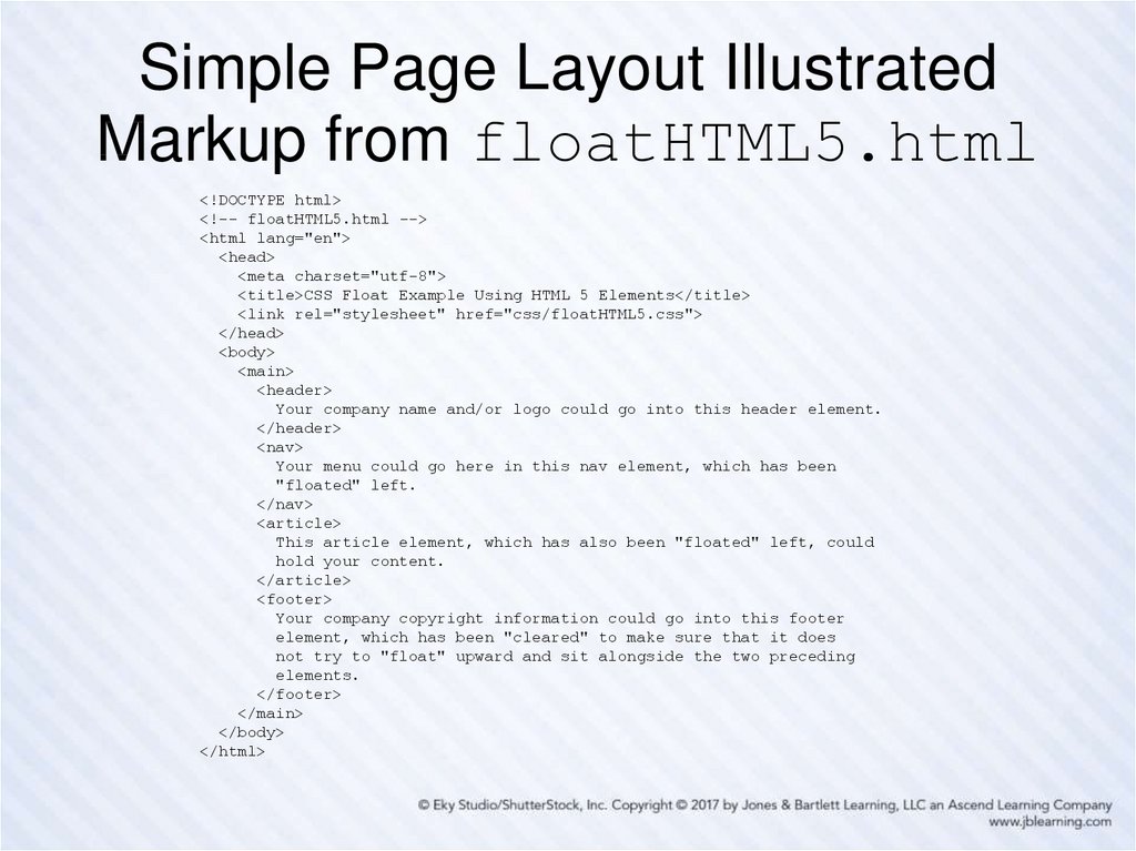
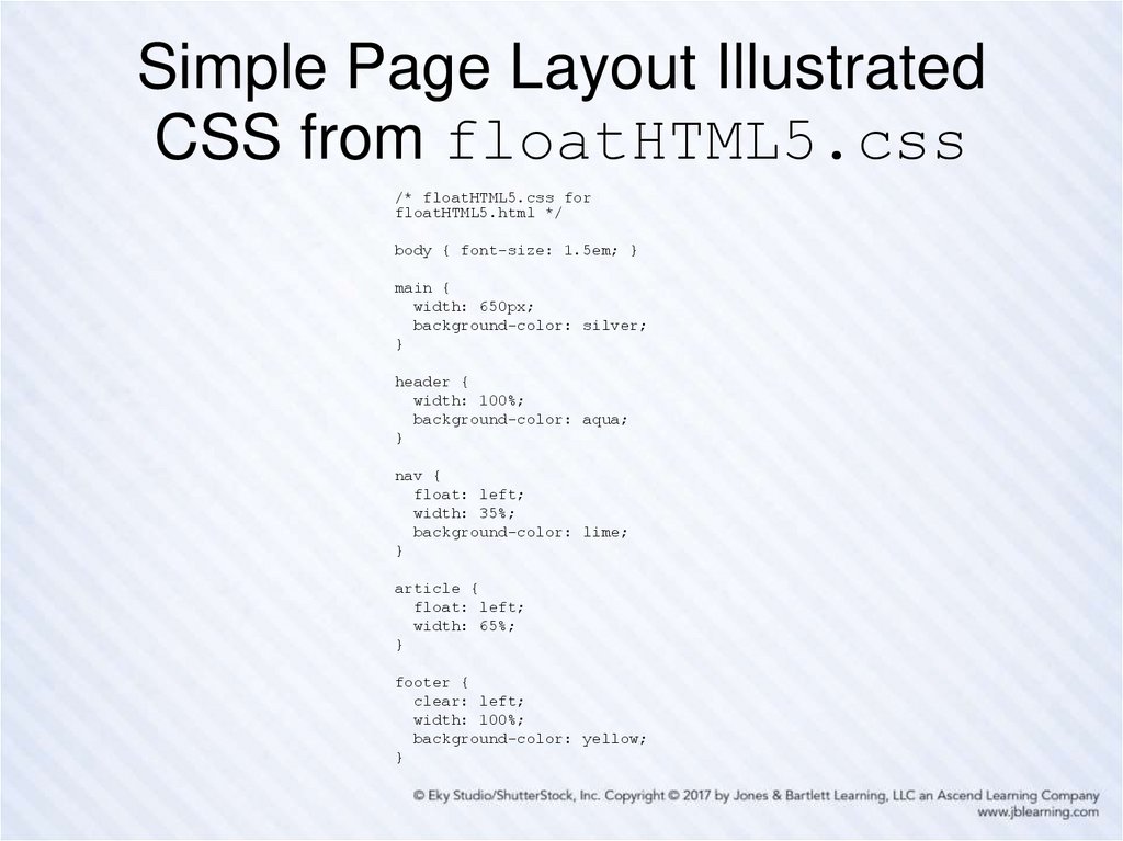
are reasonably stable, but it will be some time yet before
the full standard is in place, let alone implemented by all
browsers
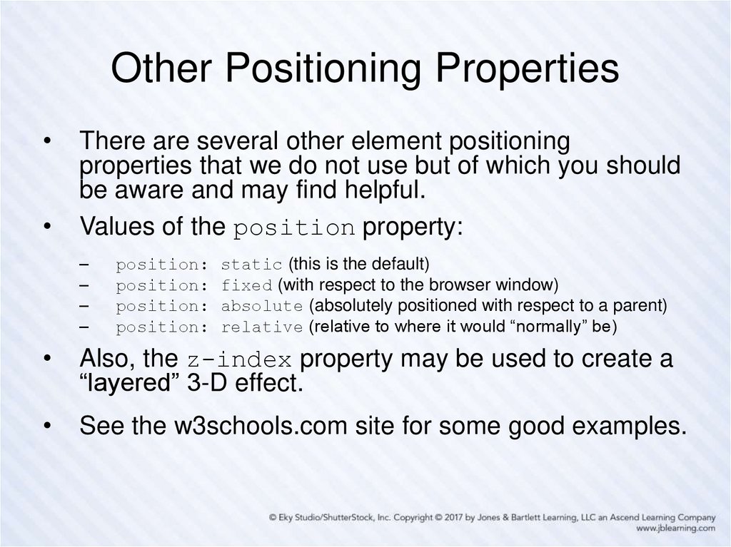
6. Style Sheets and Style Rules
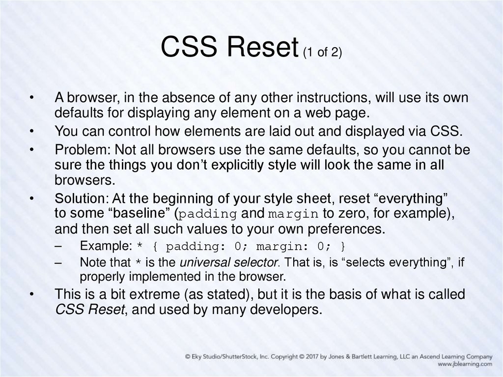
In CSS a style sheet typically contains a collection of
style rules.
Each style rule describes some aspect of how one or
more HTML elements is to be displayed (its color,
font, position, and so on).
By placing all presentational information in a style
sheet, a web designer can change the “look and feel”
of an entire web site very quickly just by making a few
changes in that style sheet.
Anything in an HTML document not specifically styled
by CSS is displayed using browser defaults, possibly
modified by user-adjusted browser settings.
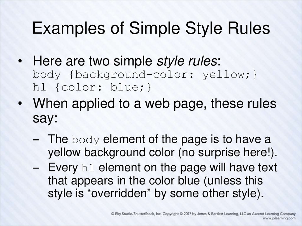
7. Examples of Simple Style Rules
• Here are two simple style rules:body {background-color: yellow;}
h1 {color: blue;}
• When applied to a web page, these rules
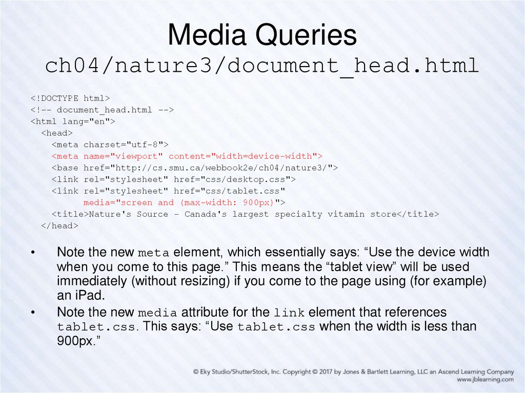
say:
– The body element of the page is to have a
yellow background color (no surprise here!).
– Every h1 element on the page will have text
that appears in the color blue (unless this
style is “overridden” by some other style).
8. Style Rule Terminology and Syntax
A slightly more complex style rule:h1 {color: blue; text-align: center;}
h1 is called the selector—it “selects” what is to be
styled. So … any HTML element can be a CSS selector.
The part enclosed by braces is the “style” part of the
“style rule”.
This style contains two declarations, each followed by a
semicolon (technically a separator, so the last one is
optional but using it is a “best practice”).
Each declaration contains a property (color, textalign) and, separated from it by a colon, its property
value (blue, center).
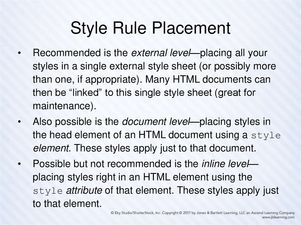
9. Style Rule Placement
Recommended is the external level—placing all your
styles in a single external style sheet (or possibly more
than one, if appropriate). Many HTML documents can
then be “linked” to this single style sheet (great for
maintenance).
Also possible is the document level—placing styles in
the head element of an HTML document using a style
element. These styles apply just to that document.
Possible but not recommended is the inline level—
placing styles right in an HTML element using the
style attribute of that element. These styles apply just
to that element.
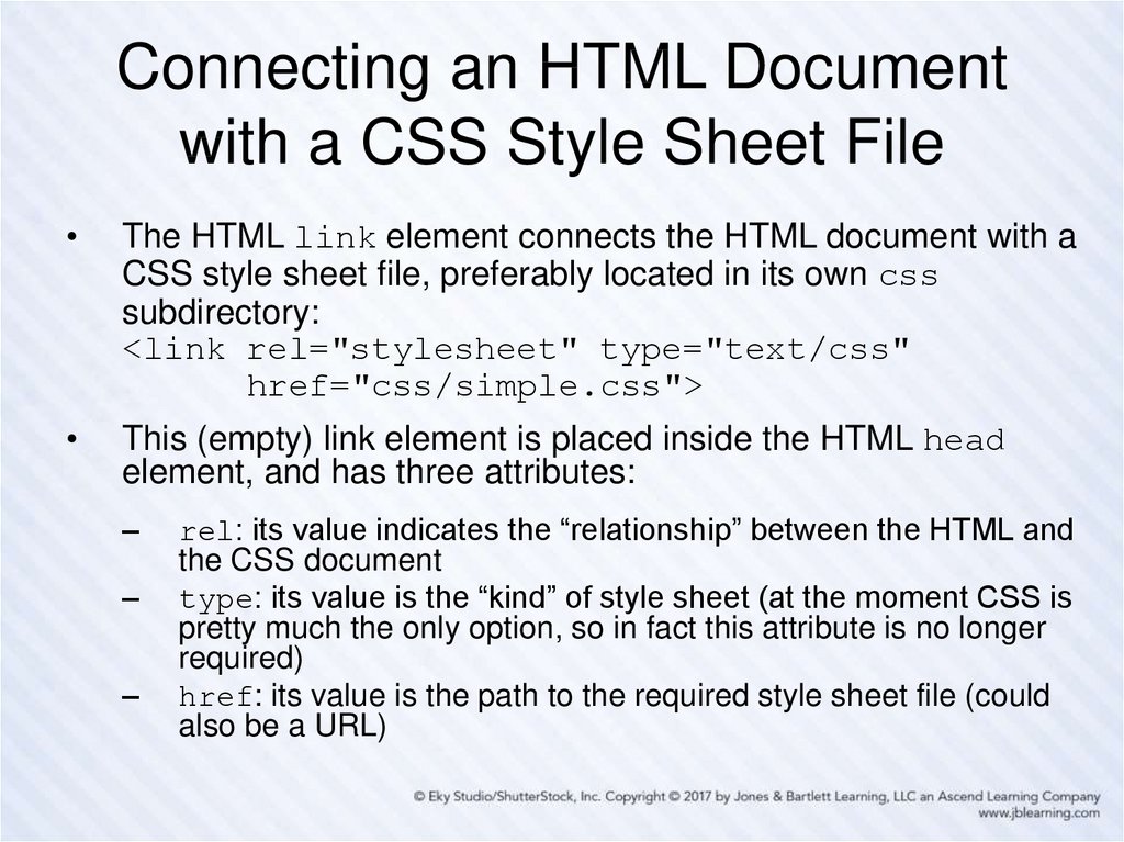
10. Connecting an HTML Document with a CSS Style Sheet File
The HTML link element connects the HTML document with a
CSS style sheet file, preferably located in its own css
subdirectory:
<link rel="stylesheet" type="text/css"
href="css/simple.css">
This (empty) link element is placed inside the HTML head
element, and has three attributes:
–
–
–
rel: its value indicates the “relationship” between the HTML and
the CSS document
type: its value is the “kind” of style sheet (at the moment CSS is
pretty much the only option, so in fact this attribute is no longer
required)
href: its value is the path to the required style sheet file (could
also be a URL)
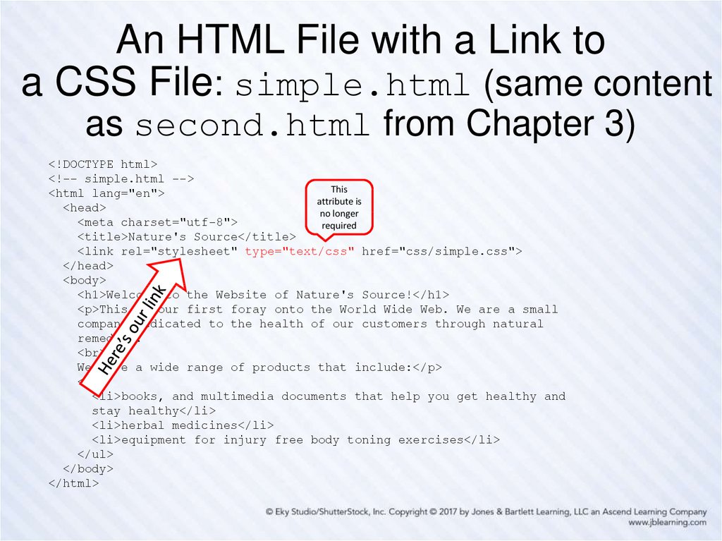
11. An HTML File with a Link to a CSS File: simple.html (same content as second.html from Chapter 3)
<!DOCTYPE html><!-- simple.html -->
This
<html lang="en">
attribute is
<head>
no longer
<meta charset="utf-8">
required
<title>Nature's Source</title>
<link rel="stylesheet" type="text/css" href="css/simple.css">
</head>
<body>
<h1>Welcome to the Website of Nature's Source!</h1>
<p>This is our first foray onto the World Wide Web. We are a small
company dedicated to the health of our customers through natural
remedies.
<br>
We have a wide range of products that include:</p>
<ul>
<li>books, and multimedia documents that help you get healthy and
stay healthy</li>
<li>herbal medicines</li>
<li>equipment for injury free body toning exercises</li>
</ul>
</body>
</html>
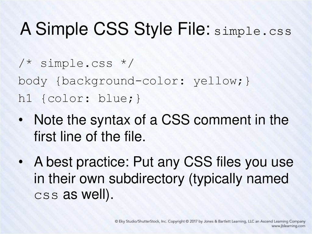
12. A Simple CSS Style File: simple.css
/* simple.css */body {background-color: yellow;}
h1 {color: blue;}
• Note the syntax of a CSS comment in the
first line of the file.
• A best practice: Put any CSS files you use
in their own subdirectory (typically named
css as well).
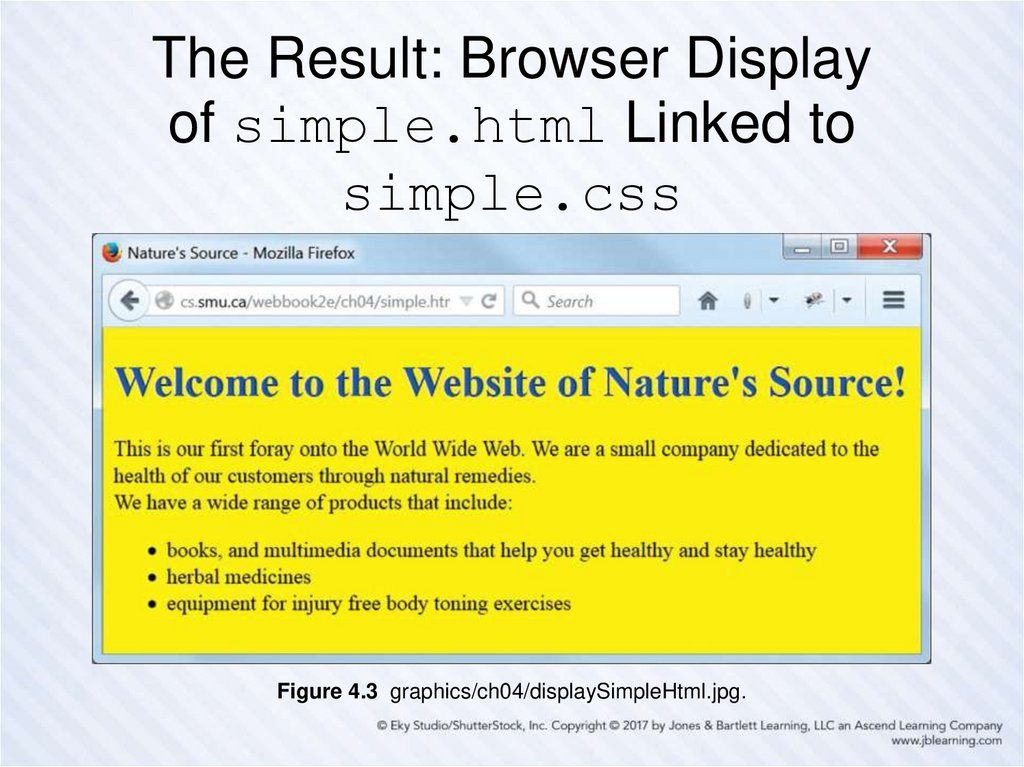
13. The Result: Browser Display of simple.html Linked to simple.css
Figure 4.3 graphics/ch04/displaySimpleHtml.jpg.14. More Style Rule Syntax Examples
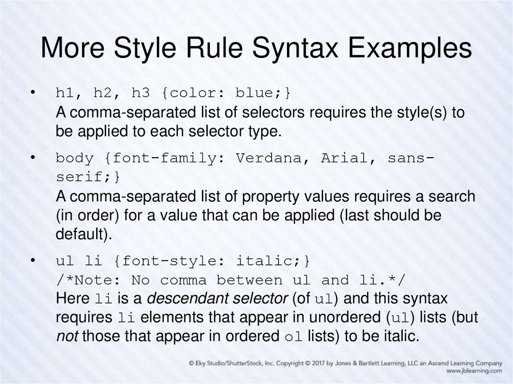
h1, h2, h3 {color: blue;}
A comma-separated list of selectors requires the style(s) to
be applied to each selector type.
body {font-family: Verdana, Arial, sansserif;}
A comma-separated list of property values requires a search
(in order) for a value that can be applied (last should be
default).
ul li {font-style: italic;}
/*Note: No comma between ul and li.*/
Here li is a descendant selector (of ul) and this syntax
requires li elements that appear in unordered (ul) lists (but
not those that appear in ordered ol lists) to be italic.
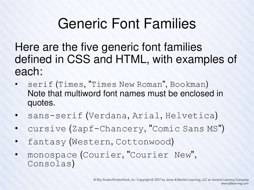
15. Generic Font Families
Here are the five generic font familiesdefined in CSS and HTML, with examples of
each:
serif (Times, "Times New Roman", Bookman)
Note that multiword font names must be enclosed in
quotes.
sans-serif (Verdana, Arial, Helvetica)
cursive (Zapf-Chancery, "Comic Sans MS")
fantasy (Western, Cottonwood)
monospace (Courier, "Courier New",
Consolas)
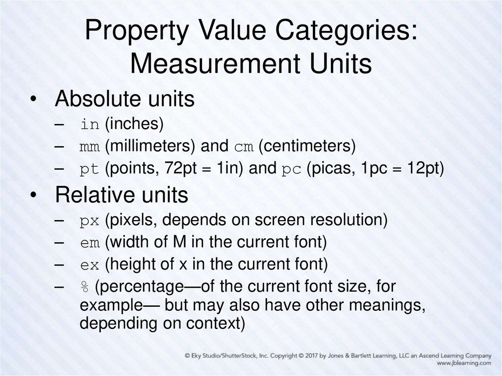
16. Property Value Categories: Measurement Units
• Absolute units– in (inches)
– mm (millimeters) and cm (centimeters)
– pt (points, 72pt = 1in) and pc (picas, 1pc = 12pt)
• Relative units
–
–
–
–
px (pixels, depends on screen resolution)
em (width of M in the current font)
ex (height of x in the current font)
% (percentage—of the current font size, for
example— but may also have other meanings,
depending on context)
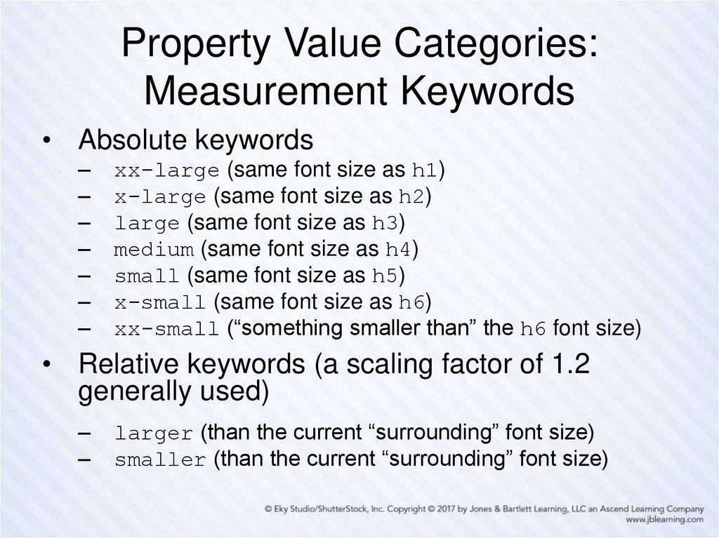
17. Property Value Categories: Measurement Keywords
• Absolute keywords–
–
–
–
–
–
–
xx-large (same font size as h1)
x-large (same font size as h2)
large (same font size as h3)
medium (same font size as h4)
small (same font size as h5)
x-small (same font size as h6)
xx-small (“something smaller than” the h6 font size)
• Relative keywords (a scaling factor of 1.2
generally used)
–
–
larger (than the current “surrounding” font size)
smaller (than the current “surrounding” font size)
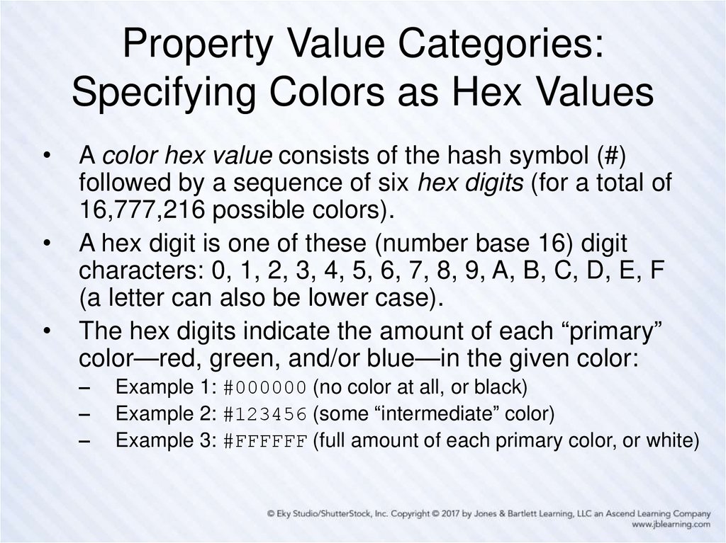
18. Property Value Categories: Specifying Colors as Hex Values
A color hex value consists of the hash symbol (#)
followed by a sequence of six hex digits (for a total of
16,777,216 possible colors).
A hex digit is one of these (number base 16) digit
characters: 0, 1, 2, 3, 4, 5, 6, 7, 8, 9, A, B, C, D, E, F
(a letter can also be lower case).
The hex digits indicate the amount of each “primary”
color—red, green, and/or blue—in the given color:
–
–
–
Example 1: #000000 (no color at all, or black)
Example 2: #123456 (some “intermediate” color)
Example 3: #FFFFFF (full amount of each primary color, or white)
19. Property Value Categories: Long-Form and Short-Form Hex Values
A long-form hex color value has six hex digits—the
first two specify the amount of red, the second two
the amount of green, and the last two the amount of
blue (minimum 00 and maximum FF in each case).
–
–
–
Example 1: #FF0000 (red) and #0000FF (blue)
Example 2: #FFFF00 (red and green, giving yellow)
Example 3: #A2A2A2 (a shade of gray)
A short-form hex color can (only) be used if, in each
group of two digits in the long form, both digits are
the same.
–
–
Example 1: #F00 (same as #FF0000)
Example 2: #2AC (same as #22AACC)
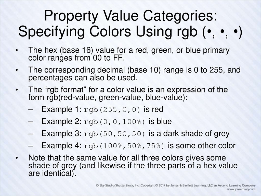
20. Property Value Categories: Specifying Colors Using rgb (•, •, •)
The hex (base 16) value for a red, green, or blue primary
color ranges from 00 to FF.
The corresponding decimal (base 10) range is 0 to 255, and
percentages can also be used.
The “rgb format” for a color value is an expression of the
form rgb(red-value, green-value, blue-value):
– Example 1: rgb(255,0,0) is red
–
Example 2: rgb(0,0,100%) is blue
–
Example 3: rgb(50,50,50) is a dark shade of grey
–
Example 4: rgb(100%,50%,75%) is some other color
Note that the same value for all three colors gives some
shade of grey (and likewise if the three parts of a hex value
are identical).
21. Property Value Categories: Specifying Colors with Keywords
Keywords can also be used to specify colors.
Keywords are not case-sensitive.
At the time of writing, CSS (and HTML) recognize at
least 140 different color names, such as:
–
–
–
–
Example 1: Aqua (#00FFFF)
Example 2: Beige (#F5F5DC)
Example 3: Chocolate (#D2691E)
Example 4: Cornsilk (#FFF8DC)
Hex numbers, though less readable, are
recommended, and preferred over keywords, to avoid
possible confusion like this:
–
–
Example 1: green (is #008000, not #00FF00)
Example 2: lime (is #00FF00)
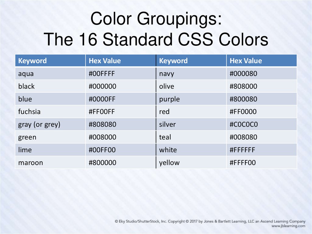
22. Color Groupings: The 16 Standard CSS Colors
KeywordHex Value
Keyword
Hex Value
aqua
#00FFFF
navy
#000080
black
#000000
olive
#808000
blue
#0000FF
purple
#800080
fuchsia
#FF00FF
red
#FF0000
gray (or grey)
#808080
silver
#C0C0C0
green
#008000
teal
#008080
lime
#00FF00
white
#FFFFFF
maroon
#800000
yellow
#FFFF00
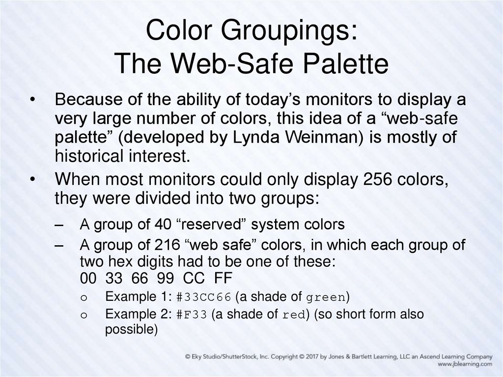
23. Color Groupings: The Web-Safe Palette
Because of the ability of today’s monitors to display a
very large number of colors, this idea of a “web-safe
palette” (developed by Lynda Weinman) is mostly of
historical interest.
When most monitors could only display 256 colors,
they were divided into two groups:
–
–
A group of 40 “reserved” system colors
A group of 216 “web safe” colors, in which each group of
two hex digits had to be one of these:
00 33 66 99 CC FF
o
o
Example 1: #33CC66 (a shade of green)
Example 2: #F33 (a shade of red) (so short form also
possible)
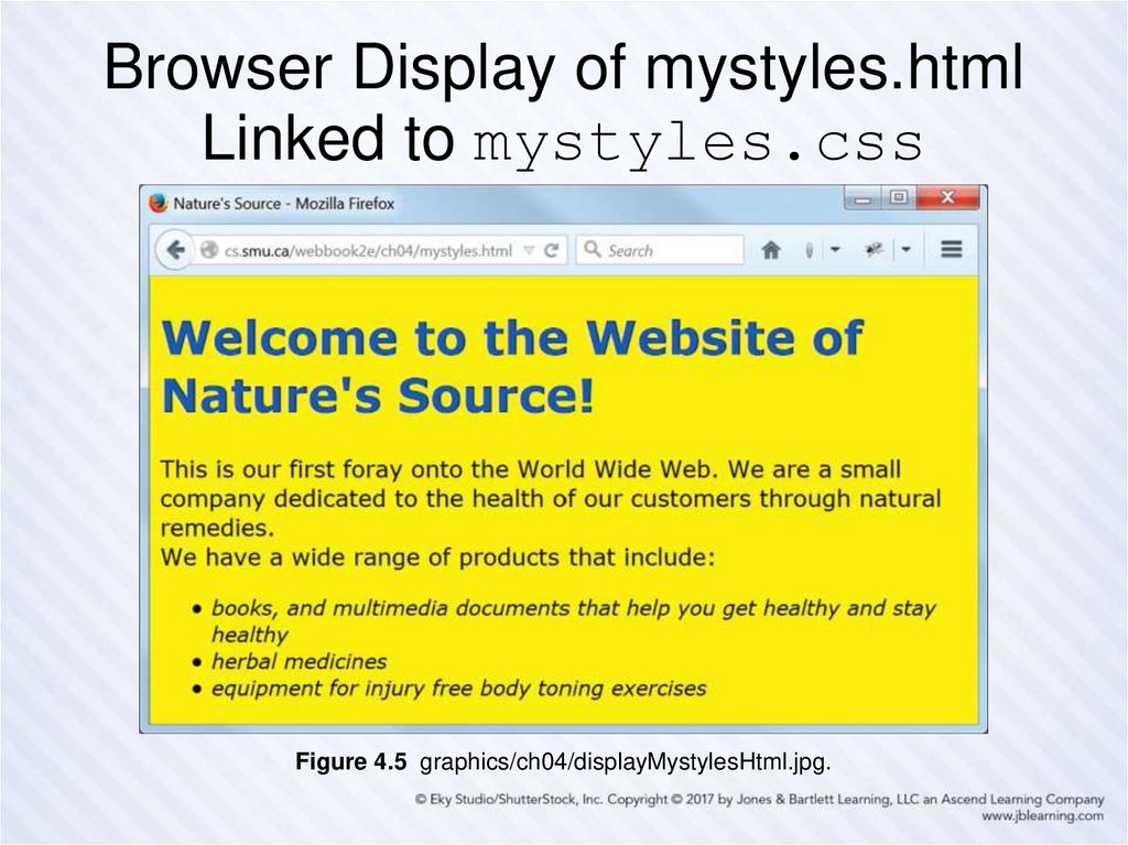
24. Our CSS Style Sheet Structure, Comments, and Formatting Illustrated: mystyles.css
/* mystyles.css for mystyles.htmlA few styles to illustrate the structure and formatting of a
CSS style file
*/
/* Styles that apply to every element in the body, unless overridden */
body {
font-family: Verdana, Arial, Helvetica, sans-serif;
font-size: large;
color: #000;
background-color: #FF0; /* yellow */
}
h1 { color: #00F; } /* Overrides body font color style above */
/* Styles any list item in an unordered list */
ul li {
font-size: medium; /* Overrides body text font size above */
font-style: italic; /* Adds italic style to text of list items */
}
25. Browser Display of mystyles.html Linked to mystyles.css
Figure 4.5 graphics/ch04/displayMystylesHtml.jpg.26. General Usage Guidelines for CSS Property Values
• Prefer relative measurement units forelement properties on pages that need to
“scale well” when displayed at different
sizes.
• Prefer absolute measurement units for
element properties when something must
remain at a fixed size.
• Prefer hex values for color property values.
• Use keywords for property values when
appropriate, but be careful of color
keywords.
27. Some Things We Can’t Do (Easily) (Yet)
• Apply a given style to some, but not all, ofthe HTML elements of a given type on a web
page.
• Apply the same style to HTML elements of
different types at different locations on a web
page.
• Apply a given style to an entire section of a
web page.
• Apply a given style to some part of a web
page that is not an HTML element.
28. The Legacy HTML Grouping Elements: div and span
• The div and span HTML elements areused to enclose parts of a web page for
purposes of identification and manipulation.
• The only difference between them is that
div is a block element and span is an
inline element.
• Neither div nor span has any formatting
effect on its content.
29. Two Useful HTML Attributes: class and id
• The class and id attributes are core orstandard attributes in HTML that are also
very often used as CSS selectors.
• This means that most (though not all) HTML
elements can have these attributes, and be styled
through them via CSS.
• The major difference between class and id:
– Many different HTML elements on a web page can
have a class attribute with the same value.
– Only one element on a web page can have an id
attribute with a given value.
30. New HTML5 Semantic Elements vs. div
• HTML5 has added new semantic elements thatare useful for grouping.
• Examples include: main, header, footer, nav,
article, section, aside …
• These elements can now be used in many places
where only a div element was available in the
past.
• Examples:
– Instead of <div id="header"> … </div> use
<header> … </header>
– Instead of <div id="footer"> … </div> use
<footer> … </footer>
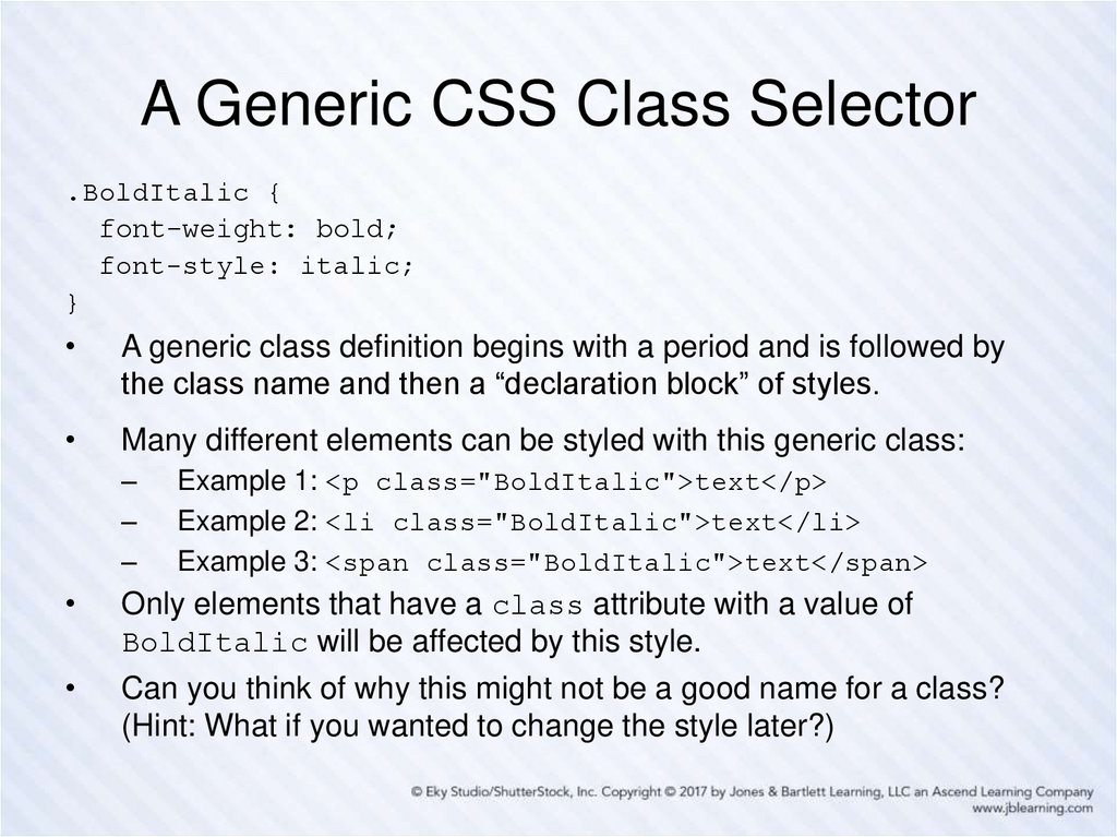
31. A Generic CSS Class Selector
.BoldItalic {font-weight: bold;
font-style: italic;
}
A generic class definition begins with a period and is followed by
the class name and then a “declaration block” of styles.
Many different elements can be styled with this generic class:
–
–
–
Example 1: <p class="BoldItalic">text</p>
Example 2: <li class="BoldItalic">text</li>
Example 3: <span class="BoldItalic">text</span>
Only elements that have a class attribute with a value of
BoldItalic will be affected by this style.
Can you think of why this might not be a good name for a class?
(Hint: What if you wanted to change the style later?)
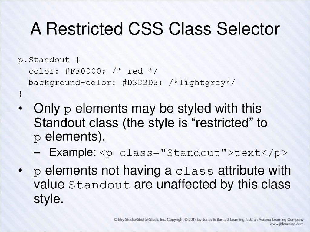
32. A Restricted CSS Class Selector
p.Standout {color: #FF0000; /* red */
background-color: #D3D3D3; /*lightgray*/
}
• Only p elements may be styled with this
Standout class (the style is “restricted” to
p elements).
– Example: <p class="Standout">text</p>
• p elements not having a class attribute with
value Standout are unaffected by this class
style.
33. The CSS id Selector
An id selector with a given value must be unique on a page.
Thus an id selector is often used to identify and style a
particular (unique) part of a page (such as a header or menu
section).
An id selector is defined and used in the same way as a
class selector, except that a # symbol is used in place of
the period (.).
So … some CSS might look like this:
div#importantNotes { … styles … }
The HTML that uses it would then look like this:
<div id="importantNotes">
… content of the div element …
</div>
34. Our Capitalization Conventions
• Both class and id names use camelnotation (that is, in multiword names, the
second and subsequent words start with a
capital letter).
• The first letter of a class name is a capital.
• The first letter of an id name is lower case.
• All other letters are lower case.
• Names thus capitalized help us to
distinguish the purpose of the thing named in
markup.
35. CSS Inheritance
On a typical web page many elements are nested inside
other elements.
–
This structure creates a parent-child relationship among
elements.
Many properties of an element are inherited (by default) from
its parent element.
–
Example: The font-family, font-size, and (text) color
of the body are inherited by every p element in that body.
Not all properties of an element are inherited.
–
Example: A body element contains a p element, which
contains a span element.
Example: The padding (space around the content of) a p
element is not inherited by a span element within that
paragraph.
Inherited styles can, of course, be overridden.
36. The Cascade in CSS
The cascade is the mechanism used to resolve conflicts
when different styles are applied to the same element.
A simplified view is that the most “specific” style that applies
is the one used.
In practice this often reduces to the “last style seen” being
the one that gets used.
So, as a best practice:
–
–
–
Put as many styles as you can, for your entire web site, in an
external style sheet file and link all your pages to that file.
Put any document-specific styles in a style element in the
head element of that document, and place the style element
after the link element containing the link to the external style
file.
If you really must, use the style attribute to style a particular
element on the page, but only as a last resort.
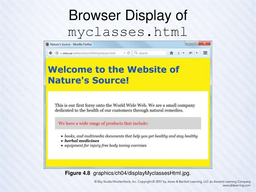
37. Browser Display of myclasses.html
Figure 4.8 graphics/ch04/displayMyclassesHtml.jpg.38. Markup from myclasses.html
<!DOCTYPE html><!-- myclasses.html -->
<html lang="en">
<head>
<meta charset="utf-8">
<title>Nature's Source</title>
<link rel="stylesheet" href="css/myclasses.css">
</head>
<body>
<h1>Welcome to the Website of Nature's Source!</h1>
<div class="BlackOnWhiteSerif">
<p>This is our first foray onto the World Wide Web. We are a small
company dedicated to the health of our customers through natural
remedies.</p>
<p class="Standout">We have a wide range of products that include:</p>
<ul>
<li>books, and multimedia documents that help you get healthy and
stay healthy</li>
<li class="BoldItalic">herbal medicines</li>
<li>equipment for injury free body toning exercises</li>
</ul>
</div>
</body>
</html>
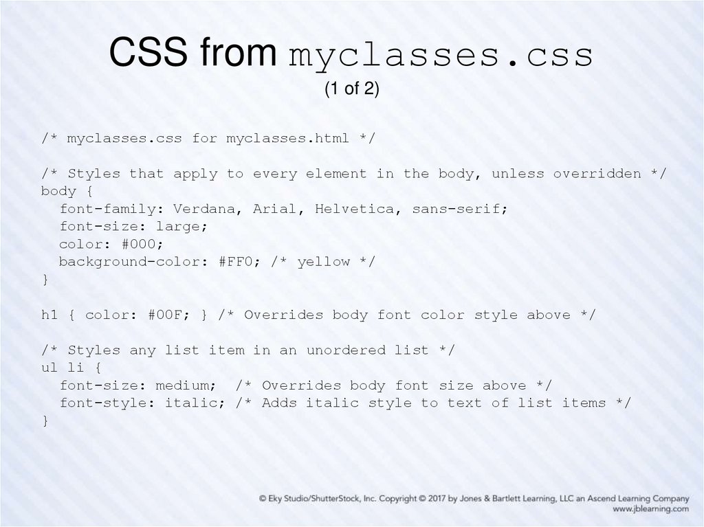
39. CSS from myclasses.css (1 of 2)
/* myclasses.css for myclasses.html *//* Styles that apply to every element in the body, unless overridden */
body {
font-family: Verdana, Arial, Helvetica, sans-serif;
font-size: large;
color: #000;
background-color: #FF0; /* yellow */
}
h1 { color: #00F; } /* Overrides body font color style above */
/* Styles any list item in an unordered list */
ul li {
font-size: medium; /* Overrides body font size above */
font-style: italic; /* Adds italic style to text of list items */
}
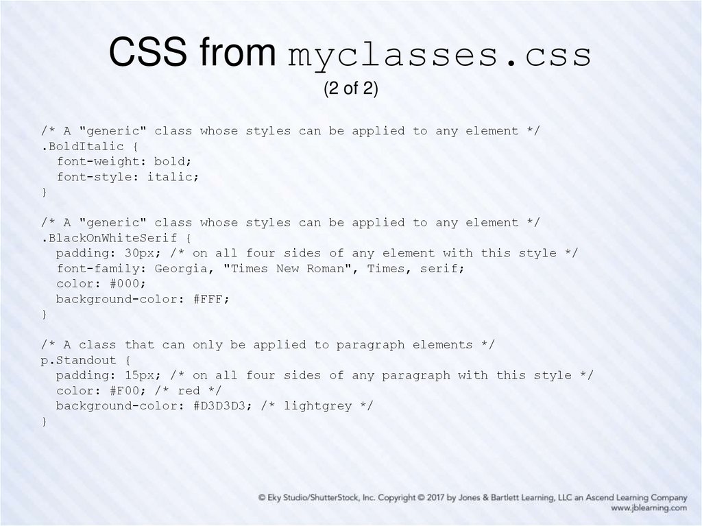
40. CSS from myclasses.css (2 of 2)
/* A "generic" class whose styles can be applied to any element */.BoldItalic {
font-weight: bold;
font-style: italic;
}
/* A "generic" class whose styles can be applied to any element */
.BlackOnWhiteSerif {
padding: 30px; /* on all four sides of any element with this style */
font-family: Georgia, "Times New Roman", Times, serif;
color: #000;
background-color: #FFF;
}
/* A class that can only be applied to paragraph elements */
p.Standout {
padding: 15px; /* on all four sides of any paragraph with this style */
color: #F00; /* red */
background-color: #D3D3D3; /* lightgrey */
}
41. Validating Your CSS
• Recall how important it is to validate yourHTML markup.
• It’s just as important to validate your CSS.
• The process is similar to HTML markup
validation, and here is the URL of the W3C
CSS validator:
http://jigsaw.w3.org/css-validator/
• You can enter the URL of a CSS document
directly for validation, or the URL of an HTML
document styled with CSS to validate the
CSS used.
42. Validating myclasses.css
Figure 4.9 graphics/ch04/displayMyclassesCssToValidate.jpg.43. Validation Report for myclasses.css
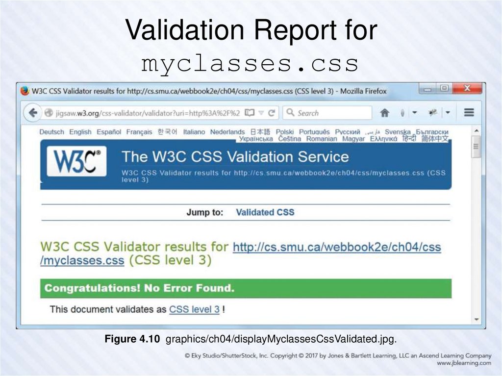
Figure 4.10 graphics/ch04/displayMyclassesCssValidated.jpg.44. The CSS Box Model
Every HTML element, block or inline, that appears on a web page is
treated as a “box”.
This box has a content area at its center, and may (or may not) have one
or more of the following (moving outward from that content):
– padding to surround the content
– a border surrounding the padding
– a margin surrounding the border
Even an element which is an “empty element” from the HTML viewpoint
may have content in the above sense.
– Example: The content of an “empty” img element is its image.
The padding, border and/or margin may appear on all four sides of the
content, on no sides, or just on some sides.
The slide after the next one gives our detailed example of the box model
and needs to be studied carefully. But … you should also Google “CSS
box model images” and study some of the examples that will show up
there, until you get comfortable with the idea.
45. A Diagram of the CSS Box Model
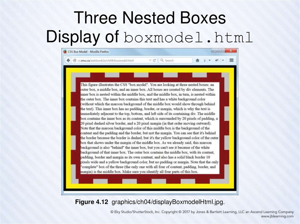
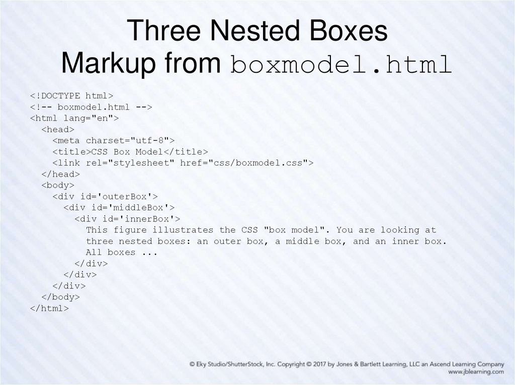
Figure 4.11 graphics/ch04/BoxModel.jpg.46. Three Nested Boxes Display of boxmodel.html
Figure 4.12 graphics/ch04/displayBoxmodelHtml.jpg.47. Three Nested Boxes Markup from boxmodel.html
<!DOCTYPE html><!-- boxmodel.html -->
<html lang="en">
<head>
<meta charset="utf-8">
<title>CSS Box Model</title>
<link rel="stylesheet" href="css/boxmodel.css">
</head>
<body>
<div id='outerBox'>
<div id='middleBox'>
<div id='innerBox'>
This figure illustrates the CSS "box model". You are looking at
three nested boxes: an outer box, a middle box, and an inner box.
All boxes ...
</div>
</div>
</div>
</body>
</html>
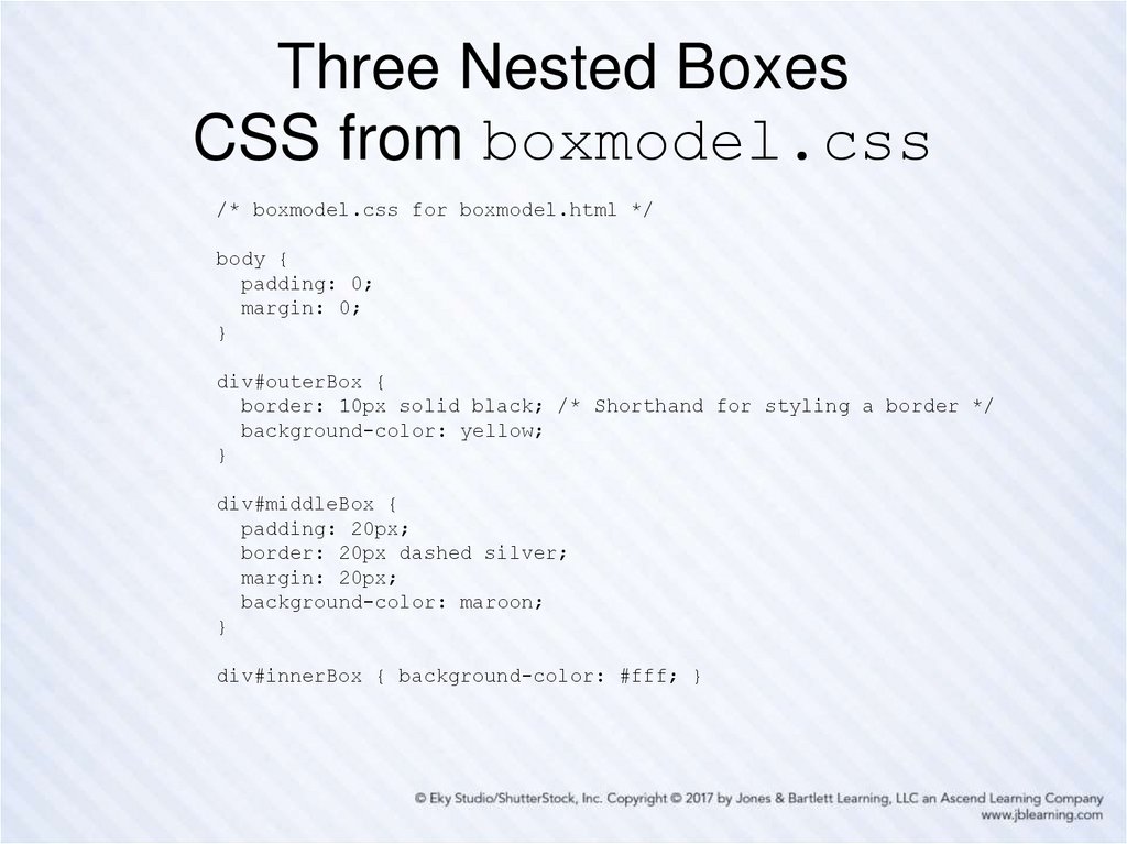
48. Three Nested Boxes CSS from boxmodel.css
/* boxmodel.css for boxmodel.html */body {
padding: 0;
margin: 0;
}
div#outerBox {
border: 10px solid black; /* Shorthand for styling a border */
background-color: yellow;
}
div#middleBox {
padding: 20px;
border: 20px dashed silver;
margin: 20px;
background-color: maroon;
}
div#innerBox { background-color: #fff; }
49. Padding and Margin Shorthand Styles
• For padding– Example 1: Specifying same amount on all four
sides
padding: 10px;
– Example 2: Specifying all four sides explicitly (order
is top, right, bottom, left)
padding: 10px 20px 30px 40px;
– Example 3: Specifying top/bottom and left/right
padding: 10px 20px;
– Example 4: Specifying top, left/right, and bottom
padding: 10px 20px 30px;
• For the margin property, examples analogous to
those above also apply in the same way.
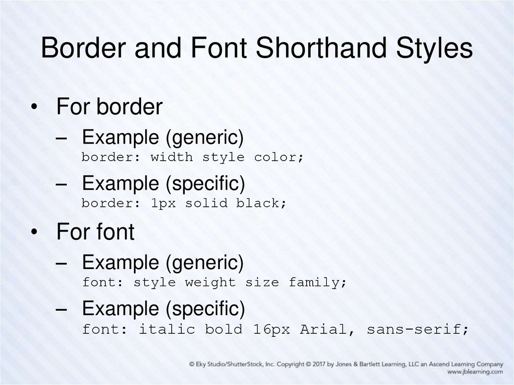
50. Border and Font Shorthand Styles
• For border– Example (generic)
border: width style color;
– Example (specific)
border: 1px solid black;
• For font
– Example (generic)
font: style weight size family;
– Example (specific)
font: italic bold 16px Arial, sans-serif;
51. Using New HTML5 Semantic Elements for Structure
Using HTML table elements for page structure and layout is not a
good idea.
A better idea is to use the new HTML5 semantic elements
(elements whose names suggest their intended usage).
Examples include: main, header, footer, nav , article,
section, aside and so on …
Next, you must position those elements appropriately on the web
page using CSS.
Two important things to keep in mind when structuring your pages
is the order (top to bottom, left to right) in which the various
elements should appear, and whether there should be any nesting
of one element inside another.
Each element will need an id attribute to identify and style it in the
associated style sheet and/or a class attribute if you wish to have
it styled by one or more CSS classes.
52. The div Element Is Still Useful
New HTML5 semantic elements should be used to
contain those parts of a web page that are “semantically
meaningful”, such as the header, the main part of the
page, and the footer.
But … sometimes a part of a page needs to be
considered as a group, but there is no semantic
element that applies directly.
So … use a div element for the grouping.
And … give the div element an id and/or a class
attribute, as appropriate.
We have used, and will continue to use, div elements
in standalone examples for illustration purposes, but will
switch to the new HTML5 semantic elements when
revising our Nature’s Source website.
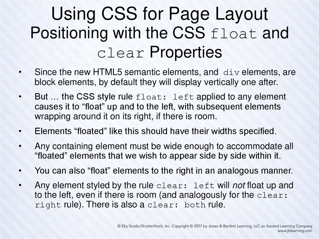
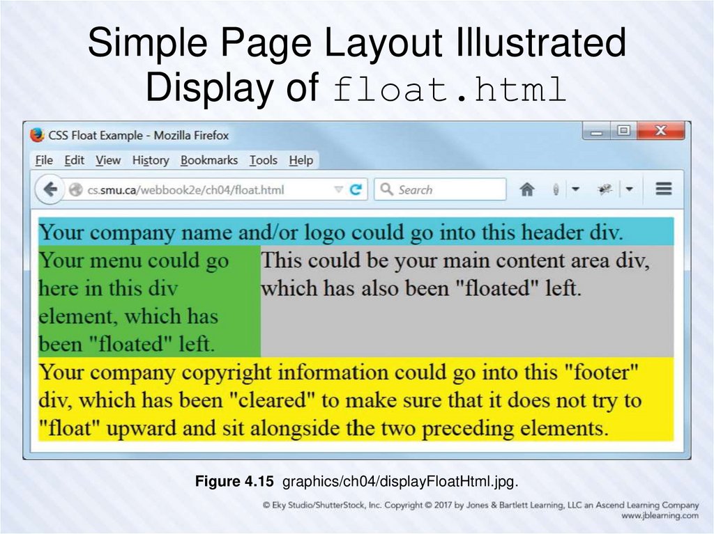
53. Using CSS for Page Layout Positioning with the CSS float and clear Properties
Since the new HTML5 semantic elements, and div elements, are
block elements, by default they will display vertically one after.
But … the CSS style rule float: left applied to any element
causes it to “float” up and to the left, with subsequent elements
wrapping around it on its right, if there is room.
Elements “floated” like this should have their widths specified.
Any containing element must be wide enough to accommodate all
“floated” elements that we wish to appear side by side within it.
You can also “float” elements to the right in an analogous manner.
Any element styled by the rule clear: left will not float up and
to the left, even if there is room (and analogously for the clear:
right rule). There is also a clear: both rule.
54. Simple Page Layout Illustrated Display of float.html
Figure 4.15 graphics/ch04/displayFloatHtml.jpg.55. Simple Page Layout Illustrated Markup from float.html
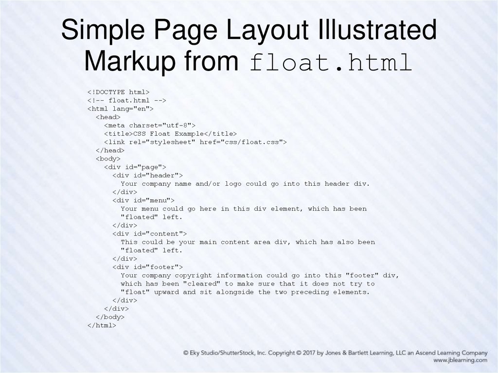
<!DOCTYPE html><!-- float.html -->
<html lang="en">
<head>
<meta charset="utf-8">
<title>CSS Float Example</title>
<link rel="stylesheet" href="css/float.css">
</head>
<body>
<div id="page">
<div id="header">
Your company name and/or logo could go into this header div.
</div>
<div id="menu">
Your menu could go here in this div element, which has been
"floated" left.
</div>
<div id="content">
This could be your main content area div, which has also been
"floated" left.
</div>
<div id="footer">
Your company copyright information could go into this "footer" div,
which has been "cleared" to make sure that it does not try to
"float" upward and sit alongside the two preceding elements.
</div>
</div>
</body>
</html>
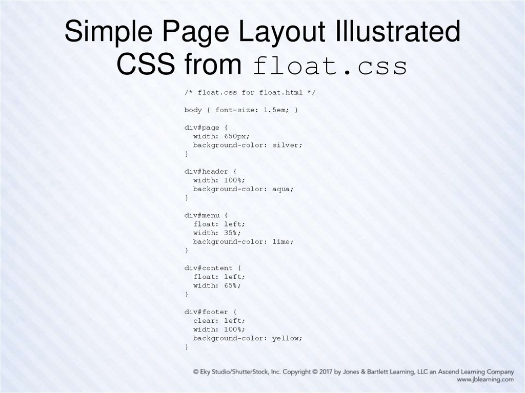
56. Simple Page Layout Illustrated CSS from float.css
/* float.css for float.html */body { font-size: 1.5em; }
div#page {
width: 650px;
background-color: silver;
}
div#header {
width: 100%;
background-color: aqua;
}
div#menu {
float: left;
width: 35%;
background-color: lime;
}
div#content {
float: left;
width: 65%;
}
div#footer {
clear: left;
width: 100%;
background-color: yellow;
}
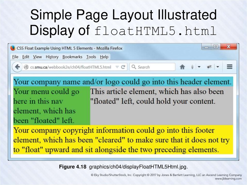
57. Simple Page Layout Illustrated Display of floatHTML5.html
Figure 4.18 graphics/ch04/displayFloatHTML5Html.jpg.58. Simple Page Layout Illustrated Markup from floatHTML5.html
<!DOCTYPE html><!-- floatHTML5.html -->
<html lang="en">
<head>
<meta charset="utf-8">
<title>CSS Float Example Using HTML 5 Elements</title>
<link rel="stylesheet" href="css/floatHTML5.css">
</head>
<body>
<main>
<header>
Your company name and/or logo could go into this header element.
</header>
<nav>
Your menu could go here in this nav element, which has been
"floated" left.
</nav>
<article>
This article element, which has also been "floated" left, could
hold your content.
</article>
<footer>
Your company copyright information could go into this footer
element, which has been "cleared" to make sure that it does
not try to "float" upward and sit alongside the two preceding
elements.
</footer>
</main>
</body>
</html>
59. Simple Page Layout Illustrated CSS from floatHTML5.css
/* floatHTML5.css forfloatHTML5.html */
body { font-size: 1.5em; }
main {
width: 650px;
background-color: silver;
}
header {
width: 100%;
background-color: aqua;
}
nav {
float: left;
width: 35%;
background-color: lime;
}
article {
float: left;
width: 65%;
}
footer {
clear: left;
width: 100%;
background-color: yellow;
}
60. Other Positioning Properties
There are several other element positioning
properties that we do not use but of which you should
be aware and may find helpful.
Values of the position property:
–
–
–
–
position:
position:
position:
position:
static (this is the default)
fixed (with respect to the browser window)
absolute (absolutely positioned with respect to a parent)
relative (relative to where it would “normally” be)
Also, the z-index property may be used to create a
“layered” 3-D effect.
See the w3schools.com site for some good examples.
61. CSS Reset (1 of 2)
A browser, in the absence of any other instructions, will use its own
defaults for displaying any element on a web page.
You can control how elements are laid out and displayed via CSS.
Problem: Not all browsers use the same defaults, so you cannot be
sure the things you don’t explicitly style will look the same in all
browsers.
Solution: At the beginning of your style sheet, reset “everything”
to some “baseline” (padding and margin to zero, for example),
and then set all such values to your own preferences.
–
–
Example: * { padding: 0; margin: 0; }
Note that * is the universal selector. That is, is “selects everything”, if
properly implemented in the browser.
This is a bit extreme (as stated), but it is the basis of what is called
CSS Reset, and used by many developers.
62. CSS Reset (2 of 2)
• Not all developers will agree on exactlyhow a CSS Reset should be done.
• Eric Meyer is a well-known web
development authority, and you can find
his thoughts on this subject here:
http://meyerweb.com/eric/tools/css/reset/
• Google the phrase “CSS reset” for
additional links to other opinions on the
matter.
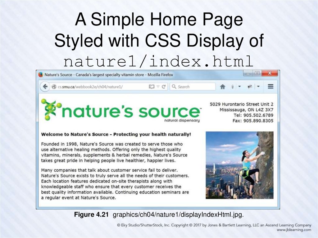
63. A Simple Home Page Styled with CSS Display of nature1/index.html
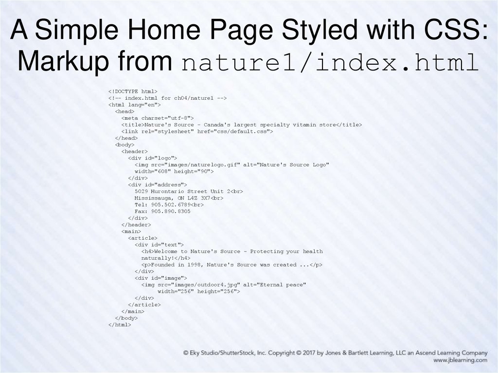
Figure 4.21 graphics/ch04/nature1/displayIndexHtml.jpg.64. A Simple Home Page Styled with CSS: Markup from nature1/index.html
<!DOCTYPE html><!-- index.html for ch04/nature1 -->
<html lang="en">
<head>
<meta charset="utf-8">
<title>Nature's Source - Canada's largest specialty vitamin store</title>
<link rel="stylesheet" href="css/default.css">
</head>
<body>
<header>
<div id="logo">
<img src="images/naturelogo.gif" alt="Nature's Source Logo"
width="608" height="90">
</div>
<div id="address">
5029 Hurontario Street Unit 2<br>
Mississauga, ON L4Z 3X7<br>
Tel: 905.502.6789<br>
Fax: 905.890.8305
</div>
</header>
<main>
<article>
<div id="text">
<h4>Welcome to Nature's Source - Protecting your health
naturally!</h4>
<p>Founded in 1998, Nature's Source was created ...</p>
</div>
<div id="image">
<img src="images/outdoor4.jpg" alt="Eternal peace"
width="256" height="256">
</div>
</article>
</main>
</body>
</html>
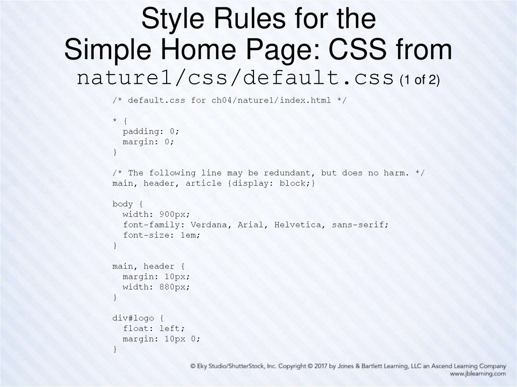
65. Style Rules for the Simple Home Page: CSS from nature1/css/default.css (1 of 2)
/* default.css for ch04/nature1/index.html */* {
padding: 0;
margin: 0;
}
/* The following line may be redundant, but does no harm. */
main, header, article {display: block;}
body {
width: 900px;
font-family: Verdana, Arial, Helvetica, sans-serif;
font-size: 1em;
}
main, header {
margin: 10px;
width: 880px;
}
div#logo {
float: left;
margin: 10px 0;
}
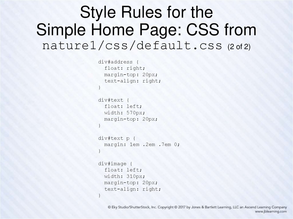
66. Style Rules for the Simple Home Page: CSS from nature1/css/default.css (2 of 2)
Style Rules for theSimple Home Page: CSS from
nature1/css/default.css
div#address {
float: right;
margin-top: 20px;
text-align: right;
}
div#text {
float: left;
width: 570px;
margin-top: 20px;
}
div#text p {
margin: 1em .2em .7em 0;
}
div#image {
float: left;
width: 310px;
margin-top: 20px;
text-align: right;
}
(2 of 2)
67. Some Good Advice for What Follows
First, this advice relates to the following slides, which can only point you in
the right direction, so don’t take this advice lightly, even though it will
require some effort …
You should plan to spend some time studying the full HTML markup files
and the corresponding CSS style sheet files for the versions of the
Nature’s Source website in this chapter.
Look in particular at how some of the new HTML5 semantic elements are
being used in the markup.
As you’re doing this, comment out various style rules in the CSS and
observe any resulting changes when the affected page is refreshed.
But be careful: when doing this, make sure you know how to force your
browser to reload a web page; otherwise you may be looking at a “cached”
version of the page and not see the effect of the changes you’ve made.
If you’re not sure about this, Google a phrase like “how to force a browser
refresh” and look for what is required for your browser.
68.
Preamble for the Remaining SlidesFirst we show the home page of each of the three remaining
versions of our Nature’s Source website in this chapter:
nature2/index.html, nature3/index.html and nature4/index.html
Compare the home pages of nature2 and nature3, noting the
slight re-design of nature3, and its somewhat improved look,
achieved with a little bit of CSS 3.
We show a couple additional pages of the nature3 website, and
you should compare those pages with the corresponding pages
from nature2 as viewed online.
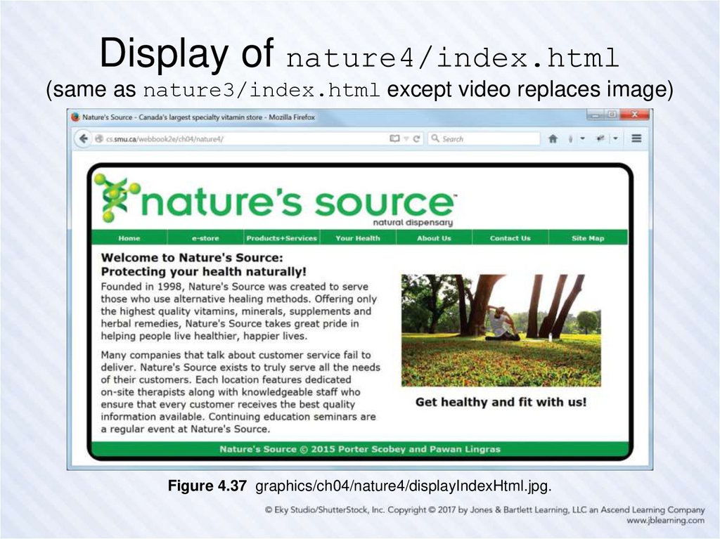
Note that the nature4 website is exactly the same as nature3,
except that a video has replaced the still image on the home page.
Finally, the nature3 and nature4 website versions illustrate
simple “responsive design”, so we show the home page of
nature3 in “tablet view” and discuss how this is achieved.
69. Display of nature2/index.html (note CSS-styled main menu and footer)
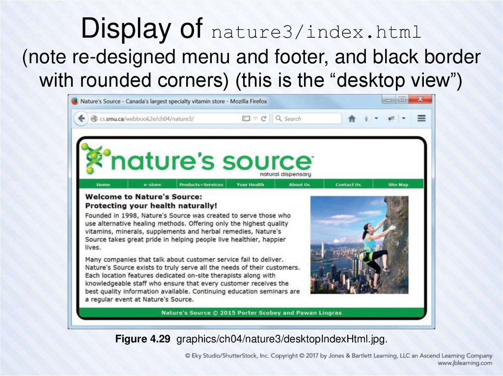
Figure 4.24 graphics/ch04/nature2/displayIndexHtml.jpg.70. Display of nature3/index.html (note re-designed menu and footer, and black border with rounded corners) (this is the “desktop
view”)Figure 4.29 graphics/ch04/nature3/desktopIndexHtml.jpg.
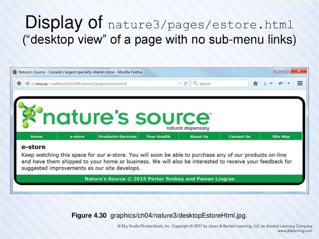
71. Display of nature3/pages/estore.html (“desktop view” of a page with no sub-menu links)
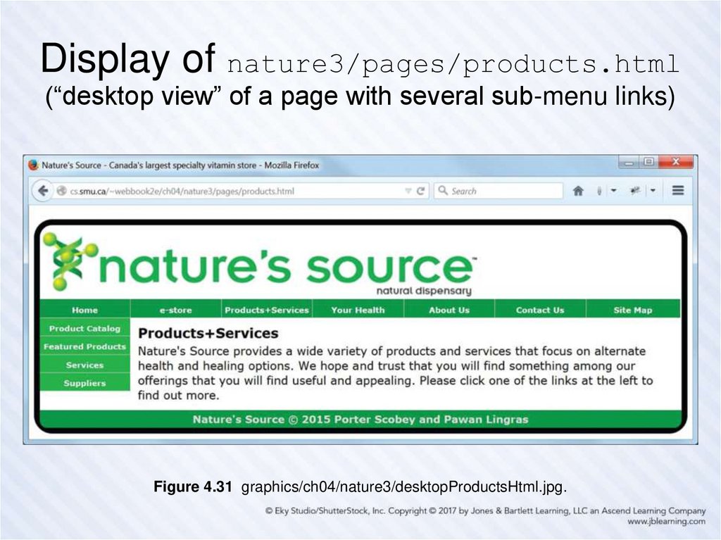
Figure 4.30 graphics/ch04/nature3/desktopEstoreHtml.jpg.72. Display of nature3/pages/products.html (“desktop view” of a page with several sub-menu links)
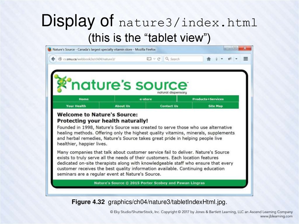
Figure 4.31 graphics/ch04/nature3/desktopProductsHtml.jpg.73. Display of nature3/index.html (this is the “tablet view”)
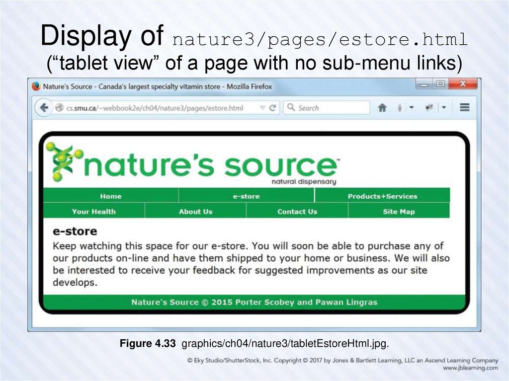
Figure 4.32 graphics/ch04/nature3/tabletIndexHtml.jpg.74. Display of nature3/pages/estore.html (“tablet view” of a page with no sub-menu links)
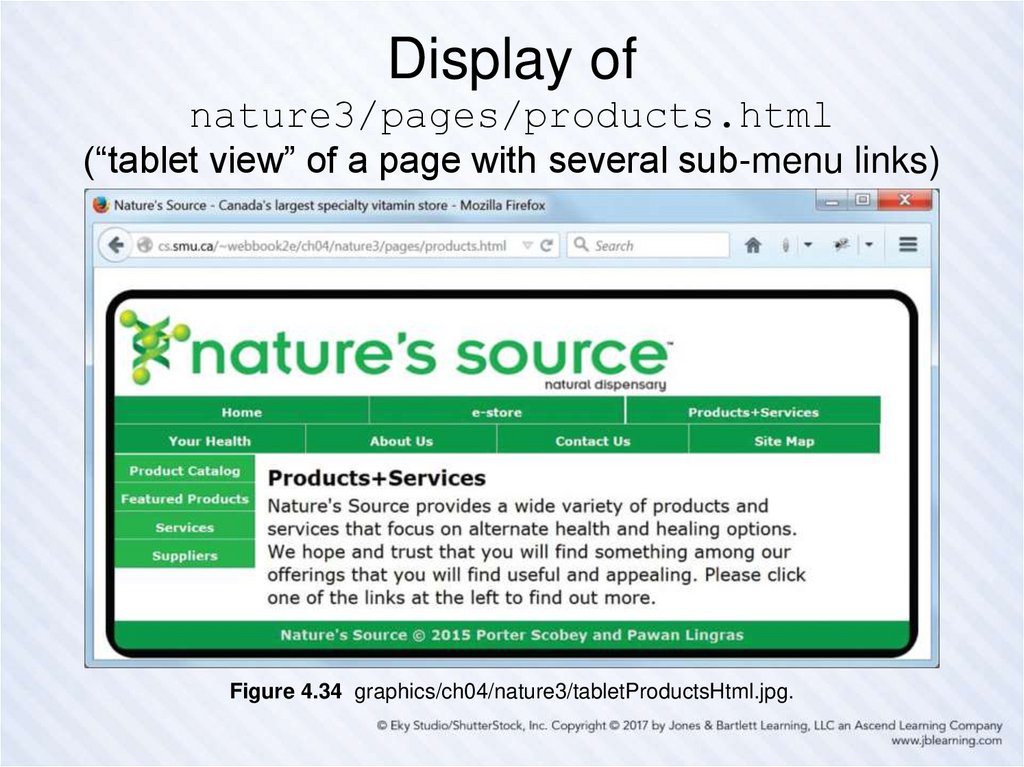
Figure 4.33 graphics/ch04/nature3/tabletEstoreHtml.jpg.75. Display of nature3/pages/products.html (“tablet view” of a page with several sub-menu links)
Figure 4.34 graphics/ch04/nature3/tabletProductsHtml.jpg.76. Responsive Design
• Design your web pages so they can beviewed on multiple devices (desktop PCs,
tablets, smart phones, …)
• We illustrate the idea by converting between
a “desktop view” and a “tablet view”.
• We use only CSS to do this.
• We have two style files—desktop.css and
tablet.css—and use a media query to
decide which should be in effect.
77. Media Queries ch04/nature3/document_head.html
<!DOCTYPE html><!-- document_head.html -->
<html lang="en">
<head>
<meta charset="utf-8">
<meta name="viewport" content="width=device-width">
<base href="http://cs.smu.ca/webbook2e/ch04/nature3/">
<link rel="stylesheet" href="css/desktop.css">
<link rel="stylesheet" href="css/tablet.css"
media="screen and (max-width: 900px)">
<title>Nature's Source - Canada's largest specialty vitamin store</title>
</head>
Note the new meta element, which essentially says: “Use the device width
when you come to this page.” This means the “tablet view” will be used
immediately (without resizing) if you come to the page using (for example)
an iPad.
Note the new media attribute for the link element that references
tablet.css. This says: “Use tablet.css when the width is less than
900px.”



















 internet


