
 industry
Similar presentations:


")

Corporate identity guide
1.
Corporate identity guide2.
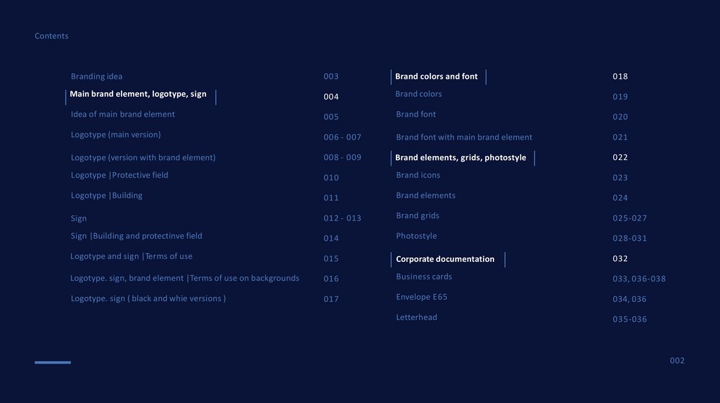
ContentsBranding idea
003
Brand colors and font
018
Main brand element, logotype, sign
004
Brand colors
019
Idea of main brand element
005
Brand font
020
Logotype (main version)
006 - 007
Brand font with main brand element
021
Logotype (version with brand element)
008 - 009
Brand elements, grids, photostyle
022
Logotype |Protective field
010
Brand icons
023
Logotype |Building
011
Brand elements
024
Sign
012 - 013
Brand grids
025-027
Sign |Building and protectinve field
014
Photostyle
028-031
Logotype and sign |Terms of use
015
Corporate documentation
032
Logotype. sign, brand element |Terms of use on backgrounds
016
Business cards
033, 036-038
Logotype. sign ( black and whie versions )
017
Envelope E65
034, 036
Letterhead
035-036
002
3.
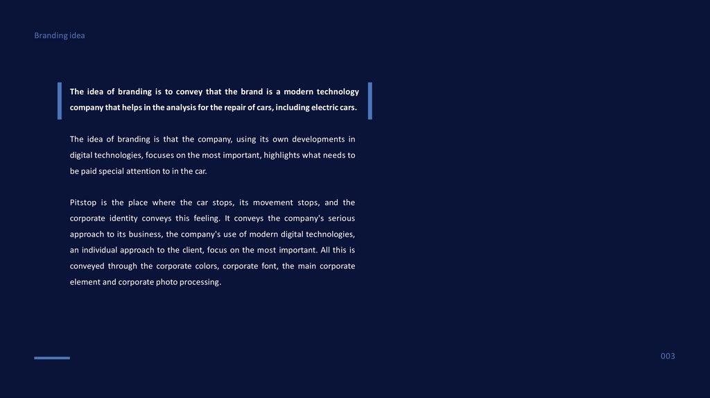
Branding ideaThe idea of branding is to convey that the brand is a modern technology
company that helps in the analysis for the repair of cars, including electric cars.
The idea of branding is that the company, using its own developments in
digital technologies, focuses on the most important, highlights what needs to
be paid special attention to in the car.
Pitstop is the place where the car stops, its movement stops, and the
corporate identity conveys this feeling. It conveys the company's serious
approach to its business, the company's use of modern digital technologies,
an individual approach to the client, focus on the most important. All this is
conveyed through the corporate colors, corporate font, the main corporate
element and corporate photo processing.
003
4.
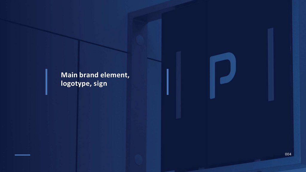
Main brand element,logotype, sign
004
5.
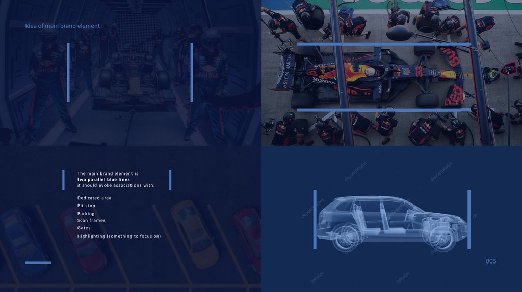
Idea of main brand elementThe main brand element is
two parallel blue lines
it should evoke associations with:
Dedicated area
Pit stop
Parking
Scan frames
Gates
Highlighting (something to focus on)
005
6.
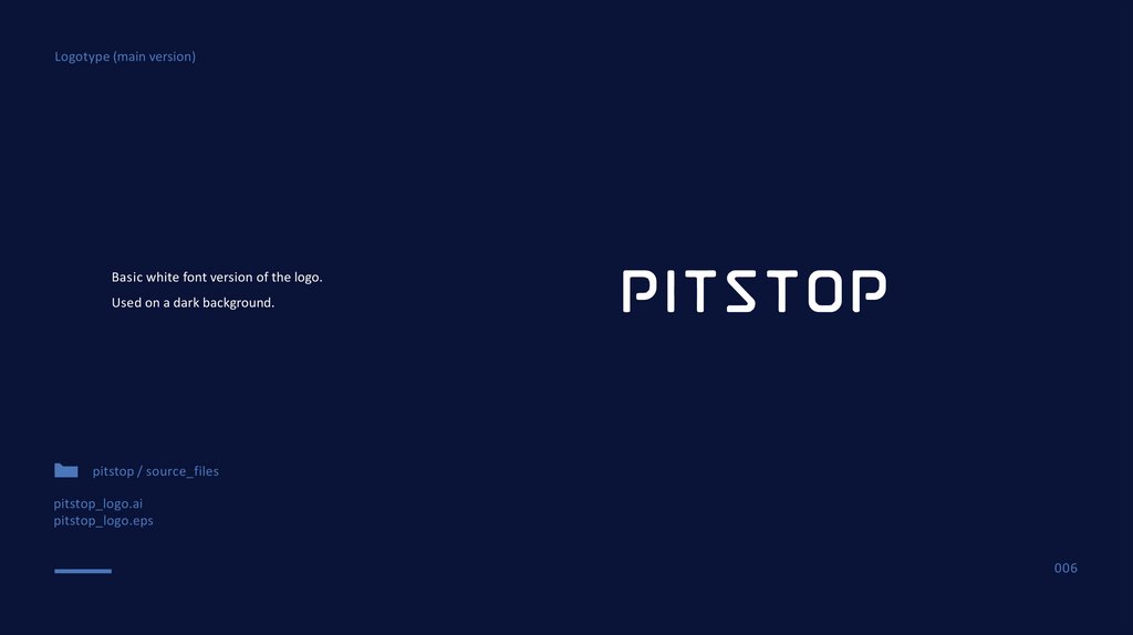
Logotype (main version)Basic white font version of the logo.
Used on a dark background.
pitstop / source_files
pitstop_logo.ai
pitstop_logo.eps
006
7.
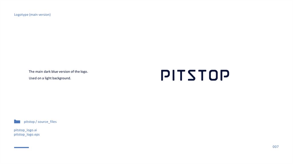
Logotype (main version)The main dark blue version of the logo.
Used on a light background.
pitstop / source_files
pitstop_logo.ai
pitstop_logo.eps
007
8.
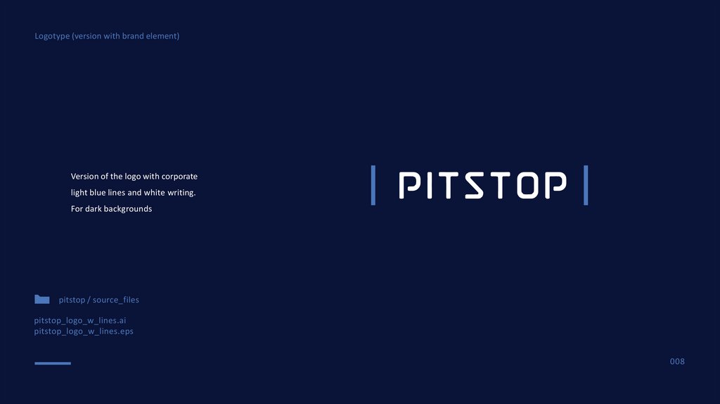
Logotype (version with brand element)Version of the logo with corporate
light blue lines and white writing.
For dark backgrounds
pitstop / source_files
pitstop_logo_w_lines.ai
pitstop_logo_w_lines.eps
008
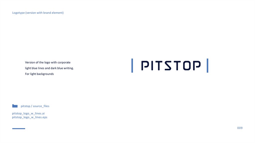
9.
Logotype (version with brand element)Version of the logo with corporate
light blue lines and dark blue writing.
For light backgrounds
pitstop / source_files
pitstop_logo_w_lines.ai
pitstop_logo_w_lines.eps
009
10.
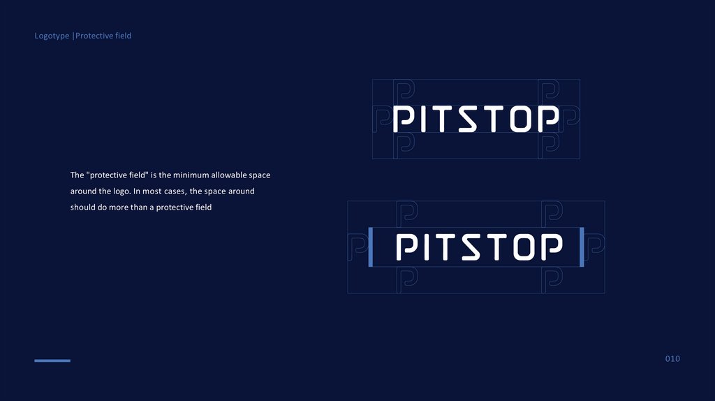
Logotype |Protective fieldThe "protective field" is the minimum allowable space
around the logo. In most cases, the space around
should do more than a protective field
010
11.
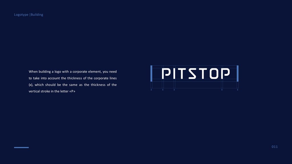
Logotype |BuildingWhen building a logo with a corporate element, you need
to take into account the thickness of the corporate lines
(x), which should be the same as the thickness of the
vertical stroke in the letter «P»
x
x
x
x
x
011
12.
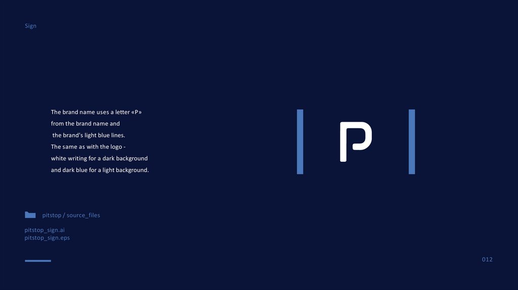
SignThe brand name uses a letter «P»
from the brand name and
the brand's light blue lines.
The same as with the logo white writing for a dark background
and dark blue for a light background.
pitstop / source_files
pitstop_sign.ai
pitstop_sign.eps
012
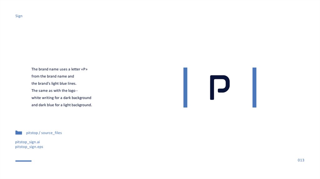
13.
SignThe brand name uses a letter «P»
from the brand name and
the brand's light blue lines.
The same as with the logo white writing for a dark background
and dark blue for a light background.
pitstop / source_files
pitstop_sign.ai
pitstop_sign.eps
013
14.
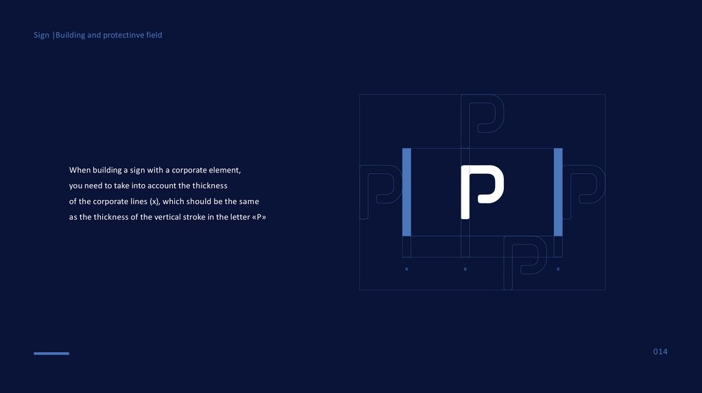
Sign |Building and protectinve fieldWhen building a sign with a corporate element,
you need to take into account the thickness
of the corporate lines (x), which should be the same
as the thickness of the vertical stroke in the letter «P»
x
x
x
014
15.
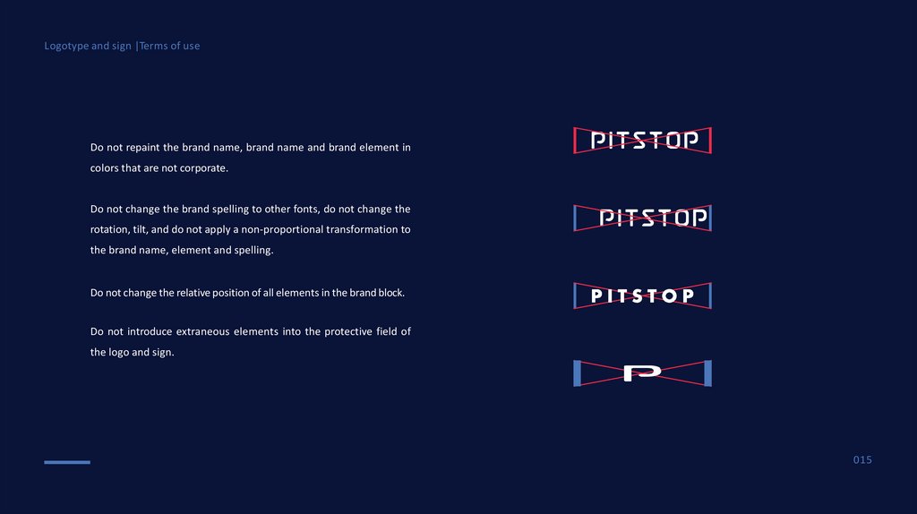
Logotype and sign |Terms of useDo not repaint the brand name, brand name and brand element in
colors that are not corporate.
Do not change the brand spelling to other fonts, do not change the
rotation, tilt, and do not apply a non-proportional transformation to
the brand name, element and spelling.
Do not change the relative position of all elements in the brand block.
Do not introduce extraneous elements into the protective field of
the logo and sign.
015
16.
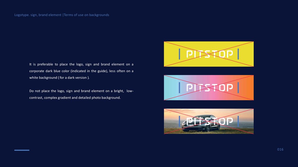
Logotype. sign, brand element |Terms of use on backgroundsIt is preferable to place the logo, sign and brand element on a
corporate dark blue color (indicated in the guide), less often on a
white background ( for a dark version ).
Do not place the logo, sign and brand element on a bright, lowcontrast, complex gradient and detailed photo background.
016
17.
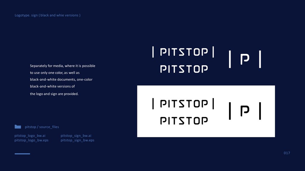
Logotype. sign ( black and whie versions )Separately for media, where it is possible
to use only one color, as well as
black-and-white documents, one-color
black-and-white versions of
the logo and sign are provided.
pitstop / source_files
pitstop_logo_bw.ai
pitstop_logo_bw.eps
pitstop_sign_bw.ai
pitstop_sign_bw.eps
017
18.
Brand colorsand font
018
19.
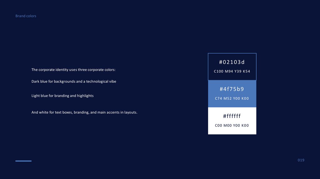
Brand colors#02103d
The corporate identity uses three corporate colors:
C100 M94 Y39 K 5 4
Dark blue for backgrounds and a technological vibe
#4f75b9
Light blue for branding and highlights
And white for text boxes, branding, and main accents in layouts.
C74 M52 Y00 K 0 0
#ffffff
C00 M00 Y00 K 0 0
019
20.
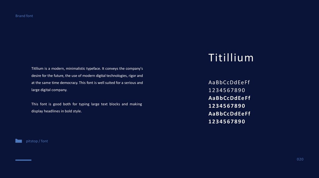
Brand fontTitillium
Titllium is a modern, minimalistic typeface. It conveys the company's
desire for the future, the use of modern digital technologies, rigor and
at the same time democracy. This font is well suited for a serious and
large digital company.
This font is good both for typing large text blocks and making
display headlines in bold style.
AaBbCcDdEeFf
1234567890
AaBbCcDdEe Ff
1234567890
AaBbCcDdEe Ff
1234567890
pitstop / font
020
21.
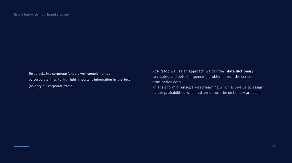
Brand font with main brand elementText blocks in a corporate font are well complemented
by corporate lines to highlight important information in the text
(bold style + corporate frame)
021
22.
Bran d ele ment s,grids , pho tosty le
022
23.
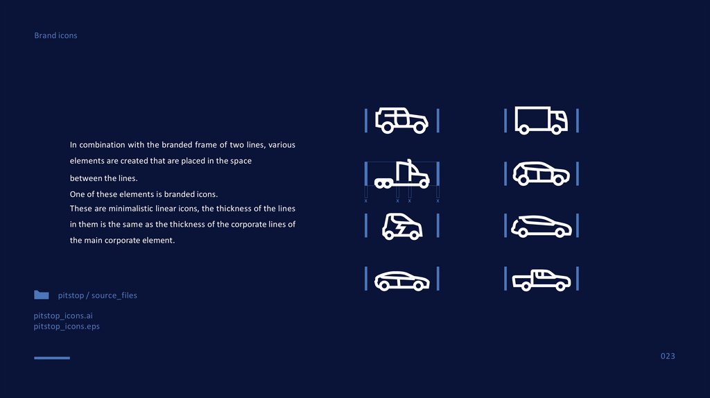
Brand iconsIn combination with the branded frame of two lines, various
elements are created that are placed in the space
between the lines.
One of these elements is branded icons.
x
x
x
x
These are minimalistic linear icons, the thickness of the lines
in them is the same as the thickness of the corporate lines of
the main corporate element.
pitstop / source_files
pitstop_icons.ai
pitstop_icons.eps
023
24.
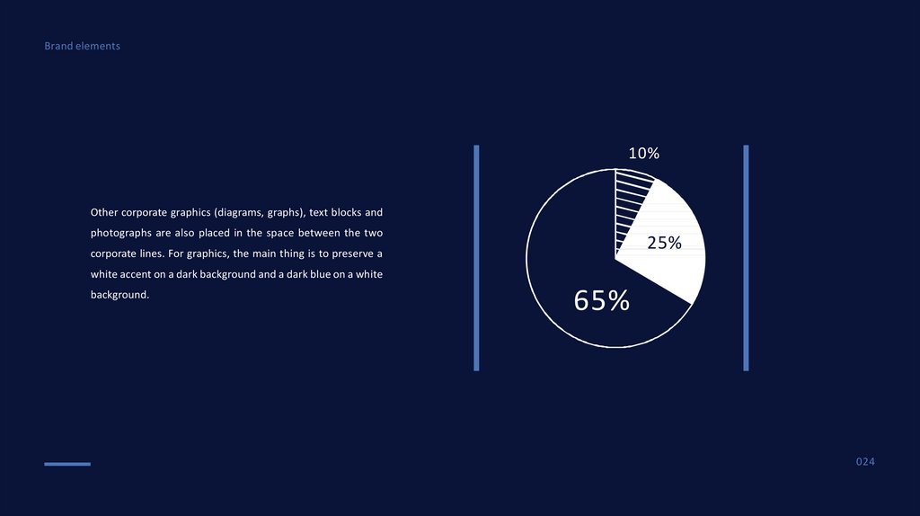
Brand elements10%
Other corporate graphics (diagrams, graphs), text blocks and
photographs are also placed in the space between the two
25%
corporate lines. For graphics, the main thing is to preserve a
white accent on a dark background and a dark blue on a white
background.
65%
024
25.
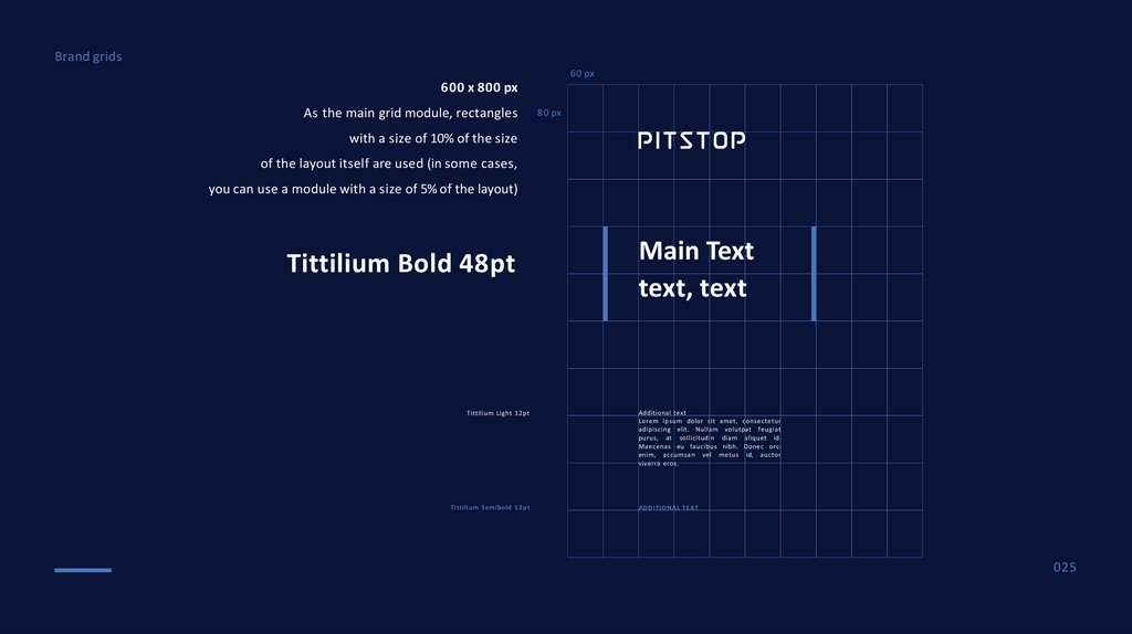
Brand grids60 px
600 x 800 px
As the main grid module, rectangles
80 px
with a size of 10% of the size
of the layout itself are used (in some cases,
you can use a module with a size of 5% of the layout)
Tittilium Bold 48pt
Tittilium Light 12pt
Tittilium Semibold 12pt
Main Text
text, text
Additional text
Lorem ipsum dolor sit amet, consectetur
adipiscing elit. Nullam volutpat feugiat
purus, at sollicitudin diam aliquet id.
Maecenas eu faucibus nibh. Donec orci
enim, accumsan vel metus id, auctor
viverra eros.
ADDITIONAL T E X T
025
26.
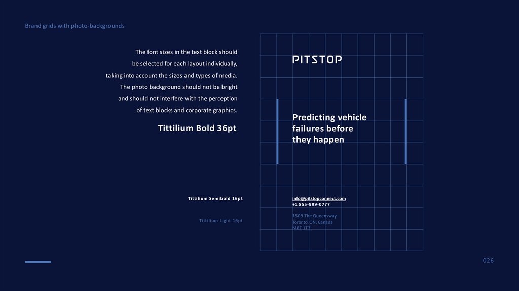
Brand grids with photo-backgroundsThe font sizes in the text block should
be selected for each layout individually,
taking into account the sizes and types of media.
The photo background should not be bright
and should not interfere with the perception
of text blocks and corporate graphics.
Tittilium Bold 36pt
Tittilium Semibold 16pt
Tittilium Light 16pt
Predicting vehicle
failures before
they happen
info@pitstopconnect.com
+1 855-999-0777
1509 The Queensway
Toronto, ON, Canada
M8Z 1T3
026
27.
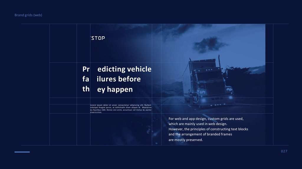
Brand grids (web)Pr edicting vehicle
fa ilures before
th ey happen
Lorem ipsum dolor sit amet, consectetur adipiscing elit. Nullam
volutpat feugiat purus, at sollicitudin diam aliquet id. Maecenas
eu faucibus nibh. Donec orci enim, accumsan vel metus id, auctor
viverra eros.
For web and app design, custom grids are used,
which are mainly used in web design.
However, the principles of constructing text blocks
and the arrangement of branded frames
are mostly preserved.
027
28.
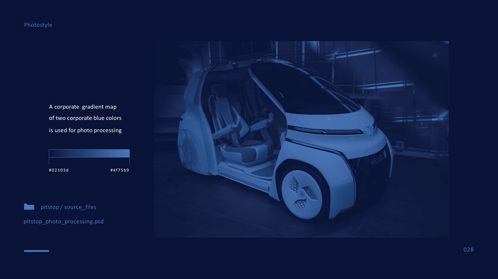
PhotostyleA corporate gradient map
of two corporate blue colors
is used for photo processing
#02103d
#4f75b9
pitstop / source_files
pitstop_photo_processing.psd
028
29.
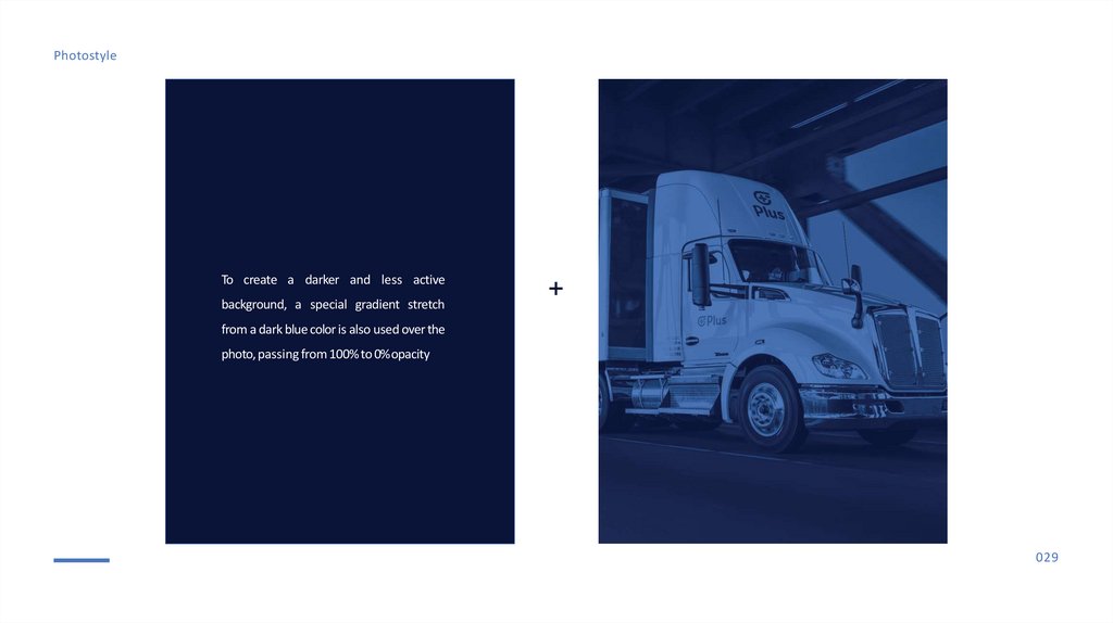
PhotostyleTo create a darker and less active
background, a special gradient stretch
+
from a dark blue color is also used over the
photo, passing from 100% to 0%opacity
029
30.
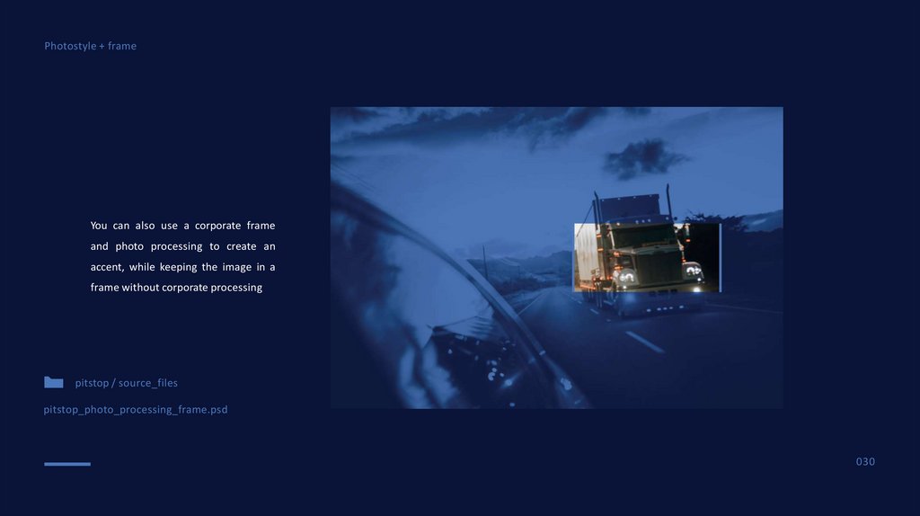
Photostyle + frameYou can also use a corporate frame
and photo processing to create an
accent, while keeping the image in a
frame without corporate processing
pitstop / source_files
pitstop_photo_processing_frame.psd
030
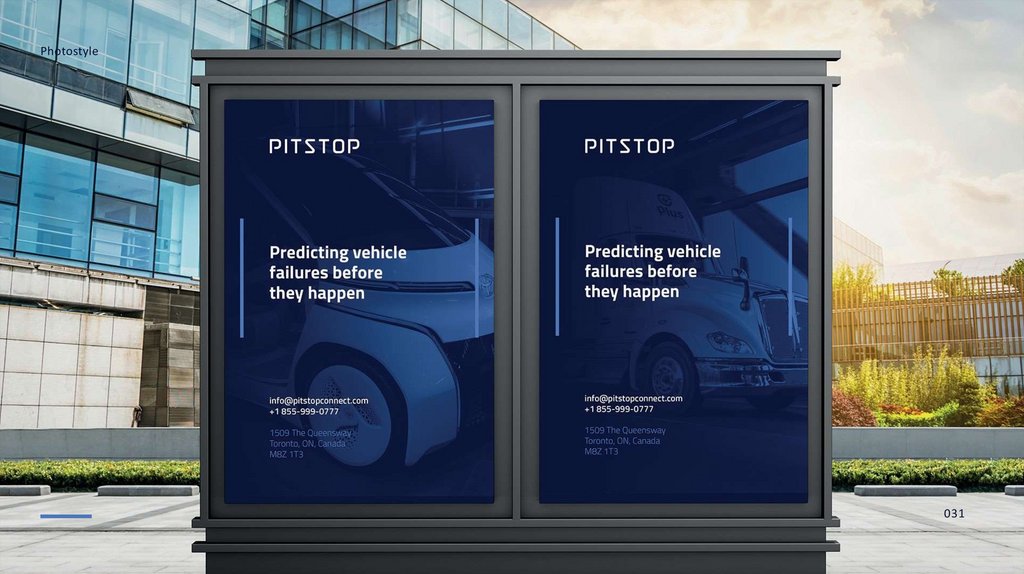
31.
Photostyle031
32.
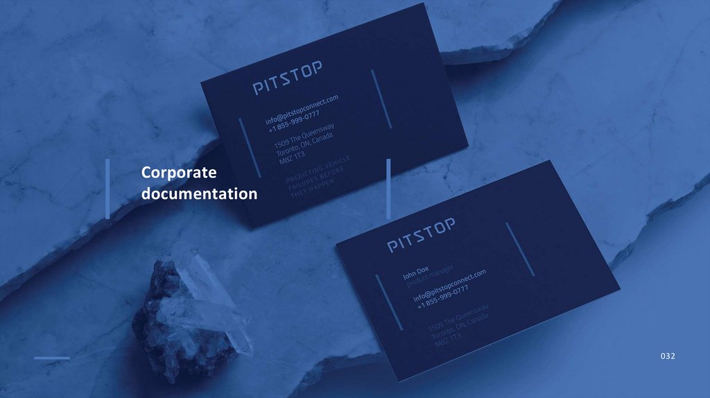
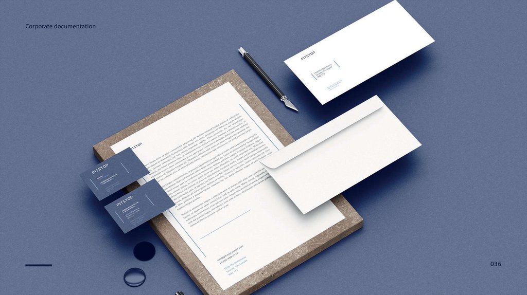
Corporatedocumentation
032
33.
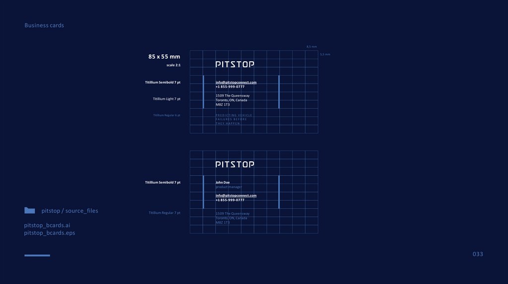
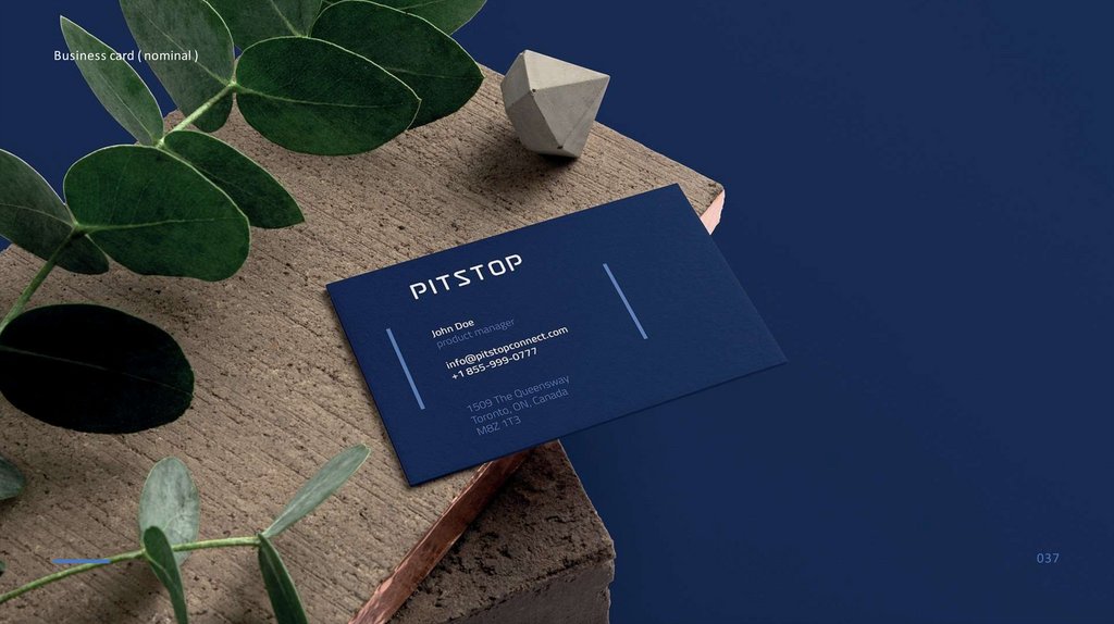
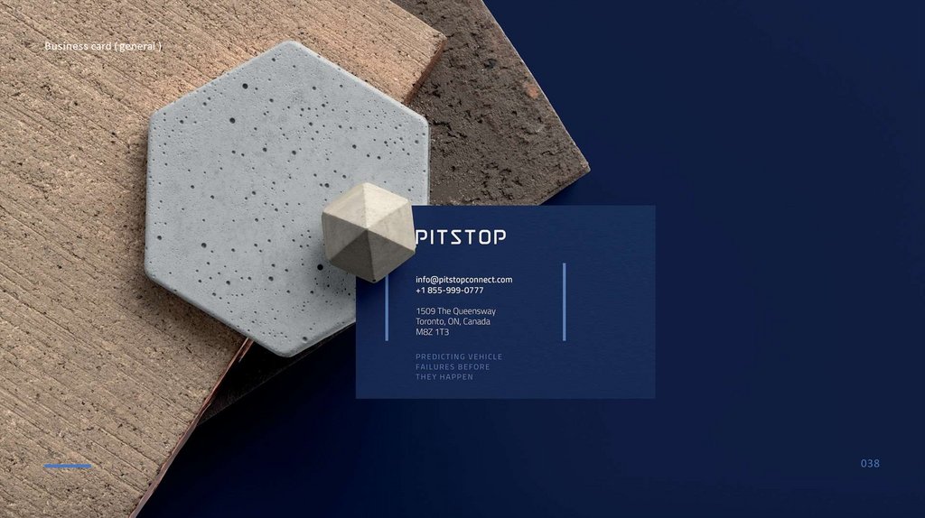
Business cards8,5 mm
5,5 mm
85 x 55 mm
scale 2:1
Titillium Semibold 7 pt
Titillium Light 7 pt
Titillium Regular 6 pt
Titillium Semibold 7 pt
info@pitstopconnect.com
+1 855-999-0777
1509 The Queensway
Toronto, ON, Canada
M8Z 1T3
PREDICTING VEHICLE
FAILU R ES B E F ORE
THEY HAPPEN
John Doe
product manager
info@pitstopconnect.com
+1 855-999-0777
pitstop / source_files
pitstop_bcards.ai
pitstop_bcards.eps
Titillium Regular 7 pt
1509 The Queensway
Toronto, ON, Canada
M8Z 1T3
033
34.
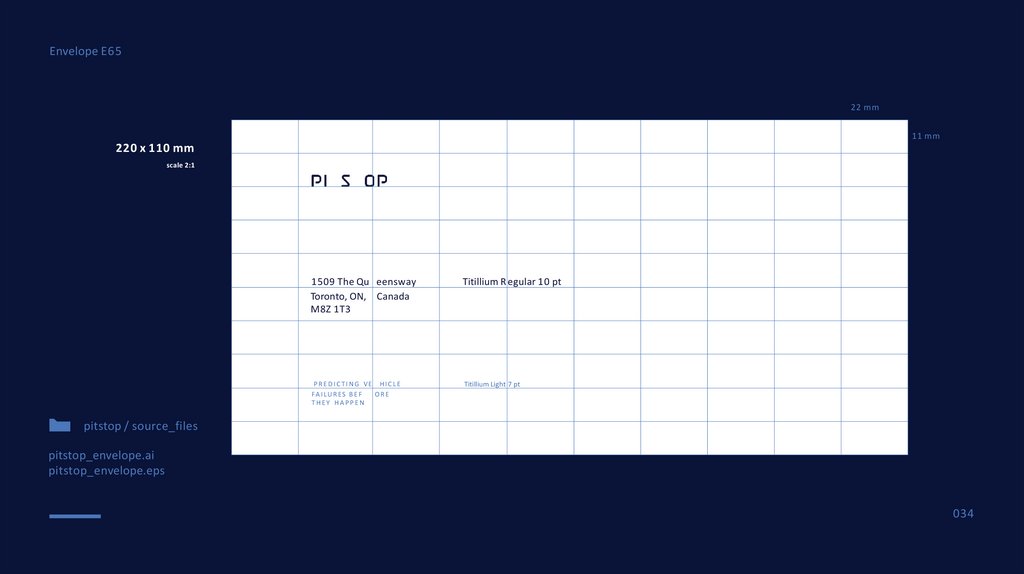
Envelope E6522 mm
11 mm
220 x 110 mm
scale 2:1
1509 The Qu eensway
Toronto, ON, Canada
M8Z 1T3
Titillium R egular 10 pt
P R E D I C T I N G VE HIC L E
F A I L U R ES B E F
ORE
THEY HAPPEN
Titillium Light 7 pt
pitstop / source_files
pitstop_envelope.ai
pitstop_envelope.eps
034
35.
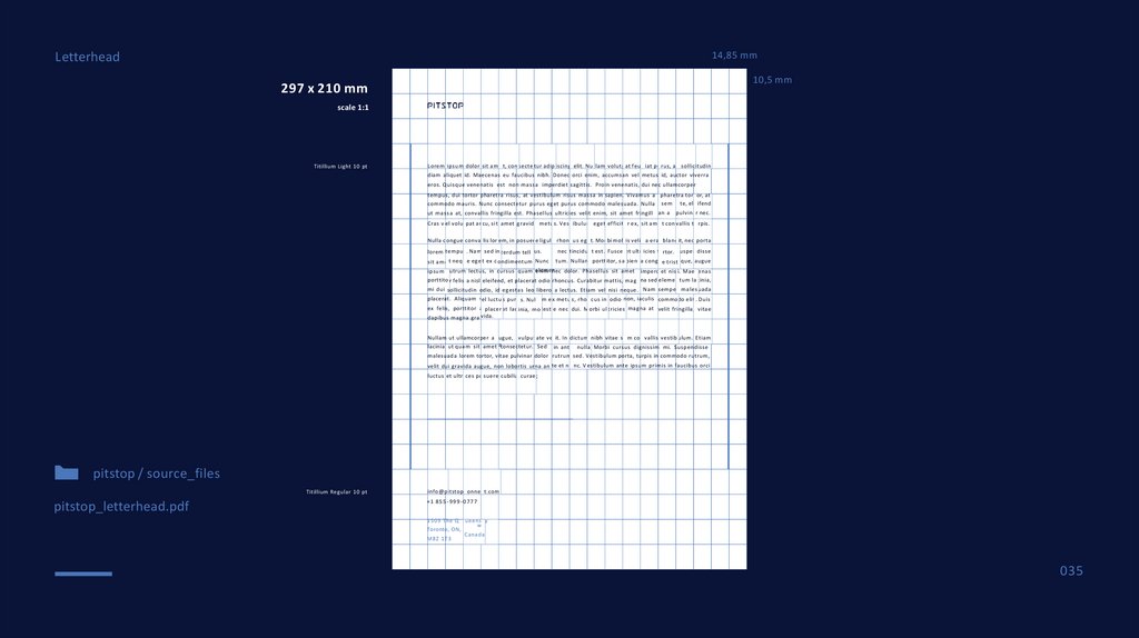
Letterhead14,85 mm
10,5 mm
297 x 210 mm
scale 1:1
Titillium Light 10 pt
L orem ipsum dolor sit ame t, con secte tur adip iscing elit. Nu llam volutpat feug iat pu rus, at sollic itudin
diam aliquet id. Maecenas eu faucibus nibh. Donec orci enim, accumsan vel metus id, auctor viverra
eros. Quisque venenatis est non m a s s a imperdiet sagittis. Proin venenatis, dui nec ullamcorper
tempus, dui tortor pharetra risus, at vestibulum risus m a s s a in sapien. Vivamus a phare tra tort or, at
commodo mauris. Nunc consectetur purus eget purus commodo malesuada. Nulla sem te, ele ifend
ut m a s s a at, convallis fringilla est. Phasellus ultricies velit enim, sit amet fringill an a
pulvina r nec.
Cras v el volut pat ar cu, sit amet gravida metu s. Vest ibulum eget efficitu r ex, sit amearcu
t con vallis tu rpis.
Nulla c ongue conval lis lor em, in posuer e ligula rhonc u s ege t. Mor bi moll is velit a erat bland it, nec porta
lorem tempus . Na m sed in terdum tell us.
sit ame t nequ e ege t ex c ondimentum Nunc
nec tincidun t est. Fusce et ultr icies to rtor. Suspen disse
tum. Nullam portt itor, s a pien a congu e trist ique, augue
enim nec dolor. Phasellus sit amet imperdi et nis i. Mae cenas
ipsum rutrum lectus, in cursus quam elemen
porttito r felis a nisl eleifend, et placerat odio rhoncus. Curabitur mattis, m a g na sed elemen tum la cinia,
mi dui sollicitudin odio, id egestas leo libero a lectus. Etiam vel nisi neque. Na m semper males uada
placerat. Aliquam vel luctu s puru s. Nul lam e x metu s, rhon cus in odio non, iaculis commodo elit . Duis
ex felis, porttitor a placer at lac inia, mo lesti e nec dui. M orbi ul tricies magna at velit fri ngilla, vitae
dapibus magna gra vida.
Nullam ut ullamcorper a ugue, vulput ate vel it. In dictum nibh vitae s e m con vallis vestib ulum. E tiam
lacinia ut quam sit amet aconsectetur. S ed in ante nulla . Morbi cursus dignissim mi. Suspendisse
malesuada lorem tortor, vitae pulvinar dolor rutrum sed. Vestibulum porta, turpis in commodo rutrum,
velit dui gravida augue, non lobortis urna an te et nu nc. V estibulum ante ipsum primis in faucibus orci
luctus et ultri ces po suere cubilia curae ;
pitstop / source_files
Titillium Regular 10 pt
pitstop_letterhead.pdf
info@ p itstopc onnec t.com
+1 8 5 5 - 9 9 9 - 0 7 7 7
1 5 0 9 The Q ueen s ay
w
Toronto, ON,
Canada
M8Z 1 T 3
035
36.
Corporate documentation036
37.
Business card ( nominal )037
38.
Business card ( general )038