Similar presentations:
EMUI 9.1 Themes Tutorial 2019-01-17
1.
EMUI 9.1 Themes Tutorial2019-01-17
2.
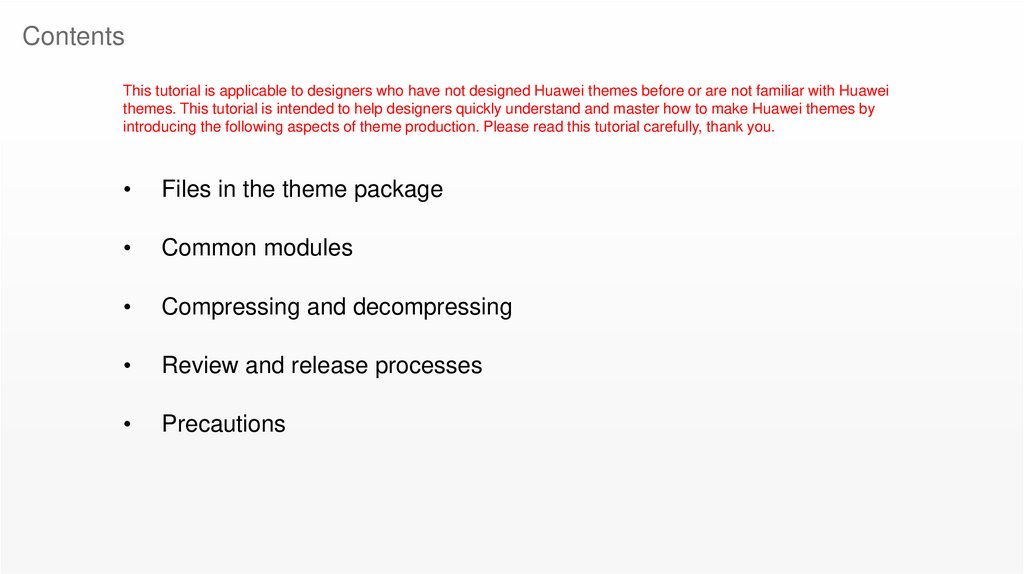
ContentsThis tutorial is applicable to designers who have not designed Huawei themes before or are not familiar with Huawei
themes. This tutorial is intended to help designers quickly understand and master how to make Huawei themes by
introducing the following aspects of theme production. Please read this tutorial carefully, thank you.
Files in the theme package
Common modules
Compressing and decompressing
Review and release processes
Precautions
3.
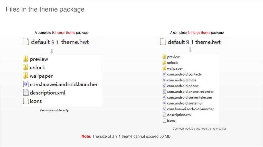
Files in the theme packageA complete 9.1 small theme package
A complete 9.1 large theme package
9.1
9.1
Common modules only
Common modules and large theme modules
Note: The size of a 9.1 theme cannot exceed 50 MB.
4.
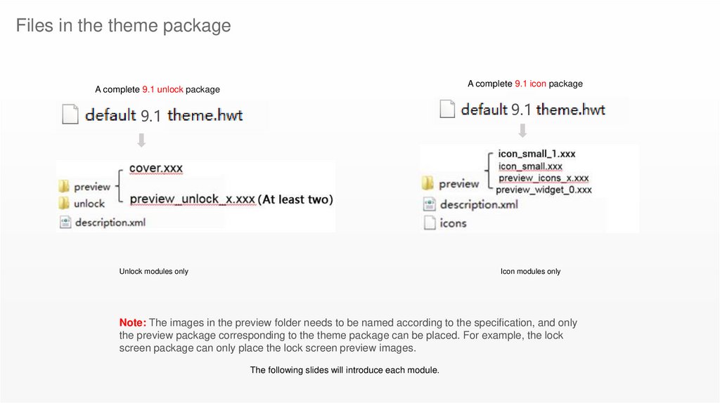
Files in the theme packageA complete 9.1 icon package
A complete 9.1 unlock package
9.1
9.1
Unlock modules only
Icon modules only
Note: The images in the preview folder needs to be named according to the specification, and only
the preview package corresponding to the theme package can be placed. For example, the lock
screen package can only place the lock screen preview images.
The following slides will introduce each module.
5.
Common modulesdescription.xml: Description file
6.
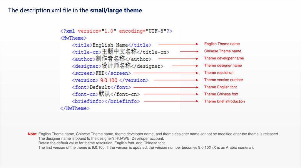
The description.xml file in the small/large themeEnglish Theme name
Chinese Theme name
Theme developer name
Theme designer name
Theme resolution
9.0.100
Theme version number
Theme English font
Theme Chinese font
Theme brief introduction
Note: English Theme name, Chinese Theme name, theme developer name, and theme designer name cannot be modified after the theme is released.
The designer name is bound to the designer's HUAWEI Developer account.
Retain the default value for theme resolution, English font, and Chinese font.
The first version of the theme is 9.0.100. If the version is updated, the version number becomes 9.0.10X (X is an Arabic numeral).
7.
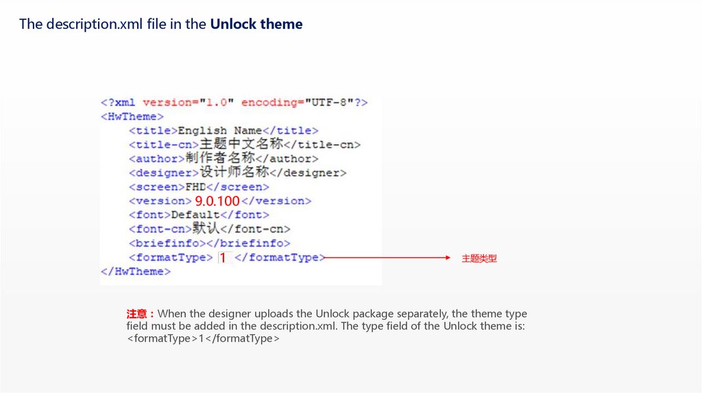
The description.xml file in the Unlock theme9.0.100
1
主题类型
注意 When the designer uploads the Unlock package separately, the theme type
field must be added in the description.xml. The type field of the Unlock theme is:
<formatType>1</formatType>
8.
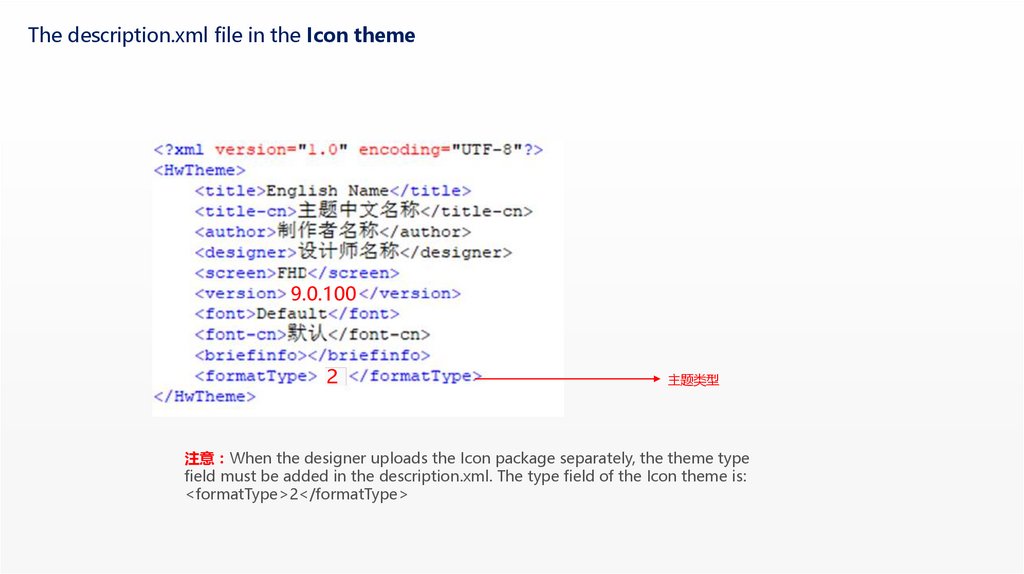
The description.xml file in the Icon theme9.0.100
2
主题类型
注意 When the designer uploads the Icon package separately, the theme type
field must be added in the description.xml. The type field of the Icon theme is:
<formatType>2</formatType>
9.
Common modulespreview: Preview images
10.
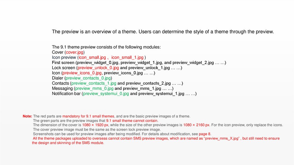
The preview is an overview of a theme. Users can determine the style of a theme through the preview.The 9.1 theme preview consists of the following modules:
Cover (cover.jpg)
Icon preview (icon_small.jpg 、icon_small_1.jpg )
First screen (preview_widget_0.jpg, preview_widget_1.jpg, and preview_widget_2.jpg … …)
Lock screen (preview_unlock_0.jpg and preview_unlock_1.jpg … …)
Icon (preview_icons_0.jpg, preview_icons_0.jpg … …)
Dialer (preview_contacts_0.jpg)
Contacts (preview_contacts_1.jpg and preview_contacts_2.jpg … …)
Messaging (preview_mms_0.jpg and preview_mms_1.jpg … …)
Notification bar (preview_systemui_0.jpg and preview_systemui_1.jpg … …)
Note: The red parts are mandatory for 9.1 small themes, and are the basic preview images of a theme.
The green parts are the preview images that 9.1 small theme cannot contain.
The dimension of the cover is 1080 × 1920 px, while the size of the other preview images is 1080 × 2160 px. For the icon preview, only replace the icons.
The cover preview image must be the same as the screen lock preview image.
Screenshots can be used for preview images after being modified. For details about modification, see page 8.
All the theme packages uploaded to overseas cannot contain SMS preview images, which are named as “preview_mms_X.jpg” , but still need to ensure
the design and skinning of the SMS module.
11.
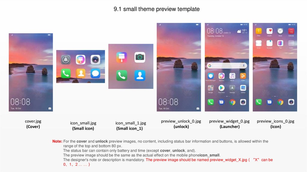
9.1 small theme preview templatecover.jpg
(Cover)
icon_small.jpg
(Small icon)
icon_small_1.jpg
(Small icon_1)
preview_unlock_0.jpg
(unlock)
preview_widget_0.jpg
(Launcher)
preview_icons_0.jpg
(icon)
Note: For the cover and unlock preview images, no content, including status bar information and buttons, is allowed within the
range of the top and bottom 80 px.
The status bar can contain only battery and time (except cover, unlock, and).
The preview image should be the same as the actual effect on the mobile phoneicon_small.
The designer's note or description is mandatory. The preview image should be named preview_widget_X.jpg “X”can be
0、1、2 … …
12.
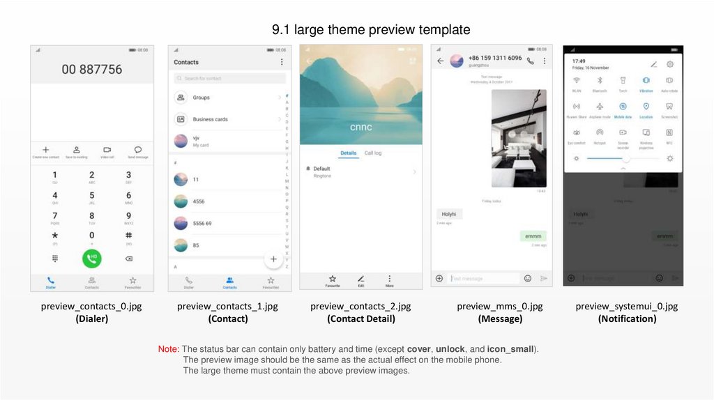
9.1 large theme preview templatepreview_contacts_0.jpg
(Dialer)
preview_contacts_1.jpg
(Contact)
preview_contacts_2.jpg
(Contact Detail)
preview_mms_0.jpg
(Message)
Note: The status bar can contain only battery and time (except cover, unlock, and icon_small).
The preview image should be the same as the actual effect on the mobile phone.
The large theme must contain the above preview images.
preview_systemui_0.jpg
(Notification)
13.
Common modulesunlock: Lock screen components
14.
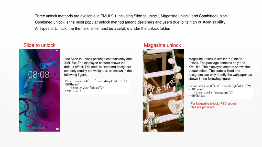
Three unlock methods are available in EMUI 9.1 including Slide to unlock, Magazine unlock, and Combined unlock.Combined unlock is the most popular unlock method among designers and users due to its high customizability.
All types of Unlock, the theme.xml file must be available under the unlock folder.
Slide to unlock
Magazine unlock
The Slide to unlock package contains only one
XML file. The displayed content shows the
default effect. The code is fixed and designers
can only modify the wallpaper, as shown in the
following figure.
Magazine unlock is similar to Slide to
unlock. The package contains only one
XML file. The displayed content shows the
default effect. The code is fixed and
designers can only modify the wallpaper, as
shown in the following figure.
For Magazine unlock, PSD source
files are provided.
15.
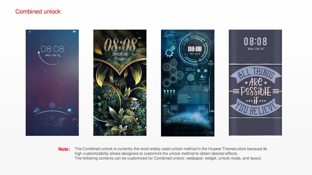
Combined unlockNote:
The Combined unlock is currently the most widely used unlock method in the Huawei Themes store because its
high customizability allows designers to customize the unlock method to obtain desired effects.
The following contents can be customized for Combined unlock: wallpaper, widget, unlock mode, and layout.
16.
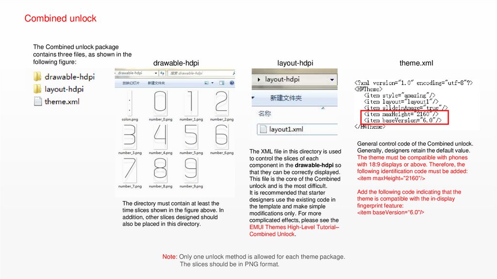
Combined unlockThe Combined unlock package
contains three files, as shown in the
following figure:
drawable-hdpi
The directory must contain at least the
time slices shown in the figure above. In
addition, other slices designed should
also be placed in this directory.
layout-hdpi
The XML file in this directory is used
to control the slices of each
component in the drawable-hdpi so
that they can be correctly displayed.
This file is the core of the Combined
unlock and is the most difficult.
It is recommended that starter
designers use the existing code in
the template and make simple
modifications only. For more
complicated effects, please see the
EMUI Themes High-Level Tutorial–
Combined Unlock.
Note: Only one unlock method is allowed for each theme package.
The slices should be in PNG format.
theme.xml
General control code of the Combined unlock.
Generally, designers retain the default value.
The theme must be compatible with phones
with 18:9 displays or above. Therefore, the
following identification code must be added:
<item maxHeight="2160"/>
Add the following code indicating that the
theme is compatible with the in-display
fingerprint feature:
<item baseVersion=“6.0"/>
17.
Combined unlock – In-display fingerprintSecurity area
Note:
Security area positions on current products
Security area includes:
1. Security area in red with a size 240 x 360 and whose bottom edge is 582 pixel to the bottom edge of the screen;
2. Security area in red with a size 240 x 360 and whose bottom edge is 84 pixel to the bottom edge of the screen;
3. Security area in red with a size 240 x 360 and whose bottom edge is 57 pixel to the bottom edge of the screen;
4. Security area in red with a size 240 x 360 and whose bottom edge is 24 pixel to the bottom edge of the screen;
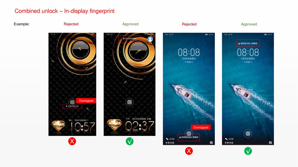
The in-display fingerprint feature is available on selected products, but the fingerprint sensor positions, time displays, and prompt positions are different. Therefore,
be sure that the operation areas do not overlap:
1. In the security area, operations such as touching and sliding cannot be performed. The edge of the hot zone cannot overlap with that of the security area.
2. An animation or prompt message on which users do not need to operate can be displayed in the security area, but should not affect the display of the fingerprint
sensor icon.
18.
Combined unlock – In-display fingerprintExample:
Rejected
Approved
Rejected
Overlapped
Overlapped
Approved
19.
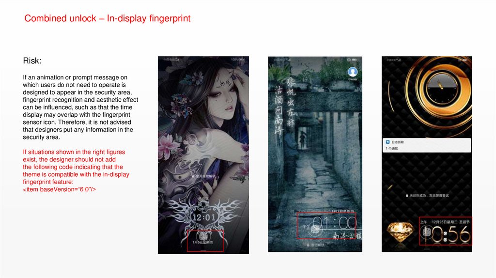
Combined unlock – In-display fingerprintRisk:
If an animation or prompt message on
which users do not need to operate is
designed to appear in the security area,
fingerprint recognition and aesthetic effect
can be influenced, such as that the time
display may overlap with the fingerprint
sensor icon. Therefore, it is not advised
that designers put any information in the
security area.
If situations shown in the right figures
exist, the designer should not add
the following code indicating that the
theme is compatible with the in-display
fingerprint feature:
<item baseVersion=“6.0"/>
20.
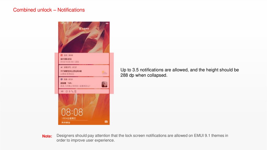
Combined unlock – NotificationsUp to 3.5 notifications are allowed, and the height should be
288 dp when collapsed.
Note:
Designers should pay attention that the lock screen notifications are allowed on EMUI 9.1 themes in
order to improve user experience.
21.
Common moduleswallpaper: Wallpapers
22.
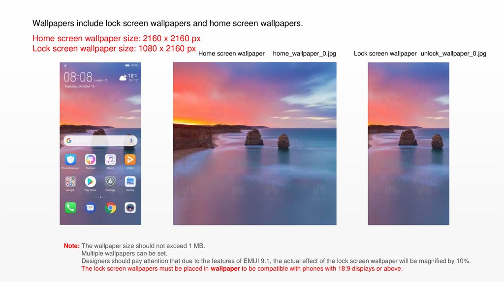
Wallpapers include lock screen wallpapers and home screen wallpapers.Home screen wallpaper size: 2160 x 2160 px
Lock screen wallpaper size: 1080 x 2160 px
Home screen wallpaper
home_wallpaper_0.jpg
Lock screen wallpaper unlock_wallpaper_0.jpg
Note: The wallpaper size should not exceed 1 MB.
Multiple wallpapers can be set.
Designers should pay attention that due to the features of EMUI 9.1, the actual effect of the lock screen wallpaper will be magnified by 10%.
The lock screen wallpapers must be placed in wallpaper to be compatible with phones with 18:9 displays or above.
23.
Common modulescom.huawei.android.launcher:
Home screen components
24.
The Launcher package contains three files, as shown inthe following figure:
com.huawei.android.launcher\res\drawable-xxhdpi
The framework-res-hwext folder contains the
slices of common components on the Settings
screen that can be modified by designers.
The res folder contains the slices of
components on the home screen, as shown in
the right figure.
The theme.xml contains the code of colors
used on the home screen.
Note: The Optimizer is the component that themes must be compatible with.
The folder_open_shadow.9 is a NinePatchDrawable graphic, which can be used only after NinePatchDrawable compilation.
25.
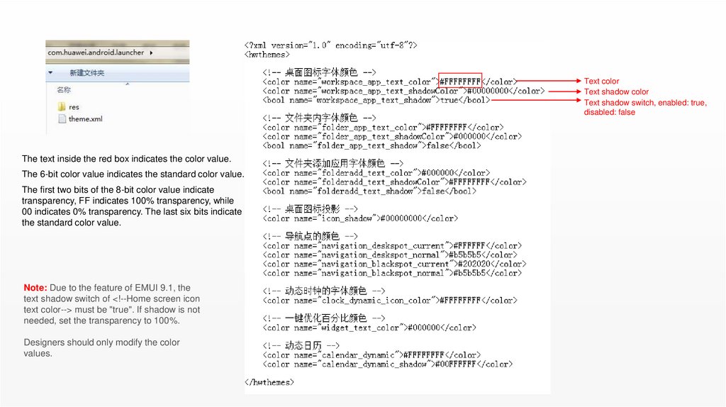
Text colorText shadow color
Text shadow switch, enabled: true,
disabled: false
The text inside the red box indicates the color value.
The 6-bit color value indicates the standard color value.
The first two bits of the 8-bit color value indicate
transparency, FF indicates 100% transparency, while
00 indicates 0% transparency. The last six bits indicate
the standard color value.
Note: Due to the feature of EMUI 9.1, the
text shadow switch of <!--Home screen icon
text color--> must be "true". If shadow is not
needed, set the transparency to 100%.
Designers should only modify the color
values.
26.
Common modulesicons: Icons
27.
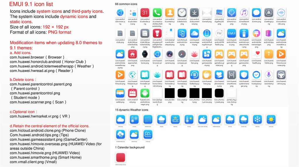
EMUI 9.1 icon list66 common icons
Icons include system icons and third-party icons.
The system icons include dynamic icons and
static icons.
Size of all icons: 192 × 192 px
Format of all icons: PNG format
Modification items when updating 8.0 themes to
9.1 themes:
a. Add icons.
com.huawei.browser Browser
com.huawei.honorclub.android Honor Club
com.huawei.android.totemweatherapp Weather
com.huawei.hwread.al.png Reader
b.Delete icons
com.huawei.parentcontrol.parent.png
Parent control
com.huawei.parentcontrol.png
Student mode
com.huawei.scanner.png Scan
c.Optional icon
com.huawei.hwmarket.vr.png VR
d.Retain the central element of the official icons.
com.hicloud.android.clone.png (Phone Clone)
Com.huawei.android.tips.png (Tips)
com.huawei.gameassistant.png (GameCenter)
com.huawei.himovie.overseas.png (HUAWEI Video (for
areas outside China)
com.huawei.himovie.png (HUAWEI Video)
com.huawei.smarthome.png (Smart Home)
com.vmall.client.png (Vmall)
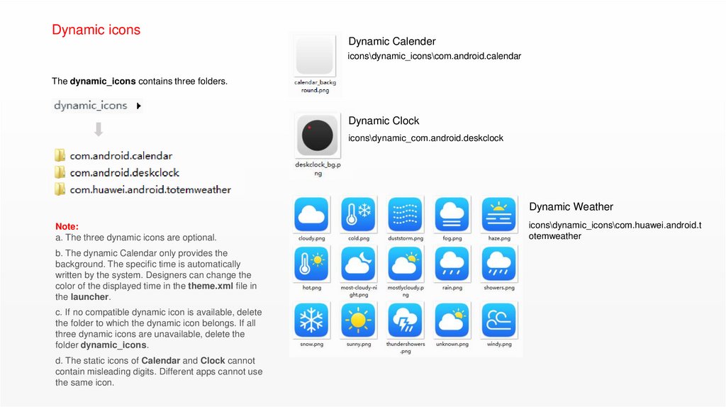
15 dynamic Weather icons
1 Calendar background
28.
Dynamic iconsDynamic Calender
icons\dynamic_icons\com.android.calendar
The dynamic_icons contains three folders.
Dynamic Clock
icons\dynamic_com.android.deskclock
Dynamic Weather
Note:
a. The three dynamic icons are optional.
b. The dynamic Calendar only provides the
background. The specific time is automatically
written by the system. Designers can change the
color of the displayed time in the theme.xml file in
the launcher.
c. If no compatible dynamic icon is available, delete
the folder to which the dynamic icon belongs. If all
three dynamic icons are unavailable, delete the
folder dynamic_icons.
d. The static icons of Calendar and Clock cannot
contain misleading digits. Different apps cannot use
the same icon.
icons\dynamic_icons\com.huawei.android.t
otemweather
29.
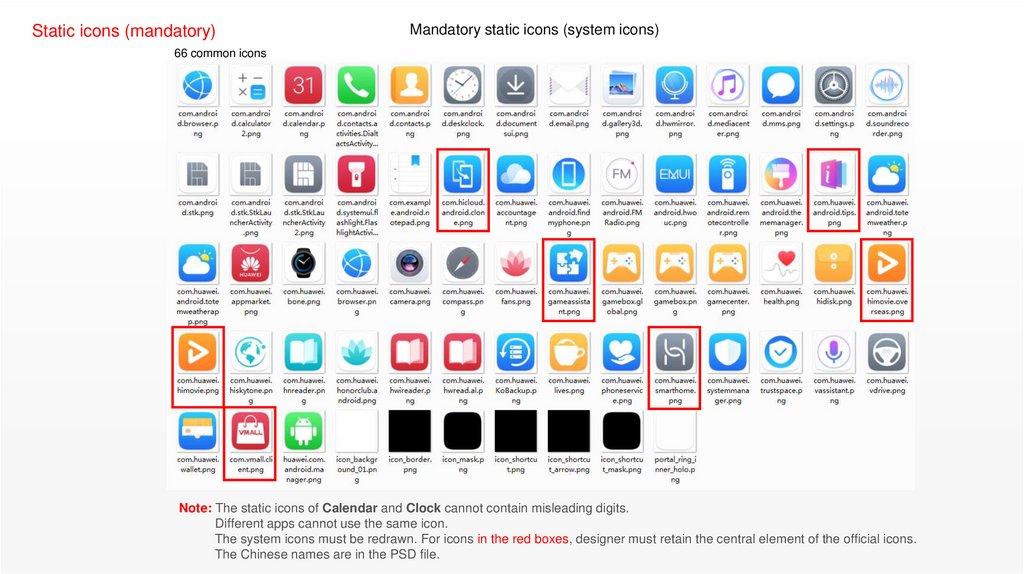
Static icons (mandatory)Mandatory static icons (system icons)
66 common icons
Note: The static icons of Calendar and Clock cannot contain misleading digits.
Different apps cannot use the same icon.
The system icons must be redrawn. For icons in the red boxes, designer must retain the central element of the official icons.
The Chinese names are in the PSD file.
30.
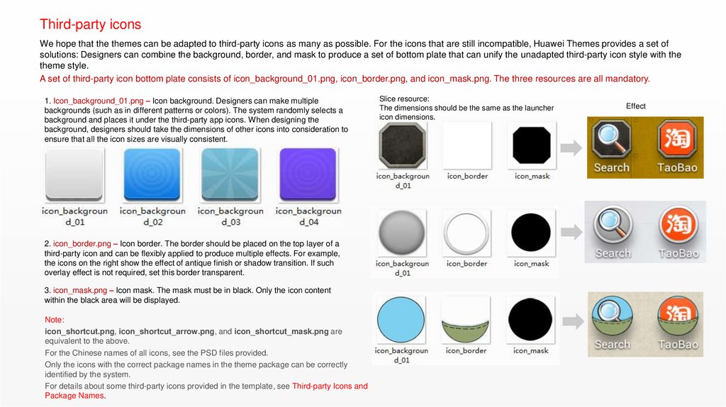
Third-party iconsWe hope that the themes can be adapted to third-party icons as many as possible. For the icons that are still incompatible, Huawei Themes provides a set of
solutions: Designers can combine the background, border, and mask to produce a set of bottom plate that can unify the unadapted third-party icon style with the
theme style.
A set of third-party icon bottom plate consists of icon_background_01.png, icon_border.png, and icon_mask.png. The three resources are all mandatory.
1. Icon_background_01.png – Icon background. Designers can make multiple
backgrounds (such as in different patterns or colors). The system randomly selects a
background and places it under the third-party app icons. When designing the
background, designers should take the dimensions of other icons into consideration to
ensure that all the icon sizes are visually consistent.
2. icon_border.png – Icon border. The border should be placed on the top layer of a
third-party icon and can be flexibly applied to produce multiple effects. For example,
the icons on the right show the effect of antique finish or shadow transition. If such
overlay effect is not required, set this border transparent.
3. icon_mask.png – Icon mask. The mask must be in black. Only the icon content
within the black area will be displayed.
Note:
icon_shortcut.png, icon_shortcut_arrow.png, and icon_shortcut_mask.png are
equivalent to the above.
For the Chinese names of all icons, see the PSD files provided.
Only the icons with the correct package names in the theme package can be correctly
identified by the system.
For details about some third-party icons provided in the template, see Third-party Icons and
Package Names.
Slice resource:
The dimensions should be the same as the launcher
icon dimensions.
Effect
31.
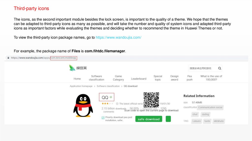
Third-party iconsThe icons, as the second important module besides the lock screen, is important to the quality of a theme. We hope that the themes
can be adapted to third-party icons as many as possible, and will take the number and quality of system icons and adapted third-party
icons as important factors while evaluating the themes and deciding whether to recommend the theme in Huawei Themes or not.
To view the third-party icon package names, go to https://www.wandoujia.com/
For example, the package name of Files is com.fihtdc.filemanager.
32.
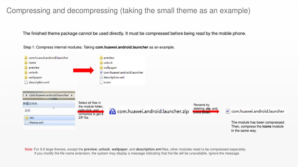
Compressing and decompressing (taking the small theme as an example)The finished theme package cannot be used directly. It must be compressed before being read by the mobile phone.
Step 1: Compress internal modules. Taking com.huawei.android.launcher as an example.
Select all files in
the module folder,
right-click, and
compress to get a
ZIP file.
Rename by
deleting .zip, and
press Enter.
The module has been compressed.
Then, compress the icons module
in the same way.
Note: For 9.0 large themes, except the preview, unlock, wallpaper, and description.xml files, other modules need to be compressed separately.
If you modify the file name extension, the system may display a message indicating that the file will be unavailable. Ignore the message.
33.
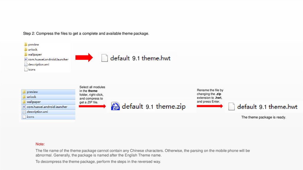
Step 2: Compress the files to get a complete and available theme package.9.1
Select all modules
in the theme
folder, right-click,
and compress to
get a ZIP file.
Rename the file by
changing the .zip
extension to .hwt,
and press Enter.
9.1
9.1
The theme package is ready.
Note:
The file name of the theme package cannot contain any Chinese characters. Otherwise, the parsing on the mobile phone will be
abnormal. Generally, the package is named after the English Theme name.
To decompress the theme package, perform the steps in the reversed way.
34.
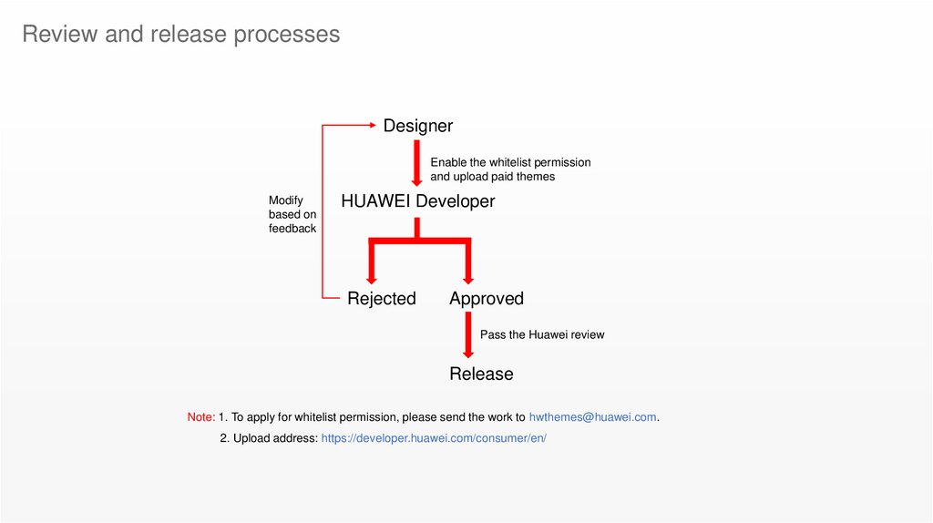
Review and release processesDesigner
Enable the whitelist permission
and upload paid themes
Modify
based on
feedback
HUAWEI Developer
Rejected
Approved
Pass the Huawei review
Release
Note: 1. To apply for whitelist permission, please send the work to hwthemes@huawei.com.
2. Upload address: https://developer.huawei.com/consumer/en/
35.
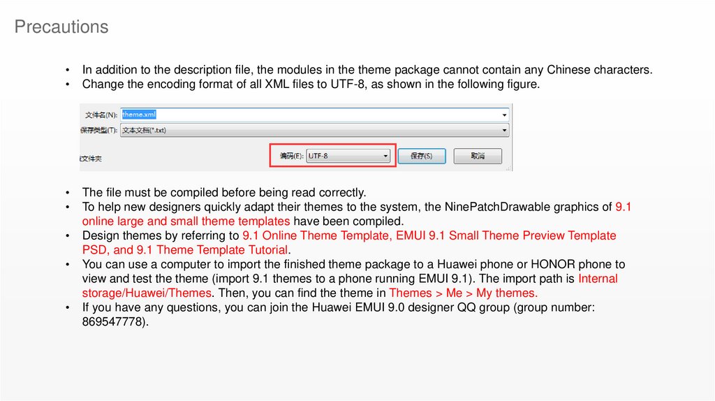
PrecautionsIn addition to the description file, the modules in the theme package cannot contain any Chinese characters.
Change the encoding format of all XML files to UTF-8, as shown in the following figure.
The file must be compiled before being read correctly.
To help new designers quickly adapt their themes to the system, the NinePatchDrawable graphics of 9.1
online large and small theme templates have been compiled.
Design themes by referring to 9.1 Online Theme Template, EMUI 9.1 Small Theme Preview Template
PSD, and 9.1 Theme Template Tutorial.
You can use a computer to import the finished theme package to a Huawei phone or HONOR phone to
view and test the theme (import 9.1 themes to a phone running EMUI 9.1). The import path is Internal
storage/Huawei/Themes. Then, you can find the theme in Themes > Me > My themes.
If you have any questions, you can join the Huawei EMUI 9.0 designer QQ group (group number:
869547778).



 programming


