


 english
Similar presentations:








IELTS Writing Task 1: Describing Charts
1.
2.
COMBINATION3.
4.
5.
6.
7.
8.
The table provides information about three sources ( National government, Local taxes and othersources) and the total police budget for 2017 and 2018 in one area in Britain. The figures are given
in millions of pounds. The pie chart shows how the money was spent.
Overall it can be seen that the largest proportion of the budget came from the national
government in both years. In addition, the total budget and the amount received from all three
sources increased from 2017 to 2018.
The highest percentage of money was spent on salaries, while technology accounted for the
smallest proportion of the budget.
Looking first at the table, the national government provided the largest amount of money,
accounting for 175.5 million in 2017 and 177.8 million in 2018. Compared with the national
government, less money came from other sources ,making up 38 million and 38.5 million
respectively. Meanwhile, the figure for local taxes increased slightly from 91.2 million in 2017 to
102.3 million in 2018. The total budget rose by 14.1 million in 2018.
Turning to the pie chart, although the proportion of the budget decreased from 75% in 2017 to
69% in 2018, salaries remained the main area where the money was spent.
As regards building and transport, the figure was higher than that for technology, accounting for
17% in both years. Technology represented the smallest share of the budget, increasing from 8% in
2017 to 14% in 2018
9.
10.
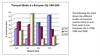
The pie chart illustrates the average amount of time UK workers spent commuting to work in 2009, while the barchart compares the methods of transport used by workers in London and the rest of the UK in the same year. All
figures are given in percentages.
Overall, the largest proportion of UK workers spent between 1 and 15 minutes travelling to work. In terms of
transport, travelling by car was by far the most common method in both London and the rest of the UK. By
contrast, cycling was the least popular means of transport in London, whereas the Underground was used by only
a very small proportion of workers outside London.
Looking first at the pie chart, 42% of workers spent between 1 and 15 minutes commuting to work, compared
with 33% who travelled for 16–30 minutes. The proportions then declined steadily as commuting time increased.
Only 12% of workers spent 31–45 minutes travelling, while the figures for the 45–60 minute and over 60 minute
categories were 8% and 5%, respectively.
Turning to the bar chart, travelling by car was the most popular method in both areas, accounting for
approximately 35% of commuters in London and around 70% in the rest of the UK. Public transport, however, was
considerably more common in London. Around one-fifth of London workers travelled by train or Underground,
compared with only about 3% in the rest of the UK for each mode. Bus travel was also more popular in London
(12% versus 8%), whereas walking was slightly more common outside the capital, at around 10% compared with
approximately 8% in London. Finally, cycling was the least frequently used means of transport in London, at about
5%, although its figure was only slightly higher in the rest of the UK.