


 education
Similar presentations:


")
")


Academic Tables. Writing 1
1. Writing 1
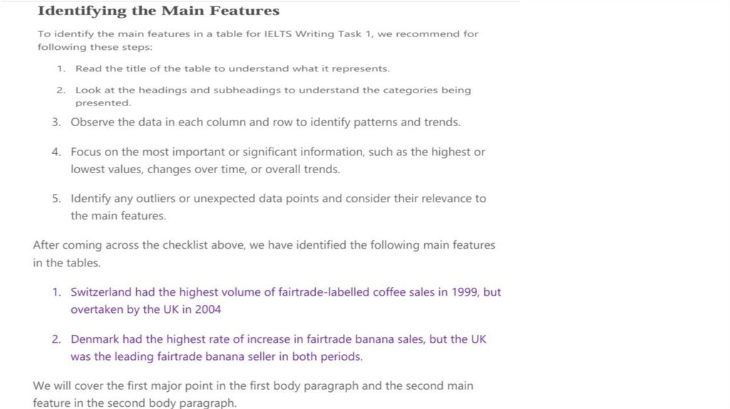
Academic Tables2. Essential Information
• People doing the Academic test will write a report on a data set, map, orprocess.
• You must write 150 words or more.
• You should spend around 20 minutes on this part of the test.
• Task 1 is worth 1/3 of your total mark on the Writing test.
• You will be assessed in four areas:
• Task Achievement (25%)
• Coherence and Cohesion (25%)
• Lexical Resource (25%)
• Grammatical Range and Accuracy (25%)
• The most important thing is that you can demonstrate that you can clearly
communicate in English.
3. Types of Diagrams
BAR CHARTSLINE GRAPH
TABLES
PIE CHARTS
Method of Student Travel to College by Percentage
Walking
12
Bicycle
20
Car
25
Public Transport
43
4. Criteria
• Task Achievement• This requires the students to accurately reflect the relevant information in the graph. If you gave your
answer to a stranger, would they be able to accurately reproduce the graph? If they could, then you have
fulfilled this task.
• Coherence and Cohesion
• This part of the marking criteria judges students’ ability to produce an answer that is clear, fluent and easy
to understand. Structure, appropriate vocabulary and good grammar help to boost your score here. Good
paragraphing and appropriate use of cohesive devices can also be used to gain a higher score.
• Lexical Resource
• This section is all about vocabulary and is often the most misunderstood. It is NOT about inserting as many
long words as you can think of. It is about choosing relevant, appropriate and accurate words. You will help
your score here by using a variety of vocabulary and not simply copying the words in the question.
• Grammatical Range and Accuracy
• Obviously, you have to produce grammatically accurate sentences to do well in this section, but it is also
about using the appropriate structures. You are expected to use different structures for describing
numbers, trends and making comparisons. The most common grammar mistake students make in IELTS
task 1 is not using articles and plurals properly.
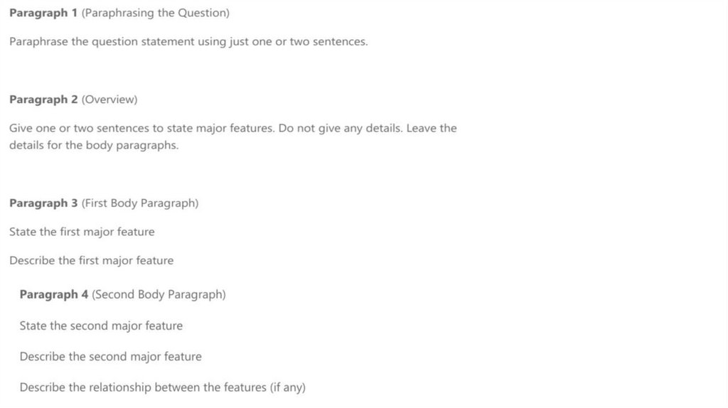
5. STRUCTURE
• Paragraph 1 (Introduction)• Sentence 1- Paraphrase Question
• Paragraph 2 (Overview)
• Sentence 1- Overview of first main feature
• Sentence 2- Overview of second main feature
• Sentence 3- Make general comparison, if appropriate
• Paragraph 3 (Details of significant feature 1)
• Sentence 1- Supporting details
• Sentence 2- Supporting details
• Sentence 3- Supporting details/comparison details, if appropriate
• Paragraph 4 (Details of significant feature 2)
• Sentence 1- Supporting details
• Sentence 2- Supporting details
• Sentence 3- Supporting details/Comparison details, if appropriate
6. Tables
7.
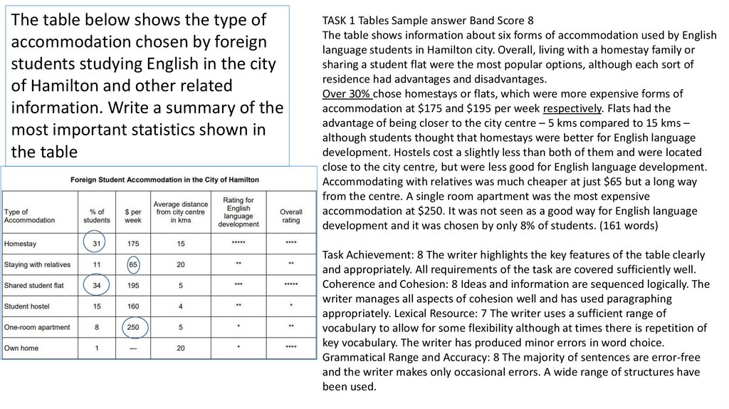
The table below shows the type ofaccommodation chosen by foreign
students studying English in the city
of Hamilton and other related
information. Write a summary of the
most important statistics shown in
the table
TASK 1 Tables Sample answer Band Score 8
The table shows information about six forms of accommodation used by English
language students in Hamilton city. Overall, living with a homestay family or
sharing a student flat were the most popular options, although each sort of
residence had advantages and disadvantages.
Over 30% chose homestays or flats, which were more expensive forms of
accommodation at $175 and $195 per week respectively. Flats had the
advantage of being closer to the city centre – 5 kms compared to 15 kms –
although students thought that homestays were better for English language
development. Hostels cost a slightly less than both of them and were located
close to the city centre, but were less good for English language development.
Accommodating with relatives was much cheaper at just $65 but a long way
from the centre. A single room apartment was the most expensive
accommodation at $250. It was not seen as a good way for English language
development and it was chosen by only 8% of students. (161 words)
Task Achievement: 8 The writer highlights the key features of the table clearly
and appropriately. All requirements of the task are covered sufficiently well.
Coherence and Cohesion: 8 Ideas and information are sequenced logically. The
writer manages all aspects of cohesion well and has used paragraphing
appropriately. Lexical Resource: 7 The writer uses a sufficient range of
vocabulary to allow for some flexibility although at times there is repetition of
key vocabulary. The writer has produced minor errors in word choice.
Grammatical Range and Accuracy: 8 The majority of sentences are error-free
and the writer makes only occasional errors. A wide range of structures have
been used.
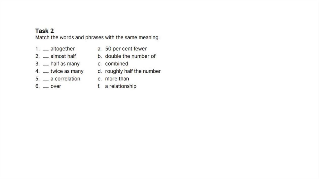
8. There are a number of different ways of expressing the same figure in English. For example, we can say ‘a half’, ‘one in two’
There are a number of different ways of expressing the same figure in English. For example, we can say ‘a half’,‘one in two’ or ‘fifty per cent’ and they all mean the same. It’s a good idea to vary the way you express figures
in your description of the table or chart. All the phrases below can be used to describe figures. Group them
into phrases which mean the same.
a fifth
a quarter
a tenth
a third
just over sixty per cent
just over thirty per cent
one in five
one in four
one in ten
one in three
seventy five per cent
ten per cent
three out of four
three quarters
twenty five per cent
twenty per cent
two out of three
two thirds
9.
10.
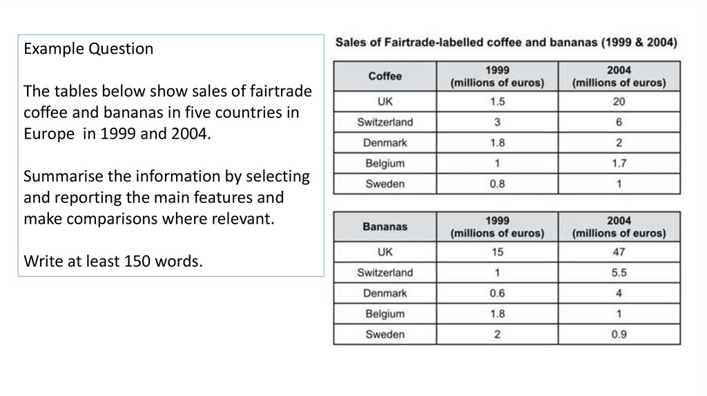
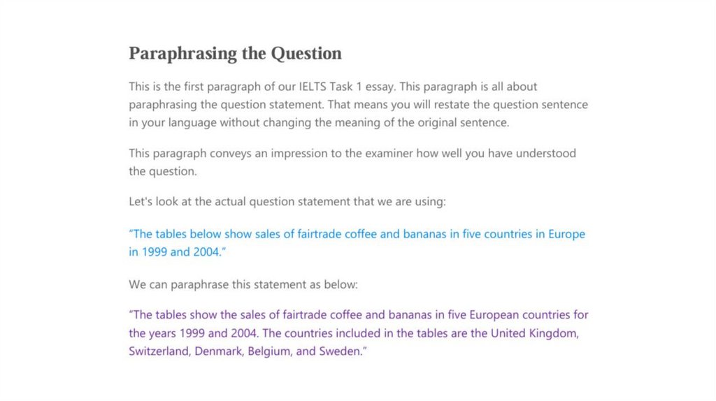
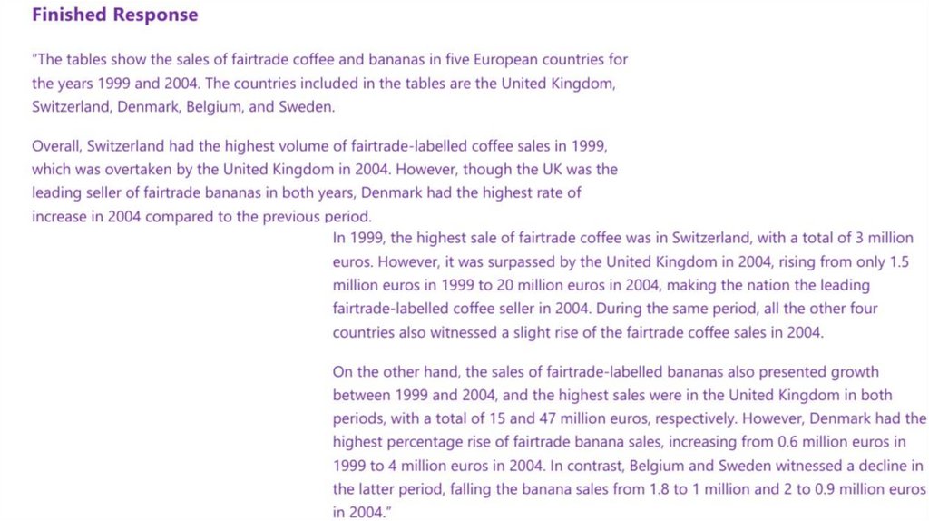
Example QuestionThe tables below show sales of fairtrade
coffee and bananas in five countries in
Europe in 1999 and 2004.
Summarise the information by selecting
and reporting the main features and
make comparisons where relevant.
Write at least 150 words.
11.
12.
13.
14.
15.
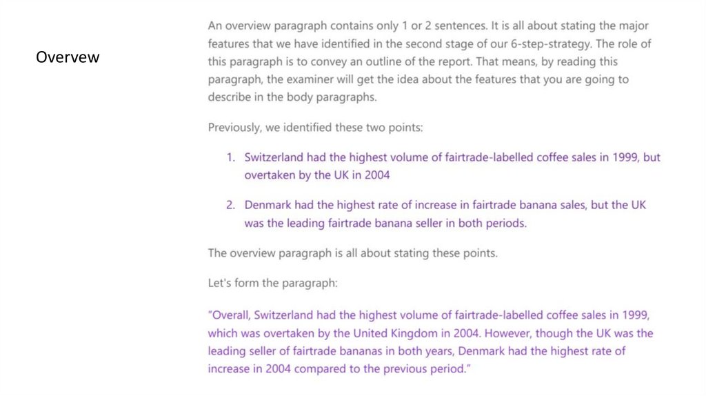
Overvew16. First Body Paragraph
17. Second body paragraph
18.
19. Percentage, Porton and Numbers
• Percentages:10% increase, 25 percent decrease, increased by 15%, dropped by 10 per cent, fall at 50%, reached 75%,
tripled, doubled, one-fourth, three-quarters, half, double fold, treble, 5 times higher, 3 times lower, declined to
about 49%, stood exactly at 43%.
• Fractions:
4% = A tiny fraction.
24% = Almost a quarter.
25% Exactly a quarter.
26% = Roughly one quarter.
32% Nearly one-third, nearly a third.
49% = Around a half, just under a half.
50% Exactly a half.
51% = Just over a half.
73% = Nearly three quarters.
77% = Approximately three quarters, more than three-quarter.
79% = Well over three quarters.
• Proportions:
2% = A tiny portion, a very small proportion.
4% = An insignificant minority, an insignificant proportion.
16% = A small minority, a small portion.
70% = A large proportion.
72% = A significant majority, A significant proportion.89% = A very large proportion.
89% = A very large proportion.
20. Percentage, Portion and Numbers
• You should not keep repeating the same structures. The keylanguage when you write about bar charts/pie charts is proportions
and percentages. Common phrases to see are "the proportion
of…" or "the percentage of…"
• However, you can also use other words and fractions:
a large number of people
over a quarter of people
a small minority
a significant number of people
less than a fifth
21. Words/ Phrases of Approximation - Vocabulary
• Approximately» Nearly
» Roughly
» Almost
» About
» Around
» More or less
» Just over
» Just under
» Just around
» Just about
» Just below
» A little more than
» A little less than.
22. Words/ Phrases of Approximation - Vocabulary
• If the percentages are not exact as above, then you can usequalifiers to make sure your description remains accurate. Here
are some examples:
Percentage
Qualifier
77%
just over three quarters
77%
approximately three quarters
49%
just under a half
49%
nearly a half
32%
almost a third
Percentage
proportion / number / amount / majority / minority
• 75% - 85%
a very large majority
• 65% - 75%
a significant proportion
• 10% - 15%
a minority
• 5%
a very small number
23.
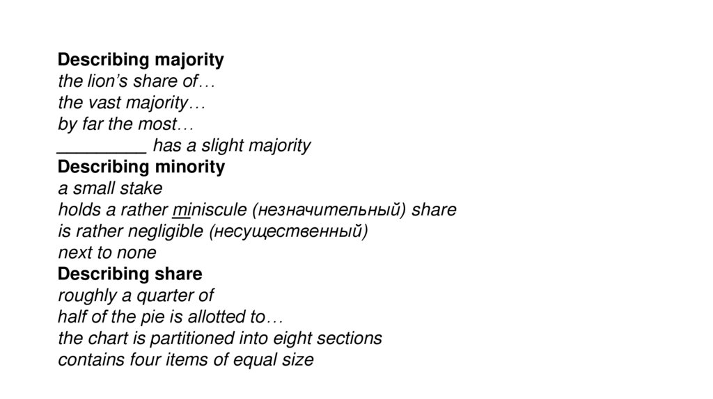
Describing majoritythe lion’s share of…
the vast majority…
by far the most…
_________ has a slight majority
Describing minority
a small stake
holds a rather miniscule (незначительный) share
is rather negligible (несущественный)
next to none
Describing share
roughly a quarter of
half of the pie is allotted to…
the chart is partitioned into eight sections
contains four items of equal size
24.
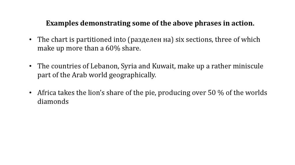
Examples demonstrating some of the above phrases in action.• The chart is partitioned into (разделен на) six sections, three of which
make up more than a 60% share.
• The countries of Lebanon, Syria and Kuwait, make up a rather miniscule
part of the Arab world geographically.
• Africa takes the lion’s share of the pie, producing over 50 % of the worlds
diamonds
25.
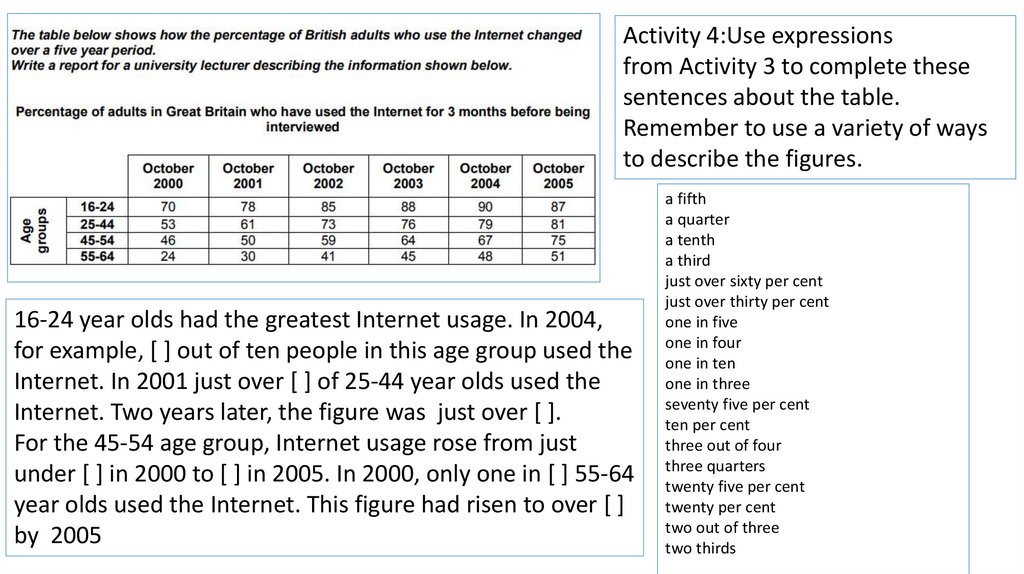
Activity 4:Use expressionsfrom Activity 3 to complete these
sentences about the table.
Remember to use a variety of ways
to describe the figures.
16-24 year olds had the greatest Internet usage. In 2004,
for example, [ ] out of ten people in this age group used the
Internet. In 2001 just over [ ] of 25-44 year olds used the
Internet. Two years later, the figure was just over [ ].
For the 45-54 age group, Internet usage rose from just
under [ ] in 2000 to [ ] in 2005. In 2000, only one in [ ] 55-64
year olds used the Internet. This figure had risen to over [ ]
by 2005
a fifth
a quarter
a tenth
a third
just over sixty per cent
just over thirty per cent
one in five
one in four
one in ten
one in three
seventy five per cent
ten per cent
three out of four
three quarters
twenty five per cent
twenty per cent
two out of three
two thirds
26.
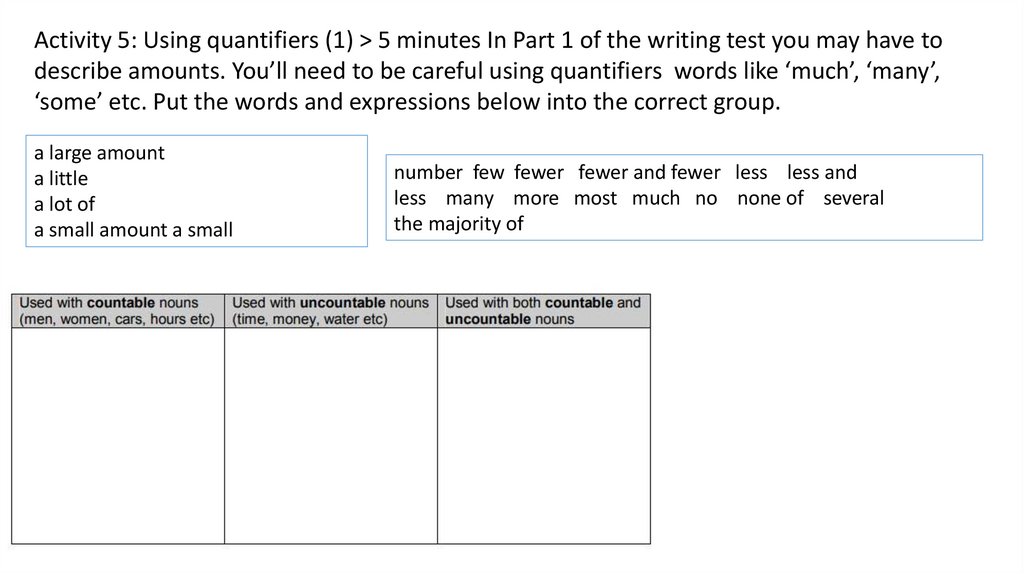
Activity 5: Using quantifiers (1) > 5 minutes In Part 1 of the writing test you may have todescribe amounts. You’ll need to be careful using quantifiers words like ‘much’, ‘many’,
‘some’ etc. Put the words and expressions below into the correct group.
a large amount
a little
a lot of
a small amount a small
number few fewer fewer and fewer less less and
less many more most much no none of several
the majority of
27.
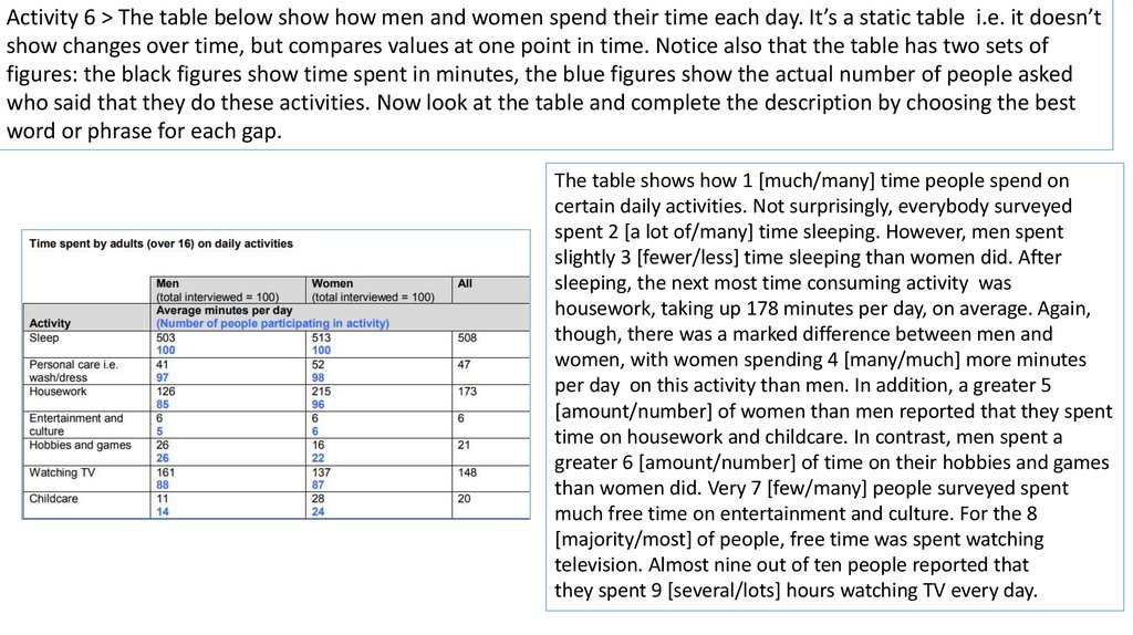
Activity 6 > The table below show how men and women spend their time each day. It’s a static table i.e. it doesn’tshow changes over time, but compares values at one point in time. Notice also that the table has two sets of
figures: the black figures show time spent in minutes, the blue figures show the actual number of people asked
who said that they do these activities. Now look at the table and complete the description by choosing the best
word or phrase for each gap.
The table shows how 1 [much/many] time people spend on
certain daily activities. Not surprisingly, everybody surveyed
spent 2 [a lot of/many] time sleeping. However, men spent
slightly 3 [fewer/less] time sleeping than women did. After
sleeping, the next most time consuming activity was
housework, taking up 178 minutes per day, on average. Again,
though, there was a marked difference between men and
women, with women spending 4 [many/much] more minutes
per day on this activity than men. In addition, a greater 5
[amount/number] of women than men reported that they spent
time on housework and childcare. In contrast, men spent a
greater 6 [amount/number] of time on their hobbies and games
than women did. Very 7 [few/many] people surveyed spent
much free time on entertainment and culture. For the 8
[majority/most] of people, free time was spent watching
television. Almost nine out of ten people reported that
they spent 9 [several/lots] hours watching TV every day.
28.
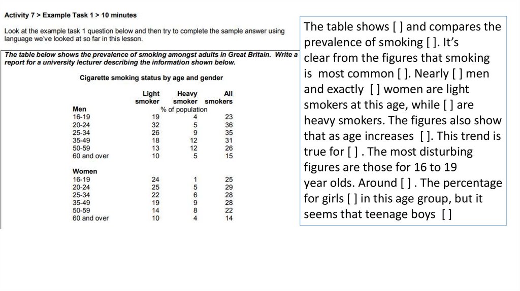
The table shows [ ] and compares theprevalence of smoking [ ]. It’s
clear from the figures that smoking
is most common [ ]. Nearly [ ] men
and exactly [ ] women are light
smokers at this age, while [ ] are
heavy smokers. The figures also show
that as age increases [ ]. This trend is
true for [ ] . The most disturbing
figures are those for 16 to 19
year olds. Around [ ] . The percentage
for girls [ ] in this age group, but it
seems that teenage boys [ ]
29.
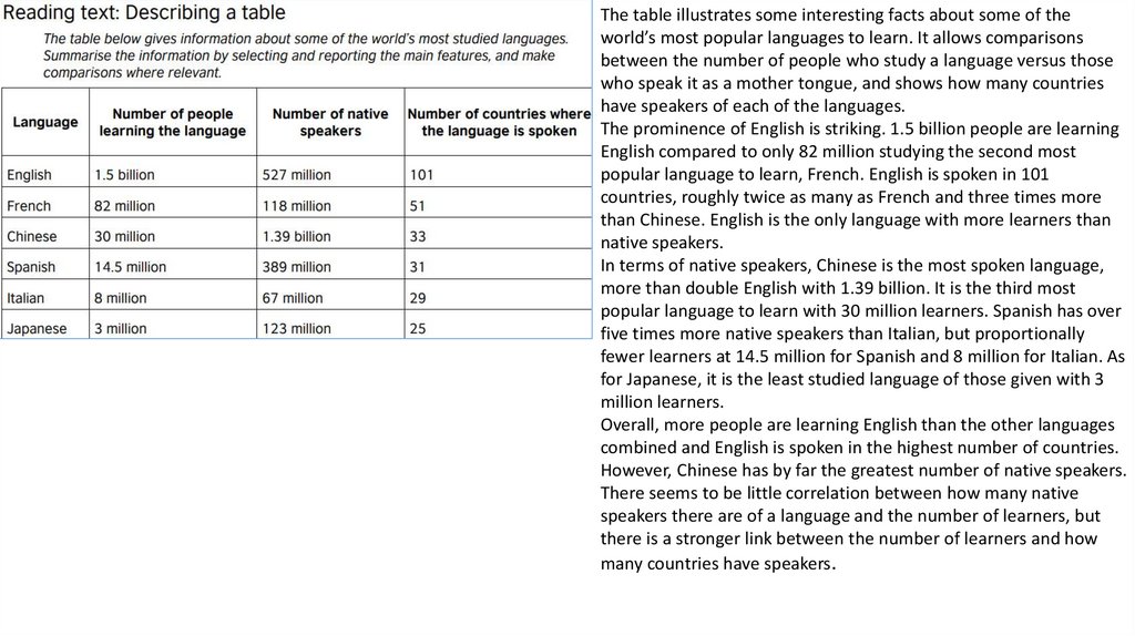
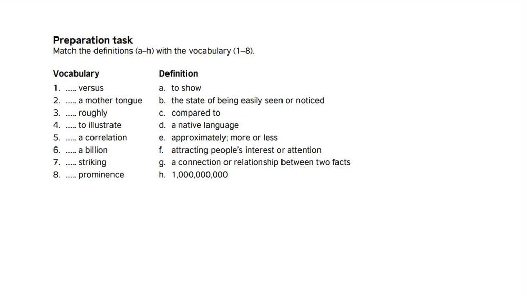
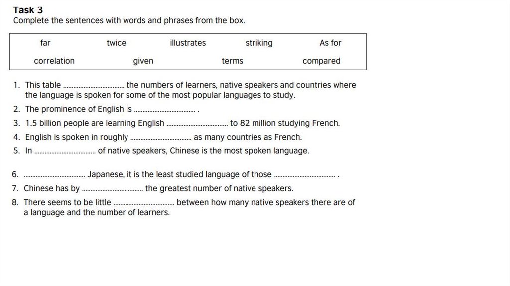
The table illustrates some interesting facts about some of theworld’s most popular languages to learn. It allows comparisons
between the number of people who study a language versus those
who speak it as a mother tongue, and shows how many countries
have speakers of each of the languages.
The prominence of English is striking. 1.5 billion people are learning
English compared to only 82 million studying the second most
popular language to learn, French. English is spoken in 101
countries, roughly twice as many as French and three times more
than Chinese. English is the only language with more learners than
native speakers.
In terms of native speakers, Chinese is the most spoken language,
more than double English with 1.39 billion. It is the third most
popular language to learn with 30 million learners. Spanish has over
five times more native speakers than Italian, but proportionally
fewer learners at 14.5 million for Spanish and 8 million for Italian. As
for Japanese, it is the least studied language of those given with 3
million learners.
Overall, more people are learning English than the other languages
combined and English is spoken in the highest number of countries.
However, Chinese has by far the greatest number of native speakers.
There seems to be little correlation between how many native
speakers there are of a language and the number of learners, but
there is a stronger link between the number of learners and how
many countries have speakers.
30.
31.
32.
33.
34.
35. Vocabulary of Introduction Part
StartingPresentation Type
Verb
Description
The/ the given / the
supplied / the presented
/ the shown / the
provided
diagram / table / figure /
illustration / graph / chart /
flow chart / picture/
presentation/ pie chart / bar
graph/ column graph / line
graph / table data/ data /
information / pictorial/
process diagram/ map/ pie
chart and table/ bar graph
and pie chart ...
shows / represents / depicts the comparison of…
/ enumerates / illustrates / the differences…
presents/ gives / provides / the changes...
delineates/ outlines/
the number of…
describes / delineates/
information on…
expresses/ denotes/
data on…
compares/ shows contrast / the proportion of…
indicates / figures / gives
the amount of…
data on / gives information information on...
on/ presents information
data about...
about/ shows data about/
comparative data...
demonstrates/ sketch out/ the trend of...
summarises...
the percentages of...
the ratio of...
how the...
36. Examples of Introduction
• The diagram shows employment rates among adults in four Europeancountries from 1925 to 1985.
• The given pie charts represent the proportion of male and female
employees in 6 broad categories, dividing into manual and non-manual
occupations in Australia, between 2010 and 2015.
• The chart gives information about consumer expenditures on six products
in four countries namely Germany, Italy, Britain and France.
• The supplied bar graph compares the number of male and female
graduates in three developing countries while the table data presents the
overall literacy rate in these countries.
• The bar graph and the table data depict the water consumption in different
sectors in five regions.
37. Vocabulary for the Overview Part
• In general,• In common,
• Generally speaking,
• Overall,
• It is obvious,
• As is observed, As a general trend, As can be seen, As an overall
trend, As is presented, It can be clearly seen that, At the first glance,
it is clear, At the onset, it is clear that, A glance at the graphs reveals
that..
38. Examples of overview:
• In general, the employment opportunities increased till 1970 andthen declined throughout the next decade.
• As is observed, the figures for imprisonment in the five mentioned
countries show no overall pattern, rather shows the considerable
fluctuations from country to country.
• Generally speaking, citizens in the USA had a far better life standard
than that of remaining countries.
• As can be seen, the highest number of passengers used the London
Underground station at 8:00 in the morning and at 6:00 in the
evening.
39. Vocabulary to Start the Report Body
• 1As is presented in the diagram(s)/ graph(s)/ pie chart(s)/ table...2. As (is) shown in the illustration...
3. As can be seen in the...
4. As the diagrams suggest...
5. According to the...
6. Categorically speaking...
7. Getting back to the details...
8. Now, turning to the details...
9. The table data clearly shows that...
10. The diagram reveals that...
11. The data suggest that...
12. The graph gives the figure...
13. It is interesting to note that...
14. It is apparently seen that...
15. It is conspicuous that...
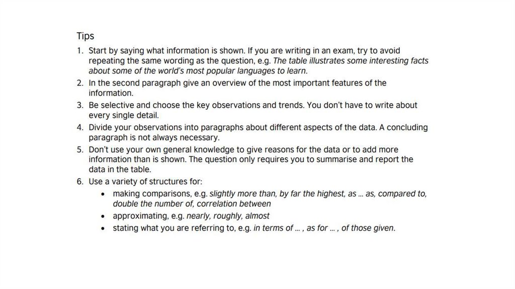
40. TIPS FOR OVERVIEW WRITING 1
The overview / summary is a very important part of your task 1 report. Many people have no trouble describingspecific details, but they find it difficult to describe the general features of a graph, chart or diagram. So here are
my tips on how to write a good overview:
1. Always try to write two sentences. This forces you to describe two main or general features of the graph, chart
or diagram.
2. Don't put any numbers in your overview. Save specific numbers for the 'details' paragraphs.
3. If the graph or chart shows a time period (e.g. years), look for theoverall change from the beginning to the
end of the period (e.g. from the first year to the last year).
4. Look for overall trends, and ignore individual figures that don't fit the trend. For example, if a graph shows a
rising trend overall, you can ignore a specific year when the figures decreased -save that year for your 'details'
paragraphs.
5. If no time period is shown, you can't look for trends. Instead, look for differences and similarities between
items.
41. TIPS FOR OVERVIEW WRITING 1
6. Don't look for individual 'highest' or 'lowest' figures such as a 'peak' on a line graph. Instead, describe thehighest and lowest items overall (e.g. which line on the graph was the highest for the whole or most of the
period?).
7. Start your overview with a simple phrase that clearly shows the examiner that this is your summary
paragraph e.g. It is clear that... , It is noticeable that... , Overall we can see that...
8. If there are two different charts, write one overview sentence about each chart.
9. If there are more than two charts, they must be connected in some way, so look for two main features
overall.
10. If the task is to describe a diagram or map that compares things, you can mention the main differences
and maybe the number of differences and / or similarities between the two diagrams.
11. If the task is to describe a process diagram, you can mention the total number of stages in the process
and say where or how the process begins and ends.