Similar presentations:
FaceByte UI Review
1. FaceByte UI Review
2019-04-04Nina Milani
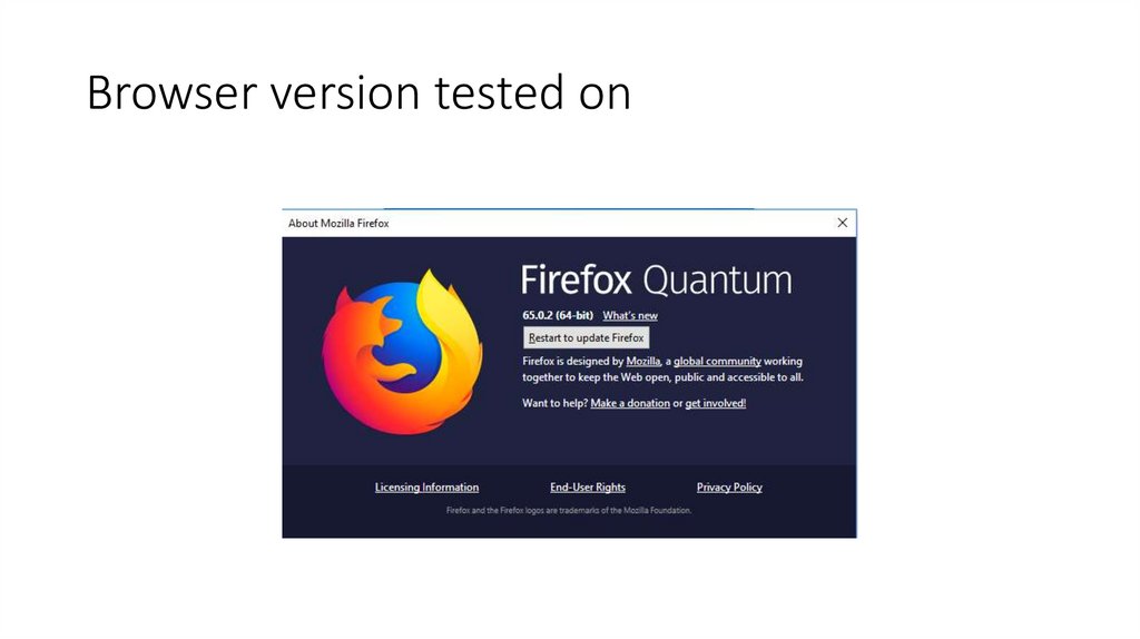
2. Browser version tested on
3. MS: [home & sign in] Row 24, New picture upload 05
MS: [home & sign in]Row 24, New picture upload 05
• Please add the actual link to it.
4. MS: [home & sign in] Row 25, Manually add 02
MS: [home & sign in]Row 25, Manually add 02
Design
Date added is missing in the developed version.
Developed version
5. MS: [home & sign in] Row 27 desktop, Match Found
MS: [home & sign in]Row 27 desktop, Match Found
Design
Developed version
In the design version it says next match and in the developed version it
says next photo. Please change to next match.
6. Row 27, mobile, Match Found
DesignDeveloped version
This is not a big problem only for your reference, mobile view looks
broken if jumping from desktop to mobile view on browser. Starting on
mobile view from the beginning everything looks fine. Same for the next
slide
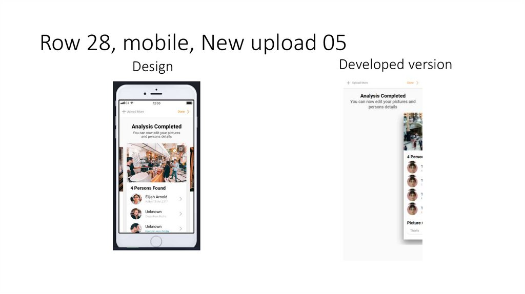
7. Row 28, mobile, New upload 05
DesignDeveloped version
8. Version 4.4 Additions
2019-04-06Peyman Askari
9.
The next few slides are visuallycorrect (for the most part), but
the flow is completely wrong
2019-04-06
Peyman Askari
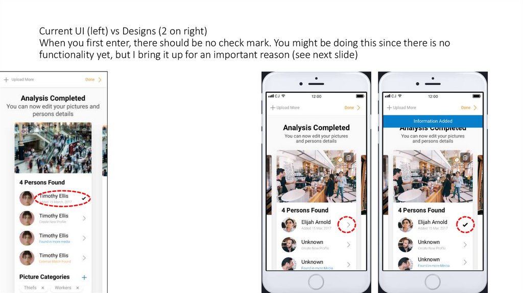
10. Current UI (left) vs Designs (2 on right) When you first enter, there should be no check mark. You might be doing this since
there is nofunctionality yet, but I bring it up for an important reason (see next slide)
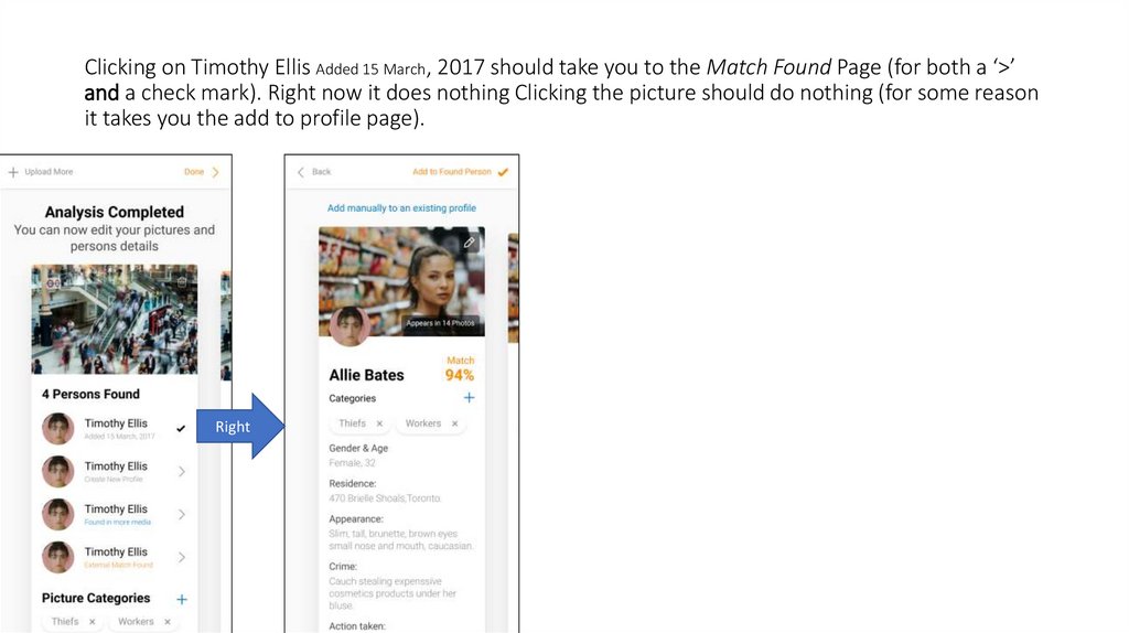
11. Clicking on Timothy Ellis Added 15 March, 2017 should take you to the Match Found Page (for both a ‘>’ and a check mark). Right
Clicking on Timothy Ellis Added 15 March, 2017 should take you to the Match Found Page (for both a ‘>’and a check mark). Right now it does nothing Clicking the picture should do nothing (for some reason
it takes you the add to profile page).
Right
12. To complicate matters further, for some reason clicking on the picture takes you the add to Match Found page (it should do
nothing).Wrong
Right
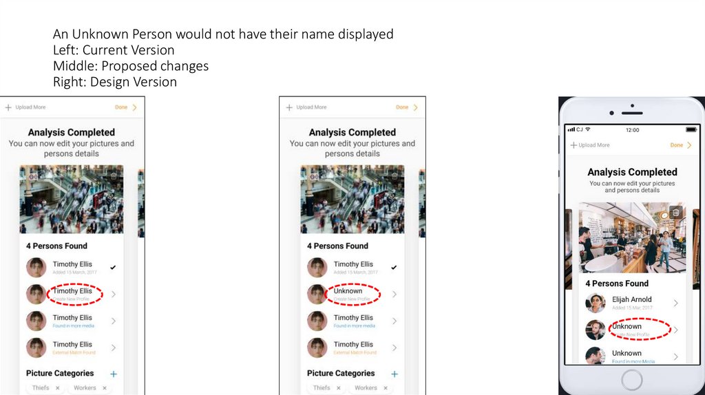
13. An Unknown Person would not have their name displayed Left: Current Version Middle: Proposed changes Right: Design Version
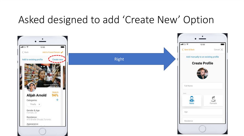
14. Design Change
2019-04-06Peyman Askari
15. Asked designed to add ‘Create New’ Option
Right16. Clarification of design
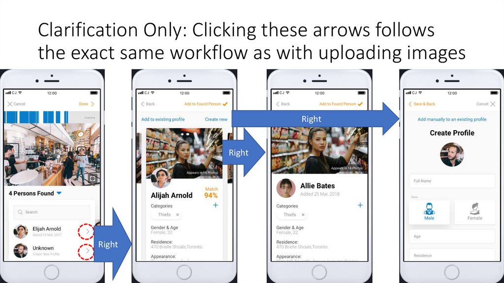
2019-04-06Peyman Askari
17. Clarification Only: Clicking these arrows follows the exact same workflow as with uploading images
RightRight
Right
![MS: [home & sign in] Row 24, New picture upload 05 MS: [home & sign in] Row 24, New picture upload 05](https://cf2.ppt-online.org/files2/slide/d/dZqhiTjOrV1W0IBfplMsvwmnJyXYHL3xCgQNt7/slide-2.jpg)
![MS: [home & sign in] Row 25, Manually add 02 MS: [home & sign in] Row 25, Manually add 02](https://cf2.ppt-online.org/files2/slide/d/dZqhiTjOrV1W0IBfplMsvwmnJyXYHL3xCgQNt7/slide-3.jpg)
![MS: [home & sign in] Row 27 desktop, Match Found MS: [home & sign in] Row 27 desktop, Match Found](https://cf2.ppt-online.org/files2/slide/d/dZqhiTjOrV1W0IBfplMsvwmnJyXYHL3xCgQNt7/slide-4.jpg)



 internet


