Similar presentations:
Death by PowerPoint (and how to fight it)
1.
Death by PowerPoint(and how to fight it)
Alexei Kapterev
2.
There are 300 millionPowerPoint users
in the world*
* estimate
3.
They do 30 millionpresentations
each day*
* estimate
4.
About a millionpresentations are
going on right now*
* estimate
5.
50% of them areunbearable*
* conservative estimate
6.
LOTS of peopleare killing each other
with bad presentations.
NOW.
7.
They are all DEAD! Well, almost.8.
A vicious circleBad
presentations
Bad
communication
Less
training
Less
money
Bad
relations
Less
sales
9.
Let’s make the worlda better place.
10.
Why are they doing it?!11.
Research shows:Bullets don’t kill people
People kill people
Unintentionally
Yet regularly
12.
Mainly due to lack of...Significance
Structure
Simplicity
Rehearsal
13.
Significance14.
Why do you present?To “pass the information”?
Your boss told you to?
Or to make meaning?
15.
What’s the subject andwhy it matters to you?
16.
How presentations workSignificance creates passion
Passion attracts attention
Attention leads to action
17.
Are you passionate?Check yourself.
18.
This is passion.19.
This is passion.20.
This is passion.21.
This is not.22.
Can’t findthe meaning?
Don’t present.
23.
Structure24.
Structure is how you place thebuilding blocks of your story.
25.
Q: What structure to use?A: Any – as long as it is:
Convincing
Memorable
Scalable
26.
Structure choicesProblem – Pathway – Solution
Problem – Solution – Reasoning
Fancy stuff (if it makes sense)
27.
Give 3-4 reasonssupporting your point.
They will not remember
more anyway.
28.
Memorable opening1
More details...
2
3
More details...
2 argument
1
2
3
More details...
3 argument
1
2
3
More details...
1 argument
More details...
More details...
More details...
More details...
More details...
Memorable closing
45
minutes
29.
You can tell this in...5 minutes
15 minutes
45 minutes
It is scalable.
30.
Simplicity31.
“Everything should be made as
simple as possible but not simpler.
32.
Apparently, being simpleis not that simple.
Will give you some examples.
33.
Don’t worry: knowing the languagedoesn’t really help.
34.
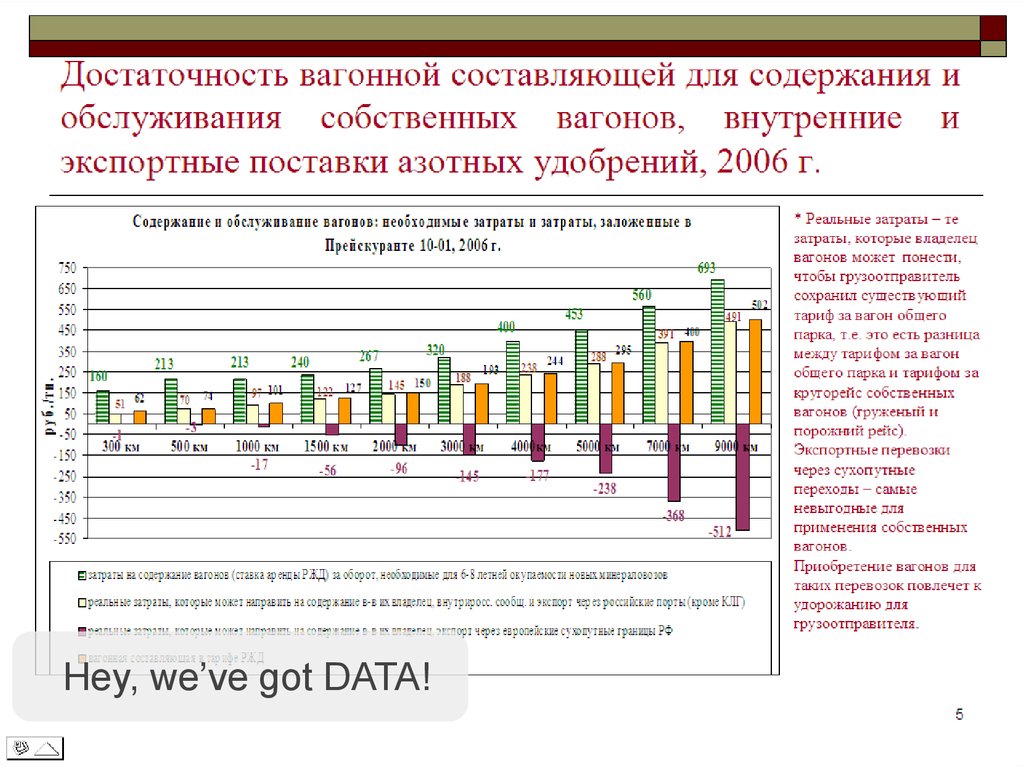
Notice cool background.35.
Hey, we’ve got DATA!36.
This one’s my favorite.37.
Fundamental problem?38.
PowerPoint helps to:Visualize ideas
Create key points
Impress
39.
They use it as:Prompter
Handouts
Data dumps
40.
People read faster than you speak.This means you are useless.
41.
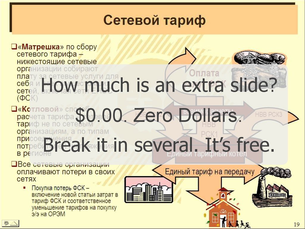
How much is an extra slide?$0.00. Zero Dollars.
Break it in several. It’s free.
42.
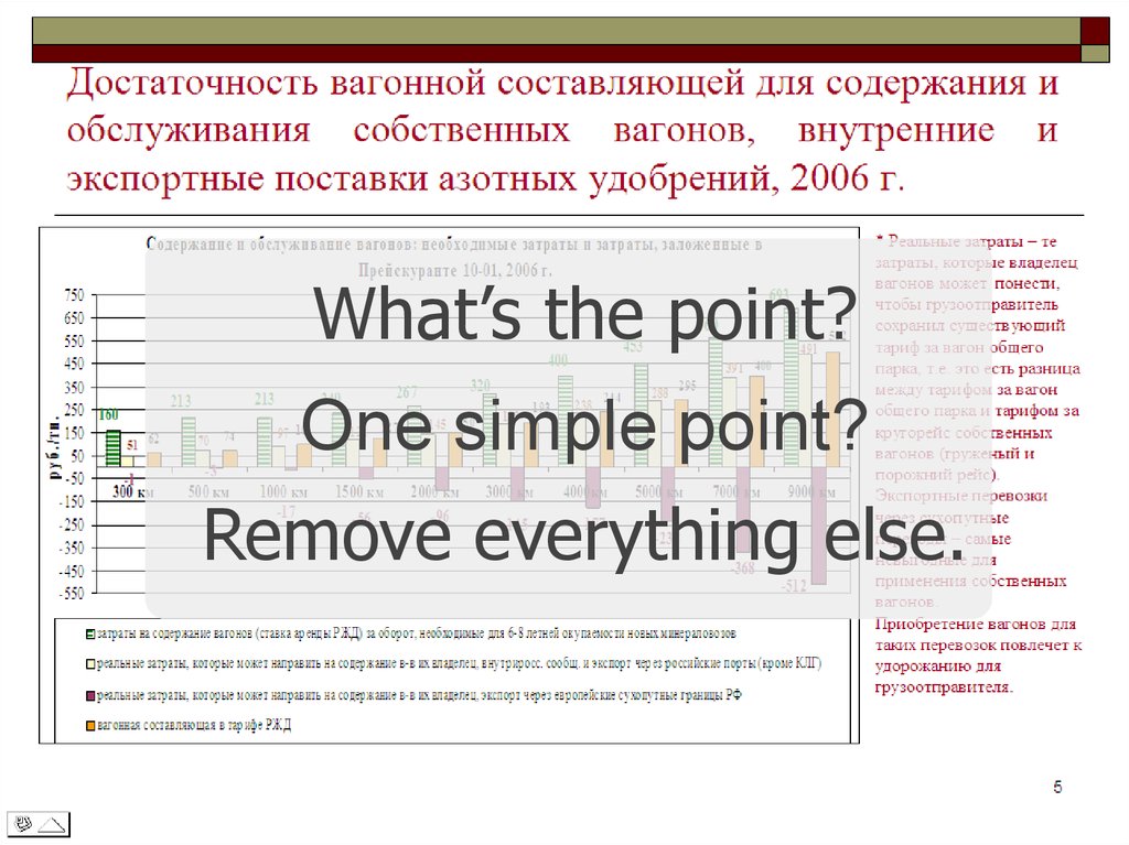
What’s the point?One simple point?
Remove everything else.
43.
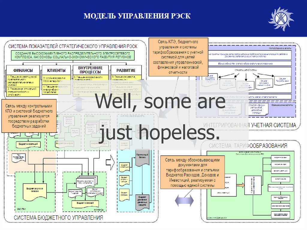
Well, some arejust hopeless.
44.
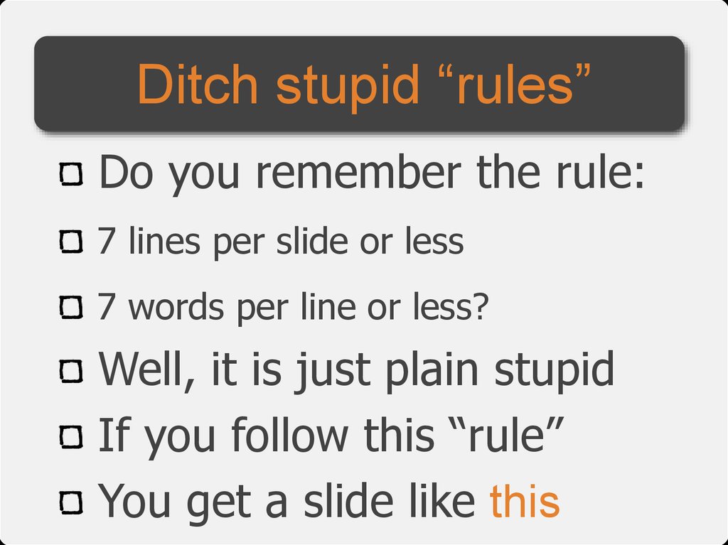
Ditch stupid “rules”Do you remember the rule:
7 lines per slide or less
7 words per line or less?
Well, it is just plain stupid
If you follow this “rule”
You get a slide like this
45.
Ditch stupid “rules”Do you remember the rule:
7 lines per slide or less
7 words per line or less?
Well, it is just plain stupid
If you follow this “rule”
You get a slide like this
46.
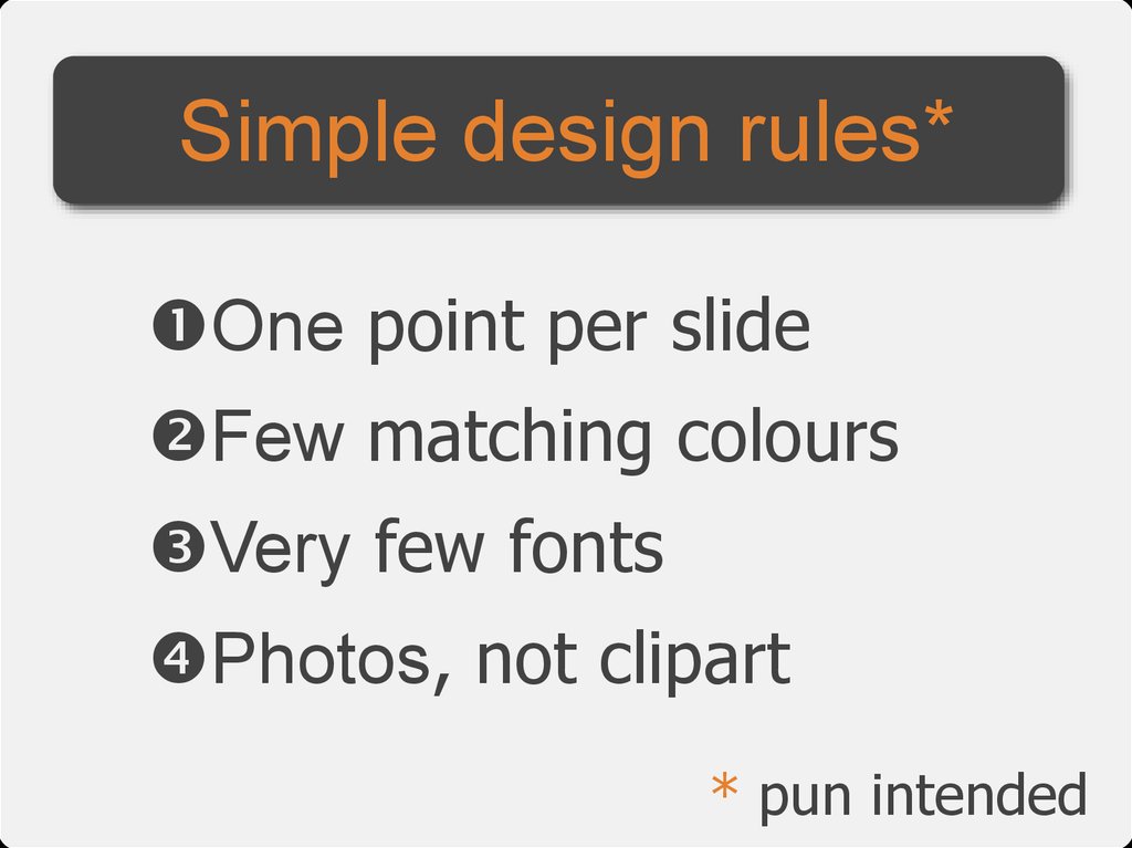
Simple design rules*One point per slide
Few matching colours
Very few fonts
Photos, not clipart
* pun intended
47.
Less text.More imagery.
Wild imagery.
48.
But what if I need tosend or print the slides?
49.
Write a document50.
The LargestLeasing Companies
•Hansa Leasing
•РГ Лизинг
•Авангард-Лизинг
•Raiffeisen Leasing
•ММБ-Лизинг
Make 2 sets of slides
51.
Print with notes52.
Inform with little text** yes you can
53.
Rehearsal54.
It will never work completelyfor the first time. Trust me.
55.
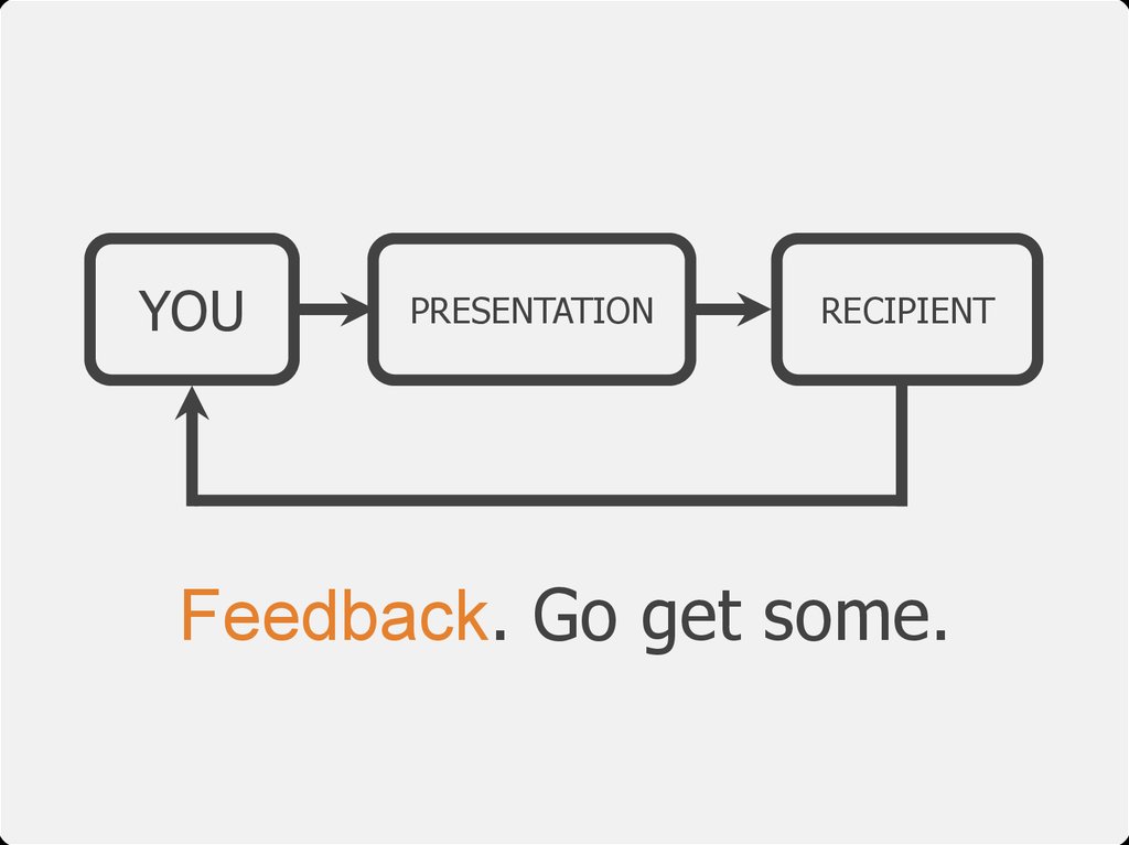
YOUPRESENTATION
RECIPIENT
Feedback. Go get some.
56.
No audience? Present to thefurniture. But aloud. Try it.
57.
Check the roomand equipment.
58.
Presentation checklist59.
All this leads to...60.
Wow** great presentations
61.
Alexei KapterevOffshore presentation
design & consulting
kapterev@gmail.com
www.kapterev.com


















 informatics


