Similar presentations:
Brand book by tailor brands
1.
IDENTITY & LOGOUSAGE GUIDELINES
Created by
2.
GUIDELINESTable Of Contents.
SECTION 1
I LOGOTYPE
3
SECTION 2 I BRAND FONTS
7
SECTION 3 I COLOR SYSTEM
11
SECTION 4 I LOGO USE
13
SECTION 5 I LOGO FORMATS
16
SECTION 6 I RESIZING
17
SECTION 7 I BRAND ASSETS
18
SECTION 8 I MOCK UPS
19
Created by
3.
01LOGOTYPE
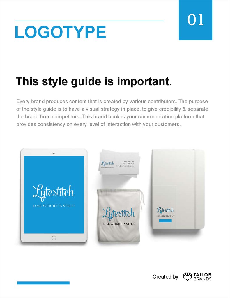
This style guide is important.
Every brand produces content that is created by various contributors. The purpose
of the style guide is to have a visual strategy in place, to give credibility & separate
the brand from competitors. This brand book is your communication platform that
provides consistency on every level of interaction with your customers.
JOHN SMITH
347-234-234
info@johnsmith.com
Created by
4.
01LOGOTYPE
Clearspace & Computation.
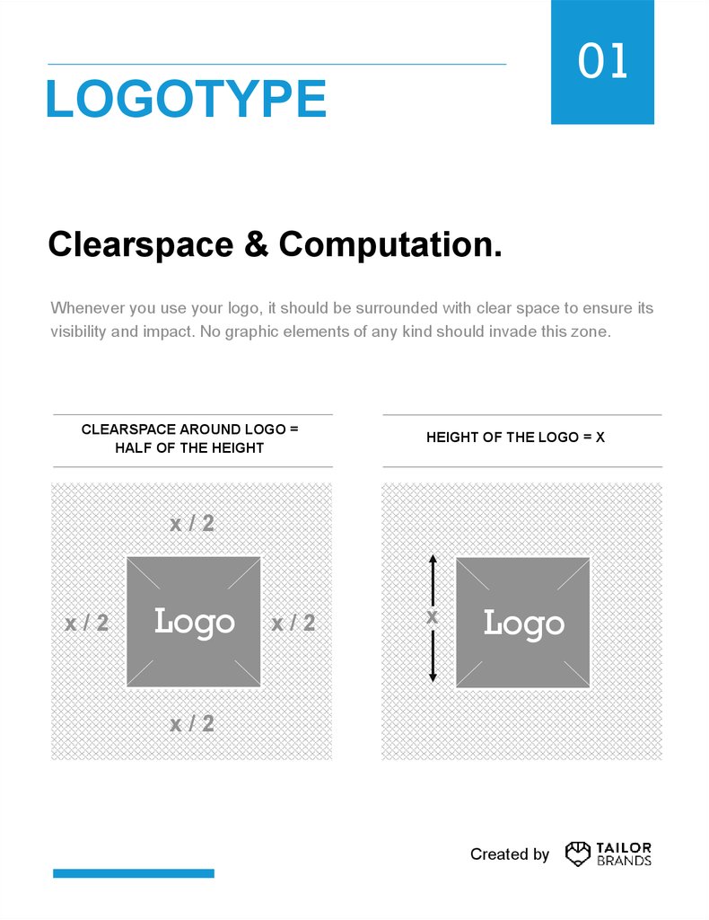
Whenever you use your logo, it should be surrounded with clear space to ensure its
visibility and impact. No graphic elements of any kind should invade this zone.
CLEARSPACE AROUND LOGO =
HALF OF THE HEIGHT
HEIGHT OF THE LOGO = X
x/2
x/2
Logo
x/2
x
Logo
x/2
Created by
5.
01LOGOTYPE
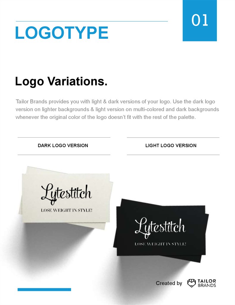
Logo Variations.
Tailor Brands provides you with light & dark versions of your logo. Use the dark logo
version on lighter backgrounds & light version on multi-colored and dark backgrounds
whenever the original color of the logo doesn’t fit with the rest of the palette.
DARK LOGO VERSION
LIGHT LOGO VERSION
Created by
6.
01LOGOTYPE
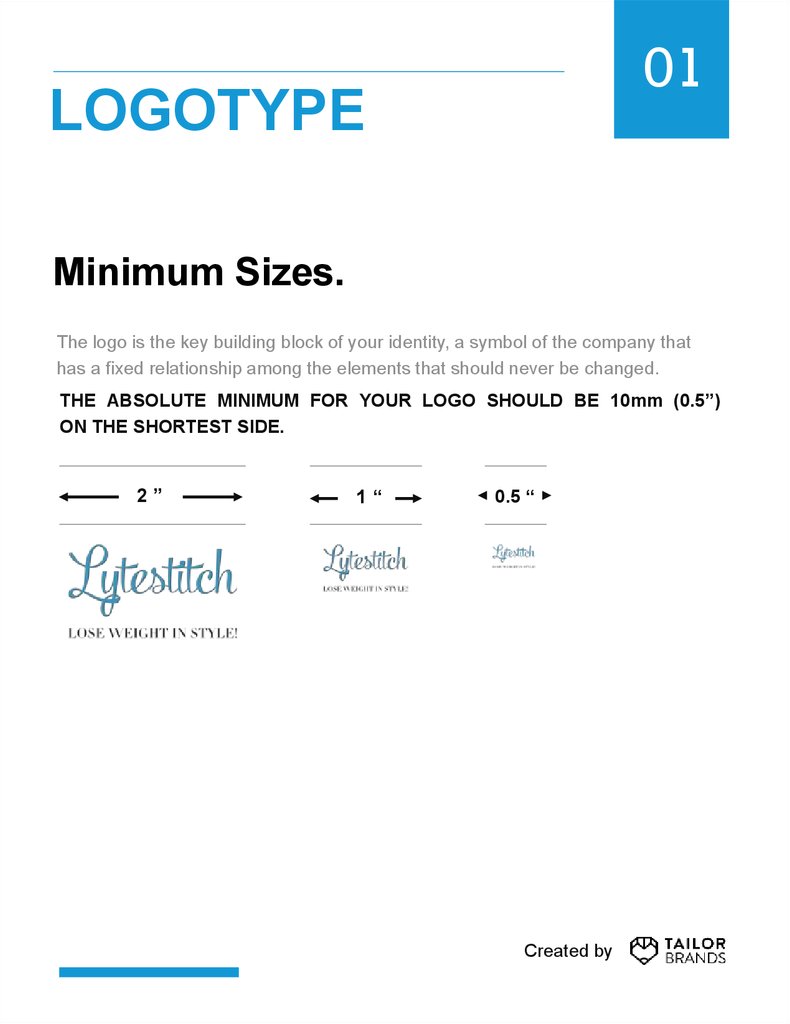
Minimum Sizes.
The logo is the key building block of your identity, a symbol of the company that
has a fixed relationship among the elements that should never be changed.
THE ABSOLUTE MINIMUM FOR YOUR LOGO SHOULD BE 10mm (0.5”)
ON THE SHORTEST SIDE.
2”
1“
0.5 “
Created by
7.
02BRAND FONTS
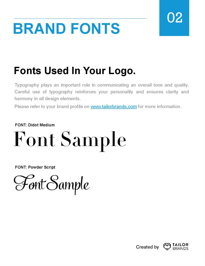
Fonts Used In Your Logo.
Typography plays an important role in communicating an overall tone and quality.
Careful use of typography reinforces your personality and ensures clarity and
harmony in all design elements.
Please refer to your brand profile on www.tailorbrands.com for more information.
FONT: Didot Medium
FONT: Powder Script
Created by
8.
02BRAND FONTS
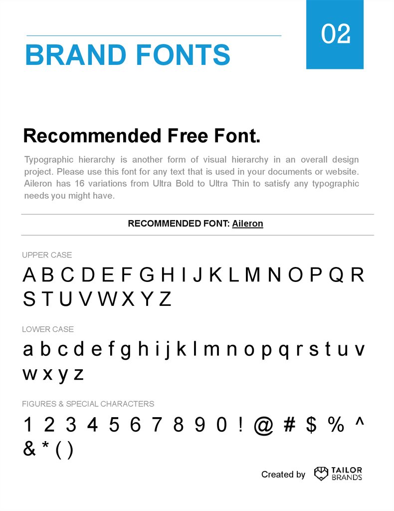
Recommended Free Font.
Typographic hierarchy is another form of visual hierarchy in an overall design
project. Please use this font for any text that is used in your documents or website.
Aileron has 16 variations from Ultra Bold to Ultra Thin to satisfy any typographic
needs you might have.
RECOMMENDED FONT: Aileron
UPPER CASE
ABCDEFGHIJKLMNOPQR
STUVWXYZ
LOWER CASE
abcdefghijklmnopqrstuv
wxyz
FIGURES & SPECIAL CHARACTERS
1 2 3 4 5 6 7 8 9 0 ! @ # $ % ^
&*()
Created by
9.
COLOR SYSTEM03
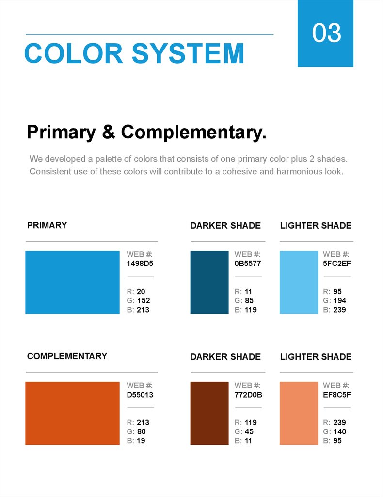
Primary & Complementary.
We developed a palette of colors that consists of one primary color plus 2 shades.
Consistent use of these colors will contribute to a cohesive and harmonious look.
PRIMARY
DARKER SHADE
LIGHTER SHADE
WEB #:
1498D5
WEB #:
0B5577
WEB #:
5FC2EF
R: 20
G: 152
B: 213
R: 11
G: 85
B: 119
R: 95
G: 194
B: 239
COMPLEMENTARY
DARKER SHADE
LIGHTER SHADE
WEB #:
D55013
WEB #:
772D0B
WEB #:
EF8C5F
R: 213
G: 80
B: 19
R: 119
G: 45
B: 11
R: 239
G: 140
B: 95
10.
COLOR SYSTEM03
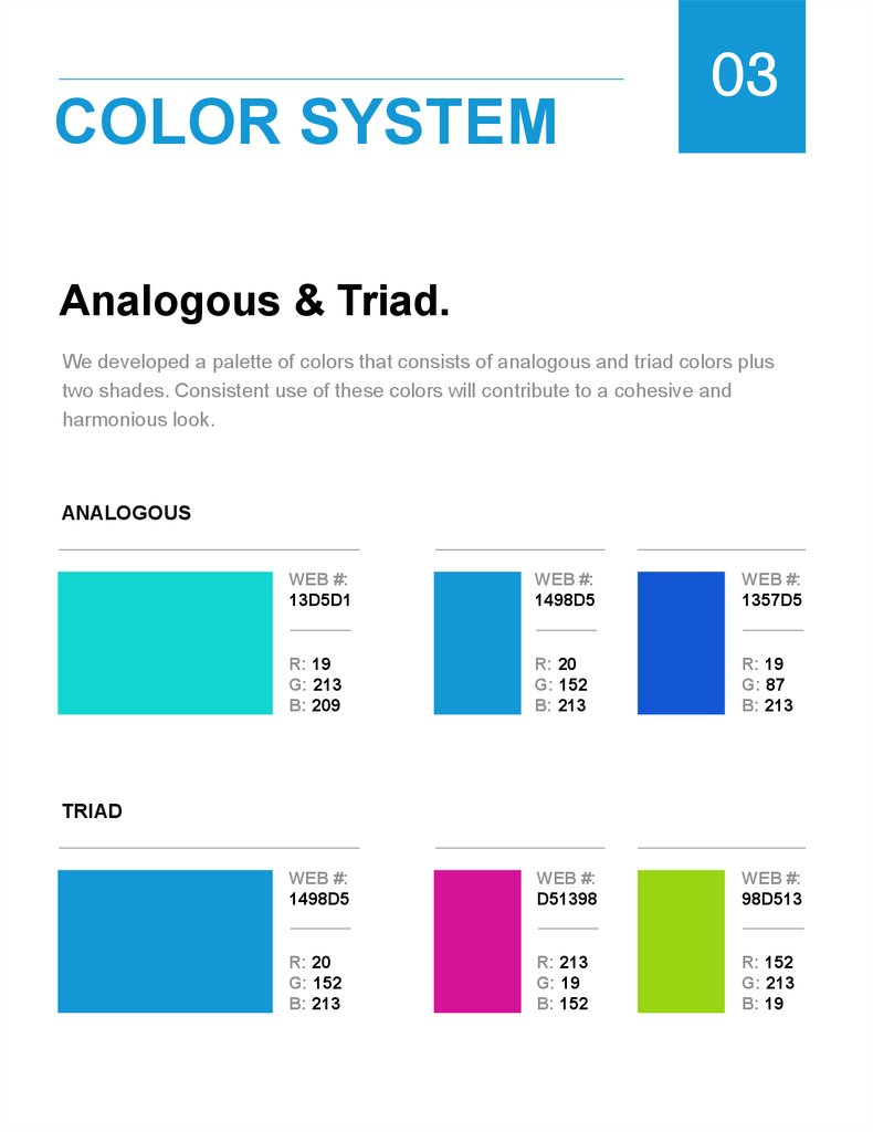
Analogous & Triad.
We developed a palette of colors that consists of analogous and triad colors plus
two shades. Consistent use of these colors will contribute to a cohesive and
harmonious look.
ANALOGOUS
WEB #:
13D5D1
WEB #:
1498D5
WEB #:
1357D5
R: 19
G: 213
B: 209
R: 20
G: 152
B: 213
R: 19
G: 87
B: 213
WEB #:
1498D5
WEB #:
D51398
WEB #:
98D513
R: 20
G: 152
B: 213
R: 213
G: 19
B: 152
R: 152
G: 213
B: 19
TRIAD
11.
04LOGO USE
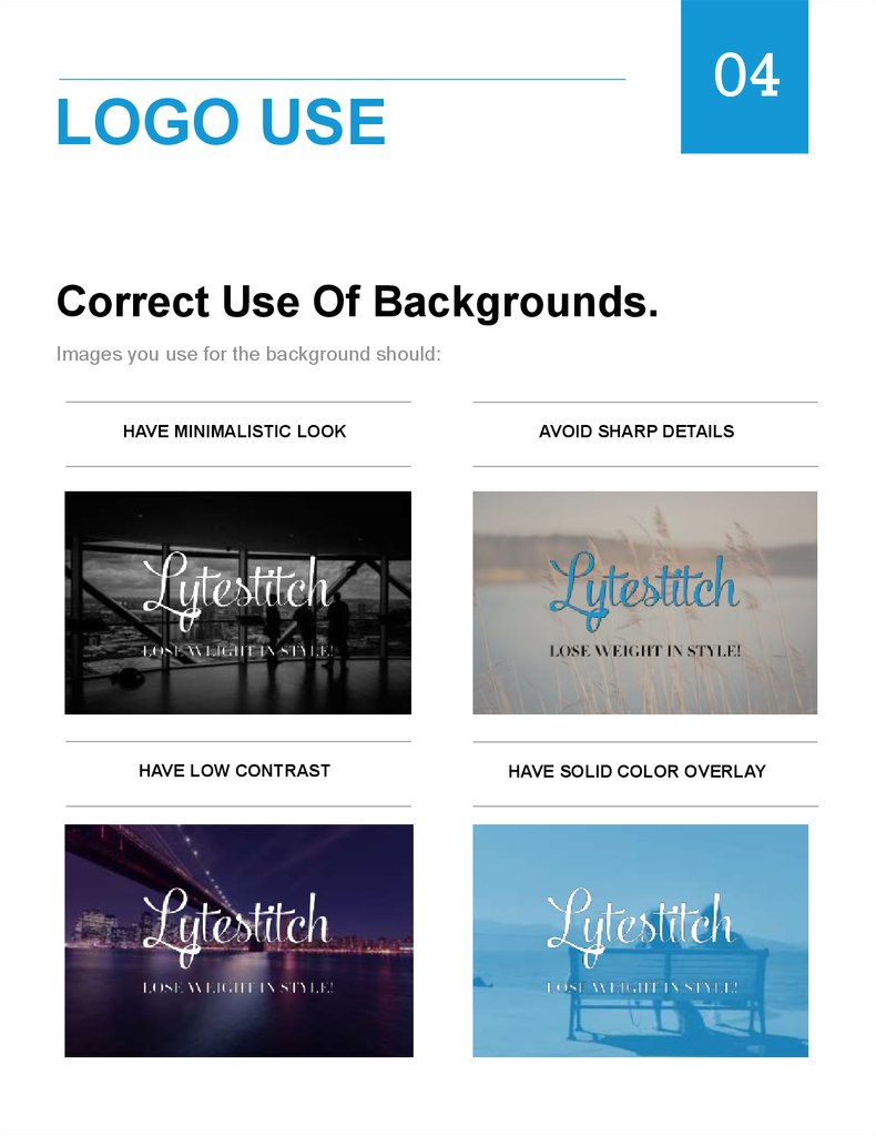
Correct Use Of Backgrounds.
Images you use for the background should:
HAVE MINIMALISTIC LOOK
AVOID SHARP DETAILS
HAVE LOW CONTRAST
HAVE SOLID COLOR OVERLAY
12.
04LOGO USE
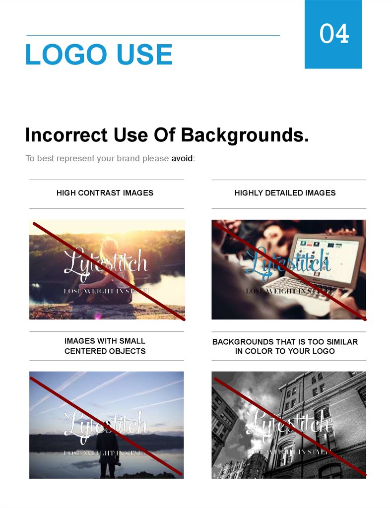
Incorrect Use Of Backgrounds.
To best represent your brand please avoid:
HIGH CONTRAST IMAGES
HIGHLY DETAILED IMAGES
IMAGES WITH SMALL
CENTERED OBJECTS
BACKGROUNDS THAT IS TOO SIMILAR
IN COLOR TO YOUR LOGO
13.
04LOGO USE
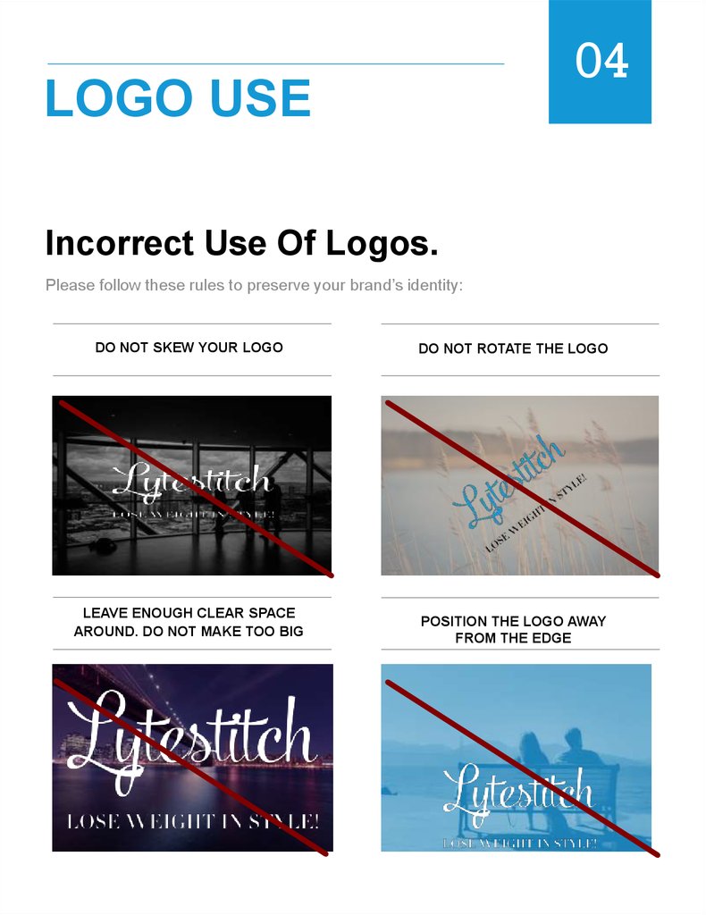
Incorrect Use Of Logos.
Please follow these rules to preserve your brand’s identity:
DO NOT SKEW YOUR LOGO
DO NOT ROTATE THE LOGO
LEAVE ENOUGH CLEAR SPACE
AROUND. DO NOT MAKE TOO BIG
POSITION THE LOGO AWAY
FROM THE EDGE
14.
05LOGO FORMATS
PNG & EPS Formats.
Depending on the nature of the project, you might require a different format of the
logo to fit the job.
PNG file has a transparent background and is a high resolution raster file suitable
best for web and small scale printing. Each Tailor Brands logo package comes with
the original logo + dark & white versions of it.
Best for web & small scale printing.
Has a transparent background & can be placed over a colored background.
EPS is a vector file of a graphic, text or illustration. Because it’s a vector, it can be
easily resized. An EPS file can be reopened and edited in a vector editing software
such as Adobe Illustrator, Sketch or Photoshop.
Best for print.
Editable with a proper software.
Created by
15.
RESIZING06
How To Resize Your Logo.
PNG
Since PNG file is a raster file, resizing small or tiny elements of your logo may result
in blurriness. If resizing your PNG is resulting in a visible loss of clarity, please resize
the EPS format and then export it to PNG.
EPS
EPS is a vector file that can be resized and scaled up and down without a loss of
quality and clarity. If you wish to print on very large or very small surfaces please use
EPS file. EPS format could be saved as PDF, PNG or JPG formats in programs such
as Photoshop, Illustrator or Sketch.
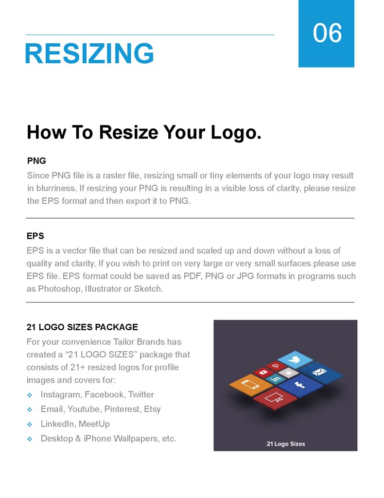
21 LOGO SIZES PACKAGE
For your convenience Tailor Brands has
created a “21 LOGO SIZES” package that
consists of 21+ resized logos for profile
images and covers for:
Instagram, Facebook, Twitter
Email, Youtube, Pinterest, Etsy
LinkedIn, MeetUp
Desktop & iPhone Wallpapers, etc.
16.
BRAND ASSETS07
Accessing Brand Assets.
BRAND PROFILE
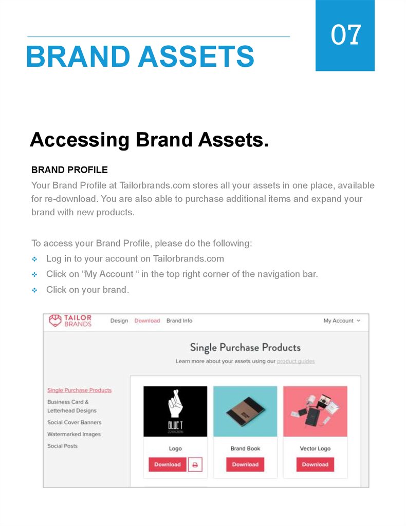
Your Brand Profile at Tailorbrands.com stores all your assets in one place, available
for re-download. You are also able to purchase additional items and expand your
brand with new products.
To access your Brand Profile, please do the following:
Log in to your account on Tailorbrands.com
Click on “My Account “ in the top right corner of the navigation bar.
Click on your brand.
17.
MOCK UPS08
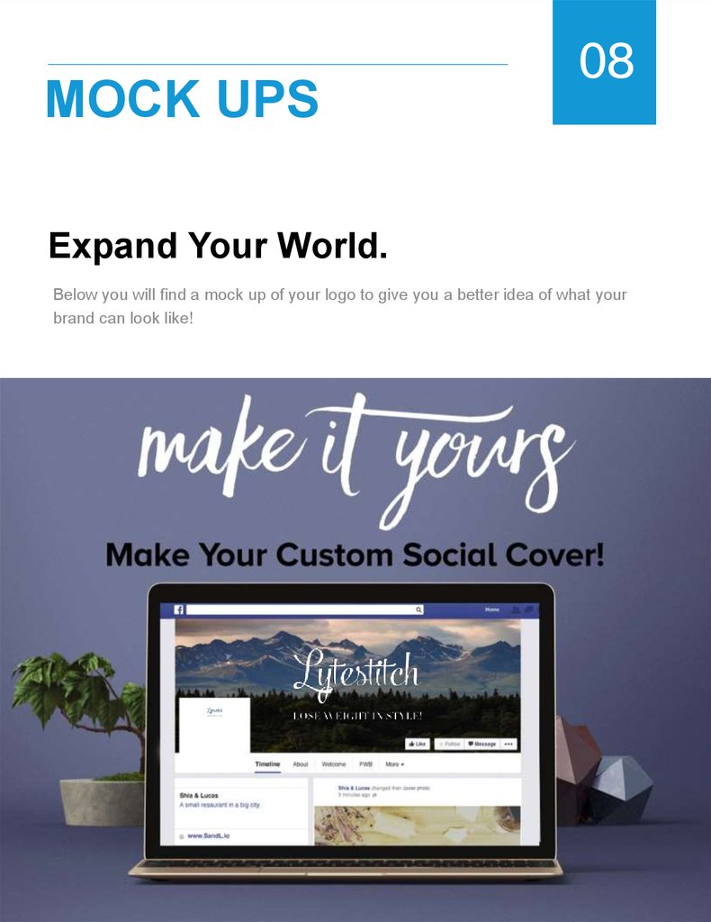
Expand Your World.
Below you will find a mock up of your logo to give you a better idea of what your
brand can look like!
 marketing


