Similar presentations:
Landing page corrections
1.
SSD SIS2024
2.
Topics for discussion:Landing page corrections
Adapting landing page to mobile
Mobile Visibility vs Desktop
Anticipated launch
3.
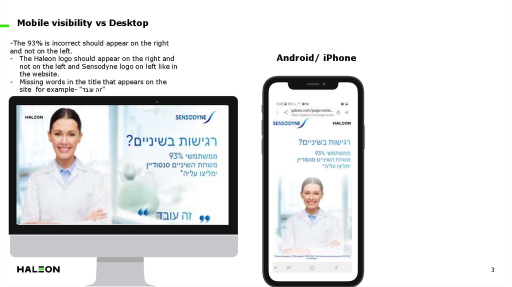
Mobile visibility vs Desktop-The 93% is incorrect should appear on the right
and not on the left.
- The Haleon logo should appear on the right and
not on the left and Sensodyne logo on left like in
the website.
- Missing words in the title that appears on the
site for example- ""זה עובד
Android/ iPhone
3
4.
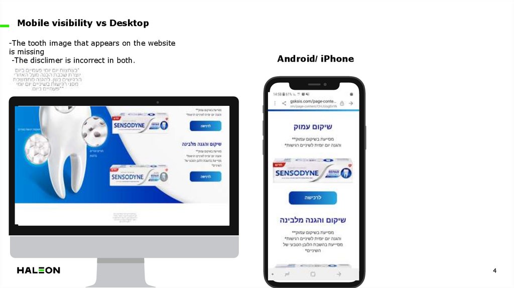
Mobile visibility vs Desktop-The tooth image that appears on the website
is missing
-The disclimer is incorrect in both.
Android/ iPhone
4
5.
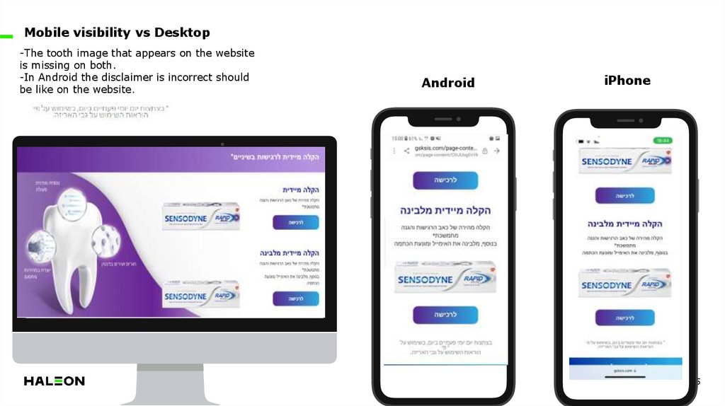
Mobile visibility vs Desktop-The tooth image that appears on the website
is missing on both.
-In Android the disclaimer is incorrect should
be like on the website.
Android
iPhone
5
6.
Mobile visibility vs DesktopThe title doesn't need to appear in three lines
on Android.
Android
iPhone
6
7.
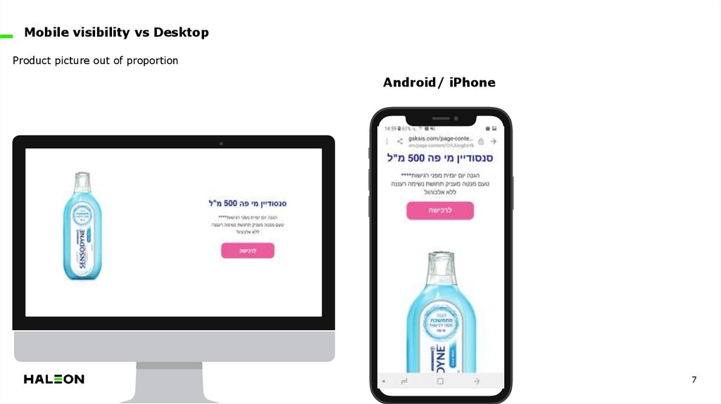
Mobile visibility vs DesktopProduct picture out of proportion
Android/ iPhone
7
8.
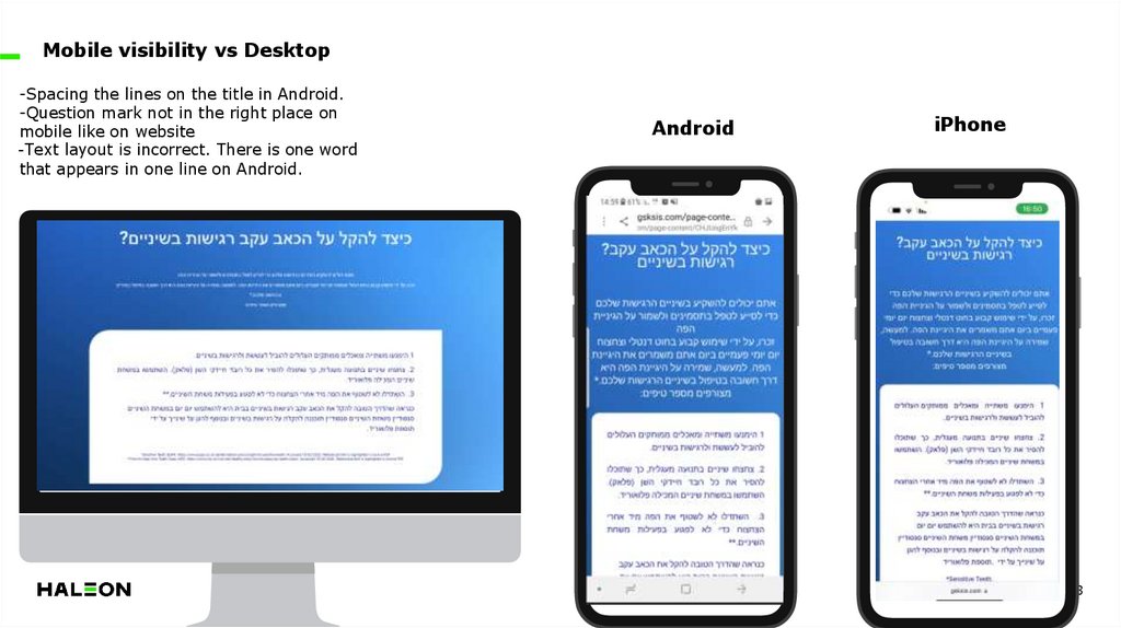
Mobile visibility vs Desktop-Spacing the lines on the title in Android.
-Question mark not in the right place on
mobile like on website
-Text layout is incorrect. There is one word
that appears in one line on Android.
Android
iPhone
8
9.
Summary:Should be Compatibility between the site and the
mobile. In content and pictures.
Disclaimer should be like on the website with the
asterisks on the right and starting with the correct line.
Make sure that visibility and content appear exactly
like on the website on both Android and iPhone.

 medicine


