Similar presentations:
Displaying data – shape of distributions. Week 3 (1)
1. BBA182 Applied Statistics Week 3 (1) Displaying data – shape of distributions
DR SUSANNE HANSEN SARALEMAIL: SUSANNE.SARAL@OKAN.EDU.TR
HT TPS://PIAZZA.COM/CLASS/IXRJ5MMOX1U2T8?CID=4#
WWW.KHANACADEMY.ORG
DR SUSANNE HANSEN SARAL
1
2. Histogram of employee completion times Numerical data
Interval (sec.) Frequency230
5
240
8
250
13
260
22
270
32
280
13
290
10
300
7
DR SUSANNE HANSEN SARAL, SUSANNE.SARAL@GMAIL.COM
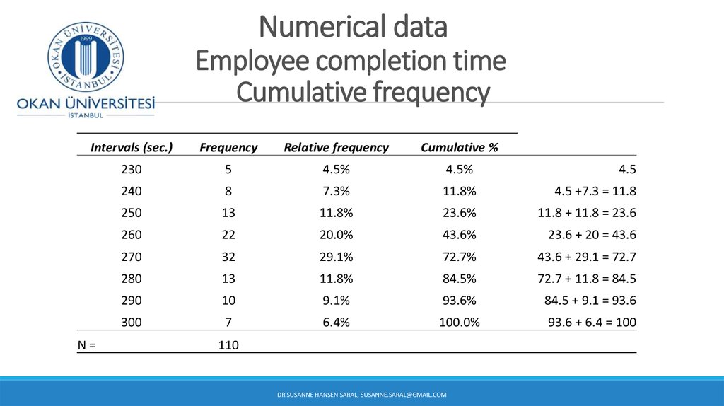
3. Numerical data Employee completion time Cumulative frequency
Intervals (sec.)Frequency
Relative frequency
Cumulative %
230
5
4.5%
4.5%
4.5
240
8
7.3%
11.8%
4.5 +7.3 = 11.8
250
13
11.8%
23.6%
11.8 + 11.8 = 23.6
260
22
20.0%
43.6%
23.6 + 20 = 43.6
270
32
29.1%
72.7%
43.6 + 29.1 = 72.7
280
13
11.8%
84.5%
72.7 + 11.8 = 84.5
290
10
9.1%
93.6%
84.5 + 9.1 = 93.6
300
7
6.4%
100.0%
93.6 + 6.4 = 100
N=
110
DR SUSANNE HANSEN SARAL, SUSANNE.SARAL@GMAIL.COM
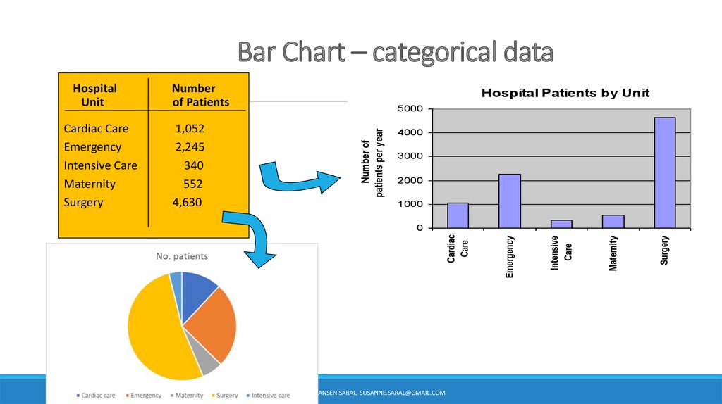
4. Bar Chart – categorical data
50004000
3000
2000
1000
DR SUSANNE HANSEN SARAL, SUSANNE.SARAL@GMAIL.COM
Surgery
Maternity
Intensive
Care
0
Emergency
1,052
2,245
340
552
4,630
Hospital Patients by Unit
Cardiac
Care
Cardiac Care
Emergency
Intensive Care
Maternity
Surgery
Number
of Patients
Number of
patients per year
Hospital
Unit
5. Describing distributions
Once we have made a pictureof our numerical data, the
histogram, what can we say
about it’s shape?
DR SUSANNE HANSEN SARAL, SUSANNE.SARAL@GMAIL.COM
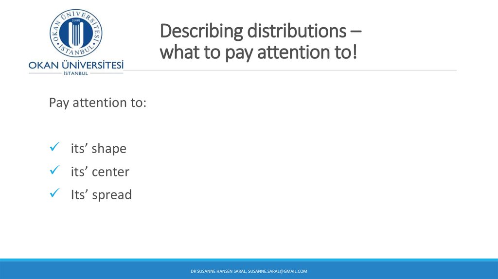
6. Describing distributions – what to pay attention to!
Pay attention to:its’ shape
its’ center
Its’ spread
DR SUSANNE HANSEN SARAL, SUSANNE.SARAL@GMAIL.COM
7. Describing the shape of distributions
We describe the shape of a distribution in terms of:Modes
Symmetry
Gaps or outlying values
DR SUSANNE HANSEN SARAL, SUSANNE.SARAL@GMAIL.COM
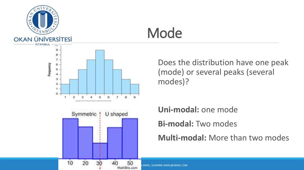
8. Mode
Does the distribution have one peak(mode) or several peaks (several
modes)?
Uni-modal: one mode
Bi-modal: Two modes
Multi-modal: More than two modes
DR SUSANNE HANSEN SARAL, SUSANNE.SARAL@GMAIL.COM
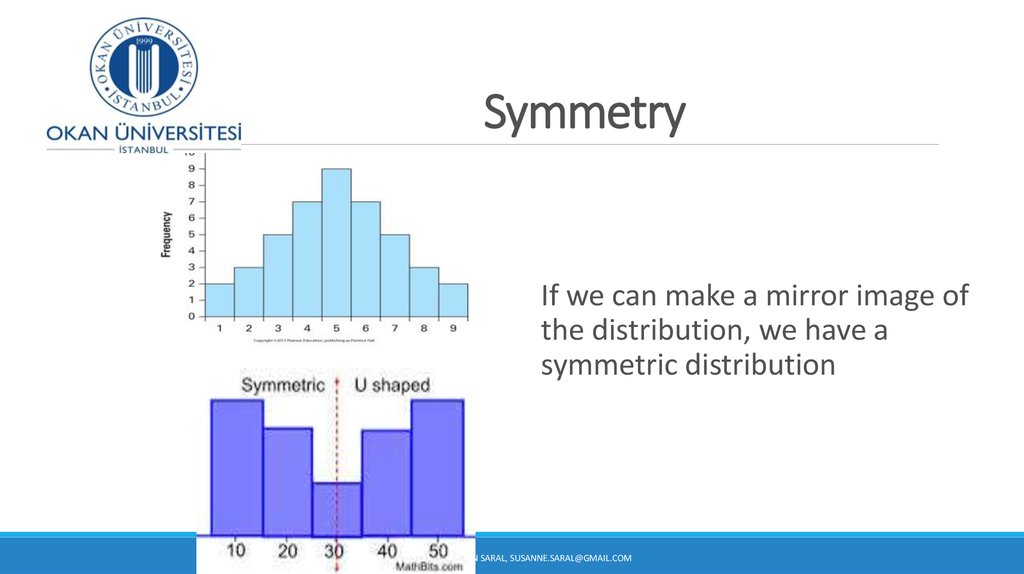
9. Symmetry
If we can make a mirror image ofthe distribution, we have a
symmetric distribution
DR SUSANNE HANSEN SARAL, SUSANNE.SARAL@GMAIL.COM
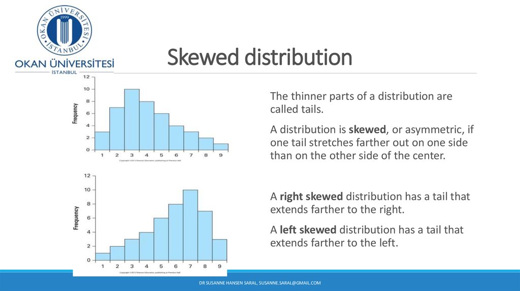
10. Skewed distribution
The thinner parts of a distribution arecalled tails.
A distribution is skewed, or asymmetric, if
one tail stretches farther out on one side
than on the other side of the center.
A right skewed distribution has a tail that
extends farther to the right.
A left skewed distribution has a tail that
extends farther to the left.
DR SUSANNE HANSEN SARAL, SUSANNE.SARAL@GMAIL.COM
11. Right skewed distributions Examples
Employee salaries in a companyWaiting times in a line
DR SUSANNE HANSEN SARAL, SUSANNE.SARAL@GMAIL.COM
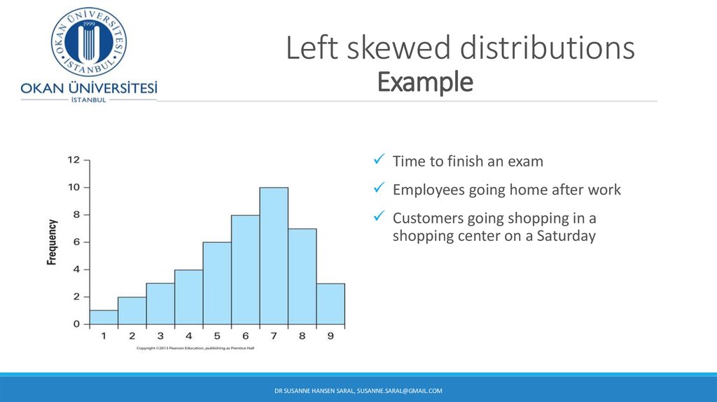
12. Left skewed distributions Example
Time to finish an examEmployees going home after work
Customers going shopping in a
shopping center on a Saturday
DR SUSANNE HANSEN SARAL, SUSANNE.SARAL@GMAIL.COM
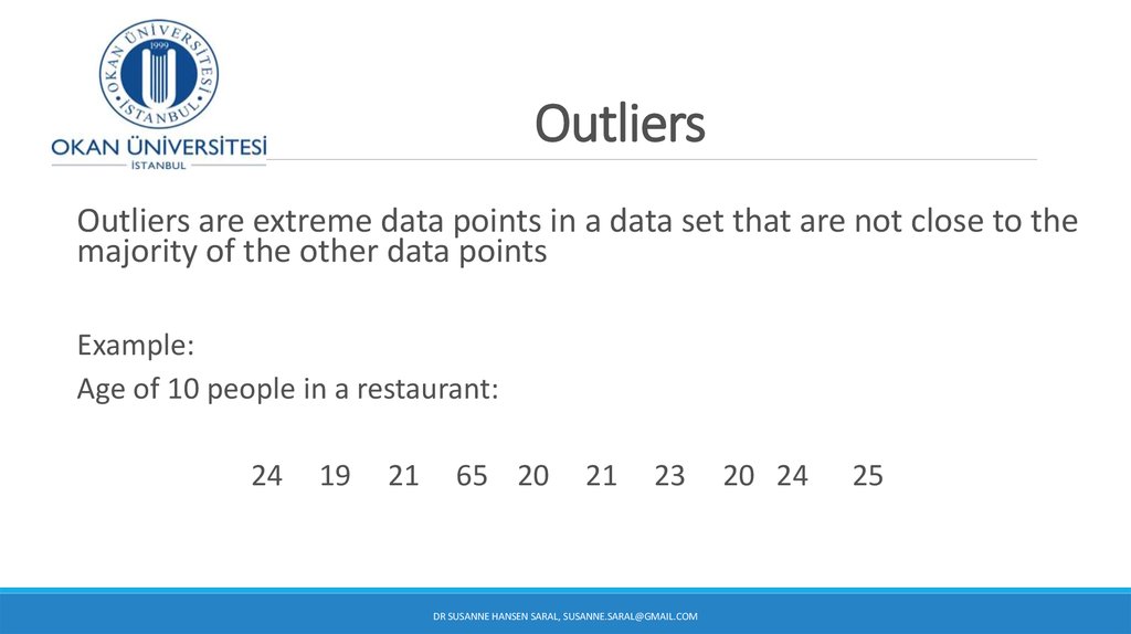
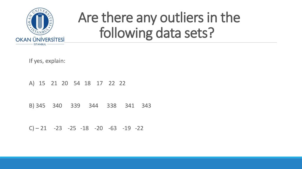
13. Outliers
Outliers are extreme data points in a data set that are not close to themajority of the other data points
Example:
Age of 10 people in a restaurant:
24
19
21
65 20
21
23
DR SUSANNE HANSEN SARAL, SUSANNE.SARAL@GMAIL.COM
20 24
25
14. Outliers
If you are studying the personal wealth of Americans in 2010 and youhave Bill Gates (Founder of Microsoft) in your sample.
How would the personal wealth of Bill Gates affect the distribution of
personal wealth of Americans in the sample?
DR SUSANNE HANSEN SARAL, SUSANNE.SARAL@GMAIL.COM
15. Outliers
Outliers will affect the shape of a distribution:DR SUSANNE HANSEN SARAL, SUSANNE.SARAL@GMAIL.COM
16. Outliers
Outliers can affect almost every statistical method we use in Statistics.Therefore we need to look out for them.
An outlier can be the most informative part in your data or it may just be an
error.
No matter what it is, you need to look at it critically and judge if it is important
for our analysis.
DR SUSANNE HANSEN SARAL, SUSANNE.SARAL@GMAIL.COM
17. Graphs to Describe Time-Series Data
A histogram can provide information about the distribution of a variable, butit cannot show any pattern of the data over time.
Sometimes we need to analyze data over time.
A graph of values against time is called a times series plot
DR SUSANNE HANSEN SARAL, SUSANNE.SARAL@GMAIL.COM
18. Graphs to Describe Time-Series Data
A time-series plot is used to show the values of a variable ordered over time.Time is measured on the horizontal axis
The variable of interest is measured on the vertical axis
Used to monitor the evolution of a certain item of interest, such as evolution of the price of
gas, annual interest rates, daily closing prices for shares of common stock, evolution of home
prices in a certain region, exchange rates (Euro-TL, TL-$), etc.
DR SUSANNE HANSEN SARAL, SUSANNE.SARAL@GMAIL.COM
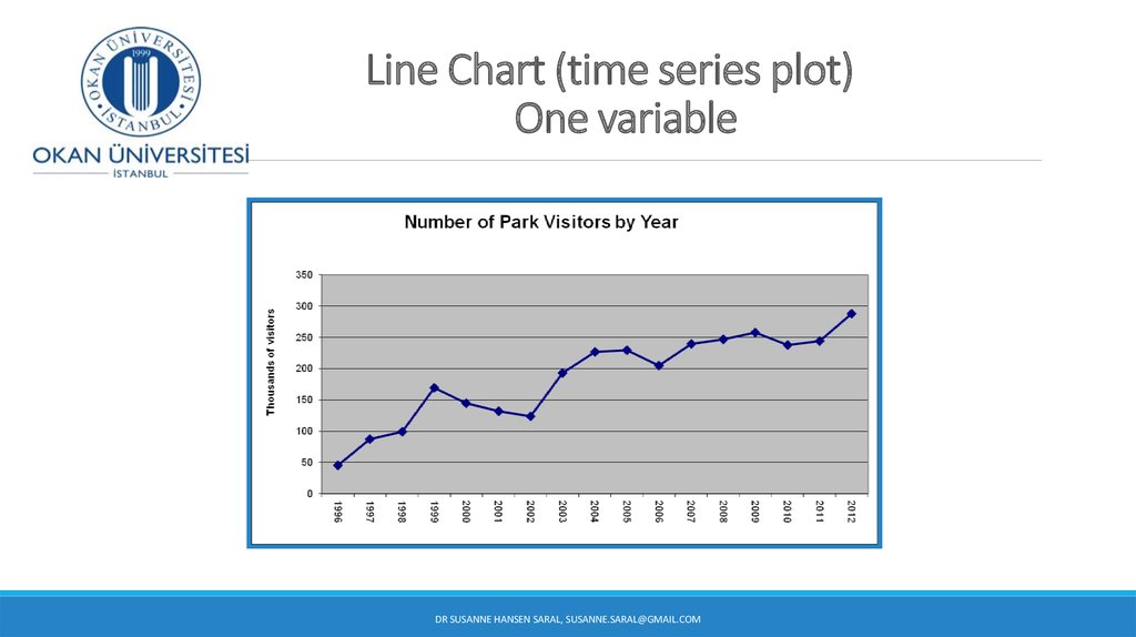
19. Line Chart (time series plot) One variable
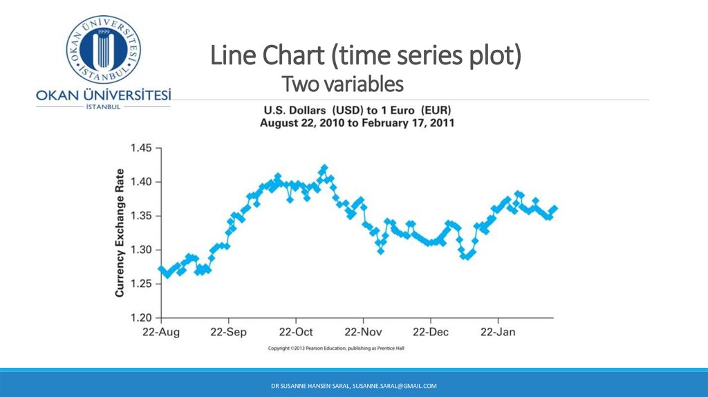
DR SUSANNE HANSEN SARAL, SUSANNE.SARAL@GMAIL.COM20. Line Chart (time series plot) Two variables
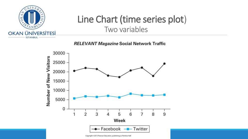
DR SUSANNE HANSEN SARAL, SUSANNE.SARAL@GMAIL.COM21. Line Chart (time series plot) Two variables
DR SUSANNE HANSEN SARAL, SUSANNE.SARAL@GMAIL.COM22. Presenting statistical charts and graphs
When presenting data for an audience or a manager your charts and graphsMUST give as clear and accurate picture of the data as possible.
The graphs and charts must be:
Convincing
Clear
Truthful
DR SUSANNE HANSEN SARAL
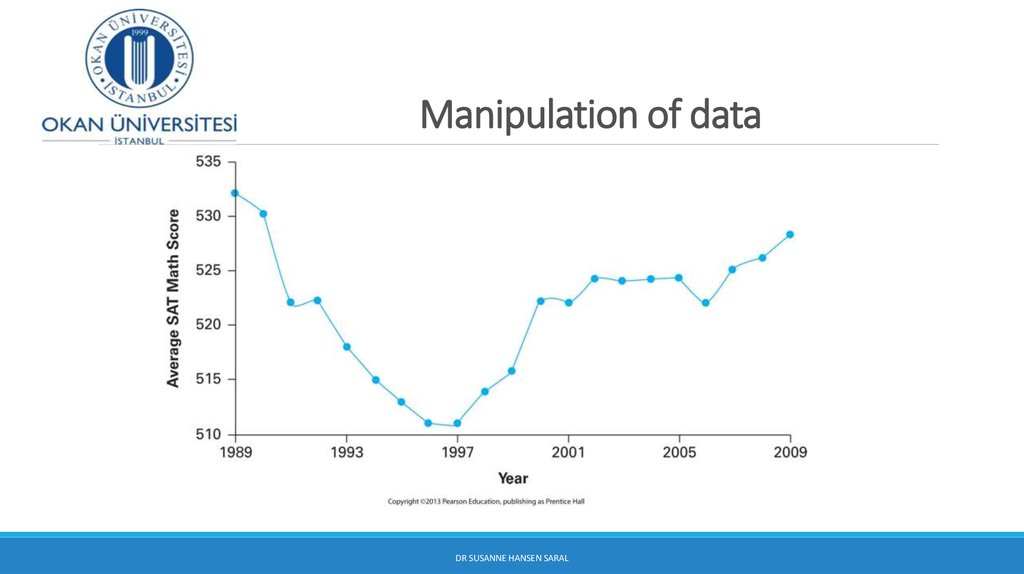
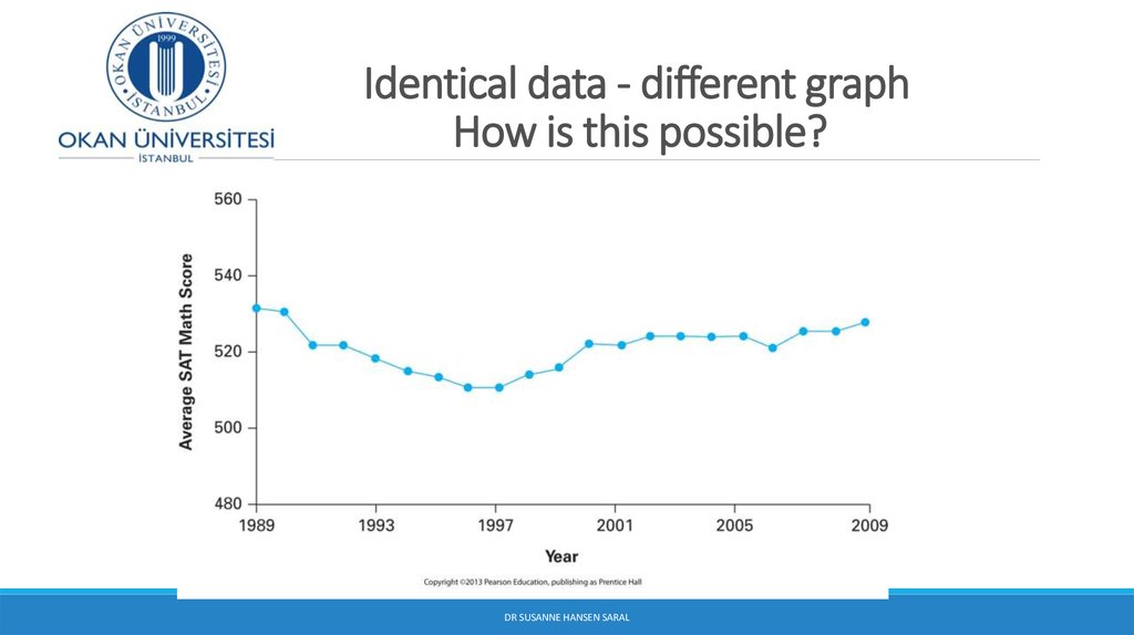
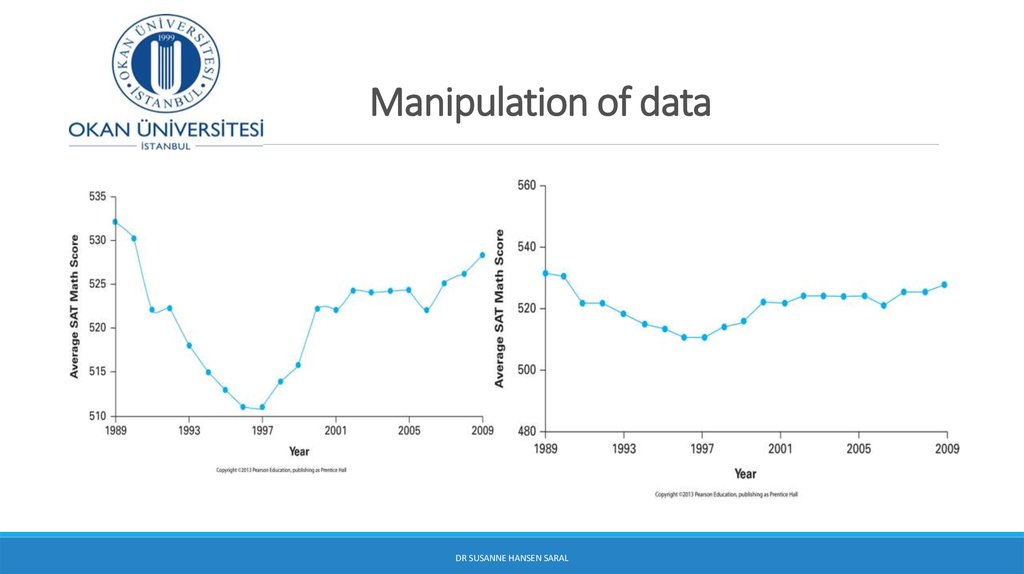
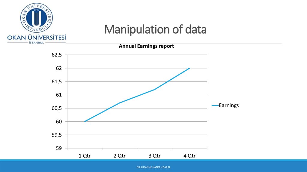
23. Manipulation of data
Data can be manipulated in graphical techniques in such a way that they lookmore/less favorable than they are in reality. This gives misleading information
about the data.
You need to be critical whenever you are presented a graph, pie-chart,
histogram, etc.
You should also be careful not to construct misleading information with
graphical techniques.
3/22/2017
24. Manipulation of data
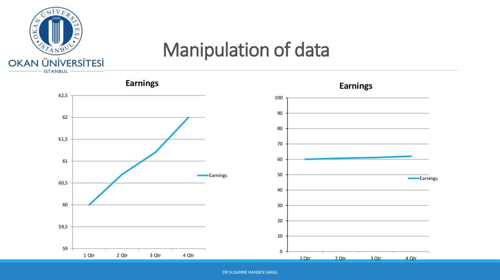
DR SUSANNE HANSEN SARAL25. Identical data - different graph How is this possible?
DR SUSANNE HANSEN SARAL26. Manipulation of data
DR SUSANNE HANSEN SARAL27. Manipulation of data
Annual Earnings report62,5
62
61,5
61
Earnings
60,5
60
59,5
59
1 Qtr
2 Qtr
3 Qtr
DR SUSANNE HANSEN SARAL
4 Qtr
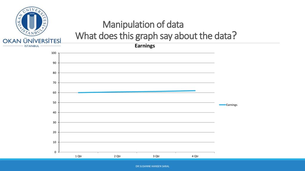
28. Manipulation of data What does this graph say about the data?
Earnings100
90
80
70
60
50
Earnings
40
30
20
10
0
1 Qtr
2 Qtr
3 Qtr
DR SUSANNE HANSEN SARAL
4 Qtr
29. Manipulation of data
EarningsEarnings
62,5
100
90
62
80
61,5
70
60
61
Earnings
50
Earnings
60,5
40
60
30
20
59,5
10
59
1 Qtr
2 Qtr
3 Qtr
0
4 Qtr
1 Qtr
DR SUSANNE HANSEN SARAL
2 Qtr
3 Qtr
4 Qtr
30. Histogram with equal interval width
31.
Data Presentation Errors(continued)
Do not make a histogram of categorical data
Unequal histogram interval widths
Label the x-axis and y-axis clearly (identify
variables clearly)
Compressing or distorting the vertical axis
Do not calculate numerical summaries of categorical data,
such as code, telephone numbers, etc.
DR SUSANNE HANSEN SARAL
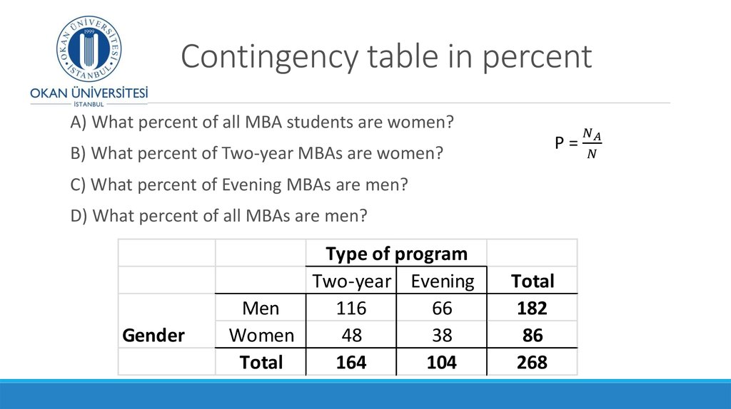
32. Contingency table Class exercise
A survey of the entering MBA students at a university in the US reported thefollowing data on the gender of their students in their two MBA programs:
What are the two variables under study?
Gender
Type of program
Two-year Evening
Men
116
66
Women
48
38
Total
164
104
Total
182
86
268
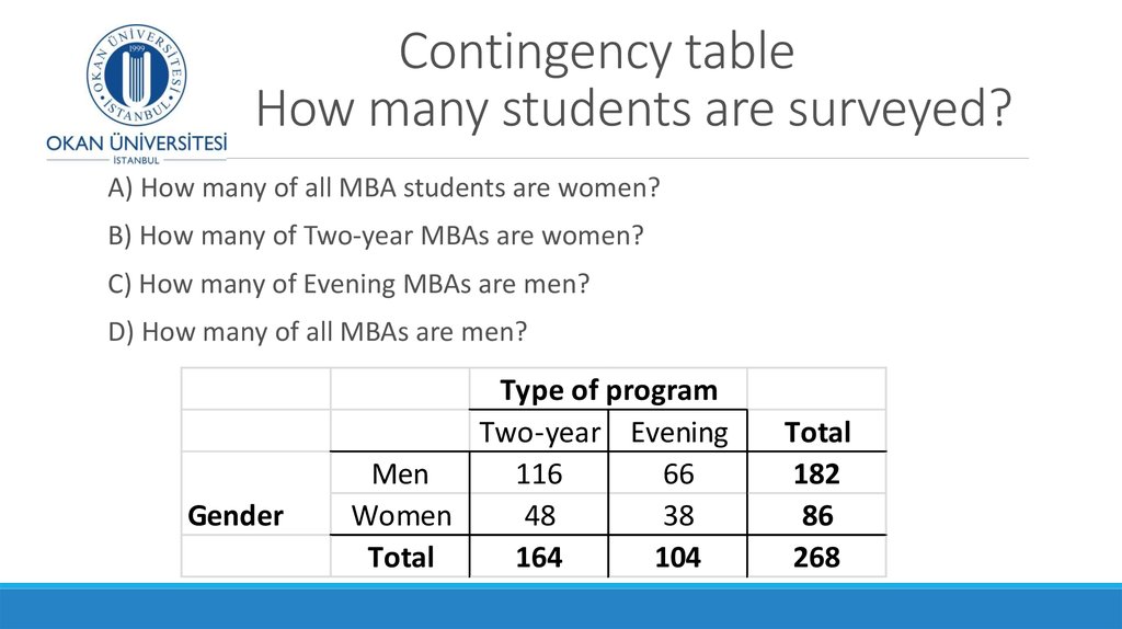
33. Contingency table How many students are surveyed?
A) How many of all MBA students are women?B) How many of Two-year MBAs are women?
C) How many of Evening MBAs are men?
D) How many of all MBAs are men?
Gender
Type of program
Two-year Evening
Men
116
66
Women
48
38
Total
164
104
Total
182
86
268
34. Contingency table How many students are surveyed?
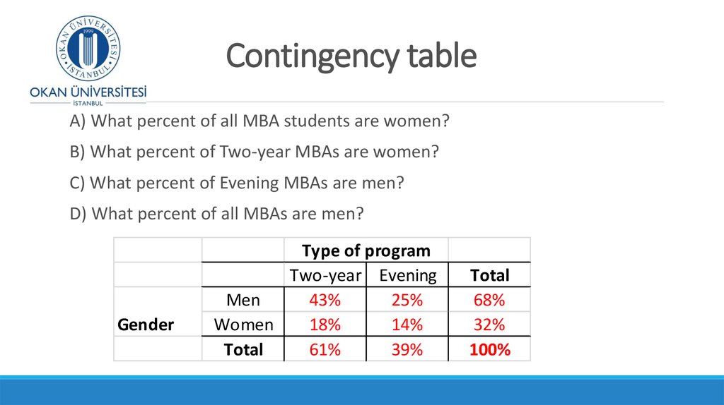
Calculating the percent/probability of absolute frequencies:P=











 mathematics


