Similar presentations:
Conceptual models & interface metaphors
1. Conceptual Models & Interface Metaphors
Conceptual Models &Interface Metaphors
Prof. James A. Landay
University of Washington
Autumn 2008
October 23, 2008
2. Interface Hall of Fame or Shame?
• Tabbed dialog for setting options in MS Web Studio– more tabs than space to display them
• Clicking on the right arrow once gives
CSE 440
User Interface Design, Prototyping, and Evaluation
2
3. Interface Hall of Shame!
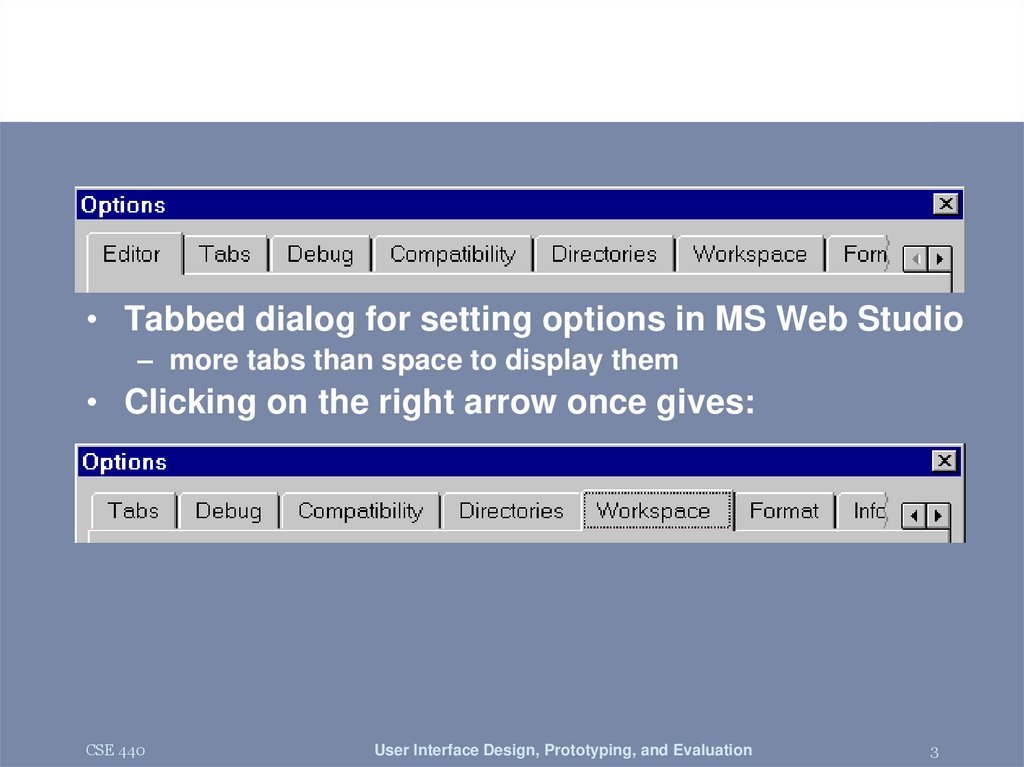
• Tabbed dialog for setting options in MS Web Studio– more tabs than space to display them
• Clicking on the right arrow once gives:
• Inconsistent display of possible tabs
– Where did the “Editor” tab go?
• Position of arrows awkward (split to each side?)
– also, small targets near each other (Fitts’ Law)
CSE 440
User Interface Design, Prototyping, and Evaluation
3
4. Conceptual Models & Interface Metaphors
Conceptual Models &Interface Metaphors
Prof. James A. Landay
University of Washington
Autumn 2008
October 23, 2008
5. Outline
• Review• Meetings
• Design of Everyday Things
• Conceptual models
• Interface metaphors
• Ubiquitous computing
CSE 440
User Interface Design, Prototyping, and Evaluation
5
6. Human Abilities Review
• Color can be helpful, but pay attention to ?– how colors combine
– limitations of human perception
– people with color deficiency
• Model Human Processor ?
– perceptual, motor, cognitive processors + memory
– model allows us to make predictions
• e.g., perceive distinct events in same cycle as one
• Memory ?
– three types: sensor, WM, & LTM
– interference can make hard to access LTM
– cues in WM can make it easier to access LTM
• Key time to remember?
– 100 ms (~processor cycle time & memory access)
• Fitts’ Law ?
– moving hand is a series of microcorrections predicted by D & S
• Tpos = a + b log2 (D/S + 1)
– time to move hand depends only on relative precision required
CSE 440
User Interface Design, Prototyping, and Evaluation
6
7. Design of Everyday Things
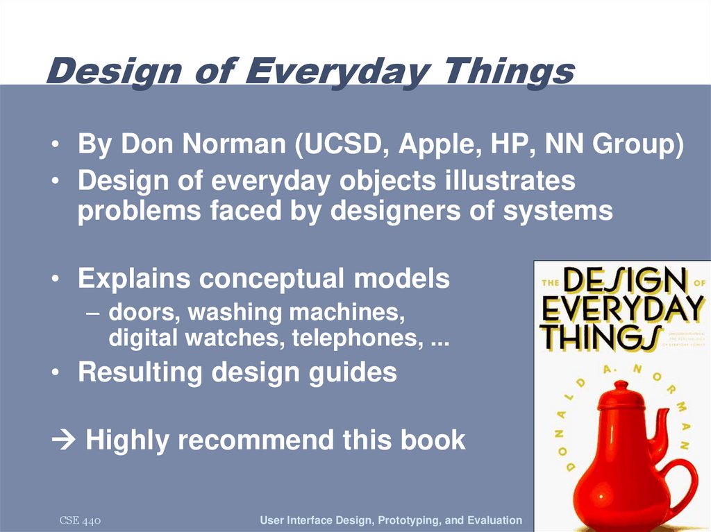
• By Don Norman (UCSD, Apple, HP, NN Group)• Design of everyday objects illustrates
problems faced by designers of systems
• Explains conceptual models
– doors, washing machines,
digital watches, telephones, ...
• Resulting design guides
Highly recommend this book
CSE 440
User Interface Design, Prototyping, and Evaluation
7
8. Conceptual Models
• Mental representation of how an artifactworks & how interface controls affect it
• People may have preconceived models that
are hard to change
– (4 + 5) vs. (4 5 +)
– dragging to trash?
• deletes file but ejects disk
• Interface must communicate model
– visually (& possibly physically or using sound)
– online help and documentation can help,
but shouldn’t be necessary
CSE 440
User Interface Design, Prototyping, and Evaluation
8
9. Affordances as Perceptual Clues
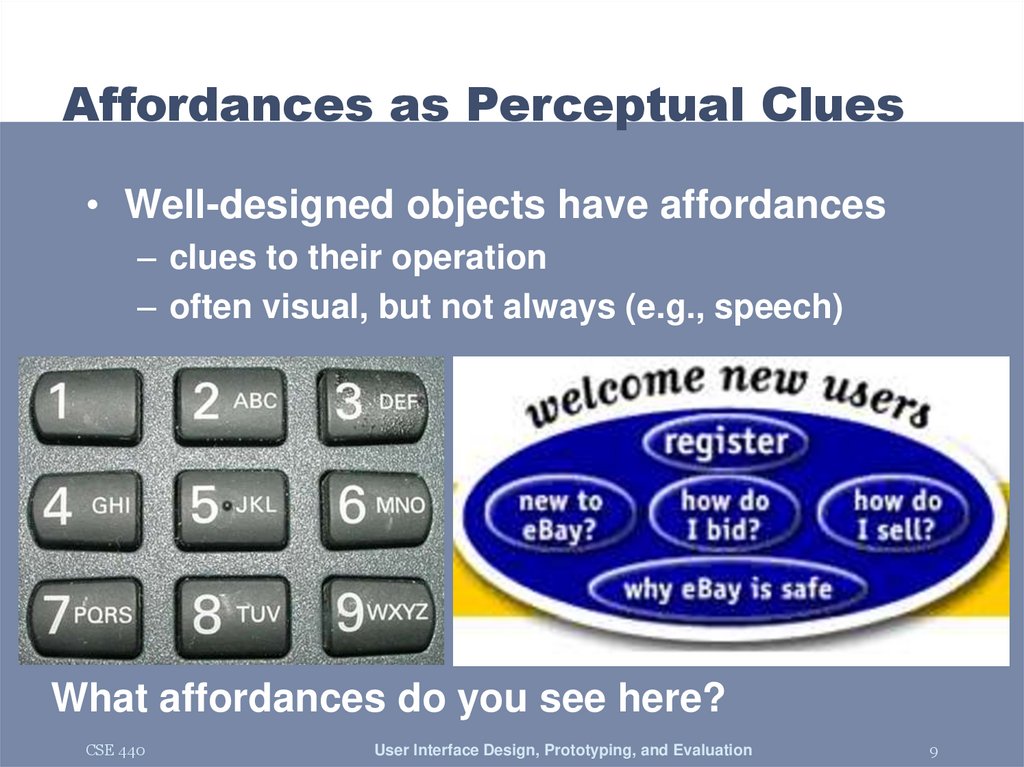
• Well-designed objects have affordances– clues to their operation
– often visual, but not always (e.g., speech)
What affordances do you see here?
CSE 440
User Interface Design, Prototyping, and Evaluation
9
10. Affordances as Perceptual Clues
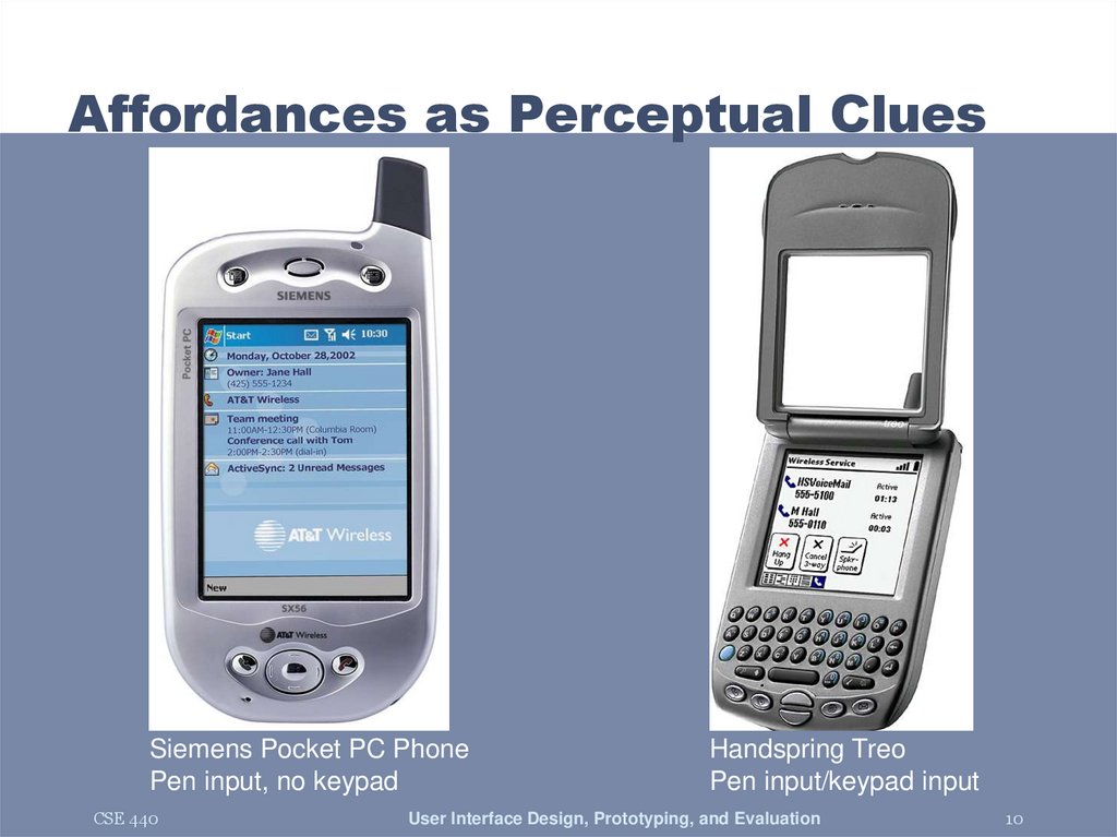
Siemens Pocket PC PhonePen input, no keypad
CSE 440
Handspring Treo
Pen input/keypad input
User Interface Design, Prototyping, and Evaluation
10
11. Affordances as Perceptual Clues
• Poorly-designed objects– no clues or misleading clues
French artist Jacques Carelman
Crazy design for a screw punch!
CSE 440
User Interface Design, Prototyping, and Evaluation
11
12. Refrigerator
freezerfresh food
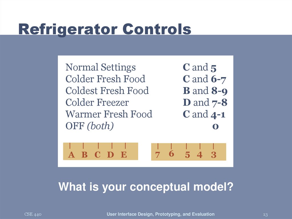
Problem: freezer too cold, but fresh food just right
CSE 440
User Interface Design, Prototyping, and Evaluation
12
13. Refrigerator Controls
Normal SettingsColder Fresh Food
Coldest Fresh Food
Colder Freezer
Warmer Fresh Food
OFF (both)
A B C D E
C and 5
C and 6-7
B and 8-9
D and 7-8
C and 4-1
0
7
6
5 4
3
What is your conceptual model?
CSE 440
User Interface Design, Prototyping, and Evaluation
13
14. A Common Conceptual Model
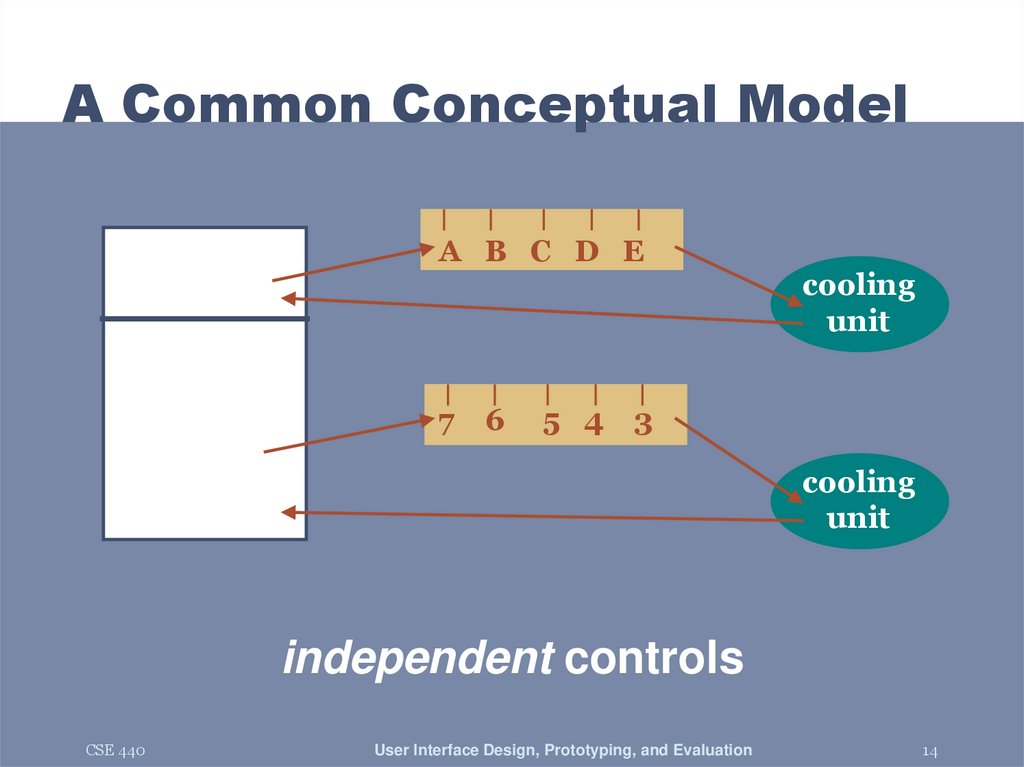
A B C D E7
6
5 4
cooling
unit
3
cooling
unit
independent controls
CSE 440
User Interface Design, Prototyping, and Evaluation
14
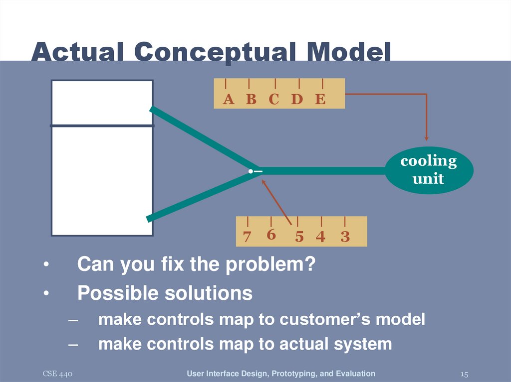
15. Actual Conceptual Model
A B C D Ecooling
unit
7
6
5 4
3
Can you fix the problem?
Possible solutions
–
–
CSE 440
make controls map to customer’s model
make controls map to actual system
User Interface Design, Prototyping, and Evaluation
15
16. Design Model & Customer Model
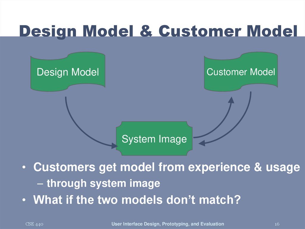
Design Model & Customer ModelDesign Model
Customer Model
System Image
• Customers get model from experience & usage
– through system image
• What if the two models don’t match?
CSE 440
User Interface Design, Prototyping, and Evaluation
16
17. Conceptual Model Mismatch
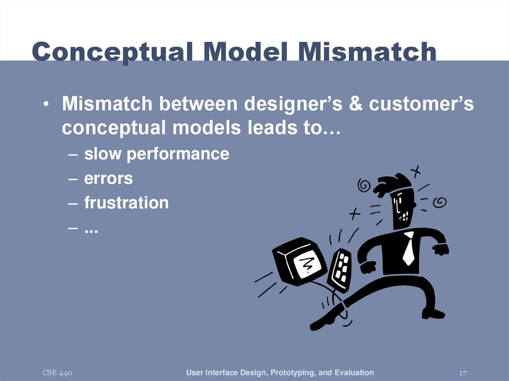
• Mismatch between designer’s & customer’sconceptual models leads to…
– slow performance
– errors
– frustration
– ...
CSE 440
User Interface Design, Prototyping, and Evaluation
17
18. Notorious Example
CSE 440User Interface Design, Prototyping, and Evaluation
18
19. Car Example
CSE 440User Interface Design, Prototyping, and Evaluation
19
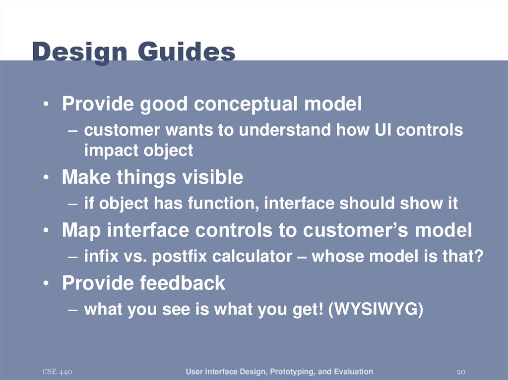
20. Design Guides
• Provide good conceptual model– customer wants to understand how UI controls
impact object
• Make things visible
– if object has function, interface should show it
• Map interface controls to customer’s model
– infix vs. postfix calculator – whose model is that?
• Provide feedback
– what you see is what you get! (WYSIWYG)
CSE 440
User Interface Design, Prototyping, and Evaluation
20
21. Make Things Visible
• Refrigerator (?)– make the A..E dial something about percentage
of cooling between the two compartments?
• Controls available on watch w/ 3 buttons?
– too many and they are not visible!
• Compare to controls on simple car radio
– #controls = #functions
– controls are labeled (?) and grouped together
CSE 440
User Interface Design, Prototyping, and Evaluation
21
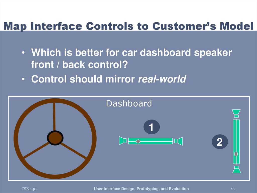
22. Map Interface Controls to Customer’s Model
• Which is better for car dashboard speakerfront / back control?
• Control should mirror real-world
Dashboard
1
2
CSE 440
User Interface Design, Prototyping, and Evaluation
22
23. Map Interface Controls to Customer’s Model
CSE 440User Interface Design, Prototyping, and Evaluation
23
24. Map Interface Controls to Customer’s Model
CSE 440User Interface Design, Prototyping, and Evaluation
24
25. Metaphor
• Definition ?– “The transference of the relation between
one set of objects to another set for the
purpose of brief explanation.”
• Lakoff & Johnson, Metaphors We Live By
– “...the way we think, what we experience, and what we do
every day is very much a matter of metaphor.”
– in our language & thinking – “argument is war”
… he attacked every weak point
… criticisms right on target
… if you use that strategy
• We can use metaphor in interface design to
leverage existing conceptual models
CSE 440
User Interface Design, Prototyping, and Evaluation
25
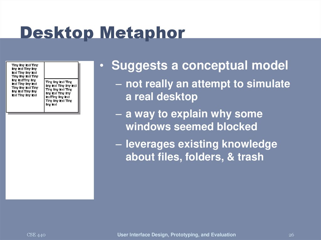
26. Desktop Metaphor
• Suggests a conceptual model– not really an attempt to simulate
a real desktop
– a way to explain why some
windows seemed blocked
– leverages existing knowledge
about files, folders, & trash
CSE 440
User Interface Design, Prototyping, and Evaluation
26
27. Example Metaphors
• Global metaphors– personal assistant, wallet, clothing, pens, cards,
telephone, eyeglasses
• Data & function
– rolodex, to-do list, calendar, applications
documents, find, assist
• Collections
– drawers, files, books, newspapers, photo albums
CSE 440
User Interface Design, Prototyping, and Evaluation
27
28. How to Use Metaphor
• Develop interface metaphor tied toconceptual model
• Communicate that metaphor to the user
• Provide high-level task-oriented operations,
not low-level implementation commands
CSE 440
User Interface Design, Prototyping, and Evaluation
28
29. Is Consistent Always Better?
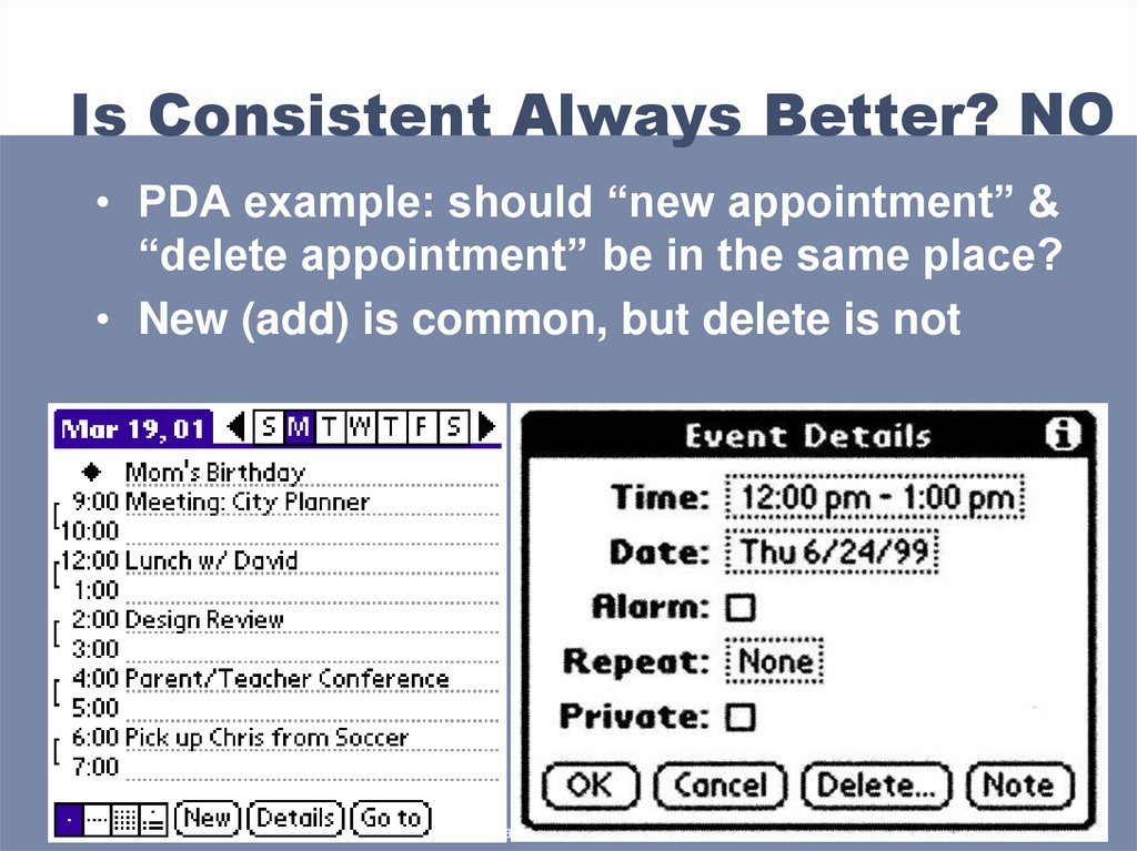
NO• PDA example: should “new appointment” &
“delete appointment” be in the same place?
• New (add) is common, but delete is not
CSE 440
10/5/2006
User Interface Design, Prototyping, and Evaluation
29
30. Is Consistent Always Better? NO
Early Palm design(like desktop version)
CSE 440
Streamlined design
User Interface Design, Prototyping, and Evaluation
30
31. Is Consistent Always Better? NO
Firefox 3 Back/Forward ButtonsCSE 440
User Interface Design, Prototyping, and Evaluation
31
32. Ways of Being Consistent
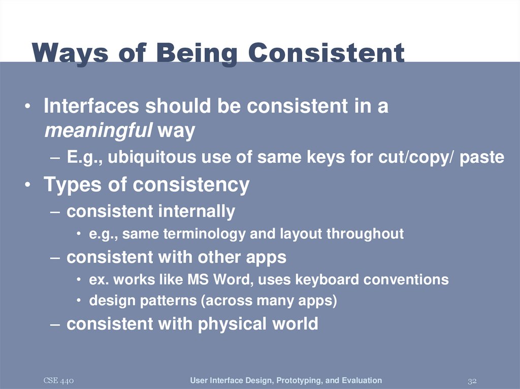
• Interfaces should be consistent in ameaningful way
– E.g., ubiquitous use of same keys for cut/copy/ paste
• Types of consistency
– consistent internally
• e.g., same terminology and layout throughout
– consistent with other apps
• ex. works like MS Word, uses keyboard conventions
• design patterns (across many apps)
– consistent with physical world
CSE 440
User Interface Design, Prototyping, and Evaluation
32
33. Summary
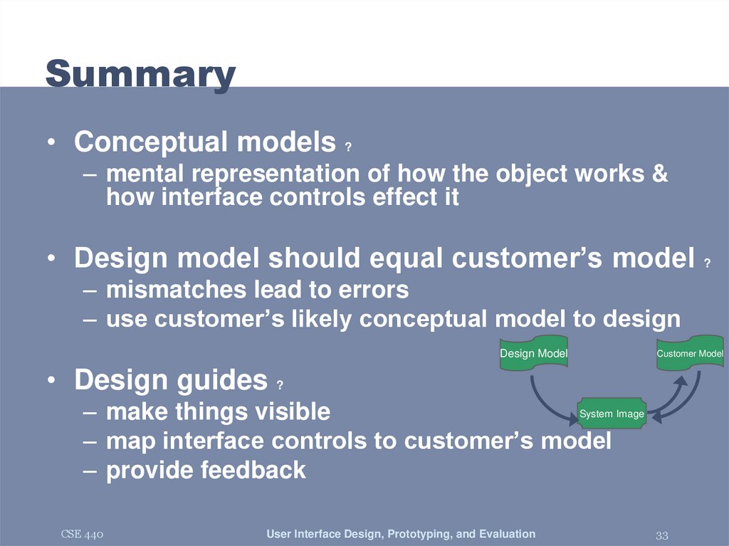
• Conceptual models ?– mental representation of how the object works &
how interface controls effect it
• Design model should equal customer’s model ?
– mismatches lead to errors
– use customer’s likely conceptual model to design
Design Model
Customer Model
• Design guides ?
System Image
– make things visible
– map interface controls to customer’s model
– provide feedback
CSE 440
User Interface Design, Prototyping, and Evaluation
33
34. Further Reading
• Design of Everyday Things, Donald Norman• Design as Practiced, Donald Norman
– Talks about failure to make changes to Macintosh
– http://www.jnd.org/dn.mss/Design_as_Practiced.html
• Computing the Case Against User Interface Consistency,
Jonathan Grudin
– Talks about why interfaces should not always be consistent
– http://www1.ics.uci.edu/~grudin/Papers/CACM89/CACM89.html
CSE 440
User Interface Design, Prototyping, and Evaluation
34
35. Ubiquitous Computing?
CSE 440User Interface Design, Prototyping, and Evaluation
35
36. Context-Awareness
• Modern computers divorced from our reality– unaware of who, where, and what around them
– mismatch between expectations and functionality
– also limits what we can do with computers
• Context-Aware Computing
– one line of ubiquitous computing research
– making computers more aware of the physical and
social situations they are embedded in
CSE 440
User Interface Design, Prototyping, and Evaluation
36
37. Why Context-Aware Computing?
Existing ExamplesContext Types
Human Concern
Auto Lights On / Off
Room Activity
Convenience
File Systems
Personal Identity
& Time
Finding Info
Calendar Reminders
Time
Memory
Potential Examples
Context Types
Human Concern
Tag Photos
Activity
Finding Info
Health Alert
Service Fleet
Dispatching
CSE 440
Time
History
Location
Identity
Activity
Proximity
Safety
Efficiency
User Interface Design, Prototyping, and Evaluation
37
38. Technology Trends
• Location, Location, Location– FCC’s E911, location for cell phones
• Lots of potential apps here
– electronic tour guides
– locating restaurants / gas stations / etc
– keeping track of a group of friends
– location-based games
• But many technological barriers as well
– reliability
– indoor location
CSE 440
User Interface Design, Prototyping, and Evaluation
38
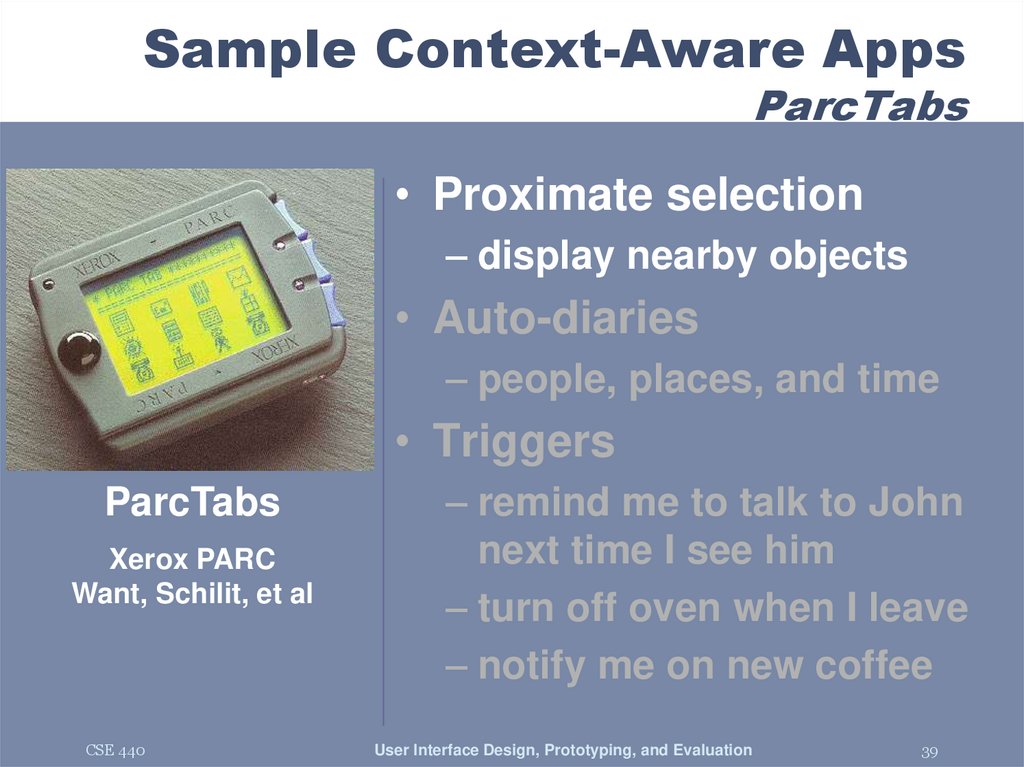
39. Sample Context-Aware Apps ParcTabs
• Proximate selection– display nearby objects
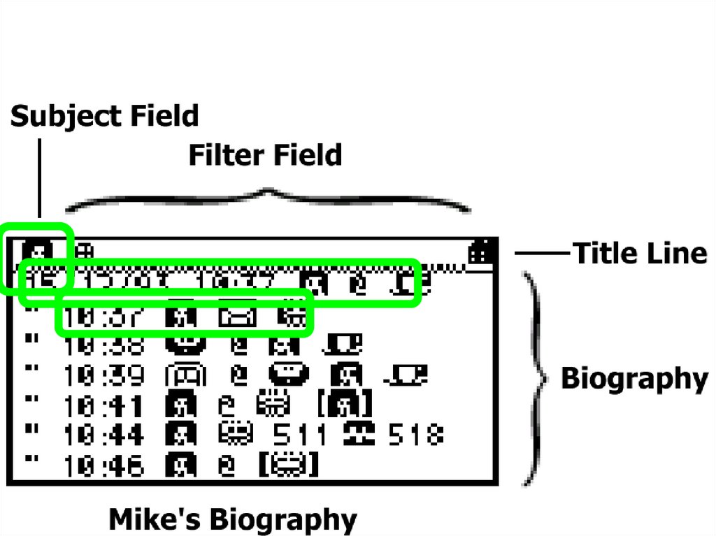
• Auto-diaries
– people, places, and time
• Triggers
ParcTabs
Xerox PARC
Want, Schilit, et al
CSE 440
– remind me to talk to John
next time I see him
– turn off oven when I leave
– notify me on new coffee
User Interface Design, Prototyping, and Evaluation
39
40. Sample Context-Aware Apps ParcTabs
CSE 440User Interface Design, Prototyping, and Evaluation
40
41. Sample Context-Aware Apps ParcTabs
• Proximate selection– display nearby objects
• Auto-diaries
– people, places, and time
• Triggers
ParcTabs
Xerox PARC
Want, Schilit, et al
CSE 440
– remind me to talk to John
next time I see him
– turn off oven when I leave
– notify me on new coffee
User Interface Design, Prototyping, and Evaluation
41
42. Sample Context-Aware Apps ParcTabs
CSE 440User Interface Design, Prototyping, and Evaluation
42
43. Sample Context-Aware Apps ParcTabs
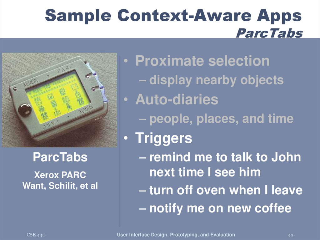
• Proximate selection– display nearby objects
• Auto-diaries
– people, places, and time
• Triggers
ParcTabs
Xerox PARC
Want, Schilit, et al
CSE 440
– remind me to talk to John
next time I see him
– turn off oven when I leave
– notify me on new coffee
User Interface Design, Prototyping, and Evaluation
43
44. Ambient Interfaces
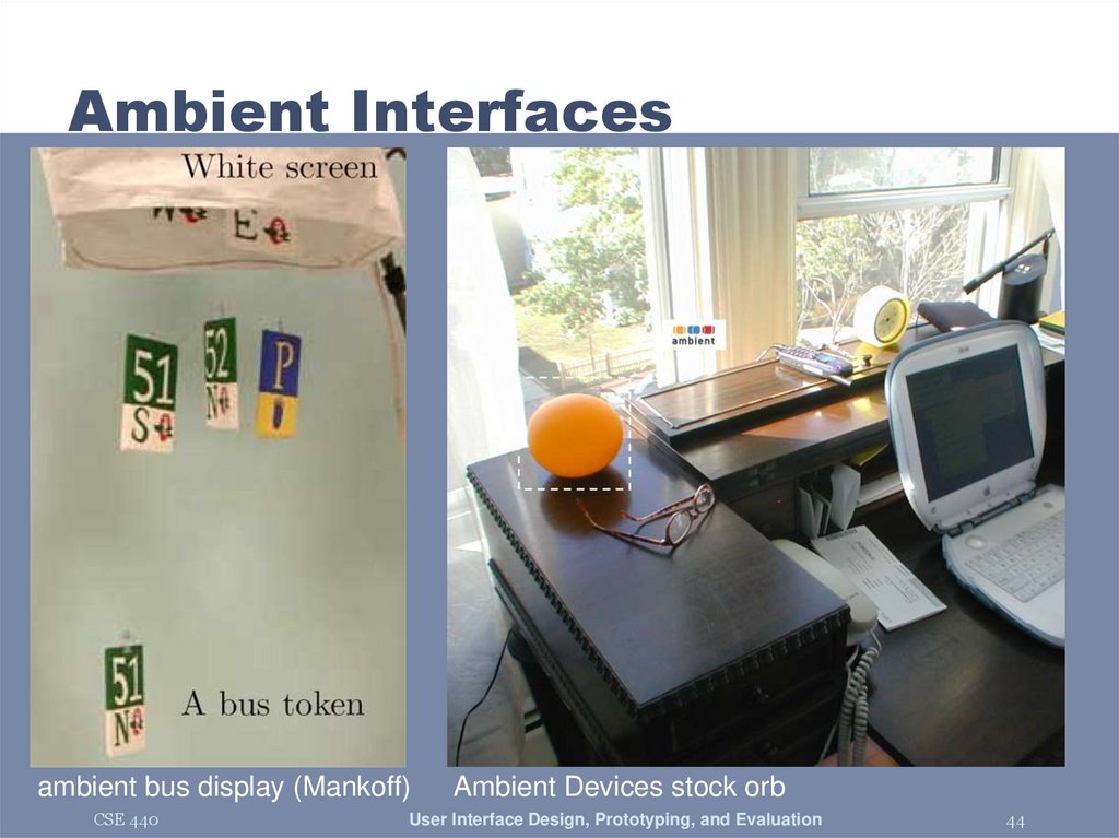
ambient bus display (Mankoff)CSE 440
Ambient Devices stock orb
User Interface Design, Prototyping, and Evaluation
44
45. Next Time
• Heuristic Evaluation• Read
– Lewis & Rieman 4.3-4.4
– Nielsen HE chapter (read 5 links under
"Jakob Nielsen's Online Writings on
Heuristic Evaluation")
CSE 440
User Interface Design, Prototyping, and Evaluation
45


















 software


