Similar presentations:
WeatherTec Services
1. WeatherTec Services
Markup Review – January 12, 20172. Page Technology
3.
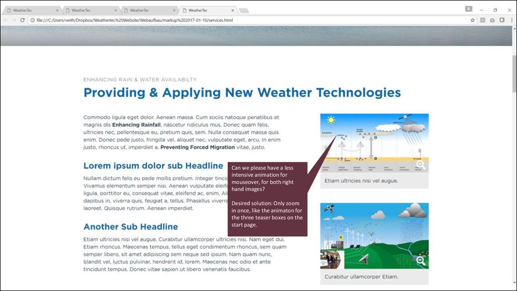
Can we please have a lessintensive animation for
mouseover, for both right
hand images?
Desired solution: Only zoom
in once, like the animaton for
the three teaser boxes on the
start page.
4.
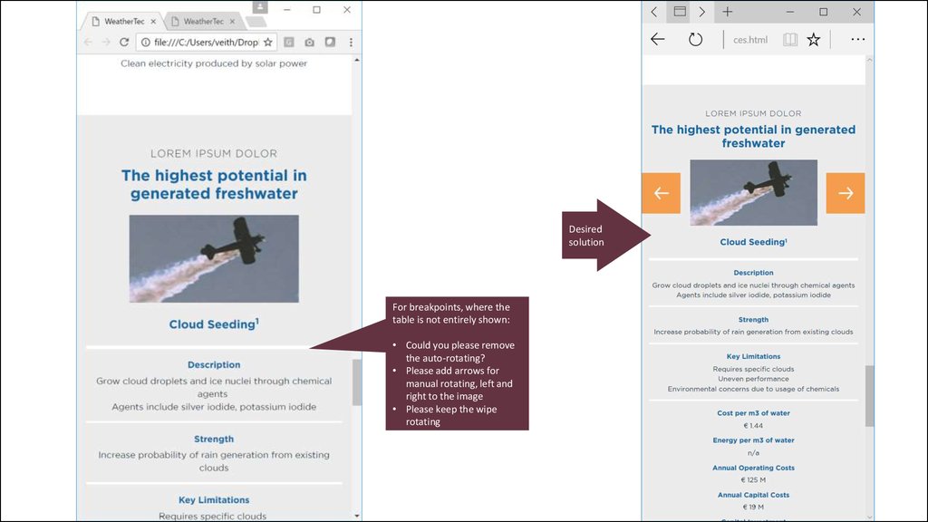
Desiredsolution
For breakpoints, where the
table is not entirely shown:
• Could you please remove
the auto-rotating?
• Please add arrows for
manual rotating, left and
right to the image
• Please keep the wipe
rotating
5. Page Case Examples
6.
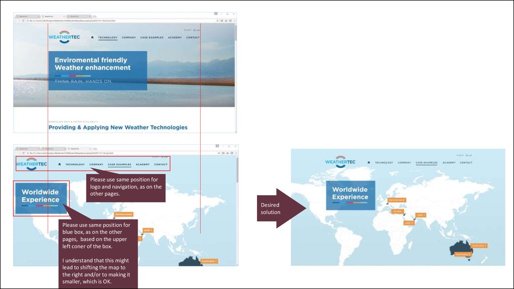
Please use same position forlogo and navigation, as on the
other pages.
Desired
solution
Please use same position for
blue box, as on the other
pages, based on the upper
left coner of the box.
I understand that this might
lead to shifting the map to
the right and/or to making it
smaller, which is OK.
7.
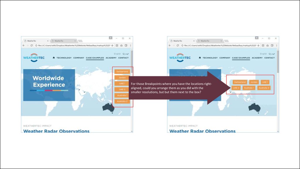
For those Breakpoints where you have the locations rightaligned, could you arrange them as you did with thesmaller resolutions, but but them next to the box?
8.
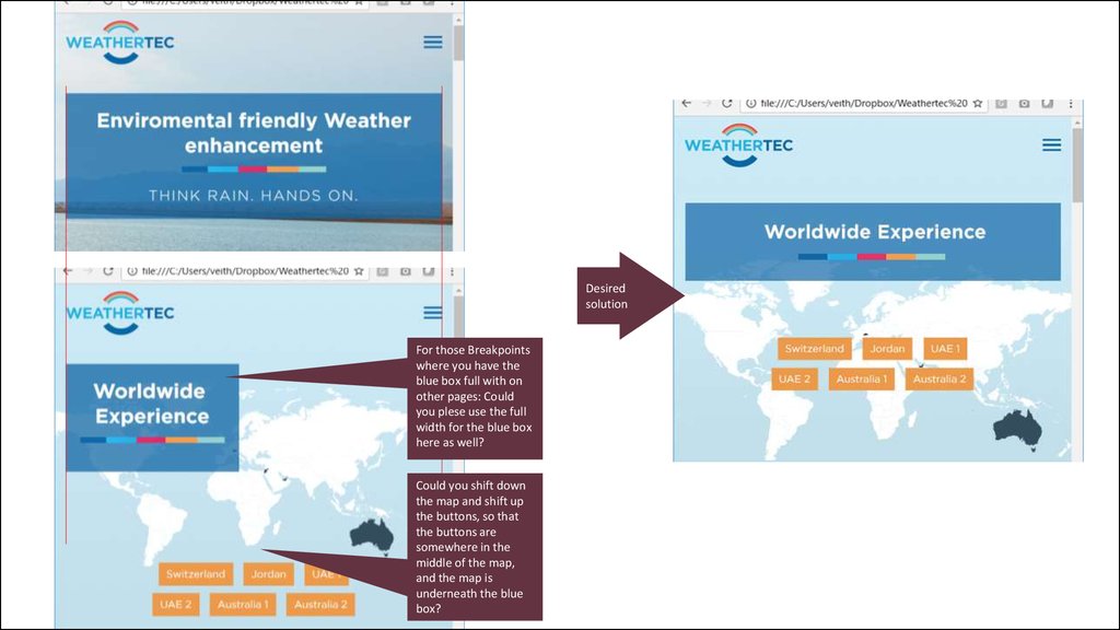
Desiredsolution
For those Breakpoints
where you have the
blue box full with on
other pages: Could
you plese use the full
width for the blue box
here as well?
Could you shift down
the map and shift up
the buttons, so that
the buttons are
somewhere in the
middle of the map,
and the map is
underneath the blue
box?
9.
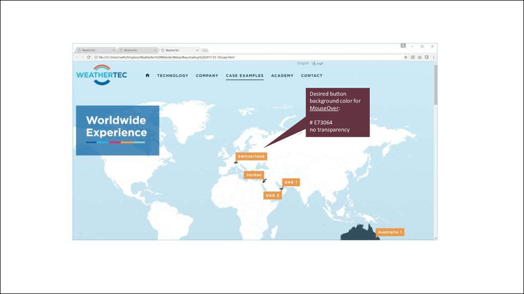
Desired buttonbackground color for
MouseOver:
# E73064
no transparency
