Similar presentations:
English for graphic designers (С.В. Рыжова, О.А. Филончик, А.Ю. Николаева)
1.
Приведены лексические единицыи выражения, наиболее употребляемые в сфере дизайна, упражнения, направленные на развитие
речи, творческие задания для работы в сети Интернет.
ENGLISH
FOR GRAPHIC
DESIGNERS
2.
Министерство образования и науки Российской ФедерацииСибирский федеральный университет
ENGLISH
FOR GRAPHIC DESIGNERS
Учебное пособие
Красноярск
СФУ
2018
3.
УДК 811.111:7.012(07)ББК 81.432.1я73
E56
Рецензенты:
Н.В. Терских, кандидат педагогических наук, доцент;
Д.В. Зиновьев, кандидат педагогических наук, доцент
Коллектив авторов: С.В. Рыжова, О.А. Филончик, А.Ю. Николаева,
Е.И. Лобынева, Н.В. Батурина, Ю.Н. Бойко, И.В. Батунова, Ю.С. Руковишников
E56
English for Graphic Designers : учеб. пособие / С.В. Рыжова,
О.А. Филончик, А.Ю. Николаева [и др.]. – Красноярск : Сиб.
федер. ун-т, 2018. – 80 с.
Приведены лексические единицы и выражения, наиболее употребляемые
в сфере дизайна, упражнения, направленные на развитие речи, творческие
задания для работы в сети Интернет.
Предназначено для студентов архитектурных специальностей 1-го и 2-го
курса, изучающих дисциплину «Иностранный язык».
Электронный вариант издания см.:
http://catalog.sfu-kras.ru
УДК 811.111:7.012(07)
ББК 81.432.1я73
© Сибирский федеральный университет, 2018
2
4.
ПРЕДИСЛОВИЕУчебное пособие “English for Graphic Designers” предназначено для
студентов бакалавриата направления «Дизайн». Пособие соответствует
программным требованиям Федерального государственного образовательного стандарта.
Основной целью данного пособия является достижение бакалаврами
практического владения иностранным языком, позволяющим использовать
язык в профессиональной деятельности и обеспечить преемственность
обучения в системе «бакалавриат – магистратура – аспирантура».
Пособие предназначено для обучения чтению, говорению и письму в
сфере профессиональной деятельности, а также для овладения
специализированной лексикой и повторения грамматических категорий,
изученных в средней школе. Также пособие направлено на формирование
профессионального мировоззрения и профессионального воспитания
студентов, обучающихся по направлению «Графический дизайн». Пособие
можно использовать для аудиторной и самостоятельной работы, а также
для развития навыков репродуктивной деятельности.
Учебно-методическое пособие реализовано на основе использования
компетентностного подхода в профессиональной подготовке специалистов. Отобранный материал и упражнения составлены с целью
формирования таких компетенций, как способность к обобщению, анализу,
восприятию информации, способность логически верно, аргументировано
и ясно строить устную и письменную речь, способность адекватно
переводить аутентичные тексты с английского языка на русский язык.
Пособие состоит из 2 частей (Part): 1. “Being a Designer”, 2. “Being a
Graphic Designer”, которые делятся на 3 раздела (Unit), каждый из которых
имеет 3 урока (Lesson).
Разделы пособия построены таким образом, чтобы процесс
овладения материалом был доступным и в то же время максимально
эффективным. В начале каждого раздела предлагаются упражнения для
активизации устной деятельности, далее следуют новые лексические
единицы и выражения, наиболее употребляемые в сфере дизайна. Каждый
урок содержит задания, направленные на развитие речи, они максимально
стимулируют навыки говорения и носят творческий характер. В каждом
уроке представлены тексты и упражнения к ним, направленные на
обучение поисковому, просмотровому и детальному чтению.
Каждый урок содержит грамматические упражнения, направленные
на реализацию практического владения грамматикой и включающие
задания на тренировку и закрепление видовременных форм глагола,
порядка слов в предложениях, модальных глаголов, степеней сравнения,
неличных форм глагола, а также сослагательного наклонения.
3
5.
Для активизации самостоятельной работы студентов пособиесодержит творческие задания для работы в сети Интернет, закрепляющие
полученные знания и стимулирующие интерес к предмету.
4
6.
PART I. BEING A DESIGNERUnit 1. INSPIRATION FOR CREATION
LESSON 1
Lead-in
Discuss the questions with a partner. Give reasons for your answers.
1) Where do you usually get the inspiration?
2) Is it difficult to create your own recognizable design style? Why?
3) What are the key points in developing a new design?
4) Choose four of the following inspirational things from the list below and
explain your choice:
1. Art galleries
2. Museums
3. Seashore
4. City streets
5. Magazines
6. Paintings
7. Natural world
8. Buildings
9. Books
10. Exhibitions
11. Flowers
12. Shops
Exercise 1. Study the vocabulary and translate the given sentences.
1. Inspiration n – вдохновение, стимул, влияние.
Inspire v – вдохновлять, побуждать, вселять.
Inspired adj – вдохновленный, поглощенный, священный.
Inspirational adj – вдохновляющий.
She was an inspiration to us. His letter inspired me with hope. Threats don’t
necessary inspire people to work. Inspired speeches helped me to continue the job.
2. Design n – проект, чертёж, модель, набросок, план, замысел, композиция;
намерение; v – проектировать, конструировать, разрабатывать; придумывать,
замышлять, планировать.
The commission may involve the design of buildings, structures and spaces among
them. Egyptians designed and built not only houses but also huge pyramids. This man
designs dresses for the Queen. The general design of the novel. He designed the
perfect crime.
3. Source n – источник.
Your source of inspiration may be the book you have read recently.
4. Endeavor (AE) n – попытка, стремление, старание; v – стараться.
syn: Attempt (BE)
I’ll make every endeavor to come. He endeavored to remain calm.
5. Creativity n – творчество.
5
7.
Create v – создавать, творить.Creative adj – творческий, созидательный.
Too many rules might deaden creativity. It seems that he created the perfect mix
of dark and light music. Creative activity. Creative personality.
6.Fair n– тематический парк, ярмарка, выставка, рынок, базар; ad j –
красивый, справедливый, ясный, светлый, белокурый.
Annual fair, book fair, county fair, job fair, computer fair. My fair lady. Fair
and square. Fair weather. Fair complexion.
7. Flamboyant adj – напыщенный, красочный, яркий, экзотический.
Flamboyant colours. She prefers to wear flamboyant dresses.
8.Inquiry n – запрос, опрос.
Inquire (about, after, for) v –спрашивать, искать, осведомляться.
Inquiring adj – пытливый, любознательный.
There's a woman at the door, she is inquiring for Simon. They make inquiries about a
matter Inquiring mind.
9.Backseat n – незавидное, скромное, невыгодное положение.
He takes a backseat at home and lets his wife do all the talking.
10.Coincidence n – точное совпадение, одинаковость.
Coincide (with) v – совпадать, соответствовать.
My entire coincidence with your opinion. It is sheer coincidence. His story coincides
with the fact.
11. Outset n – начало, начинание.
At the outset… From the outset… A good outset is half the voyage (proverb).
12. Date n – дата, свидание; v – устаревать.
Date (back/from) v – вести исчисление, восходить, датироваться,
существовать с такого-то времени.
Significant date. Due date. Who's your date tonight? Blue and white is the classic
colour combination and will never date. The building dates from 1857.
13. Draw (drew, drawn) v – чертить, рисовать, тянуть; n – чертеж, приманка.
Draw (on) v – привлекать.
To draw by sight. To draw curtains. Fashion often draws on other forms of art for
inspiration.
14. Reflection n – отражение, образ.
She stared at her reflection in the mirror.
15. Superb adj – великолепный, роскошный.
She has a superb/ terrific figure! She was in superb form today.
16. Garment n – предмет одежды, платье.
The same coarse garment served them for summer and winter.
6
8.
17. Lofty adj – очень высокий.Lofty / elevated style. Idealistic / Lofty aims.
18. Feature v – показывать; n –отличительная черта, особенность.
The film features Smoktunovsky as Hamlet. National peculiarity /feature. A
striking feature of his character. Geographical features.
19. Mood n – настроение.
He isn't in the mood to go to the theater.
20. Investigate v – исследовать.
The aim is to use images that inspire you and to investigate the concepts in an
original way.
Exercise 2. Match the synonyms in A and B. Use exercise 1.
A
1. flamboyant
2. inspiration
3. endeavor
4. inquiry
5. feature
6. draw on
7. image
8. lofty
9. superb
10. dated
11. garment
12. source
13. outset
14. coincidence
B
a. magnificent
b. attempt
c. high
d. florid
e. clothes
f. influence
g. attract
h. characteristic
i. reflection
j. origin
k. old-fashioned
l. start
m. question
n. match
Exercise 3. Fill in the gaps. Use the vocabulary of exercise 1.
1. This designer is known for his …… fashion sense.
2. The shapes of sea creatures …… her to make the brooches.
3. The price of each …… depends on the amount of material in it and the time that it
took to make.
4. All attempts to …… an international language have more or less failed.
5. …… a line on the map between point A and point B.
6. The trouble with high fashion clothes is that they …… very quickly.
7. A …… common to all these buildings is a spacious entrance hall.
7
9.
Exercise 4. Work in pairs. Answer the following questions. Then read Text 1Aand check your answers.
1) Where do designers usually get inspiration for their designs?
2) What are the most important aspects in design?
3) What qualities should the designer have?
Text 1A. Where to Start
Inspiration for design themes can be found everywhere, whether your source
is a seashell on a beach or a splendid skyscraper, the fun of the fair or the Carnival
at Rio. If you research well, your topic will automatically influence your ideas; for
example, the theme of a circus or fairground is likely to produce a colorful,
flamboyant look. With an inquiring mind, almost anything can trigger a creative
spark. The trick is to be able to select the best route to follow. As a commercial
designer you will have your customer in mind from the outset, and self-indulgent
flights of fancy may have to take a backseat.
A designer should always have a finger on the pulse of the time: music
trends, street culture, films, fine art movements, it is no coincidence that each
fashion season has a discernible look; different designers often produce similar
color ranges and silhouettes (the outline shapes of complete ensembles) because
they are all aware of the broad trends. (However, designing from a completely offthe-wall angle has also produced some of fashion's greatest moments).
Although nothing dates more quickly than fashion, looking to the past for
inspiration often produces great results. A whole era can become an inspiration,
and the popularity of different eras tends to wax and wane in cycles. One-year
styles from the 1950s might be in fashion; the next it's a 70s look that's popular.
Designs that were the height of fashion become the object of derision.
Patterns and styles based on ethnic ideas are recycled again and again by
designers. One season they might work with the weaves of Latin American
Indians; next year they might feature the prints of certain African tribes.
Fashion often draws on other forms of art for inspiration. The art deco
magnificence, glistening reflections, and lofty symmetry of the Chrysler Building
in New York make it a superb example of an artistic endeavor that could easily
inspire garment design. Hollywood movies can also start fashion trends; The
Great Gatsby and the Mad Max series popularized, respectively, 1920s flapper
dresses and the "road warrior" look that combines punk and grunge.
Your opportunities for exploring themes are unlimited. You can research
ideas by visiting museums or wandering through a city to draw and take
photographs yourself or you can absorb the paintings, sculptures, films,
photography, and books created by other people. The Internet is a great source of
information that can be accessed from your home or college.
The knack of working with inspiration is to avoid trying to absorb too
much at once. Being selective with your research and disciplined in developing
8
10.
just a few well-chosen themes will help you produce a focused range of designsthat hold together as a collection. Cherry-pick ideas: once you have thoroughly
researched your source, you can choose the aspects that attract you most to include in
your designs.
Exercise 5. Match the words in A and B to complete word combinations. Use
Text 1A.
A
1. flamboyant
2. inspiration
3. fair
4. to date
5. feature
6. to draw
7. glistening
8. lofty
9. superb
10. artistic
11. garment
12. source
13. thoroughly
B
a. example
b. at Rio
c. symmetry
d. look
e. design
f. for design
g. on other forms
h. the prints of African tribes
i. reflections
j. of information
k. endeavor
l. researched
m. quickly
Exercise 6. Read the sentences and mark them as “True” or “False”. Correct
the false ones. Use Text 1A.
1. You can find inspiration for design themes in all places that you go to or look in.
2. The topic of your project won’t automatically influence your ideas.
3. Self-indulgent flight of fancy is the main requirement for a commercial
designer.
4. Designers often return to the ideas, images, patterns and trends of the past.
5. In developing the design you should absorb as many paintings, sculptures, films,
books as you can.
Exercise 7. Read Text 1A again and find the English equivalents.
Знать различные тенденции; умение работать; отбирать лучшее;
предмет насмешки; из ряда вон выходящий; быть чрезвычайно модным;
отличимый образ; дать начало творческой идеи; идти в ногу со временем;
учитывать желания клиента; полет фантазии; потакающий своим желаниям;
пытливый ум; то увеличиваться, то уменьшаться.
9
11.
Exercise 8. Study the table about word order, then put the words in order tomake up sentences:
Time
Every
day
Subject
Verb
I
get
Object
ideas
Manner
We
our project
carefully
They
were
describing
can appeal
Place
in the
museums
during the
lesson
Time
yesterday
to buildings
Example: well, he, sketches, draws. – He draws sketches well.
1. work, the elements of, a presentation, will, together. 2. museums, seem, can,
sometimes, dull. 3. begin, at 9 o’clock, in the morning, the lectures. 4. sketchbook,
your, provide, will, you, of starting points, with hundreds. 5. they at the overall shape,
of the object, also, and, at the tiny details, look. 6. plenty of notes, in your,
sketchbook, you, can, develop ideas, at home, when, are you back. 7. the
monumental, statues, offer, in the collection of the, Egyptian antiquities, and jewelry,
ideas about, dresses. 8. final, the source, your, reflect, drawings.
Exercise 9. You are writing an article “What can inspire” for the university
newspaper. Use Text 1A and other sources (e.g. the Internet) to answer the
questions:
1. How do designers get ideas? How do they search for clever combinations of forms,
and colors to inspire their projects? Where do they borrow ideas from?
2. Do you think that a fashion designer can appeal to buildings and city streets for the
inspiration?
3. What does it mean to be a commercial designer?
Write 10–12 sentences about inspirational things for designers. Mind word
order.
LESSON 2
Exercise 1. Match the words with their definitions.
1. imaginative adj.
2. flavor n.
3. commonplace adj.
4. target n.
5. mood n.
10
a. an idea, expression, remark, etc., that is not new or
interesting
b. a picture that is produced by a camera, artist, mirror, etc.;
a mental picture
c. a conscious state of mind or predominant emotion
d. a way of dealing with a situation or problem
e. to observe or study by close examination and systematic
inquiry
12.
6. approach n.7. investigate v.
8. image n.
9. development n.
f. the quality of something that you can taste, a particular
type of taste
g. if you enjoy writing songs, or just thinking about things
in new ways, you’re are such kind of person
h. the act or process of growing or causing something to
grow or become larger or more advanced
i. something that you are trying to do or achieve
Exercise 2. Read the sentences below. Which of the following statements do you
agree with? Why?
1. There are no new ideas.
2. Most of the new ideas are discovered by chance.
3. Creating a design is a mystical affair.
4. Fashion is a continual evolution, the constant reinvention of old trends and the
creation of new ones.
5. To find inspiration a designer should research, develop and reinvent.
6. All a designer needs is enthusiasm and a willingness to express his own unique
view of the world.
7. Designs can be created through a systematic process of research and development,
and the use of a range of illustration techniques.
Exercise 3. Read Text 1B and check your answers.
Text 1B. A Fresh Look at the Familiar
When discussing how designers and illustrators work, people often wonder
where all the ideas come from. How can a designer produce such a volume of original
work each season, apparently out of thin air? The answer, of course, is that it does not
just appear as if by magic but comes from the systematic development of ideas often
triggered by the everyday world that surrounds us. As a designer you will learn
how to look anew at commonplace objects and themes, and see in them
possibilities for inspiration and creativity. Once this is understood, the mystery is
exploded and you can see how the world around you offers an endless source of
imaginative potential.
This huge range of choice may appear somewhat daunting at first, but you
will soon develop the ability to be selective with your starting points, based on
their potential value to you as a source of inspiration. The key is to use images that
truly interest and inspire you, and to investigate these concepts in an original way.
An exciting personal approach to a concept will add a unique flavor to a design.
With time, you may find yourself revisiting certain. This is perfectly acceptable so
long as you are able to find an original interpretation of your theme for each range
of designs, and it is part of the natural development of your own recognizable
design style.
11
13.
As well as being of interest to you, it is important that your sourcesincorporate various factors that you will be able to use later in your designs. The
following aspects should be considered: colors and how they are combined, texture,
proportion, shape, volume, details, and decoration. Your starting point should
satisfy your creative interest on as many of these levels as possible. You can then
use your material to create mood boards which will provide a focus for the further
development of selected aspects of your research and help you to be disciplined in
design based on a few well-chosen and targeted themes.
Exercise 4. Choose the best title for each paragraph. Two titles are odd.
1. The magic of creating new ideas.
2. The Mood board is a great fun and will help you to be selective with your
research.
3. The development of your own recognizable design style.
4. The main factors the designer should take into account.
5. How to look anew at commonplace objects and themes.
Exercise 5. Find in Text 1B word combinations which begin with these
adjectives. Make up your own phrases.
Original ..., systematic …, potential …, personal …, unique ..., natural …,
creative…., various …, original …, commonplace …, starting …, endless ….
Exercise 6. Read the sentences (a–e) and match them with the titles (1–5). Write
3–5 sentences of other inspirational things.
If you look at the surroundings through the eyes of a designer, you will see
that inspiration is everywhere:
1. in the smallest details
a. Interesting artifacts you stash away* at home. Look
closely at heirloom* or a souvenir in order to appreciate
it anew. Antique textiles, with their intricate* patterns*
and rich tones, are a great source of inspiration and can
be easily investigated through books, museums, and the
Internet.
2. in old garments
b. Embroidery* or lace work* ideas can be derived from
something like peeling rust or skeleton of a leaf, and the
undulating* lines of hills could be translated into stripes
on a blouse.
3. in popular culture
c. Taking close-up photography or drawing small objects
like shells will make you notice tiny details, such as
spirals and swirls that you can use to good effect in your
designs.
12
14.
4. in the treasures at homed. Fashion runs in cycles. Pop bands such as ABBA and
the clothes associated with them are constantly going in
or out of fashion. “Outdated” styles can be reinvented to
create contemporary ideas.
5. in the natural world
e. Street art makes a wonderful contrast to the natural
world. Bright colors can inspire print ideas with a
contemporary urban slant.
Embroidery, lace work n – вышивание.
Undulating adj – волнообразный.
Stash away v – копить, припрятывать.
Heirloom n – фамильная ценность.
Intricate adj – запутанный.
Pattern n – образец, модель.
Exercise 7. Study the table about the word order in questions. Put the words in
order to make questions. Use a capital letter to begin each question:
Questio
n word
What
When
Who
Auxiliary
verb
do
Did
were
Have
Subject
you
they
you
asked
they
Other
verbs
like
drawing
go
you
written
Object
Place
Time
to school
yesterday
here
the report
Example: know, she, several, does, languages, foreign? – Does she know
several foreign languages?
1. prefer, does, she, to, wear, dresses, flamboyant? 2. him, inspire, this, did,
book? 3. project, who, this, designed? 4. they, what, are, now, designing? 5. what,
main, is, collection, the, feature, of, this? 6. first, when, skyscraper, was, the, built? 7.
know, do, history, you, the, of, fashion? 8. did, why stare, he, mirror, at, her,
reflection, the, in? 9. what, fashion, time, the, begin, will, show, tomorrow? 10. have,
project, finished, they, their, already?
Exercise 8. Change the following sentences to general, special (beginning with
the question-words given in brackets). Use exercise 7.
1. A designer may use buildings as inspiration for clothes. (who, what, how) 2.
Fashion in clothes changes with each season. (what, how often) 3. You choose to
study a historical building like a famous modern landmark. (who, what kind of, what)
4. There are a lot of inspirations for the design themes on a beach. (where, how many,
13
15.
what) 5. Lucky ideas have to be spirited out of thin air. (who, what kind) 6. Fashion isdating very quickly. (how, how) 7. Nowadays fashion is the constant reinvention of
old trends and the creation of new ones. (what, when, what kind of) 8. The designer
has considered the target audience lately. (when, who, what).
Exercise 9. Work in pairs. Ask your partner what inspires him (her) to create
new ideas. Use exercise 6 and your own ideas. Start with question words
What…? Where…? When…? Why…? Who…? Ask 8 – 10 questions. Then
answer your partner’s questions.
Example: How often does inspiration come to you?
LESSON 3
Exercise 1. Match the synonyms in A and B.
A
1. sample
2. composition
3. impressive
4. plot
5. imaginative
6. tool
7. influence
8. goal
9. complexity
10. client
11. select
12. combine
B
a. unite
b. creative
c. impact
d. arrangement
e. intricacy
f. customer
g. example
h. choose
i. effective
j. target
k. storyline
l. instrument
Exercise 2. Work in pairs and answer the questions.
1. Do you know the term “Mood board”? Try to give your own definition of it.
2. Who uses mood board? What purpose is it used for?
3. What types of mood boards can be done?
Exercise 3. Read the text and check your answers.
What Is A Mood Board?
A mood board is a type of collage consisting of images, text, and samples
of objects in a composition. They may be physical or digital, and can be
“extremely effective” presentation tools.
14
16.
Graphic designers, interior designers, photographers and other creativeartists use mood boards to illustrate visually the style they wish to pursue.
However, they can also be used by design professionals to explain visually a
certain style of writing, or an imaginary setting for a storyline. In short, mood
boards are not limited to visual subjects, but serve as a visual tool to inform
quickly others of the overall “feel” (or “flow”) of an idea. In creative processes
mood boards can balance coordination and creative freedom.
Traditionally, mood boards are made from foam board which can be cut
up with a scalpel and can also have spray mounted cut-outs put onto it. Creating
mood boards in a digital form may be easier and quicker, but physical objects
often tend to have a higher impact on people because of the more complete
palette of sensations physical mood boards offer. Mood boards can also be
painted.
Exercise 4. Read Text 1 C and fill in the gaps with the following words:
1) project; 2) ideas; 3) collage; 4) stage; 5) flavor; 6) research; 7) images; 8) target.
Text 1C. Mood Board
Creating a mood board is great fun and will help you be selective with the
research. This is the first A)
of organizing your thoughts and collected images,
enabling you to channel your creative excitement toward a cohesive and targeted
design outcome. Mood boards are made by arranging images and color B) on a large
board so that you can see at a glance how your designs might evolve. They vary in their
complexity but, as the name suggests, mood boards should always capture the mood or
C) of your design project, as well as reflecting your D) customer.
In grouping your researched E) you will have to make decisions about editing
and prioritizing your selection, as well as confirming your color palette.
Select a theme for your work, and consider who your target customer
might be. Gather together all your F)
material. Using a 50 x 60-cm.
illustration board as a base, arrange and glue together the strongest images, and
combine them with a color palette to make a G)
. Build a mood board that
reflects the essence of your design H) .
Exercise 5. Read Text 1C again and answer the questions:
1. What is the first stage of organizing your thoughts and collected images into a
targeted design outcome?
2. What things are necessary for building a good mood board?
3. What are the main elements of the mood board?
4. Does the mood board reflect the mood and flavor of the designer or the target
customer?
15
17.
Exercise 6. Find in the texts of exercises 3 and 4 word combinations which beginwith the given words. Make up your own phrases.
Creative (1) ..., cohesive …, design …, color …, target ..., strongest …,
creative (2)…., visual …, digital …, physical …, graphic …, great ….
Exercise 7. Put the words in order to make negative sentences.
Example: know, not, she, several, does, languages, foreign – She does not
know several foreign languages.
1. they, live, do, in, not, New York. 2. did, Nick, not, at, study, the, university.
3. designers, discussed, have, the, not, question, this, yet. 4. they, fashion, not, go, to,
show, the, will, tomorrow. 5. she, not, often, have, free, does, time. 6. she, studying,
is, graphic, not, design, at, the, moment. 7. The, new, jury, did, like, not, collection,
the. 8. this, dress expensive, not, very, is. 9. method, was, not, used, by, team, a, this,
design. 10. younger, prefer, sister, his, not, does, clothes, denim.
Exercise 8. Make the sentences negative.
1. Ceramics is one of the most ancient industries on the planet. 2. The
technology and applications of ceramics (including glass) has steadily increased.
3. African figures in this long and vibrant tradition inspire Picasso's experiments
with Cubism. 4. Cast metal is the only other material to withstand the continent's
termites. 5. They date back two and a half millennia. 6. Its sculptural decoration
has had a major impact on other works of art. 7. Greek artists of the fifth and
fourth centuries B.C. attained a manner of representation. 8. School-based art
therapy in the UK is helping troubled kids get back on track. 9. It works with
children and young people who are having serious difficulties. 10. They can
achieve success in The Art Room. 11. The display includes more than three
dozen works of graphic. 12. The Yellow Kid became a popular syndicated
cartoon in the 1890’s.
Exercise 9. Your friend is going to make a mood board. Use the texts of the
Unit and make suggestions to your partner about the main aspects of mood
board (ideas, inspiration, color, texture, etc.). Say 10 sentences.
16
18.
Unit 2. CREATING COHESIVE COLLECTIONLESSON 1
Lead-in
Before we start, discuss several questions with a partner. Give reasons for
your answers.
1. What does it mean to have the own style?
2. What enables to create the style?
3. What does it mean related things? What should be related for creation a
collection?
Exercise 1. Study the vocabulary and translate the given sentences.
1. Cohesion n – единство, сплоченность.
Cohesive adj – связанный.
The lack of cohesion in the work may result in failure. Any group or association
may be regarded as a cohesive unit, such as a military company, business
company.
2. Range n – ряд, линия, цепь, ассортимент; v колебаться, простереться,
варьировать, охватывать.
A wide range of models, colors and prices are presented in the collection. His
research ranges over a wide area.
3. Consumer n – потребитель, client n – заказчик
4. Choose (chose, chosen) v – выбирать.
Choice n – выбор.
We chose curtains to match the wallpaper. You made a good choice.
5. Relate v – соотноситься, иметь отношение, быть связанным.
It is difficult to relate these events to / with each other. The sightseeing of Paris
generated a series of related ideas.
6. Similar adj – схожий.
The collection has natural cohesion as it contains similar and related features.
7. Outfit n – наряд, костюм, оснащение, снаряжение.
Silk outfit is perfect for that special day. Designers develop a whole range of
related ideas that work not only as stand-alone outfits but also as a collection.
8. Consistent adj – последовательный, совместимый, согласующийся.
A consistent method to color, shape, pattern, and proportion helps to create the
cohesive design.
9. Settle v – принимать решение, соглашаться, урегулировать.
You will learn not to settle for the first offer but to consider all proposals.
10. Approach n – подход.
One must find the right approach to the problem. A consistent approach to the
collection.
17
19.
11. Sketch (out) v – описывать в общих чертах, изображать схематически;n – набросок.
The thinking on paper may be related with sketching out series of designs.
12. Rough n – набросок; adj –грубый, неровный.
You may produce about twenty rough ideas and only one will be the starting
point for your project.
13. Jot/note (down) v – записывать.
Jot down some ideas on paper, using words as quick sketches. I must jot down
that telephone number before I forget it.
14. Scrapbook n – альбом для журнальных или газетных вырезок.
15. Novice n – новичок, стажер, неопытный.
The course is suitable for both novices and "old hands".
16. Medium n – способ, средство, поддержка, среда.
I consider your scrapbook one of the best possible mediums for new ideas.
17. Think (out) v – продумывать, обдумывать.
Drawing a number of roughs will help you to think out loud on paper.
18. Retain v – держать; удерживать, аккумулировать, вмещать.
It's creates multiple formats but retains some sort of visual similarity.
19. Daunt v – приводить в уныние, отпугивать.
This huge range of choice may daunt you at first.
20. Evoke v – вызывать (воспоминание); пробуждать (чувства).
You might include descriptions such as "rounded", "sophisticated", "feminine"
or "soft" to evoke your target customer.
Exercise 2. Match the synonyms in A and B.
A
1) range
2) choose
3) consumer
4) consistent
5) sketch
6) novice
7) approach
8) jot down
B
a) client
b) method
c) note down
d) outline
e) beginner
f) cohesive
g) select
h) line
Exercise 3. Match the words with their definitions.
1. consistent adj
2. cohere v
3. medium n
4. settle v
5. rough n
18
a. make an agreement.
b. unfinished state
c. be or remain united; stick together, consist
d. somebody or something alike or of the same sort
e. connect in thought or meaning
20.
6. outfit n7. similar adj
8. relate v
f. that by which something is expressed
g. all the clothing, equipment
h. somebody or something that has a regular pattern or style
Exercise 4. Work in pairs. Answer the questions.
1. What does it mean “consistent approach”?
2. Can it be applied to any design project? How? Give your examples.
3. What role do roughs play in working through your stream of ideas?
4. Should you try to make roughs tidy and clear to everyone?
Exercise 5. Read Text 2A and check your answers.
Text 2A. Consistent Approach
Being a successful designer is not about producing flamboyant pieces but
about developing the inspiration into a cohesive range of designs that share a
strong look while offering as much choice to the consumer as possible.
Designers develop a whole range of related ideas that work not only as standalone outfits but also as a collection. A consistent approach to important factors such
as color, shape, pattern, and proportion helps to create this cohesion. This
approach enables to integrate style, color and design in a cohesive way creating
a highly successful outcome for the client.
It is this systematic development of ideas that enables the designer to
think laterally and to get the most out of each concept. With practice and
experience, you will learn not to settle for the first idea that comes along but to
push yourself to generate a series of related concepts. You may be surprised at
the results as you progress away from your starting point and down new avenues
of creativity. The collections that you develop will have a natural cohesion
because they contain similar and related themes, and you will soon find yourself
creating a coordinating range of models rather than separate and unrelated
outfits.
An important factor in this process is to learn to be comfortable with
thinking out loud on paper. This means feeling relaxed about noting down your
ideas and sketching out series of designs. You must learn to love your roughs. A
blank page can be intimidating, and it is easy for the novice designer to become
so concerned with the appearance of the initial sketches that the actual design
process takes second place. With practice you will gain confidence and be more
relaxed about encouraging the flow of ideas. Remember that you are just
developing your thoughts, not trying to create a masterpiece. It does not matter
how well executed these roughs are; they are for your purposes only and do not
need to be judged by anyone else. All that matters is that the roughs assist you in
working through your stream of ideas. Using the more casual medium of a
scrapbook may help you relax about your rough work, and you will be able to
19
21.
combine drawn ideas with cuttings from magazines. You could also try keepinga notebook with you at all times so that you can jot down ideas as they come.
With time you will discover which methods work best for you.
Exercise 6. Complete the summary of Text 2A with the words: 1) jot down, 2)
project, 3) roughs, 4) range, 5) collection, 6) cohesive.
A successful designer should always apply consistent approach producing
any design A) . Consistent or B)
method creates related ideas which enable to
integrate color, shapes, and patterns in a cohesive way creating a C)
. The
collection with natural cohesion helps you to create a coordinating D) of models.
To develop the ability of consistent thinking you should E)
your ideas and sketch
out series of roughs. The F) will assist you in working through the stream of ideas
and you will be able to combine them.
Exercise 7. Study the table, then put the verbs in brackets into the Present
Continuous or the Present Simple:
ACTIVE
Positive
Questions
Negative
Present Simple
I (We, You, They) design.
He (She, It) designs.
I am a designer.
He, She, It is a designer.
We (You, They) are designers.
Do I (We, You, They) design?
Does He (She, It) design?
Am I a designer?
Is (He, She, It) a designer?
Are We (You, They) designers?
I (We, You, They) do not design.
He (She, It) does design.
I am not a designer.
He( She, It) is not a designer.
We (You, They) are not designers.
Present Continuous
I am designing.
We(You, They) are
designing.
He (She, It) is designing.
Am I designing?
Are We(You, They)
designing?
Is He (She, It) designing?
I am not designing.
We (You, They) are not
designing.
He (She, It) is not designing.
1. Sorry, but a designer (review) catalogues and (order) samples now. 2.
An interior designer (take) into consideration many factors in planning the
house. 3. Project managers (not / settle) for the first offer but (consider) all
proposals. 4. Identifying the needs of clients (become) increasingly important
for designers at present. 5. The designer team (use) a computer to illustrate their
vision for the design. 6. His sketch of the structure (to be) very good. 7. Fashion
20
22.
designers (develop) their new collection now. 8. They (not / go) to the fashionshow tomorrow. 9. Wood (get) popular again in the interior design. 10. Fashion
often (draw) on other forms of art for inspiration. 11. Graphic designer (offer)
professional insight into creation of a unique logo and trademark. 12. Designers
(bring) a touch of magic to book, newspaper and magazine pages. 13. The
designer (develop) a timeline for the project, (coordinate) the workers, and
(make) sure work is completed on time. 14. The collection (have) natural cohesion
as it (contain) similar and related features.
Exercise 8. Make up questions. Use a capital letter to begin each sentence.
Example: the, do, know, term, you, “Mood board”? Do you know the
term “Mood board”?
1. does, develop, and, what, produce, a, designer?
2. ideas, do, generate, how, their, designers?
3. now, series, she, sketching out, of, designs, is?
4. graphic, why, use, computer, designers, do, packages, software?
5. developing, is, at the moment, she, a, new, collection?
6. the, key, what, is, to, graphic, design, successful?
7. growing, social, network, advertising, rapidly, is?
8. areas, what, can, specialize, designers, in?
9. range, over, his, does, research, a, area, wide?
Exercise 9. Your friend is not a designer. Tell him/her how a designer
develops a whole range of related ideas. Say 8–10 sentences. Use the Present
Simple.
Example: A designer relaxes and doesn’t worry about how someone else
might respond to his drawings. He simply thinks out loud on paper.
LESSON 2
Exercise 1. Match the words with their definitions.
1. retain v
2. flexible adj
3. forgo v
4. implement v
5. separate v
6. maintain v
7. throughout prep
8. core n
a. easily changed to suite new conditions
b. keep in good repair or working order
c. to make divided
d. keep, continue to hold or have
e. in every part
f. carry out agreement, promise, work
g. central or most important part центр; сердцевина
h. do without, give up something
21
23.
9. key adj10. item n
i. single unit or detail in a list
j. most important attitude or idea
Exercise 2. Complete the table with correspondent parts of speech. Use
a dictionary.
Verb
Cohere
Noun
Adjective
Cohesive, Coherent
Adverb
Consistently
Different
Magnificence
Coincide
Coincidently
Exercise 3. Work in pairs. Answer the questions.
1. What key items are described by the author of the text?
2. How can the designer use these key items to make the project cohesive
and unique? (give 5–6 sentences in your own words)
3. Is there any difference between “cohesive design” and “identical
design”? What is this difference?
Exercise 4. Read Text 2B and check your answers.
Text 2B. Key Items to Cohesive Design
Designers have to explore a variety of projects ranging in size, format and
execution to create something that centers around one core design. Designs
should be unique to the format, but consistent across different sizes. To success
in design let’s remember what exactly a cohesive or consistent design is. At the
core, a cohesive design means that you have matching design elements
throughout. It doesn't matter what size each design is or that every piece of
content in the design is identical. What does matter is that these items are seen
throughout and develop a strong unified visual relationship. For example, let's
say you are designing a postcard, poster, flyer and brochure for a charity event.
Maintaining a cohesive design means that you will see the same colors, images
and font styles across all four items. The beauty of this concept is that it can
apply to virtually any design project either in print or online. So, once you are
comfortable with building cohesive designs, you can apply this concept
throughout your projects.
One of the most favorite and prominent steps to building a cohesive
design is Image Size. You will want to work with a few select images, vary the
sizes and placement according to the print item. Also, decide which images
should be featured on all print materials. There are some you'll need to forgo due
to size restrictions. The size differences allow for flexibility in your design and
22
24.
won't break a cohesive design. You actually want a little variety to keep thingsinteresting. The fact that you use the same images throughout your design
creates that unified look.
Another important feature of a cohesive design is Hierarchy. It separates
the most important visual information from the rest. If you want to take your
designs to the next level, consider implementing hierarchy. Maintaining a
hierarchy in your font and image sizes as well as bringing most of them across
all of your designs creates a cohesive design.
It really doesn't matter which item you start with. Look at your content
and design plan at the beginning and determine which items are key to your
design’s core. Remember, it’s not about creating an identical design. It's about
creating one that is flexible across multiple formats but retains some sort of
visual similarity.
Exercise 5. Put the titles of Text 2B in order. One title is odd.
1. Other important tips for creation design.
2. Implementation of hierarchy.
3. The concept of cohesive design.
4. How to work with Image Size.
5. Maintaining headings in design project.
Exercise 6. Mark these sentences as “True”, “False” or “Not stated”.
1. Designers don’t explore projects ranging in size to create something that
centers around one core design.
2. Maintaining a cohesive design means that the same colors, images and font
will contain the style.
3. Ancient builders didn’t apply the concept of cohesive designs to their
projects.
4. Hierarchy should be excepted if we want to create a cohesive project.
5. The size differences in your design break a cohesive design.
6. Flexible design with visual similarity doesn’t mean identical design.
Exercise 7. Study the table. Put the verbs in brackets into the correct form of the
Past Continuous or the Past Simple:
ACTIVE
Positive
Past Simple
I (We, You, He, She, It, They)
designed.
I (He, She, It) was a designer.
We (You, They) were designers.
Past Continuous
I, (He, She, It) was designing.
We (You, They) were
designing.
___
23
25.
QuestionsNegative
Did I (We, You, He, She, It They)
design?
Was I (He, She, It) a designer?
Were We (You, They) designers?
I (We, You, They) do not design.
He (She, It) does design.
I (He, She, It) was not a designer.
We (You, They) were not
designers.
Was I designing?
Were We(You, They)
designing?
Was He (She, It) designing?
___
I was not designing.
We(You, They) were not
designing.
He (She, It) was not designing.
____
Frida Kahlo (to be) a Mexican painter. Kahlo (to produce) about 200
works in her life. When she (to be) fifteen, she (meet) the famous painter Diego
Rivera. He (to do) a painting on a wall at her school at that time. Then, at the
age of eighteen, Kahlo (to be) in a terrible accident. She (to travel) on a bus
when a tram (to crash) into it. She (to begin) to paint while she (to recover) from
the accident. During the rest of her life she (to have) over 30 operations. In
1929, she (to marry) Diego Rivera. Soon Kahlo (to begin) to wear traditional
Mexican clothes and jewelry. She (to visit) the United States and France. While
she (to stay) in Paris, she (to appear) on the front cover of Vogue magazine.
Many of her works (to be) self-portraits – a mixture of dreams and reality. Many
people (to admire) her work, including Pablo Picasso.
Exercise 8. Make up questions and negative sentences. Use a capital letter to
begin each sentence.
Example: yesterday, did, revise, you, all, new words? Did you revise all new
words yesterday?
1. did, the, actual, appear, term, “graphic design”, when?
2. created, the, classic, Coca, who, Cola, logotype?
3. it, recognizable, difficult, own, to, create, is, your, not, design, style.
4. times, advertising, exist, in, did, ancient?
5. Egyptians, where, did, write, sales, messages?
6. the, not, of, each, garment, price, depend, does, on, the, amount, of, material.
7. Henry, where, to, explain, did, Cole, the, importance, of, his, graphic, design, to,
the, government?
24
26.
Exercise 9. You have to explain how you understand the term “cohesivedesign” to school-leavers. Use text 2B and other sources to answer the
questions which can be asked:
1. Does cohesive design have matching design elements?
2. What cohesive elements did designers maintain throughout SFU design project?
3. Do you see the same colours, images across it?
Make up 8–10 sentences.
LESSON 3
Exercise 1. Match the words with their definitions.
1. daunt v
2. evoke v
3. intimidate v
4. layout pad n
5. tear out v
6. blank adj
7. feminine adj
8. trace v
9. assess v
a. call forth, provoke, produce, elicit
b. mark, indicate
c. scare, frighten, discourage
d. suitable for women
e. make frightened, scare
f. pull out
g. worksheet, notebook
h. empty, with nothing written or drown
i. test, give mark
Exercise 2. Fill in the gaps. Use the vocabulary of exercise 1. Change the word
form if necessary.
1. If blank page _______you try beginning by jotting down a list of words as ideas
come into your head.
2. Include descriptions such as “rounded”, “sophisticated”, “feminine”, or “soft”
______your target customer.
3. This technique will help to sketch without ______.
4. Jot down some ideas on a________.
5. ______one drawing and lay it beneath a clean page to make the next, adapting the
previous design.
6. Don’t feel daunted by the______, start jotting down the ideas. 7. The college
_______my ideas it helped to develop the strongest design.
Exercise 3. Work in pairs. Answer the questions. Check your answers in the text
2C.
1. Do you like drawing? Where did you learn to draw? Did you go to an art school?
2. What do you like drawing most? Do you succeed in doing it?
3. What does it mean to think out loud on paper? How does it help you in
developing new ideas?
25
27.
Exercise 4. Read the title “Doing Roughs”. What are the stages of doingroughs?
Text 2C. Doing Roughs
It’s time to start thinking like a designer! The more you can relax and not
worry about how someone else might respond to your drawings, the better they
will be. Remember that you are not yet producing final illustrations or even
communicating your ideas to anyone else. You are simply thinking out loud on
paper. If you feel daunted by the blank page, try beginning by jotting down a list
of words as ideas come into your head. You might include descriptions such as
"rounded," "sophisticated," "feminine," or "soft" to evoke your target customer
and the kinds of garments that you might design for her or him. This will make
starting to sketch much less intimidating.
The project
Choose your theme and produce some first rough ideas, considering in
particular what it is that inspires you about your research. Select the strongest ideas and
expand on these. Trace over your initial visual thoughts to produce a series of designs,
changing one element with each new drawing. The result will be a series of variations
on a theme.
The objective
Create a set of ideas that holds together as a collection.
• Use roughs to expand on your starting point.
Avoid the obvious and develop your own unique style.
• Assess your ideas as you work and develop the strongest designs.
The process
Think carefully about your starting point, considering its colors, textures,
shapes, patterns, and symbolism. Jot down some ideas on paper, using words as well
as quick sketches. Taking the stronger ideas further, produces some rough designs on a
layout pad. The thinner paper of the layout pad will allow designs to be easily traced
one on top of the other. Work by tearing out one drawing and laying it beneath a clean
page to make the next, adapting the previous design. Push yourself to produce lots of
ideas, hanging one element with each new drawing and building up step-by-step a
series of related models. Now you are truly thinking like a designer, as you create a
cohesive collection.
Aim to produce about twenty rough outfit ideas. As you work, keep in mind the
inspiring features of the starting point. Assess all the rough drawings by placing them
next to each other (you can photocopy your sketchbook pages).
Exercise 5. Replace the underlined words with the words: 1) beautified,
2) allow, 3) vogue, 4) special, 5) ready, 6) client, 7) support, 8) general, 9) right,
10) appeal (spice),11) sure, 12) set up.
26
28.
A designer will always have a customer in mind. You cannot afford simply tocreate designs to suit your own tastes. It is, however, perfectly acceptable to develop
a recognizable style. You will notice that all the famous designers have their own
particular style. Clothes, jewellery, buildings have a unique flavor that reflects the
philosophy of the designer.
There are various limitations associated with a design and it is best to
confirm them before you begin. Your budget, for example, will be dictated by the
price at which your product can be sold.
For example, it is common in the fashion industry to establish a rigid and
logical price structure for all the pieces in a collection – a vest top will be cheaper
than a long-sleeved garment, for example – and your designs should reflect this.
A thing that is embellished will have a high value, but you must be certain that
the customer is willing to pay the increased price. You also need to be sure you
are designing appropriate product for the time of year when they will appear and
that your work is in line with fashion trend predictions.
Exercise 6. Match words (1–6) with their definitions (a–b). Write the definitions
as in the example.
Example: Art deco is a design style, popular between the two World Wars,
that was characterized by simplicity, bold outlines, geometrical order, and the use of
new materials such as plastic.
1. Collection
a the composition of the illustration on the page. A bold layout, which
fills the page and makes the design statement with confidence, is often
the most successful approach
2. Layout
b used interchangeably with "collection" to describe the group of
items produced each season by a designer. This word has also more
specifically commercial overtones, indicating a selection of
coordinating items that offers maximum choice to the customer
within the parameters of the collection
3. Mood board c the group of items produced each season by a designer. Usually these
items have certain features in common, such as color, shape, and
pattern
4. Presentation d the quick unconstrained sketches that a designer uses to "think out
board
loud on paper," developing a research idea into a range of designs
5. Range
e a light foam board available in various sizes from art supply stores.
Used for presenting work to tutors, employers, and clients
6. Roughs
f the representation of an item as it would look laid out flat. Used to
convey precise information about the construction, trims, finishes and
any other details of the pieces. Also known as technical or
specification drawings
27
29.
7. Workingdrawing
g a board displaying inspirational research, current fashion images,
fabric swatches, and color palettes. It should encapsulate the most
important themes from the research and act as a focus during the
creation of the designs
Exercise 7. Study the table. Put the verbs in brackets into the Future Continuous
or the Future Simple:
ACTIVE
Positive
Questions
Negative
Future Simple
I (We, You, He, She, It, They) will
design.
Future Continuous
I (We, You, He, She, It, They)
will be designing.
I (He, She, It) will be a designer.
We (You, They) will be designers.
Will I, (We, You, He, She, It, They)
design.
___
I (We, You, He, She, It, They)
will be designing.
Will I (He, She, It) be a designer?
___
Will We (You, They) be designers?
I (We, You, He, She, It, They) won’t I (We, You, He, She, It, They)
design.
will be designing.
I (He, She, It,) won’t be a designer.
We (You, They) won’t be designers.
___
1. In future a display (to include) more than three dozen works of graphic. 2. In
a month the software (not to support) the program. 3. Now she (to work) with
children and young people who (to have) serious difficulties. 4. Without doubt its
sculptural decoration (to have) a major impact on other works of art. 5. The
technology and applications of ceramics steadily (to increase). 6. Soon design
professionals also (to use) the samples to explain visually a certain style of writing. 7.
The weather (to be) unpredictable this season. 8. You (to help) me with my project
tomorrow? 9. She (not to have) her own particular style. 10. A designer (to have) a
customer in mind. 11. Your work (to be) in line with fashion trend predictions. 12.
The price at which your product can be sold (to dictate) your budget.
Exercise 8. Make up sentences using the table.
I
We
They
Designer
My sister
28
am
is
are
going to
pay the increased price
establish a rigid and logical price
create a cohesive collection
have a customer in mind
produce some first rough ideas
in a week
soon
next month
tomorrow
30.
Exercise 9. You are doing roughs for collection. Describe the steps in thisprocess to your colleague, as he is a novice. Use to be going to.
Example: I always remember that I am not going to produce final
illustrations. I am going simply to think out loud on paper.
29
31.
Unit 3. PRESENTATION OF YOUR COLLECTIONLESSON 1
Lead-in
Before we start, discuss several questions with a partner. Give reasons for
your answers.
1) Have you ever given the presentation?
2) Did you succeed in it? And what were the reasons of it?
3) What skills are necessary for a good presentation?
Exercise 1. Study the vocabulary and translate the given sentences.
1. Teem (with) v – изобиловать, быть полным (чего-л.); иметься в изобилии.
For most of the year, the area is teeming with tourists. Good fish teem in the
North Sea.
2. Mount v – подниматься; n – подложка, картон или холст, на который
наклеена картина или карта, паспарту, оправа, гора.
Your illustrations can be mounted on foam boards.
3. Preference n – предпочтение, преимущество.
Do you have a preference for sweet or for spicy food? We give preference to those
who have worked with us for a long time. What are your preferences in music?
4. Try out v – испытывать, опробовать.
Try too hard – перестараться.
He was ready to try out different jobs.
5. Emphasize v – придавать особое значение; подчёркивать, акцентировать.
She emphasized its importance to me.
6. Tattered adj – оборванный, в лохмотьях.
7. Messy adj – грязный, запачканный.
8. Sturdy adj – прочный, сильный, крепкий, здоровый.
Sturdy design is essential for ladder.
9.Essential adj – неотъемлемый, главный, базовый; n –суть основной элемент.
The black is an essential color.
10. Show off v – оттенять, подчёркивать, представлять в выгодном свете.
The gown showed off her lovely figure.
11. Accompany v – сопровождать, следовать вместе.
The presenter accompanied his speech with movements of the hands.
12. Promote v – выдвигать, продвигать, способствовать.
Regular exercise promotes all-round good health.
13. Beware of v – беречься, остерегаться, опасаться.
You should beware of repeating the same mistakes.
14.Tidy (up) v – убирать, приводить в порядок; adj – аккуратный.
Help me to tidy this room up.
30
32.
15. Flurry n – волнение, суета, вспышка, волна возбуждения, сильный порыв.16. Reveal v – открывать, разоблачать.
Why don't you reveal your thoughts to me?
17. Glimpse n – беглый взгляд, беглое знакомство, проблеск.
We got a glimpse of the history of an English town. Even imperfect theories contain
glimpses of truth.
18. Convince v – убеждать, уверять (в чём-л.), доводить до чьего-л. сознания.
We were able to convince the students of the need for wider reading.
19. Observer n – наблюдатель, эксперт.
I was invited to attend their conference as an observer.
20. Unambiguous adj – недвусмысленный, точно выраженный.
Depending on your drawing style, your work might be unambiguous or somewhat
open to interpretation.
Exercise 2. Match the antonyms in A and B.
A
1. messy
2. reveal
3. promote
4. sturdy
5. tattered
6. essential
7. beware
8. accompany
9. flurry
10. worth
B
a. risk
b. unimportant
c. calm
d. slow down
e. tidy
f. clean
g. breakable
h. of no value
i. conceal
j. leave
Exercise 3. There are some tips which can lead to a successful presentation.
Match the tips for presentation skills (1–8) to their comments (a–h).
Tips
1. Analyze your audience
Comments
a. You must keep your listener's mind 100%
occupied. Build in new devices – make your
message visual, create a conversation cycle
2. Set your goal and keep it b. Research your topic beforehand
before you
3. Confidence is the key item c. Before you begin your workshop or presentation,
to success
be sure your participants know what to expect
4. Do your homework
d. Use a marking system in the text to guide your
delivery
5. Plan your format and e. Think from your audience point of view
delivery
31
33.
6. Make a powerful first f. You may have even more than of these aims: toimpression
inform, to request for an action, to persuade, and to
build relationship
7. Manage expectations
g. Careful preparation provides the solid ground you
need to support your self-confidence.
8. Keep your audience's h. The audience will make decisions about you from
attention
your first appearance, your words and the sound of
your voice
Exercise 4. Work in pairs. Discuss the following questions.
1. Do you agree that the tips in exercise 3 are useful for presentation a design
project? Does it depend on the place and the goals of a presentation?
2. Have you ever presented your work? What kind of work was it? (a collection,
a project, paintings…) Where did you do it?
3. Can you give any other practical advices for an effective presentation of a
work?
Exercise 5. Read Text 3A to find out more about presentation in design.
Text 3A. Presenting Your Work
Visual communication and an effective presentation of your work are very
important for designers. Your brain may be teeming with innovative ideas and you
may produce the most original designs, but none of this will matter if you are unable
to communicate your vision. First impressions really do count. When you show your
work, you need to ensure that your presentation looks as professional as possible –
organized, well mounted, and clean, as well as accurate, clear, and creatively
appropriate.
Your illustrations can be mounted on foam boards or on card, both of which
can be bought from art supply stores. Boards are available in various sizes and
your choice will be influenced by factors such as personal preference, your
audience (if you are presenting to a large group the board must be big enough for
them to see), the trend of the moment (which could equally be for very large
boards or pocket-sized presentations), or the size of your illustrations or portfolio.
With experience you will find the size that suits you best but start by using a 20-x
30-inch board, and be prepared to try out different options. Avoid using a
combination of different sizes, which can make your portfolio seem messy; it is
worth emphasizing that the work you present should be clean. Carrying a portfolio
around, it's easy to get finger marks on the boards and for card edges to become
tattered. Make sure that your presentation is always fresh. Even recycled ideas can
have a market if they look as if they have just been produced.
A sturdy portfolio is essential. A selection in different sizes can be useful;
you can store your work in some sizes and keep the others for showing the
32
34.
presentations. Make sure that your portfolios are relatively easy to carry, evenwhen laden with work. For protective storage, plastic envelopes are invaluable.
You will also need to choose carefully your style of illustration as well as
your approach to the presentation as a whole, to ensure that the work is shown off
to best effect. If your designs are very delicate you might want to use an
ephemeral style of drawing to capture them on paper, perhaps accompanied by
flat working drawings. The delicate feel of your designs would then also
influence aspects such as the use of color, the fabric choice, the photography
style, the figure poses, and the arrangement of all these components on the
board. In this way, all the elements of a presentation will be working together to
promote your ideas.
Beware of trying too hard with the finished sheets. You can always use a
color photocopier to tidy up an exciting but possibly scruffy example of work
from your sketchbook, which was produced in a flurry of creativity.
Sketchbooks offer a good glimpse into the soul of your work. You may not
always want to reveal this to a client, but sometimes it may help to convince
them of the creative journey that has produced the finished ideas.
Exercise 6. Read the sentences and mark them as “True” or “False”. Correct
the false ones. Use Text 3A.
1. When you present your work, first impression isn’t so essential.
2. The best size of the board to start with is 20 x 30-inch board.
3. The choice of a board will be influenced only by your own personal preference
(favorite color, size, etc.).
4. You may use recycled ideas in your presentation only if they look as if they have
just been produced.
5. Your portfolios shouldn’t be too hard to carry.
6. Sketchbooks can’t reflect the essence of your work.
7. The combination of different sizes in your portfolio makes it organized and
clean.
Exercise 7. Study the table. Then make up sentences or questions in the Present
Perfect:
ACTIVE
Positive
Present Perfect
I (We, You, They) have designed.
He (She, It) has designed
Present Perfect Continuous
I (We, You, They) have been
designing.
He (She, It) has been
designing
33
35.
QuestionsHave I (We, You, They) designed?
Has He (She, It) designed?
Have I (We, You, They)
been designing?
Has He (She, It) been
designing?
Negative
I (We, You, They) have not
designed.
He (She, It) has not designed
I (We, You, They) have not
been designing.
He (She, It) has not been
designing
Example: you / ever been / to California? – Have you ever been to California?
1. you / ever buy / clothes from that shop?
2. the graphic designer / just look / at their website.
3. they / just open/ a new design company.
4. my parents/ have the same computer/ since 2010.
5. we / never be/ to the new shopping center.
6. you / type the report / yet?
7. he / recently publish / a book.
8. the fashion designer / visit Paris / three or four times before.
9. production of wool / decline by a million tones / since 2012.
10. the interior designers / ever used CAD / to design 3D objects?
Exercise 8. Put the verbs in brackets into the Present Perfect or Present Perfect
Continuous.
a) 1. What (you / do) all week? 2. The student (prepare) the presentation for
weeks. 3. The designer is busy. He (talk) on the phone for an hour. 4. We (work) on
this project since December. 5. We (practice) all afternoon. 6. I (do) the portfolio for
three hours. 7. Dr. Fletcher (give) the same lecture to design students for the last six
years.
b) 1. My design lessons are going well. I (learn) fashion design for five
months now and I love it. I (already /learn) a lot. 2. John (be) very busy recently. He
(paint) the living-room and the bedrooms, but he (not/start) painting the kitchen yet.
3. Is it true that you (recently /start) learning Spanish? Yes, I (study) it for three
years now and I (visit) the country twice.
Exercise 9. You are preparing tips for effective presentation for your university
website. Use Text 3A to find out what is important for it. Write 10 sentences
You may start in such a way:
Visual details are very important so your presentation should look as
professional as possible. …
34
36.
LESSON 2Exercise 1. Match the synonyms in A and B.
A
1) accurately
2) unambiguous
3) intention
4) doubt
5) working drawing
6) observer
7) creative
8) occasionally
9) evolve
B
a) clear
b) purpose
c) sometimes
d) spectator
e) distrust
f) technical drawing
g) exactly
h) bring out
i) imaginative
Exercise 2. Fill in the gaps with the correspondent parts of speech.
Verb
Noun
occasion
present
Adjective
Adverb
occasionally
presentational
correctly
produce
useful
measurement
Exercise 3. Read the statements given. Are they true or false? Use the phrases:
Quite so. Exactly. It’s (partly) true. Just the opposite. I don’t think so. That’s right.
That’s wrong.
1. The most wonderful ideas and stylish drawing techniques will count much if
you cannot present your designs effectively.
2. You should avoid abstract concepts. Your ideas must clearly and accurately
describe your design intentions.
3. You have to stay away creativity? You should satisfy the client’s desire.
4. Flat drawings and technical drawings are (not) the same things.
5. Specification drawings or technical drawings should faithfully represent every
aspect of your design project.
6. A designer often works as a part of a team and clear communication will be of great
importance for him.
35
37.
Exercise 4. Read Text 3B to check your answers.Text 3B. Clarity and Communication
It is important to remember, when you illustrate your designs, that you are
making abstract concepts from your imagination real to other people. Your drawings
may be very creative and evolve into works of art, but it is important that they can
still clearly and accurately describe your design intentions. When you show your
ideas to a client they must be as clear about your designs as you are.
This does not mean that you have to sacrifice creativity. Depending on your
drawing style, your work might be unambiguous or somewhat open to interpretation.
Look critically at your finished drawings and decide whether or not they will be
absolutely clear to a first-time observer. If you are in any doubt about clarity, it is best
to support your illustrations with flat working drawings.
You will hear these types of drawing referred to in different ways: flat drawings
or “flats”, specification drawings or “specs”, technical drawings, or working drawings
– or any combination of these terms. As the names suggest they are accurate, clear,
and easy-to-understand representations of your design ideas. Rather like the plan for a
house, they should faithfully represent every aspect of your design project.
Occasionally these drawings are even made to scale, but this is not necessary (and
measurements are also not always expected). So long as they accurately describe how
your models are constructed, and include any necessary design details, working
drawings will successfully support your more creative illustrations.
As a commercial designer, working as part of a team, clear communication will
be essential, and you will often find yourself dealing mainly or even wholly with
working drawings.
Exercise 5. Read Text 3B again and answer the questions:
1. Is it important for a designer to describe his/her design intentions accurately?
Why?
2. What is the best solution when a designer is in doubt about clarity of the work?
3. What kind of drawings should faithfully represent every aspect of the design
project?
4. How working drawings can support the designer’s creative illustrations?
Exercise 6. Find the English equivalents in Text 3B.
Становиться произведениями искусства; отвлеченные понятия;
дизайнерские замыслы (намерения); жертвовать креативностью; технический
чертёж; рабочий чертёж; комбинация терминов; дизайнерский проект; точно
представлять; время от времени (иногда); безошибочно описывать;
подробности дизайна; коммерческий дизайнер.
36
38.
Exercise 7. Study the table. Put the verbs in brackets into the Past Perfector Past Perfect Continuous:
ACTIVE
Positive
Past Perfect
I (We, You, They) had designed.
He (She, It) had designed
Questions
Had I (We, You, They) designed?
Had He (She, It) designed?
Negative
I (We, You, They) had not
designed.
He (She, It) had not designed
Past Perfect Continuous
I (We, You, They) had been
designing.
He (She, It) had been
designing
Had I (We, You, They) been
designing?
Had He (She, It) been
designing?
I (We, You, They) had not
been designing.
He (She, It) had not been
designing
1. Sue (pack) her suitcase before she called a taxi. 2. Sophie (illustrate) her
designs all day before she finished them. 3. When the client came, the designer
(not/finish) the project. 4. Mary (read) the contract before she signed it. 5. (You/wait)
long when the designer announced that he couldn’t see you? 6. After he (have) a
shower, he made breakfast. 7. John (look) for a job for six months when he found
one. 8. Sarah (work) as a fashion designer for forty years when she retired. 9. The
phone rang after he (lock) the door. 10. We (make) drawings for half an hour when
the doorbell rang. 11. He (look) at the painting for about ten minutes before he
realized who the artist was. 12. The meeting (start) when a designer arrived at the
office.
Exercise 8. Which action comes first in each sentence? Write 1 or 2 after
the verbs. Translate the sentences. Consult the table.
Example: The designer realized [2] his mistake only hours after he had
sent [1] a project to the client.
1. Sam had been [ ] in the room for some time before he realized [ ] it was
a wrong intention. 2. By the time the builders completed [ ] the work, we had
already moved in [ ]. 3. When the builders had completed [ ] the work, we
moved in [ ] 4. Mary started [ ] the course because she hadn’t find [ ] a job. 5.
Kevin got [ ] the job because he had been the best interviewee. 6. The design
team had worked hard [ ], and the collection was now finished [ ].
Exercise 9. Work in pairs. Discuss what creative projects you had completed
by last month. Use the Past Perfect.
37
39.
LESSON 3Exercise 1. Read the vocabulary of the following lesson and translate the
given sentences.
1. Embellish v – украшать, приукрашивать.
The matter is that embellishing work with unnecessary extras can show a lack of
confidence in the main concept.
2. Impact n – сильное воздействие; влияние.
3. Contribute (to) v – вносить вклад, обогатить ценным достижением.
You must be sure that you don't include anything that does not contribute to the
impact of the designs.
4. Surrounding adj – ближайший, соседний; окружающий.
Illustrations must be struck by the quality of your design statement – not by the
decoration surrounding it.
5. Edging n – окаймление, окантовка, кромка.
6. Overwhelm v – переполнять.
Decoration such as edgings must never overwhelm the illustrations.
7. Swatch n – образец, экземпляр.
Include items such as working drawings and swatches if they add to the clarity
of the presentation
8. Smudge n – грязное пятно, грязь, клякса; adj – грязный; v – загрязнять
9. Eraser n – ластик, резинка.
Clean up any smudge marks with a soft eraser.
10. Treated adj– обработанный.
Drawings that have been made using charcoal or pastel will smudge if they are
not treated.
11. Cram (on) v – впихивать, вдавливать.
Don't try to cram on too much information.
Exercise 2. Fill in the gaps. Sometimes the word can be changed: 1) board,
2) overwhelm, 3) embellishing, 4) impact, 5) smudge.
To make presentation of your work perfect you should be ready to answer
the questions. Is your presentation bold and decorations don’t A) it? Is the work
neat and clean or there are B)
? Will a viewer understand the design story or
maybe he is struck by the C) ? Is the D) practical for you to take to a client?
Could you have presented your illustrations differently to greater E) ?
38
40.
Exercise 3. Read and translate the following word combinations from thetexts of this Unit.
Example:
a) design statement – проектное задание;
b) design project – разработка проекта;
c) health reasons – из соображений охраны здоровья.
Design intentions, design palette, design ideas, design details, drawing style,
drawing style, foam boards, photography style, presentation style, fabric choice,
figure poses, garment design, street culture, Hollywood movies, mood boards,
print ideas, print item, key item, design elements, sketchbook pages, decoration
surrounding, manipulate the design, unnecessary extras, the impact of the
designs, complement the design palette.
Exercise 4. Think of the presentation where you were sitting in the audience.
Complete the questionnaire below. Write yes or no next to each question.
Did the presenter
1. …prepare thoroughly; check the meaning and pronunciation of new words,
create slides, etc.?
2….start the talk in an interesting way to get the attention of the audience?
3. …speak from notes rather than read a whole text?
4….give an overview of his talk at the beginning?
5…. use phrases to help the audience follow his ideas?
6….provide examples to illustrate complex and/or original ideas?
7. …provide visual support?
8…. invite the audience to ask questions?
9…..emphasize the main points by slowing down and leaving pauses?
10…make eye contact with his audience?
11….avoid repetitive use of pet' words or phrases (e.g. so, well, OK, like)?
12….use effective gestures?
Exercise 5. Read Text 3C to check your answers.
Text 3C. Practicalities of Presentation
It is very essential to define the goals of any presentation. A presenting
design is not an exception. So, each designer tends to
• Create a professional presentation;
• Include items that contribute to the impact of his design;
• Present designs in a way that makes them look like part of a cohesive
collection.
39
41.
There are some advices for your successful presentation. The matter isthat embellishing work with unnecessary extras can show a lack of confidence in
the main concept, so whether you feel your designs call for an understated
presentation, you must be sure that you don't include anything that does not
contribute to the impact of the designs. You want someone seeing your
Illustrations for the first time to be struck by the quality of your design statement
– not by the decoration surrounding it. A simple presentation has more chance of
being successful, and will not offend anyone's tastes, although a more creative
presentation style can create a strong impact. Decoration such as edgings must
never overwhelm the illustrations, and colored backgrounds should be used only
if they complement the design palette. Include items such as working drawings
and swatches if they add to the clarity of the presentation, and remember that
your work should appear clean and tidy.
Now let’s come to the process itself. Select a few of your favorite
illustrations from the same project to mount on a 20- x 30-inch board or boards.
You should choose and arrange your illustrations to reinforce the impression that
they are part of a cohesive collection.
Before mounting, you may remove tattered edges or make the composition
more focused. Use a scalpel and ruler. Clean up any smudge marks with a soft
eraser. Reproducing illustrations in a different medium may give a more
professional finish, so consider taking photographs or making photocopies. You
could even scan the pictures into a computer in order to further manipulate the
designs, and then print the results. Drawings that have been made using charcoal
or pastel will smudge if they are not treated. Spray them with a fixative according
to the instructions on the can. For health reasons, it is best to spray outside. Never
sign your illustrations as if they were finished works of art. However good they
are, your drawings are not ends in themselves but commercial representations of
ideas.
Decide how many illustrations you want to include on the board and,
before sticking anything down, arrange all the illustrations and other items.
Don't try to cram on too much information and don't overlap the illustrations so
much that you can't see the designs. If you are presenting on more than one
board, you can repeat color and composition to give the group a cohesive feel.
Start sticking down the images only when you are happy with the overall
composition.
Exercise 6. Answer the following questions.
1. What is the aim of a collection presentation?
2. Why should presenter avoid extra embellishing of his design?
3. How to give the presentation a cohesive feel?
4. How to prevent smudge marks on drawings that have been made with charcoal
or pastel?
40
42.
Exercise 7. Use the active form (Simple, Continuous or Perfect) of the verbs inthe brackets.
1. Clear windows (use) since the invention of glass to cover small
openings in a building. 2. Manufacturers (produce) different types of glass
nowadays. 3. The majority of your portfolio (consist) of pictures of work that
you have completed. 4. You (get up) to a 50% discount on the materials you use
when you purchase them directly from suppliers. 6. After collecting this
information, the designer (go) to the shop and (buy) all necessary materials. 7.
They (work out) a new production plan for two weeks. 8. They (conduct) an
experiment on the constriction site from 9 till 12 yesterday. 9. City houses
(become) much more comfortable now. 10. They (need) the help of many other
skilled designers tomorrow. 11. He (know) the chief designer for three years. 12.
The designer (use) a computer in the office at 3 o’clock yesterday. 13. They
(send) a project to a project manager before I (find) the mistake. 14. They
(develop) this product for two years. 15. Recent decades (see) the rise of
specializations within the profession of a designer. 16. They (paint) the exterior
of the house now. 17. Charlie (see) the client three times this week. 18. Megan
(not/attend) the meeting tomorrow. 19. They (discuss) a new fashion collection
when I (arrive).
Exercise 8. Correct the mistakes.
1. The designer has looked for the sketch all day. He can’t find it.
2. This idea enable the designer to think laterally and to get the most out of each
concept.
3. The managing director has left just a few minutes ago.
4. Your source of inspiration may be the book you read recently.
5. Whenever I called the secretary, she talked on the phone.
6. Egyptians wrote sales messages and designed wall posters on papyrus, while
politicians in Pompeii and ancient Arabia create campaign displays.
7. Throughout the 20th century, new styles and technologies emerge rapidly, each
one exerting some influence on graphic design.
8. Most graphic designers are working in specialized design services: advertising
and related services; printing and related support activities; or newspaper,
periodical, book, and directory publishers.
9. We are pleased to say that the designer have been working well all season.
10. What is a portfolio look like?
Exercise 9. You are speaking about “Practicalities of Presentation” at the
seminar. Use Text 3C. Make up 8–10 sentences.
41
43.
PART II. BEING A GRAPHIC DESIGNERUNIT 4. A GRAPHIC DESIGNER AND HIS WORKING
ENVIRONMENT
LESSON 1
Lead-in
Before we start, discuss several questions with a partner. Give reasons for
your answers.
a) What makes a good graphic designer?
b) What key qualities should he/she have?
c) What spheres can he/she be applied for?
Exercise 1. Study the vocabulary and translate the given sentences.
1. Versatile adj – многосторонний, многогранный, разносторонний
He’s a versatile designer who has done plenty of projects for a wide variety of clients.
2. Multitude n – множество; большое число; масса.
Our graduates are capable of performing multitudes of different tasks.
3. Visual symbol – зрительный символ.
Visual symbols are representations of direct reality, which comes in the form of
signs and symbols.
4. Layout n – планировка, план, расположение; разметка.
The layout is uncluttered and the illustrations are helpful.
5. Layout technique – методика компоновки.
CSS layout techniques will quickly get us practicing the theory learned in CSS
foundations and give us that last bit confidence we'll need to start building solid
layouts.
6. Promotional display – рекламный показ (показ с целью рекламирования
товара/услуги).
Whether you are looking for in-store promotional displays, graphics or visual
messaging signage, we can assist you in finding an outdoor display solution to
fit your needs.
7. Credits n – список участников (разработчиков, организаторов)
Increasingly, UK networks are making demands on what formats credits can be
in – ITV, at one point, deemed that the same name could not appear twice,
leading to interesting credits like “Written and produced and directed by”.
8. Mock-up design – экспериментальная модель, макет (в натуральную
величину).
Participants are called to submit a mock-up design and project plan, which will
be evaluated by external reviewers.
42
44.
9. Supervise v – смотреть, наблюдать (за чем-л.); надзирать; заведовать.A senior administrator has accepted to supervise applicants’ résumés.
10. Up-to-date adj – современный; новейший; соответствующий
современным требованиям.
You can visit the championship website for up-to-date information on the latest
scores.
11. Vary v – разниться; отличаться, различаться, расходиться.
As they’re handmade, each one varies slightly.
12. Setting n – окружение, окружающая обстановка.
They have planned to design a romantic house in a wonderful setting beside the
River Wye.
13. To meet schedule – выдерживать/укладываться в график; выполнять
график/план
In order to meet the schedule that was intended for the translation, he will need
a finished draft in six weeks’ time.
14. Familiar adj – хорошо знакомый, близкий, привычный.
He talked of other cultures as if they were more familiar to him than his own.
15. Bachelor’s degree – степень/звание бакалавра.
The first degree that you get when you study at a university. Bachelor’s degrees
include Bachelor of Arts (BA) and Bachelor of Science (BSc).
16. Have an eye for – быть знатоком чего-л.; уметь разбираться в чем-л.
She has an eye for nice furniture and her apartment is absolutely beautiful.
17. Advance v – продвигаться, продвигать, наступать, выдвигать.
My supervisor was advanced to the position of vice-president about a year ago.
18. Freelance adj – внештатный, независимый, свободный.
The editor asked me to do all that writing on a freelance basis, but in the end he
never paid me, so I took him to court.
19. Interactive media – интерактивная среда.
Interactive media is the integration of digital media including combinations of
electronic text, graphics, moving images, and sound, into a structured digital
computerised environment that allows people to interact with the data for
appropriate purposes.
20. Advertising n – рекламная деятельность, рекламный бизнес.
Last month, 10 companies that produce almost two-thirds of the food and drink
advertising for children under 12 agreed to start cutting back on advertising
junk foods.
Exercise 2. Match the words in A and B. Each word is used once. Make
sentences with these combinations.
A
B
1) communication
2) experienced
a) techniques
b) layout
43
45.
3) working4) overall
5) long
6) layout
7) meet
8) promotional
9) changing
10) up-to-date
c) displays
d) strategies
e) equipment
f) conditions
g) deadlines
h) trends
i) hours
j) designers
Exercise 3. Use vocabulary of exercise 1 and fill in the gaps. Sometimes you
should change the word.
1) I believe this design isn’t … . It’s old and no one will pay any attention to it.
2) You can make good money in … but you really have to sell goods.
3) If we want to meet … with this project, we’ll work overtime.
4) This software is … to me. I used it when I worked on my last year task.
5) He sells vintage stuff: old furniture, clothes and plates. He also has … for
antiques.
6) Ms. Litman is going to … you for a couple of months. If you have any
questions, consult her please.
7) What does it mean? – … mean a list of people who create, for example, a TV
programme.
8) They are … their new product. The advertisements are everywhere.
9) They want a romantic … for this ad: roses, candles and the sunset.
10) Look! That’s the … of the brochure. Here’s the logo and the pictures are
there.
Exercise 4. What is a graphic designer? Give your answer. Start with “A
graphic designer is a person who … .”
Exercise 5. Read Text 4A and answer the following questions:
1) How would you define graphic design?
2) What are fields of application for a graphic designer?
Text 4A. Why Do We Need Graphic Design?
Graphic design is versatile. It may embrace a multitude of diverse designrelated industries. However, on the whole design encompasses services provided
by professional artists, designers and image makers. We think graphic design is
not just a beautiful visual representation, but a science in its own right, with its
own philosophy and history. It marries painter’s art and analyst’s precision.
After all, any graphic design, operating non-verbal and visual symbols, may
exert great influence on the audience.
44
46.
Graphic designers – or graphic artists – plan, analyze, and create visualsolutions to communicational problems. They find the most effective way to get
messages across in print and electronic media using color, type, illustration,
photography, animation, and various print and layout techniques. Graphic
designers develop the overall layout and production design of magazines,
newspapers, journals, corporate reports, and other publications. They also
produce promotional displays, packaging, and marketing brochures for products
and services, design distinctive logos for products and businesses, and develop
signs and signage systems – called environmental graphics – for business and
government. An increasing number of graphic designers also develop material
for Internet Web pages, interactive media, and multimedia projects. Graphic
designers also may produce the credits that appear before and after television
programmes and movies.
Exercise 6. Read the sentences and mark them as “True”, “False” or
“Not stated”. Correct the false ones.
1) Graphic design concerns professional designers only.
2) Graphic design cannot “speak” but still can influence a lot.
3) Nowadays the Internet is the biggest part of graphic designers’ work.
4) There’re no publications which can go without graphic design.
5) To create a necessary impression a graphic designer can use any means or
techniques.
6) Environmental graphics help people to discuss problems of nature: pollution,
car traffic, garbage.
Exercise 7. Study the table about Zero conditionals, then match the
parts of the sentences.
The condition clause (if –
The result clause
clause)
If the sun goes down,…
…it gets dark.
The use
“General truth”
1) General truths and
If you turn on the …a laptop starts its rules;
power,…
working.
2) Real situations that can
happen at any time;
If you want to order,…
…call the receptionist.
3) One event that always
If you go to Egypt, …
… you can see the follows another.
Pyramids.
1) When I drink too much coffee …
2) If you need more information, …
3) My teacher gets angry …
a) … please visit our website.
b) … when I am late.
c) … I always have sleep problems.
45
47.
4) If you want bright colours, …5) Phone this number …
6) If your car doesn’t start, …
d) … first check the amount of
petrol you have.
e) … if you want to know more
about the product.
f) … use this graphic tool.
Exercise 8. Each sentence has got 1 mistake. Correct it.
1. Use your mood board if you will want inspiration.
2. Unless you don’t turn the power, your laptop doesn’t work.
3. If you’ll like the Renaissance, you enjoy this book.
4. If you want soft colours, you could use this programme.
5. If the client want something modern, use animation.
6. You must have a graphic designer if you wants a multimedia project.
7. If he a graphic designer, he can use a lot of different tools.
Exercise 9. You have to explain the role of a graphic designer to schoolleavers. Use text 4A and other sources (e.g. the Internet) to answer the
questions which can be asked:
1) What is graphic design?
2) What does a graphic designer do?
3) What qualities should he/she have?
4) Where can a graphic designer work?
Make up 8–10 sentences.
LESSON 2
Exercise 1. Match the synonyms in A and B.
A
1) great number
2) move forward
3) advertisement
4) client
5) working full-scale model
6) definite group of people
7) differ v
8) choose v
B
a) vary v
b) multitude
c) mock-up design
d) advance v
e) advertising
f) customer
g) select v
h) target audience
Exercise 2. What professions can deal with creating a design? Why? Make
a list.
46
48.
Exercise 3. Work in pairs / groups. Make a list of steps in a developing of anew product graphic design.
Exercise 4. Read Text 4B and compare your lists with it. Complete your list.
Text 4B. How to Design
The first step in developing a new design is to determine the needs of the
client, the message the design should portray, and its appeal to customers or
users. Graphic designers consider cognitive, cultural, physical, and social factors
in planning and executing designs for the target audience. Designers gather
relevant information by meeting with clients, creative or art directors, and by
performing their own research. Identifying the needs of consumers is becoming
increasingly important for graphic designers as they continue to develop
corporate communication strategies in addition to creating designs and layouts.
Graphic designers prepare sketches or layouts – by hand or with the aid of
a computer – to illustrate their vision for the design. They select colors, sound,
artwork, photography, animation, style of type, and other visual elements for the
design. Designers also select the size and arrangement of the different elements
on the page or screen. They may create graphs and charts from data for use in
publications, and they often consult with copywriters on any text that
accompanies the design. Designers then present the completed design to their
clients or art or creative director for approval. In printing and publishing firms,
graphic designers also may assist the printers by selecting the type of paper and
ink for the publication and reviewing the mock-up design for errors before final
publication.
Graphic designers use specialized computer software packages to help
them create layouts and design elements and to program animated graphics.
Graphic designers sometimes supervise assistants who follow instructions
to complete parts of the design process. Designers who run their own businesses
also may devote a considerable amount of time to developing new business
contacts, choosing equipment, and performing administrative tasks, such as reviewing catalogues and ordering samples. The need for up-to-date computer and
communications equipment is an ongoing consideration for graphic designers.
Exercise 5. Answer the questions:
1. How can a designer have necessary information?
2. What are two tasks of a graphic designer?
3. Can a designer use charts or graphs?
4. Who can review mock-ups for errors?
5. What are responsibilities of a designer who runs his/her own business?
47
49.
Exercise 6. Each sentence has got one mistake. Use Text 4B to find andcorrect it.
1) The client, the customer and the user are three most important things in the
first step in developing a new design.
2) All designers pay attention to several factors in planning and creating designs
for their customers.
3) Nowadays all design sketches and layouts are made with computers.
4) Before publishing, designers present the completed designs to their clients.
5) In some printing firms graphical designers can print their mock-up designs.
6) Designer needs an up-to-date computer for graphic designs.
Exercise 7. Use the correct verb forms of Zero Conditionals in the
sentences. Use exercise 7 in Lesson 1.
1) The sun (hurt) your eyes if you (look) at it.
2) If you (not, understand), (look) at the example.
3) Water (turn) into ice when the temperature (fall) below 0 °C.
4) When you (press) this icon, the window (open).
5) If you (be) tired, (go) to bed.
6) If you (want) to pass the exams, you (must, study).
7) My parents (get) worried if I (not, answer) my phone.
8) If you (go) to Rome, you (can, see) the Colosseum.
9) (Call) the receptionist if you (not, know) what to do.
10) Unless you (press) the button, the machine (not, work).
Exercise 8. Translate the sentences in English. Use Zero Conditionals.
1. Если вы хороший дизайнер, то учитывайте (to consider) целевую группу.
2. Когда дизайнер определил потребности клиента, он готовит наброски
или план.
3. Дизайнер советуется с копирайтером, если хочет использовать текст.
4. Дизайнеру требуется мощный компьютер, если он хочет работать с
анимацией.
5. Если вы хотите выполнить заказ хорошо, посоветуйтесь с артдиректором.
Exercise 9. You are writing some advice for school-leavers who want to be
designers. Use text 4B and exercise 7 to make up 8–10 sentences about
graphic designer’s work.
For example:
If a graphic designer has got a powerful laptop, s/he can program
animated graphics.
When a graphic designer runs his/her own business, s/he answers the
phone a lot.
48
50.
LESSON 3Exercise 1. Fill in the gaps in the word list with a correspondent part of
speech. Note that some word forms may not exist.
Noun
effect
Verb
Adjective
Adverb
Differ
promotional
considerably
visual
Generalize
frequence
Promote
equal
interactively
Exercise 2. Work in pairs / groups. Discuss the questions:
1) Where can graphic designers be employed?
2) What kind of education do graphic designers need?
3) How can graphic design and technologies be connected?
Exercise 3. Read Text 4C and think of the best title for each paragraph.
Text 4C. Work Environment and Professional Training
Working conditions and places of employment vary. Graphic designers
employed by large advertising, publishing, or design firms generally work
regular hours in well-lighted and comfortable settings. Designers in smaller
design consulting firms and those who freelance generally work on a contract.
They frequently adjust their workday to suit their clients’ schedules and
deadlines. Consultants and self-employed designers tend to work longer hours
and in smaller environments.
Designers may work in their own offices or studios or in clients’ offices.
Designers who are paid by the assignment are under pressure to please existing
clients and to find new ones to maintain a steady income. All designers
sometimes face frustration when their designs are rejected or when their work is
not as creative as they wish. Graphic designers may work evenings or weekends
to meet production schedules, especially in the printing and publishing
industries where deadlines are shorter and more frequent.
Graphic designers must be familiar with computer graphics and design
software. A bachelor’s degree in graphic design is usually required. Creativity,
49
51.
communication, and problem-solving skills are important, as are a familiaritywith computer graphics and design software.
Jobseekers are expected to face keen competition: individuals with Web
site design and animation experience will have the best opportunities.
Graphic designers must keep up with new and updated computer graphics
and design software, either on their own or through formal software training
programs.
Graphic designers must be creative and able to communicate their ideas
visually, verbally, and in writing. They also must have an eye for details.
Designers show employers these traits by putting together a portfolio – a
collection of examples of a person’s best work. A good portfolio often is the
deciding factor in getting a job.
Because consumer tastes can change fairly quickly, designers also need to
be well read, open to new ideas and influences, and quick to react to changing
trends. The abilities to work independently and under pressure are equally
important traits. People in this field need self-discipline to start projects on their
own, to budget their time, and to meet deadlines and production schedules.
Beginning graphic designers usually need 1 to 3 years of working
experience before they can advance to higher positions. Experienced graphic
designers in large firms may advance to chief designer, art or creative director,
or other supervisory positions. Some experienced designers open their own
firms or choose to specialize in one area of graphic design. Most graphic
designers work in specialized design services: advertising and related services;
printing and related support activities; or newspaper, periodical, book, and
directory publishers. A small number of designers produced computer graphics
for computer systems design films. Some designers do freelance work – full
time or part time – in addition to holding a salaried job in design or in other
occupations. Graphic designers with Web site design and animation experience
will especially be needed as demand increases for design projects for interactive
media – Web sites, mobile phones, and other technology. Demand for graphic
designers also will increase as advertising firms create print and Web marketing
and promotional materials for a growing number of products and services.
Growth in Internet advertising is expected to increase the number of designers.
However, growth may be tempered by reduced demand in the print publishing,
where many graphic designers are employed.
Exercise 4. Answer the questions.
1. What is the difference between a corporate designer and a self-employed one?
2. Consultants can work less, can’t they?
3. Where can a designer work?
4. Are there any important skills for a designer? What are they?
5. What are the most important things for a designer in time-management?
6. Is designer’s portfolio necessary? Why?
50
52.
7. What fields can a designer work in?8. What are career possibilities for a designer?
Exercise 5. Read the sentences and mark them as “True”, “False” or
“Not stated”. Correct the false ones. Use Text 4C.
1) Working conditions are equal for any designer.
2) Being a designer require at least a bachelor’s degree and knowledge in special
software.
3) The sphere of design is highly competitive.
4) A designer must create projects relying on his vision only.
5) Freelance is an inevitable part of the designer’s profession.
Exercise 6. Find in the text word combinations which begin with the
adjectives. Make up your own phrases.
Visual …, effective …, electronic …, various …, graphic …, promotional
…, marketing …, distinctive …, interactive …, multimedia …, cognitive …,
relevant …, creative …, different …, completed …, specialized …, considerable
….
Exercise 7. Study the table about First conditionals, then match the parts of
the sentences.
The condition clause
(if – clause)
If he gets this new job, …
The result clause
The use
… he will move to a better “Real present”
flat.
1) Real or very
If you are studying now, … … you can call me later.
probable situations in
If you get the shopping, …
the present or future;
If you are free, …
… I will wash the car.
2)
Offers
and
When you have finished, … … you should visit us.
warnings.
If you make any noise, …
… have a break.
… I’ll call the police.
1) If the weather is OK, …
2) Unless you hurry, …
3) Buy some paper …
4) If he doesn’t pay …
5) As long as you study well, …
6) We might not go camping …
a) … we’ll be late.
b) …you’ll get your scholarship.
c) … the police will get him.
d) … if it’s raining tomorrow.
e) … when you’re shopping.
f) … we’ll go to the lake.
Exercise 8. Use the correct verb forms in the sentences.
1) I (not, wash) your car unless you (pay) me.
2) When you (finish) your letter, (reread) it for any mistakes.
51
53.
3) If you (give) me a hand with washing, I (go) to the dentist with you.4) You (catch) a cold unless you (wear) your coat.
5) If she (not, give) my money back, I (can, not, pay) the rent.
6) His parents (give) him a car if he (pass) the exam well.
7) If he (not, pay) the electricity bill, they (cut) it off.
8) If you (wait) here, I (get) the layouts.
9) You (must, phone) your Granny if she (be) ill.
10) He (start) work as a designer when he (finish) the course.
Exercise 9. Imagine you have graduated. Use text 4C and exercise 7 to make
up 8–10 sentences about your future employment and experience. For
example:
If I work for a large firm, I will have regular hours.
I won’t get the best position in a large firm unless I have successful
working experience.
52
54.
UNIT 5. BASICS OF GRAPHIC DESIGNLESSON 1
Lead-in
Before we start, discuss several questions with a partner.
a) What are the major elements of graphic design?
b) What role in graphic design does texture play?
c) What areas of human activity can graphic design be applied to?
Exercise 1. Study the vocabulary and translate the given sentences.
1. Visible adj – видимый, видный, очевидный, явный.
You should notice that a layer that is visible in model space is not visible in
the layout viewport.
2. Significant adj – значительный, выразительный, важный, существенный;
Insignificant adj – незначительный, несущественный; пустячный.
We will look into significant eras in design history as well as particular
design styles that can be used as inspiration for your own work. Don’t hesitate
to ask any questions otherwise you may omit the insignificant details.
3. Vary v – изменять, менять; отличаться; варьировать.
Variety n – разнообразие; различие, несходство; ассортимент;
разновидность.
There is a variety of options to change. For example, you can vary the colors of data
markers within the same data series in doughnut charts and in single-series charts.
4. Typography n – книгопечатание, типография; оформление.
Typography is, quite simply, the art and technique of arranging type. It’s central
to the work and skills of a designer and is about much more than making the
words legible.
5. Length n – длина; расстояние; протяженность.
Breadth n – ширина; широта (кругозора, взглядов).
Height n – высота, вышина; высшая точка (чего-л.).
The limits to what can be built are a function of modular size (maximum width,
length, and height) and structural capability.
6. Surface n – поверхность; вид, внешность; v – отделывать/покрывать
поверхность; обнаруживаться.
There are little waves on the surface of the water. Criteria for designing
runways to be surfaced with landing mat and membrane-type materials.
7. Dense adj – плотный; сжатый; густой, частый.
Density n – густота; плотность; концентрация.
Dense urban centers, such as Manhattan, Rome or Chicago, are easily
understood by figure-ground. The “weight” of a graphic element is related to
both its size and its density.
53
55.
8. Correspond (with/to) v – соответствовать; согласовываться, совпадать;Correspondence n – соответствие; соотношение; аналогия, отношение.
We elaborate beauty and make up trendy books so that your future products
correspond to your customers’ desires. Correspondence between our price and
quality can live up any expectation.
9. Smooth adj – гладкий, ровный; плавный, спокойный.
Sometimes, a smooth elegant design is all a bride is looking for. Add some
flowers or a ribbon, and it is perfect for a bride who wants a clean classic look
with no frills.
10. Virtual adj – возможный, виртуальный; воображаемый; в сущности
являющийся (чем-л.).
Mostly they focus on virtual design in digital games, but also touch on serious
digital currencies such as Bitcoin as well as virtual economies that emerge in
social media around points, likes, and followers.
11. Reflect v – отражать (свет, тепло, звук); давать отражение (о зеркале);
воспроизводить, свидетельствовать (о чём-л.)
Brand designers that listen to you, understand your goals, consider your
audience and your budget to create marketing materials that reflect your
business.
12. Manipulate v – манипулировать; умело обращаться/управлять (чем-л.);
воздействовать, влиять (на кого-л. / что-л.).
Manipulation n – манипуляция; обращение; махинация; движения руками,
умение владеть руками
In today’s digitally connected world many of us assume that photo manipulation
is a byproduct of Adobe Photoshop and they are surprised to learn that people
managed to manipulate photos in the 1860s.
13. Depict v – изображать на картине, рисовать.
Depiction n – изображение, картина, описание.
A London-based designer has depicted an ongoing series of minimalist posters
that attempt to translate obscure, underused, or favorite words into graphic
depictions to illustrate their meanings and help them stick.
14. Convey v – выражать, передавать (мысль, звуки, запахи).
Through hand drawings or computer software, graphic designers convey
concepts visually with strategic use of images, color or logo designs in order to
promote a product or idea.
15. Juxtaposition n – сличение, сопоставление, сравнение.
Simply stated, juxtaposition means placing things side-by-side. In art this
usually is done with the intention of bringing out a specific quality or creating
an effect, particularly when two contrasting or opposing elements are used.
16. In relation to – относительно, по отношению к, что касается.
A grid can be used to organize graphic elements in relation to a page, in
relation to other graphic elements on the page, or relation to other parts of the
same graphic element or shape.
54
56.
Exercise 2. Match the synonyms in A and B.A
1. visible
2. significant
3. similarly
4. representation
5. size
6. express
7. include
8. unique
9. manipulate
10. amplify
B
a. contain
b. increase
c. likewise
d. volume
e. unparalleled
f. evident
g. reflect
h. image
i. handle
j. essential
Exercise 3. Match the opposite parts to complete sentences.
1) Typography
2) Surface
3) Photo manipulation
4) Density
5) Texture
6) Putting a smooth
7) Juxtaposition
8) Many depictions
a) texture directly next to a rough one seem weightier than
if you space them apart
b) was designed to reflect the environment as well as
casting a soft dynamic light into the space
c) of the human form were presented in the 1920s as new
possibilities emerged after the damage of World War I
d) was a specialized occupation until the Digital Age
e) in interior design refers to the surface quality of a
material
f) is essential for creating lively places with lots of
amenities
g) is a true example of creating something out of the
ordinary by combining two or more elements
h) is used to present and link two or more varying ideas
Exercise 4. Read Text 5A. Choose the best title for each part. Two titles are
odd.
1. Blank parts?
2. Colour can speak.
3. How shapes interacted.
4. The most important element.
5. Use shapes proper.
Text 5A. Some Other Elements of Design
Color is one of the most 1) essential elements of design, for both the user
and the designer. It can stand alone, as an 2) immaterial background, or be
applied to other elements, like lines, shapes, textures or typography. Color 3)
55
57.
creates a mood within the piece and tells a story about the brand. Every color4) says something different, and combinations can alter that impression further.
Shapes, geometric or organic, add 5) difference. Shapes are defined by
boundaries, such as lines or color, and they are often used to 6) highlight a
portion of the page. Everything is ultimately a shape, so you must always think
in terms of how the various elements of your design are 7) making shapes, and
how those shapes are interacting.
Negative space is one of the most commonly underutilized and 8)
misunderstood aspects of designing for the page. The parts of the site that are
left blank, whether that’s white or some other color, help to create an 9) general
image. Use negative space to create 10) forms as you would any other elements.
Exercise 5. Complete these sentences using Text 5A. Use one word.
1) ____can be used alone or with other elements.
2) The element of ___ gives diversity.
3) Actually, you can use any ___ in negative space.
4) The interaction between ___ makes you think it over better.
5) One of the most important element of design is ___ .
6) A space with no writing on it is called ___ .
Exercise 6. Replace the underlined words in Text 5A with the synonymous
ones. Use exercise 1.
Exercise 7. Study the table about Second conditionals, then match the parts
of the sentences.
The condition clause (if –
clause)
If he had this new job, …
If you hurried now, …
The result clause
The use
… he would be the best of
our graduates.
… you might finish your
project.
“Unreal present”
1)
Imaginary
situations contrary to
facts in the present;
2) Giving advice
If you were developing the
brand image, …
… I could help you.
If I were you, …
1) If I were you, …
… I would talk about a pay
rise
a) … you photo manipulations
would be better.
2) If you were using the shades of blue, … b) … they would get a scholarship.
3) If you used this software, …
c) … I would ask for some help of
your groupmates.
56
58.
4) If I were you, …5) If they were working as hard, …
6) If she asked for advice, …
d) … she could save her time.
e) … the image might look more
impressive.
f) … I’d try to discuss the project
with a teacher.
Exercise 8. Use the correct verb forms in Second Conditionals in the
sentences.
1) If I (be) you, I (not, use) a lot of black colours for a children book.
2) What university would you study, if you (can, choose)?
3) They (can, meet) you at the exhibition if you (phone) them.
4) He might pass “Design” with a good mark if he (study) it hard.
5) If she (work) as a brand designer, she (not, ask) such a question.
6) If I (be) you, I (learn) how to use this programme.
7) What would you do if you (have) this order from “Nike”?
8) We (develop) any type of product if we (have) their budget.
9) I (not, use) dense and sharp objects here if I (be) you.
Exercise 9. Work in pairs. Think about the designs which you have
problems with. Give some advice to each other using the Second
Conditional. Make up 8–10 sentences.
LESSON 2
Exercise 1. Match the synonyms in A and B.
A
1) point
2) singular
3) path
4) flush v
5) alignment
6) recede v
7) smooth
8) breadth
9) skew v
B
a) level v
b) width
c) flat adj
d) alone
e) turn aside
f) dot
g) way
h) arranging in a line
i) decrease v
Exercise 2. Read the statements. Are they true or false?
1) Point, line, and plane are the supplementary elements of design.
2) In design the significance of a point depends only on a pair of x, y
coordinates.
3) A line is made of limitless sequence of points.
4) A plane is believed to be a three-dimensional surface.
57
59.
5) Texture can be considered as a tangible grain of exterior and material elements.Exercise 3. Read Text 5B and check your answers in exercise 2.
Text 5B. Point, Line, Plane
Point, line, and plane are the building blocks of design. From these
elements, designers create images, icons, textures, patterns, diagrams,
animations, and typographic systems.
A point marks a position in space. In pure geometric terms, a point is a
pair of x, y coordinates. It has no mass at all. Graphically, however, a point takes
form as a dot, a visible mark. A point can be an insignificant fleck of matter or a
concentrated focus of power. It can penetrate like a bullet, pierce like a nail, or
pucker like a kiss. Through its scale, position, and relationship to its
surroundings, a point can express its own identity or melt into the crowd.
A series of points forms a line. A mass of points becomes texture, shape,
or plane. Tiny points of varying size create shades of gray. The tip of an arrow
points the way, just as the crossing of an X marks a spot. In typography, the
point is a period – the definitive end of a line. Each character in a field of text is
a singular element, and thus a kind of point, a finite element in a series.
A line is an infinite series of points. Understood geometrically, a line has
length, but no breadth. A line is the connection between two points, or it is the
path of a moving point.
A line can be a positive mark or a negative gap. Lines appear at the edges
of objects and where two planes meet.
Graphically, lines exist in many weights; the thickness and texture as well
as the path of the mark determine its visual presence. Lines are drawn with a
pen, pencil, brush, mouse, or digital code. They can be straight or curved,
continuous or broken. When a line reaches a certain thickness, it becomes a
plane. Lines multiply to describe volumes, planes, and textures.
A graph is a rising and falling line that describes change over time, as in a
waveform charting a heartbeat or an audio signal.
In typographic layouts, lines are implied as well as literally drawn.
Characters group into lines of text, while columns are positioned in blocks that
are flush left, flush right, and justified. Imaginary lines appear along the edges of
each column, expressing the order of the page.
A plane is a flat surface extending in height and width. A plane is the path
of a moving line; it is a line with breadth. A line closes to become a shape, a
bounded plane. Shapes are planes with edges. In vector-based software, every
shape consists of line and fill. A plane can be parallel to the picture surface, or it
can skew and recede into space. Ceilings, walls, floors, and windows are
physical planes. A plane can be solid or perforated, opaque or transparent,
textured or smooth.
58
60.
A field of text is a plane built from points and lines of type. A typographicplane can be dense or open, hard or soft. Designers experiment with line
spacing, font size, and alignment to create different typographic shapes.
Texture is the tactile grain of surfaces and substances. Textures in our
environment help us understand the nature of things: rose bushes have sharp
thorns to protect the delicate flowers they surround; smooth, paved roads signal
safe passage; thick fog casts a veil on our view.
Exercise 4. Answer the questions. Use Text 5B.
1) What can help point to be various?
2) How is point connected with line? Shade? Plane?
3) Is line always a positive block of design?
4) What are the instruments for line creation?
5) Planes and shapes are connected, aren’t they? How?
6) Can you give examples of physical planes?
7) Why is texture important?
Exercise 5. Read the summary of Text 5B. It has got 5 mistakes. Correct
them.
The building blocks of design are point, line, and plane. To create them a
designer uses various tools: images, icons, textures, patterns, diagrams, animations,
and typographic systems. Point marks the boundaries in space. But also it can have
other features. Lines are made from points. It isn’t a versatile element. A graph is a
rising and falling line that describes change over time. Planes are surfaces which use
only width and height. One cannot usually use it physically or give it other features.
Texture is the tactile grain of surfaces and substances.
Exercise 6. Study the table about Third conditionals, then match the parts
of the sentences.
The condition clause
The result clause
The use
(if – clause)
If he had got this new job, … he would have been the “Unreal past”
…
best of our graduates.
1) Imaginary
situations contrary to
If she had studied harder, … … she could have passed facts in the past;
the exam with A grade.
2) expressing regrets
If we had been working on
or criticism
the project for 6 months, … … we might have got more
money.
If I stayed at the University,
…
… I could have got a better
job
59
61.
1) If I had gone to bed earlier yesterday, …a) … we’d have discussed it
together.
2) If you had phoned me, …
b) … they wouldn’t have
offered him a job.
3) If you had saved the changes, …
c) … I would have completed
the project on time.
4) If I had got any fresh ideas, …
d) … I wouldn’t have been
late for my graphics exam.
5) If we had been working within the budget, … e) … we wouldn’t have
redone the work.
6) If he hadn’t been a talented designer, …
f) … we’d have had problems
with realization.
Exercise 7. Use the correct verb forms in Third conditionals in the
sentences.
1) You (not, ask) to pass your exam if you (study) better.
2) If they (not, use) this bad texture, our client (not, reduce) the budget.
3) If she (prepare) her own presentation, she might (have) problems with
animation.
4) If the surface (be) smoother, the view (be) much better.
5) If you (use) a variety of tools, your layout (win) the 1st prize.
6) The public (not, tell) about the brand if it (not, depict) religious scenes.
7) If you (be) late for the meeting you could (phone) me.
8) I (never, be) a success if I (work) hard for 5 years.
9) If the printers (not, be) on time, what could (happen)?
Exercise 8. Think about your bad designs or studying problems. How could
you improve the situation? Write 8–10 sentences. Use the Third
Conditionals.
Exercise 9. You are speaking up at the seminar. You have to tell about one
of the blocks of design – point, line or plane. Use Text 8B and your notes for
the exercises 2 and 4 to speak up. Make 6–8 sentences. Remember to
answer the questions:
1) What is a definition of the element?
2) What are the properties of the element?
3) What are the examples of physical/virtual use of the element?
60
62.
LESSON 3Exercise 1. Fill in the gaps with a correspondent part of speech. Note that
some word forms may not exist.
Noun
correspondence
Verb
Adjective
appear
coloured
presence
different
Exercise 2. Match the antonyms in A and B.
A
1) subtle
2) smooth
3) physical
4) matte
5) pebbly
6) prickly
7) ordinary
8) sparingly
B
a) unique
b) soft
c) pronounced
d) rough
e) smooth
f) virtual
g) liberally
h) glossy
Exercise 3. Work in pairs / groups. Discuss the questions:
1) What do texture styles may include?
2) Why do physical textures are so important?
3) What are the main reasons for a designer to use textures?
4) How to make attractive texture?
Exercise 4. Read Text 5C to check your answers.
Text 5C. Texture
The textures of design elements similarly correspond to their visual
function. An elegant, smoothly patterned surface might adorn the built interior
or printed brochure of a day spa; a snaggle or barbed wire could stand as a
metaphor for violence or incarceration.
Texture styles include paper, stone, concrete, brick, fabric and natural
elements, among flat or smooth colors. Textures can also be subtle or
pronounced and can be used sparingly or liberally. They work with pretty much
everything. Even if they do not seem important, the textures can totally change a
website and offer a totally different visual impact.
61
63.
In design, texture is both physical and virtual. Textures include the literalsurface employed in the making of a printed piece or physical object as well as
the optical appearance of that surface. Paper can be rough or smooth, fabric can
be nubby or fine, and packaging material can be glossy or matte. Physical
textures affect how a piece feels to the hand, but they also affect how it looks. A
smooth or glossy surface, for example, reflects light differently than a soft or
pebbly one.
Many of the textures that designers manipulate are not physically
experienced by the viewer at all but exist as optical effect and representation.
Texture adds detail to an image, providing an overall surface quality as well as
rewarding the eye when viewed up close.
Whether setting type or depicting a tree, the designer uses texture to
establish a mood, reinforce a point of view, or convey a sense of physical
presence. A body of text set in Garamond italic will have a delicately irregular
appearance, while a text set in Univers roman will appear optically smooth with
even tonality. Likewise, a smoothly drawn vector illustration will have a
different feel from an image taken with a camera or created with code.
As in life, the beauty of texture in design often lies in its poignant
juxtaposition or contrast prickly/soft, sticky/dry, fuzzy/smooth, and so on. By
placing one texture in relation to its opposite, or a smart counterpart the designer
can amplify the unique formal properties of each one.
Exercise 5. Think of the title for each paragraph in text 5C.
Exercise 6. Mark the sentences as “True” or “False”. Correct the false ones.
1. A beauty spa place and a poster about violence can both have the same
texture.
2. Textures are usually artificial (man-made).
3. A texture can change a visual image.
4. Physical textures can affect how you can feel them in your hand.
5. Types can make textures more impressive.
6. Textures can add a detail to the design but not very often.
Exercise 7. Each sentence has got 1 mistake. Correct it. Use Conditionals 1,
2 or 3.
1. If you chose these elements, you will have to use darker colours.
2. Unless you don’t get a degree, you won’t be able to work in this company.
3. If I won the design competition I would have got a lot of money.
4. What ideas would you develop if you are a part of our company?
5. If she used a soft texture here, she should soften the colours then.
6. I would have met the deadline if a printer didn’t break.
7. What you are going to do if you want to improve this poster?
62
64.
Exercise 8. Use the correct verb forms in the sentences (Conditionals 0, 1, 2or 3).
1) What kind of job would you do if you (can, choose)?
2) If you (not, visited) the classes, you wouldn’t have got an excellent mark.
3) You’re going to have schedule problems if you (not, start) your work now.
4) If the client (phone), tell him I’ll be in an hour.
5) If I (be) you I would use more visual symbols here.
6) Unless you (choose) the right tools the picture won’t be smooth and matte.
7) What projects will you do if you (be) a freelancer?
8) They (tell) us about the time if they had known.
9) If you (have) a master degree, you would work as a chief designer.
Exercise 9. You are speaking up about the roles of textures in design at the
seminar. Use text 8C and question in exercise 3 to make a complete answer.
Make up 8–10 sentences.
63
65.
UNIT 6. THE HISTORY OF GRAPHIC DESIGNLESSON 1
Lead-in
Before we start, discuss several questions with a partner. Give reasons for
your answers.
a) What are the roots of graphic design?
b) What persons influenced its development most of all?
c) How did designers’ tools change throughout time?
Exercise 1. Study the vocabulary and translate the given sentences.
1. Sparingly adv – скупо, экономно, щадяще.
By all means, an artist embraces new features of survey design software, but
uses them sparingly and take care that they don’t detract from the respondent
experience.
2. Primarily adv – первоначально, в основном, прежде всего.
A collection of dynamic visuals, primarily in the realm of graphic design and
illustration; ranging from book covers and posters to zines and album art.
3. Typesetting n – набор текста, типографский набор, печатная форма.
Jameson & Co also provides typesetting and formatting services which are often
an integral part of the graphic design process as well as laser printing, offering
the highest resolution possible.
4. Craft n – ремесло, ловкость, умение, искусство, сноровка.
In a world where ideas are the prime currency and craft skills can be hired,
craft and “concept” are seen as mutually exclusive, and craft practitioners will
only be funded to continue their work if they call themselves “artists” or
“designer makers”.
5. Linotype machine – линотип, строкоотливная наборная машина.
Around for a century, linotype machines were made obsolete in the 1970s by
changing technologies – but they have not been forgotten.
6. Layout n – планировка, план, расположение; разметка; макет (книги).
Page layout typically involves a lot of placement, rearranging and formatting of
elements and many designers approach this process organically, feeling their
way to a pleasing end result, which can lead to some excellent happy accidents,
although there is a risk that using a free-form methodology can result in a lack
of visual balance on the page.
7. Visual adj – зрительный, визуальный; наглядный; оптический.
Visuals n – зрительный ряд, изображение, фото, графика (в комп. играх).
Visualize v – визуализировать; делать видимым; представлять, воображать
In this post, specialists will share with you the exact strategies they use to create
visuals for clients’ blogs, right from start to finish. There are usually many ways
64
66.
to visualize the same information; for example, consider a made-upstatistic:“80% of the respondents in a survey prefer Pepsi over Coke.”
8. Off-limits adj – запрещённый, неразрешённый.
While this might seem ideal to someone in the market for a designer, asking for
work on spec should be off-limits.
9. Surreal adj – сюрреалистичный, нереальный.
In this Photoshop tutorial, you’ll learn how to create a surreal photo
manipulation, and then add a touch of apocalyptic destruction to it; also, you’ll
see how to balance colors, integrate stock images, and also how to create
realistic looking smoke trails.
10. Montage n – монтаж; изображение, скомпонованное из разнородных
материалов; коллаж; калейдоскоп.
One form of conceptual montage is the comparison montage, which involves
juxtaposing two thematically similar events to reinforce a basic idea.
11. Influence n – влияние, действие, воздействие; v – оказывать влияние,
влиять, воздействовать.
The influence that graphic designers have on how communication is delivered
may not always be apparent to them, as quite often they are embroiled in the
details of a project and don’t even realize the impact their work has had or will
have until some time has passed and the work is seen in retrospect. In turn,
designers are influenced by the work of other designers, and moral and cultural
factors, therefore, they also have to be aware of the moral, cultural and
environmental impact of their work.
12. Rely on v – полагаться на кого-л./что-л., надеяться на кого-л.
Advertising agencies rely on computers and software to express their creativity
and, in turn, technology companies like Apple rely on good design for
distinction and differentiation (from industrial design to marketing).
13. Playfulness n – весёлость, игривость, шутливость.
Witty thinking is playfulness with ideas, words playing against images, and
unexpected connections prompting new insights.
14. Helvetica n – шрифт Гельветика.
Helvetica’s sleek lines and modern sensibilities were just what companies were
looking for to remake their identities and set themselves apart from the past.
15. Distil v – извлекать сущность, доискиваться до сути; очищать,
перегонять; извлекать эссенцию (из растений).
In 1965, Armin Hofmann distilled the essential principles of his rational
approach to teaching design in his textbook, titled Graphic Design Manual.
16. Manipulate v – умело обращаться; умело управлять (чем-л.);
воздействовать, влиять (на кого-л./что-л.); манипулировать.
We use raster graphics editor as primary tool to edit a digital image in terms of
manipulating, enhancing, transforming, applying effects and filters, and file
formats converting.
65
67.
17. Appeal v – привлекать, притягивать; обращаться, прибегать.Whether a website appeals to us affects how we perceive it, how we use it, and
how we remember it.
Exercise 2. Match the words in A and B. Make sentences with these word
combinations.
A
1) create
2) influenced by
3) craft
4) distill
5) appeal to
6) visual
7) conceptual
8) primarily
9) considerable
10) manipulate
B
a) skills
b) balance
c) visuals
d) montage
e) influence
f) the idea
g) principles
h) sizes
i) reason
j) an urban problem
Exercise 3. Fill in the gaps with derivatives from the adjective visual.
1) This order is created by the ___ contrast between forms in a field of
perception and objects with highest contrast to their surroundings are recognized
first by the human mind.
2) While both artists and designers compose___ and have a shared toolkit and
knowledge base, there’s a distinct difference between the two.
3) There are several different techniques to ___ scientific data, with isosurface
reconstruction and direct volume rendering being the more common.
4) The freelancer must not only be good at texture design, but he or she must
also be aware of how to____represent information, whether it’s pure data
visualization or just visual presentation of facts.
5) The given theory constitutes itself in language and lives in discursivity, it has
a tense relationship to____, a central category of design.
Exercise 4. Fill in the gaps with derivatives from the noun influence.
1) To understand the ___ of the Bauhaus on America in the early 20th century,
one must look at the history of art prior to the Bauhaus.
2) Get up close and personal with successful entrepreneurs and art ___ through
our interview series.
3) With its peak from 1916 to 1922 Dadaism ___ surrealism, pop art, and punk
rock and favored going against normal social actions.
4) However, ___ movement parameters are acceleration, delay and positioning
quality.
5) Effective leadership today relies more than ever on ___ others – impacting
their ideas, opinions, and actions.
66
68.
Exercise 5. Read Text 6A and fill in the gaps with appropriate words. Fivewords are odd: 1) influence v.; 2) physical; 3) design n.; 4) typography;
5) primarily; 6) reflect v.; 7) although; 8) architect; 9) craft; 10) appealing to;
11) moreover; 12) visual; 13) typography; 14) relying on; 15) architecture.
Text 6A. The Bauhaus
The Bauhaus was founded in 1919 by German A)
Walter Gropius
(1883–1969). Its core objective was a radical concept: to reimagine the material
world to B)
the unity of all the arts. The Bauhaus combined elements of both
fine arts and C)___ education. Its students entered specialized workshops, which
included metalworking, cabinetmaking, weaving, pottery, D)
, and wall
painting.
E)
Gropius’ initial aim was a unification of the arts through
F)
, aspects of this approach proved financially impractical. While
maintaining the emphasis on craft, he repositioned the goals of the Bauhaus in
1923, G) the importance of designing for mass production.
The typography workshop, while not H)
a priority of the Bauhaus,
though it was conceived as both an empirical means of communication and an
artistic expression, with I)
clarity stressed above all. Concurrently, J)
became increasingly connected to corporate identity and advertising. The
promotional materials prepared for the Bauhaus at the workshop, with their use
of sans serif typefaces and the incorporation of photography as a key graphic
element, served as visual symbols of the avant-garde institution.
Exercise 6. Answer the questions.
1. When was the Bauhaus established?
2. What is the aim of the Bauhaus?
3. What fields did the Bauhaus students work in?
4. How is the Bauhaus and mass production connected?
5. Did the Bauhaus use any graphic elements? If yes, what were they?
Exercise 7. Study the table about the nouns, then fill in the gaps with “a”,
“an”, “much”, “many”, “few”, “little”. Sometimes several words can be
used for one gap.
Countable nouns
1) Can take singular/plural form:
The exam is tomorrow. The exams start
tomorrow.
2) Always go with a/an/the/my, etc.:
They ordered a new mock-up
Uncountable nouns
1) Always take singular verbs:
Education gives you the best position.
2) Do not go with a/an/the/1/2, etc.:
I like to use wood in design
67
69.
3) Can be used alone or with 3) Can be used alone or withsome/any/many/few in the plural:
some/any/much/little/the/my, etc.:
I’d like to buy some programmes.
Remember to use some equipment.
1) ___ software; 2) ___ abstract; 3) ___ influence; 4) ___silver; 5) ___
design; 6) ___tool; 7) ___ craft; 8) ___ piece of advice; 9) ___unique texture;
10) ___ material; 11) ___ paints; 12) ___ news; 13) ___ ideas; 14) ___ opaque
sheet; 15) ___ matte surface; 16) ___ rooms.
Exercise 8. Fill in the gaps with “a”, “an” or “some” where necessary.
1) They booked ___ room for the students’ conference.
2) I’ve found ___ glass from the broken vase.
3) There is ___ room for 50 students here.
4) I need ___ paper to write my ideas on.
5) The Eiffel Tower is made of ___ iron.
6) Let’s take ___ paper to read during the break.
7) The clients want ___ huge glass of juice for the promotional display.
8) I need ___ scissors to cut the brochure.
9) ___ litter can never be a piece of art in my opinion.
Exercise 9. You are speaking at the students’ conference about the Bauhaus
style. Use Text 6A and other sources to make up 8–10 sentences about it.
Mind articles. You may start like this: Bauhaus is one of the most interesting
styles. …
LESSON 2
Exercise 1. Match the words in A and B.
A
1) movable type
2) to rebel
3) readability
4) to diminish
5) to swear off
6) to coin
7) drastic
8) interpretive
B
a) удобочитаемость
b) давать зарок
c) интенсивный, решительный
d) бунтовать
e) подвижная литера
f) содержащий толкование
g) уменьшаться
h) создавать неологизмы
Exercise 2. Work in pairs / groups. Make a list of things you know about
these movements in design: the Futurists, Dadaists and De Stijl.
68
70.
Exercise 3. Read Text 6B and compare your lists with it.Text 6B. From Origins to the 2nd World War
Graphic design is a relatively young way of expression, primarily a
response to the needs of the industrial revolution. Since the invention of
movable type in the early 1400s, book design was a craft primarily focused on
readability. Typography was neutral, and headings were very rare. Images were
used sparingly and mostly for iconic purposes. A book was merely a medium for
communicating spoken words.
William Addison Dwiggins coined the term “graphic design” in 1922 to
describe his process of designing books, as combination of typesetting,
illustration and design. Book design changed from being a simple craft to an
interpretive art. Dwiggins was born in 1880 at the exact time of the invention of
the Linotype machine. He was the director of the Harvard University Press and
founder of the Society of Calligraphers in Boston. He believed that seeing is as
important as reading, and that typography and illustration can be used for
symbolism. Dwiggins worked most of his life in advertising, and released the
book “Layout in Advertising” in 1928.
At the same time in the early 20th century, quite a few artistic movements
had an effect on the developments of graphic design. The most important of
these were the Futurists, Dadaists and De Stijl. With these movements came a
very strong reinvention of graphic form, as many of them rejected the former
divide between high art and everyday design.
The futurists, for example, started as a number of Italian artists swore off
the traditional arts, and instead sought to visualize the future, technology and the
industrial revolution. In the graphic arts this meant experiments in typography,
geometric forms and color. Text was no longer off-limits in the graphic arts.
Dadaism was an art movement that started as a reaction to the First World
War. They borrowed heavily from the experimental typography of the Futurists,
although their style was more surreal. They rebelled against any logic in the arts.
In the graphic arts they combined expressive typography and extreme use of
white-space with the heavy use of photo montages.
De Stijl, or “The Style” in Dutch, was an abstract art movement formed in
the Netherlands. With its strict minimalism, De Stijl artists kept to a bare
minimum of expression, rarely using anything other than straight lines and
primary colors.
All in all, these movements made a drastic impact on the way typography,
form and color was used in publications. It diminished the distinction
between high art and print design, and all three of these movements had a great
impact on the teachings at the Bauhaus.
Few things have influenced modern architecture, arts and design like the
Bauhaus school in Germany. Opened by Walter Gropius in 1919 in Weimar, the
69
71.
Bauhaus school took a modernist approach to the unification of arts and craft.The Bauhaus was made possible because a range of techniques and machines of
the industrial revolution became available for everyone.
The graphic products from the Bauhaus era are therefore closely tied to all
other fields of art practiced at the Bauhaus. Nothing is used without a functional
meaning, which led to an increased focus on grids and proportions. Color theory
also played a major role in the Bauhaus foundation courses. The Bauhaus closed
abruptly in 1933 after intense pressure from the Nazi party.
Considered degenerate art by the leading Nazi politicians, Bauhaus modernism
was replaced by art and architecture informed by classicist ideals. In the coming
years graphic design was heavily influenced by regime changes around the
world.
Exercise 4. Put the sentences in order. Use Text 6B.
1. The Futurists paid attention to technology and geometry in art.
2. New movements appeared because they wanted to reconsider graphic forms.
3. They employed white and photo montages.
4. The term “graphic design” was coined to illustrate a design of book.
5. Simple lines and a few colours were used by De Stijl artists.
6. Graphic design is not old.
7. The Dadaists used no logic in art.
Exercise 5. Are these sentences right or wrong? Correct the wrong ones.
Use Text 6B.
1) Graphic design appeared to be the way of expression that contrasted itself to
the needs of the industrial revolution.
2) The Linotype machine was invented in the first half of the 19th century.
3) The futurists began as a group of Italian artists in the 1920s.
4) The Bauhaus school was significantly influenced by the Futurists, Dadaists
and De Stijl.
5) The Bauhaus was closed for collaboration with the Nazi party.
Exercise 6. Answer the questions. Use Text 6B.
1) What features did book design have since the 15th century?
2) What does the term “graphic design” imply?
3) Why were the Futurists, Dadaists and De Stijl important for the graphic
design?
4) Did the futurists visualize the future? How?
5) How did Dadaism express its ideas?
6) What is the feature of De Stijl?
7) How were the Bauhaus and industrial revolution connected?
70
72.
Exercise 7. Study the table about the use of articles, then fill in the gapswith “a/an” or “the”.
Article “a/an” is used
1) with singular uncountable nouns
after
“be”
to
say
what
someone/something is:
She’s a graphic designer. It’s a design.
2) with “have (got)”:
I’ve got a wonderful idea!
3) in some expressions:
This year you have to go to art school
twice a week. He studied a lot.
Article “the” is used
1) with nouns that are specific or
known or mentioned for a second
time:
I made a layout last year. The layout was
OK.
2) with nouns which are unique:
I’m working on a book about the Earth.
3) with the names of rivers, seas,
oceans, hotels, mountain rangers,
groups of islands, theaters/cinemas,
newspapers,
museums,
historical
periods, the titles, nationality words,
superlative adjectives, etc.:
We stayed at the Sheraton Hotel. The
Middle Ages didn’t give much to design.
1) I don’t like ___ typesetting you used last time.
2) This artist presents ___new set of graphics twice ___ year.
3) ___Stone Age period gave us___opportunity to know few crafts.
4) Have you got ___ degree?
5) I bought ___ issue of “___ Modern Design”. I didn’t like this paper at all.
6) I’m meeting with my client in ___ afternoon.
7) This is___most impressive idea I’ve ever met!
8) He’s ___ very popular designer at___ moment.
9) ___ Dutch are famous for their minimalistic style.
10) ___Yenisey river was used as____source of inspiration for the design.
Exercise 8. Read the text. There are five mistakes with the use of articles.
Correct them.
Since I was the child I liked art. I drew a lot and used lot of materials to
create some art objects. I studied at the art school for 7 years and my teachers
found my abilities “the really good”. I wanted to do degree in the Arts, so I went
to the university to ask for some information.
Exercise 9. Prepare a 3-minute speech (8–10 sentences) for the students’
conference about one of the movements: the Futurism, the Dadaism, De
Stijl. Use Text 6B and the Internet sources. Remember to tell about: the
period of the movement, the outstanding artists, the main features, the famous
works.
71
73.
LESSON 3Exercise 1. Match the synonyms in A and B.
A
1) mainstream
2) constraint
3) assumption
4) to trace back
5) noteworthy
6) emergence
7) to explore
8) to breed
9) rep
B
a) force or restrictive condition
b) to raise, to produce
c) appearance
d) to examine, to investigate
e) the leading trend
f) to go back
g) statement
h) remarkable
i) reputation
Exercise 2. Work in pairs. Make a list of things you know about these
movements in design: Big Idea designers; The golden days of advertising;
The Swiss Style; The Serial Art; The New Tendencies.
Exercise 3. Read Text 6C and complete the gaps with these words: 1) the
New Tendencies; 2) the Serial Art; 3) the golden days of advertising; 4) Big
Idea designers; 5) the Swiss Style.
Text 6C. From 1940s to Present Days
Despite the Second World War European designers and artistic
movements influenced a new generation of American designers, primarily
centered around New York School of Advertising in the 50’s and 60’s. These
so-called A)
often relied on the creativity of the individual designer,
introducing the idea of the artist into mainstream advertising. Characterized by a
balance between simplicity and playfulness, these designers revolutionized the
advertising industry. This period is often called B)
, as glorified in the TVseries Mad Men.
C)
is a term used to describe the new approach to graphic design that
came from Switzerland in the 1960’s. It was based on an assumption of
Modernist rational “method”, a codified approach not so dependent on the
individualistic inspiration and talent of the designer. It distilled graphic design
into a series of simple constraints and rules. Use Helvetica. Use a grid system. It
was a return to the purely functional graphic arts, in a way that it has been
applied in Bauhaus.
Another significant post-war movement was D)
which basic aspects
can be traced back to the 1930’s, but it came into the public’s eye during the
1960’s with the emergence of artists like Karl Gerstner and Sol Lewitt. Central
72
74.
to the works of the serial artists is the concept of creating art through algorithms,although the computer was still not a tool of the artist.
The first noteworthy computer design tool was built by Ivan Sutherland in
1963. It was called the Sketchpad, and it was a very early form of CAD drawing
program. The user could manipulate geometric shapes on the screen by using a
light-pen. Exactly like the Bauhaus, where machines became accessible to
ordinary people, the computer slowly became accessible for artists.
One of the first movements, based in Yugoslavia, but with artists all over
the world appeared later. E)
explored the use of the computer in the 1960’s
and 1970’s in international exhibitions and the magazine “Bit International”.
A second generation of artists started in the 1980’s and 1990’s. Common
for all of them were a strong knowledge about and focus on the art of
programming. Nothing has contributed more to the acceleration of new
programming artists as the Internet. A series of coding environments started
appealing to designers who would otherwise not have thought of programming
as a creative expression.
Of course, there’s the Internet and HTML + CSS (not a programming
language though). Nothing has done more to breed new programming artists
than the Internet. Adobe Director and the programming language Lingo made it
possible for the first time to draw things on the screen and control them in code.
Even though it has a bad rep, Flash was hugely successful in graphic
designers. The notion of drawing objects and manipulating them in code (the
DisplayObject and scene graph) was extremely powerful, and it has inspired a
number of modern frameworks. Books about Flash and Director started being
published, only targeted towards designers. What’s interesting, however, is that
all of these books focused on generative art, not so much graphic design.
Such drastic changes in graphic design has risen a question whether it is
an art, science, business, craft or language. Modern graphic design has operated
under multiple identities since its inception with each of these identities
dominant at one moment or another. And each may predominate from one
project to the next in a designer’s practice today. Often, graphic design is
defined as a duality, combing two of these definitions, such as craft/language or
business/art. This identity crisis is confirmed by the lack of agreement on a
name for the field. Graphic design, visual communications and visual design are
all thoughtful names in current use. A variety of archaic terms persist including
commercial art, layout and graphics design.
Though, modern generation of graphic designers is not working in the
blind. There is a history of people that came before us who thought about
graphic design, and graphic design with computers. Today graphic design has
penetrated into many aspects of modern life and its spread tends to grow.
Exercise 4. Think of the title for each paragraph in Text 6C.
73
75.
Exercise 5. Read the sentences and mark them as “True”, “False” or “Notstated”. Correct the false ones. Use Text 6C.
1) Individuality meant a lot in the advertising in the 1950s – 1960s.
2) The Swiss Style had some things in common with the Bauhaus.
3) The Serial Art approach was widely spread as long as since 1930s.
4) Ivan Sutherland is widely regarded as the “father of computer graphics”.
5) Programming and coding contributed the most to the Internet.
6) Flash is a bad program and isn’t used by the designers.
7) As graphic design is considered as a mixture of many skills, it hasn’t got the
exact definition nowadays.
8) Modern designers have to learn much to become professionals.
Exercise 6. Answer the questions. Use Text 6C.
1. Who created a revolution in advertising?
2. How did the Sketchpad work?
3. What do the Swiss Style and the Serial Art have in common?
4. What was essential for the graphic artists of 1980s and 1990s?
5. Is graphic design influencing our lives?
Exercise 7. Study the table about the use of articles, then fill in the gaps
with “a/an”, “the” or “-”. Use exercise 7 in Lesson 2.
Article “a/an” is not used
1) with uncountable nouns or plural
countable nouns, we can use “some”
instead:
I need paper. They’ve done some
projects.
2) before an adjective if it is not
followed by a noun:
It’s my project. It is big. It is a big
project
Article “the” is not used
1) with nouns that are used in general:
Computers made a lot in graphics
developing.
2) with proper names (but used with
families):
I’m working for the Johnsons. Tom is the
head.
3) with the names of countries,
continents, cities, parks, bridges,
individual islands and mountains,
sports, days, months, languages,
means of transport, etc.:
I speak English fluently.
4) with possessive adjectives and the
possessive case:
Brenda’s project was the best
1) Can you give me ___ advice?
2) They have developed ___ new texture tool.
3) I’d like to visit ___ Asia one day.
4) These are my ___ old layouts. Throw them.
74
76.
5) ___ Programming is closely related to ___ design.6) I’m so tired. I should take ___ day off.
7) He used to travel by ___ plane when he was ___ younger.
8) ___ River Volga is ___ longest in ___ Europe.
9) ___ Satterns asked me to estimate the project.
10) The budget of their advertising is ___ impressive.
Exercise 8. Read the text. Fill in the gaps with “a/an”, “the” or “-”.
1) ___ Mary is at university, studying 2) ___ art. In 3) ___ morning, she
goes to 4) ___ lectures and in 5) ___ afternoon she spends 6) ___ hour or two
painting or drawing. She painted 7) ___ picture of her 8) ___ university
yesterday. She is going to give it to her friend as 9) ___ present. Mary hopes to
be 10) ___ famous artist one day, so she practices all 11) ___ time, even on 12)
___ Sundays. She is also 13) ___ freelancer. So, in 14) ___ evenings, she works
doing 15) ___ graphic designs for 16)___ small companies.
Exercise 9. You are writing for the university website about: Big
Idea designers; The golden days of advertising; The Swiss Style; The Serial
Art; The New Tendencies. Make up 8–10 sentences. Remember to tell
about: the period of the movement, the outstanding artists, the main
features, the famous works.
75
77.
References1. Касаткина Т.Ю. English for Design Students: учеб. пособие. Ижевск: Издво «Удмуртский университет», 2013. 145 c.
2. Шанаева Н.В. Основные грамматические трудности в английском языке.
Новосибирск: Наука. Сиб. отделение, 1989. 51 с.
3. Caroline Tatham, Juilian Seaman. Fashion: design drawing course. Canada,
Barron’s. 2003. 146 p.
4. Chris Redston, Gillie Cunningham. Face2Face. Pre-intermediate. CUP. 2000.
162 p.
5. Clive Oxenden, Christina Latham-Koenig. New English File. Upperintermediate. OUP. 2004. 161 p.
6. Jerzy Smardzewski. Furniture Design. Springer International Publishing,
Switzerland. 2015. 652 p.
7. Jim Postell. Furniture Design. Second edition. John Wiley & Sons, Inc.,
Hoboken, New Jersey. 2012. 434 p.
8. John Hopkins. Fashion Drawing. AVA Publishing. 2010. 178 p.
9. Stuart Redman. English Vocabulary in Use. Pre-intermediate and
Intermediate. CUP. 1997. 269 p.
10. Lupton E. Graphic Design: The New Basics. Princeton Architectural Press,
2008. 247 p.
11. Mark Foley, Diane Hall My Grammar Lab Intermediate. Pearson Education
Limited, 2012. 372 p.
12. Michael McCarthy, Felicity O’Dell. English Vocabulary in Use. Upperintermediate and Advanced. CUP. 1994. 303 p.
13. Paul Emmerson. Business Grammar Builder/Oxford: MACMILLAN, 2002.
273 p.
14. Электронный ресурс:
http://www.metmuseum.org/toah/hd/bauh/hd_bauh.htm
15. Электронный ресурс: http://printingcode.runemadsen.com/lecture-intro/
16. Электронный ресурс:
http://www.forbes.com/sites/walterloeb/2012/12/05/ikea-is-a-world-widewonder/#a23402436f42
17. Электронный ресурс:
http://www.encyclopedia.com/topic/Herman_Miller_Inc.aspx
76
78.
ОГЛАВЛЕНИЕПРЕДИСЛОВИЕ ............................................................................................... 3
PART I. BEING A DESIGNER ......................................................................... 5
Unit 1. INSPIRATION FOR CREATION ................................................................. 5
Unit 2. CREATING COHESIVE COLLECTION .................................................. 17
Unit 3. PRESENTATION OF YOUR COLLECTION........................................... 30
PART II. BEING A GRAPHIC DESIGNER ................................................. 42
UNIT 4. A GRAPHIC DESIGNER AND HIS WORKING
ENVIRONMENT........................................................................................................ 42
UNIT 5. BASICS OF GRAPHIC DESIGN.............................................................. 53
UNIT 6. THE HISTORY OF GRAPHIC DESIGN................................................. 64
References .......................................................................................................... 76
77
79.
Учебное изданиеРыжова Светлана Валерьевна
Филончик Ольга Александровна
Николаева Альбина Юрьевна
Лобынева Екатерина Ивановна
Батурина Наталья Викторовна
Бойко Юрий Николаевич
Батунова Ирина Валерьевна
Руковишников Юрий Сергеевич
English for Graphic Designers
Учебное пособие
Корректор З. В. Малькова
Компьютерная верстка И. В. Гревцовой
78
80.
Подписано в печать 09.07.2018. Печать плоскаяФормат 60×84/16. Бумага офсетная. Усл. печ. л. 5,0
Тираж 100 экз. Заказ № 5846
Библиотечно-издательский комплекс
Сибирского федерального университета
660041, Красноярск, пр. Свободный, 82а
Тел. (391) 206-26-67; http://bik.sfu-kras.ru
E-mail: publishing_house@sfu-kras.ru
79
81.
ДЛЯ ЗАМЕТОК80
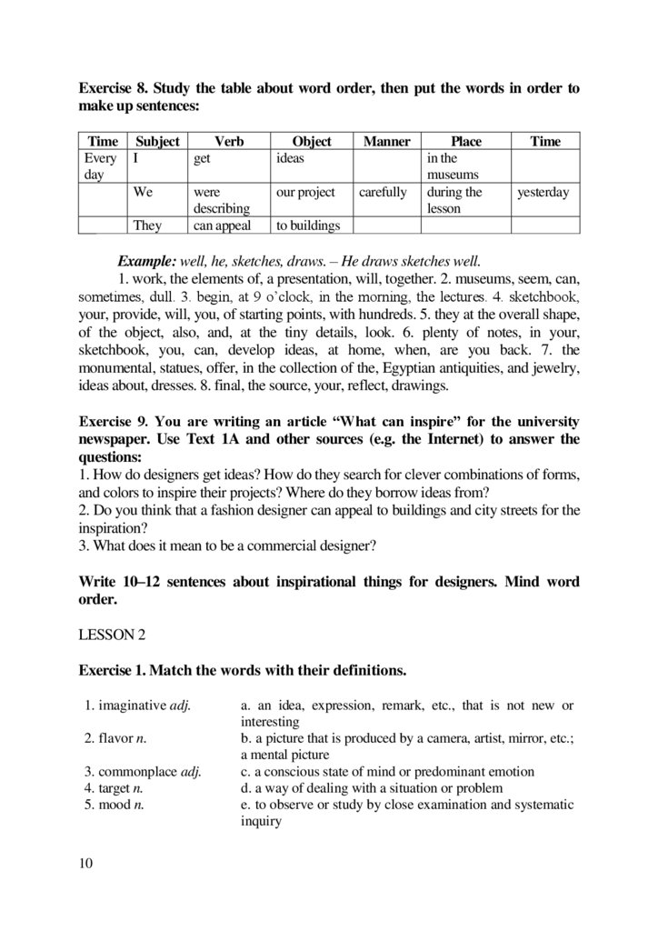
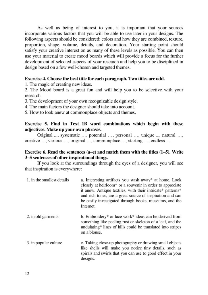
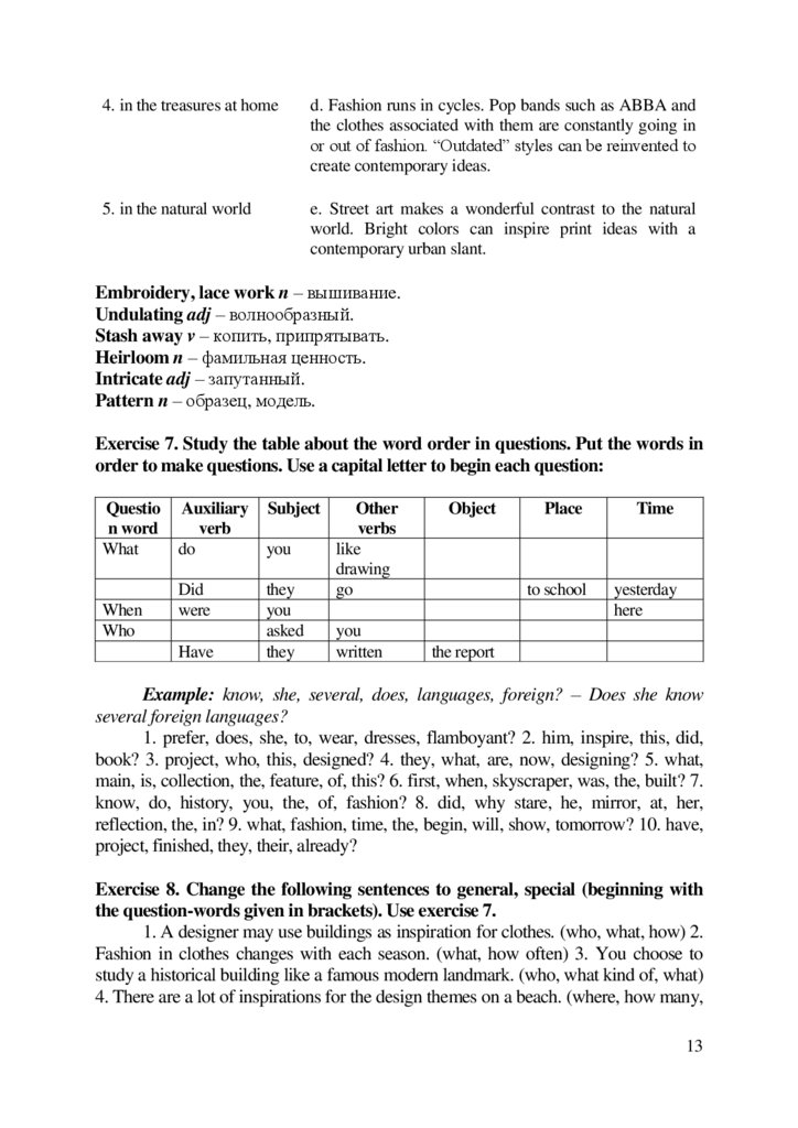
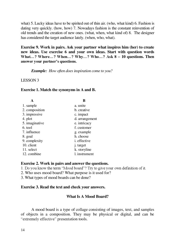
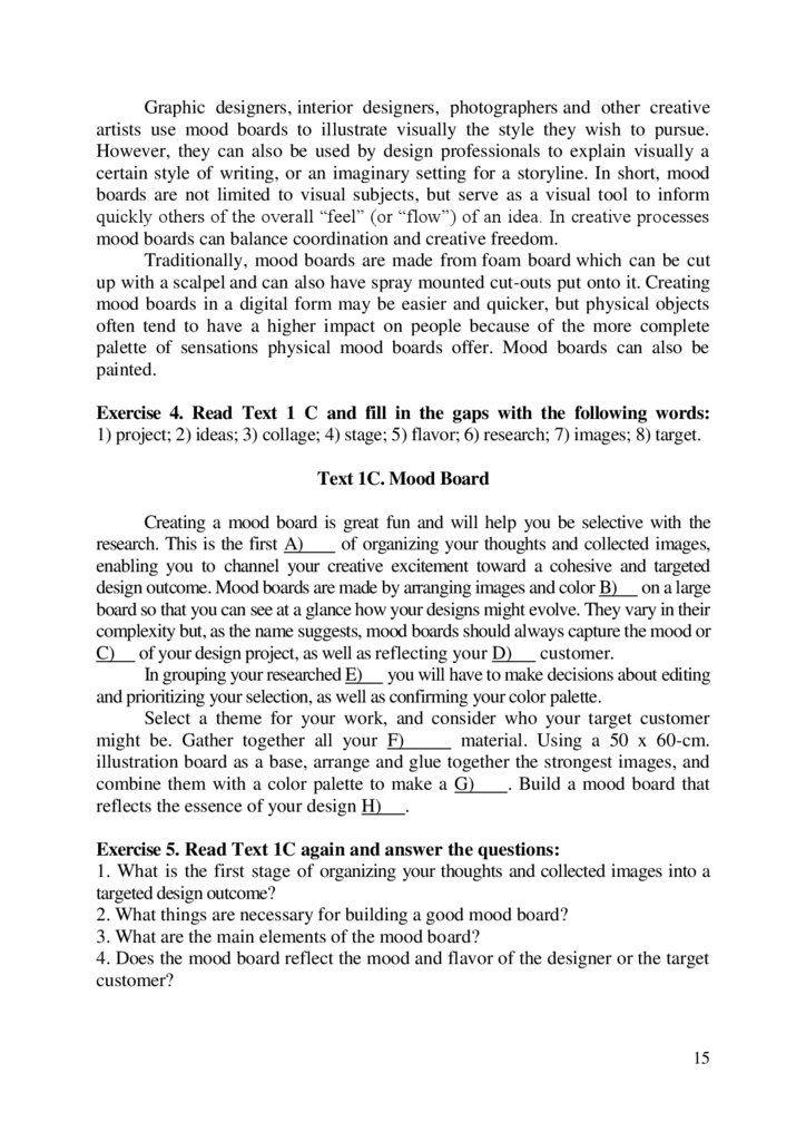


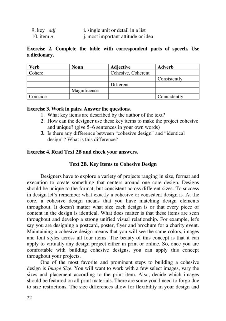

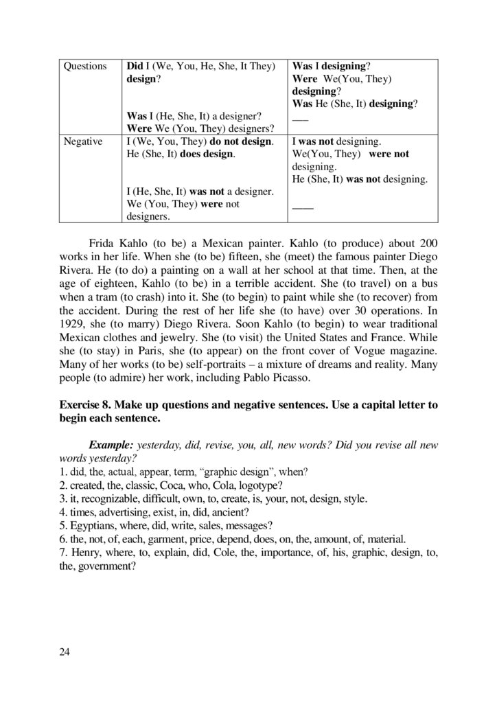
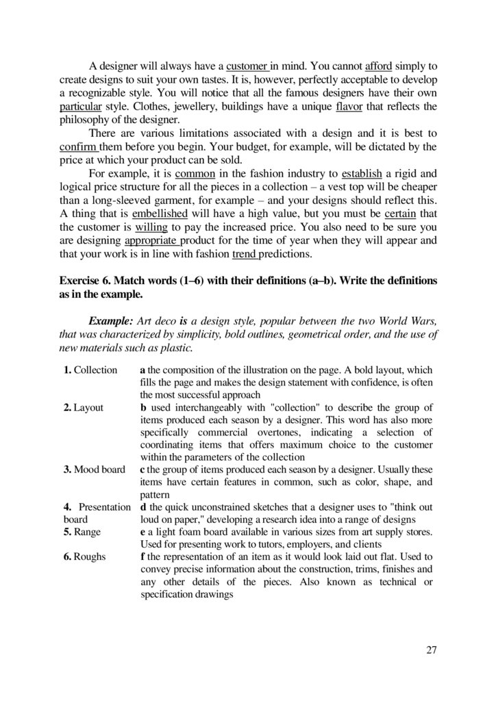
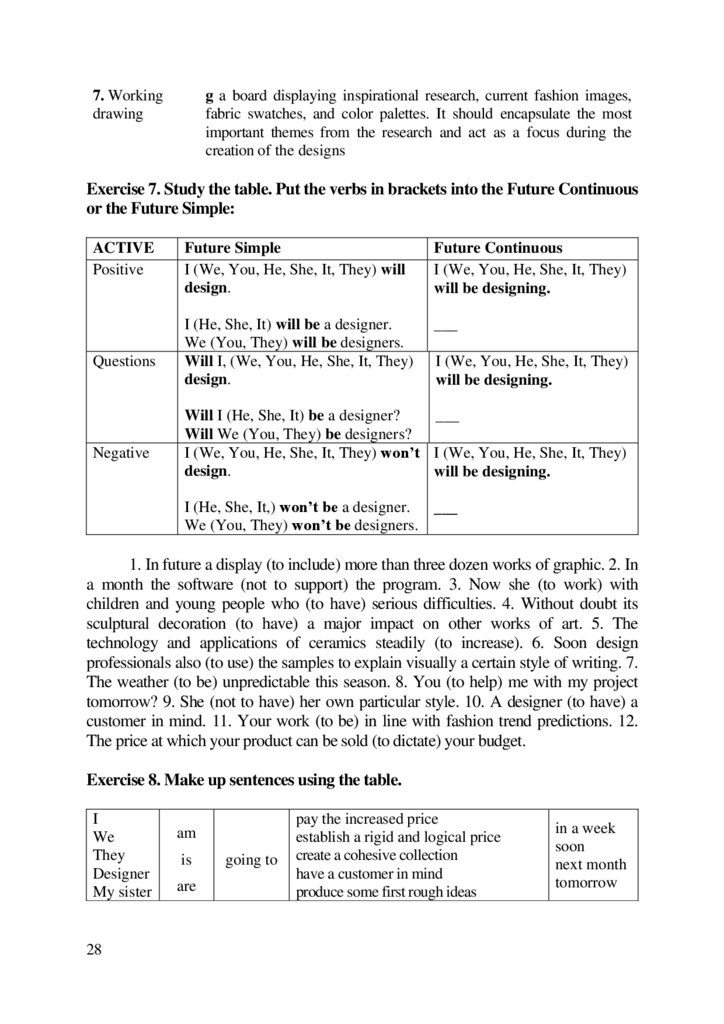

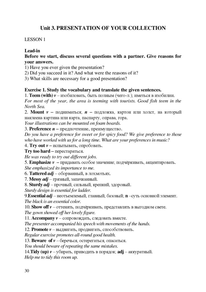
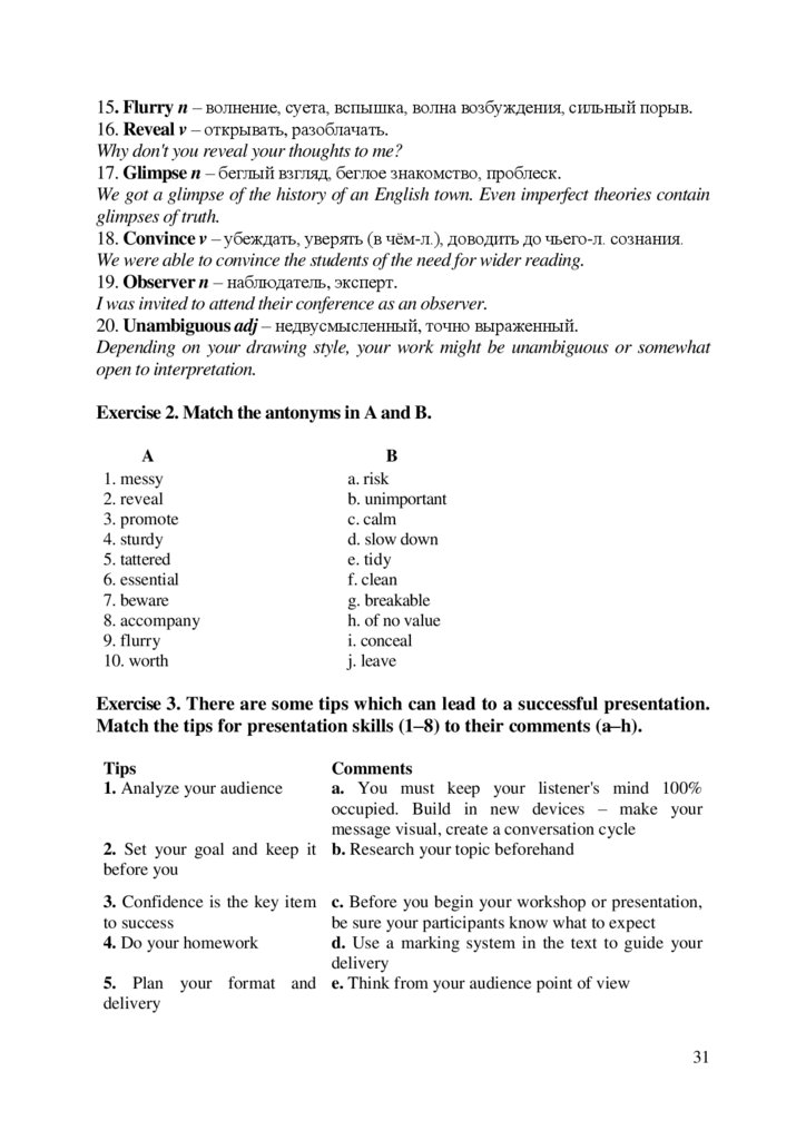
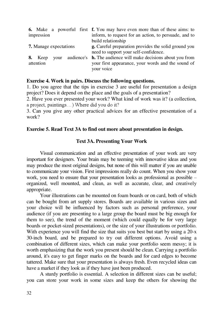
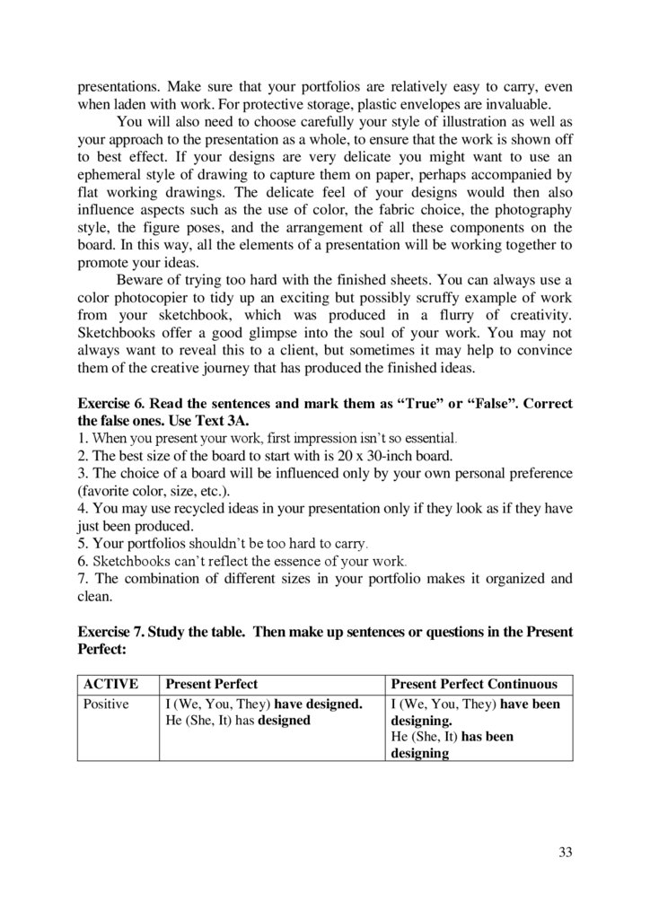
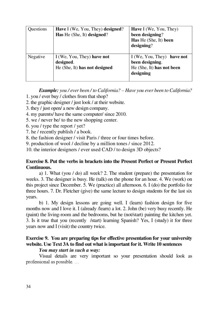
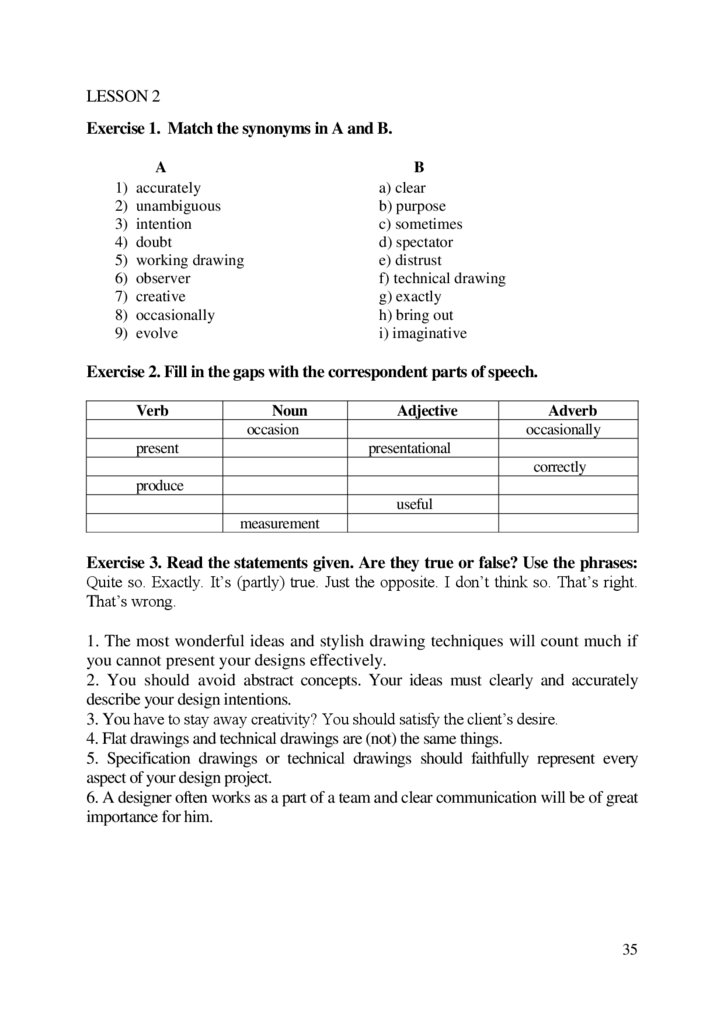
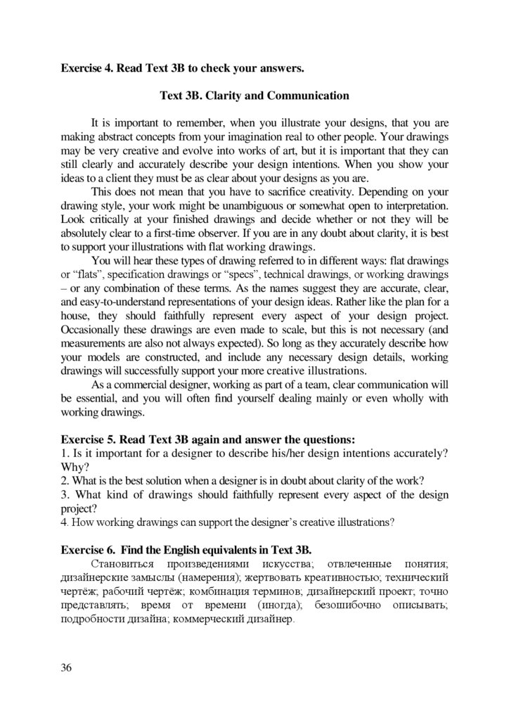
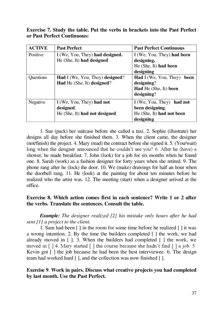


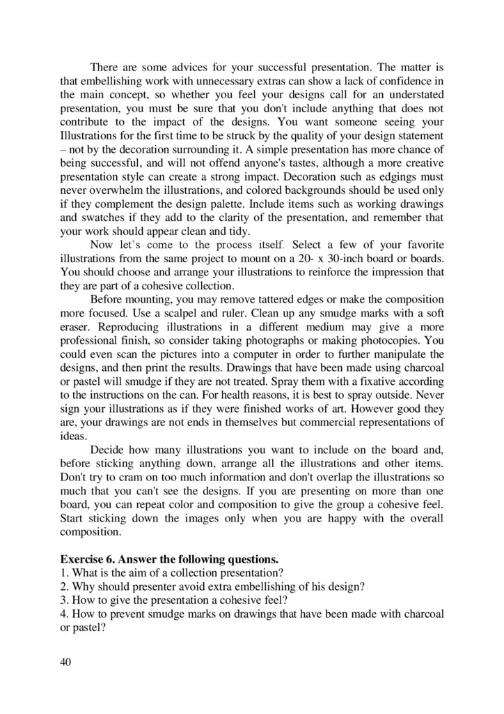

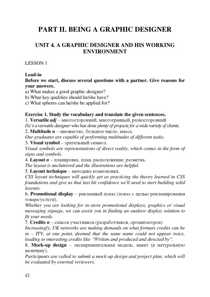
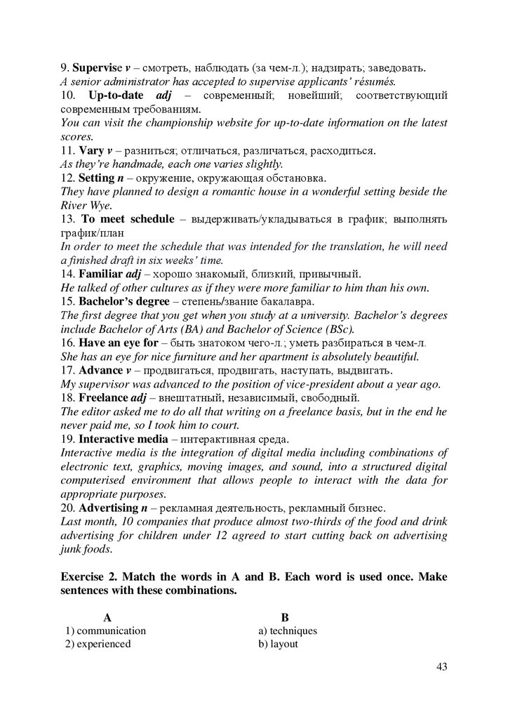
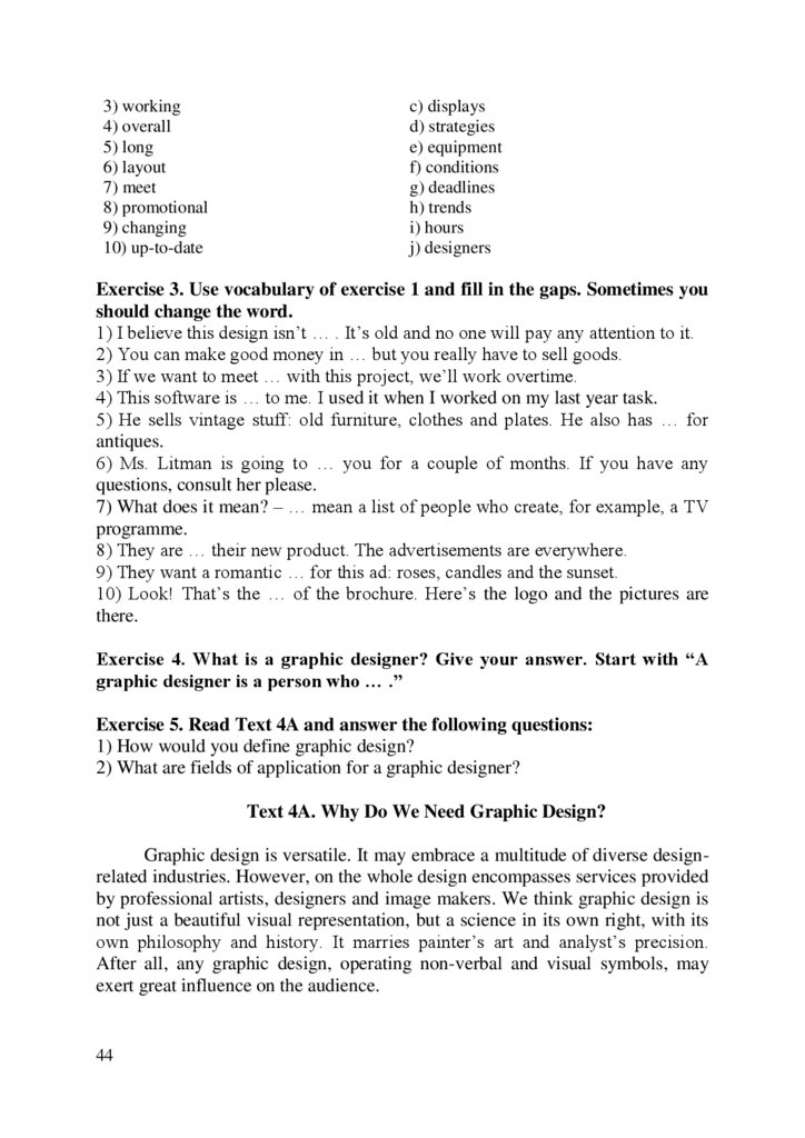
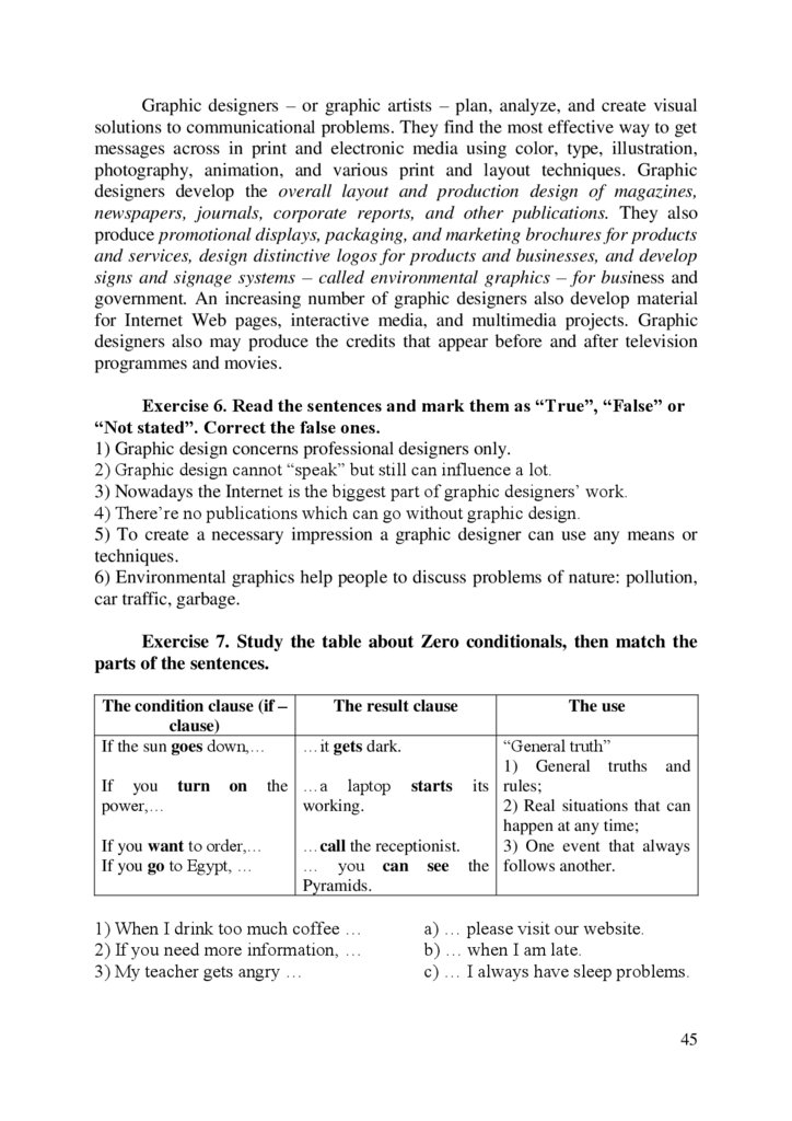
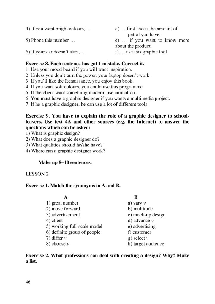
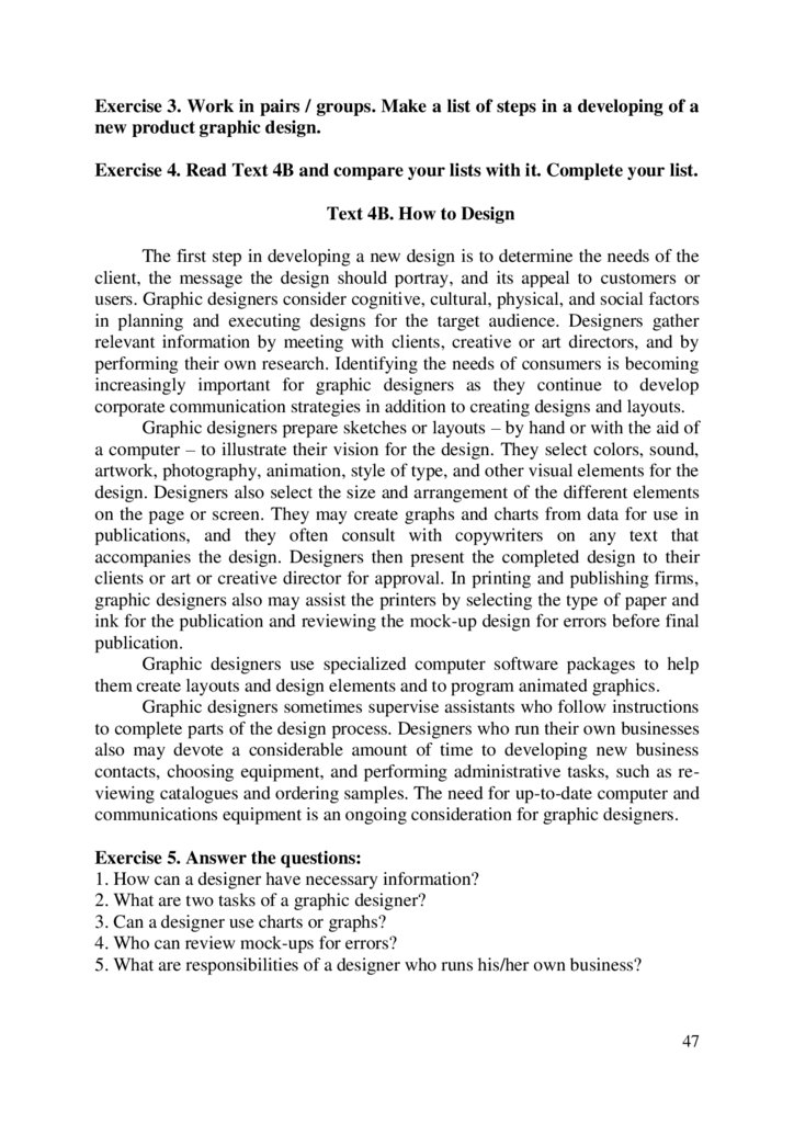
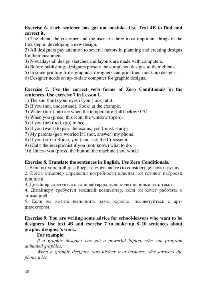

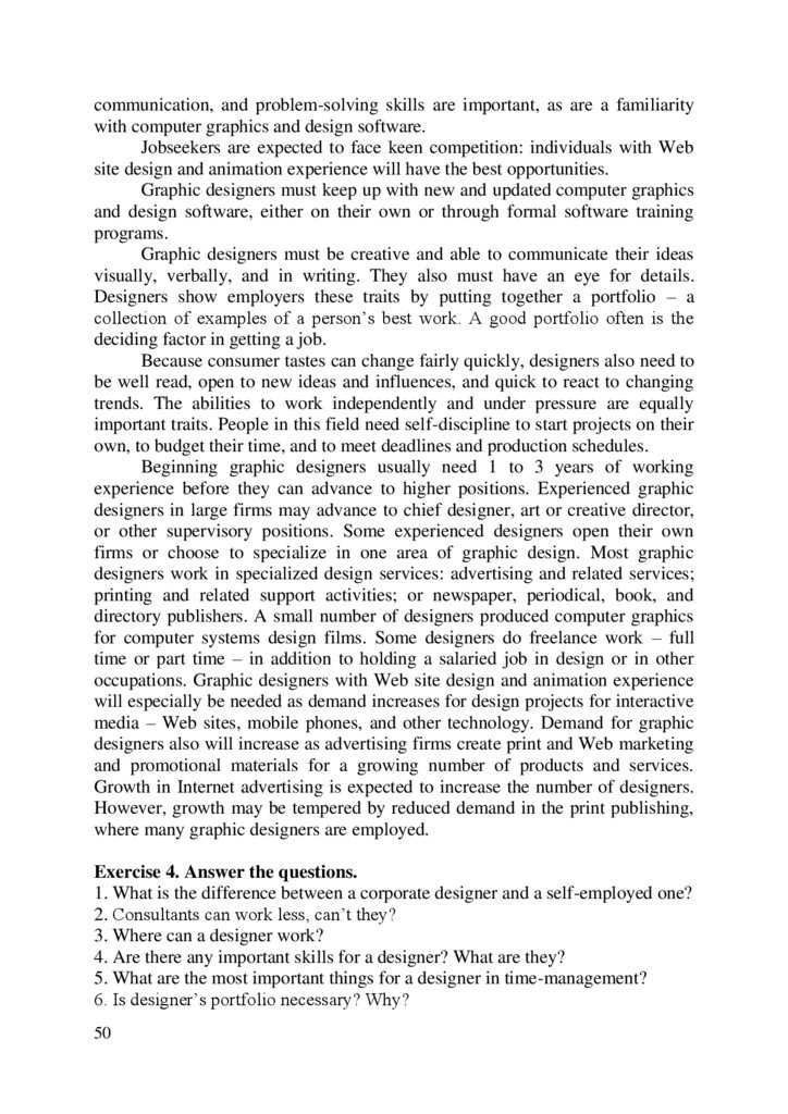

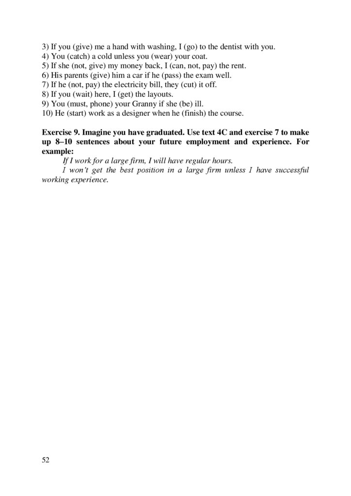
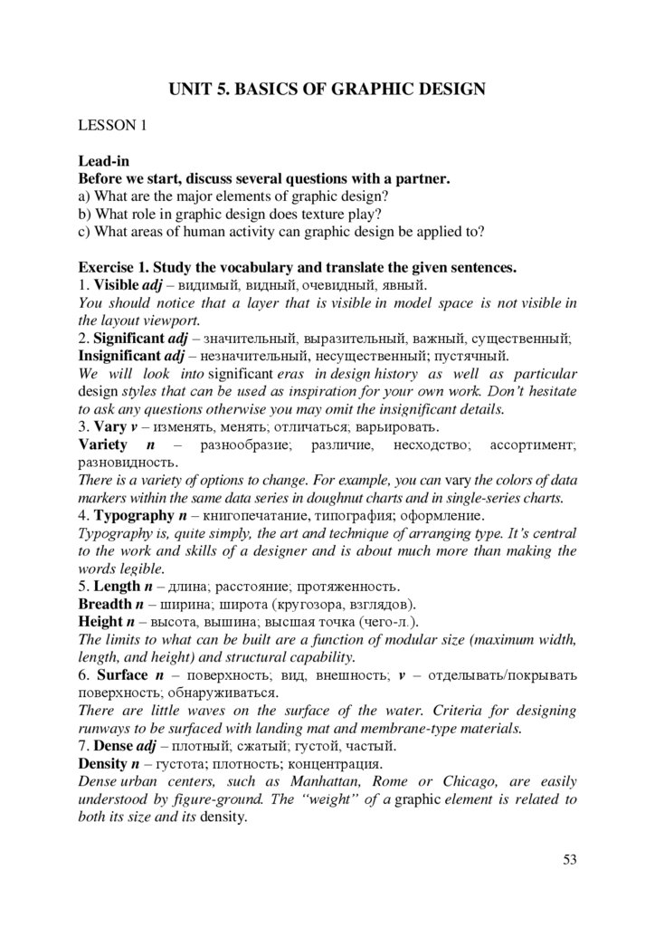


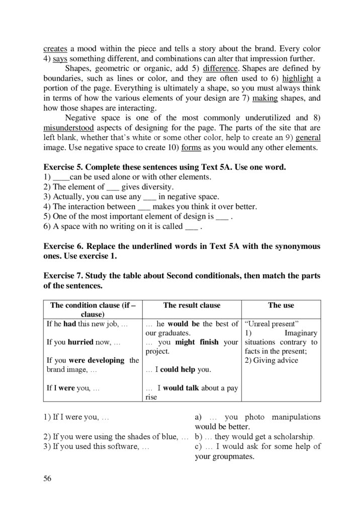

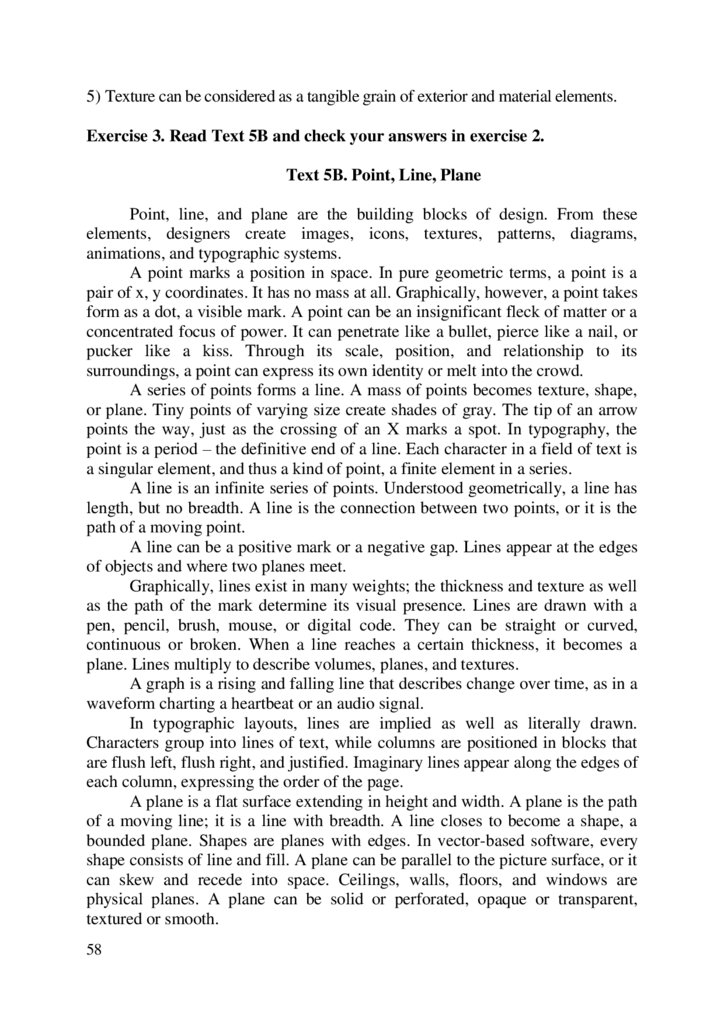
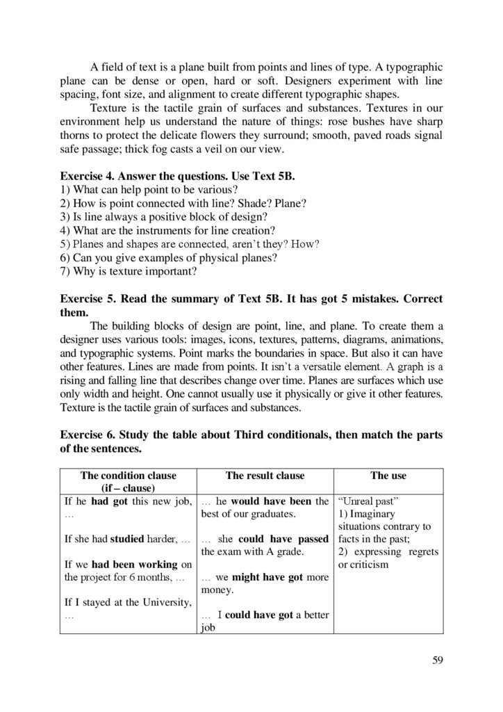
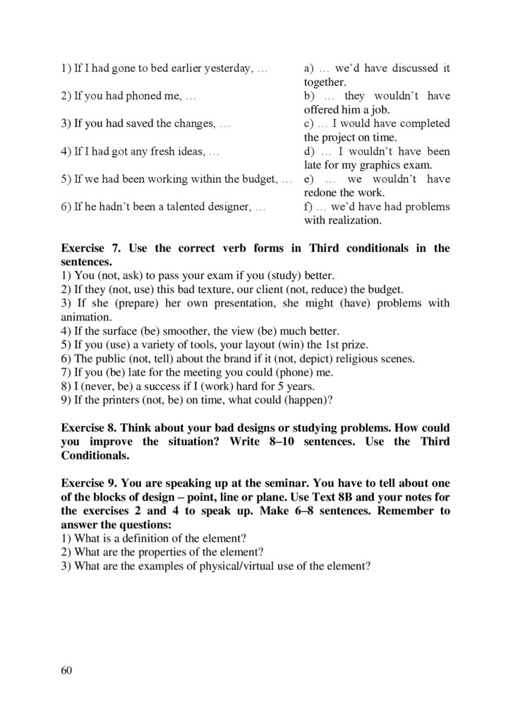
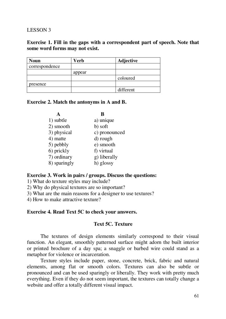
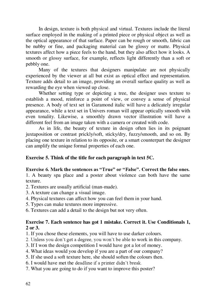


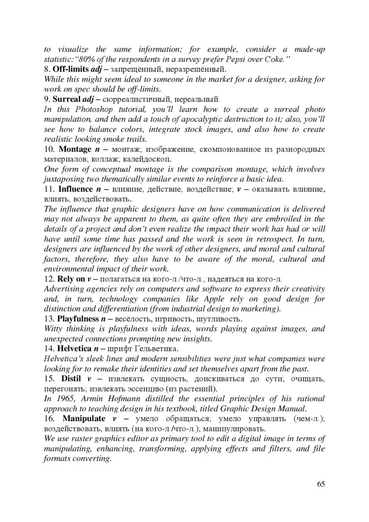
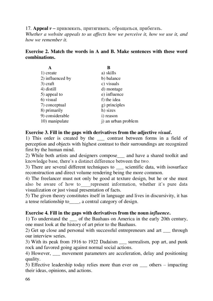
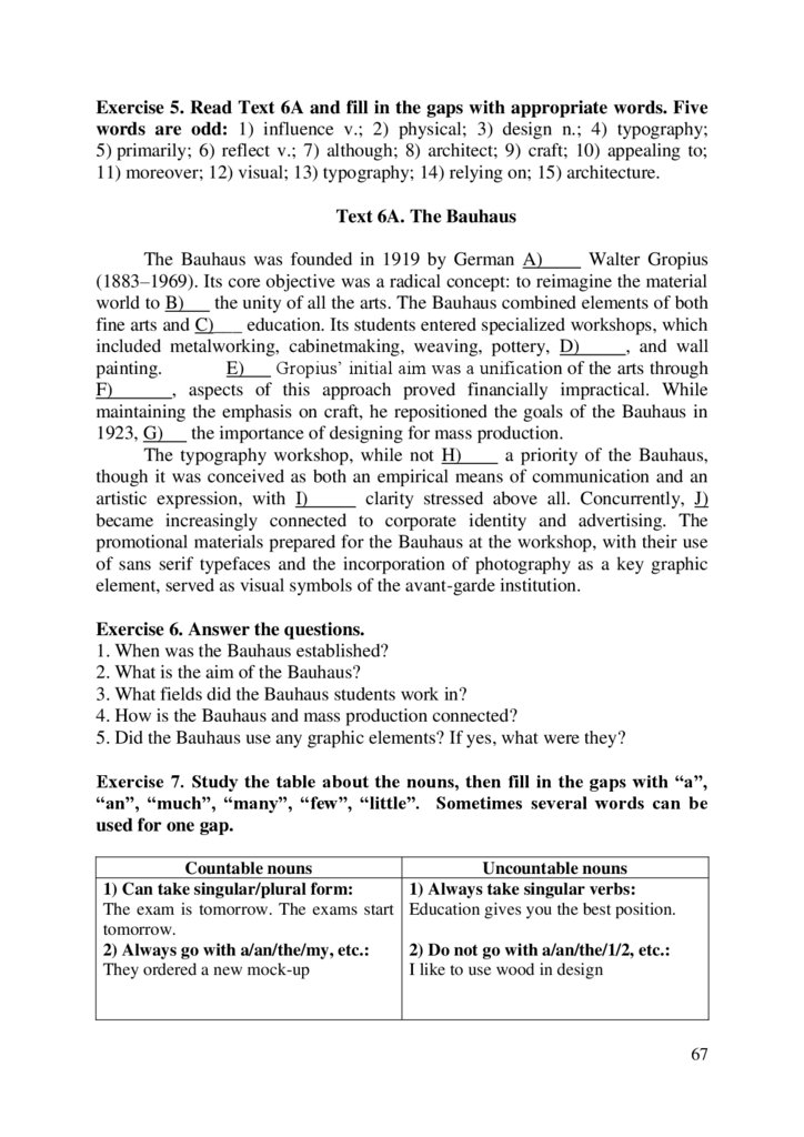
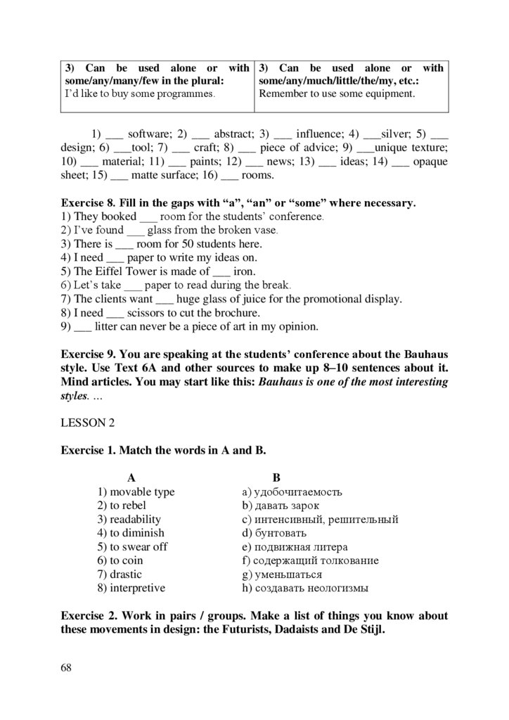
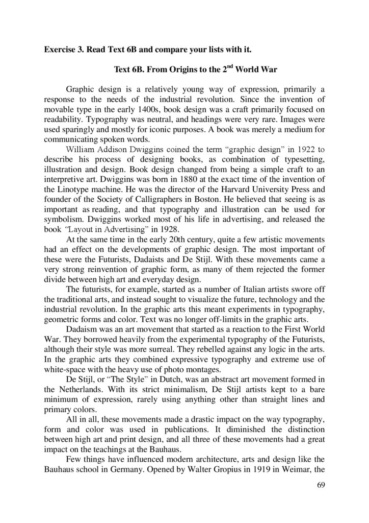
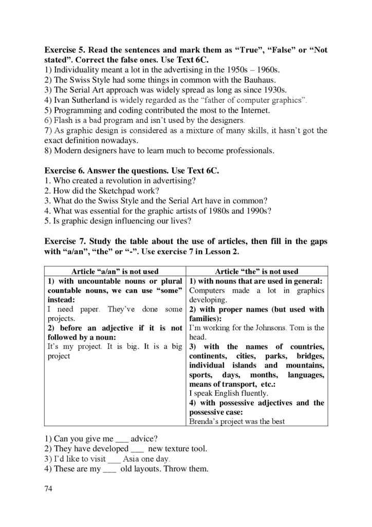
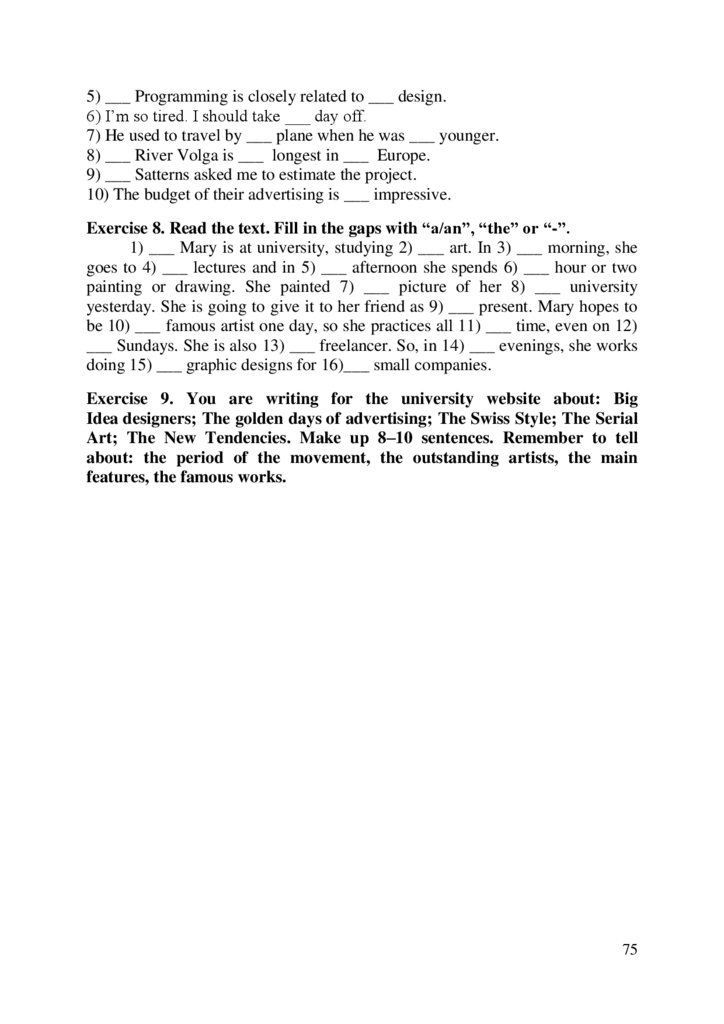

 programming
 english


