


 finance
Similar presentations:


Updated Return on investment (ROI)
1.
Project Part IIWork done by:
Adina
Dilshat
Aigerim
Darkhan
2.
Introduction3.
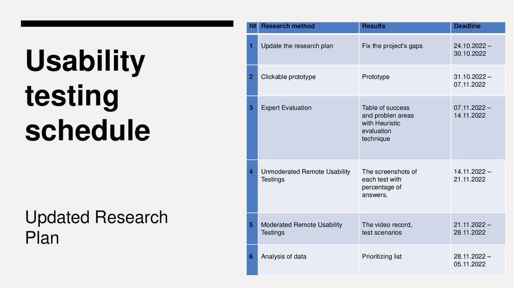
Usabilitytesting
schedule
Updated Research
Plan
№ Research method
Results
Deadline
1
Update the research plan
Fix the project’s gaps
24.10.2022 –
30.10.2022
2
Clickable prototype
Prototype
31.10.2022 –
07.11.2022
3
Expert Evaluation
Table of success
and problen areas
with Heuristic
evaluation
technique
07.11.2022 –
14.11.2022
4
Unmoderated Remote Usability
Testings
The screenshots of
each test with
percentage of
answers.
14.11.2022 –
21.11.2022
5
Moderated Remote Usability
Testings
The video record,
test scenarios
21.11.2022 –
28.11.2022
6
Analysis of data
Prioritizing list
28.11.2022 –
05.11.2022
4.
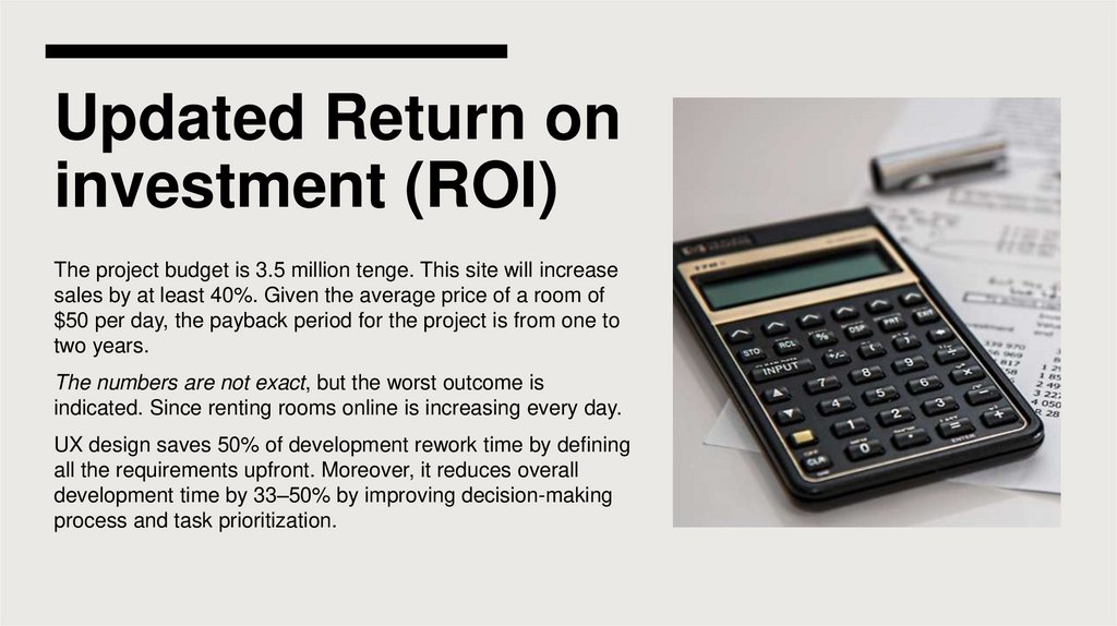
Updated Return oninvestment (ROI)
The project budget is 3.5 million tenge. This site will increase
sales by at least 40%. Given the average price of a room of
$50 per day, the payback period for the project is from one to
two years.
The numbers are not exact, but the worst outcome is
indicated. Since renting rooms online is increasing every day.
UX design saves 50% of development rework time by defining
all the requirements upfront. Moreover, it reduces overall
development time by 33–50% by improving decision-making
process and task prioritization.
5.
UX goals:1.
Ease of use
2.
High customer satisfaction
3.
Consistency
4.
Pleasure of Use
6.
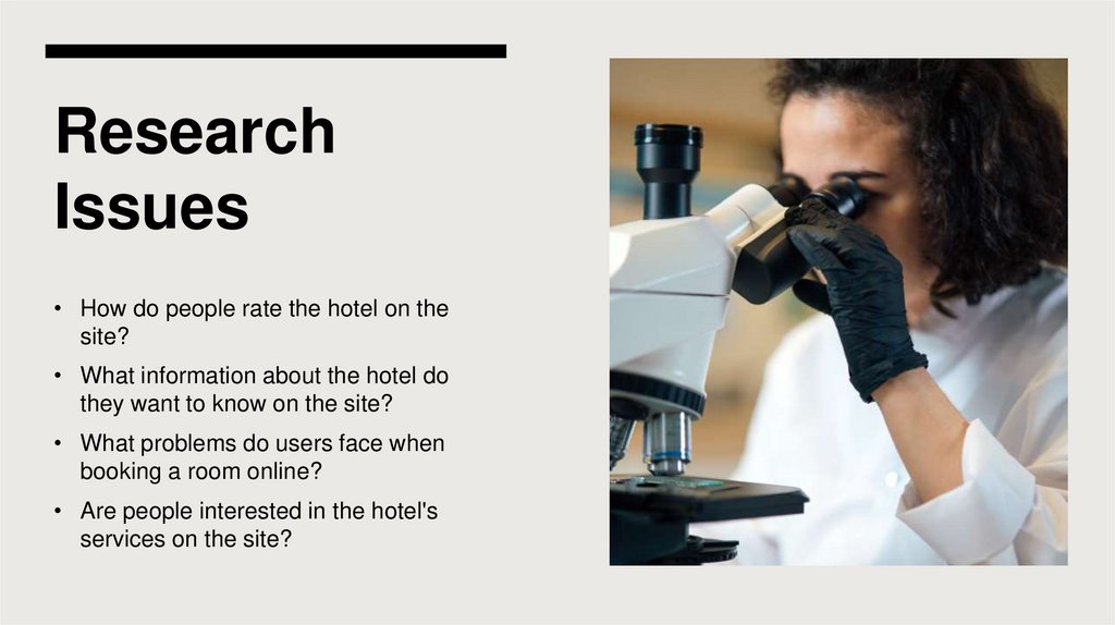
ResearchIssues
• How do people rate the hotel on the
site?
• What information about the hotel do
they want to know on the site?
• What problems do users face when
booking a room online?
• Are people interested in the hotel's
services on the site?
7.
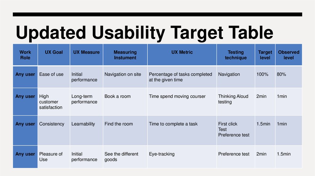
Updated Usability Target TableWork
Role
UX Goal
UX Measure
Measuring
Instument
UX Metric
Any user Ease of use
Initial
performance
Navigation on site
Percentage of tasks completed
at the given time
Any user High
customer
satisfaction
Long-term
performance
Book a room
Any user Consistency
Learnability
Any user Pleasure of
Use
Initial
performance
Testing
technique
Target
level
Observed
level
Navigation
100%
80%
Time spend moving courser
Thinking Aloud
testing
2min
1min
Find the room
Time to complete a task
First click
Test
Preference test
1.5min
1min
See the different
goods
Eye-tracking
Preference test
2min
1.5min
8.
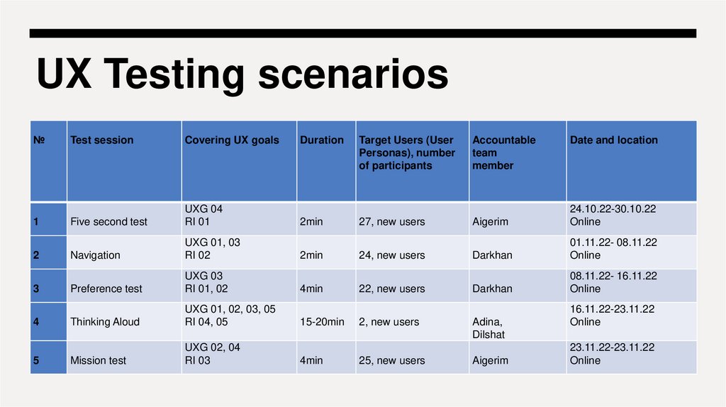
UX Testing scenarios№
1
2
3
4
5
Test session
Covering UX goals
Five second test
UXG 04
RI 01
Navigation
UXG 01, 03
RI 02
Preference test
UXG 03
RI 01, 02
Thinking Aloud
UXG 01, 02, 03, 05
RI 04, 05
Mission test
UXG 02, 04
RI 03
Duration
2min
2min
4min
15-20min
4min
Target Users (User
Personas), number
of participants
27, new users
24, new users
22, new users
2, new users
25, new users
Accountable
team
member
Date and location
Aigerim
24.10.22-30.10.22
Online
Darkhan
01.11.22- 08.11.22
Online
Darkhan
08.11.22- 16.11.22
Online
Adina,
Dilshat
Aigerim
16.11.22-23.11.22
Online
23.11.22-23.11.22
Online
9.
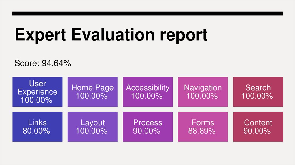
Expert Evaluation reportScore: 94.64%
User
Experience
100.00%
Home Page
100.00%
Accessibility
100.00%
Navigation
100.00%
Search
100.00%
Links
80.00%
Layout
100.00%
Process
90.00%
Forms
88.89%
Content
90.00%
10.
SUCCESSAREA: The need
to confirm the
data when
booking a room
Heuristic: #5 Error
Prevention, #6 Recognition
Rather Than Recall
Object: Modal booking
window
Evidence: (In the next slide)
11.
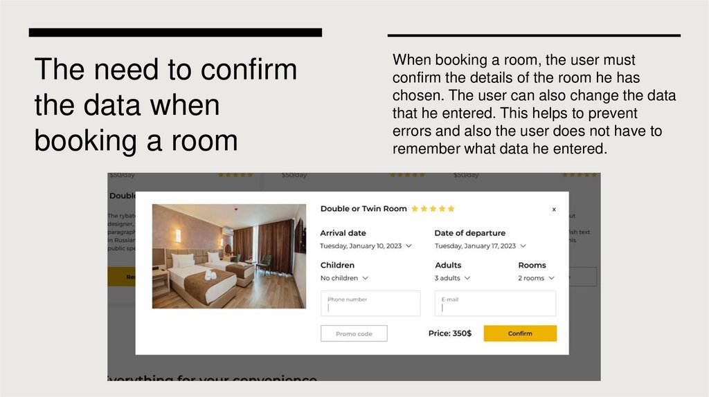
The need to confirmthe data when
booking a room
When booking a room, the user must
confirm the details of the room he has
chosen. The user can also change the data
that he entered. This helps to prevent
errors and also the user does not have to
remember what data he entered.
12.
SUCCESSAREA: Message
on successful
booking
Object: Dialog box messages
Heuristic: #1 Visibility of
system status
Evaluator: Dilshat
Evidence: (In the next slide)
13.
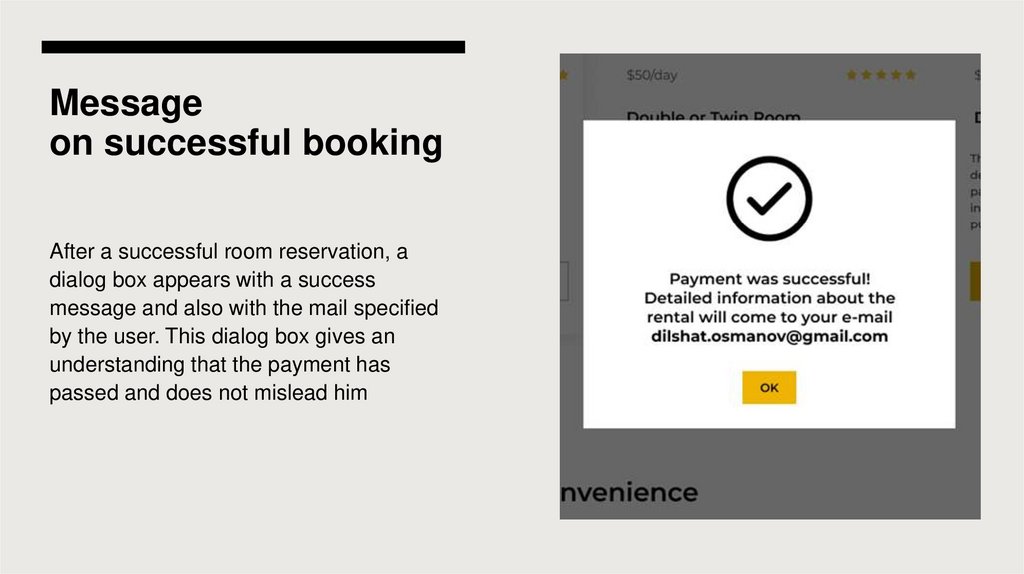
Messageon successful booking
After a successful room reservation, a
dialog box appears with a success
message and also with the mail specified
by the user. This dialog box gives an
understanding that the payment has
passed and does not mislead him
14.
SUCCESSAREA: Available
rooms section
Object: Available rooms section
Heuristic: #8 Aesthetic and
Minimalist Design
Evaluator: Dilshat
Evidence: (In the next slide)
15.
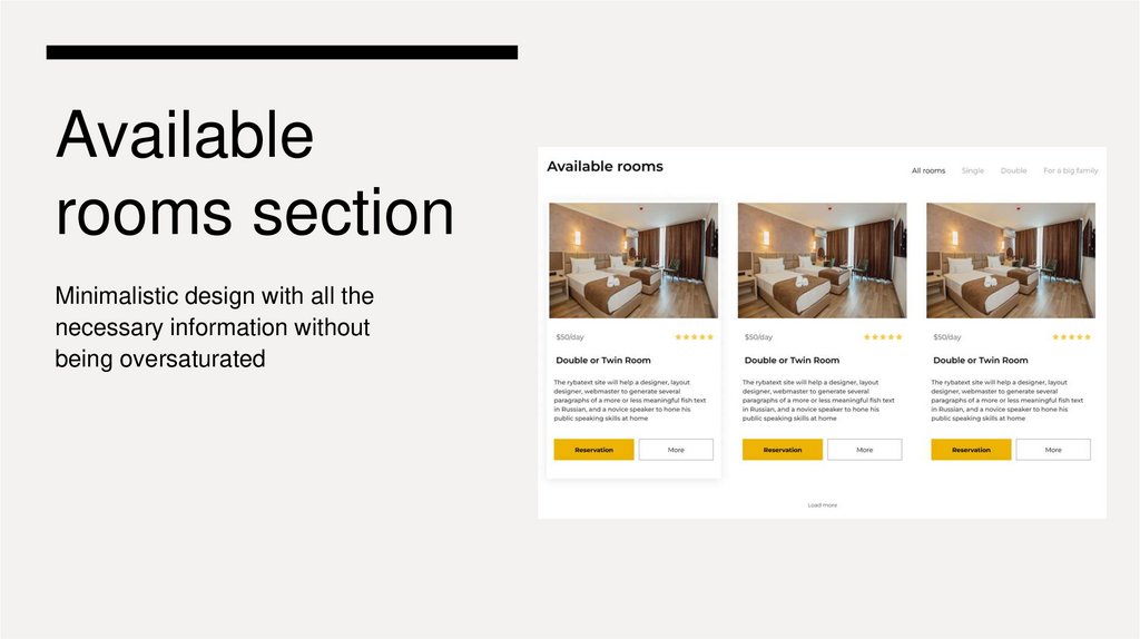
Availablerooms section
Minimalistic design with all the
necessary information without
being oversaturated
16.
PROBLEMAREA: There is
no back button in
the modal
payment window
Object: Payment modal
Heuristic: #3 User Control and Freedom
Severity Rating and Ease of fix ranking:
S3 E2
There is no back button in the modal
payment window, if you need to change
the data, you must exit the modal window
and fill in all the data again. This may be
inconvenient for users.
17.
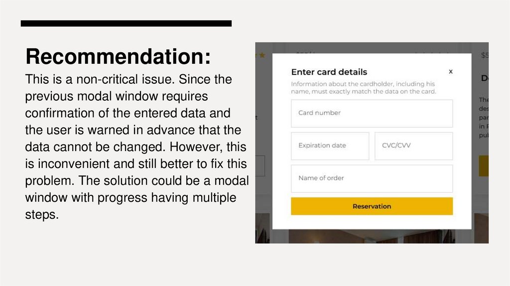
Recommendation:This is a non-critical issue. Since the
previous modal window requires
confirmation of the entered data and
the user is warned in advance that the
data cannot be changed. However, this
is inconvenient and still better to fix this
problem. The solution could be a modal
window with progress having multiple
steps.
18.
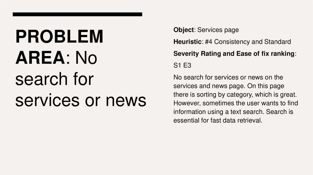
PROBLEMAREA: No
search for
services or news
Object: Services page
Heuristic: #4 Consistency and Standard
Severity Rating and Ease of fix ranking:
S1 E3
No search for services or news on the
services and news page. On this page
there is sorting by category, which is great.
However, sometimes the user wants to find
information using a text search. Search is
essential for fast data retrieval.
19.
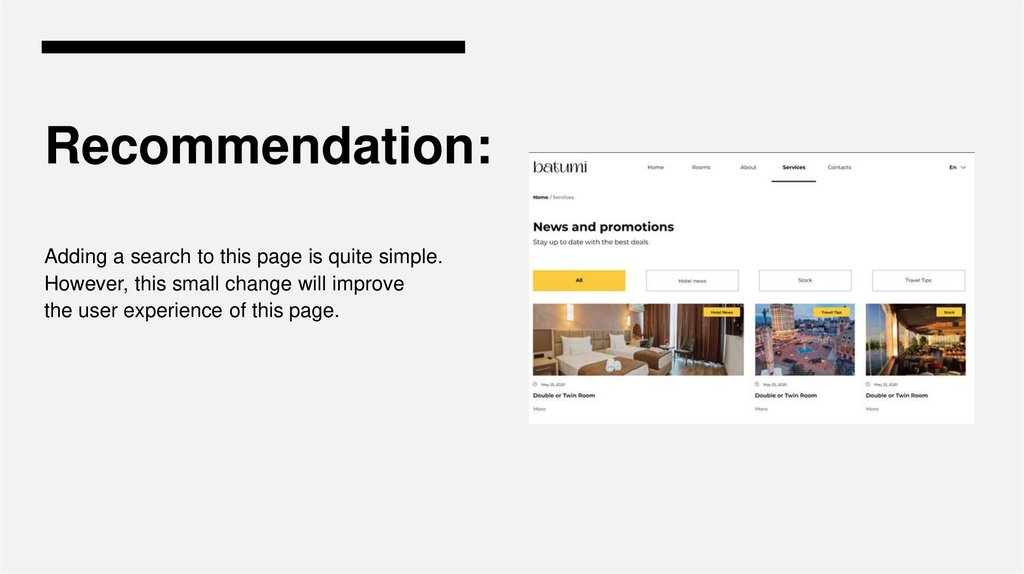
Recommendation:Adding a search to this page is quite simple.
However, this small change will improve
the user experience of this page.
20.
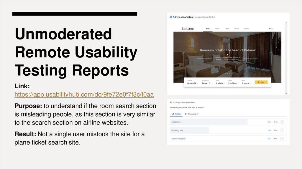
UnmoderatedRemote Usability
Testing Reports
Link:
https://app.usabilityhub.com/do/9fe72e0f7f3c/f0aa
Purpose: to understand if the room search section
is misleading people, as this section is very similar
to the search section on airline websites.
Result: Not a single user mistook the site for a
plane ticket search site.
21.
Navigation TestLink:
https://app.usabilityhub.com/do/848a03
ba1436/b110
Purpose: to check if the "To Services"
button is misleading and is not
confused with the "Services" link in the
main menu.
Result: 17% of users repatched this
button, which means it needs to be
renamed.
22.
Preference Test:Link:
https://app.usabilityhub.com/do/5fa05ae3abef/b9b7
Purpose: to decide what is more important on the
main menu "Phone number" or "Language
change button".
Result: Users liked the phone number design
more, but most users consider the language
change feature to be more important. We also
consider the function of changing the language
more important, plus the phone number is in the
footer and also on the "Contact" page. Solution: it
is necessary to check whether the user will find a
phone number on the site. (P.S. We will check this
in moderated testing)
23.
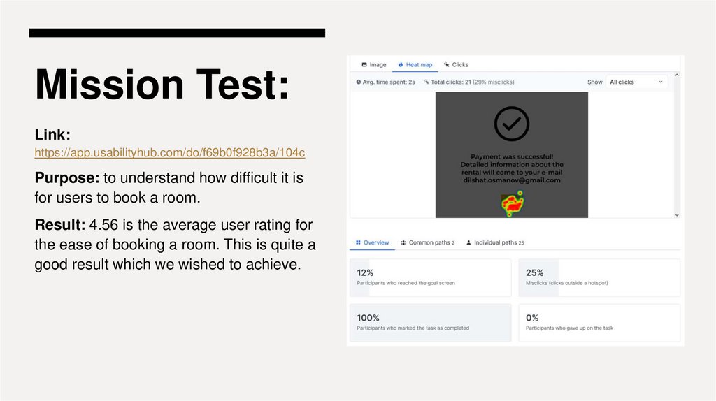
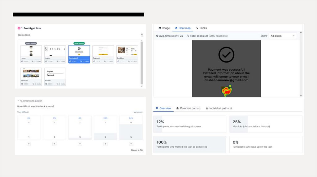
Mission Test:Link:
https://app.usabilityhub.com/do/f69b0f928b3a/104c
Purpose: to understand how difficult it is
for users to book a room.
Result: 4.56 is the average user rating for
the ease of booking a room. This is quite a
good result which we wished to achieve.
24.
25.
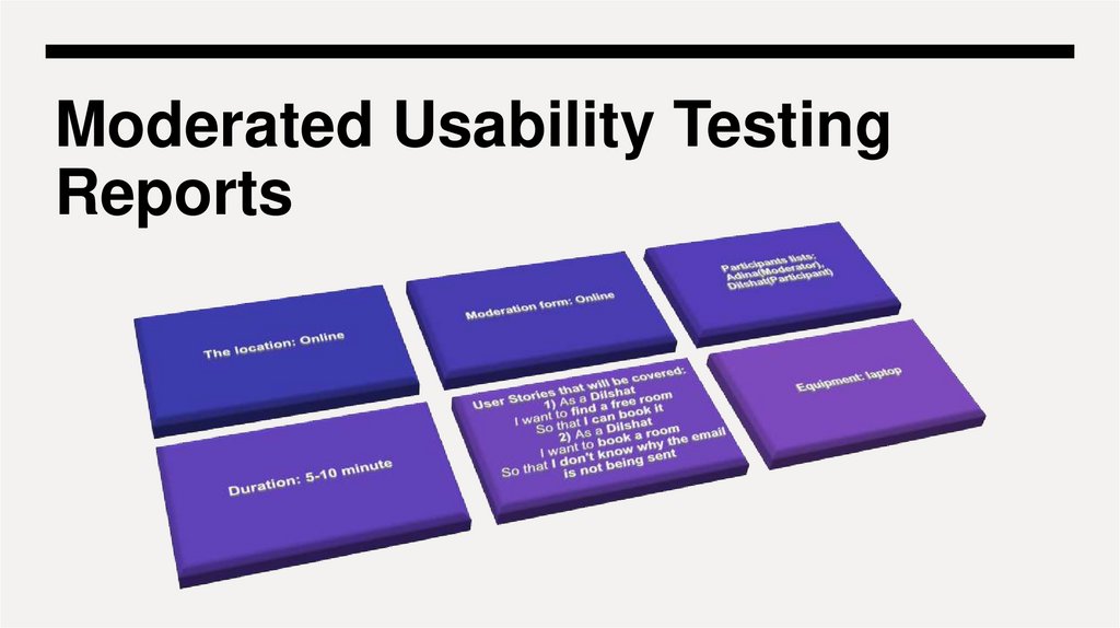
Moderated Usability TestingReports
26.
Prioritized list ofrecommendations for 2nd
iteration
27.
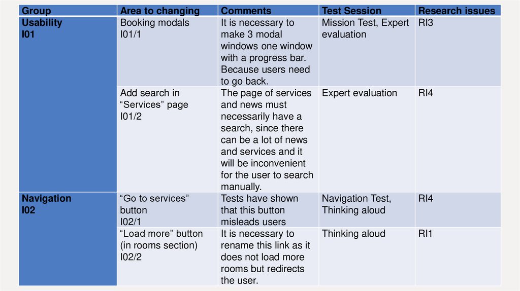
GroupUsability
I01
Area to changing
Booking modals
I01/1
Add search in
“Services” page
I01/2
Navigation
I02
“Go to services”
button
I02/1
“Load more” button
(in rooms section)
I02/2
Comments
It is necessary to
make 3 modal
windows one window
with a progress bar.
Because users need
to go back.
The page of services
and news must
necessarily have a
search, since there
can be a lot of news
and services and it
will be inconvenient
for the user to search
manually.
Tests have shown
that this button
misleads users
It is necessary to
rename this link as it
does not load more
rooms but redirects
the user.
Test Session
Research issues
Mission Test, Expert RI3
evaluation
Expert evaluation
RI4
Navigation Test,
Thinking aloud
RI4
Thinking aloud
RI1
28.
aoaoaooammmm