


 informatics
 software
Similar presentations:


")


Moslashuvchan dizayn
1.
Moslashuvchan dizayn2.
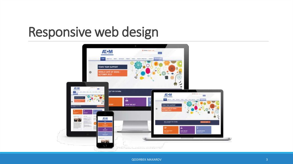
Responsive web designQODIRBEK MAXAROV
2
3.
Responsive web designQODIRBEK MAXAROV
3
4.
Responsive web designQODIRBEK MAXAROV
4
5.
Responsive vs AdaptiveQODIRBEK MAXAROV
5
6.
Moslashuvchan dizaynMoslashuvchan dizayn texnikasining 3ta asosiy komponenti:
• Moslashuvchan setka (flexible grid, fluid layout)
• Moslashuvchan rasmlar (flexible images)
• CSS media so'rovlar (media queries)
*Qo'shimcha ravishda viewport meta elementi.
QODIRBEK MAXAROV
6
7.
Viewport meta elementi<meta name="viewport" content="width=device-width, initial-scale=1">
QODIRBEK MAXAROV
7
8.
Developer toolsQurilmalarda
ko'rinishni yoqish
Qurilmani tanlash
QODIRBEK MAXAROV
8
9.
Moslashuvchan setka (flexible grid, fluid layout)CSS Grid layout
CSS Flex layout
Foizli qiymatlar
QODIRBEK MAXAROV
9
10.
Moslashuvchan rasmlar (flexible images)img {
max-width: 100%;
}
QODIRBEK MAXAROV
10
11.
Media so'rovlar@media [not | only] type [and (feature: value)]... {
/* styles for browsers that meet this criteria */
}
@media screen and (orientation: landscape) {
body {
background: skyblue;
}
}
@media screen and (orientation: portrait) {
body {
background: coral;
}
}
QODIRBEK MAXAROV
11
12.
Media turlarall – barcha turdagi qurilmalar uchun
print – printerlar uchun
screen – kompyuter, planshet, smartfon ekranlari uchun
speech – ekrandagi sahifani o'qiydigan (ovoz bilan) dasturlar uchun
QODIRBEK MAXAROV
12
13.
Media xossalarwidth
ko'rinish sohasi (viewport) kengligi, min-width, max-width ham ishlatiladi
height
ko'rinish sohasi (viewport) uzunligi, min-height, max-height ham ishlatiladi
orientation
qurilma yo'nalishini aniqlash (portrait, landscape)
aspect-ratio
qurilma tomonlari nisbati (width/height), masalan, aspect-ratio: 16/9
color
displeyning bitlari, masalan, color: 8 – qurilma kamida 8 bitli rangni qo'llaydi
resolution
qurilmaning piksellar zichligi (dpi, dpcm)
grid
qurilmaning displeyi setkaga asoslanganini aniqlash, terminal oynasiga
o'xshash
https://www.w3.org/TR/mediaqueries-4/
QODIRBEK MAXAROV
13
14.
IshlatishHTMLda:
<head>
<link rel="stylesheet" href="styles.css">
<link rel="stylesheet" href="2column-styles.css" media="screen and (min-width:1024px)">
</head>
CSSda import orqali:
<style>
@import url("/default-styles.css");
@import url("/wide-styles.css") screen and (min-width: 1024px);
</style>
CSSda media so'rov orqali:
<style>
@media screen and (orientation: landscape) {
body {
background: skyblue;
}
}
</style>
QODIRBEK MAXAROV
14
15.
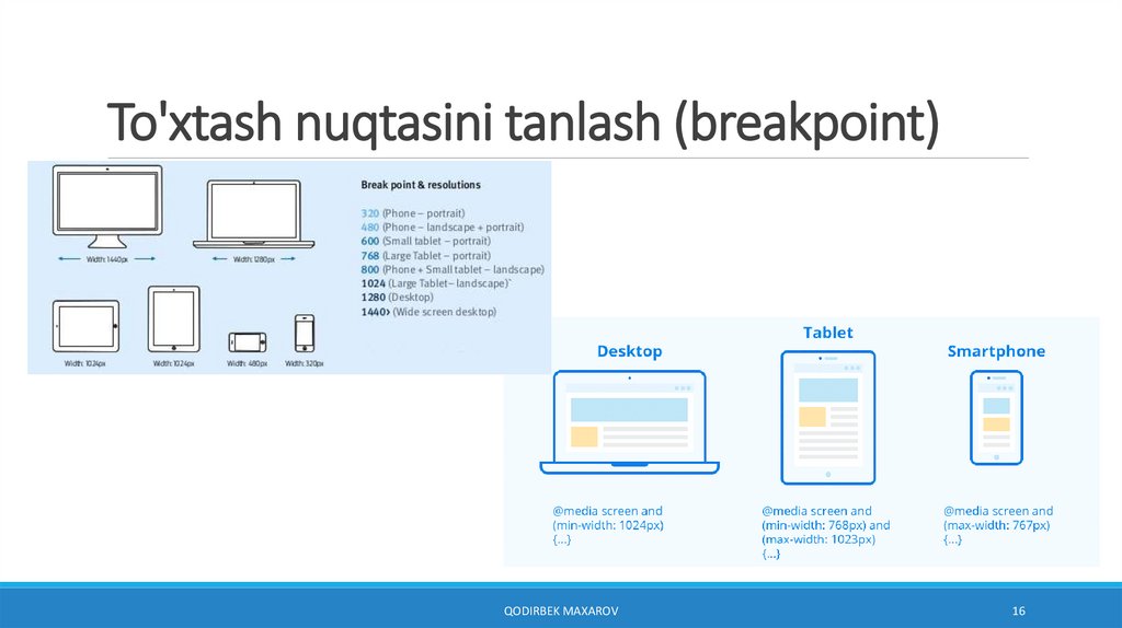
To'xtash nuqtasini tanlash (breakpoint)QODIRBEK MAXAROV
15
16.
To'xtash nuqtasini tanlash (breakpoint)QODIRBEK MAXAROV
16
17.
Moslashuvchan dizaynMuhim bo'lgan elementlar:
• Kontent ierarxiyasi (Content hierarchy)
• Maket (Layout)
• Tipografiya (Typography)
• Navigatsiya (Navigation)
• Rasmlar (Images)
• Maxsus content (jadvallar, formalar, interaktiv elementlar)
QODIRBEK MAXAROV
17
18.
Moslashuvchan maket shablonlari(Responsive layout patterns)
QODIRBEK MAXAROV
18
19.
TipografiyaQODIRBEK MAXAROV
19
20.
TipografiyaMuhim bo'lgan xossalar:
• shrift oilasi
• shrift o'lchami
• qator uzunligi
• element chegarasi atrofidagi masofalar
Shuningdek, vw, vh o'lchov birliklaridan foydalanish mumkin.
QODIRBEK MAXAROV
20
21.
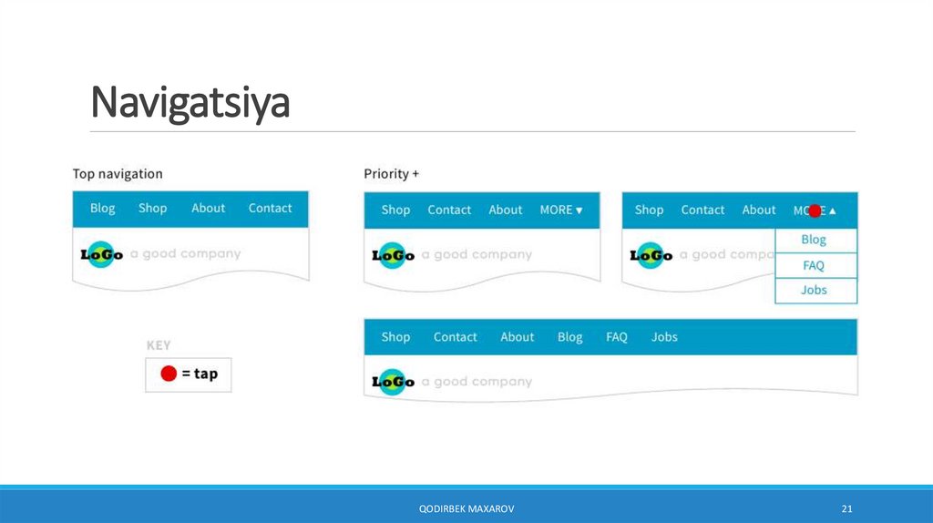
NavigatsiyaQODIRBEK MAXAROV
21
22.
NavigatsiyaQODIRBEK MAXAROV
22
23.
NavigatsiyaQODIRBEK MAXAROV
23
24.
Namunalar (kenglikka nisbatan)body {
background-color: tan;
}
/* maksimal kenglik 992px bo'lganda */
@media screen and (max-width: 992px) {
body {
background-color: blue;
}
}
/* maksimal kenglik 600px bo'lganda */
@media screen and (max-width: 600px) {
body {
background-color: olive;
}
}
QODIRBEK MAXAROV
24
25.
Namunalar (orientatsiya)body {
background-color: lightgreen;
}
@media only screen and (orientation: landscape) {
body {
background-color: lightblue;
}
}
QODIRBEK MAXAROV
25
26.
Namunalar (bloklar).column {
float: left;
width: 24%;
height: 100px;
background-color: aquamarine;
margin: 0.5%;
}
<div>
<div class="column"></div>
<div class="column"></div>
<div class="column"></div>
<div class="column"></div>
</div>
@media screen and (max-width: 992px) {
.column {
width: 49%;
}
}
@media screen and (max-width: 600px) {
.column {
width: 100%;
}
}
QODIRBEK MAXAROV
26
27.
Namunalar (menyu).topnav {
overflow: hidden;
background-color: #333;
}
.topnav a {
float: left;
display: block;
color: white;
text-align: center;
padding: 14px 16px;
text-decoration: none;
}
.topnav a:hover {
background-color: green;
}
@media screen and (max-width: 600px) {
.topnav a {
float: none;
width: 100%;
}
}
...
<div class="topnav">
<a href="#">Home</a>
<a href="#">Link 1</a>
<a href="#">Link 2</a>
<a href="#">Link 3</a>
</div>
QODIRBEK MAXAROV
27