 geography
Similar presentations:


World Map. Vintage Instructions
1.
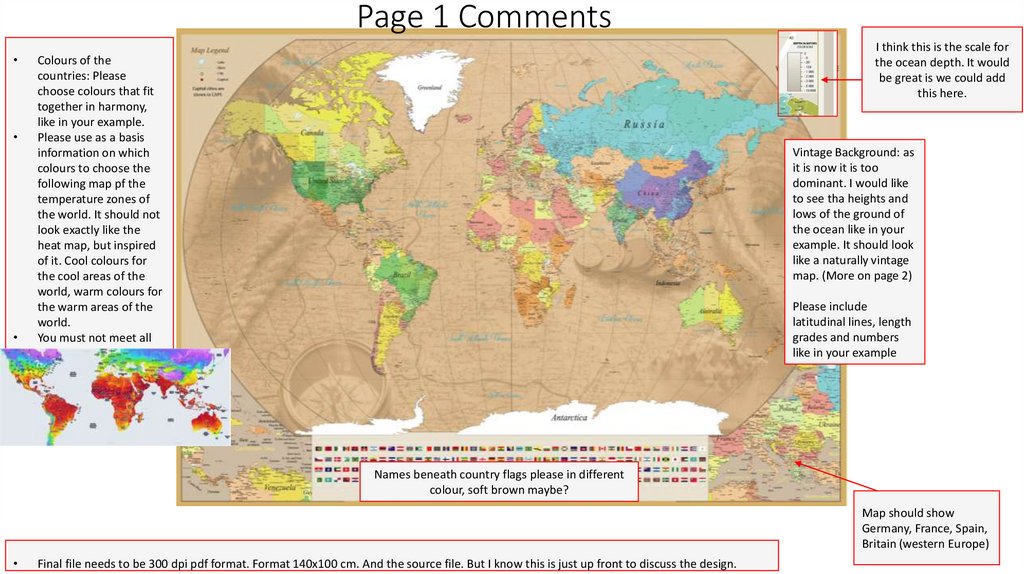
Page 1 CommentsI think this is the scale for
the ocean depth. It would
be great is we could add
this here.
Colours of the
countries: Please
choose colours that fit
together in harmony,
like in your example.
Please use as a basis
information on which
colours to choose the
following map pf the
temperature zones of
the world. It should not
look exactly like the
heat map, but inspired
of it. Cool colours for
the cool areas of the
world, warm colours for
the warm areas of the
world.
You must not meet all
climate zones! Just so
the pattern can be seen.
Vintage Background: as
it is now it is too
dominant. I would like
to see tha heights and
lows of the ground of
the ocean like in your
example. It should look
like a naturally vintage
map. (More on page 2)
Please include
latitudinal lines, length
grades and numbers
like in your example
Names beneath country flags please in different
colour, soft brown maybe?
Map should show
Germany, France, Spain,
Britain (western Europe)
Final file needs to be 300 dpi pdf format. Format 140x100 cm. And the source file. But I know this is just up front to discuss the design.
2.
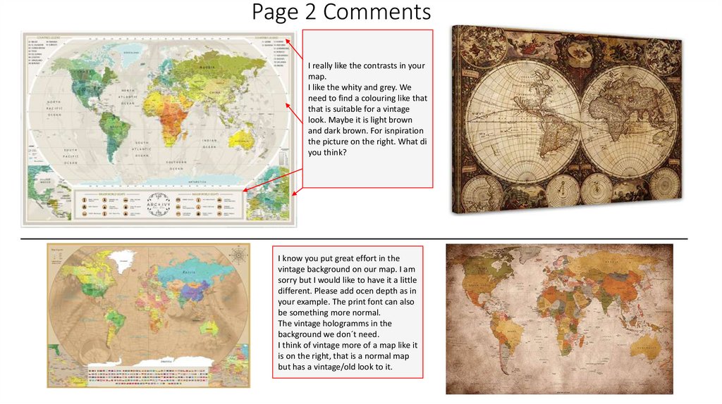
Page 2 CommentsI really like the contrasts in your
map.
I like the whity and grey. We
need to find a colouring like that
that is suitable for a vintage
look. Maybe it is light brown
and dark brown. For isnpiration
the picture on the right. What di
you think?
I know you put great effort in the
vintage background on our map. I am
sorry but I would like to have it a little
different. Please add ocen depth as in
your example. The print font can also
be something more normal.
The vintage hologramms in the
background we don´t need.
I think of vintage more of a map like it
is on the right, that is a normal map
but has a vintage/old look to it.