


 advertising
Similar presentations:


")


Fujikura group basic rules for brand logo
1.
Fujikura Group Basic Rules for Brand LogoDecember 2010
A Basic design system
B Application design system
C Sign design system
2.
00Introduction
Fujikura Ltd. and the Fujikura Group have created a design system for displaying the brand logo, in order to further strengthen our brand in the global
market.
This document, “Fujikura Group Basic Rules for Brand Logo,” specifies the
basic display system for design, in order for each company in the Fujikura
Group to use and display the brand logo correctly. It describes our approach
to major design uses with examples, in order to maintain a constant design
level in using for various media.
A consistent and sophisticated corporate image is a company's asset. It is also
an effective means for the Group to carry out corporate activities with a sense
of unity. Please understand and use this manual correctly in order to communicate the identity of the Fujikura Group effectively internally and externally.
Please contact the brand logo manager, Corporate Strategy Planning Division
of Fujikura Ltd., if you are unclear on how to create specific design applications or if there are special cases.
December 2010
Corporate Strategy Planning Division
Fujikura Ltd.
Fujikura Group Brand Logo Policy
The Fujikura Group defines a uniform worldwide
brand logo in order to advance our businesses
strategically at the global level.
Application and Checking with
Brand Logo Manager
Before using the Fujikura Group brand logo, please submit a brand logo application (available from the Corporate Strategy Planning Division website)
to the brand logo manager (Corporate Strategy Planning Division).
Your application must be confirmed by the brand logo manager prior to use.
3.
ABasic design system
A01
Basic Design Elements, Part 1
A02
Basic Design Elements, Part 2
A03
Basic Design Elements, Part 3
A04
A05
A06
Scope of Isolation
Standards for Brand Logo Colors
Standards for Use of Brand Logo by
Group Companies
Rules for Displaying Brand Logo on
Business Cards
A07
Corporate Symbol
Brand Logo
Corporate Colors
Company Name Logotype
Graphical Elements
Recommended Fonts
4.
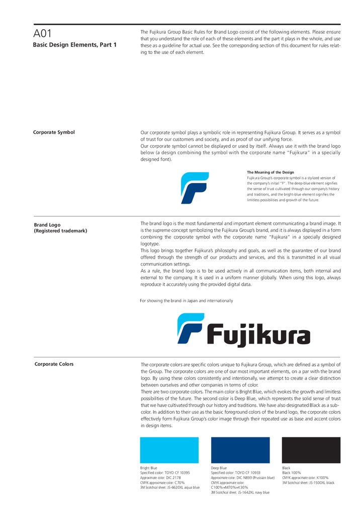
A01Basic Design Elements, Part 1
Corporate Symbol
The Fujikura Group Basic Rules for Brand Logo consist of the following elements. Please ensure
that you understand the role of each of these elements and the part it plays in the whole, and use
these as a guideline for actual use. See the corresponding section of this document for rules relating to the use of each element.
Our corporate symbol plays a symbolic role in representing Fujikura Group. It serves as a symbol
of trust for our customers and society, and as proof of our unifying force.
Our corporate symbol cannot be displayed or used by itself. Always use it with the brand logo
below (a design combining the symbol with the corporate name “Fujikura” in a specially
designed font).
The Meaning of the Design
Fujikura Group’s corporate symbol is a stylized version of
the company’s initial “F”. The deep-blue element signifies
the sense of trust cultivated through our company’s history
and traditions, and the bright-blue element signifies the
limitless possibilities and growth of the future.
Brand Logo
(Registered trademark)
The brand logo is the most fundamental and important element communicating a brand image. It
is the supreme concept symbolizing the Fujikura Group’s brand, and it is always displayed in a form
combining the corporate symbol with the corporate name “Fujikura” in a specially designed
logotype.
This logo brings together Fujikura’s philosophy and goals, as well as the guarantee of our brand
offered through the strength of our products and services, and this is transmitted in all visual
communication settings.
As a rule, the brand logo is to be used actively in all communication items, both internal and
external to the company. It is used in a uniform manner globally. When using this logo, always
reproduce it accurately using the provided digital data.
For showing the brand in Japan and internationally
Corporate Colors
The corporate colors are specific colors unique to Fujikura Group, which are defined as a symbol of
the Group. The corporate colors are one of our most important elements, on a par with the brand
logo. By using these colors consistently and intentionally, we attempt to create a clear distinction
between ourselves and other companies in terms of color.
There are two corporate colors. The main color is Bright Blue, which evokes the growth and limitless
possibilities of the future. The second color is Deep Blue, which represents the solid sense of trust
that we have cultivated through our history and traditions. We have also designated Black as a subcolor. In addition to their use as the basic foreground colors of the brand logo, the corporate colors
effectively form Fujikura Group’s color image through their repeated use as base and accent colors
in design items.
Bright Blue
Specified color: TOYO CF 10395
Approximate color: DIC 2178
CMYK approximate color: C70%
3M Scotchcal sheet: JS-6620XL aqua blue
Deep Blue
Specified color: TOYO CF 10933
Approximate color: DIC N893 (Prussian blue)
CMYK approximate color:
C100%+M70%+K30%
3M Scotchcal sheet: JS-1642XL navy blue
Black
Black 100%
CMYK approximate color: K100%
3M Scotchcal sheet: JS-1500XL black
5.
A02Basic Design Elements, Part 2
Company Name Logotype
The basic rule of Fujikura Group’s brand logo consists of the following elements. Please ensure
that you understand the role of each of these elements and the part it plays in the whole, and use
these as a guideline for actual use. See the corresponding section of this document for rules relating to the use of each element.
The role of the company name logotype is to convey accurately the corporate name of each
company in Fujikura Group (registered name). The official typeface for displaying the company
name is designed to coordinate well with the brand logo.
The design also takes into account functionality (e.g. ease of reading at small sizes), image
durability, and the like. The logotype is designed to a very fine-grained level, including spacing
between letters and the balance of Japanese Kanji and Kana characters. Thus barring exceptional
cases, the representation cannot be changed; this includes changing the shape of the characters,
the spacing, or the font. When using this logotype, always reproduce it accurately using the
provided digital data.
When the company name is written in text, use the same font as the surrounding text; do not use
the logotype.
Format for Group Company Names
The recommended fonts are Shingo M for Japanese, and Frutiger 55 Roman for English. Use the
recommended font, and adjust the letter spacing, balance, and other aspects as appropriate.
〒135-8512 東京都江東区木場1-5-1
TEL 03-5606-1061 FAX 03-5606-1510
1-5-1,Kiba,Koto-ku,Tokyo 135-8512, Japan
TEL +81-3-5606-0000 FAX +81-3-5606-0000
〒135-8512 東京都江東区木場1-5-1
TEL 03-5606-1061 FAX 03-5606-1510
1-5-1,Kiba,Koto-ku,Tokyo 135-8512, Japan
TEL +81-3-5606-0000 FAX +81-3-5606-0000
Graphical Elements
Sample Uses
Graphical elements (such as design background elements of the brand logo) can be used dynamically in order to increase the appeal of the Fujikura Group’s image more effectively. Although
there are no restrictions on how these elements are displayed, the colors used, or the like, they
must always be displayed within the same screen as the official brand logo.
The use of designs incorporating graphical elements must be determined based on expert design
knowledge. For this reason, the confirmation and approval of a brand logo manager must in
principle be obtained every time graphical elements are to be used in a publication.
6.
A03Basic Design Elements, Part 3
Recommended Fonts
The basic rule of Fujikura Group’s brand logo consists of the following elements. Please ensure
that you understand the role of each of these elements and the part it plays in the whole, and use
these as a guideline for actual use. See the corresponding section of this document for rules relating to the use of each element.
The recommended fonts have been selected from existing fonts in order to increase the effectiveness
of textual communication, and create a uniform style for the various display elements making up the
Group’s image design. These fonts were selected in order to complement the brand logo and
company name logotype. Modern, readable, and simple font faces are used.
The recommended fonts are used in the most diverse range of items possible, including displaying the
names of head offices, branch offices, departments, and addresses. Select the font below with the
appropriate weight for the purpose of use.
Although these fonts must be given precedence in order to create a unique Fujikura Group’s image,
fonts other than those below may also be used if this is determined to be more effective for the
function/purpose of the item in question.
Macintosh font
Japanese: Shin Go Family, Hiragino
English: Frutiger Family
ABCDEFGHIJK
abcdefghijk 1234567890
Shin Go L
安以宇衣於加幾久計己
かきくけこサシスセソタチツテト
45 Light
Shin Go R
安以宇衣於加幾久計己
かきくけこサシスセソタチツテト
55 Roman
ABCDEFGHIJK
abcdefghijk 1234567890
Shin Go DB 安以宇衣於加幾久計己
かきくけこサシスセソタチツテト
75 Bold
ABCDEFGHIJK
abcdefghijk 1234567890
Shin Go H
安以宇衣於加幾久計己
かきくけこサシスセソタチツテト
95 Black
ABCDEFGHIJK
abcdefghijk 1234567890
Hiragino
W3
安以宇衣於加幾久計己
かきくけこサシスセソタチツテト
Hiragino
W3
ABCDEFGHIJK
abcdefghijk 1234567890
Hiragino
W6
安以宇衣於加幾久計己
かきくけこサシスセソタチツテト
Hiragino
W6
ABCDEFGHIJK
abcdefghijk 1234567890
Windows font
Japanese: MSP Gothic, Meiryo Family
English: Arial Family、Microsoft Sans Serif
MSP
Gothic
Ꮽ௧Ꮻ⾨᪂ຊᖼ゛ᕤ
䛑䛓䛕䛗䛙䜹䜻䜽䜿䝁䝃䝅䝈䝊䝌
Arial
Regular
ABCDEFGHIJK
abcdefghijk 1234567890
Meiryo
Regular
ਰഌᅎਸ୲ੑഞ
ऊऌऎऐऒ१३५७९ॱॳॶॸॺ
Arial
Bold
ABCDEFGHIJK
abcdefghijk 1234567890
Meiryo
Bold
ਰഌᅎਸ୲ੑഞ
ऊऌऎऐऒ१३५७९ॱॳॶॸॺ
Microsoft
Sans Serif
ABCDEFGHIJK
abcdefghijk 1234567890
〒135-8512 東京都江東区木場1-5-1
TEL 03-5606-1061 FAX 03-5606-1510
ふじ くら
藤 倉
いち た ろう
一太郎
光機器事業部
精密機器製品部 開発グループ
主席技術員
Address
Japanese: Shingo L
English characters and numbers:
Frutiger45 Light
Rubi (readings) characters etc.: Shin Go L
Name: Shin Go L
Job title: Shin Go L
7.
A04Scope of Isolation
“Scope of isolation” is a rule governing the amount of clear space that must be placed between
the brand logo and other display elements. This enables the symbolism of the brand logo to be
made more salient. The more clear space around the logo, the more effectively the brand image
is communicated, because it ensures visibility.
The standards displayed here indicate the minimum amount of space between the brand logo
and other display elements. Other elements must not be displayed within the specified dimensions. When using the logo with other items, strive to adjust the design to that the maximum
amount of space possible is placed around the logo. Ordinarily, these basic standards shall be
applied in principle. When using the logo on such items as labels and signs, however, the standards for signs may be applied as an exception.
For General Display
0.6X
0.6X
0.6X
X(=1)
0.6X
For Signs (when there are space limitations)
0.25X
0.25X
X(=1)
0.15X
0.25X
8.
A05Standards for Brand Logo Colors
It is vital to convey the brand logo with the correct image at all times. The figure below is a color
control table for checking the ease of recognition of the brand logo due to the relationship
between foreground and background colors.
As a rule, the brand logo should be displayed using the basic foreground color on a white or
light-colored background.
When a dark background cannot be avoided, however (due to limitations on the properties or
number of colors of the item it is displayed on, or when the background is predetermined such
as photos or drawings), then select a display method with reference to the figure below, selecting
a method that does not damage the image of the brand logo and is clearly identifiable at all
times.
1) Color display using designated colors
Priority Display Colors
2) Black and white screen tint (when screen tint is available)
Screen tint 40%
3) Single-color solid (when using single color and screen tint is not available); Use deep blue or black
4) Negative; When the positive representation in item 3 would impede recognition due to the background color
Background and Foreground Colors
Available Foreground
Colors
Designated Color
Background Color
White background,
or density of 0% to
about 10%
(Chromatic or
achromatic color)
Density of 10% to
under 40%
(Chromatic or
achromatic color)
Density of 40% to
100%
(Chromatic or
achromatic color)
Examples of Incorrect Uses and How to Remedy Them
Black & White Screen Tint
Single Color Solid (Positive)
Negative
9.
A06Standards for Use of Brand Logo
by Group Companies
Our brand logo is an important identifier for externally promoting the existence and corporate
activities of Fujikura Ltd. and our group companies. A brand logo creates a certain corporate
image and a certain level of trust, which increases customer recognition and enables the company to grow into a trusted brand. This in turn increases the value of the company's assets.
Below are the rules for using the brand logo by each company in the Fujikura Group.
When using the logo, please abide by these principles and give due attention to them. Please
check with and get approval from the brand logo manager before using the logo in exceptional
cases not covered by these rules.
1) Share, preserve, and use
Specific Measures
as the Fujikura Group brand logo for the entire group.
2) Table 1 defines the usage for the Fujikura Group brand logo.
1. For usage types B and C, either use the company logo together with the Fujikura Group
brand logo, or include text stating that you are part of the Fujikura Group. Strive to
promote and strengthen the Fujikura Group brand logo.
2. When using your company's own brand logo in usage types B and C, you must create a
structure to protect this brand logo. This includes registering trademarks in your home
country and internationally, and making legal responses to infringement of your trademark
rights and other matters.
3) Group companies must sign a license agreement with Fujikura Ltd. in order to use the
Fujikura Group brand logo.
Table 1: Usage of the Fujikura Group Brand Logo by Target Group Companies
Target group companies
Usage
type
Consolidated
subsidiaries and
nonconsolidated
but wholly owned
subsidiaries
A
Sample usage of brand logo
Use the Fujikura Group brand logo.
Basic
B
Use your company's brand logo together with the Fujikura Group brand logo.
Company brand logo
(does not include “F” mark) +
C
Use your company's brand logo with a message.
Company brand logo
(does not include “F” mark) +“Member of the Fujikura Group”
Other group
companies
The Fujikura Group brand logo cannot be used.
Type “A” is the basic usage.
If, however, you determine that it is
more appropriate to use your
company's brand logo in your business
market, then use the display of type
“B” or “C” (B preferred over C).
In this case, please check with and
gain approval of the brand logo
manager of Fujikura Ltd. beforehand.
10.
A07Rules for Displaying Brand Logo
on Business Cards
Business cards are one of our most important brand tools. This is especially true in Japan, where
they are customarily exchanged upon first meeting business contacts. Business cards are our
most frequently used design items, and they are a symbol of your membership in the Fujikura
Group. Create business cards in accordance with the status of your company, with reference to
the sample illustrations of the design principles below.
When displaying the brand logo, create space between the logo and other information
elements, in order to make the logo’s symbolic meaning stand out.
You must check with and get approval from the brand logo manager before using the logo in a
way not covered by these principles (exceptional cases).
Sample Display of the Fujikura Group Brand Logo by Target Group Companies
Target group
companies
Consolidated
subsidiaries
and
nonconsolidat
ed but wholly
owned
subsidiaries
Usage
type
A
Sample usage of brand logo
Use the Fujikura Group brand logo.
□□ □□□
□□□・□□□□□□□□
□□□□□□□□□□□□□□
□□□□□
株式会社□□□□
〒111-0000 □□□□□□□□1-1-1
TEL 000-111-2222 FAX 000-111-3333
E-mail : xyzabcdefg_f@fujikura.co.jp
B
Use your company's brand logo together with the Fujikura Group brand logo.
□□ □□□
ABCXYZ
□□□・□□□□□□□□
□□□□□□□□□□□□□□
□□□□□
□□ □□□
or
ABCXYZ 株式会社
ABCXYZ 株式会社
〒111-0000 □□□□□□□□1-1-1
〒111-0000 □□□□□□□□1-1-1
TEL 000-111-2222 FAX 000-111-3333
E-mail : xyzabcdefg_f@fujikura.co.jp
C
□□□・□□□□□□□□
□□□□□□□□□□□□□□
□□□□□
TEL 000-111-2222 FAX 000-111-3333
E-mail : xyzabcdefg_f@fujikura.co.jp
Use your company's brand logo with a message (“Member of the Fujikura Group”).
□□ □□□
ABCXYZ
□□□・□□□□□□□□
□□□□□□□□□□□□□□
□□□□□
ABCXYZ 株式会社
〒111-0000 □□□□□□□□1-1-1
TEL 000-111-2222 FAX 000-111-3333
E-mail : xyzabcdefg_f@fujikura.co.jp
Other group
companies
ABCXYZ
Fujikura Group
The Fujikura Group brand logo cannot be used.
Use a business-card design
with your company’s
unique symbol and logo.
□□ □□□
□□□・□□□□□□□□
□□□□□□□□□□□□□□
□□□□□
ABCXYZ 株式会社
〒111-0000 □□□□□□□□1-1-1
TEL 000-111-2222 FAX 000-111-3333
E-mail : xyzabcdefg_f@fujikura.co.jp
ABCXYZ
11.
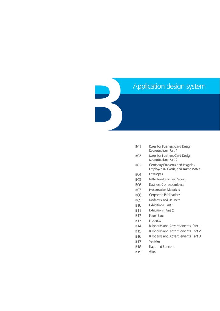
BApplication design system
B01
Rules for Business Card Design
Reproduction, Part 1
B02
Rules for Business Card Design
Reproduction, Part 2
B03
Company Emblems and Insignias,
Employee ID Cards, and Name Plates
B04
B05
B06
B07
B08
B09
B10
B11
B12
B13
B14
B15
B16
B17
B18
B19
Envelopes
Letterhead and Fax Papers
Business Correspondence
Presentation Materials
Corporate Publications
Uniforms and Helmets
Exhibitions, Part 1
Exhibitions, Part 2
Paper Bags
Products
Billboards and Advertisements, Part 1
Billboards and Advertisements, Part 2
Billboards and Advertisements, Part 3
Vehicles
Flags and Banners
Gifts
12.
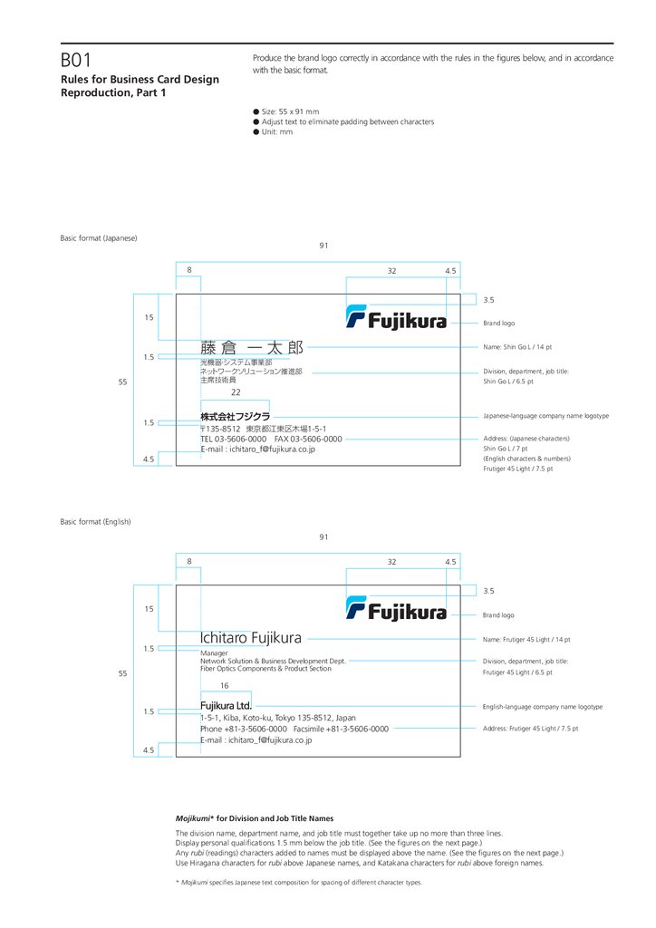
B01Produce the brand logo correctly in accordance with the rules in the figures below, and in accordance
with the basic format.
Rules for Business Card Design
Reproduction, Part 1
● Size: 55 x 91 mm
● Adjust text to eliminate padding between characters
● Unit: mm
Basic format (Japanese)
91
8
32
4.5
3.5
15
Brand logo
藤倉 一太郎
1.5
Name: Shin Go L / 14 pt
光機器・システム事業部
ネットワークソリューション推進部
主席技術員
55
Division, department, job title:
Shin Go L / 6.5 pt
22
Japanese-language company name logotype
1.5
〒135-8512 東京都江東区木場1-5-1
TEL 03-5606-0000 FAX 03-5606-0000
E-mail : ichitaro_f@fujikura.co.jp
4.5
Address: (Japanese characters)
Shin Go L / 7 pt
(English characters & numbers)
Frutiger 45 Light / 7.5 pt
Basic format (English)
91
8
32
4.5
3.5
15
1.5
55
Brand logo
Ichitaro Fujikura
Name: Frutiger 45 Light / 14 pt
Manager
Network Solution & Business Development Dept.
Fiber Optics Components & Product Section
Division, department, job title:
Frutiger 45 Light / 6.5 pt
16
1.5
4.5
English-language company name logotype
1-5-1, Kiba, Koto-ku, Tokyo 135-8512, Japan
Phone +81-3-5606-0000 Facsimile +81-3-5606-0000
E-mail : ichitaro_f@fujikura.co.jp
Address: Frutiger 45 Light / 7.5 pt
Mojikumi* for Division and Job Title Names
The division name, department name, and job title must together take up no more than three lines.
Display personal qualifications 1.5 mm below the job title. (See the figures on the next page.)
Any rubi (readings) characters added to names must be displayed above the name. (See the figures on the next page.)
Use Hiragana characters for rubi above Japanese names, and Katakana characters for rubi above foreign names.
* Mojikumi specifies Japanese text composition for spacing of different character types.
13.
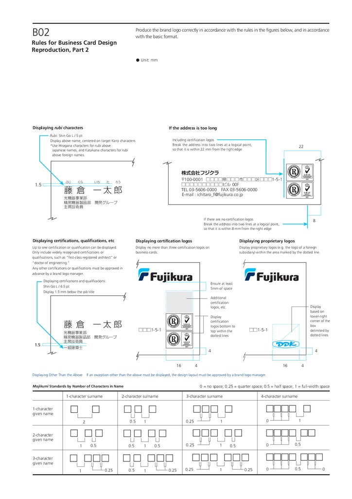
B02Produce the brand logo correctly in accordance with the rules in the figures below, and in accordance
with the basic format.
Rules for Business Card Design
Reproduction, Part 2
● Unit: mm
Displaying rubi characters
If the address is too long
Rubi: Shin Go L / 5 pt
Display above name, centered on target Kanji characters
*Use Hiragana characters for rubi above
Japanese names, and Katakana characters for rubi
above foreign names.
ふじ くら
1.5
藤 倉
Including certification logos
Break the address into two lines at a logical point,
so that it is within 22 mm from the right edge
22
〒100-0001 □□□□県□□□市□□□区□□□1-5-1
□□□□□□□□□□ビル 00F
いち た ろう
一太郎
TEL 03-5606-0000 FAX 03-5606-0000
E-mail : ichitaro_f@fujikura.co.jp
光機器事業部
精密機器製品部 開発グループ
主席技術員
一級建築士
If there are no certification logos
Break the address into two lines at a logical point,
so that it is within 8 mm from the right edge
8
Displaying certifications, qualifications, etc
Displaying certification logos
Displaying proprietary logos
Up to one certification or qualification can be displayed.
Only include widely recognized certifications or
qualifications, such as “first-class registered architect” or
“doctor of engineering.”
Any other certifications or qualifications must be approved in
advance by a brand logo manager.
Display no more than three certification logos on
business cards.
Display proprietary logos (e.g. the logo of a foreign
subsidiary) within the area marked by the dotted line.
Displaying certifications and qualifications:
Shin Go L / 6.5 pt
Display 1.5 mm below the job title
Ensure at least
5mm of space
Additional
certification
logos, etc.
藤 倉
1.5
一太郎
Display
certification
logos bottom to
top within the
dotted lines
□□□1-5-1
光機器事業部
精密機器製品部 開発グループ
主席技術員
一級建築士
□□1-5-1
4
16
Displaying Other Than the Above
Display
based on
lower-right
corner of the
box
delimited by
dotted lines
4
4
16
4
If an exception other than the above must be displayed, the design layout must be approved by a brand logo manager.
0 = no space; 0.25 = quarter space; 0.5 = half space; 1 = full-width space
Mojikumi Standards by Number of Characters in Name
1-character surname
2-character surname
3-character surname
4-character surname
1-character
given name
2
0.5
1
0.5
1
0.5
1
0.25
1
0.25
1
0.25
1
2-character
given name
1
0.5
0.5
0.5
0
1
0
0.5
0
0.5
3-character
given name
1
0.25
0.25
0.25
0
14.
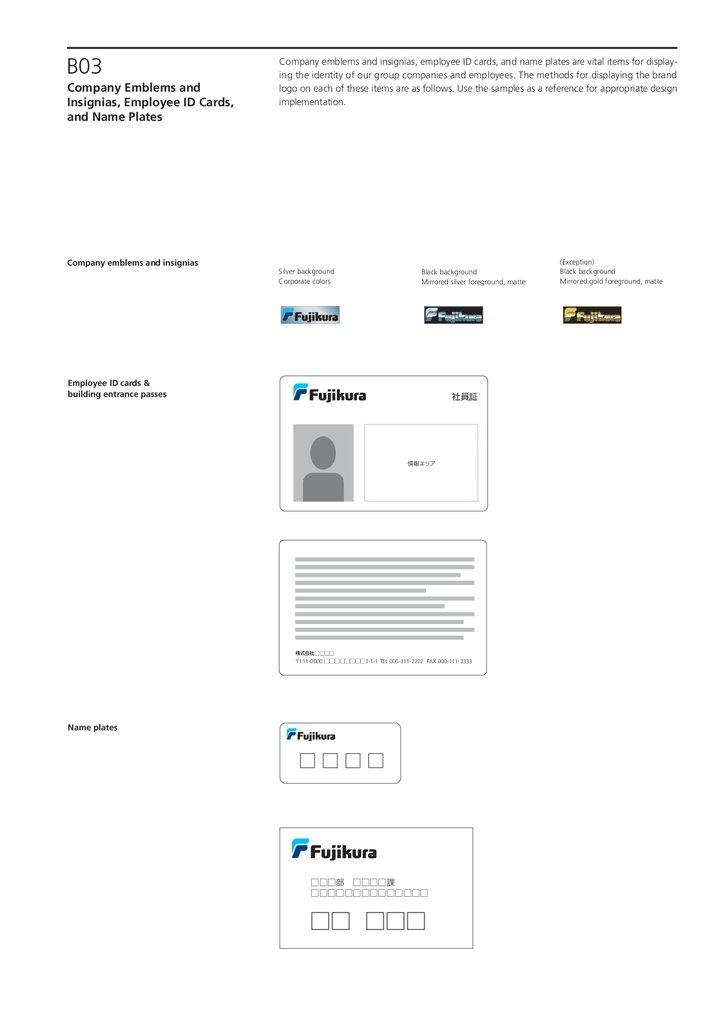
B03Company Emblems and
Insignias, Employee ID Cards,
and Name Plates
Company emblems and insignias
Company emblems and insignias, employee ID cards, and name plates are vital items for displaying the identity of our group companies and employees. The methods for displaying the brand
logo on each of these items are as follows. Use the samples as a reference for appropriate design
implementation.
Silver background
Corporate colors
Black background
Mirrored silver foreground, matte
Employee ID cards &
building entrance passes
社員証
情報エリア
株式会社□□□□
〒111-0000 □□□□□□□□1-1-1 TEL 000-111-2222 FAX 000-111-3333
Name plates
□□□□
□□□部 □□□□課
□□□□□□□□□□□□□□
□□ □□□
(Exception)
Black background
Mirrored gold foreground, matte
15.
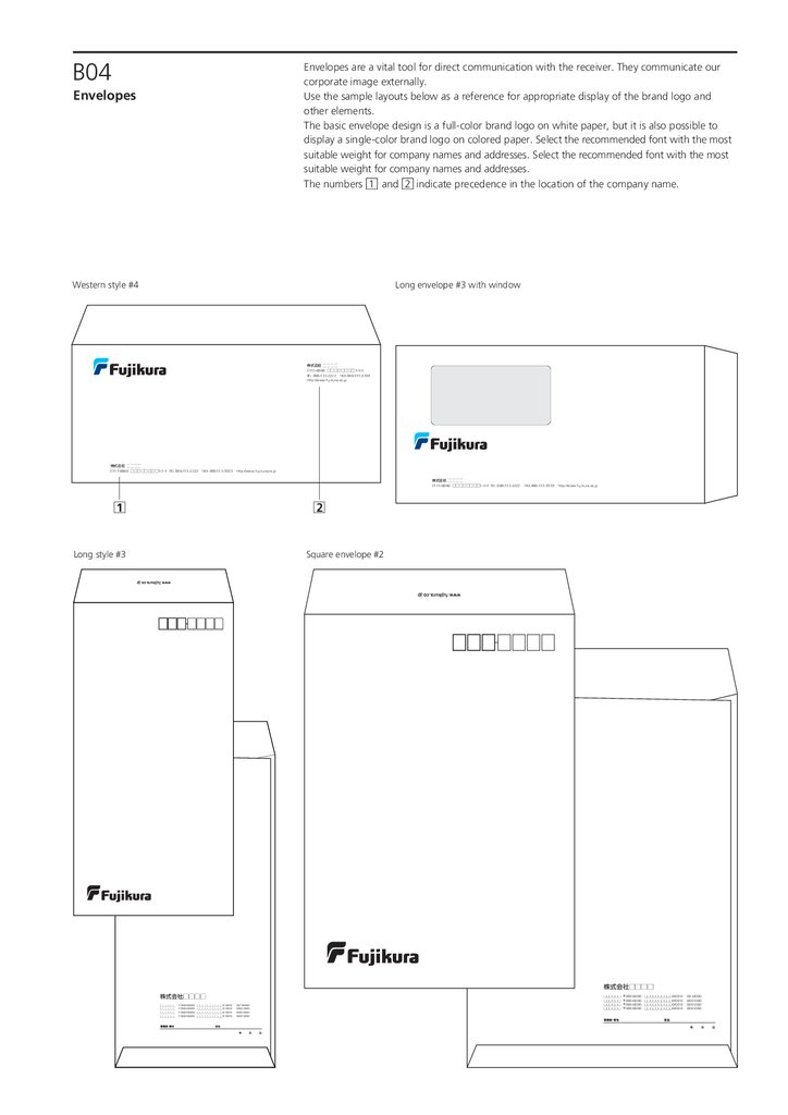
B04Envelopes are a vital tool for direct communication with the receiver. They communicate our
corporate image externally.
Use the sample layouts below as a reference for appropriate display of the brand logo and
other elements.
The basic envelope design is a full-color brand logo on white paper, but it is also possible to
display a single-color brand logo on colored paper. Select the recommended font with the most
suitable weight for company names and addresses. Select the recommended font with the most
suitable weight for company names and addresses.
The numbers 1 and 2 indicate precedence in the location of the company name.
Envelopes
Western style #4
Long envelope #3 with window
株式会社 □□□□
〒111-0000 □□□□□□□□1-1-1
TEL 000-111-2222 FAX 000-111-3333
http://www.fujikura.co.jp
株式会社 □□□□
〒111-0000 □□□□□□□□1-1-1 TEL 000-111-2222 FAX 000-111-3333 http://www.fujikura.co.jp
株式会社 □□□□
〒111-0000 □□□□□□□□1-1-1 TEL 000-111-2222 FAX 000-111-3333 http://www.fujikura.co.jp
1
□
2
□
Long style #3
Square envelope #2
株式会社□□□□
株式会社□□□□
□□□□□□ 〒000-0000 □□□□□□□□□□0-00-0 00‒0000‒
□□□□□□ 〒000-0000 □□□□□□□□□□0-00-0 000‒000‒
□□□□□□ 〒000-0000 □□□□□□□□□□0-00-0 000‒000‒
□□□□□□ 〒000-0000 □□□□□□□□□□0-00-0 000‒000‒
□□□□□□ 〒000-0000 □□□□□□□□□□0-00-0 00‒0000‒
□□□□□□ 〒000-0000 □□□□□□□□□□0-00-0 000‒000‒
□□□□□□ 〒000-0000 □□□□□□□□□□0-00-0 000‒000‒
□□□□□□ 〒000-0000 □□□□□□□□□□0-00-0 000‒000‒
16.
B05Letterhead and fax papers are important tools for direct communication with our customers.
Using the defined format communicates a consistent corporate image.
As shown in the illustrations below, place the brand logo in one of the two locations shown at the
top of the page.
Templates are available. Please use them.
The numbers 1 and 2 indicate precedence in the location of the company name.
Letterhead and Fax Papers
Letterhead
First page
株式会社 □□□□
〒111-0000 □□□□□□□□1-1-1
TEL 000-111-2222
FAX 000-111-3333
1
□
株式会社 □□□□
http://www.fujikura.co.jp
〒111-0000 □□□□□1-1-1
TEL 000-111-2222
FAX 000-111-3333
http://www.fujikura.co.jp
株式会社 □□□□
株式会社 □□□□
〒111-0000 □□□□□□□□1-1-1 TEL 000-111-2222 FAX 000-111-3333 http://www.fujikura.co.jp
〒111-0000 □□□□□□□□1-1-1 TEL 000-111-2222 FAX 000-111-3333 http://www.fujikura.co.jp
2
□
2
□
Second page
Fax paper
FAX送信紙
株式会社 □□□□
〒111-0000 □□□□□□□□1-1-1
TEL 000-111-2222
FAX 000-111-3333
1
□
17.
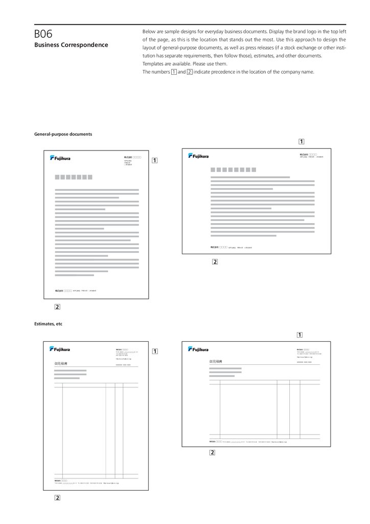
B06Below are sample designs for everyday business documents. Display the brand logo in the top left
of the page, as this is the location that stands out the most. Use this approach to design the
Business Correspondence
layout of general-purpose documents, as well as press releases (if a stock exchange or other institution has separate requirements, then follow those), estimates, and other documents.
Templates are available. Please use them.
The numbers 1 and 2 indicate precedence in the location of the company name.
General-purpose documents
1
□
株式会社 □□□□
株式会社 □□□□
経営企画室
営業本部
人事・総務部
経営企画室 営業本部 人事・総務部
1
□
株式会社 □□□□
経営企画室 営業本部 人事・総務部
2
□
株式会社 □□□□
経営企画室 営業本部 人事・総務部
2
□
Estimates, etc
1
□
株式会社 □□□□
〒111-0000 □□□□□□□□1-1-1
TEL 000-111-2222
FAX 000-111-3333
1
□
株式会社 □□□□
〒111-0000 □□□□□□□□1-1-1
TEL 000-111-2222 FAX 000-111-3333
http://www.fujikura.co.jp
http://www.fujikura.co.jp
御見積書
御見積書
株式会社 □□□□ 〒111-0000 □□□□□□□□1-1-1 TEL 000-111-2222 FAX 000-111-3333 http://www.fujikura.co.jp
2
□
株式会社 □□□□
〒111-0000 □□□□□□□□1-1-1 TEL 000-111-2222 FAX 000-111-3333 http://www.fujikura.co.jp
2
□
18.
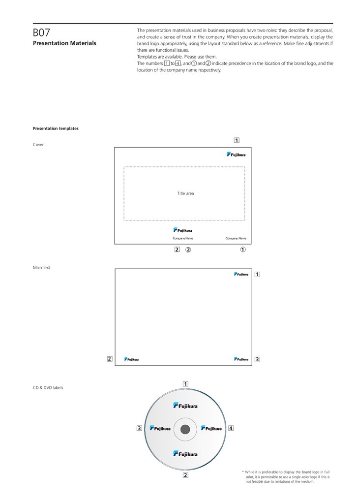
B07The presentation materials used in business proposals have two roles: they describe the proposal,
and create a sense of trust in the company. When you create presentation materials, display the
brand logo appropriately, using the layout standard below as a reference. Make fine adjustments if
there are functional issues.
Templates are available. Please use them.
The numbers 1 to 4 , and 1 and 2 indicate precedence in the location of the brand logo, and the
location of the company name respectively.
Presentation Materials
Presentation templates
1
□
Cover
Title area
Company Name
Company Name
1
○
2 ○
2
□
Main text
1
□
2
□
3
□
1
□
CD & DVD labels
3
□
4
□
2
□
* While it is preferable to display the brand logo in full
color, it is permissible to use a single-color logo if this is
not feasible due to limitations of the medium.
19.
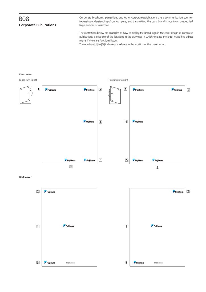
B08Corporate brochures, pamphlets, and other corporate publications are a communication tool for
increasing understanding of our company, and transmitting the basic brand image to an unspecified
large number of customers.
Corporate Publications
The illustrations below are examples of how to display the brand logo in the cover design of corporate
publications. Select one of the locations in the drawings in which to place the logo. Make fine adjustments if there are functional issues.
The numbers 1 to 5 indicate precedence in the location of the brand logo.
Front cover
Pages turn to right
Pages turn to left
1
□
2
□
1
□
4
□
4
□
5
□
5
□
3
□
2
□
3
□
Back cover
2
□
2
□
1
□
3
□
1
□
株式会社 □□□□
3
□
株式会社 □□□□
20.
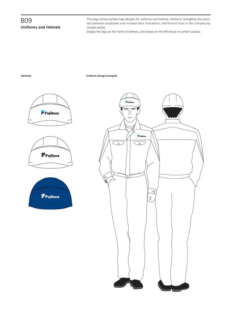
B09Uniforms and Helmets
Helmets
This page shows sample logo designs for uniforms and helmets. Uniforms strengthen the promises between employees and increase their motivation, and foment trust in the company by
outside parties.
Display the logo on the fronts of helmets, and always on the left breast of uniform jackets.
Uniform design (sample)
21.
B10Exhibitions, Part 1
This is the example of a booth design used in exhibitions, fairs, etc.
Booths are a place for presentations that communicate our brand image to all stakeholders, winning trust and creating a sense of expectation.
The drawings below illustrate a booth used in an exhibition. Adapt it as appropriate for the location and exhibit space.
Consult with the brand logo manager when planning to set up a booth.
Exhibit booth
Facade
Walls
* The drawings are samples illustrating an exhibit booth.
22.
B11The fundamental key for panels at exhibitions and fairs is to describe the features and selling
points of the presented product or service in a way that can be understood at a glance. At the
same time, however, they also serve as a clear communication of the company’s brand image. Use
the drawings below as a reference for creating panels. Keep the location of the logo consistent
when creating panels.
Also refer to the examples when designing swag which is widely distributed, staff jumpers used
on the day, etc. Consider designs that make the brand logo easy to identify given the distinctive
features of that item.
The numbers 1 to 3 indicate precedence in the location of the brand logo.
Exhibitions, Part 2
Exhibit panel
2
□
1
□
1
□
2
□
3
□
3
□
Swag and staff jumpers
* The brand logo can be displayed on existing swag and other
novelties using stickers or other means.
* While it is preferable to display the brand logo in full color, it
is permissible to use a single-color logo if this is not feasible
due to limitations of the medium.
23.
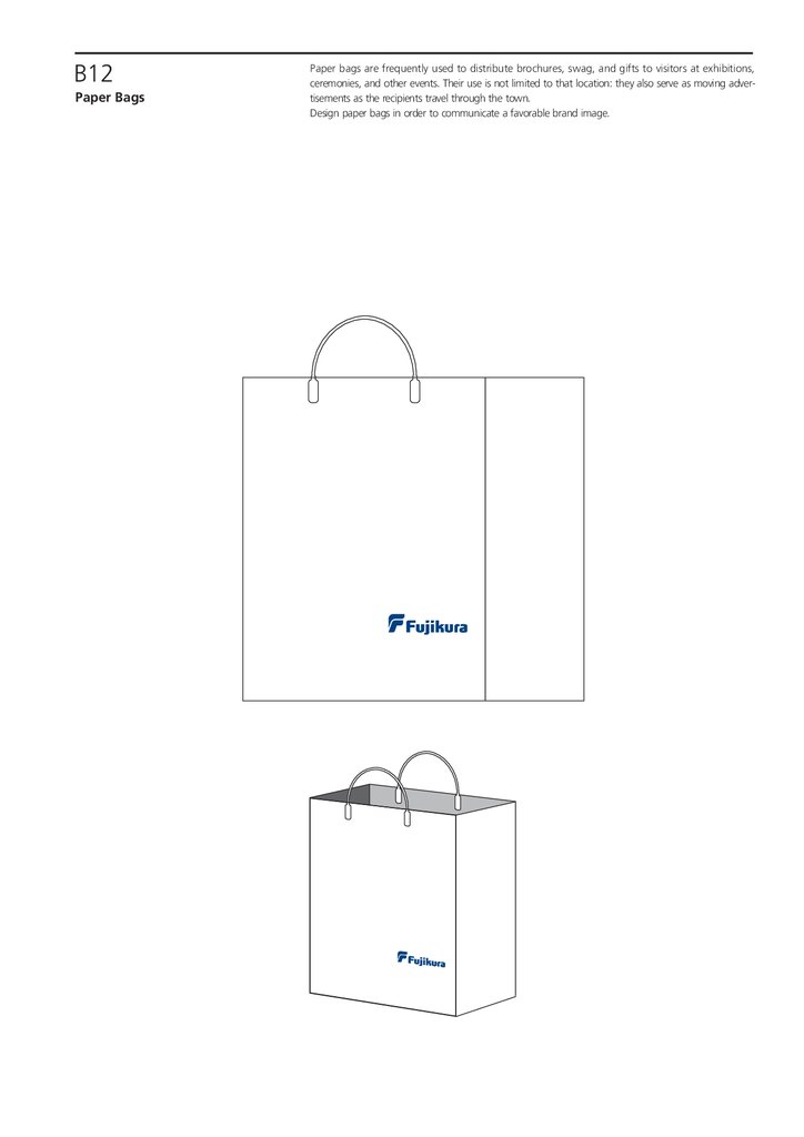
B12Paper Bags
Paper bags are frequently used to distribute brochures, swag, and gifts to visitors at exhibitions,
ceremonies, and other events. Their use is not limited to that location: they also serve as moving advertisements as the recipients travel through the town.
Design paper bags in order to communicate a favorable brand image.
24.
B13The Fujikura Group offers all its products with confidence to its customers and society.
Consequently, the brand logo shows our guarantee of each product’s performance, reliability, and
quality. Consider the location, layout, and method of reproducing the brand logo in accordance
with the requirements of each product. Strive to communicate the brand image effectively, with
full consideration for ease of recognition. Note, however, that these rules do not require the
brand logo to be displayed on all products.
Products
* While it is preferable to display the brand logo in full color, it is permissible to use a single-color
logo if this is not feasible due to limitations of the medium.
* Take into account the rules in any specifications or the like that have been distributed to
customers.
Product
Printed on product
Engraved on product
Product labels
Rules for display
1. Cables and wiring
・Made with print rolls: Print the brand logo in the prescribed location.
・Made with engraved rolls: Engrave/emboss the brand logo in the prescribed location.
・Using tape, labels, etc.: Use items containing brand logo.
2. Connection boxes and other cases
・Engraved/embossed on case: Engrave the brand logo in the prescribed location.
・Printed onto case: Add the brand logo during printing.
・Attachment of label: Use items containing brand logo.
3. Connectors, printed circuit boards,
electronic wiring components, etc.
・Engraved/embossed on case: Engrave the brand logo in the prescribed location.
・Printed on case: Print the brand logo in the prescribed location.
・Attachment of label: Use items containing brand logo.
4. Devices, systems, and structures
・Engraved/embossed on equipment case: Engrave the brand logo in the prescribed location.
・Printed on equipment case: Print the brand logo in the prescribed location.
・Attachment of label on equipment case: Use items containing brand logo.
Product packaging,
5. Others
・Manufacturer’s label: Display the brand logo. (Consult with brand logo manager)
1. Packaging for cables and wiring
・Drums, bundles, crates, cardboard boxes, etc.: Put the brand logo in the prescribed location.
・Packaging and boxes showing manufacturer: Put the brand logo in the prescribed location.
etc.
・Other packaging and boxes: Display the brand logo. (Consult with brand logo manager)
2. Packaging and boxes for connection
boxes and other cases
・Printed onto packaging or boxes: Add the brand logo during printing.
・Engraved onto packaging or boxes: Engrave the brand logo.
(e.g. cardboard boxes & wooden crates)
・Attachment of label on packaging or boxes: Use items containing brand logo.
3. Packaging and boxes for connectors,
electronic wiring components, etc.
・Engraved onto packaging or boxes: Engrave the brand logo in the prescribed location.
・Printed onto packaging or boxes: Print the brand logo in the prescribed location.
(e.g. cardboard boxes & wooden crates)
・Attachment of label on packaging or boxes: Use items containing brand logo.
4. Packaging and boxes for devices,
systems, etc.
・Engraved onto packaging or boxes: Engrave the brand logo in the prescribed location.
・Printed onto packaging or boxes: Print the brand logo in the prescribed location.
(e.g. cardboard boxes & wooden crates)
・Attachment of label on packaging or boxes: Use items containing brand logo.
5. Other packaging and boxes
・Manufacturer’s label on packaging etc.: Display the brand logo.
(Consult with brand logo manager)
(e.g. cardboard boxes & wooden crates)
Sample display
Cardboard boxes, wooden crates, etc.
Sheaves & rolls
Drums
株式会社 □□□□
□
□
□□
会社
株式
株式会社 □□□□
株式会社 □□□□
25.
B14Below are examples of billboards and large outdoor signs for stations, roadsides, etc.
Such signs must communicate information to passers-by from a relatively long distance, in a short
amount of time. This makes it vital to avoid complex designs as much as possible, and communicate the brand image clearly. Install these signs after considering the optimal design and method
of reproduction in accordance with the placement conditions and surrounding location.
Please inquire with the brand logo manager when producing signs.
The numbers 1 to 4 indicate precedence in the location of the brand logo.
Billboards and
Advertisements, Part 1
Station advertisements
Train advertisement/1 sided
Train advertisement/2 in a row
1
□
2
□
1
□
2
□
3
□
4
□
3
□
4
□
Roadside advertisement billboard
1
□
2
□
3
□
Roadside direction billboard
□□□工場
□□□工場
ここを右折
直進3km左側
4
□
26.
B15Below are examples of billboards installed in stadiums and other venues, theater curtains, etc.
Select the location of the logo and display method depending on the application: for example,
whether it is an advertisement for the corporate brand, or an advertisement promoting a particular
product.
Please inquire with the brand logo manager when producing or installing signs.
The numbers 1 to 4 indicate precedence in the location of the brand logo.
Billboards and
Advertisements, Part 2
Stadium: Billboard
1
□
2
□
3
□
4
□
Stadium: Corporate brand advertisement
□□□□□□□□
Theater: Corporate brand advertisement
Drop curtain
Sliding curtain
27.
B16Below are examples of displaying the brand logo in videos, on websites, in newspapers, magazines, and other mass media.
The purpose of these advertisements is to form a broad and solid brand image among an unspecified large number of stakeholders.
Refer to the drawings below to consider and select the most prominent location in each medium
in which to display the brand logo.
Please inquire with the brand logo manager when producing advertisements.
The numbers 1 to 4 indicate precedence in the location of the brand logo.
Billboards and
Advertisements, Part 3
Television commercial film
Banner
Website
Advertisements in newspapers, magazines, etc.
2
□
1
□
Newspaper flier insert
1
□
2
□
株式会社□□□□
株式会社□□□□
3
□
3
□
4
□
4
□
Sample displays
〒111-0000 □□□□□□□□1-1-1
TEL 000-111-2222 FAX 000-111-3333
http://www.fujikura.co.jp
〒111-0000 □□□□□□□□1-1-1
TEL 000-111-2222 FAX 000-111-3333
http://www.fujikura.co.jp
28.
B17Vehicles
Vehicles are called “moving advertisements.” They are one of our most symbolic items for
communicating the brand image externally to a wide audience.
When displaying the brand logo, select a highly visible location, using the drawings below as a
reference. The size of the display area and restrictions for display differ depending on the type of
vehicle, so consider the appropriate display size for each case.
Please inquire with the brand logo manager when producing and applying logos on vehicles.
* While it is preferable to display the brand logo in full color, it is permissible to use a single-color logo if this is not feasible due to
limitations of the medium.
株式会社 □□□□
29.
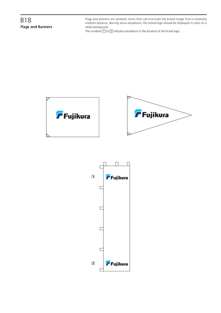
B18Flags and Banners
Flags and banners are symbolic items that communicate the brand image from a relatively
medium distance. Barring some exceptions, the brand logo should be displayed in color on a
white background.
The numbers 1 to 2 indicate precedence in the location of the brand logo.
1
□
2
□
30.
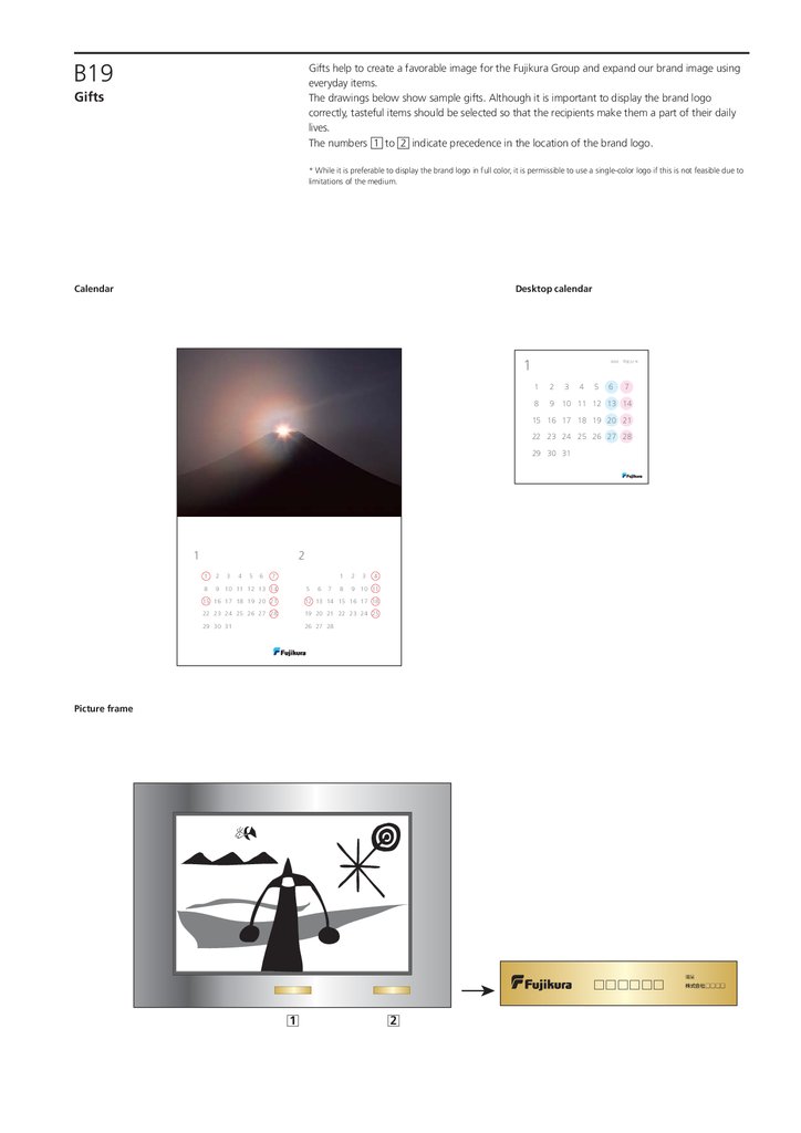
B19Gifts help to create a favorable image for the Fujikura Group and expand our brand image using
everyday items.
The drawings below show sample gifts. Although it is important to display the brand logo
correctly, tasteful items should be selected so that the recipients make them a part of their daily
lives.
The numbers 1 to 2 indicate precedence in the location of the brand logo.
Gifts
* While it is preferable to display the brand logo in full color, it is permissible to use a single-color logo if this is not feasible due to
limitations of the medium.
Calendar
Desktop calendar
1
2010 平成 22 年
1
2
8
9 10 11 12 13 14
3
4
5
6
7
15 16 17 18 19 20 21
22 23 24 25 26 27 28
29 30 31
1
2
1
2
8
9 10 11 12 13 14
3
4
5
6
7
5
6
7
1
2
8
9 10 11
3
4
15 16 17 18 19 20 21
12 13 14 15 16 17 18
22 23 24 25 26 27 28
19 20 21 22 23 24 25
29 30 31
26 27 28 29 30 31
Picture frame
贈呈
□□□□□□
1
□
2
□
株式会社 □□□□
31.
CSign design system
C01
C02
C03
C04
Sign Design Standard Image
Sign Design Standard Rules #1
Sign Design Standard Rules #2
Sign Design Display Images #1
C05
Sign Design Rules #1
C06
Sign Design Display Images #2
C07
Sign Design Rules #2
C08
Sign Design Rules #3
C09
Sign Design Rules #4
C10
Sign Design Rules #5
C11
Sign Design Rules #6
Company walls
Company walls
Company walls signs
(using metallic element channel letters
Gate signs [1]
Gate signs [2]
Gate signs [Miscellaneous]
Reception Signs
Outdoor Standing Signs
[For use in Japan]
C12
Sign Design Rules #7
Outdoor Standing Signs
[For use overseas]
32.
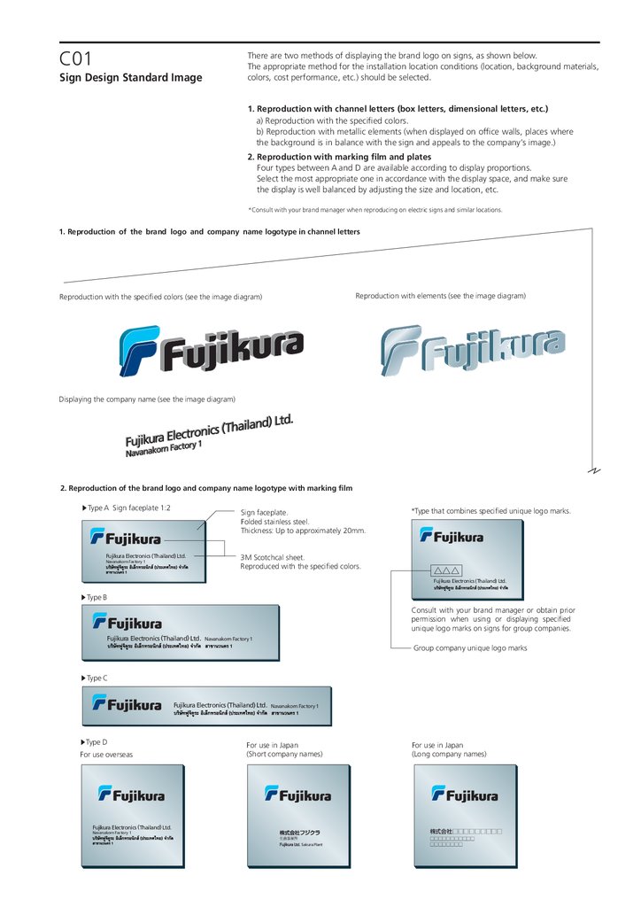
C01There are two methods of displaying the brand logo on signs, as shown below.
The appropriate method for the installation location conditions (location, background materials,
colors, cost performance, etc.) should be selected.
Sign Design Standard Image
1. Reproduction with channel letters (box letters, dimensional letters, etc.)
a) Reproduction with the specified colors.
b) Reproduction with metallic elements (when displayed on office walls, places where
the background is in balance with the sign and appeals to the company’s image.)
2. Reproduction with marking film and plates
Four types between A and D are available according to display proportions.
Select the most appropriate one in accordance with the display space, and make sure
the display is well balanced by adjusting the size and location, etc.
*Consult with your brand manager when reproducing on electric signs and similar locations.
1. Reproduction of the brand logo and company name logotype in channel letters
Reproduction with elements (see the image diagram)
Reproduction with the specified colors (see the image diagram)
Displaying the company name (see the image diagram)
2. Reproduction of the brand logo and company name logotype with marking film
▶Type A Sign faceplate 1:2
Sign faceplate.
Folded stainless steel.
Thickness: Up to approximately 20mm.
Fujikura Electronics (Thailand) Ltd.
Navanakorn Factory 1
3M Scotchcal sheet.
Reproduced with the specified colors.
*Type that combines specified unique logo marks.
△△△
Fujikura Electronics (Thailand) Ltd.
▶Type B
Consult with your brand manager or obtain prior
permission when using or displaying specified
unique logo marks on signs for group companies.
Fujikura Electronics (Thailand) Ltd.
Navanakorn Factory 1
Group company unique logo marks
▶Type C
Fujikura Electronics (Thailand) Ltd.
▶Type D
For use overseas
Navanakorn Factory 1
For use in Japan
(Short company names)
Fujikura Electronics (Thailand) Ltd.
For use in Japan
(Long company names)
株式会社□□□□□□□□□
Navanakorn Factory 1
佐倉事業所
Sakura Plant
□□□□□□□□□□□
□□□□□□□□
33.
C02There are two methods of displaying the brand logo on signs, as shown below.
The appropriate method for the installation location conditions (location, background materials,
colors, cost performance, etc.) should be selected.
Sign Design Standard Rules #1
1. Reproducing brand logo with channel letter specifications must
be carried out in full color as a basic principle
However, display with metallic elements is also possible if it has been decided that such
display would be appropriate after considering the balance with the building wall
backgrounds and the surrounding environment as well as the appeal to the company’s image.
2. Plate Type Design Standards
Reproduction of brand logo and company name logotype with marking film
1. Reproduction of the brand logo and company name logotype in channel letters
Reproduction with elements (see the image diagram)
Reproduction with the specified colors (see the image diagram)
Thickness:
X or thinner
Thickness:
X or thinner
Standard value = X
Standard value = X
Displaying the company name (see the image diagram)
Standard value = X
Thickness:
X or thinner
2. Reproduction of the brand logo and company name logotype with marking film
▶Type A. Sign faceplate 1:2
0.6X or higher
Side view (example)
Up to 20mm
▶Type D. Sign faceplate 1.5 to 1:1 (the diagram is 1:1)
Insert a carriage return or space with a
standard 0.6X left margin on the brand logo
and adjust the margin suitably.
Exsample for overseas
Arranged in the center
X or higher
0.5X or
higher
X(=1)
X(=1)
0.5X
0.24X
0.4X or
higher
Refer to [C03 Sign Design Standard Rules #2]
for the display standards when the English company
name and other languages are combined.
Line up
X or higher
Make adjustments to maintain a good balance
for this area for horizontal displays.
▶Type B. Sign faceplate 1:3.5 to 4 (the diagram is 1:3.5)
0.6X or higher to
approximately X
0.5X or
higher
Example for use in Japan
Make adjustments to maintain a good balance
for this area for horizontal displays.
Short company names
X(=1)
0.5X
0.24X
Long company names
X or
higher
X or
higher
X(=1)
X(=1)
0.4X or
higher
株式会社□□□□□□□□□
佐倉事業所
▶Type C. Sign faceplate 1:6.5
0.6X or higher
X(=1)
□□□□□□□□
□□□□□□□□□□□□□□□□
Sakura Plant
Line up
X or
higher
Make adjustments to maintain a good balance with a
standard 0.6X (minimum value) for horizontal displays.
0.6X or higher
0.6X or higher
X or
higher
Arranged in the center
Line up
Arrange the brand logo, the English company
name and the local language company name so that they
appear in the vertical center.
The [○] and [△] symbols in the rules are standardized so that they are the same size.
34.
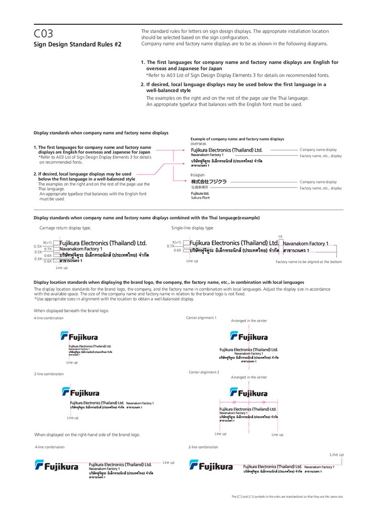
C03Sign Design Standard Rules #2
The standard rules for letters on sign design displays. The appropriate installation location
should be selected based on the sign configuration.
Company name and factory name displays are to be as shown in the following diagrams.
1. The first languages for company name and factory name displays are English for
overseas and Japanese for Japan
*Refer to A03 List of Sign Design Display Elements 3 for details on recommended fonts.
2. If desired, local language displays may be used below the first language in a
well-balanced style
The examples on the right and on the rest of the page use the Thai language.
An appropriate typeface that balances with the English font must be used.
Display standards when company name and factory name displays
Example of company name and factory name displays
overseas
1. The first languages for company name and factory name
displays are English for overseas and Japanese for Japan
*Refer to A03 List of Sign Design Display Elements 3 for details
on recommended fonts.
Company name display
Factory name, etc., display
2. If desired, local language displays may be used
below the first language in a well-balanced style
The examples on the right and on the rest of the page use the
Thai language.
An appropriate typeface that balances with the English font
must be used.
InJapan
Company name display
佐倉事業所
Factory name, etc., display
Sakura Plant
Display standards when company name and factory name displays combined with the Thai language(exsample)
Carriage return display type.
Single-line display type
1X
X(=1)
0.7X
0.6X
X(=1)
0.5X
0.7X
0.5X
0.6X
0.3X
0.6X
Line up
Factory name to be aligned at the bottom
Line up
Display location standards when displaying the brand logo, the company, the factory name, etc., in combination with local languages
The display location standards for the brand logo, the company, and the factory name in combination with local languages. Adjust the display size in accordance
with the available space. The size of the company name and factory name in relation to the brand logo is not fixed.
*Use appropriate sizes in alignment with the location to obtain a well-balanced display.
When displayed beneath the brand logo.
Center alignment 1
4-line combination
Arranged in the center
Line up
Center alignment 2
2-line combination
Arranged in the center
Line up
Line up
When displayed on the right-hand side of the brand logo.
4-line combination
Line up
2-line combination
Line up
Line up
The [○] and [△] symbols in the rules are standardized so that they are the same size.
35.
C04There are sign design display images. The appropriate method for the installation location
conditions (location, background materials, colors, cost performance, etc.) should be selected.
Sign Design Display Images #1
Company walls
1. Only the brand logo is to be displayed on company/factory walls and
on entrance facades
The display location to be selected so that it is easily visible from facing roads and other
distant locations.
2. The brand logo and the company name (in English and the local language)
are to be displayed on entrance gates and reception lobbies, etc.
Standard rules for display sign designs.
*Display of local language is not required.
Company Walls
Left
Uneven and narrow installation areas, etc.
Building facades, etc.
Center
Right
Tower
36.
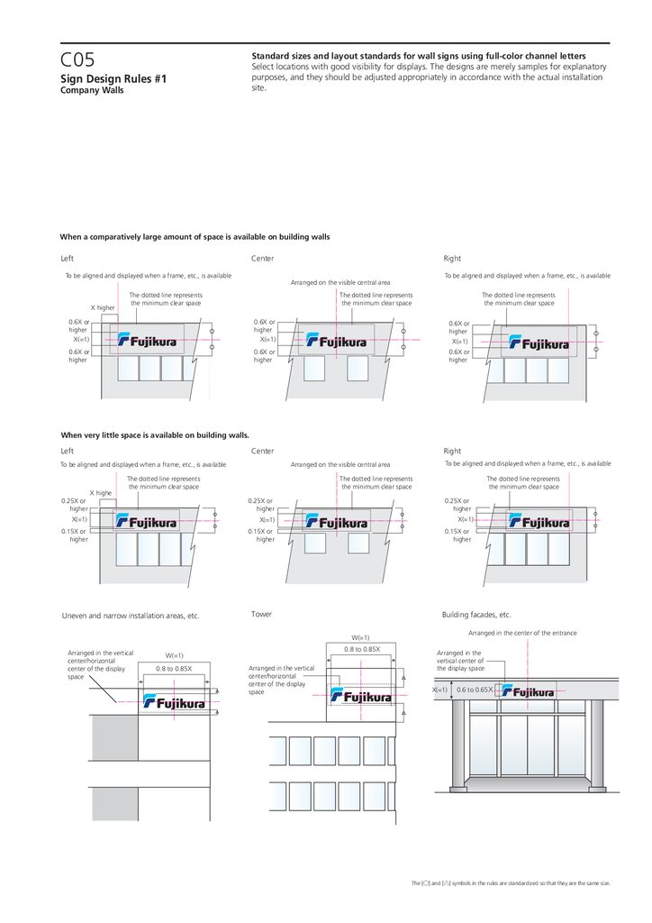
C05Standard sizes and layout standards for wall signs using full-color channel letters
Select locations with good visibility for displays. The designs are merely samples for explanatory
purposes, and they should be adjusted appropriately in accordance with the actual installation
site.
Sign Design Rules #1
Company Walls
When a comparatively large amount of space is available on building walls
Left
Center
To be aligned and displayed when a frame, etc., is available
X higher
Right
To be aligned and displayed when a frame, etc., is available
Arranged on the visible central area
The dotted line represents
the minimum clear space
The dotted line represents
the minimum clear space
The dotted line represents
the minimum clear space
0.6X or
higher
X(=1)
0.6X or
higher
X(=1)
0.6X or
higher
X(=1)
0.6X or
higher
0.6X or
higher
0.6X or
higher
When very little space is available on building walls.
Left
Center
0.25X or
higher
X highe
Right
The dotted line represents
the minimum clear space
The dotted line represents
the minimum clear space
0.25X or
higher
X(=1)
X(=1)
0.15X or
higher
0.15X or
higher
Uneven and narrow installation areas, etc.
To be aligned and displayed when a frame, etc., is available
Arranged on the visible central area
To be aligned and displayed when a frame, etc., is available
The dotted line represents
the minimum clear space
0.25X or
higher
X(=1)
0.15X or
higher
Tower
Building facades, etc.
Arranged in the center of the entrance
W(=1)
Arranged in the vertical
center/horizontal
center of the display
space
0.8 to 0.85X
W(=1)
0.8 to 0.85X
Arranged in the vertical
center/horizontal
center of the display
space
Arranged in the
vertical center of
the display space
X(=1)
0.6 to 0.65
The [○] and [△] symbols in the rules are standardized so that they are the same size.
37.
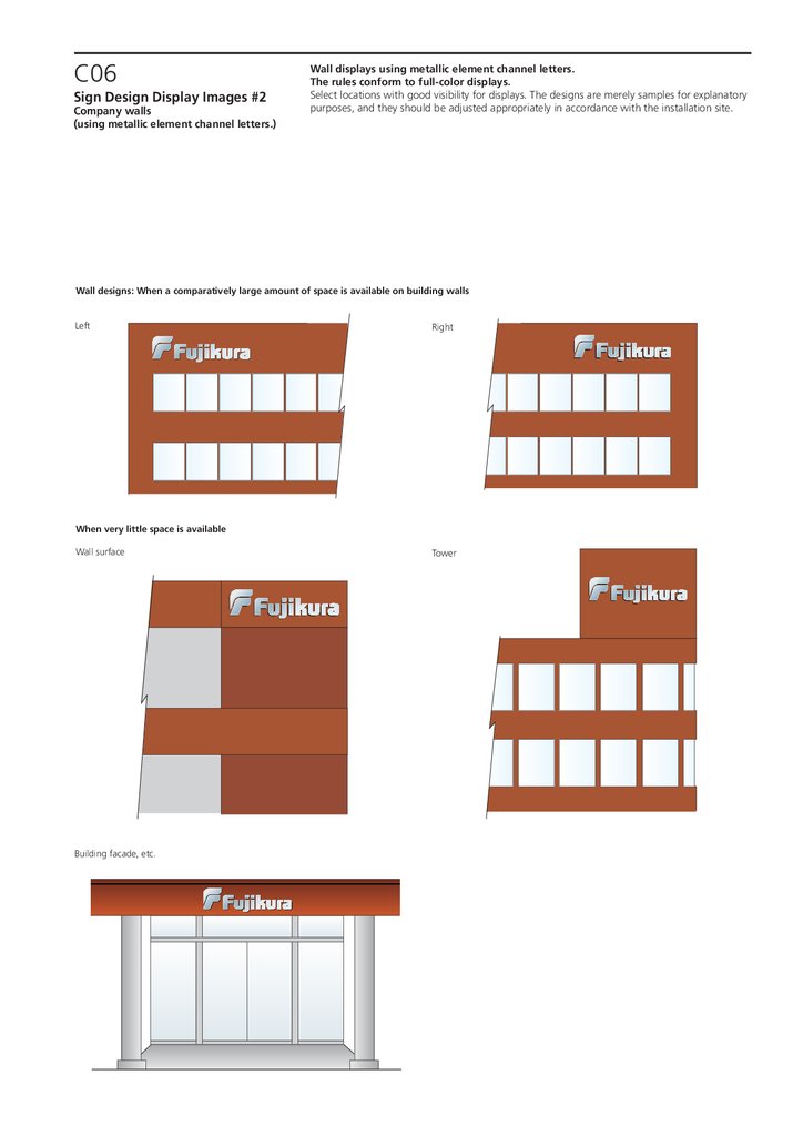
C06Sign Design Display Images #2
Company walls
(using metallic element channel letters.)
Wall displays using metallic element channel letters.
The rules conform to full-color displays.
Select locations with good visibility for displays. The designs are merely samples for explanatory
purposes, and they should be adjusted appropriately in accordance with the installation site.
Wall designs: When a comparatively large amount of space is available on building walls
Left
Right
When very little space is available
Wall surface
Building facade, etc.
Tower
38.
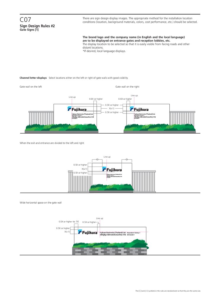
C07There are sign design display images. The appropriate method for the installation location
conditions (location, background materials, colors, cost performance, etc.) should be selected.
Sign Design Rules #2
Gate Signs [1]
The brand logo and the company name (in English and the local language)
are to be displayed on entrance gates and reception lobbies, etc.
The display location to be selected so that it is easily visible from facing roads and other
distant locations.
*If desired, local language displays.
Channel letter displays Select locations either on the left or right of gate walls with good visibility.
Gate wall on the left
Gate wall on the right
Line up
Line up
0.6X or higher
0.6X or higher
0.5X or higher
X(=1)
0.5X or higher
When the exit and entrance are divided to the left and right
Line up
0.5X or higher
X(=1)
0.5X or higher
Wide horizontal space on the gate wall
Line up
0.5X or higher to 1X
0.5X or higher
0.5X or higher
X(=1)
The [○] and [△] symbols in the rules are standardized so that they are the same size.
39.
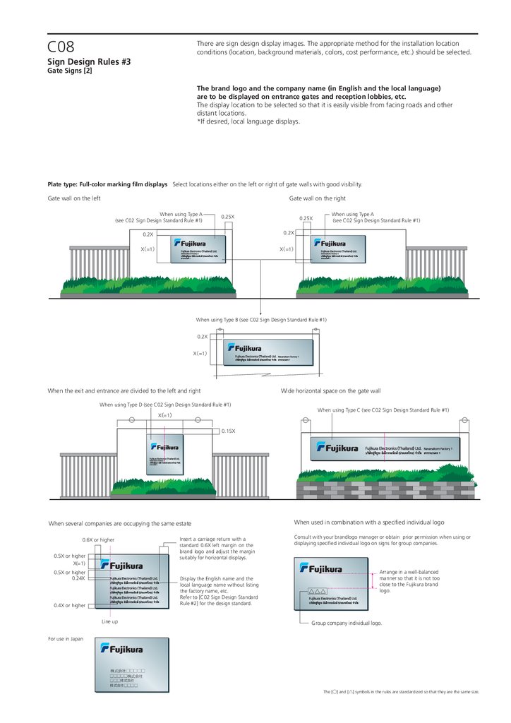
C08There are sign design display images. The appropriate method for the installation location
conditions (location, background materials, colors, cost performance, etc.) should be selected.
Sign Design Rules #3
Gate Signs [2]
The brand logo and the company name (in English and the local language)
are to be displayed on entrance gates and reception lobbies, etc.
The display location to be selected so that it is easily visible from facing roads and other
distant locations.
*If desired, local language displays.
Plate type: Full-color marking film displays Select locations either on the left or right of gate walls with good visibility.
Gate wall on the left
Gate wall on the right
When using Type A
(see C02 Sign Design Standard Rule #1)
0.25X
When using Type A
(see C02 Sign Design Standard Rule #1)
0.25X
0.2X
0.2X
X =1
X =1
When using Type B (see C02 Sign Design Standard Rule #1)
0.2X
X =1
When the exit and entrance are divided to the left and right
Wide horizontal space on the gate wall
When using Type D (see C02 Sign Design Standard Rule #1)
X =1
When using Type C (see C02 Sign Design Standard Rule #1)
0.15X
When several companies are occupying the same estate
0.6X or higher
0.5X or higher
X(=1)
0.5X or higher
0.24X
Insert a carriage return with a
standard 0.6X left margin on the
brand logo and adjust the margin
suitably for horizontal displays.
Display the English name and the
local language name without listing
the factory name, etc.
Refer to [C02 Sign Design Standard
Rule #2] for the design standard.
0.4X or higher
Line up
When used in combination with a specified individual logo
Consult with your brandlogo manager or obtain prior permission when using or
displaying specified individual logo on signs for group companies.
△△△
Arrange in a well-balanced
manner so that it is not too
close to the Fujikura brand
logo.
Group company individual logo.
For use in Japan
株式会社□□□□□
□□□□□株式会社
□□□株式会社
株式会社□□□□
The [○] and [△] symbols in the rules are standardized so that they are the same size.
40.
C09Sign Design Rules #4
Gate Signs [Miscellaneous]
There are sign design display images. The appropriate method for the installation location
conditions (location, background materials, colors, cost performance, etc.) should be selected.
When reproducing on standalone signs and special exceptions such as stone signs, permission
from the brand logo manager is required. When reproducing, consult the brand logo manager.
The brand logo and the company name (in English and the local language)
are to be displayed on entrance gates and reception lobbies, etc.
The display location to be selected so that it is easily visible from facing roads and other
distant locations.
*If desired, local language displays.
When using overhead signs owing to a low gate wall or to improve visibility
Channel letter display
Plate type: Marking film display
The entire sign faceplate covered in metallic elements.
0.6X or higher
0.6X or higher
0.4X
Line up
揃える
X
=1
0.4X
X =1
Special Exceptions : Displayed with metallic element channel letters.
Standalone signs
*Check with your brand logo manager without fail when reproducing
the special exceptions.
The layout standards for the design elements conform to the details
listed on the left (full color channel letter display.)
Channel letter displays
1X or higher
X =1
1X
Use a plate for the entirety and display with channel letters.
The layout standards for the design elements conform to the details listed above (full color
channel letter display.)
Plate type displays
The layout standards for the design elements conform to plate type D (C03 Sign Design
Standard Rule #2) and the company name and factory name are to be displayed in the center.
1
1
0.9X to 1
X =1
1X or higher
Well balanced
The [○] and [△] symbols in the rules are standardized so that they are the same size.
41.
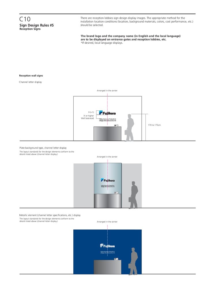
C10Sign Design Rules #5
There are reception lobbies sign design display images. The appropriate method for the
installation location conditions (location, background materials, colors, cost performance, etc.)
should be selected.
Reception Signs
The brand logo and the company name (in English and the local language)
are to be displayed on entrance gates and reception lobbies, etc.
*If desired, local language displays.
Reception wall signs
Channel letter display
Arranged in the center
X (=1)
X or higher
Well balanced
170 to 175cm
Plate background type, channel letter display
The layout standards for the design elements conform to the
details listed above (channel letter display.)
Arranged in the center
Metallic element (channel letter specifications, etc.) display
The layout standards for the design elements conform to the
details listed above (channel letter display.)
Arranged in the center
42.
C11There are Outdoor Standing Signs design rules. The appropriate method for the installation
location conditions (location, background materials, colors, cost performance, etc.) should be
selected.
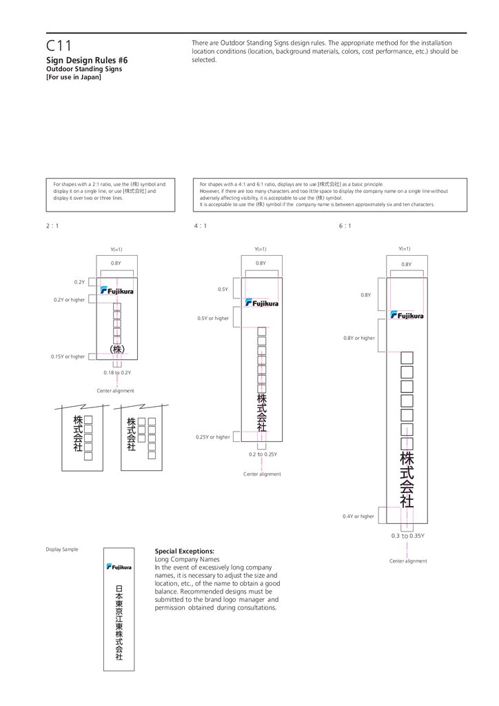
Sign Design Rules #6
Outdoor Standing Signs
[For use in Japan]
For shapes with a 2:1 ratio, use the (株) symbol and
display it on a single line, or use [株式会社] and
display it over two or three lines.
2 1
For shapes with a 4:1 and 6:1 ratio, displays are to use [株式会社] as a basic principle.
However, if there are too many characters and too little space to display the company name on a single line without
adversely affecting visibility, it is acceptable to use the (株) symbol.
It is acceptable to use the (株) symbol if the company name is between approximately six and ten characters.
4 1
6 1
Y(=1)
Y(=1)
Y(=1)
0.8Y
0.8Y
0.8Y
0.2Y
0.5Y
0.8Y
0.2Y or higher
0.5Y or higher
0.8Y or higher
0.15Y or higher
0.18 to 0.2Y
Center alignment
0.25Y or higher
0.2 to 0.25Y
Center alignment
0.4Y or higher
0.3 to 0.35Y
Display Sample
Special Exceptions:
Long Company Names
In the event of excessively long company
names, it is necessary to adjust the size and
location, etc., of the name to obtain a good
balance. Recommended designs must be
submitted to the brand logo manager and
permission obtained during consultations.
Center alignment
43.
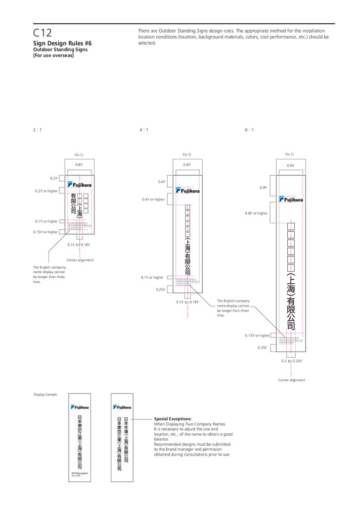
C12Sign Design Rules #6
There are Outdoor Standing Signs design rules. The appropriate method for the installation
location conditions (location, background materials, colors, cost performance, etc.) should be
selected.
Outdoor Standing Signs
[For use overseas]
2 1
4 1
6 1
Y(=1)
Y(=1)
Y(=1)
0.8Y
0.8Y
0.8Y
0.2Y
0.4Y
0.8Y
0.2Y or higher
0.4Y or higher
0.8Y or higher
0.1Y or higher
0.15Y or higher
□□□□□□□□□□□
□□□□□□□□□□□□□
□□□□□□□□
0.15 to 0.18Y
Center alignment
The English company
name display cannot
be longer than three
lines.
0.1Y or higher
□□□□□□□□□□□
□□□□□□□□□□□□□
□□□□□□□□
0.25Y
0.15 to 0.18Y
The English company
name display cannot
be longer than three
lines.
0.15Y or higher
□□□□□□□□□□□
□□□□□□□□□□□□□
□□□□□□□□
0.25Y
0.2 to 0.24Y
Center alignment
Display Sample
Special Exceptions:
When Displaying Two Company Names
It is necessary to adjust the size and
location, etc., of the name to obtain a good
balance.
Recommended designs must be submitted
to the brand manager and permission
obtained during consultations prior to use.
NTK(Shanghai)
Co., Ltd.