


 software
Similar presentations:


")


Design principles
1.
06DESIGN PRINCIPLES
IAT 102 Graphic Design
2.
06Design Basics
(a few tools)
3.
Fundamental QuestionsWhen starting a new design project, always ask yourself:
What is the objective of the communication (your intended message?
What needs to be said/understood first, second, and then after that?
(levels of hierarchy)
How do you want the eye to flow through the page?
Who are you speaking to? (your target audience)
What tone of voice is appropriate to your message and audience?
4.
Elements of good design will help youachieve your communication goals:
Hierarchy
Movement
Balance – asymmetrical & symmetrical
Consistency / Repetition
Proximity
Alignment
5.
Lead your viewer through information in the order you think ismost important by establishing a visual
HIERARCHY
6.
What is the most important information?SECOND?
What should you see FIRST?
3rd?
hierarchy
7.
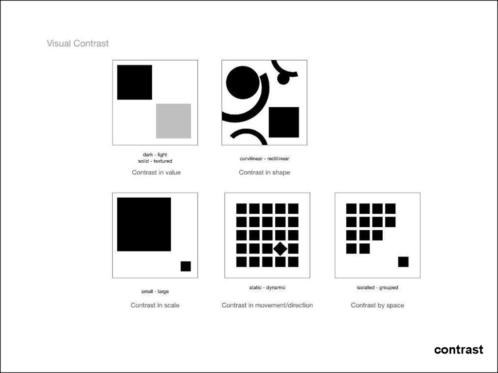
Hierarchy: look first, second, third….Scale:
relative size
Contrast: colour, value, texture…..
Example: A designer might design a full-page magazine
ad using a single small image in the middle of the page
with lots of white space.
The contrast between the scale of the page and the
scale of the content (image) draws attention to the
image (it has greater Mass or visual weight). This can
create a specific mood (depending on other elements)
such as conservative, elegant, lonely, or open.
http://desktoppub.about.com/od/gestalt/Gestalt.htm
8.
ContrastValue: light to dark area
Color: colour harmonies (contrasting colours are across from each
other on the colour wheel)
Example: A designer might design a full-page magazine ad using a
single dominant colour and then highlight an area through use of a
different colour based on a specific colour palette.
Colour can also be used to lead the eye through the work.
9.
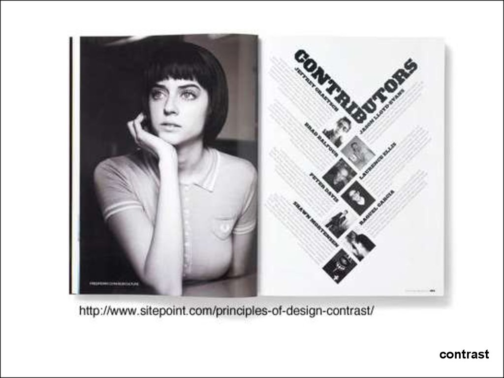
contrast10.
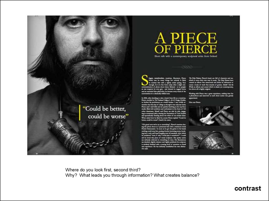
Where do you look first, second third?Why? What leads you through information? What creates balance?
contrast
11.
Where do you look first, second third?Why? What leads you through information? What creates balance?
contrast
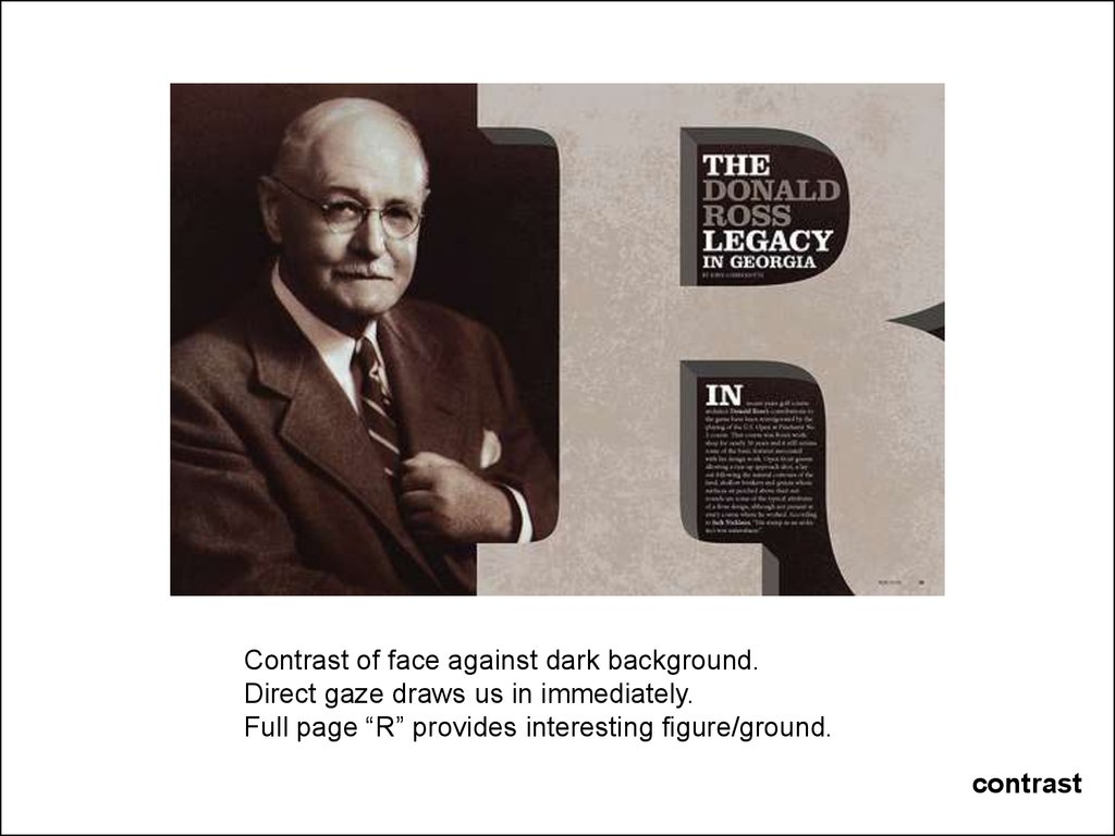
12.
Contrast of face against dark background.Direct gaze draws us in immediately.
Full page “R” provides interesting figure/ground.
contrast
13.
contrast14.
contrast15.
contrast16.
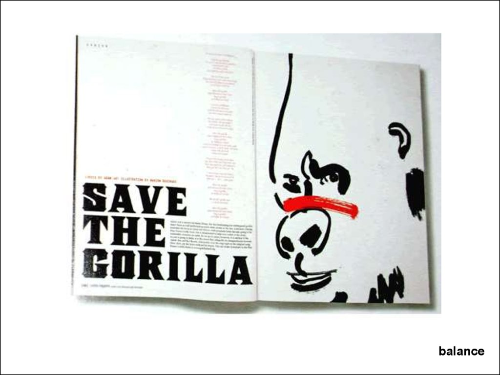
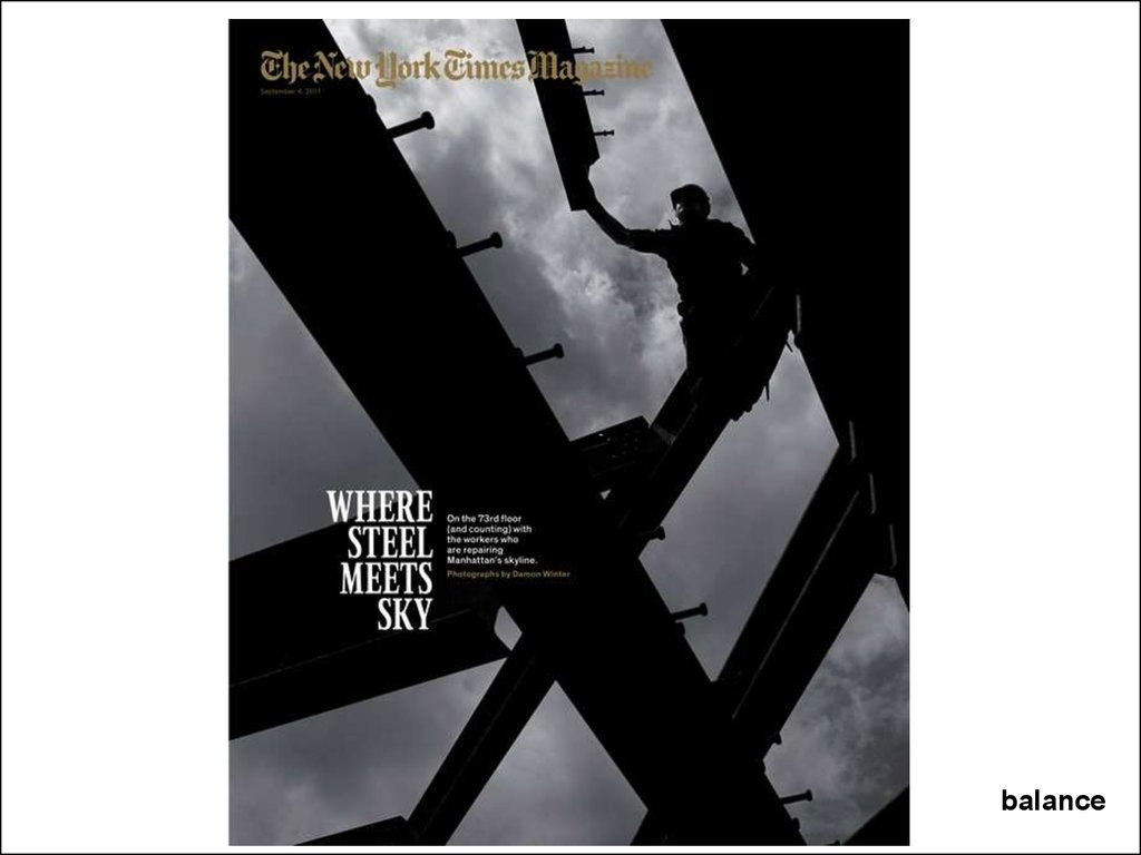
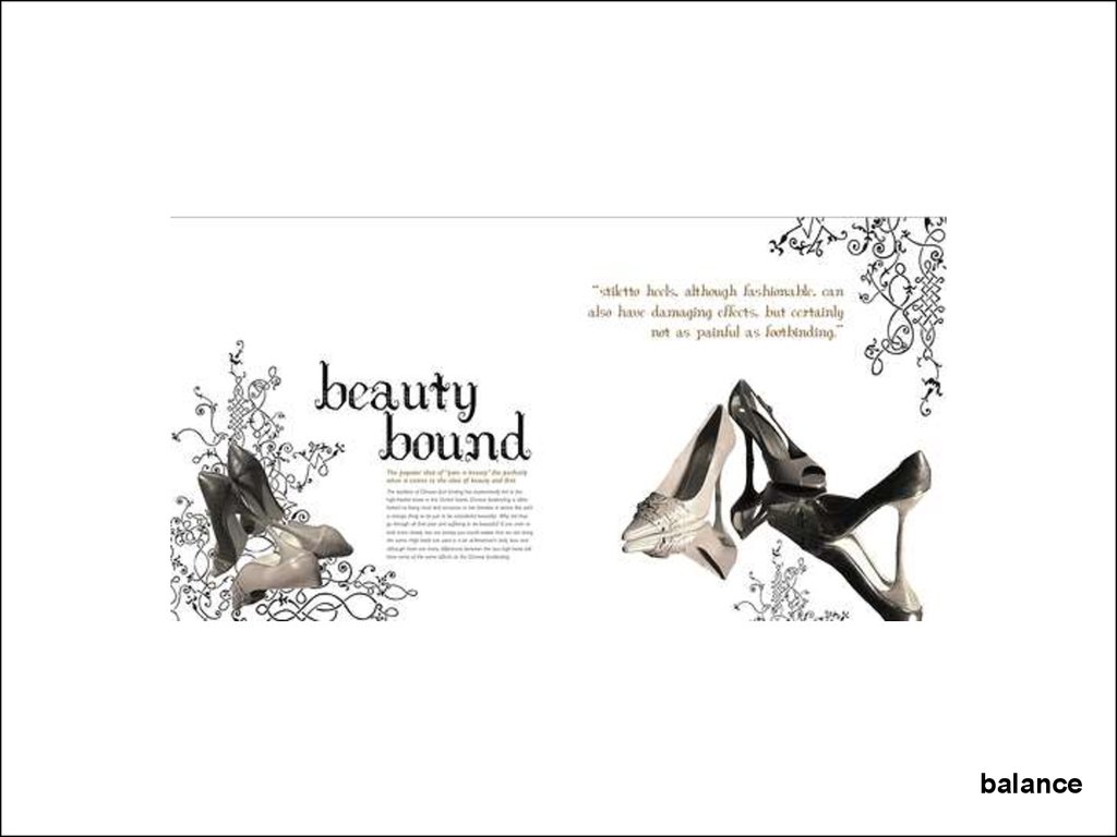
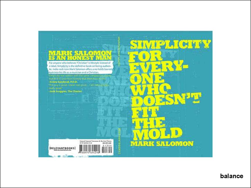
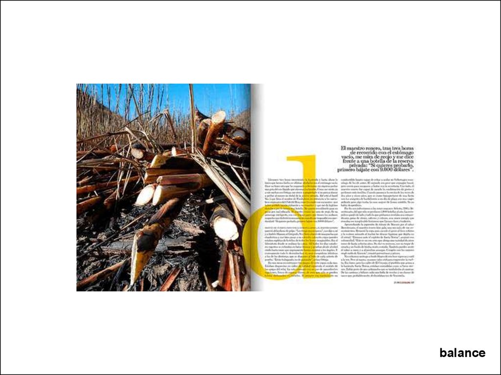
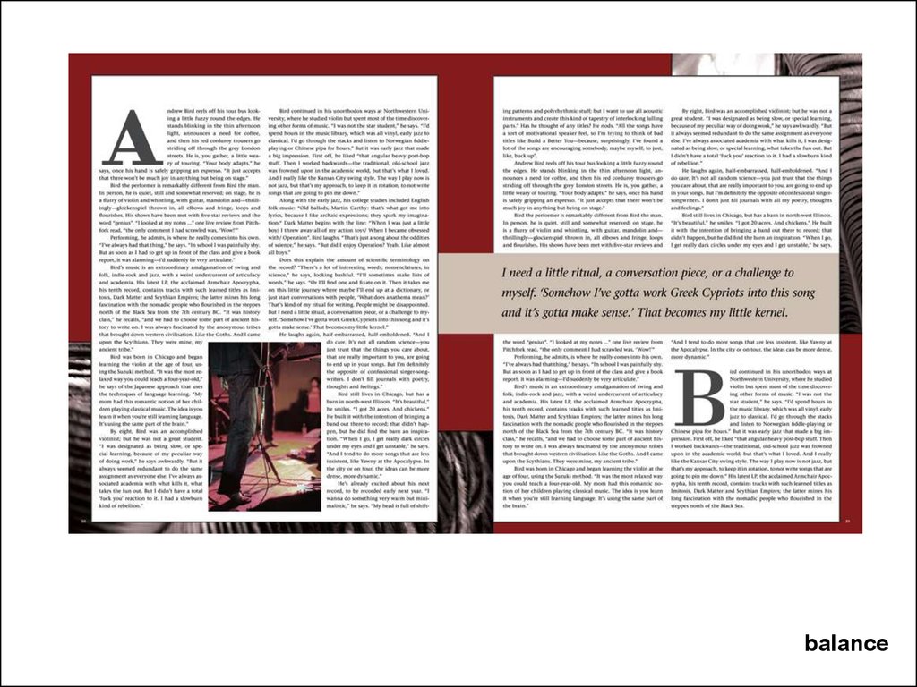
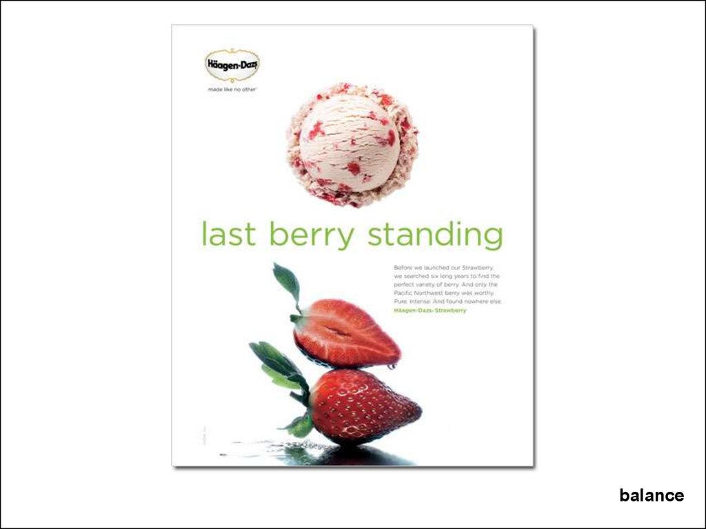
BalanceCan be achieved using:
Placement: symmetrical, asymmetrical, or radial (focal point)
scale
Colour
Value
Shape
Position (of an element in relation to other elements)
Texture, or
Eye Direction
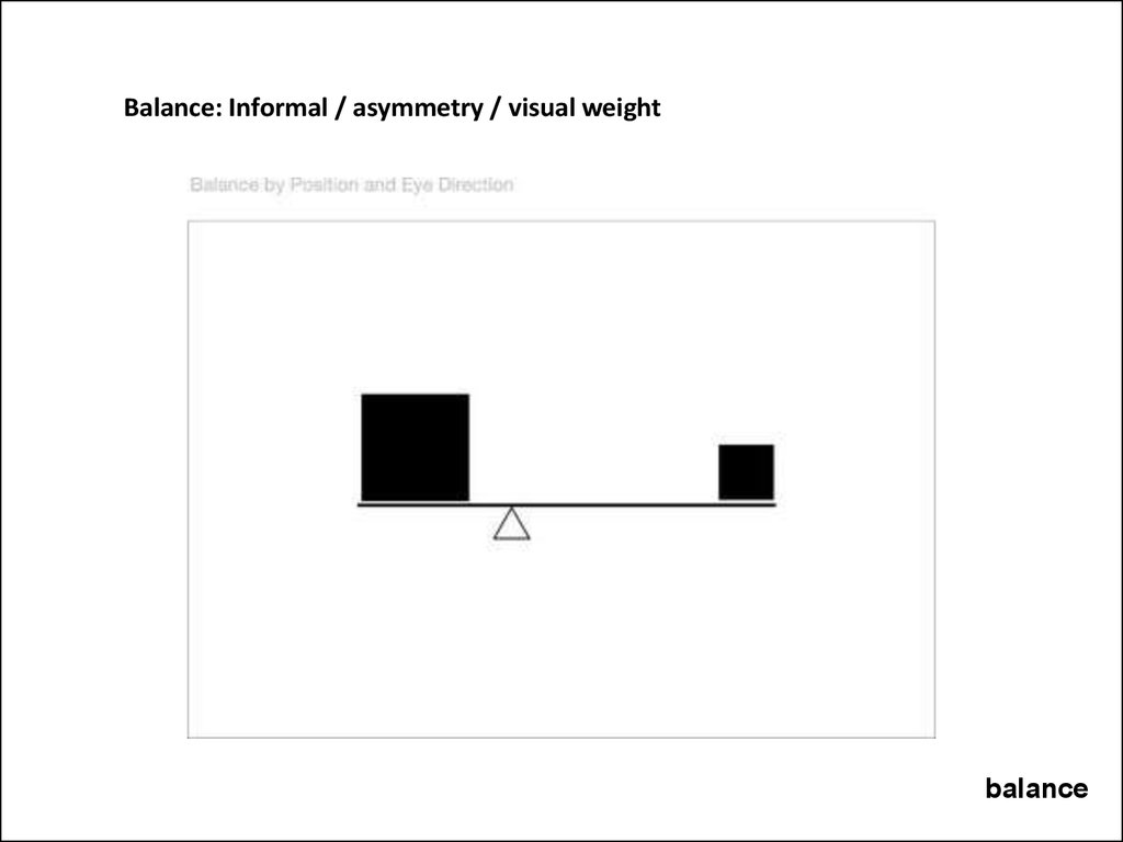
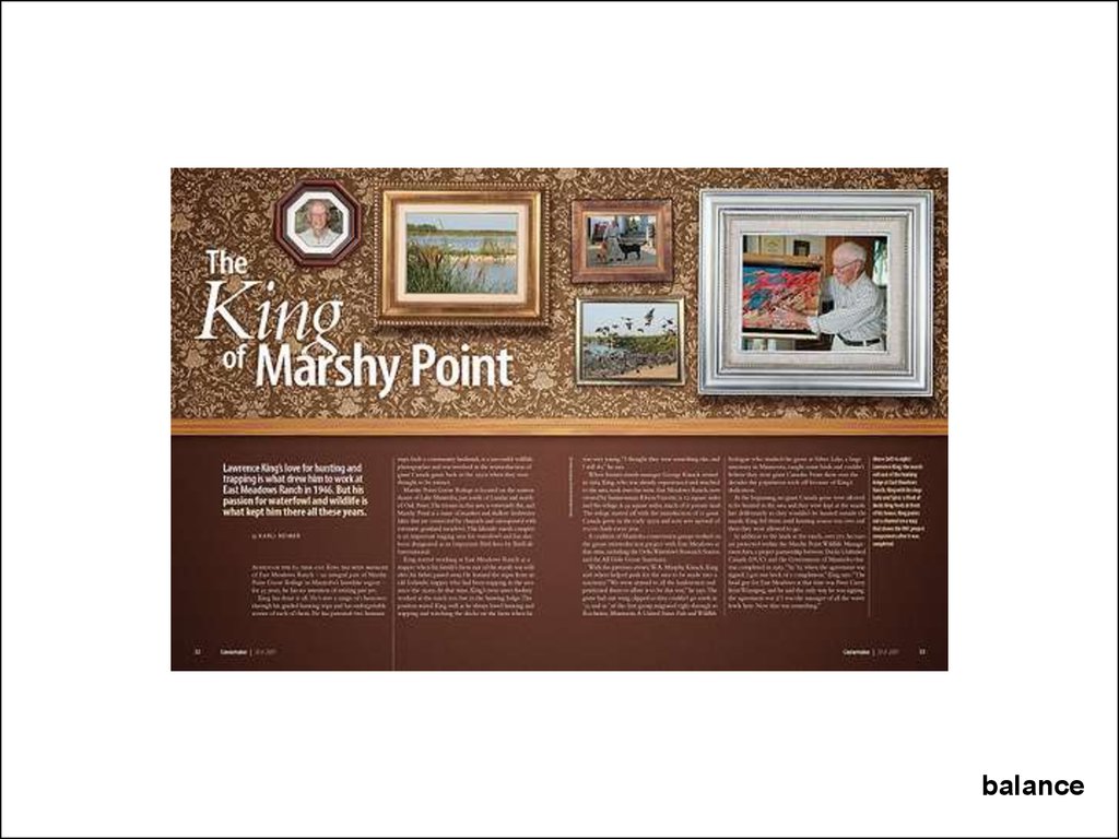
17.
Balance: Informal / asymmetry / visual weightbalance
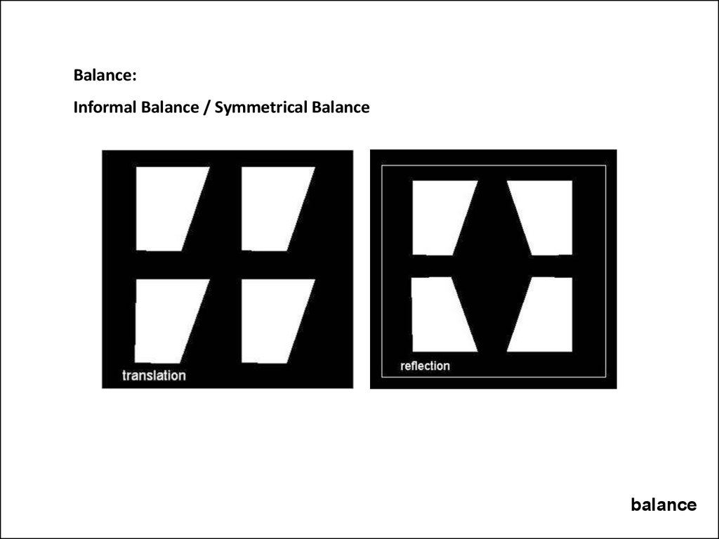
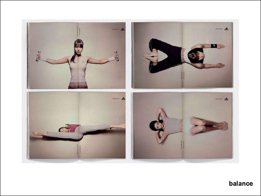
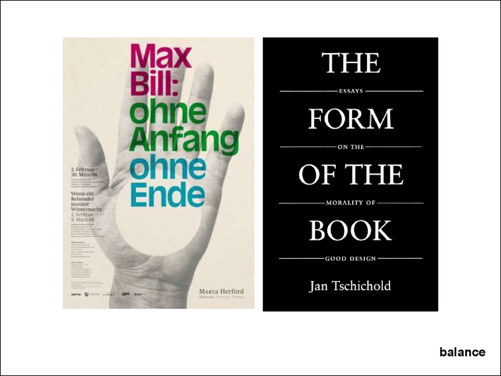
18.
Balance:Informal Balance / Symmetrical Balance
balance
19.
balance20.
balance21.
balance22.
balance23.
balance24.
balance25.
balance26.
balance27.
balance28.
balance29.
balance30.
balance31.
balance32.
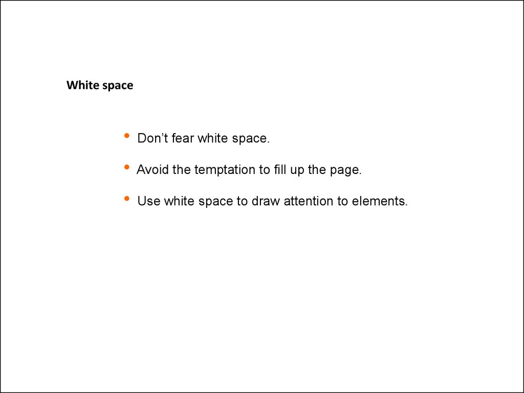
White spaceDon’t fear white space.
Avoid the temptation to fill up the page.
Use white space to draw attention to elements.
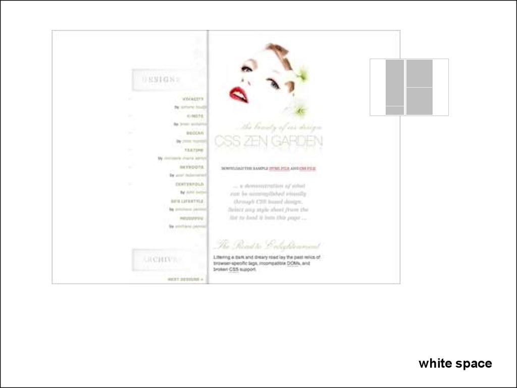
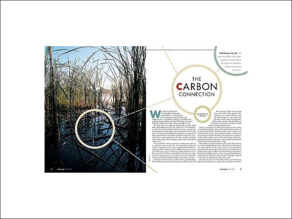
33. Emphasis through Isolation:
white space34.
Allow elements to command attentionby giving them space on the page.
http://www.boredpanda.com/creative-double-page-magazine-ads/
white space
35.
white space36.
white space37.
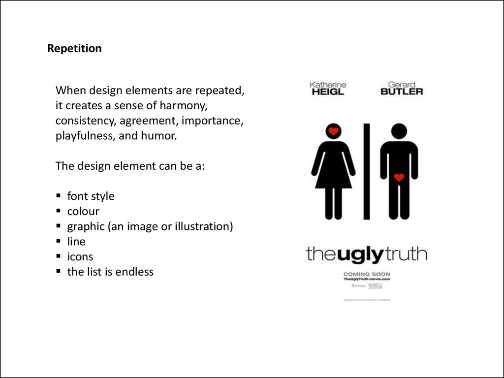
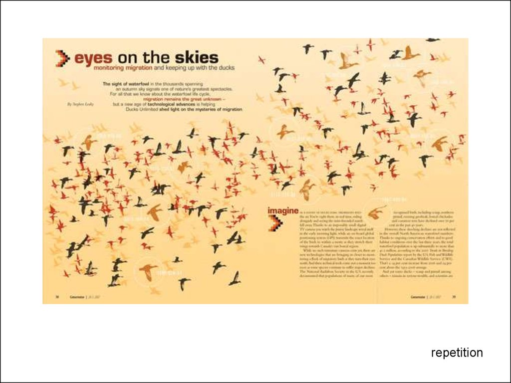
RepetitionWhen design elements are repeated,
it creates a sense of harmony,
consistency, agreement, importance,
playfulness, and humor.
The design element can be a:
font style
colour
graphic (an image or illustration)
line
icons
the list is endless
38.
repetition39.
repetition40.
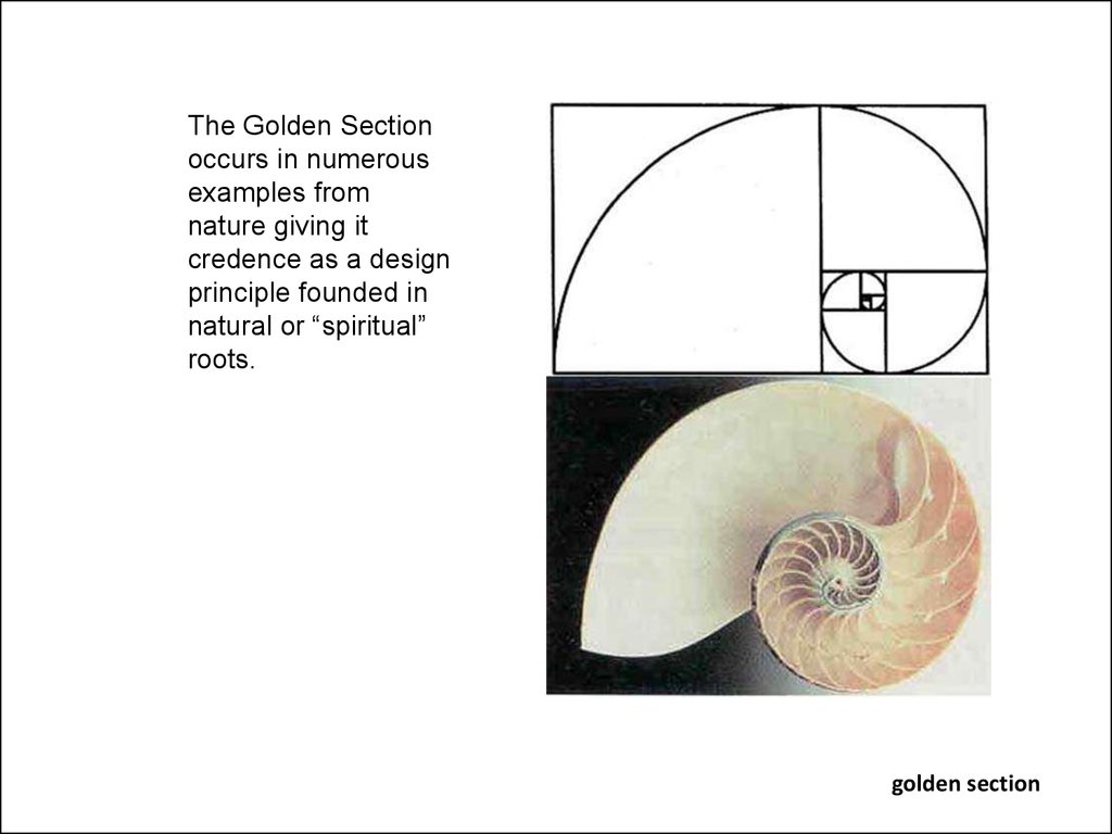
At least since the Renaissance, many artists and architects haveproportioned their works to approximate the golden ratio—
especially in the form of the golden rectangle, in which the ratio of
the longer side to the shorter is the golden ratio—believing this
proportion to be aesthetically pleasing. (Wikipedia)
hint: multiple base number by 1.6 (1 to 1.6)
Or 1.6180339887
golden section
41.
The Golden Sectionoccurs in numerous
examples from
nature giving it
credence as a design
principle founded in
natural or “spiritual”
roots.
golden section
42.
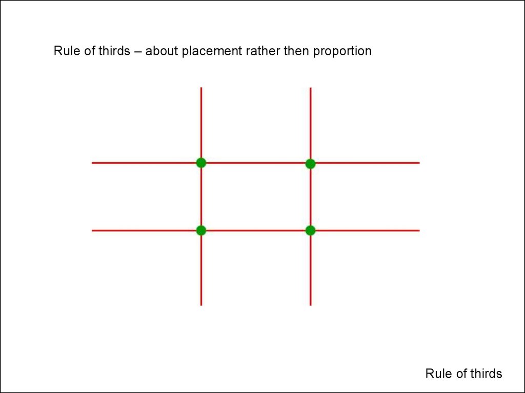
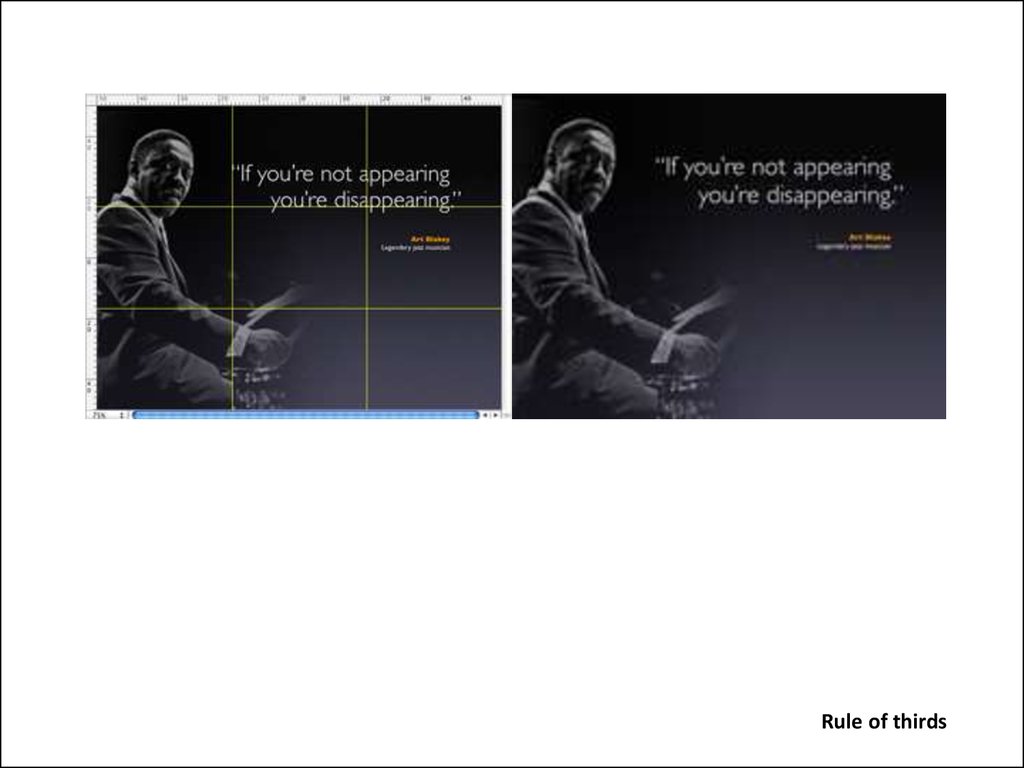
Rule of thirds – about placement rather then proportionRule of thirds
43.
Rule of thirds44.
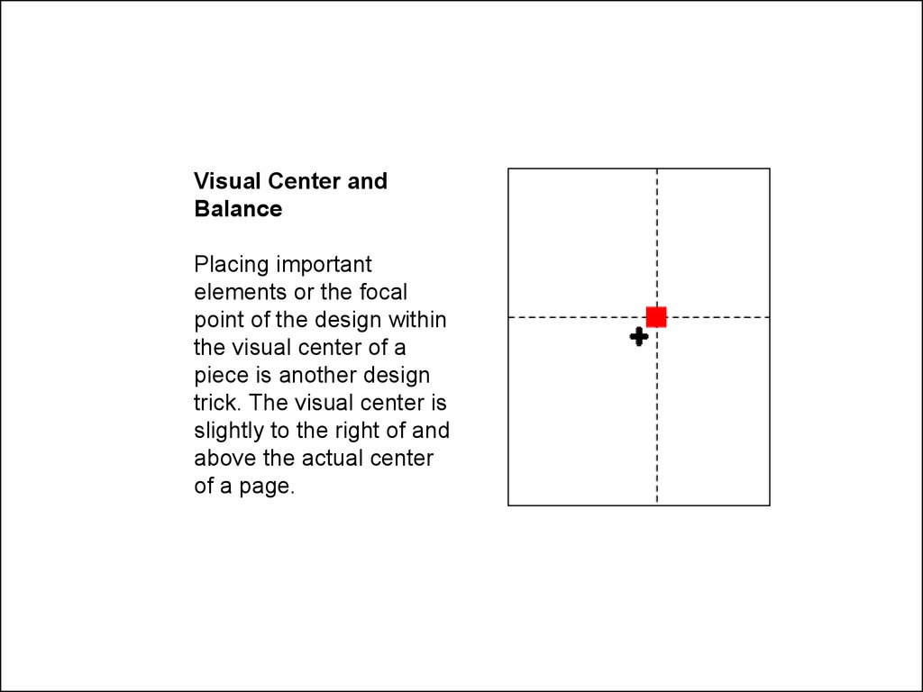
Visual Center andBalance
Placing important
elements or the focal
point of the design within
the visual center of a
piece is another design
trick. The visual center is
slightly to the right of and
above the actual center
of a page.
45.
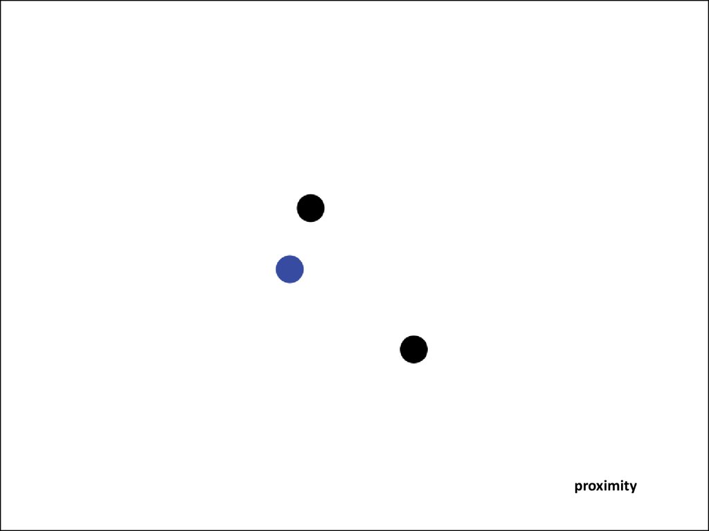
ProximityThe concept of proximity says that related items should
be grouped together. Likewise, items that are not related
should not be close to each other. The process of grouping
related information creates visual cues, which accomplishes
Jakob's principle of facilitating scanning. An example of
proximity is the relationship between subheading for my
paragraphs (such as Proximity above), and the Paragraphs
below them. Williams also suggests never having the same
amount of white space between elements that aren't a part
of a list
46.
proximity47.
proximity48.
AlignmentThe concept of alignment says that everything on a page
should be visually connected to something else on the
page. Nothing should be placed arbitrarily. When elements
are aligned they are connected to each other, even if they
are separated on the page. You may have noticed that the
alignment of the subheading "Alignment" was centered. As it
is said, "Good design is transparent." The lack of alignment
between the subhead and the related paragraph made your
eye have to travel across the page, and it was probably
enough for you to notice
49.
50.
51.
examples52.
summary:1.
Hierarchy is achieved by:
1.
Isolation
2.
Scale
3.
Contrast (value, colour, tone)
2.
Visual Hierarchy
1.
Dominant, Sub-dominant, subordinate
3.
Balance
1.
Pictorial Weight (Informal Balance)
2.
Approximate Symmetry (Formal Balance)
4.
White Space
1.
Figure / ground
5.
Repetition:
1.
Through Repetition to create a perceived similarity to Elements in a composition
6.
Proximity
1.
Create grouping
7.
Alignment:
1.
2.
One page
Across pages
53.
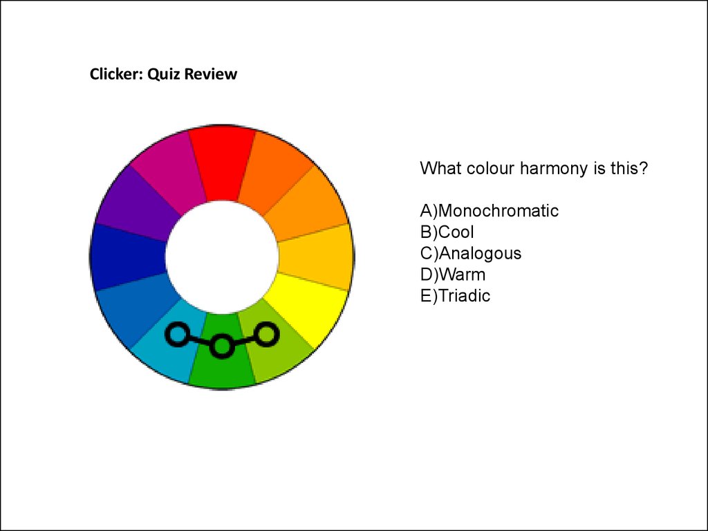
Clicker: Quiz ReviewWhat colour harmony is this?
A)Monochromatic
B)Cool
C)Analogous
D)Warm
E)Triadic
54.
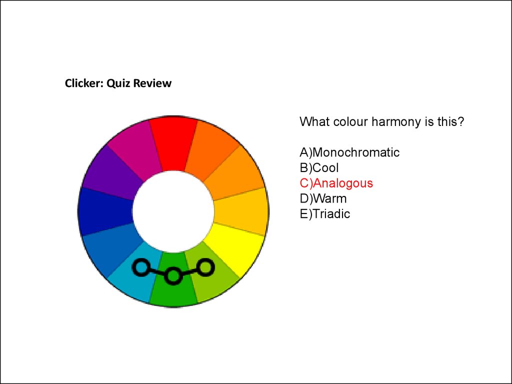
Clicker: Quiz ReviewWhat colour harmony is this?
A)Monochromatic
B)Cool
C)Analogous
D)Warm
E)Triadic
55.
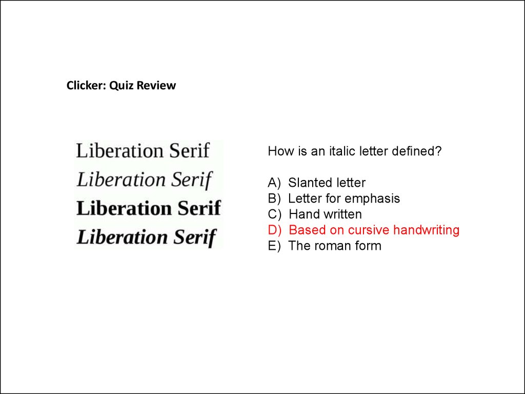
Clicker: Quiz ReviewHow is an italic letter defined?
A)
B)
C)
D)
E)
Slanted letter
Letter for emphasis
Hand written
Based on cursive handwriting
The roman form
56.
Clicker: Quiz ReviewHow is an italic letter defined?
A)
B)
C)
D)
E)
Slanted letter
Letter for emphasis
Hand written
Based on cursive handwriting
The roman form
57.
Clicker: Quiz ReviewIdentify the type crime
A)
B)
C)
D)
E)
Images are not aligned
Office should be right aligned
Too much Leading
Headquarters is bolded
Accountability is squished
58.
Clicker: Quiz ReviewIdentify the type crime
A)
B)
C)
D)
E)
Images are not aligned
Office should be right aligned
Too much Leading
Headquarters is bolded
Accountability is squished