


 management
Similar presentations:


Organizing and Visualizing Data
1.
Statistics for Managers usingMicrosoft Excel
6th Edition
Chapter 2
Organizing and Visualizing Data
Copyright ©2011 Pearson Education, Inc. publishing as Prentice Hall
2-1
2.
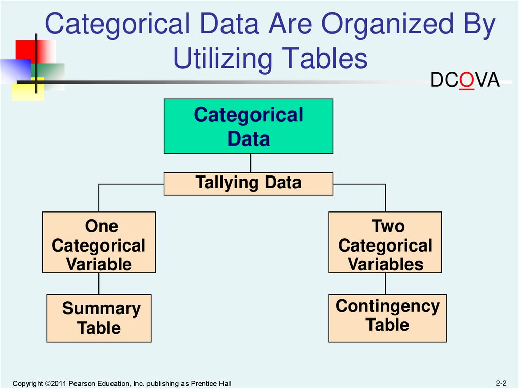
Categorical Data Are Organized ByUtilizing Tables
DCOVA
Categorical
Data
Tallying Data
One
Categorical
Variable
Two
Categorical
Variables
Summary
Table
Contingency
Table
Copyright ©2011 Pearson Education, Inc. publishing as Prentice Hall
2-2
3.
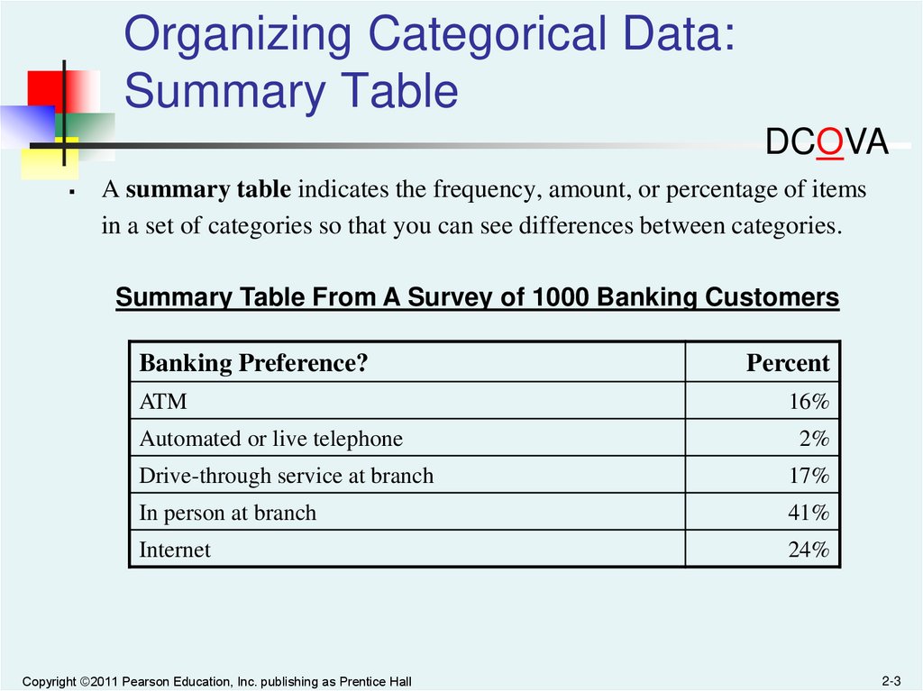
Organizing Categorical Data:Summary Table
DCOVA
A summary table indicates the frequency, amount, or percentage of items
in a set of categories so that you can see differences between categories.
Summary Table From A Survey of 1000 Banking Customers
Banking Preference?
Percent
ATM
16%
Automated or live telephone
2%
Drive-through service at branch
17%
In person at branch
41%
Internet
24%
Copyright ©2011 Pearson Education, Inc. publishing as Prentice Hall
2-3
4.
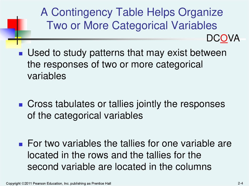
A Contingency Table Helps OrganizeTwo or More Categorical Variables
DCOVA
Used to study patterns that may exist between
the responses of two or more categorical
variables
Cross tabulates or tallies jointly the responses
of the categorical variables
For two variables the tallies for one variable are
located in the rows and the tallies for the
second variable are located in the columns
Copyright ©2011 Pearson Education, Inc. publishing as Prentice Hall
2-4
5.
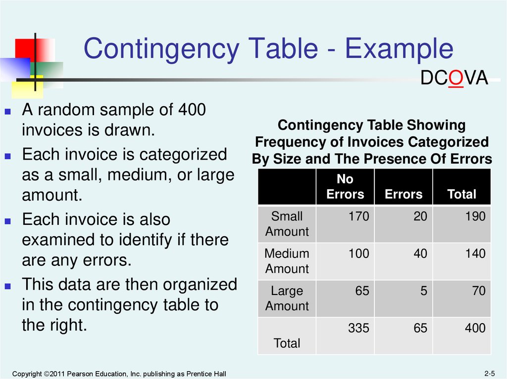
Contingency Table - ExampleDCOVA
A random sample of 400
Contingency Table Showing
invoices is drawn.
Frequency of Invoices Categorized
Each invoice is categorized
By Size and The Presence Of Errors
as a small, medium, or large
No
Errors
Errors
Total
amount.
Small
170
20
190
Each invoice is also
Amount
examined to identify if there
Medium
100
40
140
are any errors.
Amount
This data are then organized
Large
65
5
70
Amount
in the contingency table to
the right.
335
65
400
Total
Copyright ©2011 Pearson Education, Inc. publishing as Prentice Hall
2-5
6.
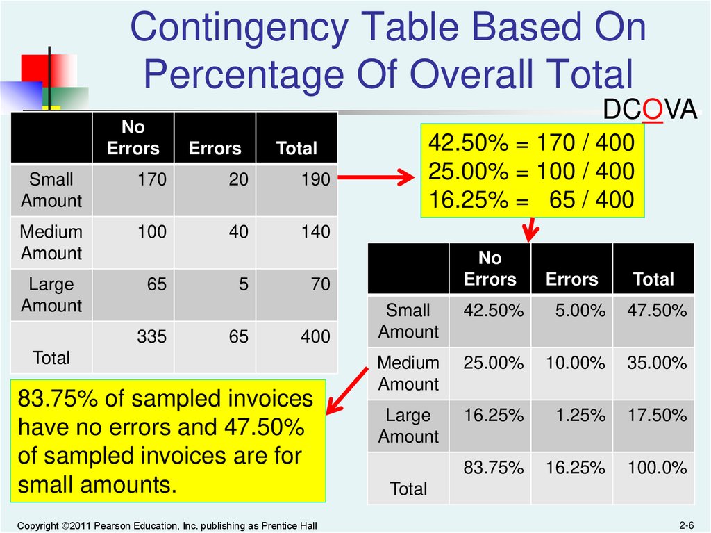
Contingency Table Based OnPercentage Of Overall Total
DCOVA
No
Errors
Errors
Small
Amount
170
20
190
Medium
Amount
100
40
140
Large
Amount
65
335
5
65
42.50% = 170 / 400
25.00% = 100 / 400
16.25% = 65 / 400
Total
No
Errors
Errors
Total
Small
Amount
42.50%
5.00%
47.50%
Medium
Amount
25.00%
10.00%
35.00%
Large
Amount
16.25%
1.25%
17.50%
83.75%
16.25%
100.0%
70
400
Total
83.75% of sampled invoices
have no errors and 47.50%
of sampled invoices are for
small amounts.
Copyright ©2011 Pearson Education, Inc. publishing as Prentice Hall
Total
2-6
7.
Contingency Table Based OnPercentage of Row Totals
DCOVA
No
Errors
Errors
Small
Amount
170
20
190
Medium
Amount
100
40
140
Large
Amount
65
335
5
65
89.47% = 170 / 190
71.43% = 100 / 140
92.86% = 65 / 70
Total
No
Errors
Errors
Total
Small
Amount
89.47%
10.53%
100.0%
Medium
Amount
71.43%
28.57%
100.0%
Large
Amount
92.86%
7.14%
100.0%
83.75%
16.25%
100.0%
70
400
Total
Medium invoices have a larger
chance (28.57%) of having
errors than small (10.53%) or
large (7.14%) invoices.
Copyright ©2011 Pearson Education, Inc. publishing as Prentice Hall
Total
2-7
8.
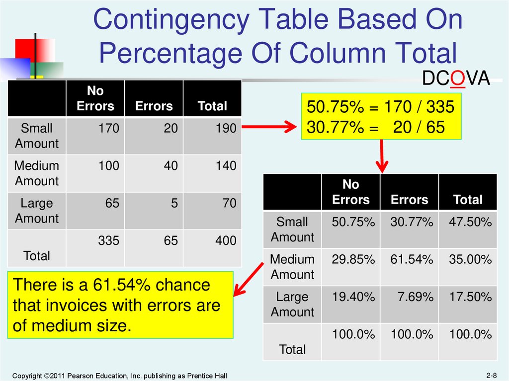
Contingency Table Based OnPercentage Of Column Total
DCOVA
No
Errors
Errors
Small
Amount
170
20
190
Medium
Amount
100
40
140
Large
Amount
65
335
5
65
50.75% = 170 / 335
30.77% = 20 / 65
Total
No
Errors
Errors
Total
Small
Amount
50.75%
30.77%
47.50%
Medium
Amount
29.85%
61.54%
35.00%
Large
Amount
19.40%
7.69%
17.50%
100.0%
100.0%
100.0%
70
400
Total
There is a 61.54% chance
that invoices with errors are
of medium size.
Total
Copyright ©2011 Pearson Education, Inc. publishing as Prentice Hall
2-8
9.
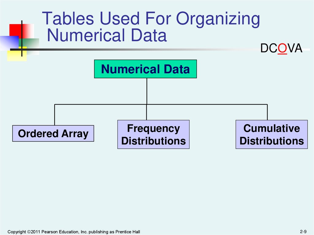
Tables Used For OrganizingNumerical Data
DCOVA
Numerical Data
Ordered Array
Frequency
Distributions
Copyright ©2011 Pearson Education, Inc. publishing as Prentice Hall
Cumulative
Distributions
2-9
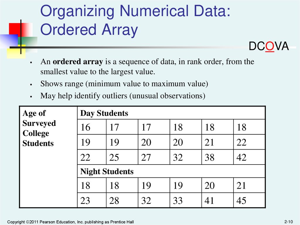
10.
Organizing Numerical Data:Ordered Array
DCOVA
An ordered array is a sequence of data, in rank order, from the
smallest value to the largest value.
Shows range (minimum value to maximum value)
May help identify outliers (unusual observations)
Age of
Surveyed
College
Students
Day Students
16
17
17
18
18
18
19
22
19
25
20
27
20
32
21
38
22
42
Night Students
18
18
19
19
20
21
23
28
32
33
41
45
Copyright ©2011 Pearson Education, Inc. publishing as Prentice Hall
2-10
11.
Organizing Numerical Data:Frequency Distribution
DCOVA
The frequency distribution is a summary table in which the data are
arranged into numerically ordered classes.
You must give attention to selecting the appropriate number of class
groupings for the table, determining a suitable width of a class grouping,
and establishing the boundaries of each class grouping to avoid
overlapping.
The number of classes depends on the number of values in the data. With
a larger number of values, typically there are more classes. In general, a
frequency distribution should have at least 5 but no more than 15 classes.
To determine the width of a class interval, you divide the range (Highest
value–Lowest value) of the data by the number of class groupings desired.
Copyright ©2011 Pearson Education, Inc. publishing as Prentice Hall
2-11
12.
Organizing Numerical Data:Frequency Distribution Example
DCOVA
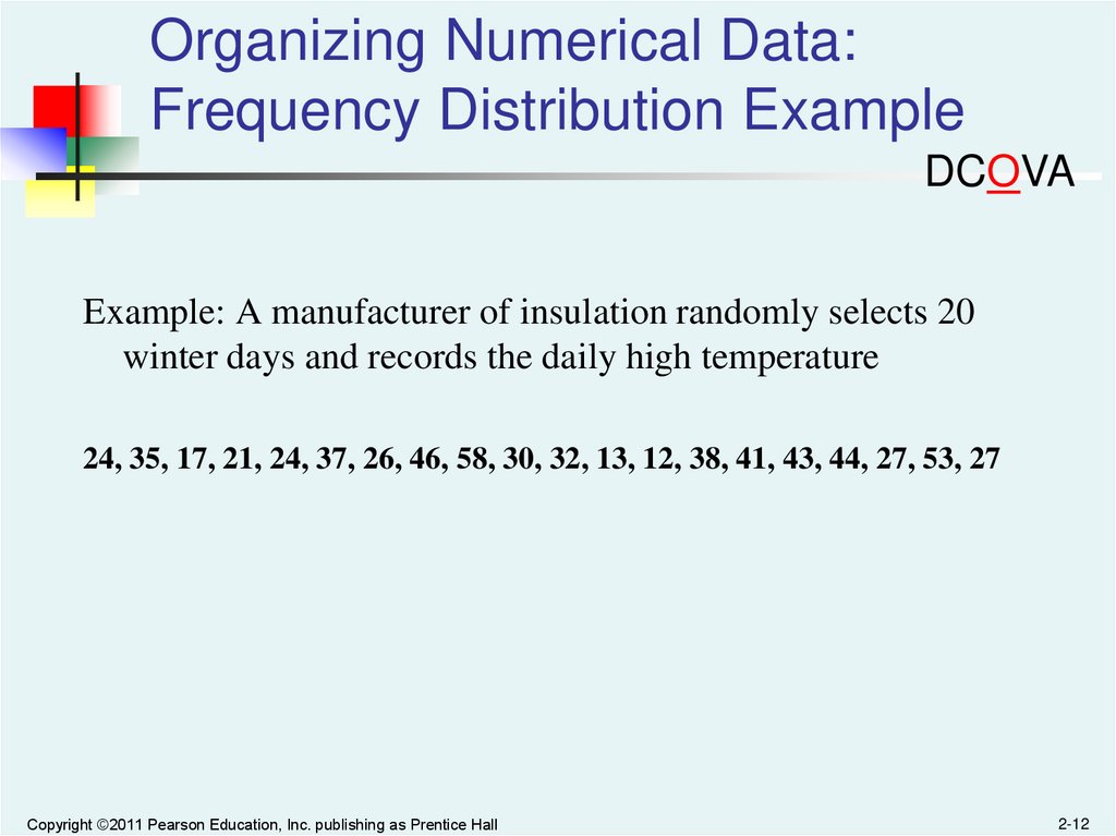
Example: A manufacturer of insulation randomly selects 20
winter days and records the daily high temperature
24, 35, 17, 21, 24, 37, 26, 46, 58, 30, 32, 13, 12, 38, 41, 43, 44, 27, 53, 27
Copyright ©2011 Pearson Education, Inc. publishing as Prentice Hall
2-12
13.
Organizing Numerical Data:Frequency Distribution Example
DCOVA
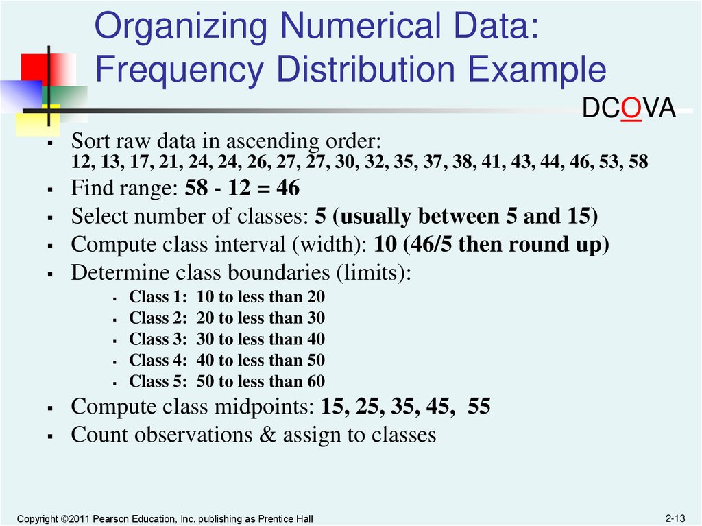
Sort raw data in ascending order:
12, 13, 17, 21, 24, 24, 26, 27, 27, 30, 32, 35, 37, 38, 41, 43, 44, 46, 53, 58
Find range: 58 - 12 = 46
Select number of classes: 5 (usually between 5 and 15)
Compute class interval (width): 10 (46/5 then round up)
Determine class boundaries (limits):
Class 1: 10 to less than 20
Class 2: 20 to less than 30
Class 3: 30 to less than 40
Class 4: 40 to less than 50
Class 5: 50 to less than 60
Compute class midpoints: 15, 25, 35, 45, 55
Count observations & assign to classes
Copyright ©2011 Pearson Education, Inc. publishing as Prentice Hall
2-13
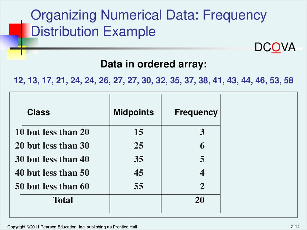
14.
Organizing Numerical Data: FrequencyDistribution Example
DCOVA
Data in ordered array:
12, 13, 17, 21, 24, 24, 26, 27, 27, 30, 32, 35, 37, 38, 41, 43, 44, 46, 53, 58
Class
10 but less than 20
20 but less than 30
30 but less than 40
40 but less than 50
50 but less than 60
Total
Midpoints
Frequency
15
25
35
45
55
3
6
5
4
2
20
Copyright ©2011 Pearson Education, Inc. publishing as Prentice Hall
2-14
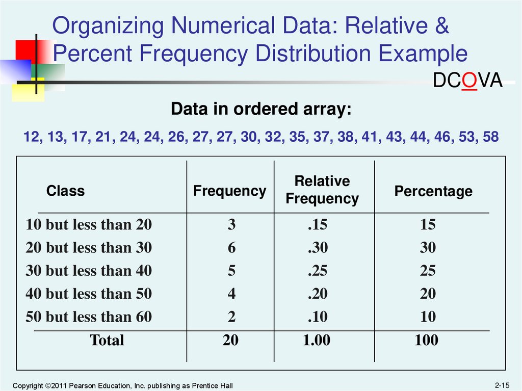
15.
Organizing Numerical Data: Relative &Percent Frequency Distribution Example
DCOVA
Data in ordered array:
12, 13, 17, 21, 24, 24, 26, 27, 27, 30, 32, 35, 37, 38, 41, 43, 44, 46, 53, 58
Class
10 but less than 20
20 but less than 30
30 but less than 40
40 but less than 50
50 but less than 60
Total
Frequency
Relative
Frequency
Percentage
3
6
5
4
2
20
.15
.30
.25
.20
.10
1.00
15
30
25
20
10
100
Copyright ©2011 Pearson Education, Inc. publishing as Prentice Hall
2-15
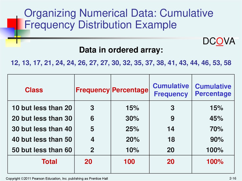
16.
Organizing Numerical Data: CumulativeFrequency Distribution Example
DCOVA
Data in ordered array:
12, 13, 17, 21, 24, 24, 26, 27, 27, 30, 32, 35, 37, 38, 41, 43, 44, 46, 53, 58
Class
Frequency Percentage
Cumulative Cumulative
Frequency Percentage
10 but less than 20
3
15%
3
15%
20 but less than 30
6
30%
9
45%
30 but less than 40
5
25%
14
70%
40 but less than 50
4
20%
18
90%
50 but less than 60
2
10%
20
100%
20
100
20
100%
Total
Copyright ©2011 Pearson Education, Inc. publishing as Prentice Hall
2-16
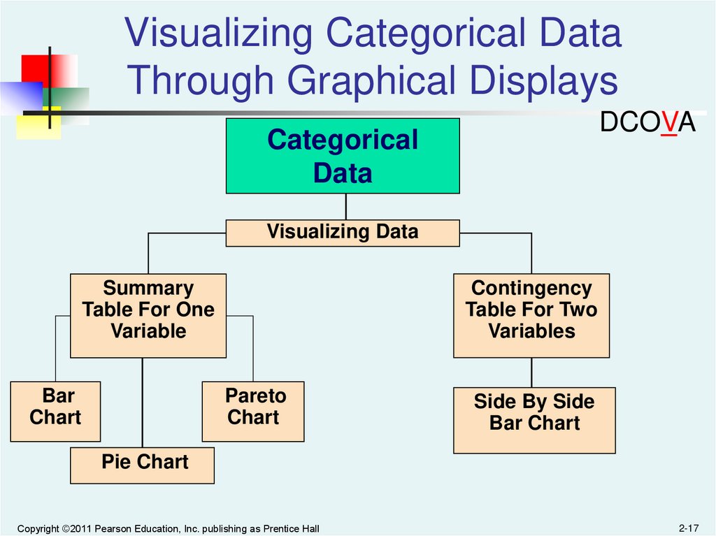
17.
Visualizing Categorical DataThrough Graphical Displays
DCOVA
Categorical
Data
Visualizing Data
Contingency
Table For Two
Variables
Summary
Table For One
Variable
Bar
Chart
Pareto
Chart
Side By Side
Bar Chart
Pie Chart
Copyright ©2011 Pearson Education, Inc. publishing as Prentice Hall
2-17
18.
Visualizing Categorical Data:The Bar Chart
DCOVA
In a bar chart, a bar shows each category, the length of which
represents the amount, frequency or percentage of values falling into
a category which come from the summary table of the variable.
Banking Preference
Banking Preference?
%
ATM
16%
Automated or live
telephone
2%
Drive-through service at
branch
17%
In person at branch
41%
Internet
24%
Internet
In person at branch
Drive-through service at branch
Automated or live telephone
ATM
0%
Copyright ©2011 Pearson Education, Inc. publishing as Prentice Hall
5% 10% 15% 20% 25% 30% 35% 40% 45%
2-18
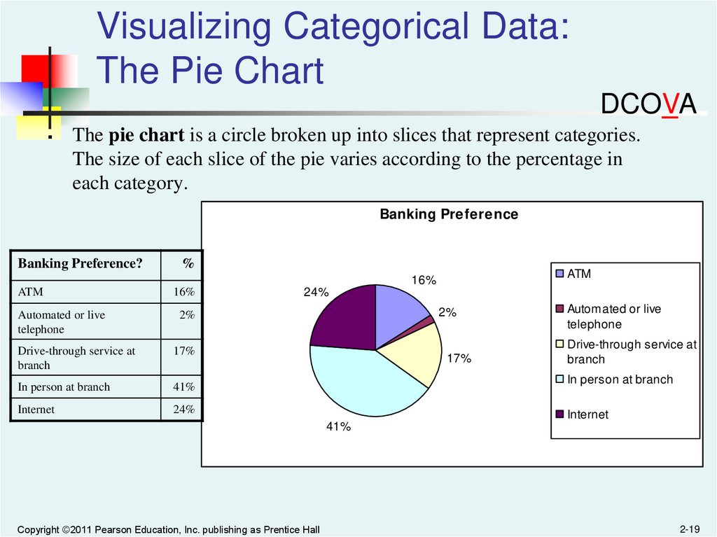
19.
Visualizing Categorical Data:The Pie Chart
DCOVA
The pie chart is a circle broken up into slices that represent categories.
The size of each slice of the pie varies according to the percentage in
each category.
Banking Preference
Banking Preference?
%
ATM
16%
ATM
16%
Automated or live
telephone
2%
Drive-through service at
branch
17%
In person at branch
41%
Internet
24%
24%
2%
17%
Automated or live
telephone
Drive-through service at
branch
In person at branch
Internet
41%
Copyright ©2011 Pearson Education, Inc. publishing as Prentice Hall
2-19
20.
Visualizing Categorical Data:The Pareto Chart
DCOVA
Used to portray categorical data (nominal scale)
A vertical bar chart, where categories are
shown in descending order of frequency
A cumulative polygon is shown in the same
graph
Used to separate the “vital few” from the “trivial
many”
Copyright ©2011 Pearson Education, Inc. publishing as Prentice Hall
2-20
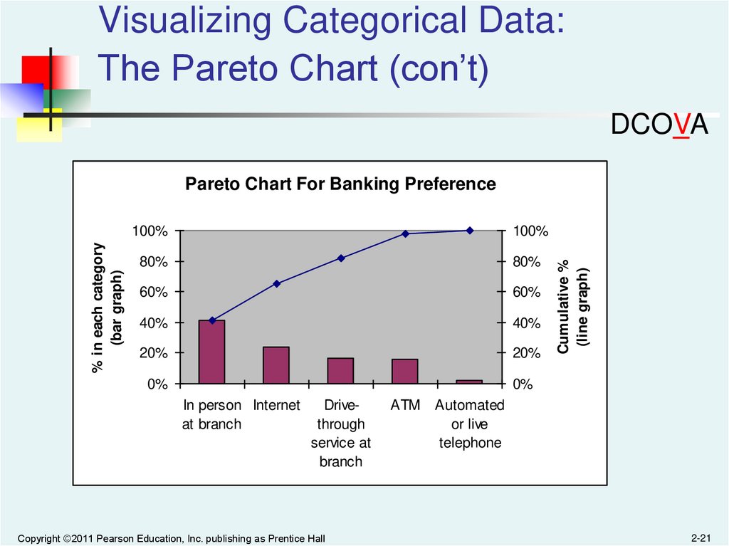
21.
Visualizing Categorical Data:The Pareto Chart (con’t)
DCOVA
100%
100%
80%
80%
60%
60%
40%
40%
20%
20%
0%
0%
In person Internet
at branch
Drivethrough
service at
branch
Copyright ©2011 Pearson Education, Inc. publishing as Prentice Hall
ATM
Cumulative %
(line graph)
% in each category
(bar graph)
Pareto Chart For Banking Preference
Automated
or live
telephone
2-21
22.
Visualizing Categorical Data:Side By Side Bar Charts
DCOVA
The side by side bar chart represents the data from a contingency table.
No
Errors
Errors
Total
Small
Amount
50.75%
30.77%
47.50%
Medium
Amount
29.85%
61.54%
35.00%
Errors
Large
Amount
19.40%
7.69%
17.50%
No Errors
Invoice Size Split Out By Errors
& No Errors
0,0%
100.0%
100.0%
100.0%
10,0%
20,0%
30,0%
40,0%
Large
Medium
50,0%
60,0%
70,0%
Small
Total
Invoices with errors are much more likely to be of
medium size (61.54% vs 30.77% and 7.69%)
Copyright ©2011 Pearson Education, Inc. publishing as Prentice Hall
2-22
23.
Visualizing Numerical DataBy Using Graphical Displays
DCOVA
Numerical Data
Frequency Distributions
and
Cumulative Distributions
Ordered Array
Stem-and-Leaf
Display
Histogram
Copyright ©2011 Pearson Education, Inc. publishing as Prentice Hall
Polygon
Ogive
2-23
24.
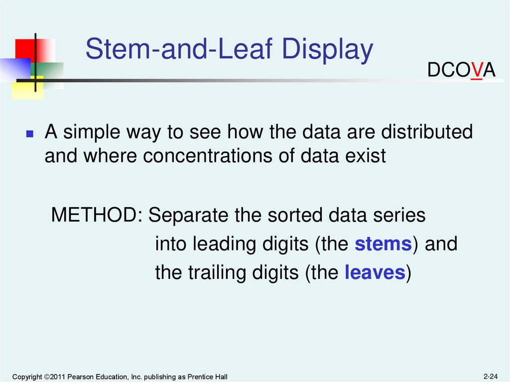
Stem-and-Leaf DisplayDCOVA
A simple way to see how the data are distributed
and where concentrations of data exist
METHOD: Separate the sorted data series
into leading digits (the stems) and
the trailing digits (the leaves)
Copyright ©2011 Pearson Education, Inc. publishing as Prentice Hall
2-24
25.
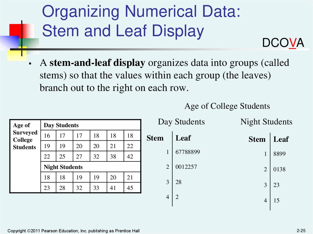
Organizing Numerical Data:Stem and Leaf Display
DCOVA
A stem-and-leaf display organizes data into groups (called
stems) so that the values within each group (the leaves)
branch out to the right on each row.
Age of College Students
Age of
Surveyed
College
Students
Day Students
Day Students
16
17
17
18
18
18
19
19
20
20
21
22
22
25
27
32
38
42
Night Students
18
18
19
19
20
21
23
28
32
33
41
45
Copyright ©2011 Pearson Education, Inc. publishing as Prentice Hall
Stem
Leaf
Night Students
Stem Leaf
1
67788899
1
8899
2
0012257
2
0138
3
28
3
23
4
2
4
15
2-25
26.
Visualizing Numerical Data:The Histogram
DCOVA
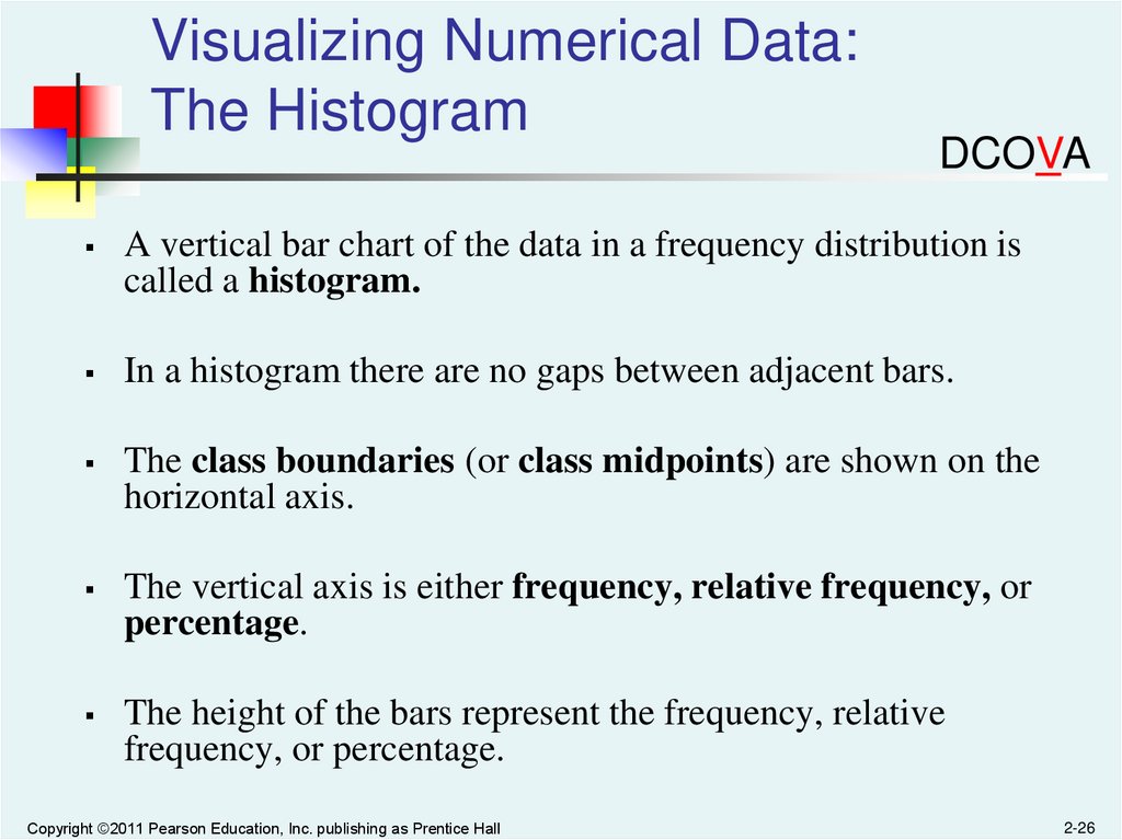
A vertical bar chart of the data in a frequency distribution is
called a histogram.
In a histogram there are no gaps between adjacent bars.
The class boundaries (or class midpoints) are shown on the
horizontal axis.
The vertical axis is either frequency, relative frequency, or
percentage.
The height of the bars represent the frequency, relative
frequency, or percentage.
Copyright ©2011 Pearson Education, Inc. publishing as Prentice Hall
2-26
27.
Visualizing Numerical Data:The Histogram
10 but less than 20
20 but less than 30
30 but less than 40
40 but less than 50
50 but less than 60
Total
Frequency
3
6
5
4
2
20
Relative
Frequency
Percentage
.15
.30
.25
.20
.10
1.00
15
30
25
20
10
100
(In a percentage
histogram the vertical
axis would be defined to
show the percentage of
observations per class)
8
Histogram: Age Of Students
Frequency
Class
DCOVA
6
4
2
0
5
Copyright ©2011 Pearson Education, Inc. publishing as Prentice Hall
15 25 35 45 55 More
2-27
28.
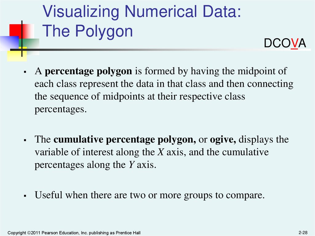
Visualizing Numerical Data:The Polygon
DCOVA
A percentage polygon is formed by having the midpoint of
each class represent the data in that class and then connecting
the sequence of midpoints at their respective class
percentages.
The cumulative percentage polygon, or ogive, displays the
variable of interest along the X axis, and the cumulative
percentages along the Y axis.
Useful when there are two or more groups to compare.
Copyright ©2011 Pearson Education, Inc. publishing as Prentice Hall
2-28
29.
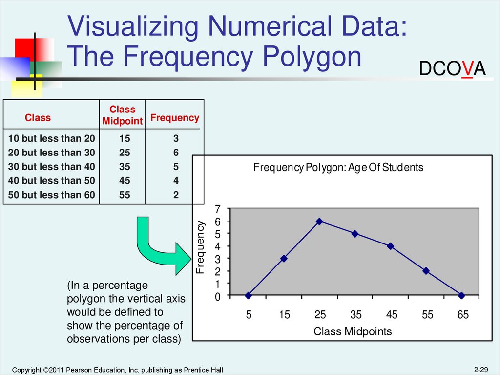
Visualizing Numerical Data:The Frequency Polygon
DCOVA
Class
Midpoint Frequency
Class
15
25
35
45
55
3
6
5
4
2
Frequency Polygon: Age Of Students
Frequency
10 but less than 20
20 but less than 30
30 but less than 40
40 but less than 50
50 but less than 60
(In a percentage
polygon the vertical axis
would be defined to
show the percentage of
observations per class)
7
6
5
4
3
2
1
0
Copyright ©2011 Pearson Education, Inc. publishing as Prentice Hall
5
15
25
35
45
Class Midpoints
55
65
2-29
30.
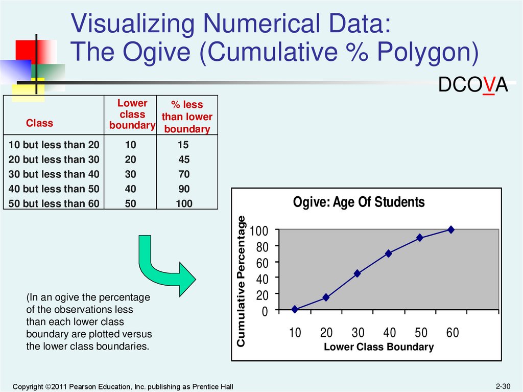
Visualizing Numerical Data:The Ogive (Cumulative % Polygon)
DCOVA
10 but less than 20
20 but less than 30
30 but less than 40
40 but less than 50
50 but less than 60
10
20
30
40
50
15
45
70
90
100
(In an ogive the percentage
of the observations less
than each lower class
boundary are plotted versus
the lower class boundaries.
Copyright ©2011 Pearson Education, Inc. publishing as Prentice Hall
Ogive: Age Of Students
Cumulative Percentage
Class
Lower
% less
class
than lower
boundary boundary
100
80
60
40
20
0
10
20
30
40
50
60
Lower Class Boundary
2-30
31.
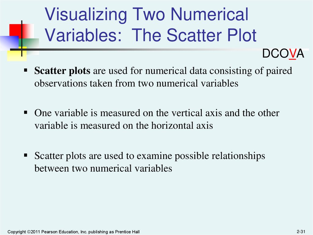
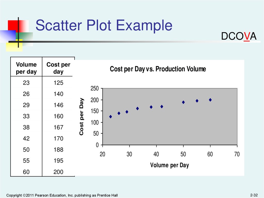
Visualizing Two NumericalVariables: The Scatter Plot
DCOVA
Scatter plots are used for numerical data consisting of paired
observations taken from two numerical variables
One variable is measured on the vertical axis and the other
variable is measured on the horizontal axis
Scatter plots are used to examine possible relationships
between two numerical variables
Copyright ©2011 Pearson Education, Inc. publishing as Prentice Hall
2-31
32.
Scatter Plot ExampleCost per
day
23
125
26
140
29
146
33
160
38
167
42
170
50
188
55
195
60
200
Cost per Day vs. Production Volume
250
Cost per Day
Volume
per day
DCOVA
200
150
100
50
0
20
Copyright ©2011 Pearson Education, Inc. publishing as Prentice Hall
30
40
50
60
70
Volume per Day
2-32
33.
Visualizing Two NumericalVariables: The Time Series Plot
DCOVA
A Time Series Plot is used to study
patterns in the values of a numeric
variable over time
The Time Series Plot:
Numeric variable is measured on the
vertical axis and the time period is
measured on the horizontal axis
Copyright ©2011 Pearson Education, Inc. publishing as Prentice Hall
2-33
34.
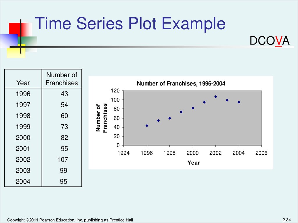
Time Series Plot ExampleDCOVA
Year
Number of
Franchises
1996
43
1997
54
1998
60
1999
73
2000
82
20
2001
95
0
1994
2002
107
2003
99
2004
95
Number of Franchises, 1996-2004
120
Number of
Franchises
100
80
60
40
Copyright ©2011 Pearson Education, Inc. publishing as Prentice Hall
1996
1998
2000
2002
2004
2006
Year
2-34
35.
All rights reserved. No part of this publication may be reproduced, stored in a retrievalsystem, or transmitted, in any form or by any means, electronic, mechanical, photocopying,
recording, or otherwise, without the prior written permission of the publisher.
Printed in the United States of America.
Copyright ©2011 Pearson Education, Inc. publishing as Prentice Hall
2-35