Similar presentations:
Визуализация данные основные принципы
1.
Технология визуализацииданных
Тема 2. Визуализация данных: основные принципы
2.
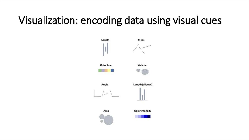
Visualization: encoding data using visual cues3.
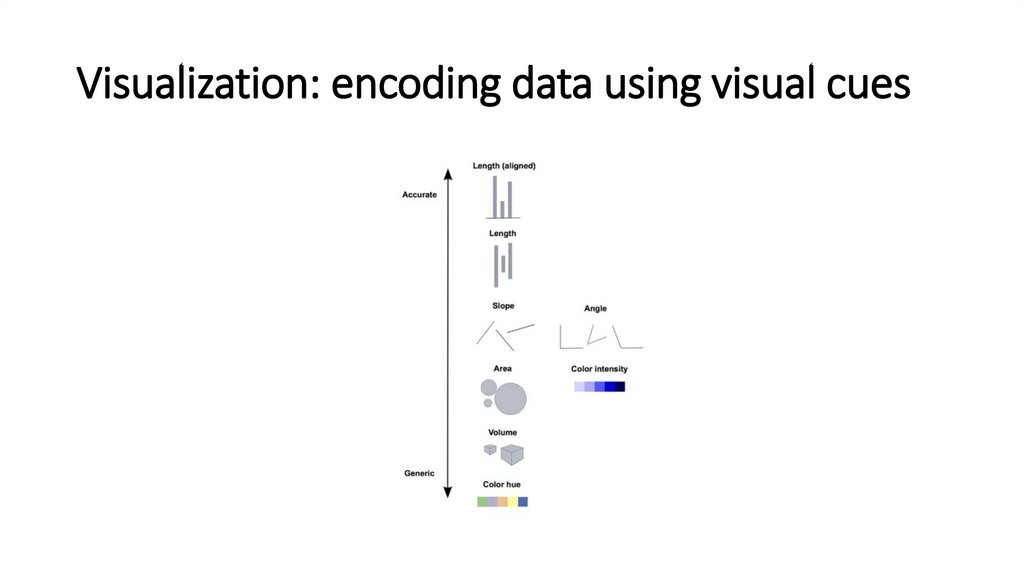
Visualization: encoding data using visual cues4.
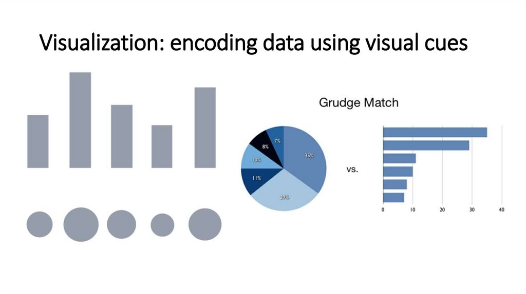
Visualization: encoding data using visual cues5.
6.
7.
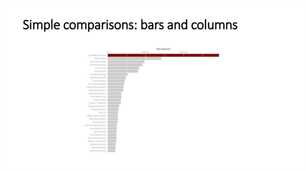
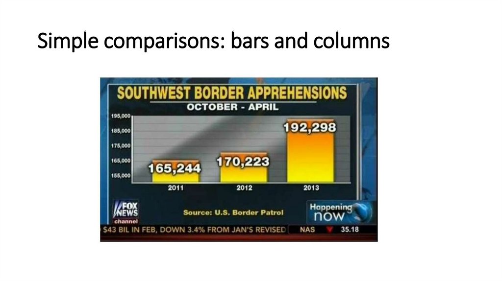
Simple comparisons: bars and columns8.
Simple comparisons: bars and columns9.
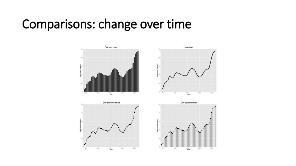
Comparisons: change over time10.
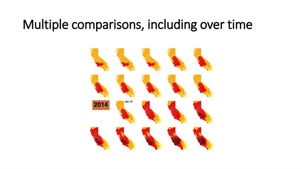
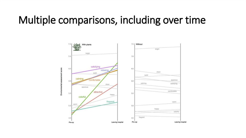
Multiple comparisons, including over time11.
Multiple comparisons, including over time12.
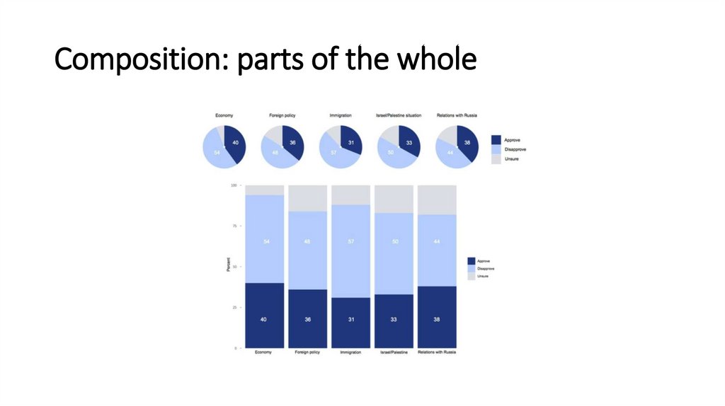
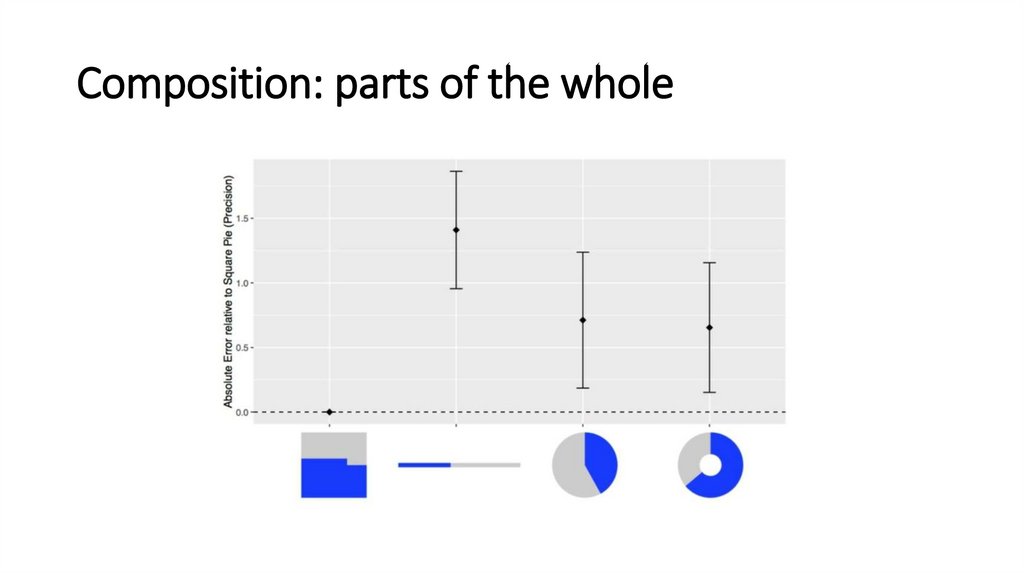
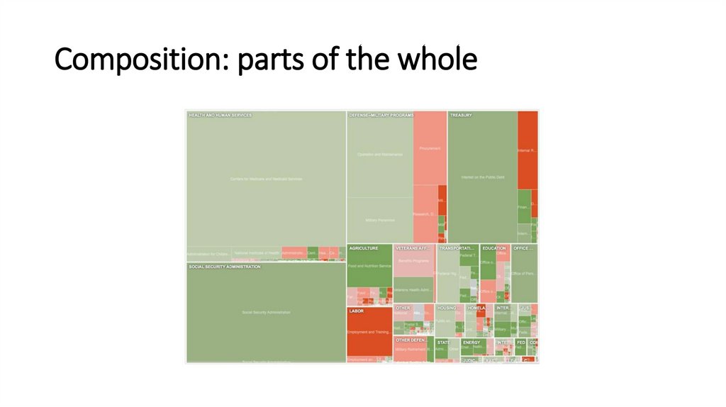
Composition: parts of the whole13.
Composition: parts of the whole14.
Composition: parts of the whole15.
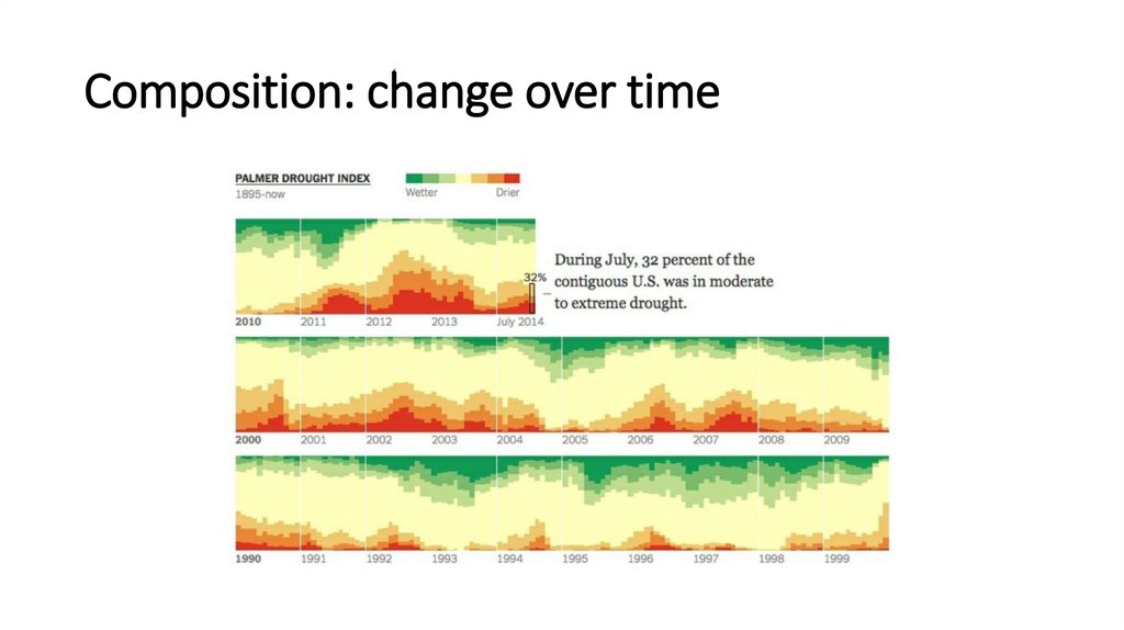
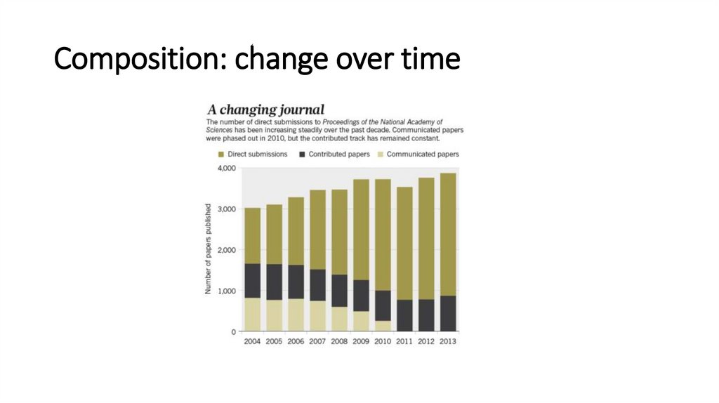
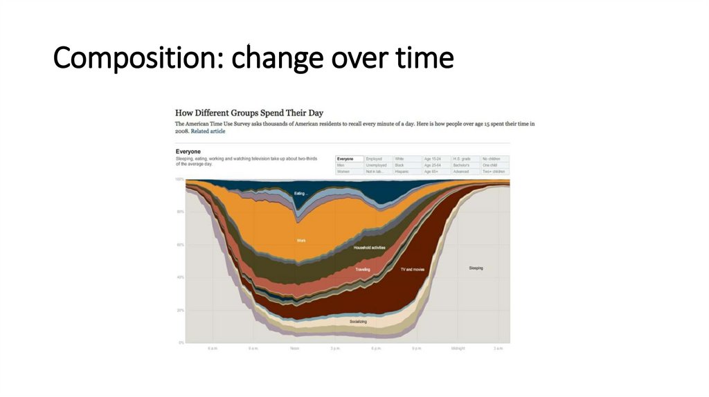
Composition: change over time16.
Composition: change over time17.
Composition: change over time18.
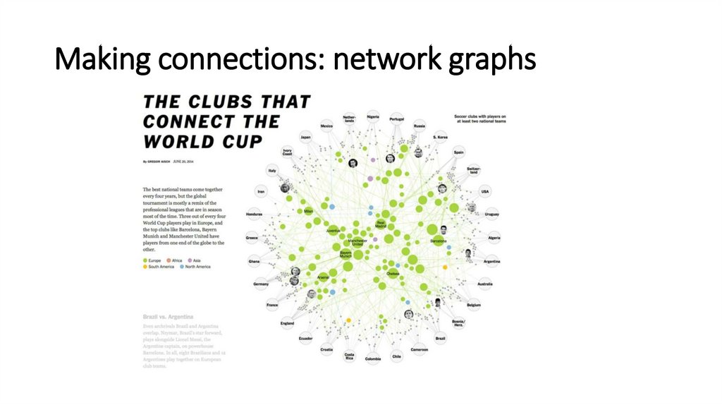
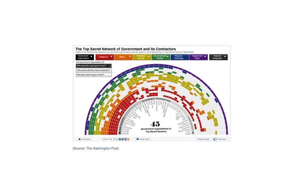
Making connections: network graphs19.
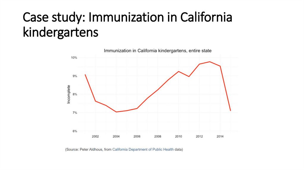
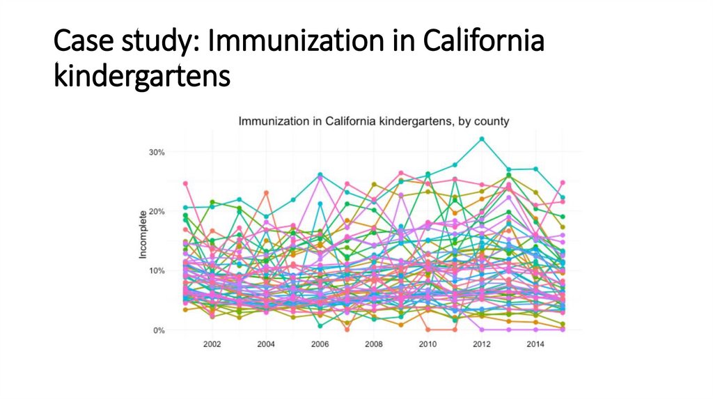
Case study: Immunization in Californiakindergartens
20.
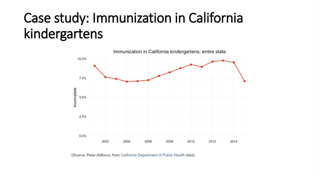
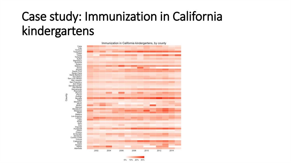
Case study: Immunization in Californiakindergartens
21.
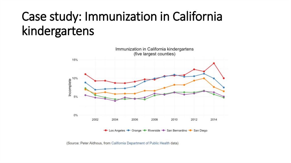
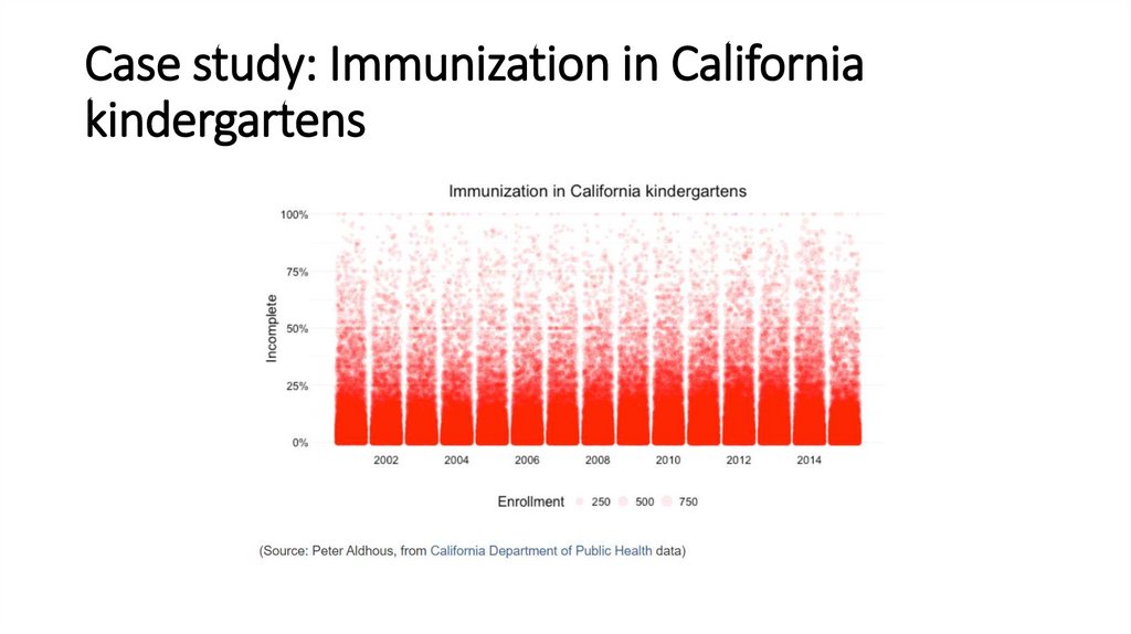
Case study: Immunization in Californiakindergartens
22.
Case study: Immunization in Californiakindergartens
23.
Case study: Immunization in Californiakindergartens
24.
Case study: Immunization in Californiakindergartens
25.
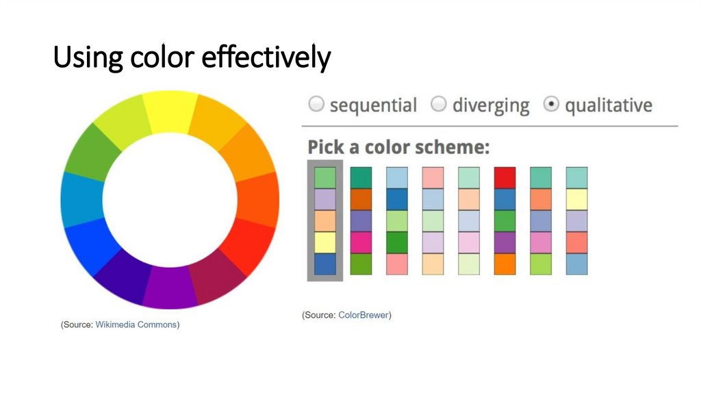
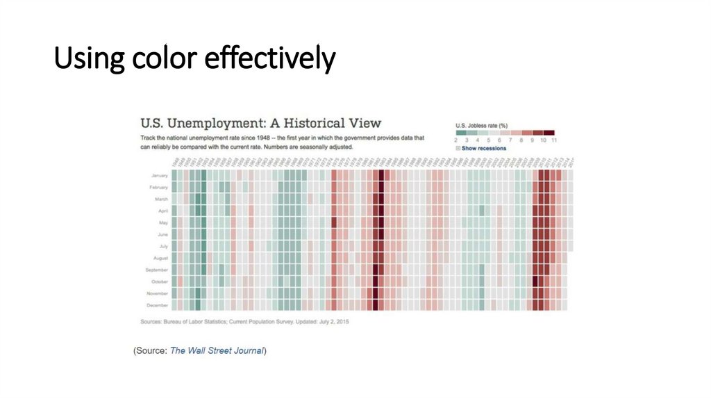
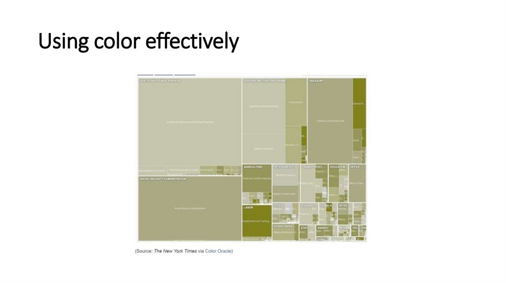
Using color effectively26.
Using color effectively27.
Using color effectively28.
Using chart furniture, minimizing chart junk,highlighting the story
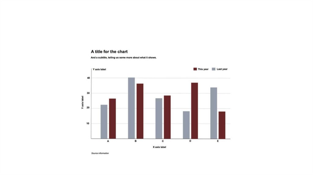
• Title and subtitle These provide context for the chart.
• Coordinate system For most charts, this is provided by the horizontal and
vertical axes, giving a cartesian system defined by X and Y coordinates; for a
pie chart it is provided by angles around a circle, called a polar coordinate
system.
• Scale Labeled tick marks and grid lines can help your audience read data
values.
• Labels You will usually want to label each axis. Think about other labels
that may be necessary to explain the message of your graphic.
• Legend If you use color or shape to encode data, you will often need a
legend to explain this encoding.
• Source information Usually given as a footnote.


 informatics


