


 database
Similar presentations:
")


 database")


Global Corona Pandemic Analysis Mini Project. Unit 40. Chapter 8. Data Analysis and Visualization Mini Project
1.
Unit 40.Global Corona Pandemic Analysis
Mini Project
Samsung Innovation Campus
Chapter 8. Data Analysis and Visualization Mini Project
1
2.
Unit 40.Global Corona Pandemic Analysis Mini ProjectMission
Samsung Innovation Campus
Chapter 8. Data Analysis and Visualization Mini Project
3.
MissionUNIT
40
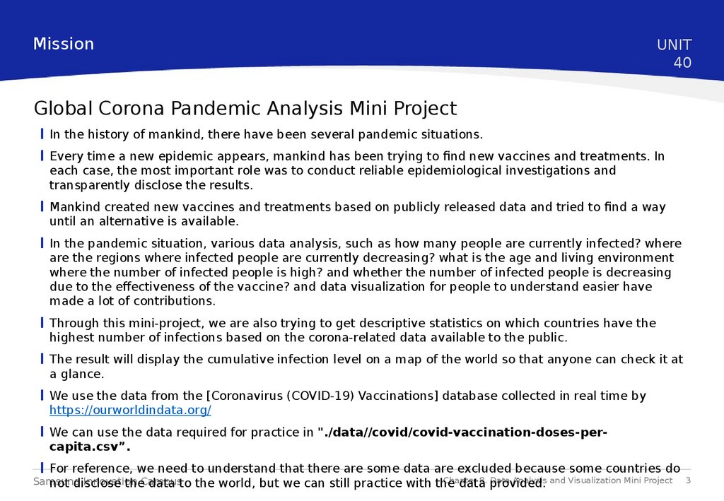
Global Corona Pandemic Analysis Mini Project
In the history of mankind, there have been several pandemic situations.
Every time a new epidemic appears, mankind has been trying to find new vaccines and treatments. In
each case, the most important role was to conduct reliable epidemiological investigations and
transparently disclose the results.
Mankind created new vaccines and treatments based on publicly released data and tried to find a way
until an alternative is available.
In the pandemic situation, various data analysis, such as how many people are currently infected? where
are the regions where infected people are currently decreasing? what is the age and living environment
where the number of infected people is high? and whether the number of infected people is decreasing
due to the effectiveness of the vaccine? and data visualization for people to understand easier have
made a lot of contributions.
Through this mini-project, we are also trying to get descriptive statistics on which countries have the
highest number of infections based on the corona-related data available to the public.
The result will display the cumulative infection level on a map of the world so that anyone can check it at
a glance.
We use the data from the [Coronavirus (COVID-19) Vaccinations] database collected in real time by
https://ourworldindata.org/
We can use the data required for practice in "./data//covid/covid-vaccination-doses-percapita.csv”.
For reference, we need to understand that there are some data are excluded because some countries do
Chapter
8. provided.
Data Analysis and Visualization Mini Project
Samsung
Innovation
not disclose
theCampus
data to the world, but we can still practice with the
data
3
4.
UNIT40.
Global Corona Pandemic Analysis Mini Project
Let’s code
Samsung Innovation Campus
Chapter 8. Data Analysis and Visualization Mini Project
5.
Let’s codeUNIT
40
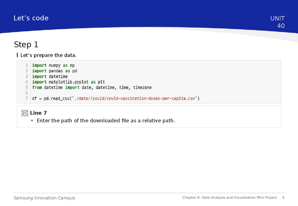
Step 1
Let’s prepare the data.
Line 7
• Enter the path of the downloaded file as a relative path.
Samsung Innovation Campus
Chapter 8. Data Analysis and Visualization Mini Project
5
6.
Let’s codeUNIT
40
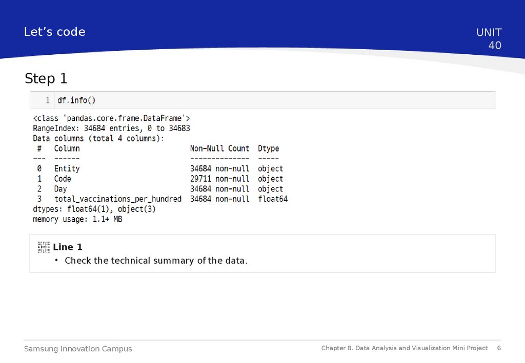
Step 1
Line 1
• Check the technical summary of the data.
Samsung Innovation Campus
Chapter 8. Data Analysis and Visualization Mini Project
6
7.
Let’s codeUNIT
40
Step 1
Line 1, 2, 3, 5
• 1: Since Day is an Object data type, there is no need to change it to a character type, just convert
it to datetime.
• 2: Change the index to the newly created column.
• 3: Delete unnecessary columns.
• 5: Check the data frame.
Samsung Innovation Campus
Chapter 8. Data Analysis and Visualization Mini Project
7
8.
Let’s codeUNIT
40
Step 1
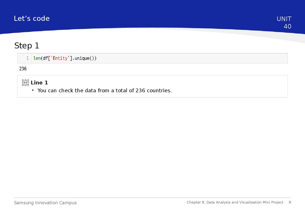
Line 1
• You can check the data from a total of 236 countries.
Samsung Innovation Campus
Chapter 8. Data Analysis and Visualization Mini Project
8
9.
Let’s codeUNIT
40
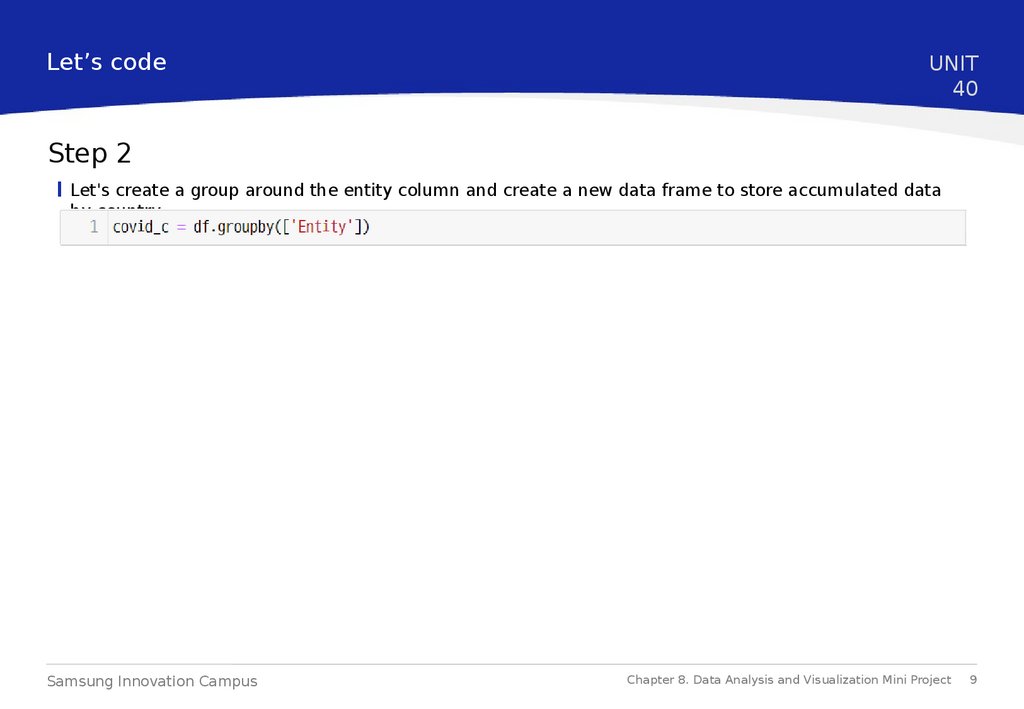
Step 2
Let's create a group around the entity column and create a new data frame to store accumulated data
by country.
Samsung Innovation Campus
Chapter 8. Data Analysis and Visualization Mini Project
9
10.
Let’s codeUNIT
40
Step 2
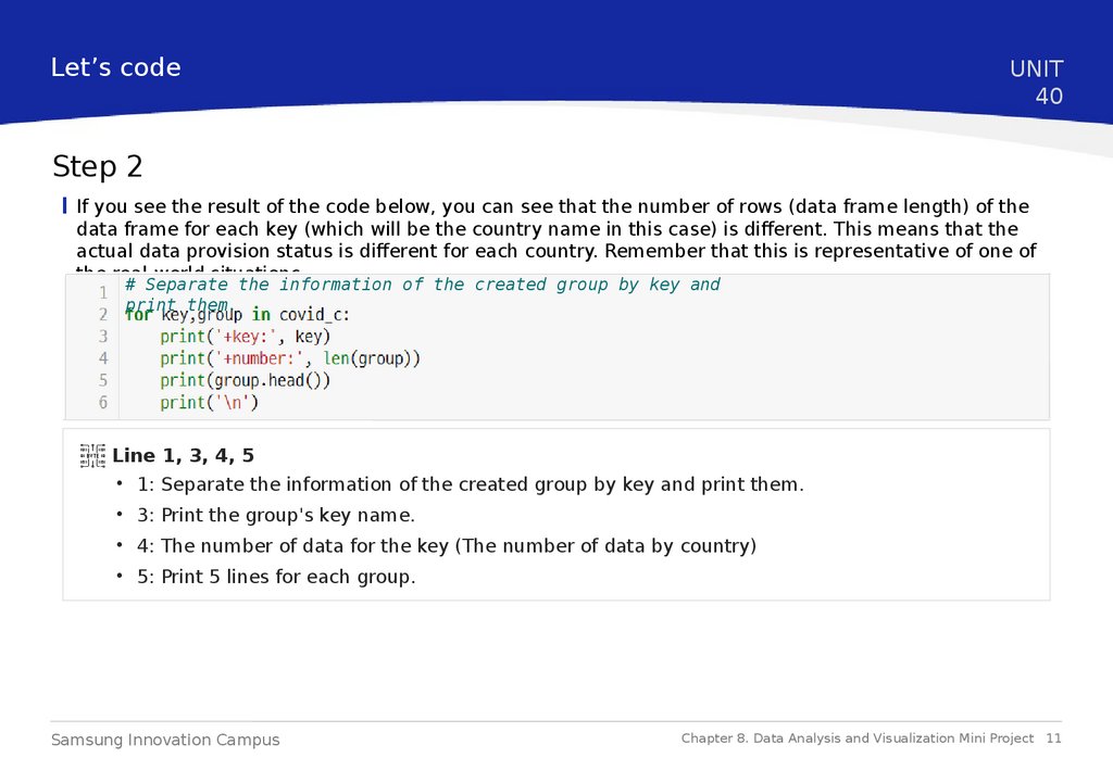
If you see the result of the code below, you can see that the number of rows (data frame length) of the
data frame for each key (which will be the country name in this case) is different. This means that the
actual data provision status is different for each country. Remember that this is representative of one of
the real-world situations.
# Separate the information of the created group by key and
print them.
Samsung Innovation Campus
Chapter 8. Data Analysis and Visualization Mini Project 10
11.
Let’s codeUNIT
40
Step 2
If you see the result of the code below, you can see that the number of rows (data frame length) of the
data frame for each key (which will be the country name in this case) is different. This means that the
actual data provision status is different for each country. Remember that this is representative of one of
the real-world situations.
# Separate the information of the created group by key and
print them.
Line 1, 3, 4, 5
• 1: Separate the information of the created group by key and print them.
• 3: Print the group's key name.
• 4: The number of data for the key (The number of data by country)
• 5: Print 5 lines for each group.
Samsung Innovation Campus
Chapter 8. Data Analysis and Visualization Mini Project 11
12.
Let’s codeUNIT
40
Step 2
Let's save the total for each group in a new data frame. We create statistics about the cumulative
number of cases by 100 people in each country from the time of the corona outbreak to the present
time.
Samsung Innovation Campus
Chapter 8. Data Analysis and Visualization Mini Project 12
13.
Let’s codeUNIT
40
Step 3
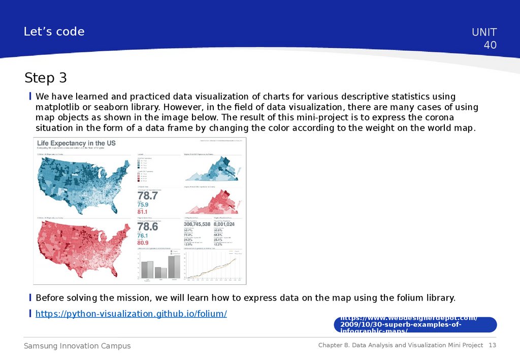
We have learned and practiced data visualization of charts for various descriptive statistics using
matplotlib or seaborn library. However, in the field of data visualization, there are many cases of using
map objects as shown in the image below. The result of this mini-project is to express the corona
situation in the form of a data frame by changing the color according to the weight on the world map.
Before solving the mission, we will learn how to express data on the map using the folium library.
https://python-visualization.github.io/folium/
Samsung Innovation Campus
https://www.webdesignerdepot.com/
2009/10/30-superb-examples-ofinfographic-maps/
Chapter 8. Data Analysis and Visualization Mini Project 13
14.
Let’s codeUNIT
40
Step 3
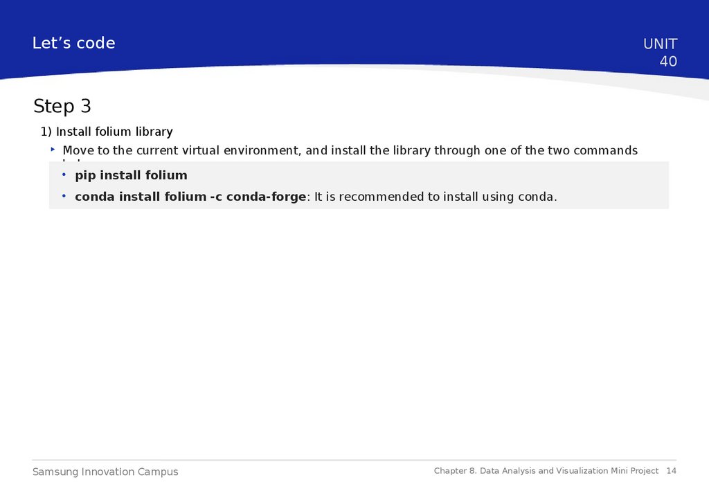
1) Install folium library
‣ Move to the current virtual environment, and install the library through one of the two commands
below.
• pip install folium
• conda install folium -c conda-forge: It is recommended to install using conda.
Samsung Innovation Campus
Chapter 8. Data Analysis and Visualization Mini Project 14
15.
Let’s codeUNIT
40
Step 3
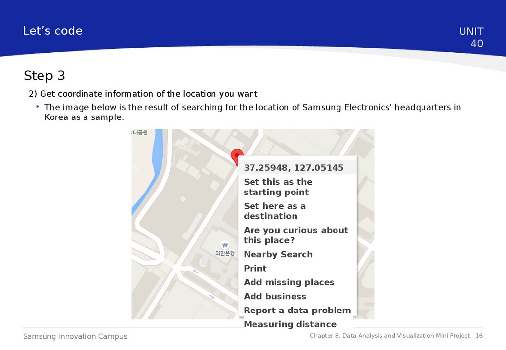
2) Get coordinate information of the location you want
‣ You need to know the latitude and longitude information of the location to display a map of the
location you want. The easiest way to get a latitude and longitude location is to use the Google Maps
service. The method below is the method when using a normal PC.
• Go to https://www.google.com/maps
• Search the location you want on the map or move it by dragging the mouse.
• Right-click the location where you want to accurately get latitude and longitude information.
• When you click the coordinate information, the information is automatically copied to the
clipboard.
Samsung Innovation Campus
Chapter 8. Data Analysis and Visualization Mini Project 15
16.
Let’s codeUNIT
40
Step 3
2) Get coordinate information of the location you want
‣ The image below is the result of searching for the location of Samsung Electronics' headquarters in
Korea as a sample.
37.25948, 127.05145
Set this as the
starting point
Set here as a
destination
Are you curious about
this place?
Nearby Search
Add missing places
Add business
Report a data problem
Measuring distance
Samsung Innovation Campus
Chapter 8. Data Analysis and Visualization Mini Project 16
17.
Let’s codeUNIT
40
Step 3
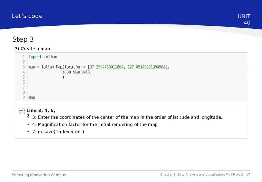
3) Create a map
Line 3, 4, 6,
7• 3: Enter the coordinates of the center of the map in the order of latitude and longitude.
• 4: Magnification factor for the initial rendering of the map
• 7: m.save("index.html")
Samsung Innovation Campus
Chapter 8. Data Analysis and Visualization Mini Project 17
18.
Let’s codeUNIT
40
Step 3
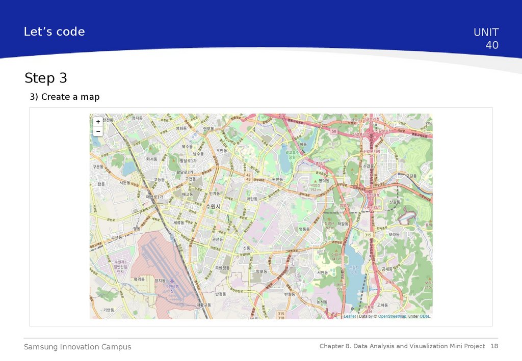
3) Create a map
Samsung Innovation Campus
Chapter 8. Data Analysis and Visualization Mini Project 18
19.
Let’s codeUNIT
40
Step 3
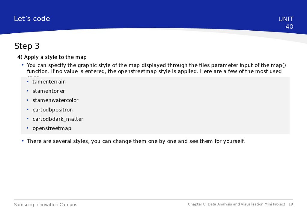
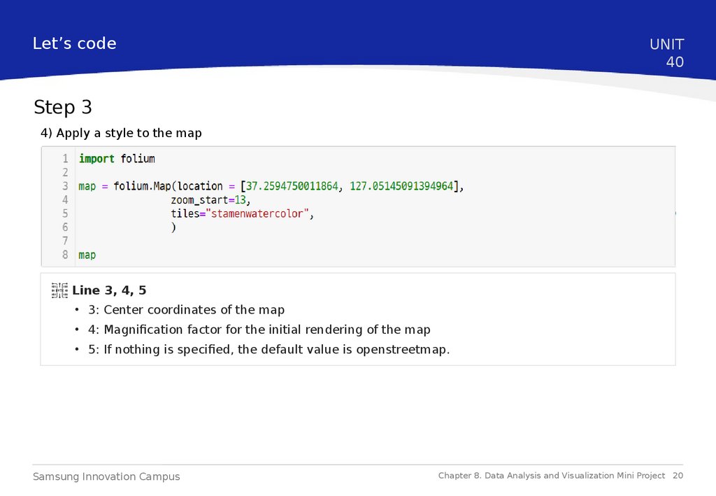
4) Apply a style to the map
‣ You can specify the graphic style of the map displayed through the tiles parameter input of the map()
function. If no value is entered, the openstreetmap style is applied. Here are a few of the most used
ones:
• tamenterrain
• stamentoner
• stamenwatercolor
• cartodbpositron
• cartodbdark_matter
• openstreetmap
‣ There are several styles, you can change them one by one and see them for yourself.
Samsung Innovation Campus
Chapter 8. Data Analysis and Visualization Mini Project 19
20.
Let’s codeUNIT
40
Step 3
4) Apply a style to the map
Line 3, 4, 5
• 3: Center coordinates of the map
• 4: Magnification factor for the initial rendering of the map
• 5: If nothing is specified, the default value is openstreetmap.
Samsung Innovation Campus
Chapter 8. Data Analysis and Visualization Mini Project 20
21.
Let’s codeUNIT
40
Step 3
4) Apply a style to the map
Samsung Innovation Campus
Chapter 8. Data Analysis and Visualization Mini Project 21
22.
Let’s codeUNIT
40
Step 3
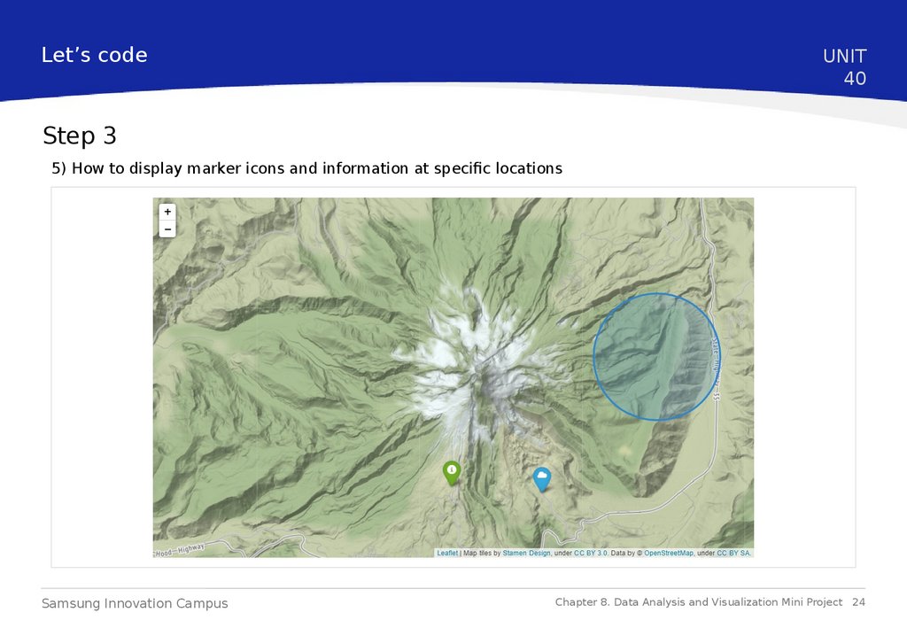
5) How to display marker icons and information at specific locations
Samsung Innovation Campus
Chapter 8. Data Analysis and Visualization Mini Project 22
23.
Let’s codeUNIT
40
Step 3
5) How to display marker icons and information at specific locations
Line 4, 5, 6, 15, 17, 18, 19, 20, 21
• 4: Latitude and longitude information where the marker will be displayed
• 5: Information to be displayed as a pop-up message when a marker is clicked
• 6: Marker icon style
• 15: A method to specify an area in a circle.
• 17: Specify the size of the circle
• 18: Information to be displayed as a pop-up message when the circle is clicked
• 19: Color information of the borderline of the circle
• 20: Decide whether to paint the inside of the circle
• 21: Color information to be painted in a circle
Samsung Innovation Campus
Chapter 8. Data Analysis and Visualization Mini Project 23
24.
Let’s codeUNIT
40
Step 3
5) How to display marker icons and information at specific locations
Samsung Innovation Campus
Chapter 8. Data Analysis and Visualization Mini Project 24
25.
Let’s codeUNIT
40
Step 3
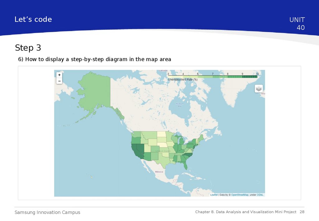
6) How to display a step-by-step diagram in the map area
‣ It is a method to visualize data by coloring the area surrounded by a certain boundary on a map, such
as a boundary line between specific countries or an administrative district.
‣ As the value of the information to be delivered increases, the color painted in the corresponding area
becomes darker.
Samsung Innovation Campus
Chapter 8. Data Analysis and Visualization Mini Project 25
26.
Let’s codeUNIT
40
Step 3
6) How to display a step-by-step diagram in the map area
Samsung Innovation Campus
Chapter 8. Data Analysis and Visualization Mini Project 26
27.
Let’s codeUNIT
40
Step 3
6) How to display a step-by-step diagram in the map area
Line 13, 15, 16,
17
• 13: geoJson data for the administrative district
• 15: Name of the data to be loaded into the administrative district
• 16: Column names and variables to use for this map in the dataframe
• 17: Matching between administrative districts in data and administrative districts in geojson
Samsung Innovation Campus
Chapter 8. Data Analysis and Visualization Mini Project 27
28.
Let’s codeUNIT
40
Step 3
6) How to display a step-by-step diagram in the map area
Samsung Innovation Campus
Chapter 8. Data Analysis and Visualization Mini Project 28
29.
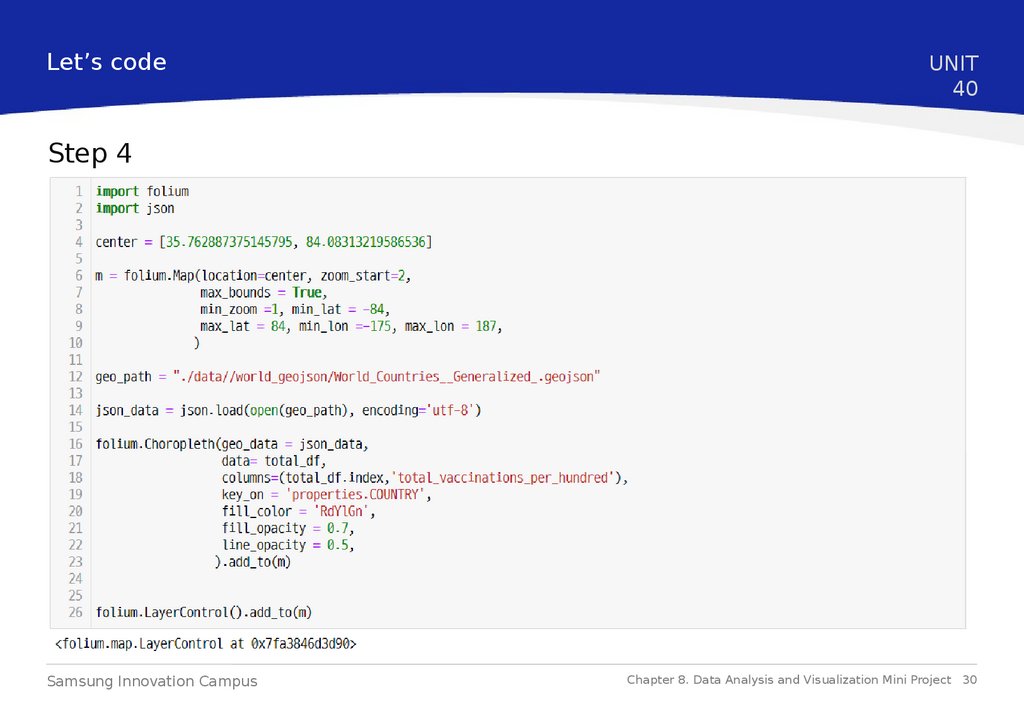
Let’s codeUNIT
40
Step 4
We can visualize the already processed data frame of the cumulative number of confirmed cases by 100
people in each country by applying the visualization method to the map learned in step 3.
https://ourworldindata.org/covid-vaccination-global-projections
Samsung Innovation Campus
Chapter 8. Data Analysis and Visualization Mini Project 29
30.
Let’s codeUNIT
40
Step 4
Samsung Innovation Campus
Chapter 8. Data Analysis and Visualization Mini Project 30
31.
Let’s codeUNIT
40
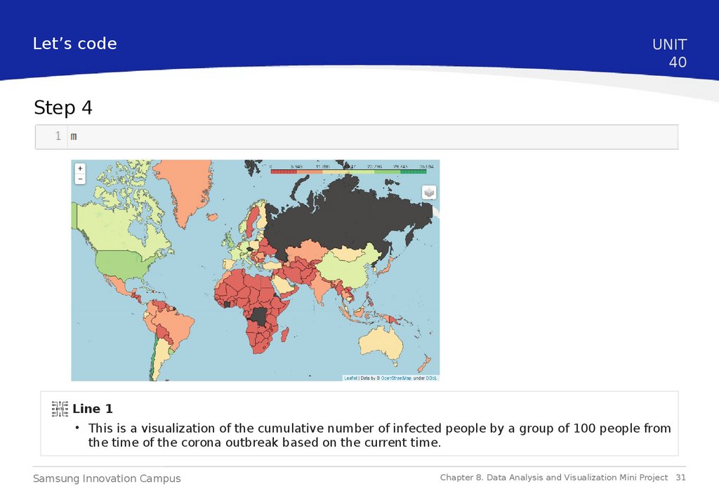
Step 4
Line 1
• This is a visualization of the cumulative number of infected people by a group of 100 people from
the time of the corona outbreak based on the current time.
Samsung Innovation Campus
Chapter 8. Data Analysis and Visualization Mini Project 31
32.
End ofDocument
Samsung Innovation Campus
Chapter 8. Data Analysis and Visualization Mini Project
32