Similar presentations:
Please do the same for other scenes. Revision 1.0
1.
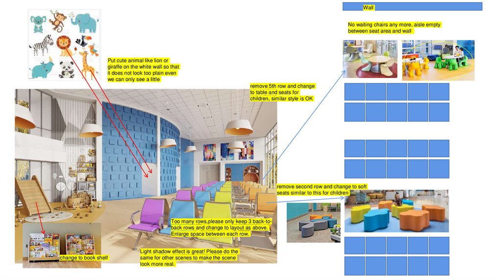
WallNo waiting chairs any more, aisle empty
between seat area and wall
Put cute animal like lion or
giraffe on the white wall so that
it does not look too plain even
we can only see a little
remove 5th row and change
to table and seats for
children, similar style is OK
remove second row and change to soft
seats similar to this for children
Too many rows,please only keep 3 back-toback rows and change to layout as above.
Enlarge space between each row.
change to book shelf
Light shadow effect is great! Please do the
same for other scenes to make the scene
look more real.
2.
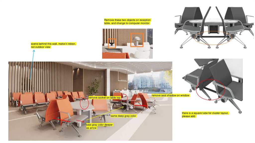
Remove these two objects on receptiontable, and change to computer monitor
scene behind this wall, make it indoor,
not outdoor view
remove socket on table top
same deep gray color
seat gray color deeper
as arrow
remove seat shadow on window
there is a square tube for cluster layout,
please add.
3.
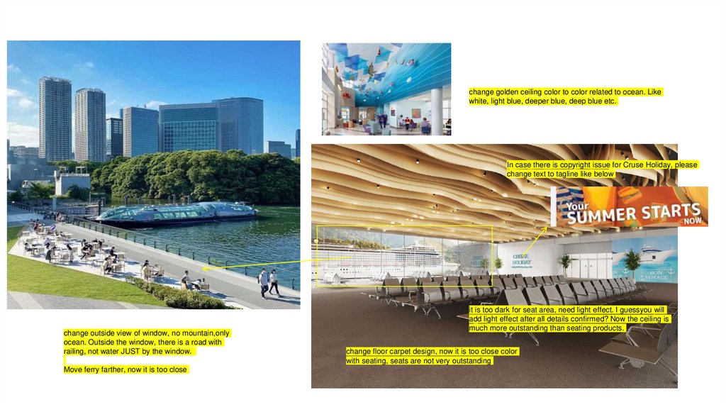
change golden ceiling color to color related to ocean. Likewhite, light blue, deeper blue, deep blue etc.
In case there is copyright issue for Cruse Holiday, please
change text to tagline like below
change outside view of window, no mountain,only
ocean. Outside the window, there is a road with
railing, not water JUST by the window.
Move ferry farther, now it is too close
it is too dark for seat area, need light effect. I guessyou will
add light effect after all details confirmed? Now the ceiling is
much more outstanding than seating products.
change floor carpet design, now it is too close color
with seating, seats are not very outstanding
4.
Add text: PHARMACY to this area so that we know this ispharmacy windows
For window, from left to right, add text:
CONSULT, PICK UP 1, PICK UP 2, PICK UP 3, PICK UP 4
When there is no middle arms for this model, it should be
seamless between each seat, no gap
Change seat color, now it is not match with interior design
Remove this row
5.
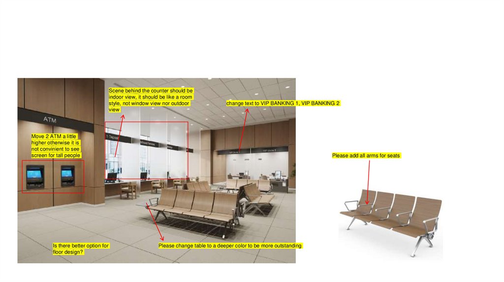
Scene behind the counter should beindoor view, it should be like a room
style, not window view nor outdoor
view
change text to VIP BANKING 1, VIP BANKING 2
Move 2 ATM a little
higher otherwise it is
not convinient to see
screen for tall people
Is there better option for
floor design?
Please add all arms for seats
Please change table to a deeper color to be more outstanding


 art
art


