1- Accessories feel and look
2- Lighting
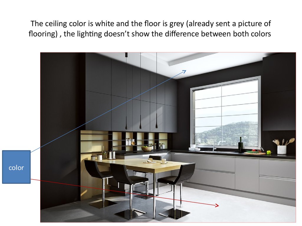
The ceiling color is white and the floor is grey (already sent a picture of flooring) , the lighting doesn’t show the difference between both colors
3- finishing
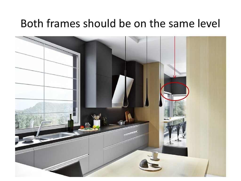
Both frames should be on the same level
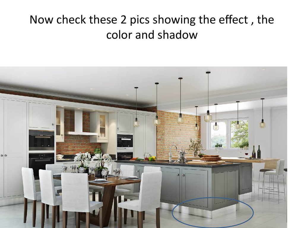
Now check these 2 pics showing the effect , the color and shadow
4- colors
It looks fake because of the high contrast and the uniformity of colors. You can't find a mass of black everywhere in real life.
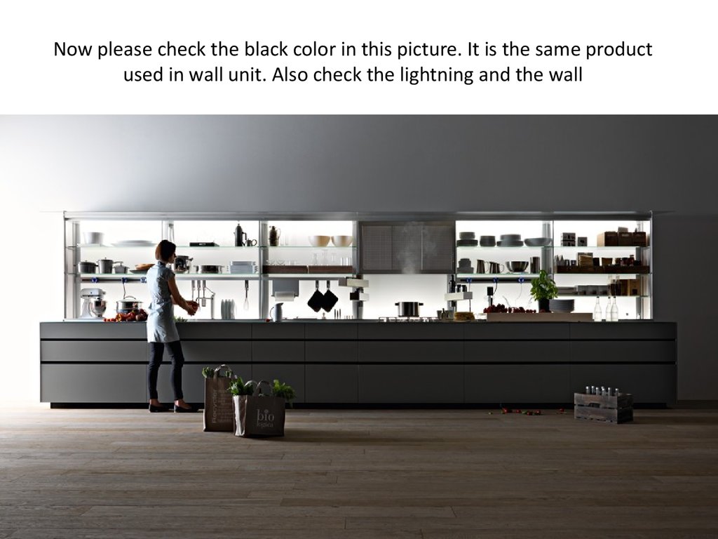
Now please check the black color in this picture. It is the same product used in wall unit. Also check the lightning and the wall
5- wide angle
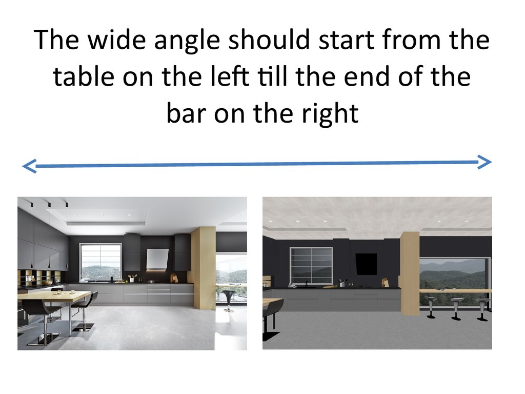
The wide angle should start from the table on the left till the end of the bar on the right
Make the rendering angle wider to see the wine cooler and fridge with table in the same angle
Rendering Quality of wine cooler and fridge r similar to this one
5- Your suggestions
Would you advise to make any changment that will affect positively the final result and make it alive?
2.46M
Category: artart

Accessories feel and look

1. 1- Accessories feel and look

1- ACCESSORIES FEEL AND LOOK

2.

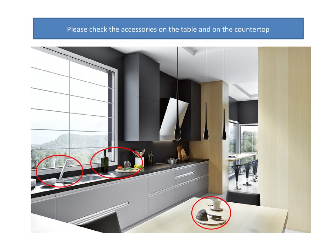
Please check the accessories on the table and on the countertop

3.

4.

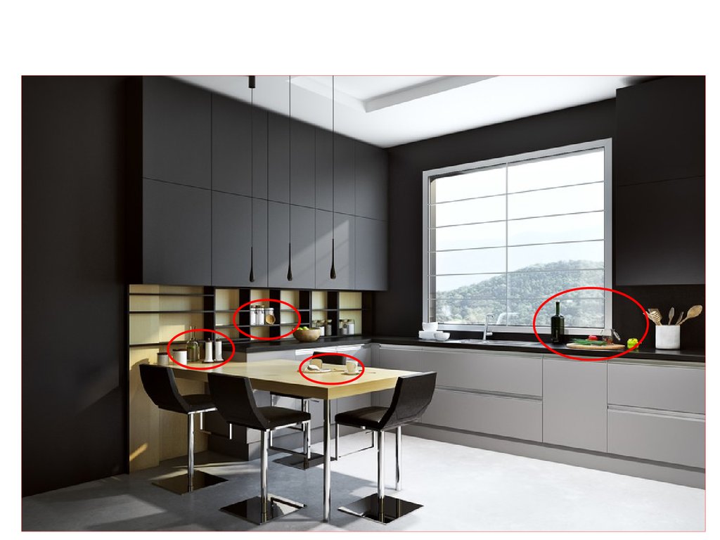
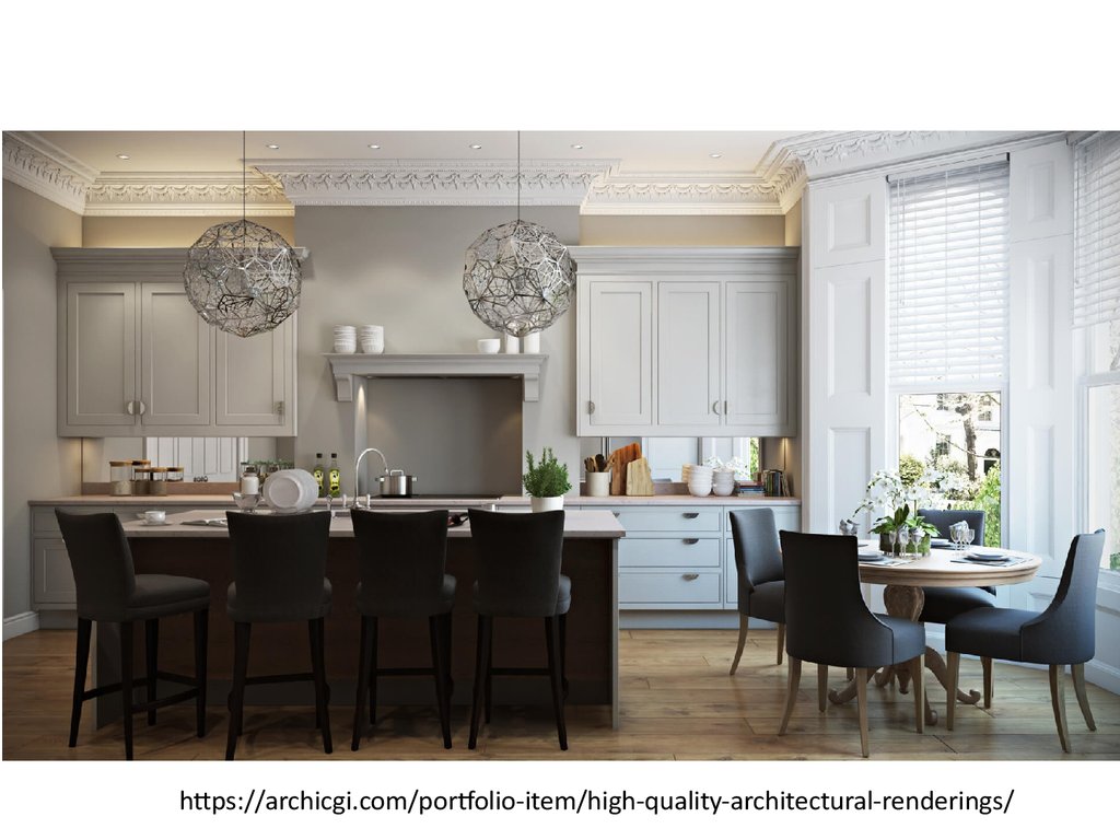
Now kindly compare them with the accessories in the
upcoming pages, do they look real?
Especially the bottle, cup of coffee, cheese, bowl, vegetables

5.

https://archicgi.com/portfolio-item/high-quality-architectural-renderings/

6.

7. 2- Lighting

2- LIGHTING

8. The ceiling color is white and the floor is grey (already sent a picture of flooring) , the lighting doesn’t show the difference between both colors

color

9.

Now please take a close look of the lighting and shadow on the wood
flooring in the upcoming picture
Also tale a look to the effect of lighting and shadow on the front wall and
the wall on your right where you can see tree outside

10.

11.

https://archicgi.com/portfolio-item/photorealistic-rendering-kitchen/

12. 3- finishing

3- FINISHING

13.

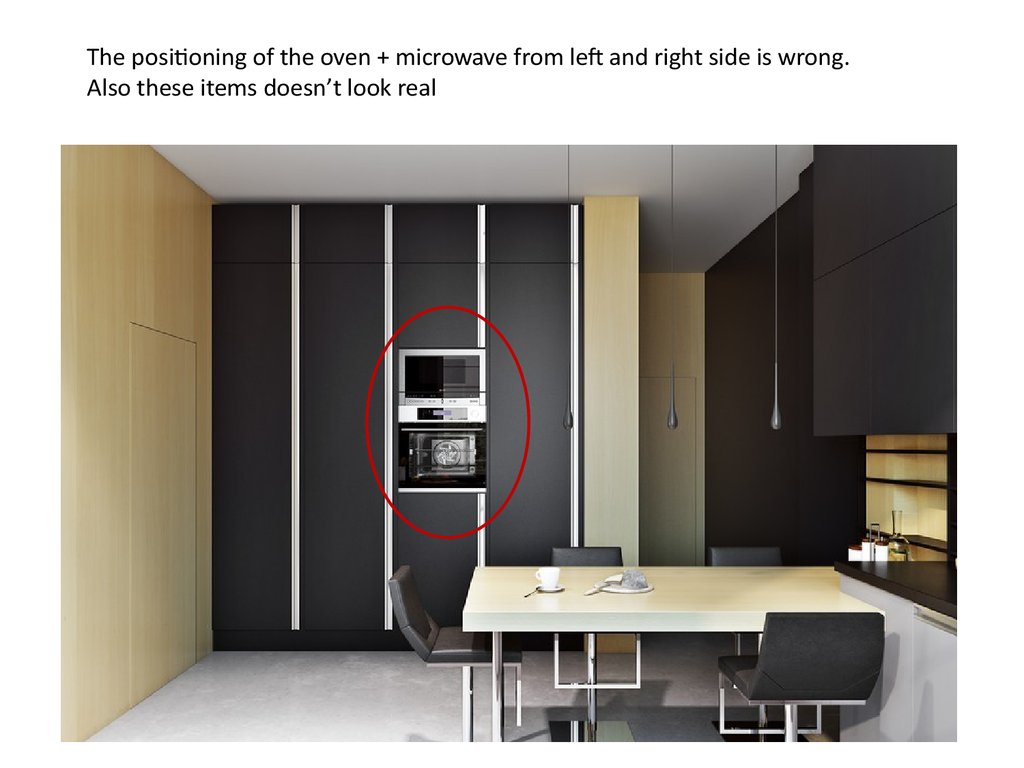
The positioning of the oven + microwave from left and right side is wrong.
Also these items doesn’t look real

14.

Now please check the positioning and finishing of the oven in this pic

15. Both frames should be on the same level

16.

Please check the skirting finishing it doesn’t look realistic

17. Now check these 2 pics showing the effect , the color and shadow

18.

19. 4- colors

4- COLORS

20. It looks fake because of the high contrast and the uniformity of colors. You can't find a mass of black everywhere in real life.

21. Now please check the black color in this picture. It is the same product used in wall unit. Also check the lightning and the wall

22. 5- wide angle

5- WIDE ANGLE

23. The wide angle should start from the table on the left till the end of the bar on the right

24. Make the rendering angle wider to see the wine cooler and fridge with table in the same angle

25. Rendering Quality of wine cooler and fridge r similar to this one

26. 5- Your suggestions

5- YOUR SUGGESTIONS

27. Would you advise to make any changment that will affect positively the final result and make it alive?

English     Русский Rules