


![.item { flex: none | [ <'flex-grow'> <'flex-shrink'>? || <'flex-basis'> ] } .item{ fllex 1 1 200px; }](https://cf2.ppt-online.org/files2/slide/m/M5oL3rcTidhsp4PVazq8Qb1lt7yvYHZf2xNJWD0GCO/slide-9.jpg ".item { flex: none | [ <'flex-grow'> <'flex-shrink'>? || <'flex-basis'> ] } .item{ fllex 1 1 200px; }")
![.item { flex: none | [ <'flex-grow'> <'flex-shrink'>? || <'flex-basis'> ] } .item{ fllex 1 1 200px; }](https://cf2.ppt-online.org/files2/slide/m/M5oL3rcTidhsp4PVazq8Qb1lt7yvYHZf2xNJWD0GCO/slide-10.jpg ".item { flex: none | [ <'flex-grow'> <'flex-shrink'>? || <'flex-basis'> ] } .item{ fllex 1 1 200px; }")

 programming
Similar presentations:


")


")


Display: flex
1. Display:flex;
2.
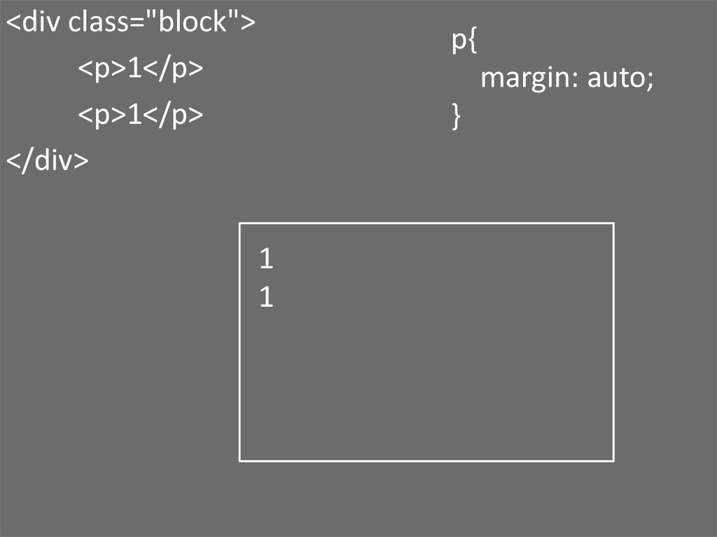
<div class="block"><p>1</p>
<p>1</p>
</div>
p{
margin: auto;
}
1
1
3.
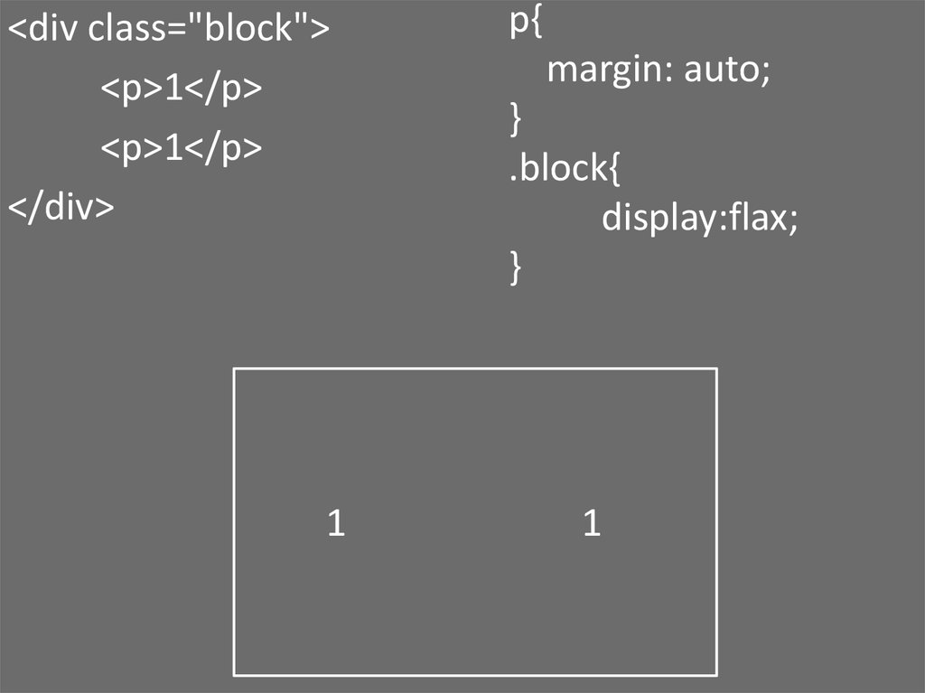
<div class="block"><p>1</p>
<p>1</p>
</div>
1
p{
margin: auto;
}
.block{
display:flax;
}
1
4. flex-direction:
rowcolumn
row-reverse
column-reverse
5. justify-content:
6. align-content:
7. align-items:
8. order: <integer>;
order: <integer>;9. flex-grow: <number>;
flex-grow: <number>;10. .item { flex: none | [ <'flex-grow'> <'flex-shrink'>? || <'flex-basis'> ] } .item{ fllex 1 1 200px; }
.item {flex: none | [ <'flex-grow'> <'flex-shrink'>? ||
<'flex-basis'> ]
}
.item{
fllex 1 1 200px;
}
11. .item { flex: none | [ <'flex-grow'> <'flex-shrink'>? || <'flex-basis'> ] } .item{ fllex 1 1 200px; }
.item {flex: none | [ <'flex-grow'> <'flex-shrink'>? ||
<'flex-basis'> ]
}
.item{
fllex 1 1 200px;
}