Similar presentations:
Frontend Comments Extended 9
1. Frontend Comments Extended 9
#191497
Code
#097
754
#E02
F1D
#F6B
40E
Frontend Comments
Extended 9
2.
1I want to see the full circle, so please
make it also visible on the white/grey
background!
2
Use out black for the text here
For Dima
3.
For Dima1
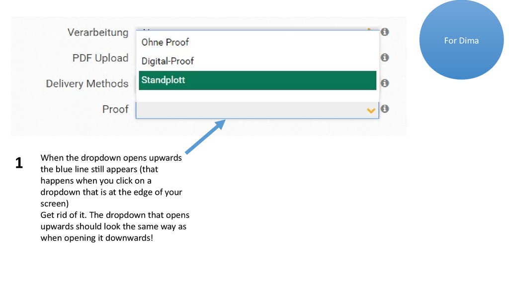
When the dropdown opens upwards
the blue line still appears (that
happens when you click on a
dropdown that is at the edge of your
screen)
Get rid of it. The dropdown that opens
upwards should look the same way as
when opening it downwards!
4.
For Dima2
When highlighting the different
quantity Options with mouseover –
use our green and white font then
(like the other dropdowns)
5.
Choose Your Delivery TimeFor Dima
1
Should look like this:
2
Remove this text! We have it already
at the bottom next to the upload
button
3
Remove the 24- hour production and
also 48-hour production! We don’t
offer that in the beginning! (So just
Express and Standard!
4
Call it: Express Delivery and
Standard Delivery
(not production)
5
Use the font you used above! This font
does not fit!
6.
DeliveryStandard Delivery
Delivery to arrive
latest:
12 July
6
For Dima
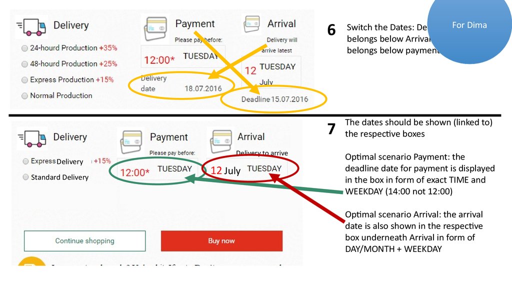
Switch the Dates: Delivery Date
belongs below Arrival and Deadline
belongs below payment!
7
The dates should be shown (linked to)
the respective boxes
Optimal scenario Payment: the
deadline date for payment is displayed
in the box in form of exact TIME and
WEEKDAY (14:00 not 12:00)
Optimal scenario Arrival: the arrival
date is also shown in the respective
box underneath Arrival in form of
DAY/MONTH + WEEKDAY
7.
8Delivery to arrive latest:
12 July
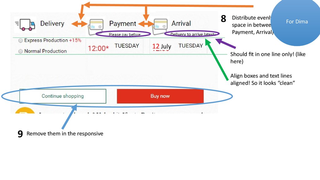
Distribute evenly, put same
For Dima
space in between all 3 (Delivery,
Payment, Arrival)
Should fit in one line only! (like
here)
Align boxes and text lines
aligned! So it looks “clean”
9
Remove them in the responsive
8.
For Sascha1
2
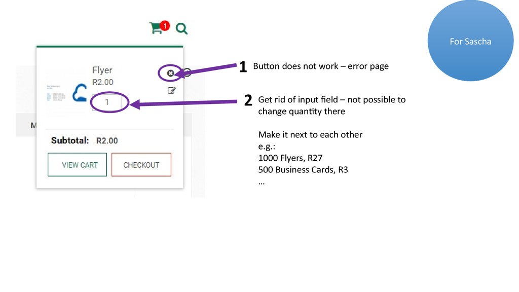
Button does not work – error page
Get rid of input field – not possible to
change quantity there
Make it next to each other
e.g.:
1000 Flyers, R27
500 Business Cards, R3
…
9.
5 Remove this (1)6 Make our yellow
For Andrey
3Make buttons like this
4 Make lines longer (same length!!)
USE VOUCHER
Initial status
USE VOUCHER
Mouseover/
click
2 Align buttons!!!
7
Make button like this
Initial status
UPDATE CART
Mouseover/
click
UPDATE CART
1Change to “GO TO CHECKOUT”
10.
1For Andrey
When in the “list view” of products, change
the buttons like this:
(ICON) ADD TO CART
Initial status
(ICON) ADD TO CART
Mouseover/
click


 informatics


