Similar presentations:
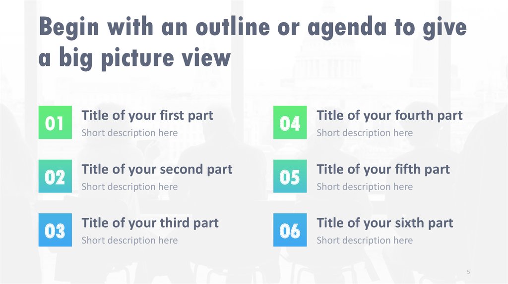
Begin with an outline or agenda to give a big picture view
1.
Your AwesomePresentation
Title
An Even More Amazing
Subtitle
2.
Your AwesomePresentation
Title
An Even More Amazing
Subtitle
3.
Your AwesomePresentation
Title
An Even More Amazing
Subtitle
4. Welcome!
Thanks for joining us5. Begin with an outline or agenda to give a big picture view
01Title of your first part
02
Title of your second part
03
Title of your third part
Short description here
Short description here
Short description here
04
Title of your fourth part
05
Title of your fifth part
06
Title of your sixth part
Short description here
Short description here
Short description here
5
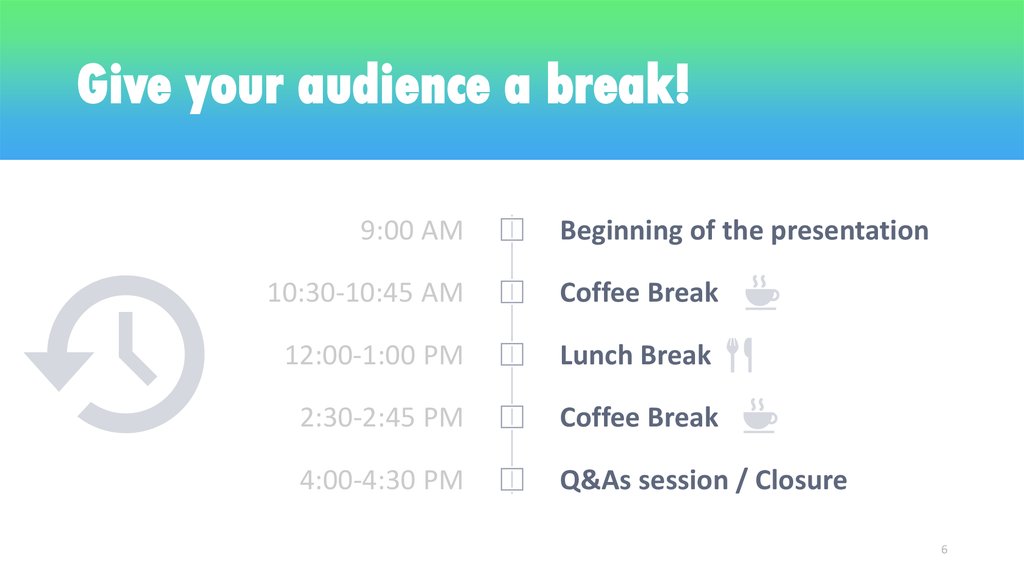
6. Give your audience a break!
9:00 AMBeginning of the presentation
10:30-10:45 AM
Coffee Break
12:00-1:00 PM
Lunch Break
2:30-2:45 PM
Coffee Break
4:00-4:30 PM
Q&As session / Closure
6
7.
01Transition Slide
Design option #1
8.
02Transition Slide
Design option #2
9.
TransitionSlide
Design option #3
10.
Transition SlideDesign option #4
11. Coffee Break
We will start again in 30’12. Use a title with specific & relevant (only) content
4Use a title with specific & relevant
(only) content
• People CAN’T listen while reading your slide.
• Always stick to the most important message.
• Less is more… be concise.
• And don’t kill your presentation with too many bullet point
slides. Use visuals instead!
12
13. Using a light background is an option to be considered
• A light background might be easier to read• Is a better option if you intend to print your document
• Suits diagrams or graphics insertion
13
14. Relevant content displayed with 2 columns is also nice!
• Lorem ipsum dolor sit amet,duis eu. Metus tortor. Eu ut
lorem, est sodales amet.
• Maecenas nam mattis,
condimentum semper
tristique. Morbi sed diam
ullamcorper cubilia et.
• Lectus mi at, inceptos lacinia
necessitatibus. Velit risus
suspendisse.
• Tempor ut id, nam
praesentium, ridiculus dui
sodales. Justo ipsum magna,
massa nec
14
15. 1 image says more
…than a thousand words15
16. BIG
is beautifulLess (text) is more
16
17.
Support your claimswith a short and
powerful quote
Author’s name
17
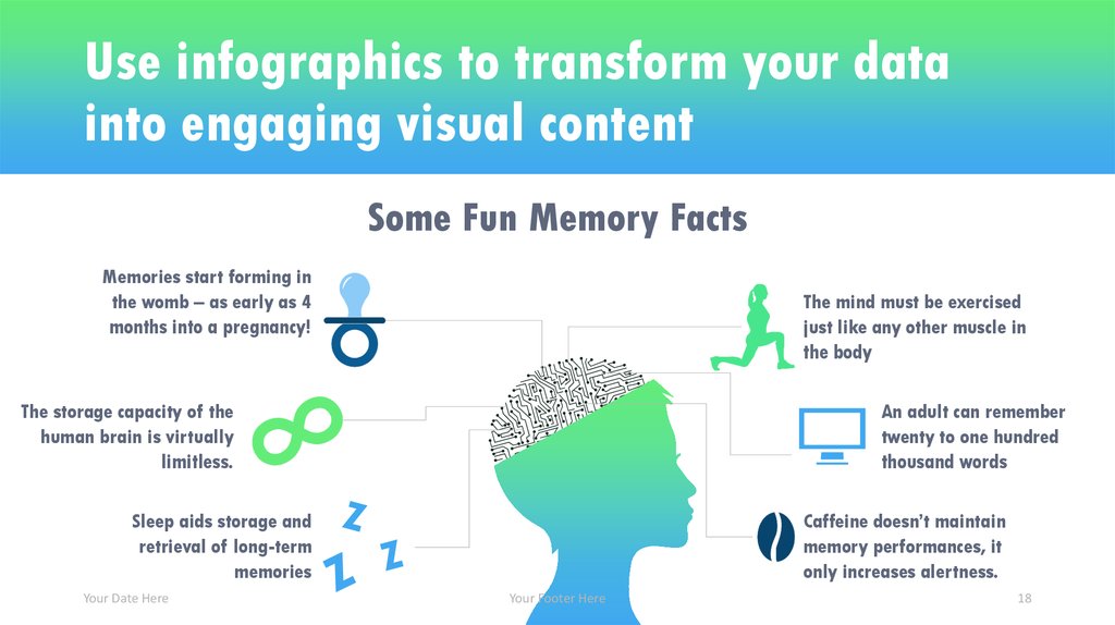
18. Use infographics to transform your data into engaging visual content
Some Fun Memory FactsMemories start forming in
the womb – as early as 4
months into a pregnancy!
The mind must be exercised
just like any other muscle in
the body
The storage capacity of the
human brain is virtually
limitless.
An adult can remember
twenty to one hundred
thousand words
Sleep aids storage and
retrieval of long-term
memories
Your Date Here
Caffeine doesn’t maintain
memory performances, it
only increases alertness.
Your Footer Here
18
19.
Support your textwith a strong and
relevant picture
Your Footer Here
19
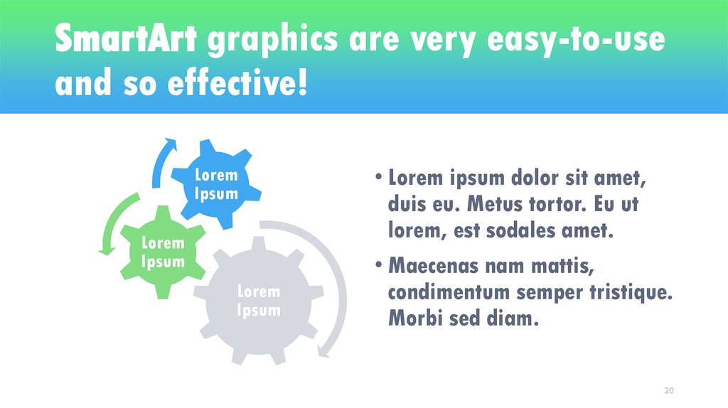
20. SmartArt graphics are very easy-to-use and so effective!
LoremIpsum
Lorem
Ipsum
Lorem
Ipsum
• Lorem ipsum dolor sit amet,
duis eu. Metus tortor. Eu ut
lorem, est sodales amet.
• Maecenas nam mattis,
condimentum semper tristique.
Morbi sed diam.
20
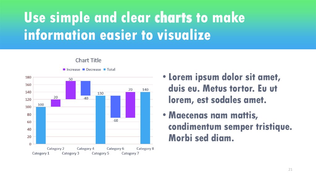
21. Use simple and clear charts to make information easier to visualize
• Lorem ipsum dolor sit amet,duis eu. Metus tortor. Eu ut
lorem, est sodales amet.
• Maecenas nam mattis,
condimentum semper tristique.
Morbi sed diam.
21
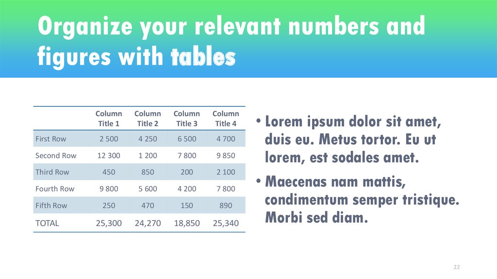
22. Organize your relevant numbers and figures with tables
ColumnTitle 1
Column
Title 2
Column
Title 3
Column
Title 4
First Row
2 500
4 250
6 500
4 700
Second Row
12 300
1 200
7 800
9 850
450
850
200
2 100
9 800
5 600
4 200
7 800
250
470
150
890
25,300
24,270
18,850
25,340
Third Row
Fourth Row
Fifth Row
TOTAL
• Lorem ipsum dolor sit amet,
duis eu. Metus tortor. Eu ut
lorem, est sodales amet.
• Maecenas nam mattis,
condimentum semper tristique.
Morbi sed diam.
22
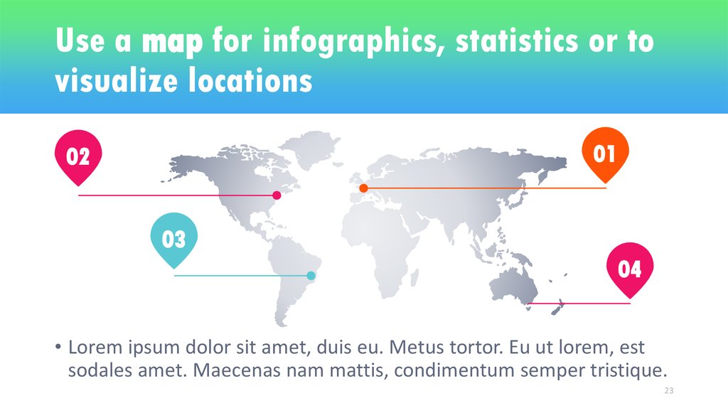
23. Use a map for infographics, statistics or to visualize locations
0102
03
04
• Lorem ipsum dolor sit amet, duis eu. Metus tortor. Eu ut lorem, est
sodales amet. Maecenas nam mattis, condimentum semper tristique.
23
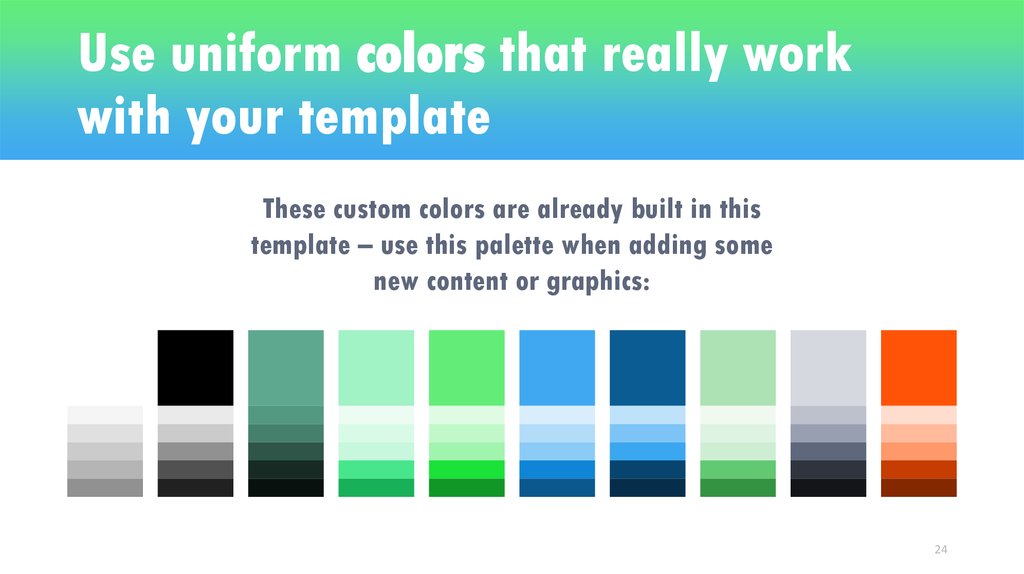
24. Use uniform colors that really work with your template
These custom colors are already built in thistemplate – use this palette when adding some
new content or graphics:
24
25. Thank You!
JOHN SHOWEETPRESENTATION EXPERT
1234 Lorem St, Ipsum, 56789, Country
+00 123 456 7890
your@email.com
Thank You!
Do you have any questions?










 english


