Similar presentations:
Management Tools
1. Management Tools Chapter 17
Ahmed AlmehairbiZee Davis
Chris Schug
Torre Walls
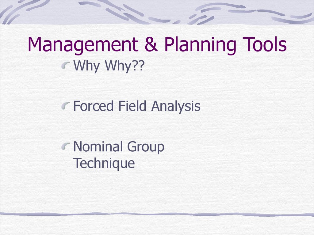
2. Management & Planning Tools
Management & Planning ToolsWhy Why??
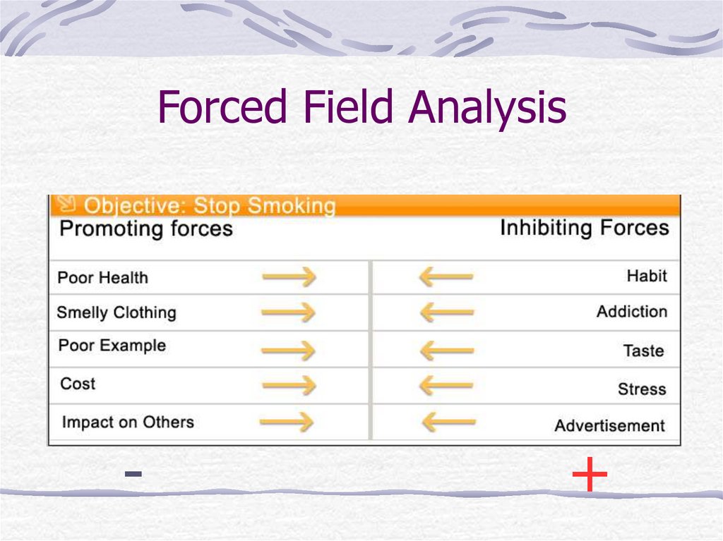
Forced Field Analysis
Nominal Group
Technique
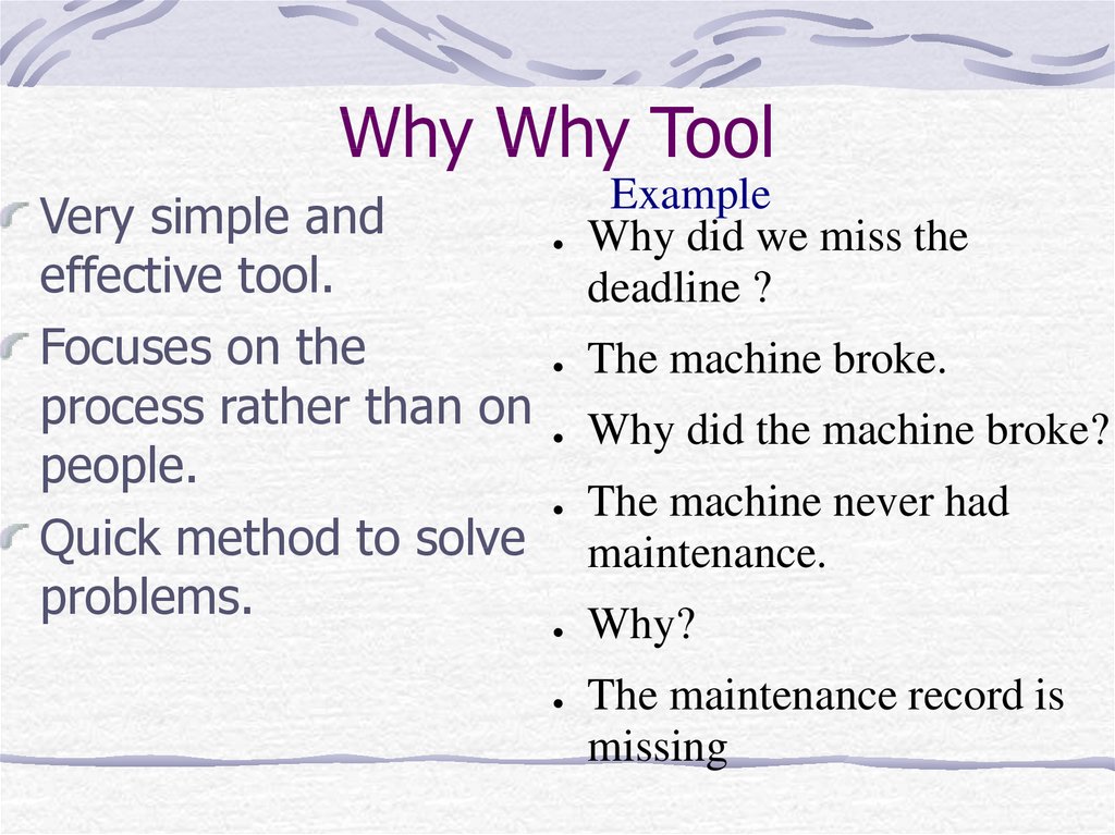
3. Why Why Tool
Very simple andeffective tool.
Focuses on the
process rather than on
people.
Quick method to solve
problems.
Example
Why did we miss the
deadline ?
The machine broke.
Why did the machine broke?
The machine never had
maintenance.
Why?
The maintenance record is
missing
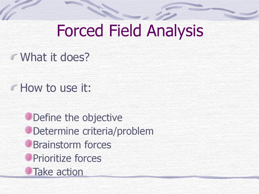
4. Forced Field Analysis
What it does?How to use it:
Define the objective
Determine criteria/problem
Brainstorm forces
Prioritize forces
Take action
5. Forced Field Analysis
-+
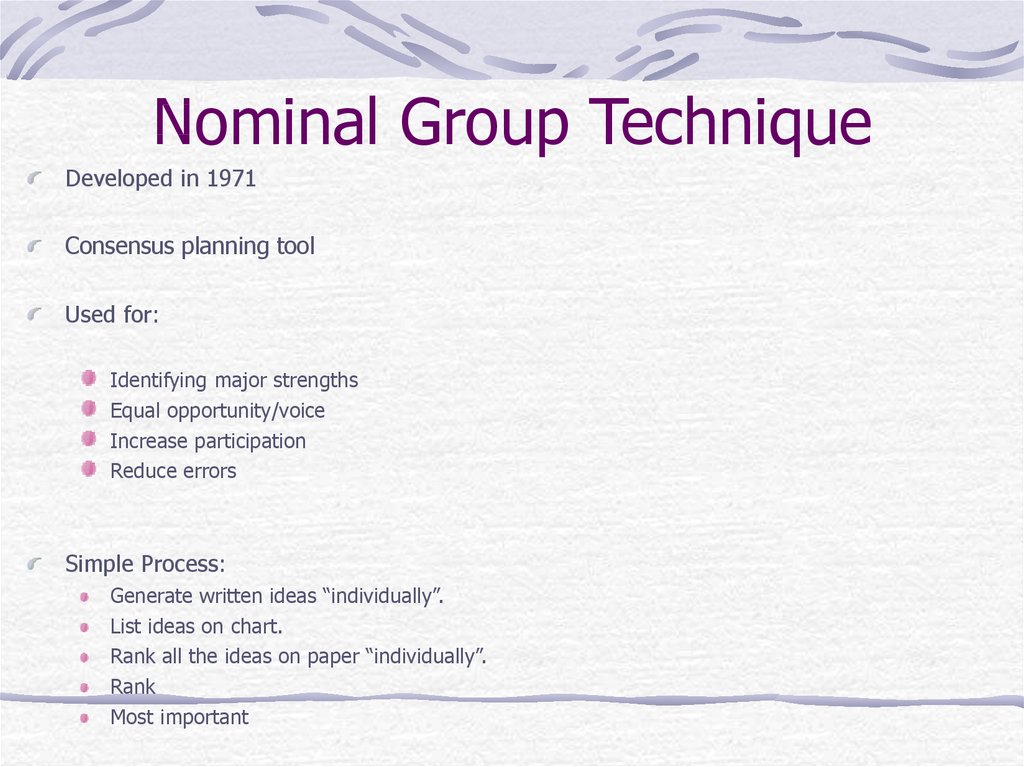
6. Nominal Group Technique
Developed in 1971Consensus planning tool
Used for:
Identifying major strengths
Equal opportunity/voice
Increase participation
Reduce errors
Simple Process:
Generate written ideas “individually”.
List ideas on chart.
Rank all the ideas on paper “individually”.
Rank
Most important
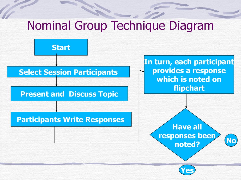
7. Nominal Group Technique Diagram
StartSelect Session Participants
Present and Discuss Topic
Participants Write Responses
In turn, each participant
provides a response
which is noted on
flipchart
Have all
responses been
noted?
Yes
No
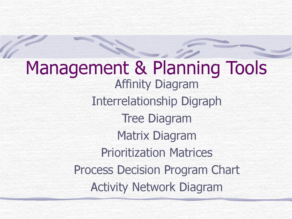
8. Management & Planning Tools
Management & Planning ToolsAffinity Diagram
Interrelationship Digraph
Tree Diagram
Matrix Diagram
Prioritization Matrices
Process Decision Program Chart
Activity Network Diagram
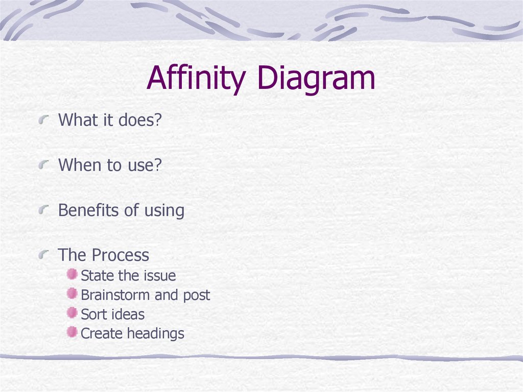
9. Affinity Diagram
What it does?When to use?
Benefits of using
The Process
State the issue
Brainstorm and post
Sort ideas
Create headings
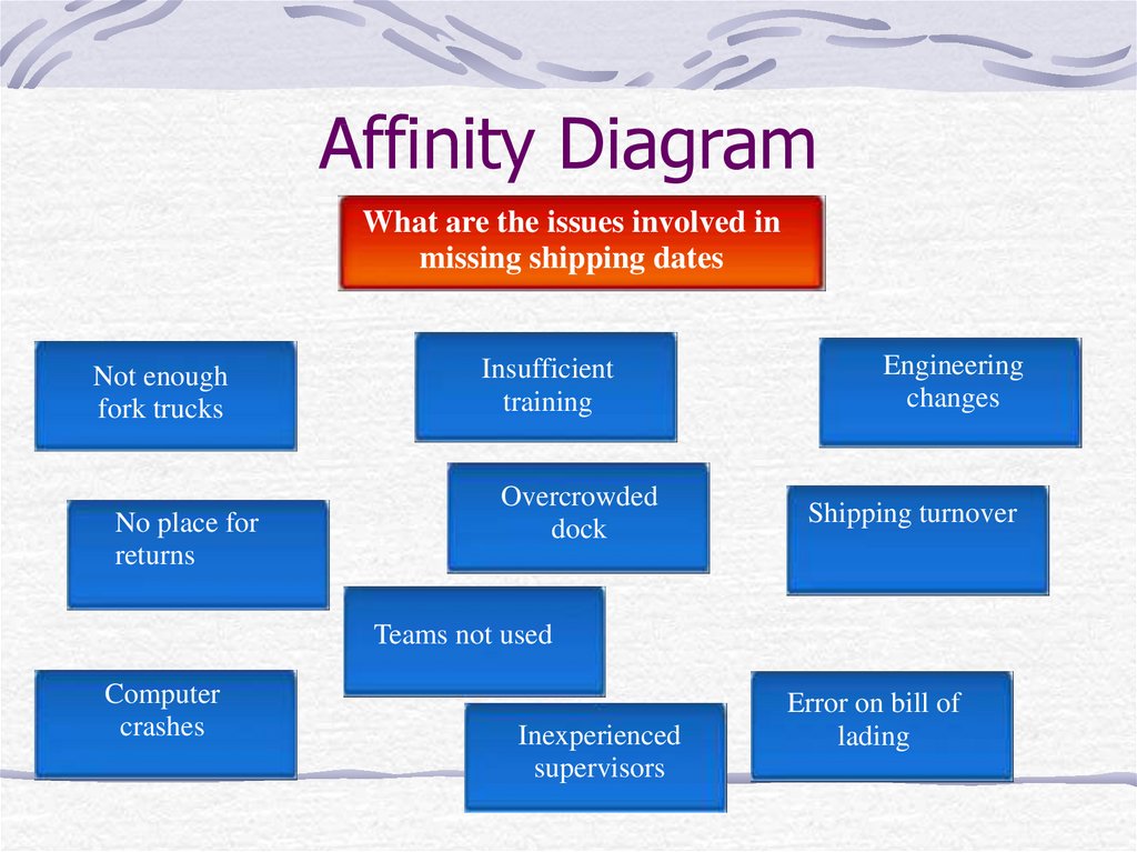
10. Affinity Diagram
What are the issues involved inmissing shipping dates
Not enough
fork trucks
No place for
returns
Insufficient
training
Overcrowded
dock
Engineering
changes
Shipping turnover
Teams not used
Computer
crashes
Inexperienced
supervisors
Error on bill of
lading
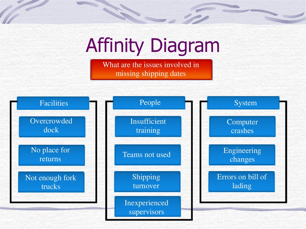
11. Affinity Diagram
What are the issues involved inmissing shipping dates
Facilities
People
System
Overcrowded
dock
Insufficient
training
Computer
crashes
No place for
returns
Teams not used
Engineering
changes
Not enough fork
trucks
Shipping
turnover
Errors on bill of
lading
Inexperienced
supervisors
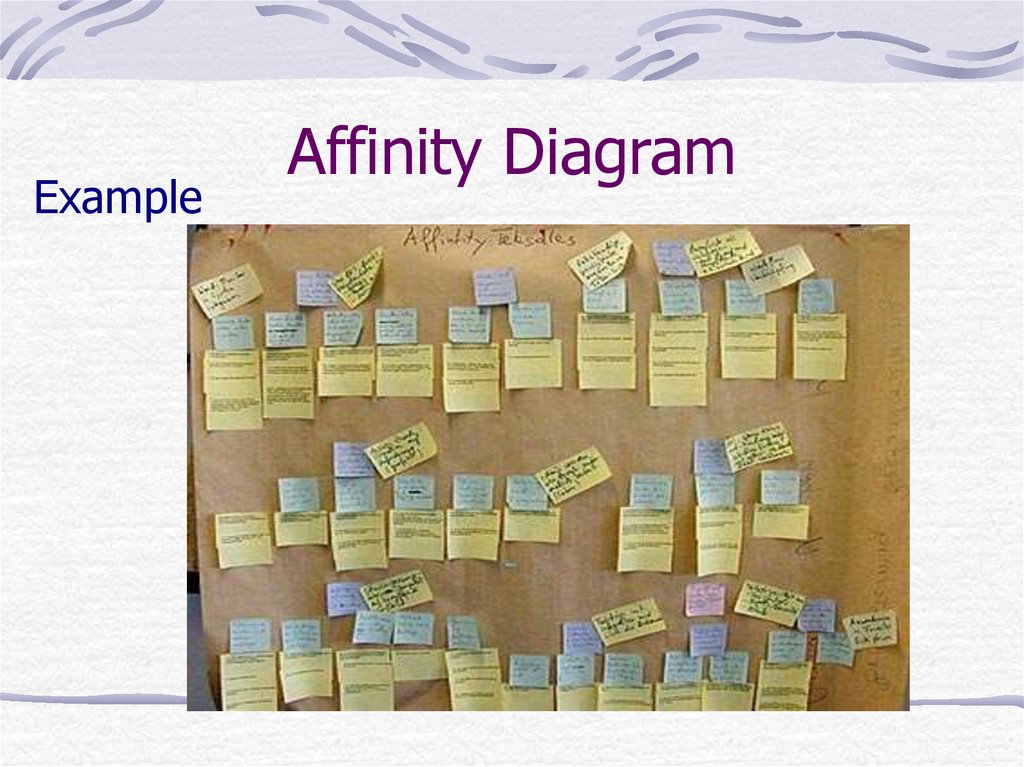
12. Affinity Diagram
ExampleAffinity Diagram
13. Interrelationship Digraph
Clarifies interrelationship of many factorsClassifies cause-and-effect relationships
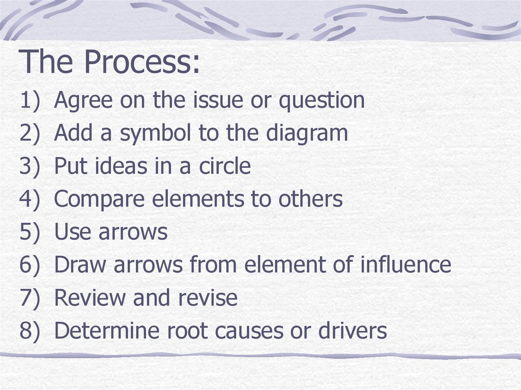
14. The Process: Agree on the issue or question Add a symbol to the diagram Put ideas in a circle Compare elements to others Use
The Process:1)
2)
3)
4)
5)
6)
7)
8)
Agree on the issue or question
Add a symbol to the diagram
Put ideas in a circle
Compare elements to others
Use arrows
Draw arrows from element of influence
Review and revise
Determine root causes or drivers
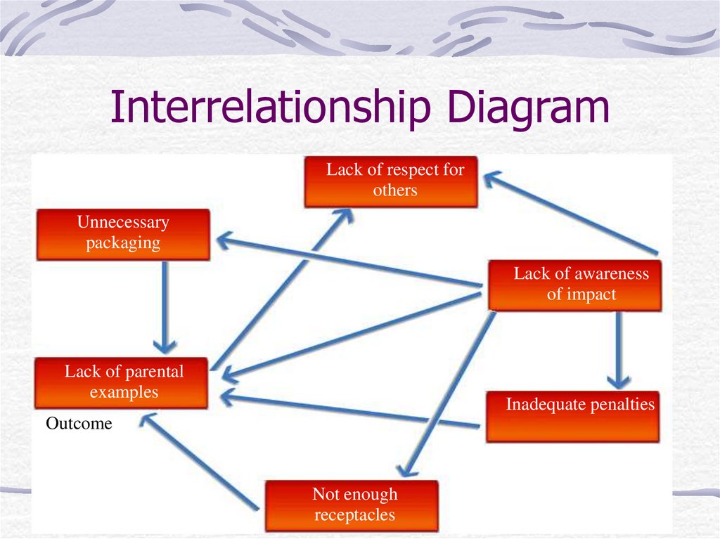
15. Interrelationship Diagram
Lack of respect forothers
Unnecessary
packaging
Lack of awareness
of impact
Lack of parental
examples
Inadequate penalties
Outcome
Not enough
receptacles
16. Questions Comments
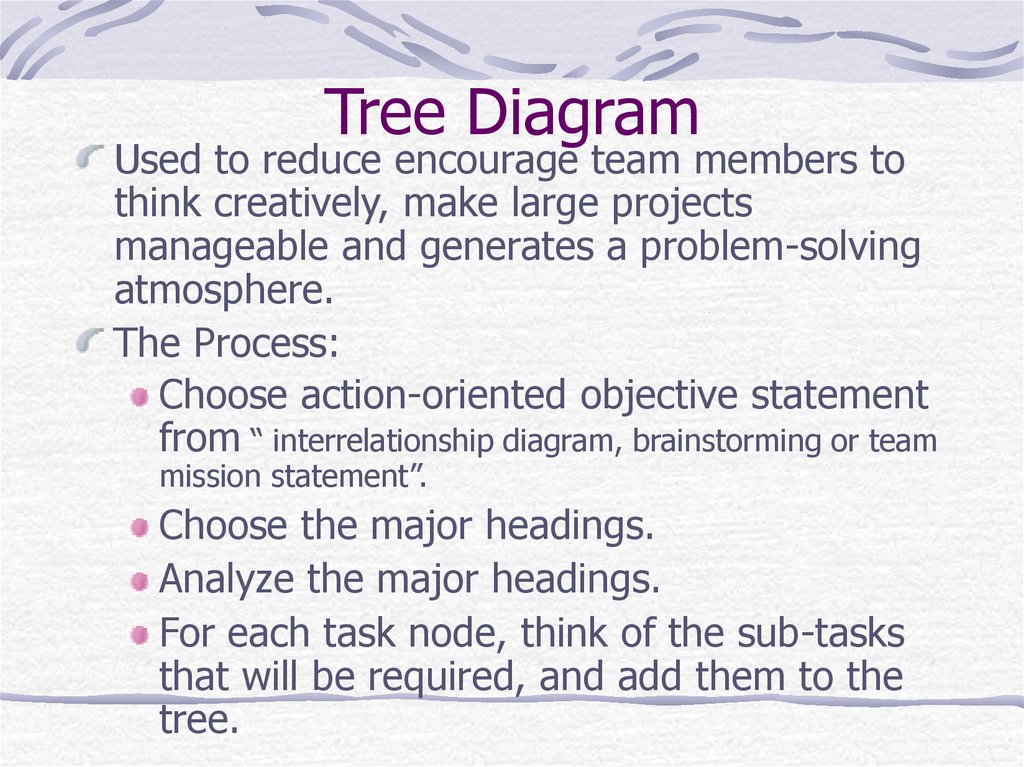
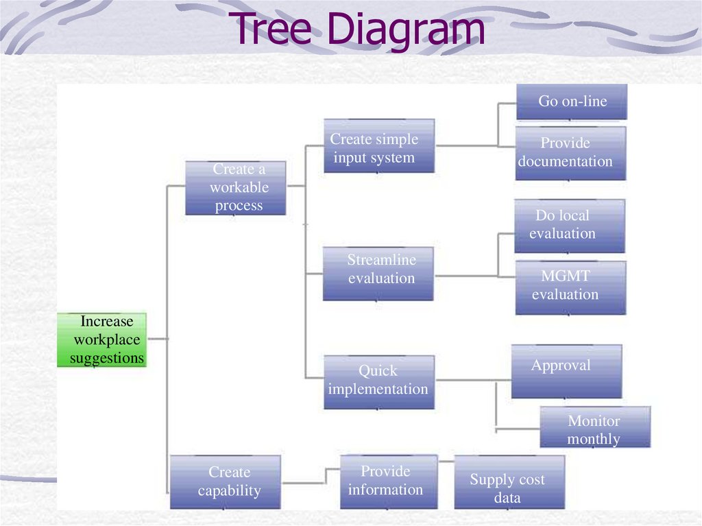
17. Tree Diagram
Used to reduce encourage team members tothink creatively, make large projects
manageable and generates a problem-solving
atmosphere.
The Process:
Choose action-oriented objective statement
from “ interrelationship diagram, brainstorming or team
mission statement”.
Choose the major headings.
Analyze the major headings.
For each task node, think of the sub-tasks
that will be required, and add them to the
tree.
18. Tree Diagram
Go on-lineCreate a
workable
process
Create simple
input system
Do local
evaluation
Streamline
evaluation
Increase
workplace
suggestions
Provide
documentation
Quick
implementation
MGMT
evaluation
Approval
Monitor
monthly
Create
capability
Provide
information
Supply cost
data
19. Matrix Diagram
Used to identify, analyze and rate therelationship among two or more
variables.
Select factors.
Select appropriate format.
Define symbols.
Analyze each cell by inserting the
appropriate symbol.
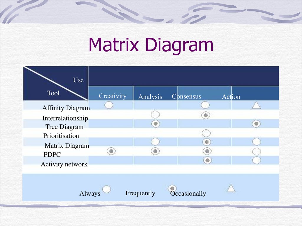
20. Matrix Diagram
UseTool
Creativity
Analysis
Consensus
Affinity Diagram
Interrelationship
Tree Diagram
Prioritisation
Matrix Diagram
PDPC
Activity network
Always
Frequently
Occasionally
Action
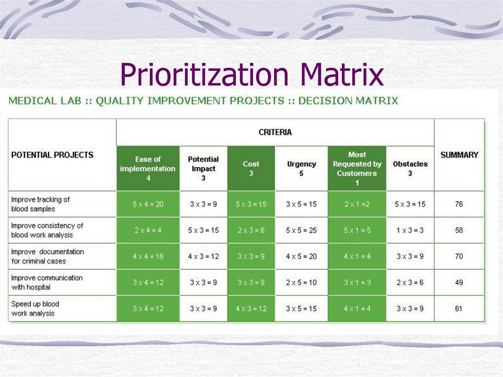
21. Prioritization Matrix
What it does?When to use it:
Broad objectives must be broken down
All of the implementation options must be
explored
Assignable tasks must be created
22. Prioritization Matrix
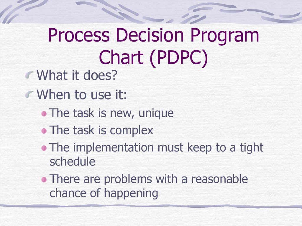
23. Process Decision Program Chart (PDPC)
What it does?When to use it:
The task is new, unique
The task is complex
The implementation must keep to a tight
schedule
There are problems with a reasonable
chance of happening
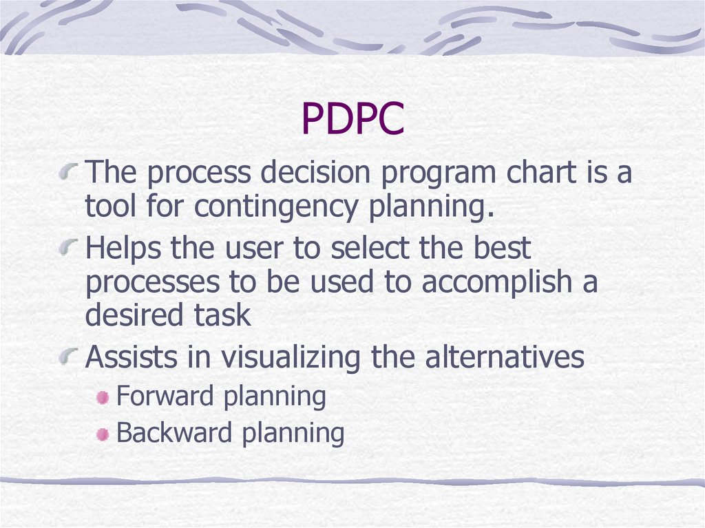
24. PDPC
The process decision program chart is atool for contingency planning.
Helps the user to select the best
processes to be used to accomplish a
desired task
Assists in visualizing the alternatives
Forward planning
Backward planning
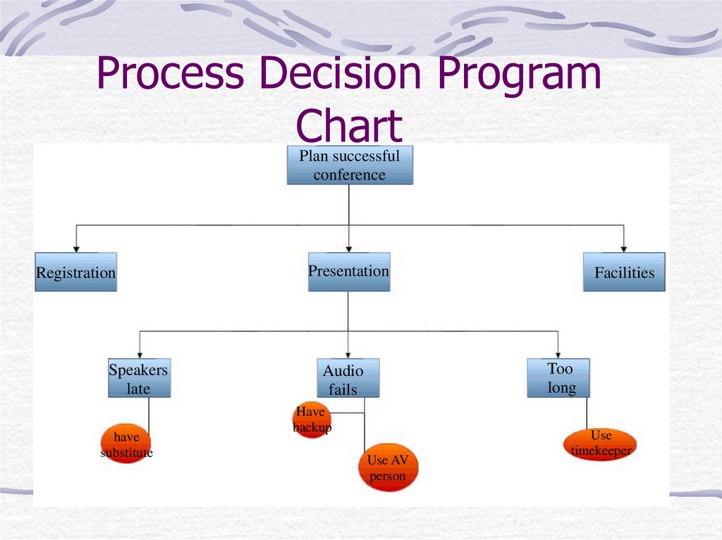
25. Process Decision Program Chart
Plan successfulconference
Registration
Speakers
late
have
substitute
Presentation
Facilities
Too
long
Audio
fails
Have
backup
Use AV
person
Use
timekeeper
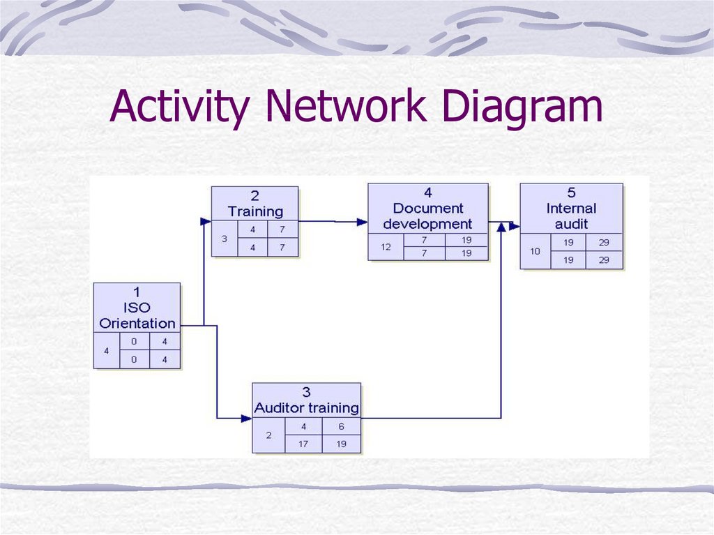
26. Activity Network Diagram
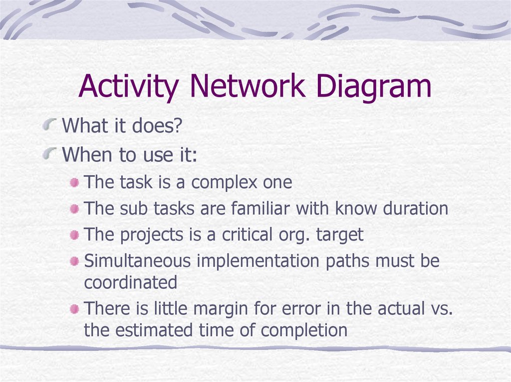
27. Activity Network Diagram
What it does?When to use it:
The task is a complex one
The sub tasks are familiar with know duration
The projects is a critical org. target
Simultaneous implementation paths must be
coordinated
There is little margin for error in the actual vs.
the estimated time of completion
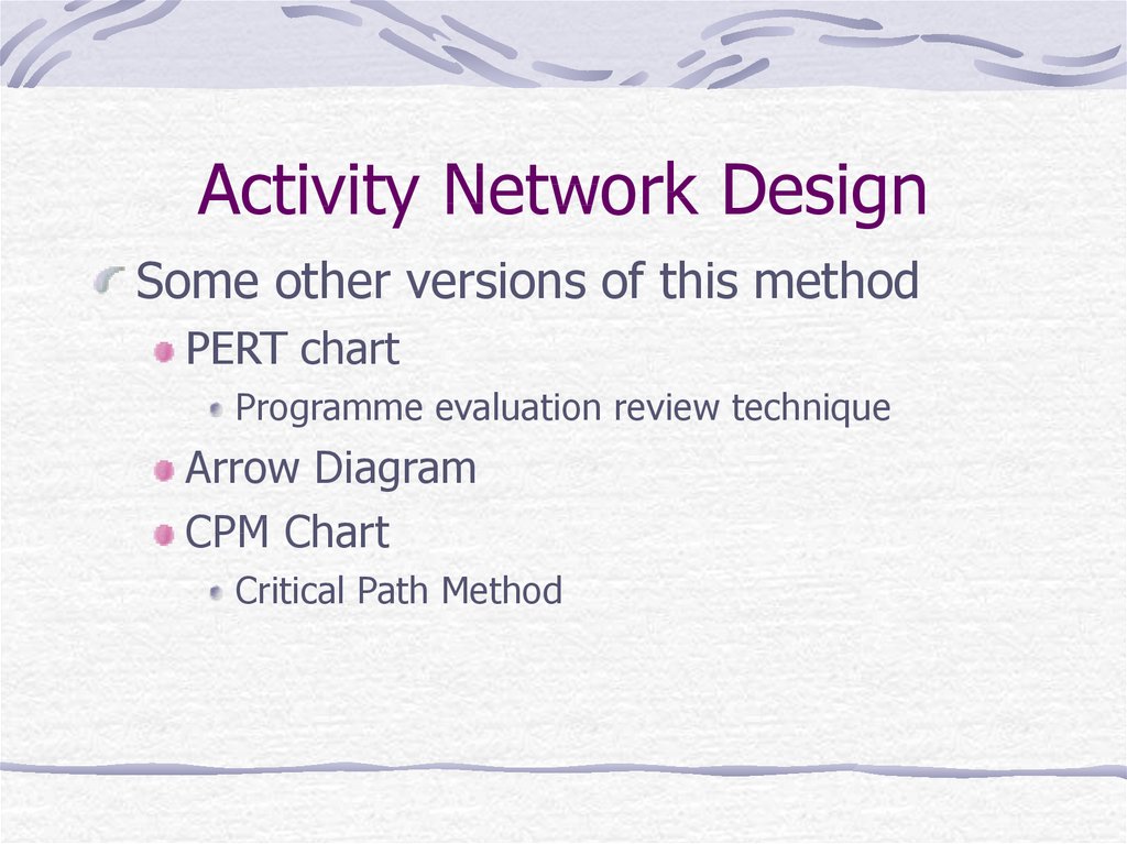
28. Activity Network Design
Some other versions of this methodPERT chart
Programme evaluation review technique
Arrow Diagram
CPM Chart
Critical Path Method
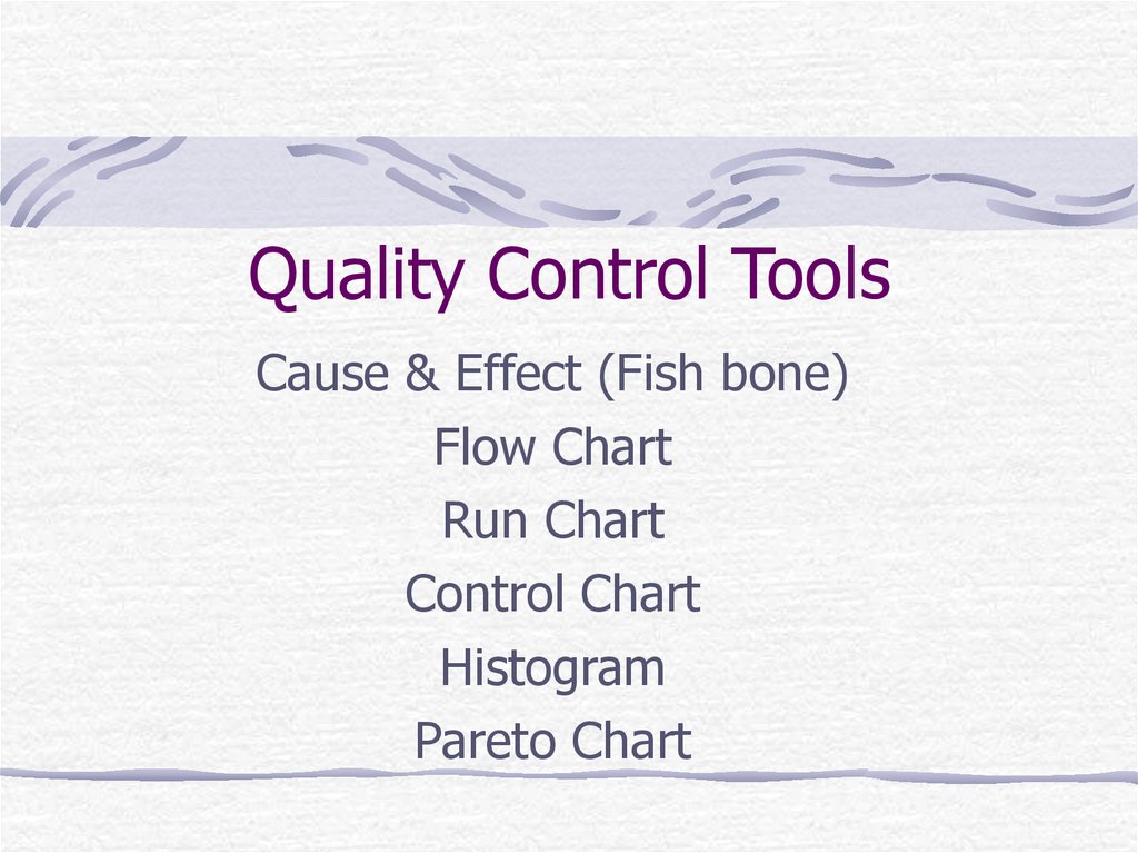
29. Quality Control Tools
Cause & Effect (Fish bone)Flow Chart
Run Chart
Control Chart
Histogram
Pareto Chart
30. Cause & Effect Diagram
Cause & Effect Diagram• A diagram composed of lines and symbols
designed to represent a meaningful
relationship between an effect and its
causes
• Developed by Dr. Kaoruno Ishikawa and
adapted to improving quality by Dr. W.
Edwards
• Often referred to as an Ishikawa diagram or
fishbone diagram
31. Flow Charts
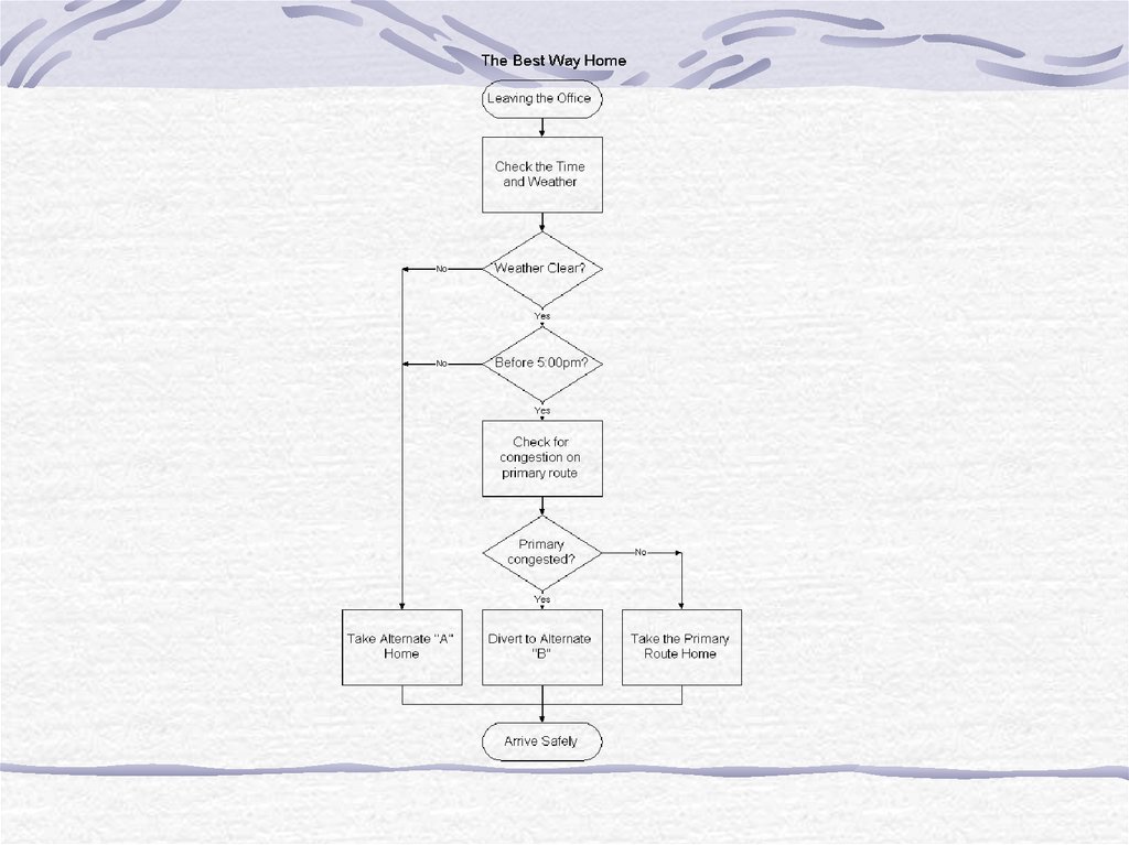
A flow chart is a pictorial representationshowing all of the steps of a process.
A Flowchart is used for:
1. Defining and analyzing processes
2. Building a step-by-step picture of the
process for analysis, discussion, or
communication purposes
3. Defining, standardizing, or finding areas
for improvement in a process
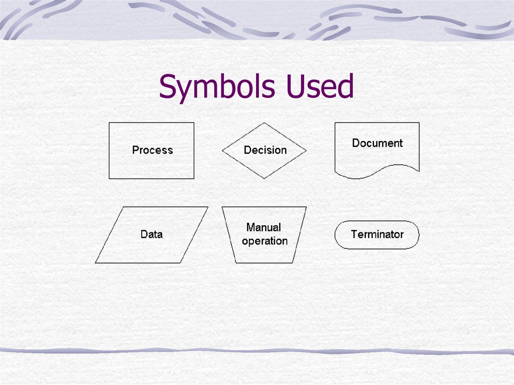
32. Symbols Used
33.
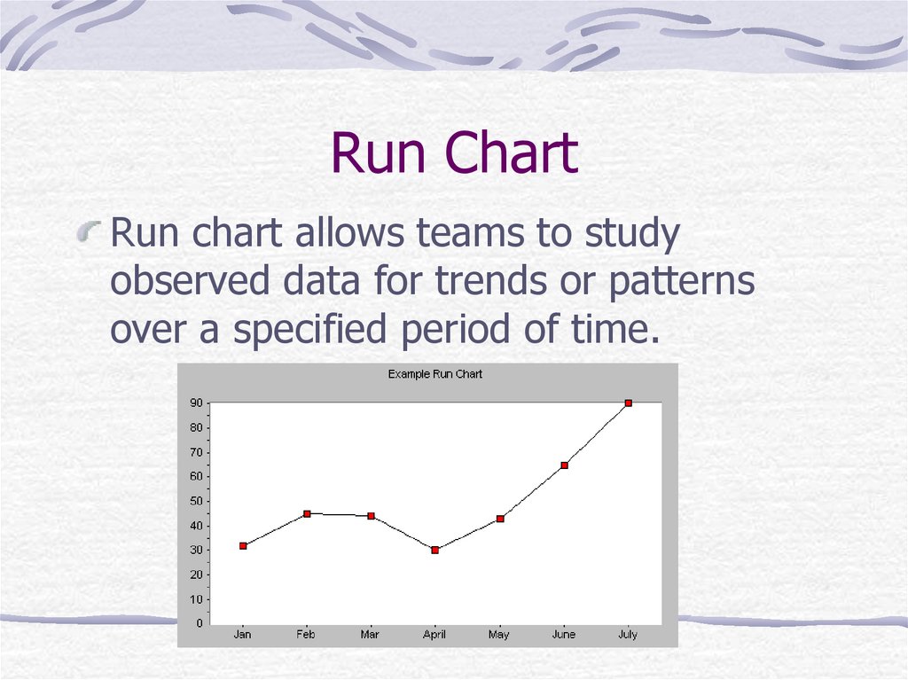
34. Run Chart
Run chart allows teams to studyobserved data for trends or patterns
over a specified period of time.
35. Control Chart
A statistical control chart is a graphiccomparison of process performance
data to computed “statistical control
limits,” drawn as limit lines on the chart.
A statistical tool used to distinguish
between process variation resulting from
common causes and variation resulting
from special causes.
36. Control Chart
BenefitsMonitor process variation over time
Differentiate between special cause and
common cause variation
Assess the effectiveness of changes to
improve a process
Communicate how a process performed
during a specific period
37. Control Chart
Types of Control chartsAttribute Data
Data that results from counting the number of
occurrences
Variables Data
Displays values resulting from the measurement
of a continuance variable
38. Control Chart
Three types of of charts:X-Bar and R Chart
Individual X and Moving Range Chart for
variables Data
Individual X and Moving Range Chart for
Attribute Data
39. Histogram
A histogram is a graphic summary ofvariation in a set of data
Basic data analysis tool for analyzing
frequency of occurrence of items
provides an easy-to-read picture of the
location and variation in a data set.
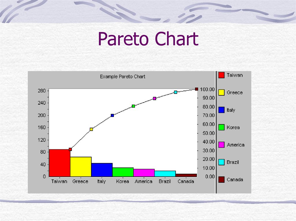
40. Pareto Chart
Pareto analysis is a ranked comparisonof factors related to a quality problem
Prioritized bar chart for determining
which problem to work on first.
Arranging data so that the few vital
factors that are causing most of the
problems reveal themselves.
41. Pareto Chart
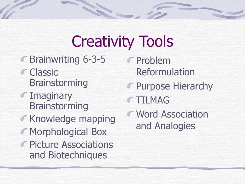
42. Creativity Tools
Brainwriting 6-3-5Classic
Brainstorming
Imaginary
Brainstorming
Knowledge mapping
Morphological Box
Picture Associations
and Biotechniques
Problem
Reformulation
Purpose Hierarchy
TILMAG
Word Association
and Analogies

 management


