Feedback_Landing
1.
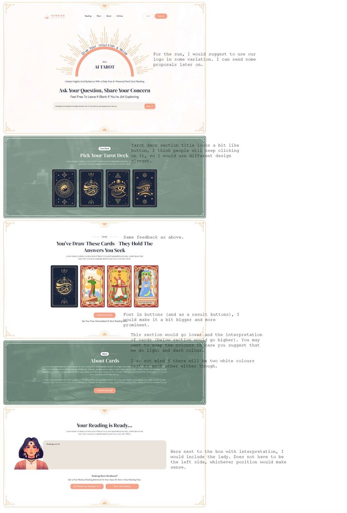
For the sun, I would suggest to use ourlogo in some variation. I can send some
proposals later on.
Tarot deck section title looks a bit like
button, I think people will keep clicking
on it, so I would use different design
element.
Same feedback as above.
Font in buttons (and as a result buttons), I
would make it a bit bigger and more
prominent.
This section would go lover and the interpretation
of cards (below section would go higher). You may
want to swap the colours in case you suggest that
we do light and dark colour.
I do not mind f there will be two white colours
next to each other either though.
Here next to the box with interpretation, I
would include the lady. Does not have to be
the left side, whichever position would make
sense.
