


 english
Similar presentations:


Ielts Academic. Writing task 1
1.
IELTS AcademicWriting Task 1
Denis Larionov
2.
What will you need to write about?3.
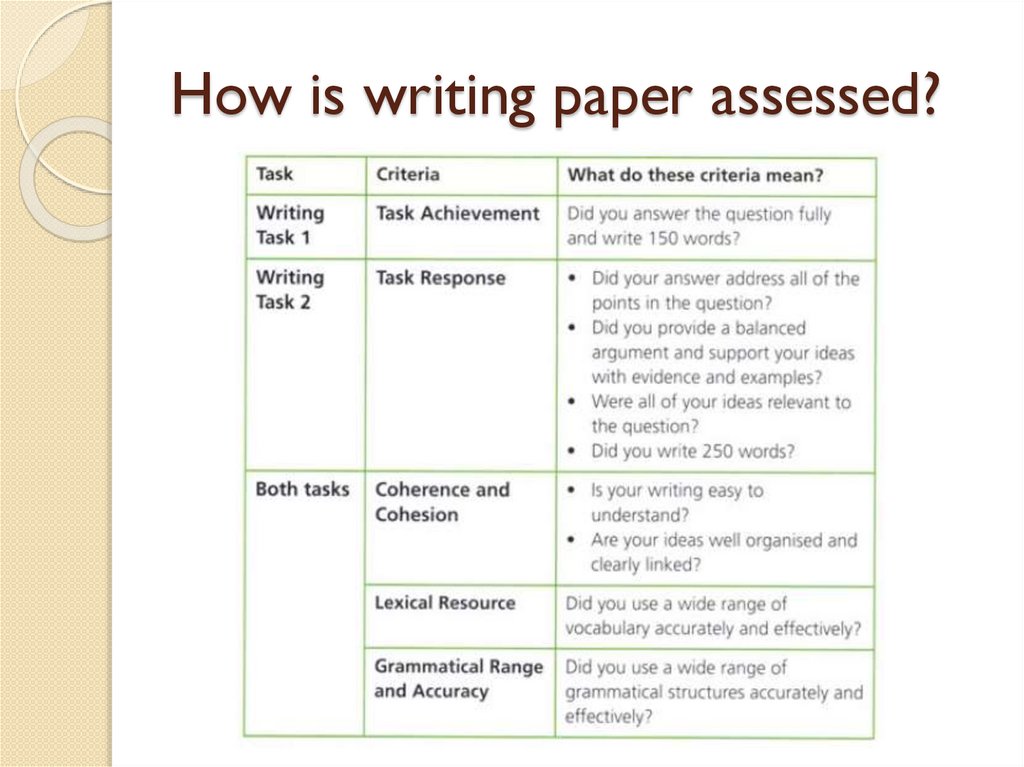
How is writing paper assessed?4.
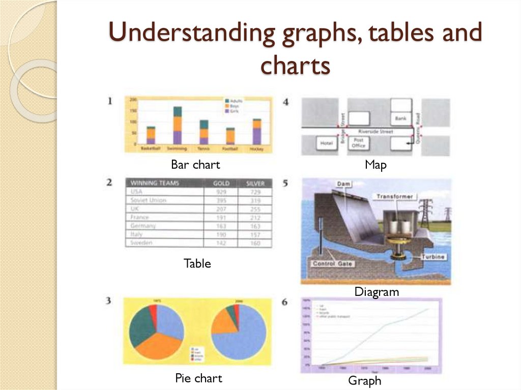
Understanding graphs, tables andcharts
Bar chart
Map
Table
Diagram
Pie chart
Graph
5.
Look thoroughly at the graph6.
Answer the following questionsWhat is being measured and how? (e.g. is
the information in millions or as a
percentage?)
2. Is there a time element to the
information? (If so, what is the gap
between each year shown?)
3. Are two or more things being compared?
(What are they?)
1.
7.
Look thoroughly at the pie charts8.
Look at the statements9.
Study the bar chart10.
Answer the following questions11.
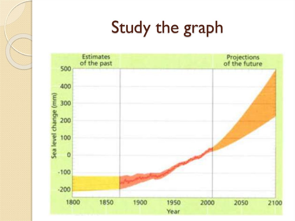
Study the graph12.
TipsUsing the passive voice helps to show
you are describing the visual information,
rather than giving your own ideas.
To describe future predictions, we often
use the passive voice form of the verbs
estimate, predict and forecast.
These sentences often start with it.
13.
Rewrite the sentences describingthe graph
14.
Task achievementTo achieve a good score for Task Achievement,
you need to:
give an overview of the information in the
graph (main trends);
describe all the most relevant and significant
information;
point out the key differences and similarities
in the data;
only include information that is represented
in the data;
produce an answer that is at least 150 words.
15.
Look at the bar chart and identifythe main trend(s)
16.
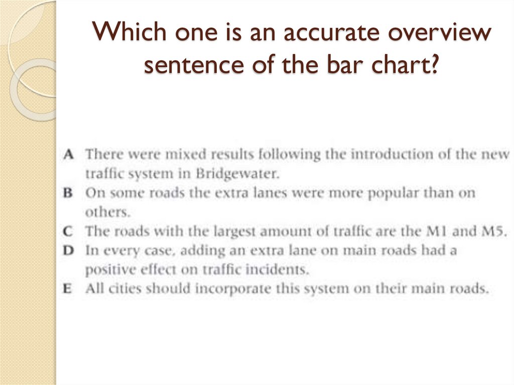
Which one is an accurate overviewsentence of the bar chart?
17.
Main features and minor detailsYou need to write 150 words describing
and summarising the main features. The
visual information may contain minor
details that should not be included.
Main feature: Extra lanes were introduced to
five main roads.
Minor detail: Before the new lane was
introduced, almost eight cars had accidents
on the M4 per kilometer per year.
18.
Decide if the information is19.
Look at the bar chart again20.
Check the model answer21.
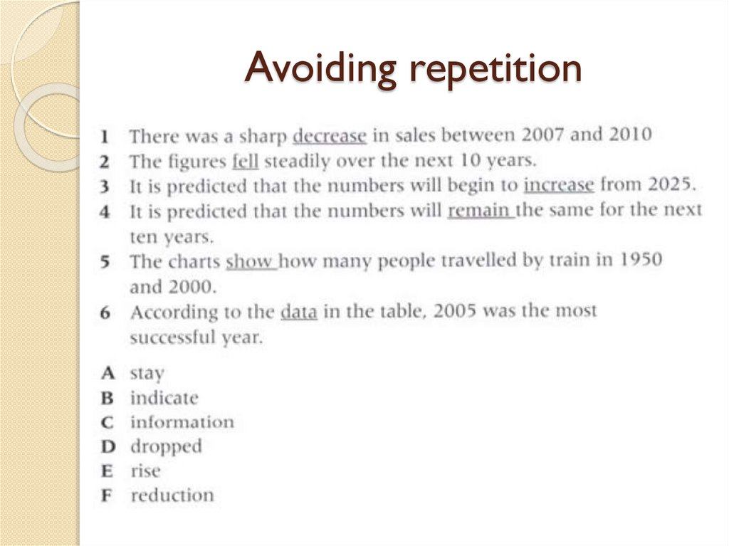
Avoiding repetition22.
Avoiding repetition23.
Avoiding repetition24.
Comparing and contrasting dataWhen you are describing a chart or
graph, you are actually describing the
patterns in the data.
Before you begin to write, spend one or
two minutes noticing the different
features of the visual information.
25.
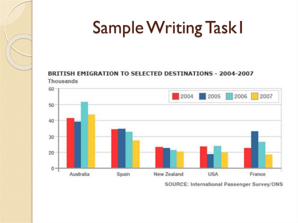
Sample Writing Task126.
Sample answerThe bar chart shows the number of British people who
emigrated to five destinations over the period 2004 to 2007.
It is evident from the chart that throughout the period, the
most popular place to move to was Australia.
Emigration to Australia stood at just over 40,000 people in
2004, which was approximately 6,000 higher than for Spain,
and twice as high as the other three countries. Apart from a
jump to around 52,000 in 2006, it remained around this level
throughout the period.
The next most popular country for Britons to move to was
Spain, though its popularity declined over the time frame to
finish at below 30,000 in 2007. Despite this, the figure was
still higher than for the remaining three countries.
Approximately 20,000 people emigrated to New Zealand
each year, while the USA fluctuated between 20-25,000
people over the period.
Although the number of visitors to France spiked to nearly
35,000 in 2005, it was the country that was the least popular
to emigrate to at the end of the period, at just under 20,000
people.